Weekending 15042012

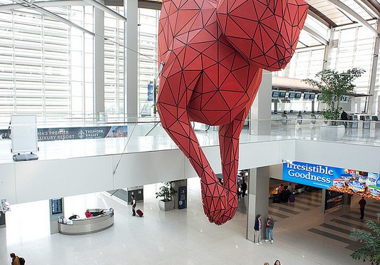
For me in Los Angeles, I spent the week debugging the Ear Freshener project and designing a new circuit board. More about that in a subsequent post. There was general following-alongs on the #NewAesthetic developments — mostly to say that it’d be nice to not over-theorize a thing that is basically a result of living the Algorithmic Life. But, it’s good therapy to say it so, to have some awareness and set of observational tools to document and capture these things, like this weird rabbit I saw in the Sacramento Airport on my way back from the Gaming the Game conference.

And that was the other thing I did last week. Thursday and Friday I was at UC Davis at this conference. It was quite good fun. Unfortunately, I missed Tim Lenoir’s keynote, but I did get to catch Mackenzie Wark talking about the cultural and political implications of the strategic elements of Debord’s Game of War (and Alex Galloway’s controversial digital edition of Game of War). Also, Tad Hirsch was there and mentioned his Trip Wire project, which I first saw at the Zero One conference in 2006. It’s one of my favorite, favorite “art technology” projects. I still think it’s a weak signal for a future of meaningful Objects that Blog (which was consistent with 2006 sensibilities — now, maybe it’s Objects that Tweet or something, such as Superball by Stamen.) It’s also, I was reminded, an audio project in that the coconuts phoned a hotline for noise complaints and then spoke. Embarrassingly, I had never heard the actual audio that was delivered in these phone messages — Tad played them and I now see that they are plainly on the project’s web site.

On the European front, I (Nicolas) spent the last week actually not in Geneva but in South of France for a mix of vacation and heavy writing. It’s good to have finally some time to focus 100% on the game controller book project. More specifically, I spent most the week researching and writing about the early instances of video game controllers that paved the way for the arrival of joypads. Our point is of course not to tell the whole history of video game but since we want to show how looking at the joypad is a good way to understand this culture, it’s important to spend some time on it. And naturally, it lead me to write about switches, knobs, dials, old-school joysticks from the beginning of the 20th Century and oscilloscope. The point is to show the different lineages, how they disappear or recombine over time. This chapter’s almost done. The difficult thing is to be accurate and try not to focus only on facts and observations since we think it’s important to discuss the implications.

Back to Geneva, I spent last Friday teaching in a design school in Annecy (France). A mix of lectures and workshop activities, the idea was to show various foresight-related approaches.

Here in Barcelona, we are approaching the release of version 1.0 of Quadrigram. I completed the list of approx. 350 modules that made the final cut and have started to plan the road map for the release cycle of the application. Arrange all the elements of a programming language is daunting task at times, but I hope people will enjoy the coherence of this first set of modules. They are categorized into five distinct Libraries. Each Library groups modules according to their purpose in developing a solution (e.g. load, manipulate, analyze, convert, filter and visualize your data). We setup a javadoc-style Language Reference web site that documents the structures of all the modules.

Quadrigram Language Reference

Design and Storytelling at AIGA Pivot

Back in 2010 at the University of Michigan Taubman School’s conference on “The Future of Technology” is where I first started thinking about the future as represented in graphs. I brought this visual graphical prop back again at the AIGA conference this last weekend in Phoenix. I guess I figured that a graphic of the future would be a good way to start a talk of the design professional society that at least started with a strong emphasis on graphic arts. (But it’s broadened itself, as I understand, which is good.)

I started with these hand drawn illustrations as a way to show that the future is contestable and malleable and one can make it and need not subscribe to the least-common denominator ideologies about what the future looks like. More than “disruption” — which has weird connotations with business, but just creating a future we imagine, not driven by forces that have typical measures of “future” that includes better battery life and larger screens and more brain-y smart devices.

I participated in a discussion on Design and Storytelling. It was a rehash of some existing material on Design Fiction and the various idioms and conventions that Design can learn from science fiction in order to do the work of design — and not just communicate design ideas, but actually *do design.

Parenthetically, I’ve only recently become a part of the AIGA and I’m still in a phase of my professionalization in design. I think it’s quite important to understand that being anything in any community means being a part of the community which means circulating oneself — ideas, conversations, listening and learning. It is a way of advancing oneself *and advancing that professional community. This is why I go to these things and why I try my best to be an active part of the conversations and discussions — contributing something in the form of a talk or a workshop. It’s not because I like to travel around. That part is actually hard on the body and the home. But it’s part of what it means to be “advanced” at whatever one does. Advanced Designers who do not Advance Design are just shift workers. And then they’ll come a time when they are obsolete because they never paid attention to the larger advances in their community and one day they’ll have befuddled looks when the generation or two “behind” them comes up and eats their lunch. It should be a formal requirement to participate at these levels, proactively. There’s a three step plan. I describe it here: http://www.nearfuturelaboratory.com/2009/04/29/follow-curiosity-not-careers/

Saturday October 15 10:49

Okay. Rant on Advanced Designers who don’t Advance Design is officially over.

Going to these things is hard, fun work — but, then you also learn *new things and meet *new people! One high-note for me was this fellow who I’m sure you all already know about and I may be the last one — Jackob Trollbäck. Here is a designer who I could admire right away as he finds the curious, little weird things full of possibility for expression and experimentation. There were a number of things he showed that were just almost incongruous studies and experiments, much of which was wrapped up in sound and rhythm (also topics of great interest to the laboratory these days) as well as curious visual studies and experiments. These were informal experiments — playing with images and videos from an iPhone that turn a technical failing into an aesthetic marvel. These sorts of unexpected things are very interesting to us here.

Also! There was a little bit of a confirmation for my own personal “that’s weird” study — things that happen and one notices them repeatedly. There’s no big theory explanation here, but I notice curious alignments of numbers on clocks — digital clocks. I was capturing them quite regularly and uploading them to a Tumblr. And then I stopped because people would say — no..that’s not weird. It’s just the time. But it seems Jackob Trollbäck has done the same. So — it was a bit of an affirmation of my weird observations.

Related, here’s the talk from the University of Michigan where I first showed these hand-drawn sketches of the future. I think there’s a t-shirt in here somewheres..

Continue reading Design and Storytelling at AIGA Pivot

Design Fiction Workshop at UX Week 2011

So — enough yammering. Time for some hammering. It’ll be workshops from here to fore. Getting to work. Shirtsleeves. Lab coats. Smocks. Aprons. Hammers.

I’ll be doing a workshop later this summer — August 24 from 2-5:30, to be precise — at the UX Week week-ish long conference in San Francisco brought to you by the fine folks at Adaptive Path. It’s got the didactic title: How the Practice of Design Can Use Fiction to Create New Things. We’re done with fancy, clever, snarky titles for workshops.

It looks like a swell line-up. Old friends. New ones. Fun sounding workshops and methoducation sessions.

Sign up. It’ll be fun.

====

From Dick Fosbury to the guy who put wheels on luggage, creating disruptions to convention in positive ways has often meant looking at the world differently. Fiction, especially science fiction, is a way of telling a story about and then forcing one to think about the world by looking at it with a different lens.

Design can approach its creative and conceptual challenges to make things better, or to think differently or to disrupt convention by combining its practice with that of fiction.

In this workshop we will look at the practical ways of employing the rhetorical, creative and cinematic aspects of fiction to help think, act upon, design and create new things.

The principle is simple. If cinematic and literary fiction is able to help imagine and communicate things that may not be possible, how can these same forms of story telling help design practices create disruptive visions of the near future?

In the workshop will share a number of relevant case studies where design and fiction were brought together. The process and outcomes of these case studies will be discussed. Through these case studies we’ll discover approaches, techniques and principles for a pragmatic designing-with-fiction process.

Prerequisites:
An open mind, notebook, pen. Familiarity with science-fiction film, optional.

Outcomes:
A set of tools, approaches and processes for initiating practical design fiction in the studio.

Continue reading Design Fiction Workshop at UX Week 2011

IxD 2011 Designing Advanced Design Workshop

Saturday February 12 10:36

Wednesday February 09 16:16

The problem that occurs when a clever, *advanced idea is inserted into a machine that is already optimized for itself — for efficiency. Just because it’s bright and clever and has colors doesn’t mean that it can find a place to fit in a process that is either (a) already humming along or, (b) unwilling or unable to change and adapt its workflow to allow something to drop into place. From my perspective, this means that it requires either a crisis which *forces the machine to stop and change itself — which is painful — or the machine needs to be changed from the outset to accommodate advanced design that does not come from left field but is accepted as something that is routine and part of the machine itself.

Some notes from Mike Kruzeniski‘s workshop at IxD11 on the topic of Designing Advanced Design. This is a fascinating topic to The Laboratory and equally fascinating to hear it from and participate with Mike, who is a good friend and former colleague at Nokia, of all things. Mike’s now at Microsoft so, like..now it might be like we’re colleagues again! At least partners in doing fascinating and unexpected things in the realm of design and technology.

Anyway. There were a number of highlights that I think are relevant. I’ll start with the general structure of the workshop, which was a workshop. ((Parenthetically, I’m a bit confused by workshops that are more someone presenting than people getting their hands a bit dirty, or going out in the world, or ignoring their iPad/iPhone update status checkers. I would even say that I don’t get the real-time twammering in a workshop. Either be there, or don’t be there. Bring a notebook. Sharpen your pen. Listen, do, speak. Okay, rant over.))
Wednesday February 09 15:06

Wednesday February 09 15:00

Wednesday February 09 14:45

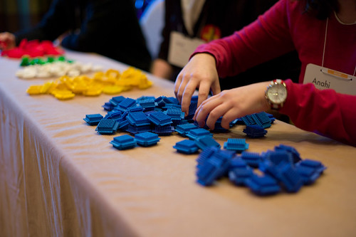
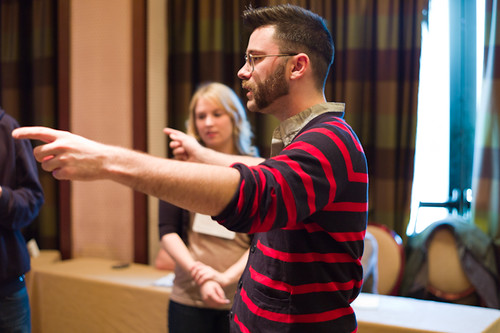
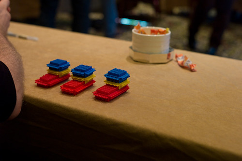
After introductions by Mike and a bit of a discussion about what advanced design might be ((I mentioned I was also quite interested in *advancing design in the sense of moving it closer to the locus of decision making, alongside of the business-y types)) Mike presented the workshop exercise. We were to build boats. Little boats. Made of plastic bits sort of like Legos but, as we would find out later — subject to subtle variations in how they can be assembled, even much more than the typical Lego brick. ((* Update: via @rhysys — they are called Stickle Bricks! *)) The group was broken up into several roles — customers, customer liaison, builders, suppliers, plant managers, quality assurance. Each group played the roles you would expect in the construction of to-spec boats. Customers would place orders which would be relayed to the operation. I was a builder so I basically tried to assemble boats as quickly as possible, making horrible but not-obvious mistakes which resulted in boats being delivered…and then rejected. Each round was broken up into 10 order cycles that ran for a short, fixed amount of time. In that period we’d try to assemble the requested amount of boats, which the customers could reject for flaws. Flaws were sent back to be disassembled so we could try again, but things moved quickly. At the end of the round ((which consisted of a number of order cycles)) a tally was made to determine the per-unit cost based on factors such as — number of workers, number of delivered boats, quantity of raw materials left over, etc. All the things you might understand to influence the cost of a boat. At the end of each round, there was a short amount of time to reconfigure the whole “plant” — increase builders, rearrange how materials moved from source to assembly, break apart assembly into multiple steps, fire people, etc. This was all in order to decreate the cost per boat. We actually did really horribly the first time — target cost: $15. our cost, like..$2500. miserable. We got better over two more rounds, but still only got down to about $30+ or something.

Some insights from this exercise, which is derived from a familiar MBA exercise. First, designers don’t seem to want to fire anyone. Second, MBA people are more than willing to fire workers (based on Mike’s description of when he participated in the exercise at a sort of MBA program). Third, companies that make things — even a few of them and not in the millions of them — are optimized for themselves to be efficient. Change breaks that kind of optimization, resulting in less efficiency, higher costs, etc.

((That third point is one reason I guess we here at the Laboratory prefer small refinements that make big impacts. Making something just a bit better, or refining it with such tenacity — simple, small, thoughtful refinements — that the consequences can become significant without significantly challenging the need for efficiency.))

In the lead-up to this exercise, Mike introduced a few simple yet important tenets surrounding advanced design. There are two basic ways for a company to compete: (1) It can be cheap; (2) It can be different (be something else.) And he introduced one of these curious “Laws” that we here at the Laboratory had never heard of: Parkinson’s Law which basically states that work expands so as to fill the time available for its completion. Or, stated another way: The demand upon a resource tends to expand to match the supply of the resource. ((And yet another way that the Laboratory’s Bureau on Time Management uses as an operating principle: If you wait until the last minute, it only takes a minute to do.))

So then we can think of advanced design as those resources set aside for other activities, which sort of means that it can get a bit out of control if we apply Parkinson’s Law. So — how does one do advanced design? What are some models and approaches?

For the workshop, Mike looked at three case studies of advanced design studios: Nokia, Microsoft and Nike. Each has somewhat different approaches to advanced design, which he laid out. ((I may get the details of the case studies slightly off, but the substance is what I recall and what I think is the significant points.))

3 Approaches to Advanced Design

1. The Outlier
This is the advanced design studio that thinks about “what if?” scenarios, and explores to the side, looking at perhaps total departures from the conventional wisdom. Real out-there stuff that challenges and provokes. He offered three examples of The Outlier: BMW’s Gina Concept car from 2008; Nokia’s Homegrown project; Xbox Kinect

2. The Pantry
A bit like squirreling things away in the pantry for when the weather goes all awry and you’re trapped and can’t get out and don’t want to starve. You do things even if they’re not assigned to go to market. The case study Mike offered was Nike who’s design studio maintains an active bit of work exploring, researching new materials and the like. In the case study, Nike was outdone by Under Armour sports kit who created an intense following amongst various gladiator sports like Football and the like. They broadsided Nike whose marketing people went to design and said, like..help. Design did not start a specific program from scratch to address this, but went to their “pantry” and put together a package from the existing “advanced design” material to create a bit of sports kit that made Football’rs look super scary..like robotic gladiators. Plus, presumably — it worked as equipment. One intriguing thing Mike mentioned was that some folks had been doing some studies on motion and the like with sports folks and found out that feet and hands move the most, so they highlighted feets and hands by bringing out these intense dayglo colorations to the materials used in gloves and sneakers so the players *look fast. I found this fascinating.

3. The Northstar
This is where design works towards an advanced goal, but it’s more an aspirational target that is steered towards, perhaps indirectly. This might best be described as evolving a vision, refining from what’s out there. This I think captures to a certain extent what *vision work does, although sometimes vision work is basically just a nice thing to look at without the tectonics that could activate design work. The challenge is to avoid just creating something that’s cool to look at but doesn’t give enough to make it start becoming material.
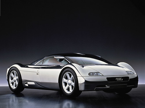
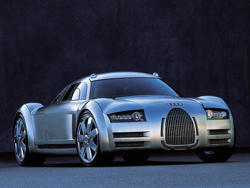
audi-avus-quattro

1991 Audi Avus Quattro Concept Car

The example Mike offered in this case was Audi Avus concept car that (I know nothing about cars except how to drive them, sorta) that provided some radical new lines in 1991. It became a sort of objective point in a way — guiding the evolution of their surfacing and configurations so that over time Audi cars begin to take on the features of this Avus concept over time. The Avus provides the “Northstar” for the design team. Now — whether its stated expressly as in a lead designer saying..in 20 years lets get *here, or if it is less formal perhaps does not matter so much. Its more that this vision becomes quite tangible over time, an evolution of the car DNA.
Audi-Rosemeyer

Audi Rosemeyer
audi-r8

Audi R8

What I find most intriguing about this sort of vision-y Northstar case of Audi in particular is that they are able to stay on course. Twenty years is a long time — even, it seems to me, in the world of automobile design where things change exceptionally slowly because of the momentum and levels of commitment necessary for manufacturing and tooling and all the rest. Yet somehow they are able to keep their eyes on this objective that must’ve seemed quite radical at the time, especially if you consider what Audi looked like in 1991.

Audi-200-turbo-1

The 1991 Audi 200 Turbo

Some random insights that came up during the workshop.
* The Apple model isn’t reproducible perhaps because it is quite driven by the owners themselves and their personalities and abilities to drive change.
* Advanced design is about change. The instinct of a company is optimization; reduce risk and costs; it will reject change.
* Our role as advanced design is to help companies *prepare for change rather than execute it. In other words, be there when things go badly and people around you start losing their head and blame you while you keep yours, and you continue to trust yourself when all those around you doubt you — in other words, when panic and confusion sets in, advanced design can lead at those moments of epic, systemic change.

What is advanced design?
Let’s take this from the perspective of “advancing” design. The “advanced” moniker seems quite old fashioned. Advancing design, or advanced designing seem like useful semantic word play. The semantics help me think about design as something that can move forward (advancing design), rather than designing something in advance of something else (as advanced design would imply), or designing in a way that is different from what is designed today (or what is thought of as design today). In that way, advancing and poking and provoking means more than differentiation. It means more than using advanced techniques.

Some notes/thoughts about what advanced/advancing design or advanced designing might be:

* working through ideas differently
* designing the way of designing always, for each and ever
* iteration, refinement — put it up, strip it back, put it back up again
* communicating tangibly, materially
* storytelling — film, prose, language
* design fiction – actively suspending disbelief. making props and probes and prototypes.
* proto-typing – making stuff, in the shop, at the bench, learning by making and doing
* photography – way better than clip-art and it forces a different kind of conversation and moves things away from *only working at the screen in Illustrator

Why do I blog this? Because I went to the workshop; it made me think of a few useful things; I’ve been sitting on this in draft state for almost two months.

Continue reading IxD 2011 Designing Advanced Design Workshop

Science Fiction Prototyping for Technology Innovation

Saturday April 23 1994, 000000

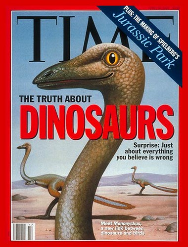
Science-fact and science-fiction all in a productive, creative, inspirational muddle. Jurassic Park meets its science meets its facts and its fictions in a favorite Time magazine cover, April 23, 1994.

This is really exciting to me. It feels like there is serious ((i.e. people with degrees who gather at conferences and congresses and use words like R&D)) comprehension of the way that science-fiction is a kind of science-fact, and science-fact is a kind of science-fiction. In fact, the two are one and the same and the categorization is mostly useful to bookstores who need to divvy up what goes where. There’s an incredibly rich view of the creation and materialization of new ideas if you disallow the hard distinctions. Honestly. It’s not insurgent view; it’s an innovative view. Seeing these kinds of cross-overs and crosstalk and the blurring-of-lines ((as should be the case, I believe — for the good of the whole smash)) makes me want to go to something like this, even after swearing off of this sort of specialist conference.

It’s at least worth looking at this Creative Science Foundation ((big sounding puff there)) the “brain-child” of an intriguing Futurist ((how artisinal)) called Brian David Johnson which has a few links to some intriguing activities and work, including this Morrow Project that Intel ran where they got some writers to write about life in the future.

============

1st Call For Papers

2nd International Workshop on Creative Science (CS’11)
– Science Fiction Prototyping for Technology Innovation –

Sponsored by Intel & Published by IOS Press

Held in conjunction with The 7th International Conference on Intelligent Environments (IE’11)

Nottingham, UK. 25th-26th of July 2011
http://www.creative-science.org/

Background and Goals: This international workshop will explore the use of science fiction as a means to motivate and direct research into new technologies and consumer products. It does this by creating science fiction stories grounded in current science and engineering research that are written for the explicit purpose of acting as prototypes for people to explore a wide variety of futures. These ‘prototypes’ can be created by scientists and engineers to stretch their work or by, for example, writers, school children and members of the public to influence the work of researchers. The outcomes of these interactions are then fed back, to shape the science research and outputs. In this way science fiction prototypes act as a way of involving the widest section of the population in determining the science research agenda, thereby making science investment, and science output more useful to everyone ranging from companies, through scientists and engineers to the public, consumers and the government that indirectly fund R&D. In this way fictional prototypes provide a powerful interdisciplinary tool to enhance the traditional practices of research, design and market research. The goals of the workshop are to act as a catalyst of this new approach by acting as a forum where researchers from differing disciplines (notably science fact and science fiction) can come together to explore how to develop this area.

Participation: You are cordially invited to participate to the workshop either as a presenter or as someone simply wishing to learn more about this topic and, perhaps, join the discussion as a member of the audience. Participation is possible either by attending the workshop in person, or by participating via the Internet. For presenters (science researchers or writers) we are looking for short imaginative fictional stories (prototypes) of no more than 12 pages (and presentations of 20 minutes) based on recent scientific publications, which would act as motivation (or discussion) or how science research might be directed. Your fictional stories (prototypes) should include a short discussion (no more than 2 pages) of your published work (and how they relate to your story, including references to your work). The fictional stories (prototypes) should conclude with a short summary (half to one page, say) that provides an overall comment on your effort to use your fictional prototype as a means to motivate your future work. References should be included at the end of the paper. All fictional stories (prototypes) accepted will be published by IOS Press.

Thanks to Intel’s generous sponsorship we will pay the workshop registration costs for the 10 best Science Fiction Prototype (SFP) stories, as judged by the reviewing committee. In addition, a Samsung P1000 Galaxy Tab (eg ARM Cortex A8 1GHz, 16GB, 7 inch TFT LCD, 3G, BT 3.0, Android 2.2) will be awarded to the writer of the best Science Fiction Prototype.

Workshop Structure: The workshop will comprise a single day event and will include:
Presentations (papers) from science and engineering researchers on their own scientific papers/projects depicting how they foresee their research might impact future worlds.
Presentations from science fiction writers depicting aspects of their stories that they feel would be feasible and useful for scientists to try to implement.

The Venue: CS’11 will run in conjunction with IE’11 at Nottingham in the heart of England and a popular tourist destination attracting an estimated 1.3 million visitors annually. Many visitors are attracted by Nottingham’s nightlife, its history, the legend of Robin Hood, Sherwood Forest and popular history-based tourist attractions including Nottingham Castle. More details are given on the IE11 web pages .

Important dates:
Paper submission: 28th March 2011 (via the CS’11 paper story submission system)
Notification of acceptance: 25th April 2011
Paper final submission (with revisions): 9th May 2011

Workshop Fees:
Before 9th May 2011
– Regular Participant or Presenter (all non-students) = £144
– Student Participant or Presenter = £120.00
After 9th May 2011
– All categories = £180

Workshop Organisers:
Brian David Johnson (Intel Labs, USA)
Victor Callaghan (University of Essex, UK)
Simon Egerton (Monash University, Malaysia)

Continue reading Science Fiction Prototyping for Technology Innovation

Swiss Design Network Conference – Design Fiction Keynote

Figured

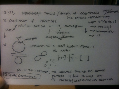
This is a notecard when I sort of figured out what I wanted to talk about at the Swiss Design Network conference held a few or four weeks ago.

I ended up with something a bit different, but I think carried on with the sentiments of these scrawled notes. The theme of design fiction continues, and what I wrote as a basis for the keynote talk and following discussions is derived a bit from the thinking that was scratched into this card. But, what I think I lost hold of was perhaps a stronger emphasis on the relationship between design, fiction and the making of knowledge — the epistemological aspects of making new things.

Tuesday November 23 08:19

Tuesday November 23 08:19

No clear way forward on that, but there are some elements yet to be explored.

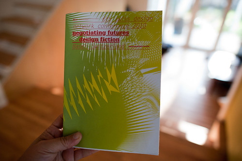
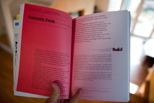
In any case — I wanted to provide a link to the paper I wrote that accompanied the nicely designed conference proceedings. At the bottom of the post is a link to the PDF of my own paper submission.

I have some additional notes about the conference as well.

James Auger‘s talk was a clear description of his design/art/technology explorations that help describe why and how things/technologies become products. James is doing this from a wonderful perspective — the domestication of things, and the lineages of domestication. He provided this example — from the wolf to strange dogs dressed up like people, or with designer clothing on them. This to me is a simple, concise way of transforming the extraordinary into the ordinary, and everyday — domestication is one example of this. If you can imagine the most ferocious canine which was the great-great-great…grandfather of the variety of wierdly domesticated and kindred dogs (like the dogs people in Los Angeles carry around in their pocketbooks or in baskets) you can begin to imagine anything out of the ordinary becoming quite ordinary and even mundane. Nearly everyone can have a dog because that animal has been made normal and quotidian.

That path from extraordinary to everyday is an important process in the route to productization — making something that is almost illegible as a thing, and making it routine. James also showed the example of a computer from 1927 — and here you can imagine a complex, analog device overwhelming in its obscurity from our vantage point today — to the thing that is quite a number of homes around the world, as ordinary as you can imagine for many of us.

I found the simplicity of this point very compelling — and it is one of those conventions that I think can help in the communication and thinking-through of new ideas. Making the extraordinary ordinary. A convention of designing with fiction.

James also made the point that design fiction might be better stated as “design faction” — paraphrasing his point he said “calling it fiction you lose some of the reality of its ‘existence’ as a social object of some sort.”

Friday October 29 01:17

Saturday October 30 00:23

There were a number of other intriguing presentations — not all of which I could make as I had to decide between these and workshops which happened simultaneously. I would like to point out an intriguing talk whose paper appears in the proceedings. It is called “Spaceflight Settings as Laboratories for Critical Design” by Regina Peldszus and Hilary Dalke. (Regina and Hilary and Chris Welch also have a paper you’ll enjoy called Science Fiction Film as Design Scenario Exercise for Psychological Habitability: Production Designs 1955-2009 in which they look at the production design in Kubrick’s 2001: A Space Odyssey as a way to run through scenarios related to living in space for a long, long time.)

Overall, I enjoyed the conference and the variety of considerations about design fiction, when and where it operates were useful for my ears. It’s encouraging that design fiction could be taken up as a theme for an entire two days of an event with workshops and everything. That’s actually very encouraging. It’ll be interesting to see where and how far the idea evolves into a practice.

Design Fiction – Props And Prototypes, Swiss Design Network Conference ((PDF))
Continue reading Swiss Design Network Conference – Design Fiction Keynote

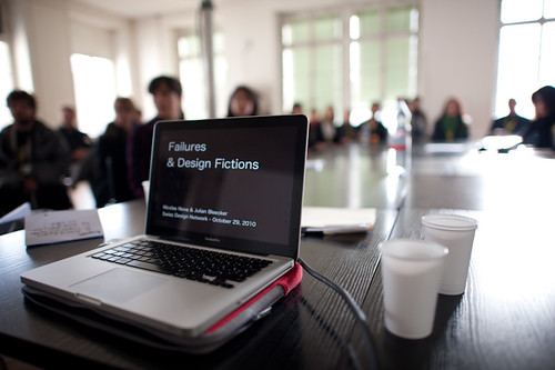
Design Fiction Workshop: Failures

Saturday October 30 05:04

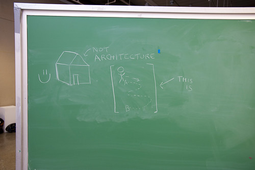
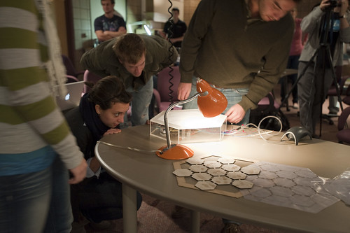
I’ve been away for awhile so obviously I’m just now catching up with some notes for the events and activities of the last few weeks. One thing I want to make a note about is the fun workshop that Nicolas and I facilitated at the Swiss Design Network conference in Basel Switzerland late last month. The workshop was largely Nicolas’ organization and we took advantage of the conference theme of “Design Fiction” to consider the topic of failure in design — failure as a guide and approach and provocation together with the considerations that design fiction can offer.
Saturday October 30 02:02

Nicolas has posted the notes from the workshop

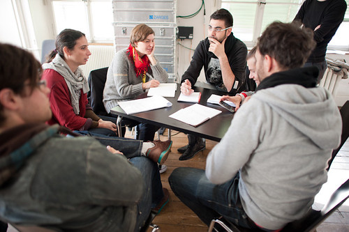
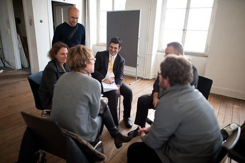
It was a relatively short workshop — a couple of hours in total. Initially I was nervous that there would be not enough guidance to allow the participants to grab onto the material enthusiastically. That proved to be wrong. After an initial presentation that went over the topic of design fiction and failures that Nicolas had prepared, we broke the approximately 30 or so participants into groups of four or five individuals. There were three assignments that we had prepared that each group was meant to conduct. After completing each assignment — which lasted from 20-25 minutes each — the group turned inward and shared some summary insights, results and conclusions. They didn’t know all the assignments ahead of time.

Saturday October 30 02:24

The first assignment was to consider where and when failure happens in design. Without a specific definition of what constitutes failure, the assignment was meant to warm things up by creating a debate and set of examples as to what failure was and when and how it occurs. From Nicolas’ notes (my notebook has escaped me temporarily):

  • #Wrong hair color, not the one that was expected
  • #Help-desk calls in which you end up being re-reroute from one person to another (and getting back to the first person you called)
  • #Nice but noisy conference bags
  • #Toilet configuration (doors, sensors, buttons, soap dispensers, hand-dryers…) in which you have to constantly re-learn everything.
  • #Super loud and difficult to configure fire alarms that people disable
  • #Electronic keys
  • #Garlic press which are impossible to clean
  • #On-line platforms to book flights for which you bought two tickets under the same name while it’s “not possible” from the company’s perspective (but it was technically feasible).
  • #Cheap lighter that burn your nose
  • #GPS systems in the woods
  • #Error messages that say “Please refer to the manual” but there is not manual
  • #Hotel WLAN not distributed anymore because hotel had to pay too many fines for illegal downloads
  • #Refrigerators that beep anxiously to indicate the door is open, but do so even when you’re busily loading groceries.

This assignment was useful to begin the thinking about failure. The goal was less about creating a definitive or definitional list and more about thinking beyond and using examples as motivators and things to think with.

Saturday October 30 02:39

The next assignment was essentially the first but to create examples that one might anticipate as a typical failure in the future — the design fiction failures. Things that could occur given that everything fails to meet our highest expectation or (as I’m particularly interested in) the highest of the hype that surrounds new designed stuff. Epic failures, or just routine annoyances were all open for consideration. How might the cloud computing promise fail in both the major disaster ways — as well as the small, wtf!? sort of ways.

Again, from Nicolas’ notes:

  • #Identity and facial surgery change, potentially leading to discrepancies in face/fingerprint-recognition,
  • #Wireless data leaking everywhere except “cold spots” for certain kind of people (very rich, very poor),
  • #Problems with space travelling
  • #Need to “subscribe” to a service as a new person because of some database problem
  • #People who live prior to the Cloud Computing era who have no electronic footprint (VISA, digital identity) and have troubles moving from one country to another,
  • #3D printers accidents: way too many objects in people’s home, the size of the printed objects has be badly tuned and it’s way too big, monster printed after a kid connected a 3D printer to his dreams, …
  • #Textiles which suppress bad smells also lead to removal of pheromones and it affects sexual desire (no more laundry but no baby either)…
  • #Shared electrical infrastructure in which people can download/upload energy but no one ever agreed on the terms and conditions… which lead to a collapse of this infrastructure
  • #Clothes and wearable computing can be hacked so you must now fly naked (and your luggage take a different flight)

I was particularly taken by the 3D printer example. There’s of course lots of excitement about the possibilities of 3D printers in the home so that everyone makes their own stuff that they need. But, making stuff is hard and inevitably open to all kinds of crazy failures such as described here. Also — what do people do with the materials when they mess something up? How is the plastic (or whatever it ends up becoming — maybe noxious nasty stuff) get recycled? Will there have to evolve an entire system of rematerializing the goop? What about the equivalent of the print failures we often experience where one document ends up printing one letter per page, after page after page and we don’t notice until fifty sheets of paper have been used? Or when we scale something wrongly and the machine blindly goes ahead and prints something at 3 meters when we meant 3 millimeters? All these sorts of things will happen — can we use these insights to help make decisions about what and how to design? Can we start to communicate these failures as a way to design not with the expectation that the world is perfect — but that the results of designs have chinks and kinks in them?

Saturday October 30 02:39

The final activity was to think about possible taxonomies for designed failures — what are the types and kinds of failures as we’ve discussed them in the previous two assignments?

  1. #Short sightedness/not seeing the big pictures
  2. #Failures and problems that we only realize ex-post/unexpected side-effects
  3. #Excluding design
  4. #Bad optimization
  5. #Unnoticed failures
  6. #Miniaturization that doesn’t serve its purpose
  7. #Cultural failures: what can be a success in one country/culture can be a failure in another
  8. #Delayed failures (feedback is to slow)
  9. #When machines do not understand user’s intentions/technology versus human perception/bad assumptions about people (”Life has more loops than the system is able to understand”)
  10. #Individual/Group failure (system that does not respond to individuals, only to the group)
  11. #System-based failures versus failures caused by humans/context
  12. #Natural failures: leaves falling from trees considered as a problem… although it’s definitely the standard course of action for trees)
  13. #Good failures: Failure need interpretation, perhaps there’s no failure… alternative uses, misuses
  14. #Inspiring failures
  15. #Harmless failures

Why do I blog this? Well — just mostly to get some notes from the workshop up to share. I’m learning quite a bit from Nicolas on the failures theme, and perhaps its a way to answer a question that Chairman Bruce has lofted — now that we “get” the idea of design fiction and it seems to be inspirational for folks and useful in that regard — witness the theme of the Swiss Design Network conference this year. But..okay. We get it. Now what? How does the idea of design fiction either operationalize or become part of specific sorts of design practices in some informal or formal ways? It’s happening of course — all over the place and not because of this idea of design fiction itself, either how I’ve discussed it over the last 18 months or so, or how it’s been described and enacted by many people and agents. It’s not just about science fiction of course — and this was the topic of a paper at the conference that I may have the energy to describe in an upcoming post. But it is useful in very direct ways with the activities and goals of design generally speaking, that much is clear.

The Spaces of Innovation

Monday January 11 09:50

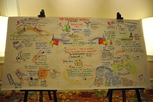
At the Microsoft Research Social Computing Symposium 2010, it was a pleasure to hear Steven Johnson drop a few tidbits on his soon-to-be-released book Where Good Ideas Come From: The Natural History of Innovation he described an interesting perspective on the history of ideas — or in a more marketable, business-type book-y way — the history of innovation, as coming from places and related to time and the pace of things. What I got from his short engaging talk then was a bit of a thoughtful debunking of the myth of the solo innovator, sitting alone and channeling brilliance from wherever. I’m looking forward to reading the book. There was a nice little animation that serves as a kind of networked-media-age jacket blurb in the video below.

Get the flash player here: http://www.adobe.com/flashplayer

var so = new SWFObject(“http://www.db798.com/pictobrowser.swf”, “PictoBrowser”, “500”, “500”, “8”, “#EEEEEE”); so.addVariable(“source”, “sets”); so.addVariable(“names”, “SCS2010”); so.addVariable(“userName”, “julianbleecker”); so.addVariable(“userId”, “66854529@N00”); so.addVariable(“ids”, “72157623066738659”); so.addVariable(“titles”, “on”); so.addVariable(“displayNotes”, “on”); so.addVariable(“thumbAutoHide”, “off”); so.addVariable(“imageSize”, “medium”); so.addVariable(“vAlign”, “mid”); so.addVariable(“vertOffset”, “0”); so.addVariable(“colorHexVar”, “EEEEEE”); so.addVariable(“initialScale”, “off”); so.addVariable(“bgAlpha”, “90”); so.write(“PictoBrowser100929065753”);

Some more images from the MSR Social Computing Symposium last winter.

19112008_132933

Why do I blog this? Mostly because I was drawn into the video, which is a cool example of these sorts of graphic note takings. There’s a bit of theater attached to it of course.

(via @jmcaddell)

Representations of the Future with Graphs

Graphs of the Future

I collected some graphs that attempt to represent how the future comes to be while I was preparing for a talk at the University of Michigan’s “Future of Technology” conference, from which I’ve just returned. The graphs are simple ways to represent the path from now into the future and what makes “then” the future and different from “now.” I drew what I had in mind as you see above while I was teasing out something interesting to say for the talk. All along the way I was hoping to be able to show some film clips that I’ve been gathering — film clips of speculative futures and science-based fictions. The talk — it was only 15 minutes exactly — was called 9 Ways of Seeing the Future.

Here they are.

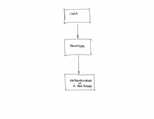
Idea, Prototype, Product

One. The future starts with an idea, and you try it out and test it, and then when it works that means you’ve accomplished something new and then you’re in the future. James Dyson is the exemplar of this kind of future-making because he prototypes his stuff insanely. ((How else do you make vacuum cleaners that suck so much?))

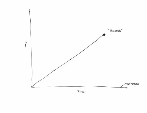
Up and to the Right

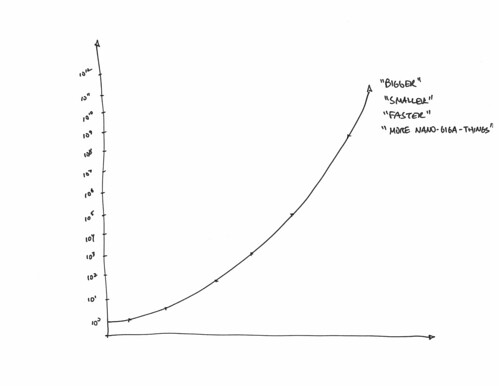
Two. The future starts at the origin and then goes up, and to the right, which is better/brighter/smaller/bigger/longer/faster than the origin, so it’s in the future.

Exponentially Better

Three.I got the scale on the left wrong, but this is the Moore’s Law future which goes up and to the right like Two, but it does so exponentially faster, so you get an intensely better future when compared to the normal up-and-to-the-right future.

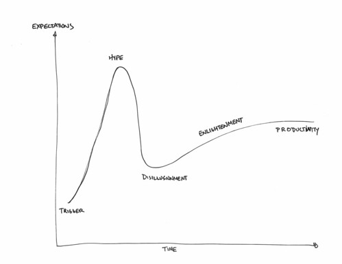
Gartner Hype Curve

Four. The Gartner Hype Curve, where whatever the future is, it is sure to be oversold and overpromised, leading to the *trough of disillusionment and despair, after which the future sort of becomes more reasonable than the hype and slowly productizes itself. ((I’m still waiting for the Jet Pack future.))

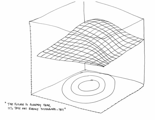
Future Is Distributed

Five. The future that distributes over space and time — William Gibson’s *sandwich spread truism that says the future is here already, but it’s just not evenly distributed. Presumably it starts in places like Silicon Valley, although he might argue that it also starts in the back alley bar in Mogadishu or some other shit hole, seeing as how things are going these days.

Auger Possible Product Futures

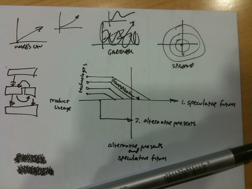
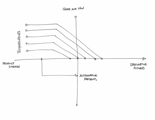
Six. James Auger‘s drawing of the product future where there are many possible *technologies that will anchor themselves into a future present, as well as alternative futures that may lie off-axis somewhere. I’m still trying to figure this one out. Maybe I’ll get the chance at the Design Fiction conference.

graphs-of-the-future-923185617-0008

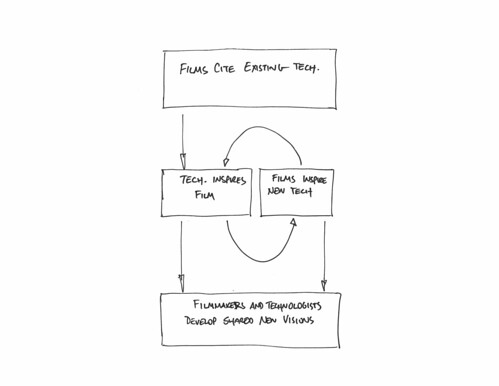
Seven. From A Survey of Human-Computer Interaction Design in Science Fiction Movies which describes the future as a collaboration/circulation of ideas between engineers/scientists and film makers. It’s a curious, provocative paper, thin on synthesis (it’s a survey, after all). I like the diagram most of all. Even in its simplicity it provides a nice appetizer for capturing some of the rich stew of David A. Kirby’s diegetic prototypes.

Eight. Colin Milburn’s Modifiable Futures: Science Fiction at the Bench is perhaps graphed dynamically in which he describes the future as particular kinds of “mods” or modifications to things that exist in the here and now. You know you’re in the future when the normal, plain thing has become kitted-out and enhanced, perhaps on the street. (link to video)

And so then I noticed that these are representations of the future that are rather flat instrumental and parametricized visions of the future and the route to it. And I’m wondering — rather than parametric and numerical and quantified representations of the futures — don’t use graphs — what about stories that avoid the problematic time-goes-from-left-to-right, or that there is only one coordinate for a specific future. An easier way of acknowledging multiple simultaneous futures, and multiple possible futures and that the future is a lived, embodied situation rather than the result of miniaturization or optimization. The future is for us and we live in experiences and stories — not in aspirations for technologies themselves.

Seeing as representations prescribe what we consider possible and even reasonable, having a richer, thicker, more lived representation to help imagine other sorts of futures — and not just bigger/brighter/smaller/lighter ones with new products that we buy to replace the old, perfectly good ones we bought six months ago — we might look toward stories about the future that you can’t graph on a piece of paper.

This is where the Ninth representation comes in — science fiction film. This of course does not exclude other strong representations of the future like science fiction writing, science and technology journalism, and all other kinds of literature I’m sure you’re thinking about. Just happens that right now I’m excited by science fiction film (err..have been for quite some time) and I’m focusing on that.

So, to close out my 15 minute talk and my 1000 word blog post, I shared a short excerpt from Volume 7 of a collection of annotated DVDs the Laboratory’s Media Theory department is creating based on representations of the near future in science fiction film. In this one I look at some of the signs and signals about The Future that are represented in some favorite films.

Why do I blog this? The main point of the talk was, for me, to think through another reason why I see design fiction as a useful idiom for doing design. What I concluded is that choosing how we imagine and represent the future is crucial — and not peripheral — to our ability to solve problems. Graphs are good, but I wanted to establish that there are other ways of productively and fruitfully representing what can be in order to materialize ones ideas. So — science fiction as much more than a distraction from the hassles of figuring out where your idea is on the productization scale, or determining when transistor counts will go up to the next order of magnitude and then never really wondering why that might be useful in a save-the-planet sort of way.

We seem to be pattern recognizers and so the templates and processes and frameworks in which our imaginations live determine to a large extent the possible things we can think of and the measures by which we judge them. ((Which, parenthetically, may be that the best thing one can learn to do is learn see the world through different lenses and from different perspectives — but maybe even more importantly is to know how and when to establish those different perspectives and then help others see — and then think — differently.))

Thanks to everyone at the Taubman College of Architecture and University of Michigan for the invitation and for enduring my hand drawn slides in a sea of luscious, expertly and painstakingly rendered 3D models of parametric architectures.
Continue reading Representations of the Future with Graphs

Future of Technology Conference University of Michigan September 24-25

Friday October 16, 15.04.18

I’ll be speaking at the Future of Technology conference at the Taubman College of Architecture, Planning and Urban Design on September 25th — the conference is on the 24th and the 25th. This courtesy of my chum John Marshall, who I visited last year to be a guest in his fantastic Heliotropic Smart Surfaces design studio which, if I remember correctly — John and Karl had no idea (in a good way!) what would happen other than that they would look into “smart” and the sun and surfaces. Brilliant guy, he is. That’s the way to run a creative studio. Optimism and enthusiasm and a tinge of creative recklessness.

Friday October 16, 11.34.47

Anyway. That’s where I’ll be. In Ann-Arbor.
Continue reading Future of Technology Conference University of Michigan September 24-25