Tom Sachs // Mars Program

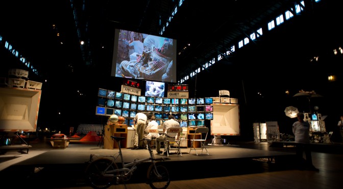
So I have just returned from a multipurpose trip, one of whose purposes was to see the Tom Sachs exhibition at the Park Avenue Armory in New York City. This is the Tom Sachs show done in collaboration with NASA (and a crop of creative partners, like Creative Time, but that’s less typical than collaborating with NASA.) Much like his studio’s “Space Program” exhibition from a few years ago at the Gagosian in Beverly Hills, this exhibition takes as its theme space travel only this time instead of a mission to the moon, it’s a mission to Mars. The specifics of the work is mostly in the details of it’s preparation and a bit in its demonstration. The way Sachs’ studio runs — as best as I can discern from the artist talk — is quite thorough. The studio treats the mission quite playfully-seriously. So, much like astronauts may work quite hard on physical fitness and the like, the studio does as well — doing morning runs, coordinated limbering exercises, weights and the like. In the videos showing the preparation work, you see the studio in appropriate era fitness clothing doing exercises idiomatic of the sort you might see in the context of astronaut preparation. They’re doing it all with a playful spirit, but evidently it’s taken quite seriously.

The script to the exhibition was fairly close to the “Space Program” — at least insofar as the space travel bits. The exploration and excavation of the martian surface had some variations of course, but otherwise it was quite similar. It’s the same Saturn V rocket and the astronauts (again, both women) travel in the LEM — I suspect it’s the exact same one as “Space Program”, but it is a lunar excursion module, rather than some speculative martian excursion module.

The collaboration with NASA brings a very intriguing “design fiction” angle to the project insofar as the studio, according to the artist talk, worked quite closely with NASA scientists. To what ends, I’m not entirely sure of course, but the collaboration is there. In a way this is somewhat like Kubrick working with the rocket scientists of his era in order to understand the needs and constraints of rocket ships basically before there were rocket ships.

Sachs enjoys the patina of bricolage so his interpretations have a certain hand-made-ness and found-materials-that-are-perfectly-fine-ness to the work. This sculptural quality makes them deliberately playful. I find this more than simply playful though, but I can’t quite get to the bottom of it. It’s ingenious in a certain way. Ingenious craftwork. To use a basketball as the main living module of the Odyssey from 2001 is fun at the same time that is subverts the tendency I might have to make the model indiscernable from the real thing, at least as far as the material goes. This is just my own perception and interpretation of this choice, but I feel like it’s something I’d like to learn from. ((Oftentimes we’ll make thins with the same level of resolution and fidelity one would expect from a “real” object. I can think of various reasons and rationales for subverting this “reality” as a way to enter into a different set of conversations — perhaps to reflect more of the craftwork, the individuality of an idea or object, or to bring in a conversation about artisinal qualities.))

One thing Sachs said during the artist talk that was nice to hear — not a surprise, just something that brought into focus perhaps one of the reasons that I enjoy his work, aside from the fact that its about golden-era space travel — was this: “I see no problem synthesizing science with fiction”. So this statement explicates his own approach to the work and captures that relationship with ‘real scientist’ and the interpretative qualities of his demonstrations and sculptural constructions together with my own interest in designing with fiction.
Weekending 11062011

Last week was fun and busy. The big thing that stands out was a sort of prodigal son’s return to the academic swampland — I went to the 4S — the Society for the Social Studies of Science conference in Cleveland Ohio. There I participated in a lovely little panel that had the overarching theme of the relationship of science, entertainment, fiction and fact. I shared my insights on the whole “design fiction” enterprise. I was humbled and happy to be there with David Kirby who continues to be a major catalyst for my thinking and lots of other people.

We called the panel The Fiction in the Science (full-colon, of course and then you say what you actually mean by that) : The Intersection of Fiction and STS. (STS is “science, technology and society”).

The basic idea is to discuss and describe and then (what I see as my role) operationalize insights into the prolific relationships amongst ideas and stories and the primary movers of societies today — science & technology. If the STS and 4S sorta people understand or are able to bring an analytic eye to the ways in which, for example, forensic science in television has shaped and informs popular understanding of law, investigation and jurisprudence — then what? So what? How are you able to turn that around and “operate on” those insights? Turn fiction into fact? Turn insight and observation into an actionable, doable creation — how do you do design with fiction, but really?

That operationalization comes from the observations of Kirby and others who have seen the ways that technical consultants of various sorts are able to have their particular perspectives turned into stories that large audiences engage and then accept as the way things are. I’m interested in this reality effect and how it can become part of what design does, to make things hopefully conscientiously better than they are.

We had one of those great dinner discussions the night before that is basically the main reason to go to these things. There was discussion about creating a center to study and produce things; to formalize the relationship between science, technology and science-fiction so that there is no more embarassment when a scientist/technologist draws from science fiction. So that there could be something like the <a href="How to Live Safely in a Science Fictional UniverseInstitute for Conceptual Technology — for real.

Other than the 4S, which was the highlight — there was continuing work on the prototypes for Project Audio. Printed circuit boards came in and got stared at as I’m out of solder paste and should’ve realized that a week or so ago. Hopefully it’ll be in this week. As well, ordered some more little parts for construction of a set of concepts from the workshop in London with RIG two weeks ago. Unrelated, but related — there was the second annual Girls Combi Pool Classic which marks a year of work on the photography book project. And I’m still not entirely done, but I did start a Kickstarter to hopefully get a limited print run of the book done.

Continue reading Weekending 11062011

Thrilling Wonder Stories..London Edition

Thrilling Wonder Stories

WONDER STORIES 3
Live in London and New York Oct 28th

Created by
Liam Young [Tomorrows Thoughts Today]
And Geoff Manaugh [BLDGBLOG]

In Association with the Architectural Association, Studio-X NYC, Popular Science

We have always regaled ourselves with speculative stories of a day yet to come. In these polemic visions we furnish the fictional spaces of tomorrow with objects and ideas that at the same time chronicle the contradictions, inconsistencies, flaws and frailties of the everyday. Slipping suggestively between the real and the imagined these narratives offer a distanced view from which to survey the consequences of various social, environmental and technological scenarios.

Wonder Stories chronicles such tales in a sci fi storytelling jam with musical interludes, live demonstrations and illustrious speakers from the fields of science, art and technology presenting their visions of the near future. Join our ensemble of mad scientists, literary astronauts, design mystics, graphic cowboys, mavericks, visionaries and luminaries for an evening of wondrous possibilities and dark cautionary tales.

For the first time, Wonder Stories will be simultaneously hosted in London and New York and Popular Science will join the Architectural Association and Studio X NYC in coordinating the event this year. Join us for the third event in the series as we chart a course from science fiction to science fact with talks, a hands on taxidermy workshop, animatronic guests, swarm robotics demonstrations, datascapes walking tour and live movie soundscapes.

Free to all. OCT 28 1200 – 2200 at the Architectural Association London and OCT 28/29 at Studio-X NYC

The event will be streamed live streamed here and you can follow the twitter feed with #tws3

Hosted by
LIAM YOUNG (‘Tomorrows Thoughts Today’ and the AA’s ‘Unknown Fields Division’)
MATT JONES (‘BERG London’, Design technologists)

VINCENZO NATALI
Director of Splice, Cube, and forthcoming films based on J.G. Ballard’s High-Rise and Neuromancer by William Gibson

BRUCE STERLING
Scifi author and futurist

KEVIN SLAVIN
Game designer and spatial theorist

ANDY LOCKLEY
Academy Award-winning visual effects supervisor for Inception,compositing/2D supervisor for Batman Begins and Children of Men

PHILIP BEESLEY
Digital media artist and experimental architect

CHRISTIAN LORENZ SCHEURER
Concept artist and illustrator for video games and films such as The Matrix, Dark City, The Fifth Element, and Superman Returns

JULIAN BLEECKER
Designer, technologist, and researcher at the Near Future Laboratory

CHARLIE TUESDAY GATES
Taxidermy artist and sculptor, to lead a live taxidermy workshop

DR RODERICH GROSS AND THE ‘NATURAL ROBOTICS LAB’
Head of the Natural Robotics Lab at the University of Sheffield,to lead a live Swarm Robotics demonstration

GAVIN ROTHERY
Concept artist for Moon, directed by Duncan Jones

GUSTAV HOEGEN
Animatronics engineer for Hellboy, Clash of the Titans, and Ridley Scott’s forthcoming film Prometheus

SPOV
Motion graphics artists for Discovery Channel’s Future Weapons and Project Earth

ZELIG SOUND
Music, composition, and sound design for film and television

RADIOPHONIC
Throughout the day we will be accompanied by electronic tonalities from Radiophonic

NEW YORK EVENT

Hosted by
GEOFF MANAUGH (BLDGBLOG, STUDIO-X NYC)
NICOLA TWILLEY (EDIBLE GEOGRAPHY, STUDIO-X NYC)
POPULAR SCIENCE

BJARKE INGELS
Architect, WSJ Magazine 2011 architectural innovator of the year, and author of Yes Is More: An Archicomic on Architectural Evolution

NICHOLAS DE MONCHAUX
Architect and author of Spacesuit: Fashioning Apollo

HARI KUNZRU
Novelist and author of Gods Without Men and The Impressionist

JAMES FLEMING
Historian and author of Fixing The Sky: The Checkered History of Weather and Climate Control

ANDREW BLUM
Journalist and author of Tubes: A Journey to the Center of the Internet

DAVID BENJAMIN
Architect and co-director of The Living

MARC KAUFMAN
Science writer and author of First Contact: Scientific Breakthroughs in the Hunt for Life Beyond Earth

DEBBIE CHACHRA
Researcher and educator in biological materials and engineering design

JACE CLAYTON AND LINDSAY CUFF OF NETTLE
Nettle’s latest album, El Resplandor, is a speculative soundtrack for an unmade remake of The Shining, set in a luxury hotel in Dubai

CHRIS WOEBKEN
Interaction designer

SETH FLETCHER
Science writer and author of Bottled Lightning: Superbatteries, Electric Cars, and the New Lithium Economy

SIMONE FERRACINA
Architect and author of Organs Everywhere

DAVE GRACER
Insect agriculturalist at Small Stock Foods

HOD LIPSON
Researcher in evolutionary robotics and the future of 3D printing

ANDREW HESSEL
Science writer and open-source biologist, focusing on bacterial genomics

CARLOS OLGUIN
Designer at Autodesk Research working on the intersection of bio-nanotechnology and 3D visualization

[Image credit ‘Inception’ dir. Christopher Nolan]

Design and Storytelling at AIGA Pivot

Back in 2010 at the University of Michigan Taubman School’s conference on “The Future of Technology” is where I first started thinking about the future as represented in graphs. I brought this visual graphical prop back again at the AIGA conference this last weekend in Phoenix. I guess I figured that a graphic of the future would be a good way to start a talk of the design professional society that at least started with a strong emphasis on graphic arts. (But it’s broadened itself, as I understand, which is good.)

I started with these hand drawn illustrations as a way to show that the future is contestable and malleable and one can make it and need not subscribe to the least-common denominator ideologies about what the future looks like. More than “disruption” — which has weird connotations with business, but just creating a future we imagine, not driven by forces that have typical measures of “future” that includes better battery life and larger screens and more brain-y smart devices.

I participated in a discussion on Design and Storytelling. It was a rehash of some existing material on Design Fiction and the various idioms and conventions that Design can learn from science fiction in order to do the work of design — and not just communicate design ideas, but actually *do design.

Parenthetically, I’ve only recently become a part of the AIGA and I’m still in a phase of my professionalization in design. I think it’s quite important to understand that being anything in any community means being a part of the community which means circulating oneself — ideas, conversations, listening and learning. It is a way of advancing oneself *and advancing that professional community. This is why I go to these things and why I try my best to be an active part of the conversations and discussions — contributing something in the form of a talk or a workshop. It’s not because I like to travel around. That part is actually hard on the body and the home. But it’s part of what it means to be “advanced” at whatever one does. Advanced Designers who do not Advance Design are just shift workers. And then they’ll come a time when they are obsolete because they never paid attention to the larger advances in their community and one day they’ll have befuddled looks when the generation or two “behind” them comes up and eats their lunch. It should be a formal requirement to participate at these levels, proactively. There’s a three step plan. I describe it here: http://www.nearfuturelaboratory.com/2009/04/29/follow-curiosity-not-careers/

Saturday October 15 10:49

Okay. Rant on Advanced Designers who don’t Advance Design is officially over.

Going to these things is hard, fun work — but, then you also learn *new things and meet *new people! One high-note for me was this fellow who I’m sure you all already know about and I may be the last one — Jackob Trollbäck. Here is a designer who I could admire right away as he finds the curious, little weird things full of possibility for expression and experimentation. There were a number of things he showed that were just almost incongruous studies and experiments, much of which was wrapped up in sound and rhythm (also topics of great interest to the laboratory these days) as well as curious visual studies and experiments. These were informal experiments — playing with images and videos from an iPhone that turn a technical failing into an aesthetic marvel. These sorts of unexpected things are very interesting to us here.

Also! There was a little bit of a confirmation for my own personal “that’s weird” study — things that happen and one notices them repeatedly. There’s no big theory explanation here, but I notice curious alignments of numbers on clocks — digital clocks. I was capturing them quite regularly and uploading them to a Tumblr. And then I stopped because people would say — no..that’s not weird. It’s just the time. But it seems Jackob Trollbäck has done the same. So — it was a bit of an affirmation of my weird observations.

Related, here’s the talk from the University of Michigan where I first showed these hand-drawn sketches of the future. I think there’s a t-shirt in here somewheres..

Continue reading Design and Storytelling at AIGA Pivot

Speculative Design: Blowup – The Era of Objects

Just a quick note to say — I’ll be at this event at V2__ in Rotterdam (V2_, Eendrachtsstraat 10, Rotterdam) Thursday September 29..so if you’re around, you should come. If you’re not — you should dial-in: ((This event will be streamed live at http://live.v2.nl))

Beyond the flying car: join top designers Julian Bleecker (Nokia, Near Future Laboratory), Alexandra Deschamps-Sonsino (Really Interesting Group), and Anab Jain (Superflux) in an exploration of speculative design.

We are rapidly entering (and perhaps even have already entered) an era where we are able to print 3D objects at our desks, make and share laser-cut gifts for friends, and use off-the-shelf tools to plug these creations into the web and have them send status updates on our behalf. We have some commonly-held visions of the future, but what could our very wildest dreams (and nightmares) look like, beyond the cliché of the flying car? What answers can we find in speculative design? Our expert guests will explore these questions in collaboration with the audience in a hands-on, “open think-tank” format.

Addressing this contemporary issue will be Julian Bleecker: designer, researcher at the Design Strategic Projects studio at Nokia Design and co-founder of Near Future Laboratory; Alexandra Deschamps-Sonsino: product designer, entrepreneur, and partner at Really Interesting Group (London); and Anab Jain: interaction designer, founder of Superflux, and recent TED Fellow.

Following a brief talk show with Julian, Alexandra, and Anab, the audience will have the unique opportunity to collaborate with our invited experts in an “open think-tank”: a guided speculative design session wherein we’ll address the product design challenges of the near and not-so-near future.

Continue reading Speculative Design: Blowup – The Era of Objects

Pneu. Ma. Tique.

Thus uttered Antoine Doinel in Truffaut’s film “Stolen Kisses” as a farewell letter to Madame Tabard is shussh-ered off through the Parisian pneumatic tube postal system..

Just enjoyed a coffee and reading Molly Steenson‘s article called Interfacing with the Subterranean on pneumatic tubes infrastructures in Issue 41 of the lovely, always diversely curious Cabinet Magazine. A nice little read on a system we’d now look on as antique, baroque and not just a little bit steampunk-y. That’s her up top sharing with me some of the very intriguing primary research she’s unearthed as she drops-gear and toe-and-heels the turn into the final lap of her dissertation Grand Prix race.

Aside from being still perplexed at how this proto-type internetwork of connected *tubes actually was able to route things hither-and-yon over cities and all such — I find it fascinating that versions of the hardware stack continue to exist in various ways. There are intranets within buildings still. The intriguing aspect of this is the material form that is rhymed (not perhaps on purpose or by design) by the networks electronic of today. Those guys standing around in the rooms receiving and continuing the little chariots of messages are little routers and TCP/IP compliant protocol handlers, one could think.

Why do I blog this? To capture a small historical scrapnote on the always constantly prototyping mechanics of communication that humans perform. This was likely perceived as wondrous, high-technology in its day. I’m surrounded this week by the hubris of high-technology prototyping, creation and thinking. Not all of it wondrous. Some of it down-right silly. Words like “engine” and context and gobble-dee-gook engineerig-y semantics make a hash of what the utterer may think of as perfectly reasonable sentence structure and syntax. I can’t tell verbs from nouns when I hear about context engines deciding that I’m in a meeting and little “agents” squirreled away on the chipset in my hand decide to book lunch but not before my chipmunk agent grabs an auctioneers gavel and let my local restaurants bid for he pleasure of my ordering a sandwich. I don’t believe this is an interesting future. There are others. More whimsical. More fun. More pneumatic.
Continue reading Pneu. Ma. Tique.

The Mind & Consciousness User Interface: SXSW Proposal?

A visit to the Psyleron facility in Princeton New Jersey

A couple of years ago — 2009, I believe — my brother and I went to visit the facilities of Psyleron, a very curious research and engineering company in Princeton, a few miles from Princeton University. He piqued my curiosity about the operation, which was extending the research of the PEAR lab at Princeton — Princeton Engineering Anomalies Research. The PEAR lab has been in operation for decades and Psyleron is a kind of way of commercializing the insights and theories and all that.

They developed a random event generator and software to allow the at-home enthusiast practice their brain control skillz. It’s called the REG. You can buy one. Adam Curry at Psyleron was kind enough to loan me one. The object needs some industrial design help, which would be fun to work on.

Why is this interesting?

* It’s atemporal, I think. There’s a twist of the Cold War paranoia about mind-controlling Russkies arranged in a phalanx on the ground, specially trained to shoot brain waves to make enemy fighter pilots shove their sticks forward and crater their jets. It’s 50’s era thinking infused into something that is still futuristic. I like the history. The story of the Princeton Engineering Anaomolies (PEAR) laboratory start comes from that history — a chance encounter at a weird proto-DoD sponsored workshop on the role of consciousness in hot-shot right-stuff-y fighter jocks in the 50s who were better able to tame the barely stable faster-than-sound aircraft than other pilots. Were they more synergistically coupled to the planes, all other things being equal? It was a real question, and a contingent of the defense apparatus wanted to know and thus funded the PEAR studies.

* People are going to tire of their fascination with “gestural” interfaces. That term already sounds antique. Even thinking about it makes my mind groan and roll its eyeballs. What’s next? I’m not saying that brain control *is next — it is a logical, automatic extension to go from contact to contactless interaction, sort of like ranges of massage and body work — from the brutalist Swedish deep tissue stuff to the hands-off, chimes-and-insense Reki flavor.

* This guy Dr. Jahn who co-founded the PEAR lab lived nearby when I was growing up. That’s kinda cool to have this weird return to early days. He was squirreling away on this research in the basement of a building I used to sneak into during those easy, trouble-free adolescent years in breezy, leafy Princeton.

Cabinet Magazine has an good short article on Dr. Jahn and the background of his research.

There’s all sorts of curious artefacts and media and materials in and around the proto-Psyleron PEAR laboratory research experiments. The PEAR Proposition DVD is an epic, 3 DVD collection of lab tours, lectures, lecture notes about the project. Margins of Reality is the reading equivalent. Good “research” materials.

Psyleron also has a number of devices to activate the principles and propositions of mind-control/consciousness control and influence. An assortment of stand-alone probes and dongles — keychains, glowing lamps and that sort of thing. A robot is forthcoming!

The most curious to me — because it produces information that can be studied, allowing one to conduct experiments and because it could probably be DIY-ified — is their REG or random event generator. The REG in general stands at the center of the research as I understand it. Having a “pure” REG that is not influenced by shaking, bumping or jostling of any sort allows one to have a sort of “white noise” norm for measuring any external effects. The best way I can understand this is one needs to remove any bias on the system except for the influence of consciousness/es. A great REG is purely random data — white noise. Supposedly the white-noise randomness of this device is superlative. Who knows? It may be, or may have been before some innovation or whatever. I think there’s some quantum tunneling mojo going on in there beneath that bit of metallic shielding.

Why do I blog this? I’m *way behind on any project related to the work at Pear and my own personal affiliation with the research itself — Dr. Jahn lived in the neighborhood when I was growing up and the kids in the neighborhood all played together in the streets and yards of the neighborhood, including his daughter. I’m also thinking about writing a talk or panel proposal for SxSW 2012 on the topic, perhaps with Mike, who’s interested in looking into brain control interfaces.

I think there’s a nice continuity between the *macro interface of many minds/bodies of the Psyleron work and the more local, *micro interface of one mind with the likes of this stuff from this operation called emotiv. I like the continuity from consciousness and action-at-a-distance to the more directly coupled, sitting-on-the-head-stuff. Making a continuum from levers, knobs, switches, lights; punchcards keypads, teletype rigs; typewriter keyboards and CRTs; mice and keyboards and CRTs; 3D mice and all that up to “gestural” interfaces and touch and then into the mind could be quite and interesting graphic. A more complex graphic or an additional vector within that one could also look at the particular semantics and syntax of thought that is required to operate the devices — the ordering of knowledge necessary to frame a task or problem and then explicate it for the specific set of interface elements one is afforded by the device. Command-line interfaces, as we well-know, allow/disallow specific tasks; menuing systems are beards for what happens on the command-line — making the framing of the task more amenable to more people (?) and certainly less terse. It’s a translation effectively of what might normally go on the command line.

One possible approach to understanding this stuff is, of course — to start using it.
Continue reading The Mind & Consciousness User Interface: SXSW Proposal?

Design Fiction Chronicles: The Future Issue of The Book and iPad

The Future Issue

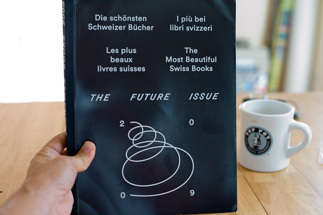
In a project we’re currently undertaking that has allowed us to work through and figure out the future of the photo book I was compelled to read through this book called “The Most Beautiful Swiss Books” and the 2009 edition is called “The Future Issue.”

I like the play on words there and didn’t see it until just now.

The Future Issue. Like..it’s the issue from 2009, because this is an annual. But, the future is an issue to consider. Get it? Well..I didn’t until my coffee took hold.

There are a few relevant passages in here on design, the future of reading and publishing and that sort of thing.

* Everyone seems to be considering the iPad. This book was published after the iPad was announced but before it was made available. There should be a follow on to the points made in there. Maybe I’ll do that. Follow up with the critics and ask them. There is the usual bulwark, which is to say that there is something about the tangibility and materiality of the book that is precious, seminal and defines book. Something that people would still want.

Other points related to iPad-mania were to indicate the distinction between book-dedicated readers like Kindle and platforms like iPad in that there is always something available with the iPad to do other than read, which can pose distractions like..*shrug..why not check email now?

There was some excitement about the evolution of book design in the pad-electronic form. What compliments and extends paper, pages, binding and all that.

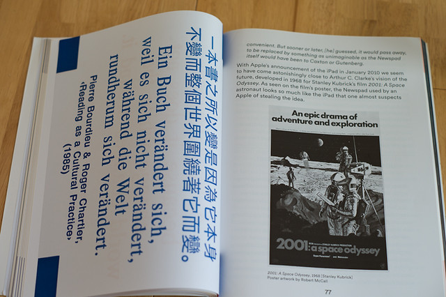
* And then there was the wonderful canonical reference to 2001 – A Space Odyssey which made me very happy. I had never noticed in the movie poster that there is an iPad, which was referred to as a Newspad in the book upon which the film was based. Bonus design fiction future issues!

There's an iPad in the 2001: A Space Odyssey movie poster

* Mention was made to Wim Wenders seeking opinion on the extinction of movies in the context of the intrusion of television. Would books suffer the same fate as movies did when television appeared?

* Perhaps the most vibrant short essay questioned the phrase The future of. Something called “Experimental Jetset” — a collective of Graphic Designers in Amsterdam wrote that they dislike the three words “The future of..” saying they find “something about the phrase that completely puts us off.”

What bothers us most is the suggestion that the future is an unchangeable entity, something that develops completely independent of ourselves. A pre-determined path, to which we should adapt ourselves, whether we like it or not..

‘Our future’, is something that is manageable, shapeable, changeable, buildable, doable. ‘A future’ sounds pretty decent as well. A plural ‘the futures’? Why not? Just as long as we can get rid of the idea of the future as something that governs us, like some kind of pre-modern deity. Let us be reckless about it: we govern the future, not the other way around.

Perhaps this is the most encouraging perspective in the essays of the book, tucked neatly in near obscurity amongst the two other possible opinions: (1) veiled conceit for the iPad/nostalgic death-grip on the smell of leather, the artisinal bookbinders craft, &c.; (2) curious exuberance for this evolution in the rituals of reading.

Why do I blog this? Notes on opinions about the evolution of book writing, making and the cultural evolutions of reading and publishing practices. Plus the bonus design fiction chronicle on the iPad in 2001!
Continue reading Design Fiction Chronicles: The Future Issue of The Book and iPad

Design Fiction at UC Calgary's Environmental Design: A First Go At Design Fiction Genre Conventions

Friday November 19 07:02

From awhile ago, back at the end of last year I went to UC Calgary’s Environmental Design and presented a further iteration of the design fiction business. I realized I hadn’t put down on paper or on this blog some thoughts from the presentation — but mostly thoughts about what design fiction can do.

Just in terms of process, my basic routine is to extend the thinking in steps, using commitments to travel and give a talk or facilitate a workshop as the motivation to move the general thinking a bit further. Where it’s going is oftentimes vague sometimes — but generally it’s just a kind of extending conversation that helps me and I hope others think about the opportunities for collapsing design and science, fact and fiction together into a productive muddle.

In this talk I set the usual frame — placing science fiction alongside of science fact and leveraging David Kirby’s work on the diegetic prototype — the prototype that does more than an engineering or technical or instrumental prototype. ((That may be my emphasis to say that it does more — or a conceit on my part.)) The exemplary diegetic prototype is revealed through Minority Report — the film — and the role that John Underkoffler played in the technical design and technical production of the film’s gestural interface. Despite the challenges of such a system in practice, Underkoffler was able to work through technical issues pertaining to such an interface mechanism through the context of the film’s story. He had a basis upon which the interface would be employed in the future of P.K. Dick’s world of 2050. Moreover the film’s popularity and just its existence provided a way of circulating the concept of this specific kind of gestural interface. The film and the fictional technology that Underkoffler proposed and demonstrated in the film became a way of leveling-up the idea — giving it some exceptional circulation. In effect, the film became the logical extension of the M.I.T. Media Lab’s mantra of demo, demo, demo — or demo-or-die.

This is the stock presentation I’ve given on design fiction. Early on — I think the first time I explicated all this stuff was in Amsterdam where I gave a talk at the Sandburg Instituut Master Course during Halloween in 2008 — I was trying perhaps not successfully to integrate film clips as a way of describing the importance of the story, rather than just objects or props. That is — during that particular presentation in Amsterdam — I showed unusually long film clips. So — the first 3 minutes of Minority Report, for example. Let’s watch that and allow the cool technology to be part of a story that is more about humans as social beings and this lets the tech become social too — it’s not just a doorknob sitting by itself. It’s also a social-instrument, an artefact that has a role to play in this particular drama. What Spielberg is able to do is introduce the technology to us — it’s just a prop — without making the whole film *just about the gesture technology or even the pre-cogs, or the slick environmental advertising, or the jet packs. They are there, of course — but that’s not what the story is about, any more than the Maltese Falcon was about a statue of a falcon from Malta. The statuette was a prop — a way of spinning the story about a couple of crooked crooks.

The purpose was to give a larger context for the gestural interface rather than just its use in the 30 or 40 seconds we see it in the beginning of the film. I wanted to give the device a role and a purpose — an instrument that’s used routinely. I wanted to shift it from being a spectacle to being just an ordinary albeit sophisticated bit of technical kit. Just in the same way that a microscope in a forensics-heavy police procedural television show is not fetishized as a prop or device in that sort of story, neither should be the gestural interface in Minority Report — even though to our eyes as viewers, at least at the first screening, it is quite extraordinary. The point is that the film makes the device quite ordinary and routine. This is John Anderton just going about his business as a savvy, street-smart, afflicted cop. It just happens to be a future world to us, with all its trappings of things extraordinary.

From this I began thinking about the conventions, stylings, idioms and techniques that make the future seem like today. How do you make the extraordinary appear ordinary and quotidian? This seems to be an important way of depicting the future and making it seem possible. It’s just a way of designing — an understatement of perhaps novel, innovative and crazy ideas from the future. Why do this? Because in a way this is part of the work of design innovation. To make something spectacular routine, domesticated (to borrow from James Auger) and perhaps even boring and everyday. When you can do this, you’ve turned a corner into a new space that provides a setting for a kind of innovation that is chaste and modest and thereby, perhaps — entirely possible. This then communicates your innovative, crazy, off-the-hook idea as legible and something which can already be accomplished.

Thursday November 18 15:20

There’s much in the social, cultural and political history of science and innovation on the topic of modesty as a mode of conveying and communicating an idea. Scientists are especially guilty of this mode of communication — behaving only as unadorned and modest presenters of things-as-facts. Just revealing nature as it is. Simon Schaffer and Steven Shapin’s Leviathan and the Air-Pump: Hobbes, Boyle, and the Experimental Life and especially Schaffer’s A Social History of Truth: Civility and Science in Seventeenth-Century England (Science and Its Conceptual Foundations series) speak much on this topic. I think here I’ve internalized their insights and tried to find ways to leverage the modest proposal of a new, speculative idea — as was the air-pump in its time — as a way to communicate it convincingly. In part design fiction is about communicating a new idea, but of course it is also, perhaps mostly, about actually doing design through the modes and idioms of science fiction.

This way of presenting an idea and enrolling people in it is described quite convincingly by Shapin and Schaffer. It’s really an important read in this regard. It’s a great historical book. I seem to re-read it every few years because it’s almost tactical in its description of how ideas become materialized and circulated. It’s certainly much more thorough and convincing than popular surveys of how ideas evolve and develop — I kept thinking about how loosey-goosey Stephen Johnson’s Where Good Ideas Come From: The Natural History of Innovation end up being for its lack of rigor and its desperate hunt for a simple one-liner — this whole adjacent possible. It reads like a nursery rhyme that forgets that its okay that the world is an intractable complex and entangled place. ((G’aah. I’m all riled up now. I’ll get back to that one later.))

Thursday November 25 09:30
Thursday November 25 09:31

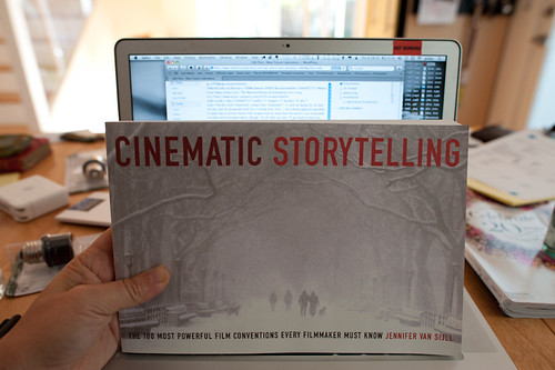
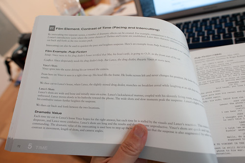
Cinematic Storytelling: The 100 Most Powerful Film Conventions Every Filmmaker Must Know. It sounds very vocational, but I find the idea of a catalog of ways of telling visual stories compelling. It would be nice to create a similar sort of thing for design fiction, I think. This is what is next.

Anyway — so what I’m trying to do now with the whole design fiction business is catalog a series of genre conventions — ways in which one can describe an idea or an object or a bit of thinking. How do we show ideas as they would be in the world? Or as they come to be? I’m thinking about mostly visual stories — little films or proper films, but mostly little films because they can be produced, we have a pre-existing language of visual story telling and now I’m convinced that that language can be used to also do the work of designing. What I and others are talking about is using film/visual explications as a means of prototyping and, perhaps more importantly — designing. It shouldn’t be just a way of showing a concept but also a way to feedback into the design process — or it should be a part of the design process, not just a final demonstration. They should be made in such a way that thinking is going on while they are being made. One should pay attention to lessons being taught by the little filmmaking process because effectively, then — you are also doing design, just with fiction which allows more freedom in the explorations.

Why do I blog this? Well — I’m doing a few design fiction workshops later this summer and fall and it seems like film is a viable way to think through how to set the scene for a near future world, or little moment of that world. It would be quite nice to do a workshop that included film making as the “hands-on” work part of the workshop. It actually takes a lot to think through things if you’re making a little movie, even a super little one. But, things get even more intriguing when the making of the film is actually part of the design process itself — allowing the extra work to be more than communicating the idea, but actually informing it quite directly. Some of the little films we’ve made in the studio were exceptionally useful to shape and challenge notions that work quite well in conversation, or on the screen or on big posters. It’s when things go in the hand and become materialized that you start to discover something about the design that needs more help to make its way into people hands.
Continue reading Design Fiction at UC Calgary's Environmental Design: A First Go At Design Fiction Genre Conventions