Social Media at Human Pace

Most connected humans suffer from poor ‘data hygiene’. For instance, we are plainly grotesquely overfed on social media with its ‘anytime’ ‘anywhere’ experience and there is no rational end in sight. In this article, I introduce the reasons why I developed Humans, an app that offers a way to rationally manage too many social media contacts and slows down the consumption of status updates, tweets, selfies, and photos of all kinds.
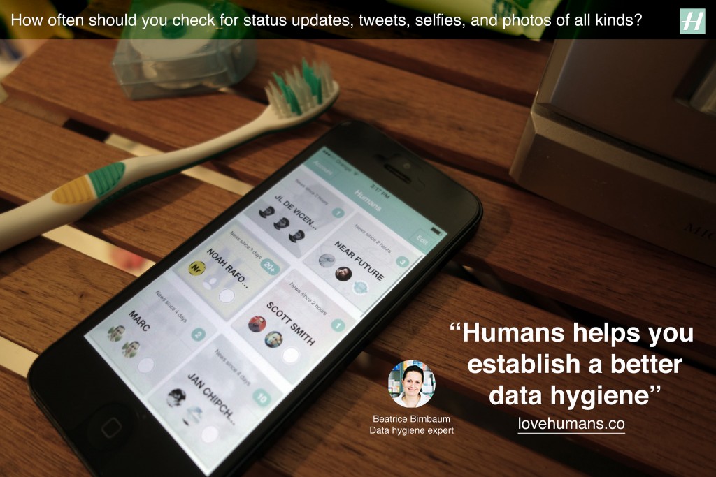
A fictional Humans ad suggesting a better practice of ‘data hygiene’

We live in a society that captures the moment, refashions it to ‘share’ across a network of social media endpoints containing algorithms and human, perpetually. Social media, its algorithms and its humans are highly optimized to never stop the cycle. Consequently, we experiencing an unprecedented increase in the rate of this ‘anytime’ ‘anywhere’ consumption cycle. As of 2014, according to the Nielsen US Digital Consumer Report almost half (47%) of smartphone owners visited social networks every day. On top of that, it is not uncommon for a Facebook user to have 1,500 posts waiting in the queue when logging in. Yet, the perpetual consumption yields to very little and there is no rational end in sight. We are quite plainly grotesquely overfed on social media.

Social media needs its consumption cycle. It depends on ‘views’, ‘eyeballs’, ‘reshares’, ‘likes’, ‘comments’ — the euphemism used by the media mavens is the optimistic word ‘engagement’. We are bloated on ‘engagement’ to the point where we sleep with our nodes, wear them on our wrists, clip them to our dashboards, autistically shove them in pockets only to immediately remove them only to shove them back in our pockets only to immediately remove them in order to slake our thirst for more content. This ‘too much, too fast’ consumption cycles has reduced an ability to pay sustained attention, have a meaningful conversation, reflect deeply — even be without our connected devices.

Humans create technologies, adapt their behaviors to them and vice-versa

The fact is that each major revolution in information technology produced descriptions of humans drowning in information unable to face tsunamis of texts, sounds, images or videos. For instance, in the 15th century Gutenberg’s printing press generated millions of copies of books. Suddenly, there were far more books than any single person could master, and no end in sight or as Barnaby Rich wrote in 1613:

“One of the diseases of this age is the multiplicity of books; they doth so overcharge the world that it is not able to digest the abundance of idle matter that is every day hatched and brought forth into the world”

Besides a Luddite position of some that rejected technological change, the invention of printing began to generate innovative new practices and methods for dealing with the accumulation of information. These included early plans for public libraries, the first universal bibliographies that tried to list all books ever written, the first advice books on how to take notes, and encyclopedic compilations larger and more broadly diffused than ever before. Detailed outlines and alphabetical indexes let readers consult books without reading them through, and the makers of large books experimented with slips of paper for cutting and pasting information from manuscripts and printed matter — a technique that, centuries later, would become essential to modern word processing.

Historically, humans have adapted to the increasing pace of information exchange with the appropriation of new practices and means to filter, categorize and prioritize information feeds.

Similarly, a couple of centuries later, the increasing presence of the telegraph multiplied the levels of stress among merchants used to more local, slower and less competitive transactions. They eventually adapted to the new pace of information exchange with new practices and means to filter, categorize and prioritize information feeds.

From social media ‘diets’ to ‘data hygiene’

What today’s most connected people share with their ancestors is the sense of excess and related discomfort, and stress linked to information load. In many ways, our behaviors for coping with overload have not changed. Besides the promises of AI and machine learning that trade control for convenience, we still need to filter, categorize and prioritize, and ultimately need human judgment and attention to guide the process.

These behaviors perspires in popular media and the many articles that share tips to follow successful social media diets, detox, or cleansing programs. The authors typically advise their readers to move away from being constantly ‘on top of things’ and to give up on concerns of missing out or being out of the loop. The diets are about replacing one behavior with another more frugal by pruning the many social networks (‘quit’, ‘uninstall’, ‘unplug’, ‘remove profile’) and contacts (‘mute’, ‘unfollow’). Yet they target a temporal improvement and fail to promote a more profound sustainable behavior with positive reinforcement.

Besides the promises of AI and machine learning that trade control for convenience, we still need to filter, categorize and prioritize, and ultimately need human judgment and attention to guide the process.

Social media platforms have also slightly updated the interfaces to support these behaviors. For instance Facebook recently started to allow users to specify the certain friends and pages that should appear at the top of the feed and Twitter introduced a ‘while you were away’ feature to its home timeline. Yet, social media feeds still feel like an endlessly accumulating pile of messy dirty laundry.

There is an opportunity to reconsider how we use social media and how we build it. Social media that gives human control to prioritize certain feeds over others, but without normalizing content into something less messy, and less complicated than a human. In fact, adapting to social media overload is not about being ‘on a diet’ than having a good ‘data hygiene’ with a set of rituals and tools. This is what I explored along with my colleagues at Near Future Laboratory with the design and development of Humans.
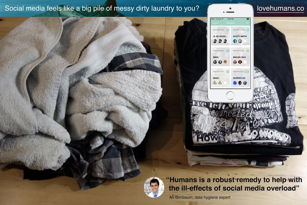
A fictional Humans ad suggesting a proper ‘data hygiene’.

Introducing Humans

Humans is an app that offers a way to rationally manage too many contacts and slows down the consumption of status updates, tweets, selfies, photos of all kinds. Its design inspires from observations on how humans adapt to the feelings of information overload with its related anxieties, obsessions, stress and other mental burdens. Humans is the toothbrush for social media you pick up twice a day to help prevent these discomforts. It promotes ‘data hygiene’ that helps adjust to current pace of social exchanges.

First, Humans gives means to filter, categorize and prioritize feeds spread across multiple services, like Twitter, Instagram, and Flickr. The result forms a curated mosaic of a few contacts, friends, or connections arranged in their context.
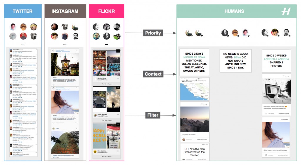
Humans gives means to filter, categorize and prioritize feeds spread across multiple services, like Twitter, Instagram, and Flickr.

Additionally Humans strips social network interfaces and algorithms from their ‘toxic’ elements that foment addictions and arouse our desire to accumulate rather than abstract. And that without altering the fascinating dynamics of social networks. One inspiration this ‘data hygiene’ design pattern is the Facebook Demetricator provocative project that removes any number present in the Facebook interface. Its developer Benjamin Grosser advocates for the reduction of our collective obsession with metrics that plays out as an insatiable desire to make every number go higher. Another inspiration is the Little Voices app that removes the ‘noise’ from Twitter feeds and that is ‘ideal for those who like their feeds slightly quieter’.

Taken together, the benefits of using Humans are:

Reduce the compulsion to perpetually check Instagram, Twitter and Flickr

A frequent use of multiple social media services reduces our ability to contextualize and focus. With Humans, you can mitigate that online social service schizophrenia and establish a rational regimen for following without the constant barrage and noise of too many extraneous strangers’ updates. It works with the main social media platforms.

Keep away from the distractions in social media feeds

Get access to content stripped out of the social media distractions. Humans removes visual noise and arrange in their context the many status updates, links, selfies, photos of all kinds.

Mitigate feelings and symptoms of remorse whilst taking short or long offline breaks

If you have been away from your screens or too busy, Humans creates digestible doses of context that will get you up to date.

I designed and developed Humans to exemplify a new mean for ‘data hygiene’ with an interface and algorithms that adapt to human pace and do not uniquely focus on the real-time, the ‘now’, and the accumulation of ‘likes’ and ‘contacts’. Or as our fictional experts in ‘data hygiene’ would suggest:

Humans data hygiene experts

Check lovehumans.co for more information and request the app.

The near future of data hygiene

At Near Future Laboratory, we like to investigate alternative paths for technology. As data and connectivity augment our lives, hygiene might no longer only relate to maintaining a healthy body. Connected humans produce ‘data doppelgängers’ and consume data ‘anywhere’ and ‘anytime’ at an unprecedented rate. Consequently, they start to experience discomforts such as social media overload that Humans helps mitigate.

Like other information technology revolutions, there is a necessity for people to adopt new rituals and tools. In the near future we might see emerge interfaces, experiences, algorithms, design patters that reshape our social practices and for instance:

  • moderate our collective obsession with metrics and the pervasive evaluation and comparison of one self.
  • reclaim space for conversation over the illusion of the connection, its ‘retweets’ and ‘likes’.
  • reduce the social cost to ‘unfollow’.
  • promote solitude as a good thing.
  • regulate our insatiable desire to capture ‘moments’ and accumulate ‘contacts’.
  • help us overcome the ineluctable situations of digital amnesia.
  • empower our skills for abstraction and generalization from the ‘moments’ we capture.
  • help us forget to better remember.
  • invite us to expect less from technology, and more from ourselves and each other.

More on these topics in upcoming projects.
Some Critical Thoughts to Inspire People Active in the Internet of Things

DSC01857

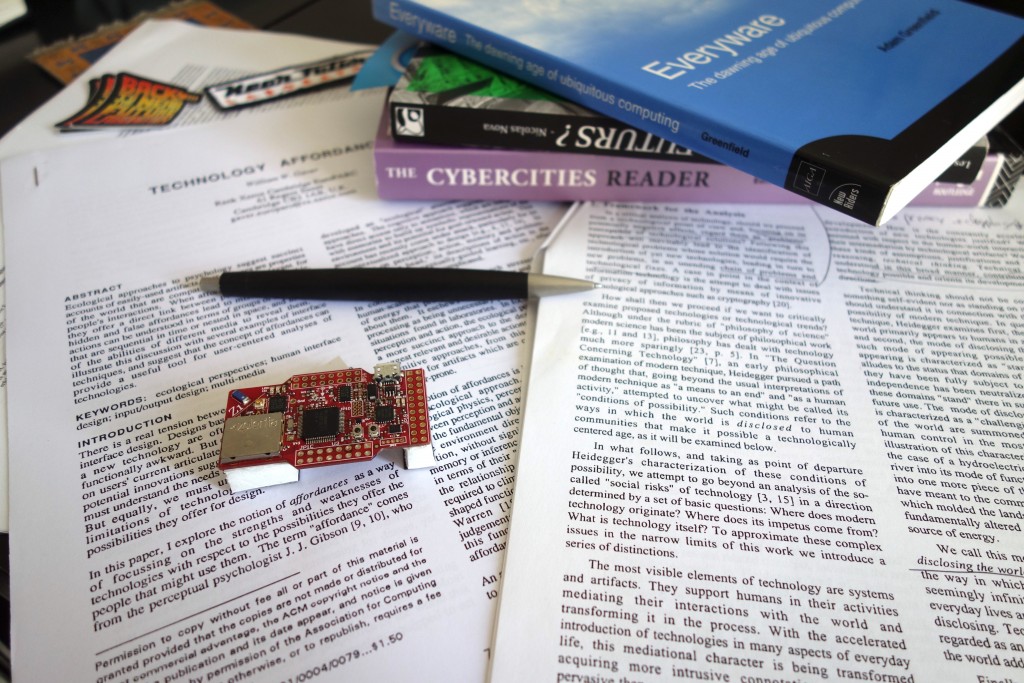
It has never been so easy to build things and throw them into people’s pockets, bags, phones, homes, cars. Almost inevitably — with this abundance of ‘solutions’ — it has never been so easy to get caught in the hyperbolic discourses of perpetual technological disruptions with their visions of flawless connectivity and seamless experiences. When translated literally, theses visions often take the form of a questionable world of Internet of Things (IoT).

At Near Future Laboratory, we get the chance to meet amazing people active in the IoT who request critique and feedback on their products. We help them abstract from the hype of the dominant vision and gain fringe insights that can refresh their strategies. To do so, I often dig into the rich literature produced in the early days of ubiquitous computing. Some of the texts were published more than 10 years old, but — trust me — they all carry inspiring thoughts to improve the contemporary and near future connected worlds.

I hope this accessible academic literature is useful for people active in IoT curious to enrich their ethical, human, geographic and social perspectives on technologies. En route and beware of shortcuts!

The shift from the showcase of the potential of technologies to the showcase of active engagement of people

Written in 1995, Questioning Ubiquitous Computing critiqued that research in ubiquitous computing is conceived as being primarily as the best possibility for “achieving the real potential of information technology” and had little to do with human needs and much more with the unfolding of technology per se.

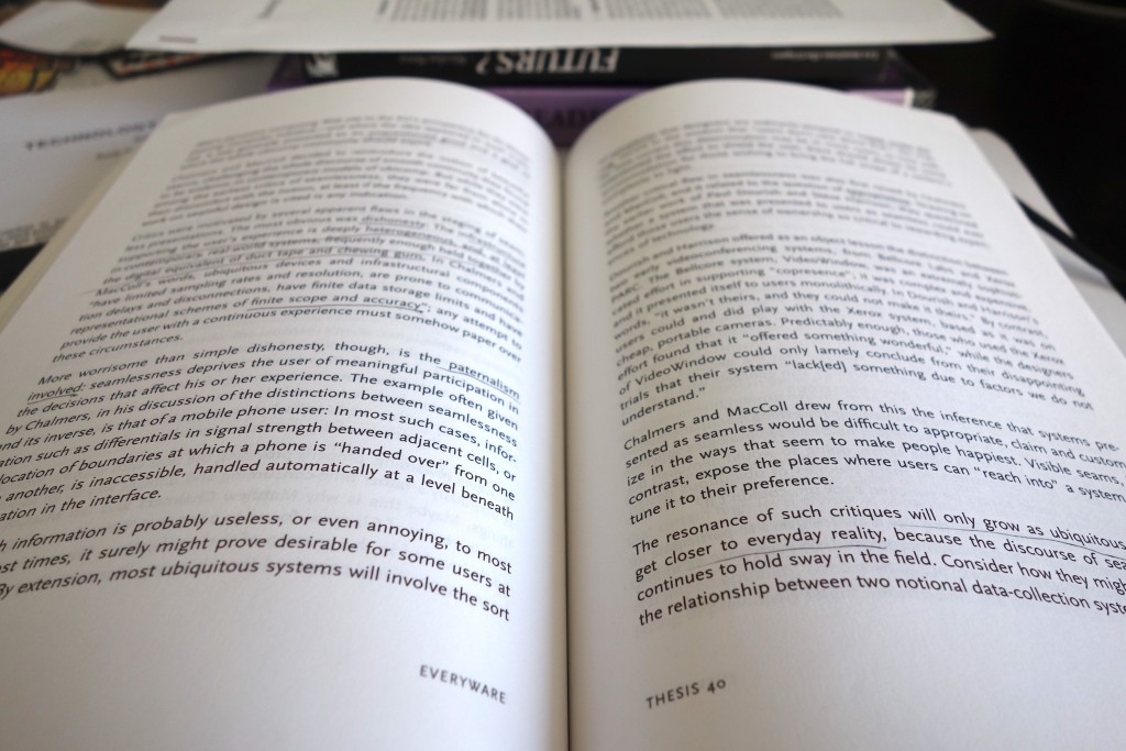
Ten years after, based on similar observations, but with more constructive arguments, Adam Greenfield wrote Everyware to question the implications of the scale up of ubiquitous computing and genuinely how to improve the connected world he coined as “everyware” [my notes].

DSC01861

In the same period voices raised to rephrase the approach of ubiquitous computing. For instance, in Moving on from Weiser’s vision of calm computing: engaging ubicomp experiences Yvonne Rodgers promotes connected technologies designed not to do things for people but to engage them more actively in what they currently do [my notes].

The shift from the design of a perfect future to the design for the messiness of everyday life

Similarly, in Yesterday’s Tomorrows: Notes on Ubiquitous Computing’s Dominant Vision Genevieve Bell and Paul Dourish highlight that the problems of ubiquitous computing are framed as implementation issues that are, essentially, someone else’s problem, to be cleaned up as part of the broad march of technology. In other words, the dominant vision of ubiquitous computing promotes an indefinitely postponed future in which someone else will take care of solving any technological (e.g. interoperability, fluctuant connectivity, or limited battery life) or social issues. Consequently, the text argues for a “ubicomp of the present” which takes the messiness of everyday life as a central theme [my notes].

That notion of messiness of technological settings provoked the interests of researchers to regard technological imperfections as an opportunity for the design of everyday life technologies. William Gaver pioneered work in that domain with his proposals of Ambiguity as a Resource for Design that requires people to participate in making meaning of a system [my notes] and Technology Affordances that promotes interfaces disclosing the direct link between perception and action. Practically, as advocated by Matthew Chalmers in Seamful interweaving: heterogeneity in the theory and design of interactive systems, this means that people accommodate and take advantage of technological imperfections or seams, in and through the process of interaction. In No to NoUI, Timo Arnall gives excellent additional arguments that question the tempting approach of “invisible design”.

Observing the dynamic relationship of technology, space and humans to demystify the perfect technology

In her PhD dissertation A Brief History of the Future of Urban Computing and Locative Media Anne Galloway shows that ubiquitous technologies reshape people experiences of spatiality, temporality and embodiment in the networked city. Her contribution augments an extensive literature that investigates how technologies are not the sole drivers of urban change and how they co-evolve with the urban fabric as they become woven into the social, economic and political life of cities. Code/Space is a seminal book by Rob Kitchin and Martin Dodge that precisely discuss software from a spatial perspective, analyzing the dynamic relationship of software and space. The production of space, they argue, is increasingly dependent on code, and code is written to produce space [my notes]. In that machine readable space bugs, glitches and crashes are widely accepted imperfections as the routine part of the convenience of computers [my notes]. Also, ubiquitous computing helps remake urban spaces through new formed strategies of security. For instance some chapters of the book Cybercities Reader talk about the emerging militarized control society encouraged by the dream of the perfect technology and the myth of the perfect power [my notes].

DSC01862

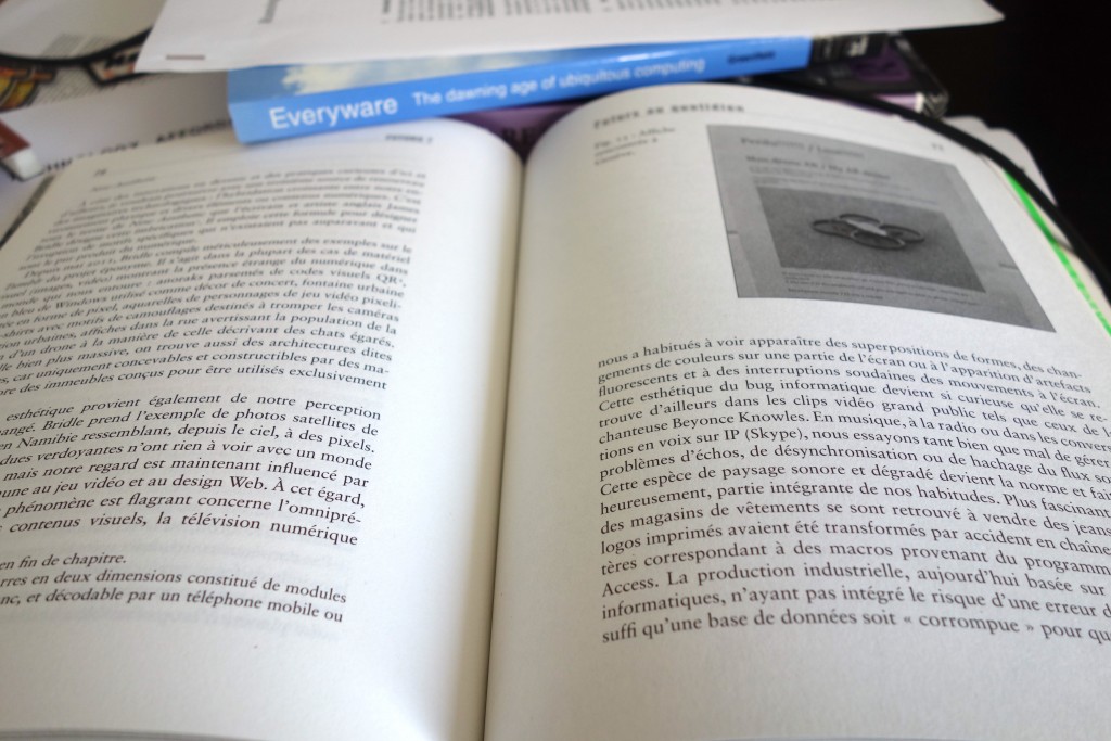
Precisely with the objective of moving beyond these dreams that foster indefinitely postponed futures, Nicolas Nova wrote Futurs? La panne des imaginaires technologiques that explores alternative ways to imagine and design future objects and experiences including Design Fiction.

I took many shortcuts to put together these heterogeneous publications but I hope that some of them can help you better question the dominant visions of the IoT and enrich your approach to improve any of the technologies that are constantly getting closer to people, their homes, streets and clothes (e.g. AI, Big Data, etc).

The Global Village and its Discomforts

Or why designers and data scientists should learn from the anxieties, obsessions, phobias, stress and other mental burdens of the connected humans.

Photo courtesy of Nicolas Nova

We live in the ‘Global Village’ and our behaviors as connected humans have been evolving since Marshall McLuhan popularized the term in the 60s. Today, we form a society that captures the ‘moment’, refashions it to ‘share’ across a network of endpoints containing algorithms and humans, perpetually. Simultaneously, we live in a society that prizes speed. Amazing technologies are delivering real-time notification of those moments to our wrists, pockets and handbags. Through the virtue of feedback loops, real-time predictive algorithms and collaborative filtering, things are recommended to us for instant actions. That optimized movement of information promise to help us gain now the time that we can then put back in our life.

That evolution came with a price. In the Global Village, it is common to hear a co-worker complain over lunch about ‘social media overload’, to have a friend share their ‘chronic infobesity’ issue with a simple look on their Tweetdeck, to overhear in the metro a person who cannot keep up with their multiple profiles on Tinder or to observe a ‘validation junky’ defying Dunbar’s number and obsessively seeking new forms to obtain ‘likes’ from ‘friends’.

In this essay, I argue that most connected people are subject to anxieties, obsessions, phobias, stress and other mental burdens resulting from living in the Global Village. In an era where some behaviors and habits are measurable, there is an opportunity to learn from the negative effects of technologies that extend our social practices. Particularly, designers and data scientists — besides from being held accountable for many of these discomforts — could get inspirations from the descriptions of these social media related pathologies to improve their design of user experiences and algorithms.

Pathologies of the Global Village

As of 2014, according to the Nielsen US Digital Consumer Report almost half (47%) of smartphone owners visited social networks every day. On top of that, it is not uncommon for a Facebook user to have 1,500 posts waiting in the queue when logging in.

Since the presence of social network is relatively new, the real gains and losses of their use can be found in the mood, behavior, rituals, manners and feelings of connected people. Only recently, the popular media started to consider the psychological effects of ‘social overload’, its impact on mental, social and even physical well-being. We are starting to hear about compulsive behaviors or any other kind of pathologies with acronyms such as FoMO (Fear of Missing Out) or FoBO (Fear of Better Options) provoked by the exposure to social media. That evolution can also easily be traced in recent academic literature. For instance, social psychologist Andrew Przybylski and his colleagues defined FoMO as:

“A pervasive apprehension that others might be having rewarding experiences from which one is absent, FoMO is characterized by the desire to stay continually connected with what others are doing.”

Building on that definition, Michael Hogan proposed a number of categories of FoMO consequences including: Pressure, Paranoia, Separation, Self-identity problems, Dissatisfaction, Loneliness, Negative Self-Image, Personal Inadequacy, Disconnection, Jealousy, and Judgement.

The consequences of FoMO. Source: Facebook and the ‘Fear of Missing Out’ (FoMO)

As a consequence, some people who first embraced constant connectivity are now looking for ways to resist the constant call to be permanently connected. These reactions manifests a need to establish boundaries, resist information overload, and strike a greater emotional balance. Some opt to follow media ‘diets’ or ‘detox’ programs as attempts to move away from being constantly ‘on top of things’ and to give up on fears of missing out or being out of the loop.

Every Technological Extension is Also an Amputation

Social network platforms act as an extension of our social practices. Like with any technological extension we are right to be fascinated by its power and scale. However, we too frequently choose to ignore or minimize the ‘amputations’ and implications they produce. Or as French cultural theorist Paul Virilio would argue:

“The invention of the ship was also the invention of the shipwreck”

For instance, our capacity to record every moment of our lives comes with the high vulnerability of digital data. In fact, no machine can today read a 15 years old hard drive. It is ironic that we have the technological means to record and share our social lives, yet we all might suffer one day from ‘digital amnesia’. Similarly, the capacity to record our lives might reduce our ability to forget inconsequential factoids which is the way for our brains to optimize the recollection of important things. Indeed, our memory uses abstraction and generalization to forget and better remember.

The understanding of these ‘amputations’ represent a source of inspiration and discussion to improve the design and algorithms of social media or any technology that touches humans and extend their social practices.

Gathering Material from Fictional Near Future

With the objective of producing an inventory of ‘amputations’, designer Etienne Ndiaye and myself projected into the near future the current discomforts in using social media. With an approach called Design Fiction, we employed that inventory as a totem for discussion and evaluation of alternative ways to experience social media.

In this exercise we postulated the future increase of cases of ‘validation junkies’ (i.e. individuals who obsessively like, favorite, share and retweet) and ‘input junkie’ (i.e. individuals obsessed with social network feeds). After a vast study on social habits and individual addictions to social media, the US Food and Drug Administration (FDA) and the European Medicines Agency (EMA) decided to set up a large technology initiative that placed limits on design, algorithms and access to social media. For instance, they imposed limits to Facebook photo clicking. In consequence NGOs and the media started to portray pathologies like FoMO as the nicotine of social network platforms forcing the Facebooks, Googles and Amazons to react.

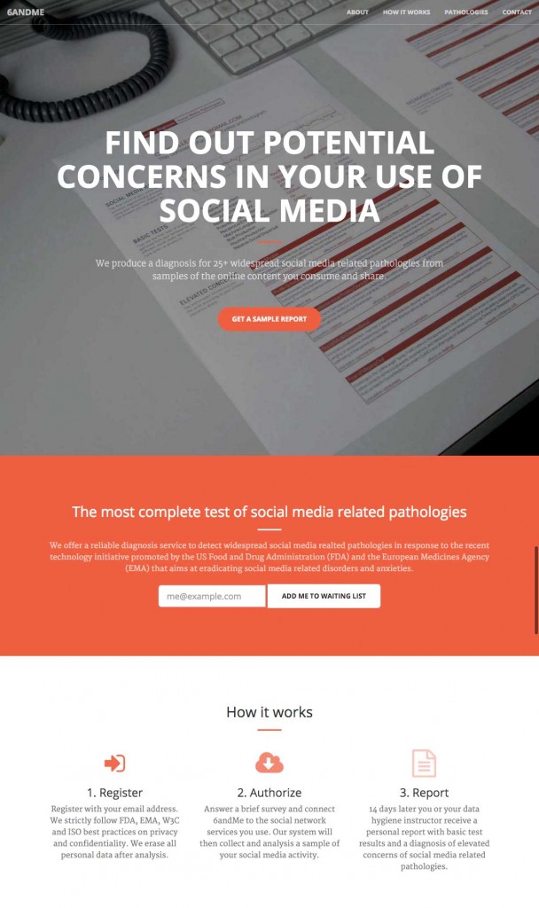
Based on that premise, our Design Fiction took the form of a fictional start-up called 6andMe active in the sector of wellness for connected humans.

The landing page of 6andMe.

That Design Fiction helped us think on how popular media might describe conditions like FoMO in the future. We debated on the tools and behaviors that could prevent or mitigate the discomforts augmented by social media; the mechanisms that 6andMe could use to detect feelings like ‘lone envy’, ‘social exclusion’, ‘missing out’ and ‘being left out’. For instance we listed the indicators that could give signs of unfilled need of ‘belongingness’ and ‘connectedness’ of a person.

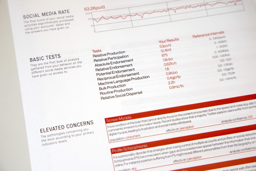
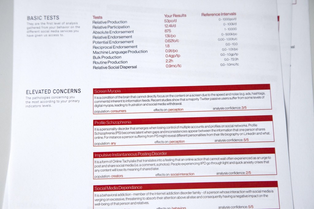
Relative Production, Relative Participation, Reciprocal Endorsement, Relative Social Dispersal, etc. The 6andMe diagnosis rely on a battery of basic tests gathered from an individual behavior on social media services to rate concerns for social media related pathologies.

Further into the exploration, we looked at the evolution of language and how some mental conditions might be linked to popular figures. For instance, 6andMe can detect levels of Systrom’s Anxiety. This fictional pathology originates from Instagram’s CEO Kevin Systrom who once said:

“We humans are forever on a quest to take a moment and record it forever in time. Because however long life is, or however short life is, we know we may never get that moment back.”

that we translated into the following symptoms:

Systrom’s Anxiety (SA)

Systrom’s Anxiety is a feel of having to capture and share a moment from the fear of not being able to get to live it again. It happens in situations when one has to decide whether a moment is best enjoyed in the present tense or preserved for posterity online.

We also investigated the emergence of technologies and research that measure social media behaviors. For instance, Michal Kosinsk at Stanford and companies like Apply Magic Sauce API are currently optimizing ways to transform digital footprints into psychological profiles. Our fiction stands 2 or 3 iterations away from that reality. As a result, data scientists at 6andMe use similar algorithms to produce a diagnosis for social media related pathologies. For instance:

The results: 2 weeks after sharing the access to your social media activity, 6andMe sends you by mail a complete diagnosis with levels of concerns on social media related pathologies (e.g. Cloud Syllogomania, Online Tachylalia, Fear of Missing Out, …)

Cloud Syllogomania (CS)

Like many people, you have a tendency to compulsively hoard documents in the cloud such as photos, music, videos, discussions, emails, or any other data formats. However, when reaching storage limit you fail to organize and discard large numbers data even to the point of causing significant clutter and impairment to basic operation of a software, computer or mobile device. This hoarding behavior is often unwanted, automated by online services and can become distressing.

Online Tachylalia (OT)

You have a tendency to share social content fast, frenetically and very frequently, so frequently that it becomes impossible for your relatives, friends, colleagues and contacts to follow you online. It may be exhibited as frequent streams of rapid posting without prosody leading to online social rejection and disdain.

Profile Schizophrenia (PS)

You suffer from a personality disorder that emerges when losing control of multiple accounts and profiles on social networks. Profile Schizophrenia (PS) becomes latent when you start to notice gaps and inconsistencies between the information that you share online. For instance you might develop different personalities from your life biography on LinkedIn and what you share on Facebook, your World of Warcraft characters and your Twitch videos.

Online Monophobia (OM)

You feel alone in online social networks. You might have relatively too few online contacts and receive low amounts of contact requests, likes, comments, reblogs or retweets. Many people with this fear feel awkward and uncomfortable on social networks. It is related to Online Athazagoraphobia that is fear of forgetting or being forgotten on social networks.

Overshadower Syndrome (OS)

In this form of a judgment disorder your mind blurs the social etiquette of knowing too much about somebody else from the information available on the Web. That behavior often leads to uncomfortable social and cultural situations when too much knowledge on a person is gathered from the extensive use of search engines and social networks.

Storage Claustrophobia (SC)

In moments of bandwidth restrictions, abusive data plans, or limited cloud space you notice an extreme fear and feeling of being confined to the limits of a specific data plan or storage system.

Six Degrees Jealousy (SDJ)

You feel or show envy of an online contact for receiving more attention in the form of “likes”, “comments”, number of contacts or the klout score. Inspired by network theories on six degrees of separation, Six Degrees Jealousy is often a reaction of teenagers to a strong social pressure and fear of not belonging to a community or tribe leading to Online Monophobia (OM).

Find more informal descriptions on 6andMe of: Timeline Myopia (TM), Impulsive Posting Disorder (IPD), Social Media Dependence (SMD), Social Media Overwhelm (SoMO), Sense and Attention Overload (S&AO), Abrupt Online Dropout (AOD), Pocket Check Obsession (PCO), Screen Addiction (SA), Compulsive Screen Absorption (CSA), Stressful Attention Battles (SAB), Online Attention Disorder (OAD), Tagophobia, Compulsive Data Cleaning Disorder (CDCD), Data Loss Meltdown (DLM), Digital Amnesia (DA), Online Athazagoraphobia (OA), Visiobibliophobia, Social Escapism (SE), Online Perseveration (OP), Avataragnosia, etc.

Our Design Fiction and the description of these fictional pathologies do not claim to be medical but are provocations on how connected humans might express their anxieties, obsessions, phobias, stress and other mental burdens in the future.

Takeaways for the present

While working on wonderful technological extensions of human body and mind, designers and data scientists need also to consider the amputations provoked by the experiences and algorithms they introduce into the Global Village. In the the book The Shallows, Nicholas Carr worries that the flood of digital information is changing not only our habits, but even our mental capacities:

Forced to scan and skim to keep up, we are losing our abilities to pay sustained attention, reflect deeply, or remember what we’ve learned.

The inventory of social media related pathologies listed in 6andMe highlights these types of technological implications. The descriptions of FoMO, Systrom’s Anxiety, Six Degrees Jealousy, etc. provide a new source of inspiration and discussion to improve the design and algorithms of any technology that touches humans and extends their social relations.

To build better data products and services, I would argue that most designers and data scientists should be aware of notions such as graphopticon introduced by the like economy and question if the technology they build establish an insatiable ‘desire for more’ or any other type of discomfort. Moreover, they should get inspirations from the techniques social media user develop to strike a greater emotional balance.

Many companies have the data and skills to consider the wanted, unwanted and toxic changes in behaviors their services or products create and amplify. For instance, Facebook introduced the roles of social engineers and a group of trust engineers to make the online world a ‘kinder, gentler place’. In their first approximations they introduced mechanisms for their users to tune the feeling of status update overload.

Currently, only a few apps and platforms promote social media experiences that mitigate the types of discomforts listed in 6andMe. Meshfire is a recent attempt to ‘make social media human again’ or as its CEO puts it in abstract terms:

“If we were to start again with social media — a completely clean slate — we’d like to see real human interaction rather than all the automatic output we witness today.”

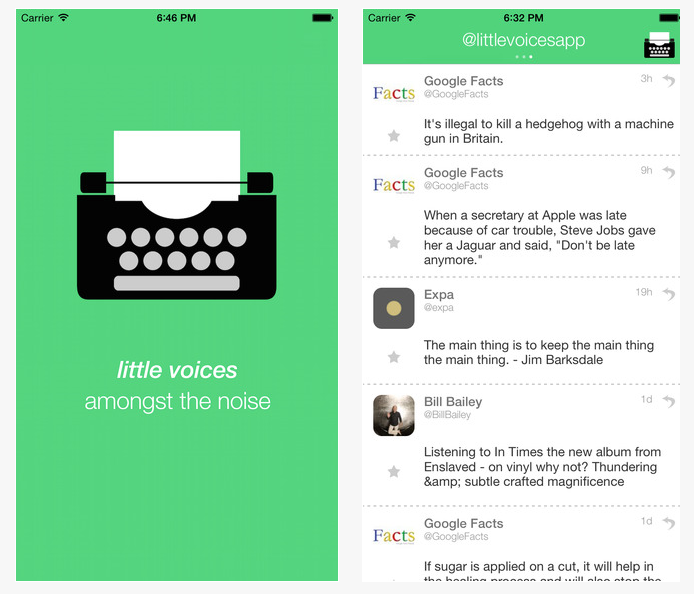
Screenshots of Little Voices by Charles Gower

Another example is the app Little Voices that removes the Tweets that contain images, links and replies from Twitter feeds. As its developer Charles Gower describes it:

“Little Voices is complementary to Twitter, not a replacement. It’s ideal for those who like their feeds slightly quieter.”

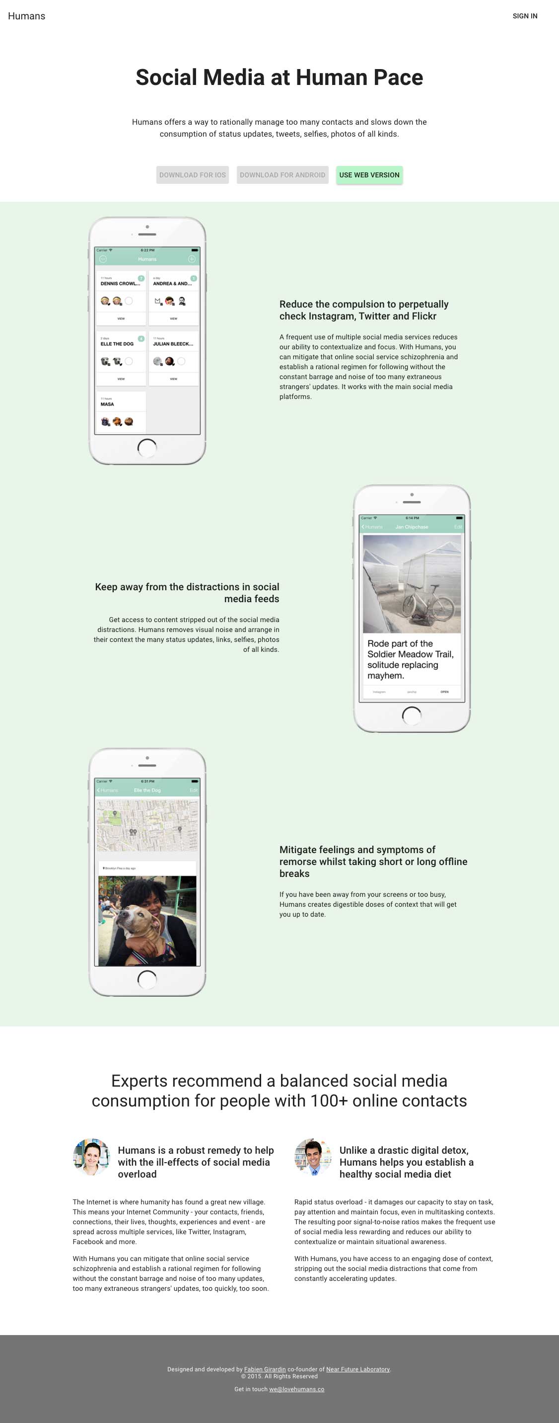
Finally, at Near Future Laboratory we have been building Humans as a platform to ‘experience social media at human pace’. Humans offers a way to rationally manage too many contacts and slows down the consumption of status updates, tweets, selfies, photos of all kinds. Its aim is to:

  • Reduce the compulsion to perpetually check for status updates.
  • Keep away from the distractions in social media feeds.
  • Mitigate feelings and symptoms of remorse whilst taking short or long offline breaks.

The Humans landing page.

More on Humans soon!

Nokia N900 Hacks

Nokia is a gigantic battleship, and in some of that ship’s little corners, quite intriguing things happen that are quite consistent with the sensibilities of play, exploration and making new meanings, and especially inverting existing assumptions or retracing histories. I think these sorts of things are some of a small number of ingredients that could make the world a more habitable place.

((And if you are one of the seven people who read this blog, you will recognize a congruency between these playful hacks and our general point-of-view on what is ‘worth-ful’ and what is worthless. Some of you may call these explorations “worthless” because you are tangled up in the constellation of meanings that assume value is only found in something that is so consistent with a “users needs” that they’ll buy it, even if their life is made no better with it than it was without it.))

This video shows some of these ingredients and explorations that activate the imagination and move away from the consistency of mindless incremental change. They are playful, “post-optimal” designs that serve as prompts and reminders and materializations of the experience and interaction metaphors that today we take for granted.

I have my reservations about what the N900 thingie will be or is or how it has come to be (and I’m eager to see it), but this corner of that “program work” gives me more hope for it than I have ever had.

((via Nokia Blog and this PUSH N900 competition.))

Continue reading Nokia N900 Hacks

Things That Go To Sleep

Real Time Clock

So, the evolution of machinery has led to the eponymous “sleep” mode, or “sleep state” for digital devices. Our phones and computers and stuff — they can go to sleep. I think the first time I saw this (and was somewhat fascinated) was when a PC I was using had this BIOS that could put the computer into a hibernate mode. The computer could hibernate. It basically powered all the way down, freezing the system state to the hard disk. Like a bear hibernating. Spring time comes and the bear just comes to, presumably — a bit hungry but ready to go. Same with the computer.

So then I start thinking about the bear. And the computer. And the metaphors. Hibernate. Sleep.

They hold up just fine. I mean, it makes sense in a way. Then I start wondering where it goes — in the near future laboratory I’m doing some tinkering to figure out what the near future holds for this metaphor and our digital stuff.

I’ve been tinkering with time quite a bit lately, wondering how it can be used to express or encourage new, hopefully playful interaction rituals for our devices. And I’ve been thinking about a series of devices I’m cobbling together here that are playing in part with time and this is what I want to do.

I want to make devices that go to sleep. I mean, that really do go to sleep. They simply get tired and suspend themselves. Maybe with a bit of a warning like..your laptop battery is running low..I’m going to sleep..even if you change the battery or plug me in..I’m going to sleep, because I’ve been working really hard for the last 3 hours and, well..I’ve just about had it.

Animal Crossing really got me thinking about this in a small, clever, every simple way that every 7 year old understands when they play the game. When our Animal Crossing little hamlet gets dark, people in the game go to sleep. You might come across the occasional night owl, but basically its dark and not a whole lot is going on. And time is coordinated. When it’s nighttime in your normal human world, it is nighttime in your Animal Crossing world. Simple. Makes sense. Games go to sleep. It would be fun to see what life is like if other things do too, imagining that this is one small aspect of the near future we are already starting to inhabit. (Sometimes I wish Twitter would go to sleep.)

Why do I blog this? Shifting the role of the device to that of a more “human” participant is interesting to me — how does this change the terms of interaction? How does it shape the design of things? Do more biologically-derived behaviors shape interaction in playful ways that perhaps lead to more healthful interactions? That reminds us of our own humanity in a way?

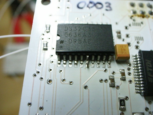
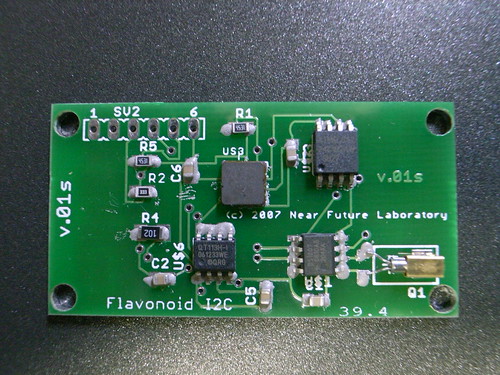
Parenthetically — the chip in that photo? It’s a real-time clock. It’s called the DS32C35 and its made by Maxim IC. It has a couple of alarms built-in that you can set. It knows the time — day, date, month, century, seconds, minutes, hours. It also has a 8kb of FRAM (flash) memory, which is really useful. It replaced the 1 megabit EEPROM I had been using. FRAM is better able to go through very many write cycles whereas EEPROM prefers less (by about an order of magnitude it seems.) Since I’m basically logging data on a frequent basis (recording readings every minute or several minutes), this is a great design alternative. I had also looked at some FRAM devices from Ramtron, but when I found the DS32C35, I integrated it in the design. It also has an on-board crystal, which further reduces the design hassles and parts count. So, when I was using the DS1307, I had to have an external crystal, which took up lots of room, relatively speaking. (You can see it here in the bottom left of this 1st version of Flavonoid.)

Flavonoid v.01s (I2C)

Depth of Field To Add "Depth" To The Interface

PownceFog

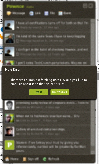
I noticed this while running the little Pownce desktop applet. It moved the window into “the background” by blurring it out a bit as if there were depth to the screen. I’m not 100% sure I like this. I haven’t seen it ever before I don’t think — and it made me wonder if I was getting ready to pass out or something.

I guess I have even more questions about Pownce itself. You know..the service.

Time, Motion, Touch

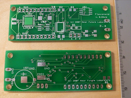
These are some images documenting one of the first Flavonoid prototype designs. During this process, I was learning how to turn the schematic design for the project — the “logical” description that shows circuit connections and components — into materialized printed circuit boards. As part of that process, I sent the PCB designs to two different board manufacturers, a process I document here. The boards are named v.01 and v.02sfe to designate the two places I sent the boards. Both are the same design. The designs were also ones wwhere I didn’t want too much happening, or too much to inevitably debug on one board. So, I left the microcontroller off. In essence, these are “dumb” boards — they require a microcontroller to be connected to them to do anything useful. In subsequent versions, I was less timid and put everything on one small board, as it should be. What this board does, and why it’s here in this post, is record time, physical motion and touch using a DS1306 real-time clock, an LIS3LV02DQ 3-axis accelerometer, and a QT113 capacitive touch sensor.

* Time, motion and touch or contact are three semantic elements that the Internets claim to diminish, but do so for our own good. For instance, for the good of allowing us to instantly communicate with friends, work colleagues or family. For the good of allowing us to work from home, or get something to someone else without having to physically move, or physically move material or ship a document. Or for the good of mitigating against the necessity of face-to-face contact.
There must be a balance between instant (messaging, downloads) and slow (mail, reflection) time scales. Or between largely sedentary digital activities (heads-down, screen-lock, sofa gaming) and embodied kinesthetic activities, like the things we do to “get away” from the screen — walk, sport, stretch. Or between mediated contact and physical touch?
It might be interesting to consider time, motion and touch as idioms whose characteristics should not be mitigated against, at least for the purpose of reflecting upon what digital life would be like if we operated in a middle ground between eliminating time delays, for instance, and having some playful or meaningful interaction with time above the sub-minute scale. (For instance, electronic games in which playing longer gains points.)
What would a world be like if things weren’t quite “instant”, but used elongated time as an interaction element? How could our own physical motion create a mechanical interface between the physical and digital worlds — beyond mouse movements or finger twitches and closer to Wii-gestures? What are the ways in which time, motion and touch be used to create a meaningful bridge between 1st life (physical) and 2nd life (digital)?
I started designing and building these sensors devices to simultaneously accumulate time, motion and touch to experiment with ways in which these idioms might be used to express some sort of online, digital, 2nd life activity.
I’ve called them “Flavonoid”, mostly because I liked the way the word sounds and its fun to hear people say it in a questioning way. They’re designed to be small, something that you carry with you all the time, like a cell phone or such. The firmware being created stretches out the dimensions of time, motion and touch so they deliberately “slow” down any accumulation of data — they won’t be “expressive” (have effects) for quickly-done activity. Time is not quick, but ponderous, relatively speaking, so that hour have meaning, but seconds can’t be measured. They’re positively glacial objects in the era of instant messaging, digital switches and network data caches.
And these three semantic idioms — time, motion, touch — work together, not separately. More expressive outputs come from these three idioms when they are integrated together. Time alone (without touch or movement) means something different than time with the object near one’s body. Motion for a brief time, alone, means barely anything, whereas sustained motion while holding the object or having it in one’s pack, has richer semantics.
The interaction semantics I’m angling at is this idea of creating an application syntax based on establishing a sense of Durable Affinity between a person, a lively designed object, and the expression in a digital, online form that these two can create through time, motion and touch based activity.
At the next level of design, they won’t look like they need a Homeland Security clearance certificate.
Why do I blog this?
To start figuring out why I’m spending so much time building these sensor amalgams devices.

Just A Few Related Things
Ross O’Shea’s G-Link
SLOWMail
Nintendo Wii
Teku Teku Angel
Piedimonsterz
Control Freaks
Flavonoid, 1st Prototype (submitted for consideration in C5 Corporation’s “Quest for Success” competition at ISEA 2006, San Jose.)

My Own Notes
Flavonoid Research Wiki Page (1st, 2nd, 3rd prototypes)
An API For Durable Affinity
Notes on Motion Sensing
Pocket Sakura
Notes on Pedometry
“Viewmaster” of the Future
Vis-a-Vis Games
Flavonoid Related

Technorati Tags: , , ,

Research Bulletin Abstract: An API For Durable Affinity

Flavonoid PCBs from BatchPCB

Title
An API for Durable Affinity: Engineering Interfaces That Matter

Short Title
Why I’ve been engineering time, motion and touch sensors

Summary
In the era of an “Internet of Things” design for interfaces between humans and devices becomes increasingly important. The pervasive reach of the digitally networked world means it is likely that “things” — computational objects — play an increasingly consequential role in the establishing, maintaining and knitting together networked social formations. It is even conceivable to imagine that these sorts of things may themselves become lively, engaged social actors. How do we want to interface with these networked objects, and what sort of interface semantics would move computer-human interaction design out of the often awkward, frustrating Proterozoic era we currently inhabit, into a more habitable, lively, human-scaled era for computer-human interfaces?

Abstract
This paper is an explication of a theory object constructed to develop a computer-human interface syntax called “durable affinity”. Durable affinity describes a kind of semantic interface between a computational device and a human that effects control over the device, but through less typical, instrumental mechanisms. Durable affinity interface elements consist of real-time, embodied motion and touch. These elements are elongated in degree. Time scales are in the range of minutes to days, while embodied motion is measured in degrees of sustained activities and touch moves into the degree of holding rather than momentary contact. By using “human-scaled” interaction elements — real-time, embodied motion, and touch — durable affinity interfaces are an attempt to establish a niche of ambient, paced, calm computational environments.

In this experiment, three primary application programming interfaces (APIs) are developed for the purposes of investigating the creation of “durable affinity” — meaningful device-human interfaces that have more aesthetic semantics than typical instrumental device-human interfaces. These three APIs are real-time, motion and touch. The theory object is composed of a small, portable computational device designed and built by the author. The device contains interface technology for these three APIs. In effect, the device is a platform for experiments in durable affinity interfaces. By connecting the device to, for instance, a small microcomputer, the elements of time, motion and touch can be accessed as interface components. Essentially, the platform becomes analagous to a typical interface platform such as a computer mouse, only rather than using horizontal motion and button clicks, the platform uses time, three-dimensional movement, and touch as components of the interface syntax.

To further the semantics of durable affinity, these three APIs are elongated beyond what many computer human interfaces consider rational, or useful. In the durable affinity context, real-time is measured in days rather than milliseconds; motion is measured in sustained, body-based activity such as a long walk or hours at sport rather than the twitch of one’s wrist; touch is measured in the degree one would find with holding hands, rather than momentary contact found in typical instrumental computer interfaces.

For the purposes of this experiment, the device platform described above is used to create an email message receiving device to help explicate aspects of the durable affinity concept. Contained within the device is an email message sent from a significant other to the device’s human. The message very slowly reveals itself over a period of days if the device’s human creates an affinity relation with the object. In order to unlock and reveal the message, presumably a message with some semantic weight, the device’s human must hold it for periods of time as if it were a treasured gift, and bring it along while engaged in routine activities like going to work or shopping for groceries.

By deliberately creating such an enduring, sympathetic interface between a computer and human, this investigation finds ways to wrap a richer set of human-scaled semantics — beyond pure instrumentalities — around computational devices.

Motivation
The goal of this project is to investigate ways of establishing a positive historical relationship with objects by inscribing them with a level of meaning attuned to the register of human emotional sensibilities. There are a range of motivations for such a goal. Such motivations include: establishing lasting associations with things so as to avoid a culture of disposability; finding areas in which an increasingly crowded, fast-paced information space can have corners of calm, slow, ambient experiences; establishing niche areas of aesthetically and emotionally rich digital networked interactions.

Creative Commons License

This work is licensed under a Creative Commons Attribution-Noncommercial-No Derivative Works 2.5 License.

References
Chapman, J. 2005. “Emotionally Durable Design: Objects, Experiences and Empathy”, Earthscan.
Deschamps-Sonsino, Alexandra. Position Paper presented at NordiCHI 2006 workshop “Near-Field Interaction and the Internet of Things”, Oslo, Norway. URL (accessed December 2006): http://www.designswarm.com/NordiCHI_asonsino.pdf
Weiser, M. and Brown, J. S. 1997. The coming age of calm technolgy. In Beyond Calculation: the Next Fifty Years, P. J. Denning and R. M. Metcalfe, Eds. Copernicus, New York, NY, 75-85.

SLOWmail

A project that Carolyn Strauss and I proposed, to do in collaboration with graphic designer and artist Zipora Fried received a Rhizome Commission! We’re pretty excited. We’ve been chatting around the project topic basically since we first met a couple of years ago now.

Here’s the project write up

I’m also doubly psyched for Aaron Meyers, a cool albeit way too lanky (especially for how much he eats) graduate student in the USC Interactive Media Division‘s MFA program for getting a Rhizome Commission for his Torrent Raiders project — basically his thesis project. Congratulations Aaron!

Here’s the short blurb for SLOWmail from the Rhizome Commissions Finalists page (and a link to the SLOWmail wiki containing some preliminary notes):

SLOWmail is a new email service that deliberately slows down the pace of electronic messaging. It operates at the opposite end of the time-to-delivery spectrum from traditional email, offering a more reflective experience for both sender and recipient, and challenging forth more artful, writerly and meaning-ful correspondence. SLOWmail leverages social software practices and idioms- ontologies, semantic tagging, media sharing, presence awareness- seeking not to supplant other forms of electronic contact, but rather to complement them. As platforms like IM and SMS increase in popularity, SLOWmail explores the possibilities of less instantaneity and more calm in communication, creating a new rhythm of social interaction. The act of composing a SLOW message requires time and care since it is largely the semantics of the dispatch that will determine the pace of its delivery. The author tags his correspondence to describe a relationship to the recipient (mom, lover, enemy, etc), their respective geographic locations and the mood of the message (solemn, jovial, angry, etc). Once sent, the message is filtered through the SLOWmail software environment which further interprets its meaning and assesses the sender-recipient relationship, factoring in message history, frequency of correspondence and past message content to determine the delivery timeframe. At any time, users may login to the SLOWmail web site to view messages in progress, experienced as compelling graphic visualizations that develop gradually to represent pending correspondence. The visualizations will be developed by graphic designer and artist Zipora Fried, who will generate a series of full-quality digital illustrations to convey ‘moods’ that correspond with the differing tones of the messages. These will be programmed to render over time at varying rates. The slow unfolding of these illustrations will provide an abstract indication of a message’s time trajectory, without revealing the exact delivery date. The service thus offers a unique air of excitement and creativity, encouraging users to be attentive and inventive as they look for the hidden meanings behind words and phrases they employ, opening up time for contemplation and enjoyment, while cultivating social bonds. With SLOWmail, it is not our desire to create a nostalgic system, but rather to use all the features and capacities of digital media — rich visuals, networked connectivity, databases, etc.— to create a new mechanism for electronic correspondence, where speed is surrendered to the promise of aesthetic character, pleasurability and new social connections. SLOWmail is a project of slowLab, inc. a New York State nonprofit organization that serves as a laboratory for ‘slow design’ thinking and practice. slowLab is dedicated to creative innovation that cultivates slower rhythms and expressions to balance today’s fast flows of information, rate of resource consumption and the increasing speed of daily encounters. slowLab founder Carolyn Strauss will serve as Project Director for SLOWmail, overseeing design, creative implementation, administration, publicity and documentation. Technologist Julian Bleecker will be responsible for the system design, software programming, information architecture of the public-facing web site, oversight of beta testing, and ongoing technical refinement/iteration. Technical and administrative interns will perform quality assurance and pr/marketing services.

Why do I blog this?Another project to help answer questions about how patterns of social communication, expectation, attachment and formation are created through networked digital publics. What are other patterns that can arise through digitally networked publics? What forms of communication, what registers of dialogue can come to be when speed is bartered for ambience, calmness, and aesthetics (other than wiggly postcards)? I dunno, so I do a project.

Slow Mail

[wikilike_img src=http://static.flickr.com/54/130168405_804e311664.jpg|align=thumb tcenter|url=http://www.flickr.com/photos/julianbleecker/130168405/|caption=an adjunct to the typical way i engage my email inbox? is “mail” even the right metaphor? do we need a new imaginary for networked, digital social communication of this kind?|width=500]

Recently I worked closely with Carolyn Strauss of Slow Lab on a proposal for a kind of messaging delivery architecture that had a deliberate aesthetic component, and derived from a metaphor of paced slowness. The idea of having a variety of mechanics for social communication is important, I think. Rather than just email, instant messaging, SMS, mobile mail, etc., we thought together about a channel of communication that was more deliberate and writerly. Something that was an adjunct to these fast-fast instant modes, we architected something that was a kind of gummed up transport that, besides being slower, created a sense of anticipation on the part of the recipient in that they would be given some kind of unfolding, growing, articulation visualization indicating that a message was on its way. It may take days or longer for the message to arrive, but you’d know it was on its way.

I say that this is an adjunct to email because it isn’t at all motivated by creating an alternative to email, but rather an additional communications transport to add to our quiver of existing transports.

So, I’m mentioning that to mention another kind of theory object style project, that I’m sure has a rich precedent in previous projects and if any one knows of such — please do let me know. It’s an adjunct email client that falls within the class of ambient style render layers for the channels of communication we receive. Even for a “datavore” like myself, the constant “bling” of new emails and the continuously up-ticking register of how many unread “articles” in my NetNewsWire trough of feeds can be debilitating at times. Rather than seeing these numbers grow and grow, I like thinking through some of the considerations that Paul Dourish in “Where the Action Is”, John Seeley Brown and Mark Weiser do in their essay “The Coming Age of Calm Technology”, or Hallnas and Redstrom in “Slow Technology — Designing for Reflection”.

How do we deal with data feeds when we’re not hungry for lots of data? In the coming pervasively and ubiquitously networked environment, with tons of sensors and a glut of data, how does one avoid data dyspepsia? Ambient modes of display, engagement and interaction is one way to consider how one would participate in richly instrumented pervasively and ubiquitously networked environments. Thinking of such environments as torrents of raw data is definitely not the way to think of a further evolution in the way we cohibitate with sensors, digital networked social communication, and such all.

Such an approach makes it quite intractable and unappealing and, frankly, is the one sure way to frame the problem so as to make it impossible to derive a solution. Who wants to be one’s own data traffic controller? No one — we just want to get on with the task of making meaning in our own individual worlds, not managing data.

My stomach gets in knots just thinking about what my email inbox might look like in the morning, and it’s not because I don’t like having lots of correspondence — it’s because email and the way it’s typically presented to me is just plain wrong. Electronic mail, metaphorically, borrows from postal mail, at least and there we almost never were in a situation to deal with 83 pieces of incoming a day, let alone incoming all throughout the course of a day. Lines and lines of subject messages becomes difficult to process and manage. I’d rather have another kind of visualization, something that was more palatable.

So, I’ve been thinking through this problem. I think email, in particular, is ripe for another set of metaphorical underpinnings. The Slow Mail project is one attempt, and this other project to create adjunct visualizers for incoming mail is another. Arg..it’s a bit of a burn that “mail” is the built-in metaphor that undergirds both of these adjunct projects, but such is as it is.

One idea for this adjunct email client sort of thing is to create a floating window on the desktop, similar to the way an IM client appears, that gives some kind of sense of the “presence” of particular messages — there might only be a few of these in a stack, regardless of whether there are 87 new messages in the inbox. One of the indicators might reveal that there are messages from someone that you’ve had several recent exchanges with — an ongoing and active correspondence. Another might be an indicator in a cool, mellow color, that you have several messages from a discussion group. Yet another might indicate a message from someone especially tagged as significant, etc.

I’m thinking a simple step into this question would be to compose such a visualizer head-end in Flash, with a middle tier done in a language with which I have some fluency, like Java. It would really turn my server-side IMAP Mailbox into a database, walking the hierarchy to create some semantic inferences. Just simple stuff.

Why do I blog this? Because right now, as I write — I feel threatened by my email client. I’m afraid to start it up because starting it up, takes me somewhere else, off the track I am on in the morning. I wish I had just a simple indicator that was almost like a pleasant garden before stepping into the day’s data blitz.

This became SLOWMail, which received a Rhizome Commission for 2007. More here.

Technorati Tags: ,