To Be Designed // Detroit // October 1-3

As the name of our Laboratory implies, we’re very interested in the hands-on, pragmatic ways in which one can imagine and then create things from and for the near future. In that sense, we design products and the like. Stuff. We make stuff. They are just things from and for the near future. Which shouldn’t be a problem. They just need to be designed with care and a sensitivity to what futures we expect or would like. Then the opportunities for that stuff is revealed.

Over the years we’ve developed an approach and a sensibility for thinking about the near future. It’s an approach that is object-based in that we make things — call them products, sometimes software, sometimes other kinds of wares. It’s a sensibility that is infused with the quotidian and everyday almost to the point of the mundane, because ultimately everything trends towards that and things seem more real and “read” easier when they simply exist without fanfare and hype. And always our approach is provocative, as in provoking conversations and stories and drama about the near future.

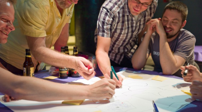
A few months ago, I asked a small group of friends to meet me and my Laboratory cohort in Detroit at the beginning of October. I wanted time together with friends whose work shares something with the Laboratory’s way of making and thinking. I wanted time to be less yammer-y and more hammer-y. The goal was to participate in a three day workshop. We were to make something and Detroit seemed like an apropos place to make a future thing that is more everyday than the future imagined in Palo Alto. Plus, it’s about midway between Los Angeles and London, more or less and I wanted to make it easy for friends from other parts to come, on their own dime, and do some work.

The work of the workshop was to make a Design Fiction product catalog using all the principles, approaches, tools and work kits that the Laboratory has gathered together over the years.

A bit of background, then.

When I first looked seriously at how science fiction shapes and informs the way we think about technology, it did not occur to me that one could do science fiction. Rather, one received it as packaged — in a book, a film, comic, a television series, etc.

Of course, I’d come to understand differently. When I wrote my dissertation and in subsequent projects, I came to realize that telling stories can happen in many ways besides novels and films. Objects can be evocative of stories — props and prototypes that our imagination begins to fill in with their reason for existing, their operation, their role.

In what I see as an addendum to that earlier work, pre-21st century work, I discussed the possibility that there’s a space for design-technology in between science fact and science fiction. The emphasis on technology-informed design is deliberate and its more a reflection of my own engineering background and interests than an attempt to cordon off other significant facets of design.

Design-technology makes sense in the idioms of science fact and science fiction so — here it is: Design Fiction is the deliberate and purposeful act of doing fiction through design. It’s telling stories by making things up, with an emphasis on “things” and their making.

So, this is what we did. With gracious support from the Penny W. Stamps School of Art and Design we all gathered together for a quite intensive three days of making things up. The brief was simple: make up a product catalog from the near future.

Christian came along and helped represent the work of the workshop with some fantastic video documentation which will become part of the documentation output. In the meantime, here’s the teaser.

TO BE DESIGNED (teaser) from svanes on Vimeo.


That’s it. Very Design Fiction-y. This is the catalog that some creative agency might gin up as a prop to sit on a living room end table and barely get a moment of screen time in some science-fiction film. But, it’d be true to itself, rather than stuffed full of blank pages to make it puff up a bit and look tangible. Someone would take the brief seriously and fill it with things-that-could-be.

And so we did that — we made a Design Fiction product catalog. Something from the near future.

Why a product catalog?

The product catalog serves as a reification of the needs, wants, desires, ambitions, fears of people as decanted into made products and provided services. And it’s an everyday, tangible thing to which most anyone can relate and comprehend.

With a product catalog, there is no need to be explicit, didactic or theoretical about the characteristics of the world at some unspecified moment in the near future. The products in the catalog serve as stand-ins and props that are representative of the everyday drama implicit in their existence. You can imply quite a bit with this form. The product catalog begins an evocative conversation with the everyday of some near future world.

Our rough working model was the SkyMall catalog for its outlandish everyday-ness. Skymall is a reminder that the world and its perceived needs, deficits and dreams has an extreme diversity. We had many other catalogs as reference points, too. Everything from the canonically yellow, talmudic McMaster-Carr to Hammacher-Schlemmer to specialty hunting outfitters and archival Sears & Roebuck catalogs.

To readers of this blog, desire and need may be defined more by the considered and crafted high-order capitol-D Design products. Our approach was to be different. To be more everyday. To travel a bit further along the hype curve and a bit towards the 99 cents end of the long tail, where normal humans live.

At this end of the future product spectrum, we could season the products with a pinch of humor — specifically satire — in order to provide the necessary twinge of criticality that makes the catalog have different effects on the reader. Its more legible to a wider audience than a more pure critical theory approach to design. Humor is also more fun. And it also leads to many more probable near future products and services, in my opinion. Although we’re not trying to predict the future. We may be placing some side bets, though. Ultimately readers will find the catalog activates their imagination and I wouldn’t be the least bit surprised if its contents lead to actual, science fact products. (After all, the idea of Twitter is pretty hysterical even after its contributions to Green Revolutions and political take-downs. It’s more than a little bit of a satirical jab at our need to jabber. And don’t get me started about wheelie luggage. That must’ve seemed idiotic at first blush.)

For example, we sell a product — “Rejuvenating Ear Fresheners” — that is recommended by 4 out of 5 doctors for those who spend more than 70 hours per week in front of a screen. “Second Nature” re-engineers your food by neutralizing any GMOs with an easy spray application. “Armstrong” (“Pure Blood, Pure Focus”) home blood oxygenation kit relieves you from the burden — and danger — of breathing dust, pollen and toxin-laden air for up to three hours. “Carbon Rain” by Tactical Weather Systems provides extreme weather protection for your fight against big weather and is made of nanofibre ferrule and kevlar skin to protect you from El Nino events, acid rain, high-UV conditions, volcanic ash, &c.

And so on, like this, for 179 products.

We had three days and wanted a tangible outcome, so we collectively selected 30 to create a full product description — name, image, price, description, key-selling points and customer endorsements. With these we did a couple of iterations on an actual catalog that we could all gather around and discuss. Subsequently we’ll do the same for some significant portion of the remaining products and then produce and print the catalog, and figure out a good way to distribute it.

A few parenthetical notes.

Megan Mulholland who participated in the workshop did a wonderful write-up of the To Be Designed workshop itself. I could do no better so you may as well read what she wrote.

WorkKit-tumblr_manyb3K5OT1r3ntzxo12_r1_1280


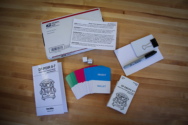
We made a prototype of a Design Fiction Work Kit that was sent out to participants in advance of the workshop. It was quite a good bit of fun to make. It was also meant to be a sort of back-up chute if we got stuck for ideas. That didn’t happen — 179 reasonably suitable product ideas in an afternoon — so we didn’t get to use the kit directly, although I do think it set the tone and mood of the workshop indirectly. I think with a bit of refinement and some additions, the work kit could be a fantastic tool for future TBD events.
Continue reading To Be Designed // Detroit // October 1-3
To Be Designed // Detroit // October 1-3

In a week’s time the gang will convene in Detroit to create a product catalog of things from the future. We’re putting our Design Fiction insights, experience, skills and moxie to the task of imagining — what are the things one might see in some future fictional catalog of stuff.

We’re not being precious, because there are interesting things from the future that are not all bright and gleamy and iPhone-y. There’s so much more to the world than the first world’s favorite digital devices. There’s lots more fun things than that. So, we’ve been seriously considering using something akin to “Skymall” as our conceptual model. Lots of weird things that lots of people seem fascinated by and I guess must actually sell, otherwise I suspect Skymall would’ve folded ages ago. (Unless there’s some weird business model they’re working under that maintains the business despite the fact that people aren’t buying, like..Sasquatch garden statuettes and LED hair growth helmets and the like.)

In any case, this is what we’re going to set out to do. At some point after the workshop itself, we’ll produce and print the catalog itself. In true Design Fiction fashion, it will be a prop around which conversations happen about desirable and undesirable futures. We’ll use it to speculate and ponder and have fun. To do some real creative play. Learn about techniques and approaches to doing design work that is solid and good and all that — but also fun.

It’s a small group gathering there in Detroit because this is all a prototype of a workshop that we hope to do more of in the future, so we’re learning and testing our process.

It’s in Detroit because I called up John and asked him what the weather was like in early fall and he said it was fine. Plus Detroit is good and weird and — on this map I drew on an index card — about half way between Venice Beach and the western bits of Europe.

It’s called “To Be Designed” because there’s a tattered, Zizekian pun somewhere in there between the acronym “TBD” and the kind of future that is always endlessly not quite yet. Or something.

We made a work kit to go along with the workshop to test some facilitation technologies. It has a random number generator and a deck of cards to create minimal design briefs, and a book of useful design idioms. It’s going to be hellafun.

Follow us on Twitter, Flickr, and Pinterest. We’ll be live starting October 1st.

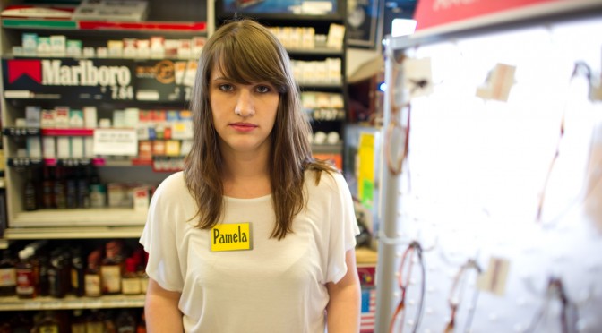
Corner Convenience // The Near Future // Design Fiction

We did a Design Fiction workshop as a kind of follow on to the Convenience newspaper. Our idea was to take the observation that the trajectory of all great innovations is to asymptotically trend towards the counter of your corner convenience store, grocer, 7-11, gas station, etc. Discerning the details as to why this occurs isn’t our primary concern. It’s an observation that tells some stories about convenience as a cultural aspiration of some sort, broadly; it’s a way of talking about industrialization, capital, the trajectory of “disruptive innovations”; it’s a way of talking about the things we take for granted that we wouldn’t were convenience to go away in some sort of puff of apocalyptic dust; it identifies the net present value of things as 99¢ and buy 1 get 1 free.

But that was the newspaper version that took the things today and made them plain. (You can get a PDF of it here.) It also serves as the conceptual set-up for what we did next which was for Nick Foster and I to tramp to Tempe Arizona to the Emerge event at ASU in order to run a workshop that would take the Corner Convenience as our site to do a bit of Design Fiction gonzo filmmaking. We imagined the Corner Convenience in some Near Future.

A couple of notes about the production of these films, but also the production of Design Fiction films generally. As the genre progresses — and it is progressing like crazy, which is fantastic — and evolves as a way to do design and make things rather than just film them, systems and structures and processes get informally put into place. I’m talking about things like styles and conventions and the visual language of Design Fictions. I’m attentive to these because it becomes useful in a Bruce Block sort of way to make use of the developing visual language and genre conventions.

One thing I notice is the way that now, early on in evolution of Design Fiction, tools have determined, or perhaps over-determined, what gets made to count as Design Fiction. Contemporary visual effects tools and software are incredibly sophisticated at what they do. I think they may have a tendency to over-determine the filmmaking. By that I mean to say that, now that we can do desktop motion capture, planar tracking, and animation in scenes — we end up with Design Fiction of surfaces as screen interfaces as if that’s the future of interaction. Which it might be, but seriously — what else? At the same time, things like green screen which is effectively a drop-down menu item in AfterEffects, or the insertion of CAD rendered objects composited seamlessly into scenes with (almost) drop-down menu item workflows, etc. That’s all a bit of the tool leading the ideas, which is generally disconcerting especially if you don’t realize or take notice of the way an algorithm is determining one’s thinking about what could be.

Don’t get me wrong — they are seductive eyeball candies. The Corning one is particularly enjoyable as pure visual experience. So is that Microsoft Office future fiction film. But these don’t feel real except for the degree of finesse in the visual effects. It almost feels like someone found the tools to do this and then the tools over-determined the diegetic prototyping. The tool was the door knob and then the designers or marketing people or whoever was behind this took the door knob and tried to build a house around it. And, in any case — they are so clean and almost fascistic in their fetish of the slick, glamorous, gleaming and super pricey stuff we’re being told we’ll live with in the near future.

What about the forgotten underbelly of the mundane futures? The ordinary and quotidian. The things that are so tangible as imminent as to be almost ignored. Like the things one would find in the Corner Convenience store but were once fantastic, extraordinary, mind-boggling disruptive stuff.

Using the Corner Convenience as our design fiction site directed us to consider things that were once amazing and are now 99¢ or $1.99 or 3 for 99¢. They’d be available *everywhere, which is as important to consider as some sort of silly ersatz coffee table that has a touch screen built into it. A thing that 1% of the world cares about, or can even comprehend or conjure some half-baked rationale to own and use before it gets tossed out when its planned obsolescence means it won’t show the antique JPEG format anymore without a firmware upgrade that probably won’t upload to it because of some byzantine tech issues that frustrates you to the point of not even caring about the thing anymore. You know? I’m still trying to get my brand new $99 5-star reviewed Brother laser printer (which replaced the 10 year HP I had that just stroked out and died) to run the crappy configuration software so I can use its built-in WiFi features. But, like..I’ll always be able to flick the flint-y scroll of a BiC lighter and make fire.

That was an aspect of the design principles that shaped these three films we made. We were deliberate in designing the production and the things in such a way that they were whiz-bang-y iPhone things with touch screens and surfaces. It was real stuff that would tip into that realm of convenience without missing a beat, and without Wieden+Kennedy running a campaign that seduces the 23-year-old bearded, skinny, waifish, Williamsburg/Brick Lane/SOMA hipsters into bending their knee — again — to the Palace of Apple.

In this Near Future Corner Convenience Store, Snow Leopard is a variety of synthetic meat jerky, not an operating system.

Anyway. Enjoy our three design fiction films.

The Players
John Sadauskas — Ersatz Shoplifter
Julie Akerly — Clerk
Dan Collins — Caffeinated Drunk/Hangover Guy
Joshua Tanenbaum — Panda Jerky Porno Trucker Guy

Background Talent
Nicole Williams
Muharrem Yildirim

Workshop Props & Make Stuff Team
Alex Gino
Joshua Tanenbaum
Adiel Fernandez
John Sadauskas
Nicole Williams
Muharrem Yildirim
Byron Lahey
John Solit

2nd Unit Production
Byron Lahey & John Solit

Thanks To Tops Liquor Staff
Greg Eccles — Owner
Matt Bannon — Manager & Nametag Maker

Special Thanks To
Assegid “Ozzie” Kidane

Directed By Julian Bleecker
Produced By Nick Foster

A *Near Future Laboratory* Production

Weekending 19122011

On the Swiss front of the laboratory (Nicolas), there is progress on the game controller project. Laurent and myself indeed met with scenographers in Lausanne to discuss the upcoming presence of the joypad collection at the Swiss Museum of Science-Fiction (yes, there is such thing as a Swiss Museum of Science-Fiction) in 2012. We chatted about the way the controllers will be presented, a chapter I wrote for the catalogue of the exhibit and also a new visual representation to be displayed as a complement to the devices. It’s the diagram that you can see at the beginning of this blogpost, designed by Laurent Bolli. What started as a book project is now slightly more complex with various artifacts like these. It seems that we’ll also sell the poster with postcards. We have the outline ready and part of the book is already written but the design approach we favored lead to intriguing bifurcations: it seems that every opportunity we get to discuss the joypad history lead to some new viewpoint that we try to express visually. And this representation then enables us to get a different perspective on the topic per se. Hopefully, I’ll write during the Christmas vacation!

Apart from that, the week was also devoted to a day of lectures at the Geneva University of Arts and Design. Monday was about interviewing techniques in field research and the afternoon about user participation in interaction design (from user-generated content to designing “hackability”.) This fostered an interesting discussion about repurposing and hacking. Students argued whether designing something so that people can create new features/functionalities is different than letting extreme users hack a system. What we agreed on at the end of the course was simply that those are different kind of possibilities along a certain spectrum… which allowed me to highlight the work of Michel de Certeau and the importance of observing peculiar ways to repurpose things in the environment (food for thoughts for designs).

And finally, I spend the end of the week conducting a field study in the train between Geneva and Zürich. The point of this project is to explore the use of (light) head-mounted displays used in conjunction with cell-phones. I can’t talk much about this but we’ll make things public at some point, perhaps an academic publication if time allows it.

At the Los Angeles Station (Julian) most of the last week was focused on a workshop at the Nokia Advanced Design Bureau where we had a wonderfully intense two day Project Audio workshop with our friends Tom Taylor and Phil Gyford from RIG. That was great good fun and engaging. Working with friends from outside the bubble of Advanced Design provides a bit of a checksum on the work. That’s to say — facing inward and not nearly as public about what we do and how we do it as we should be (and could be), bringing in trusted, thoughtful, engaged partners helps validate or repudiate the design we may *assume is fab, but may or may not be. With them alongside, we were able to move from some axioms and principles that came out of our first workshop in London a month or so ago to quite tactical plans as to how Project Audio moves forward in the 2012. Some more thinking, lots more making and some things that are very fast moving and involve multiple other participants who should be engaged in the design and making work. In between those two workshops we managed to find a way to work across eight timezones — and realized that the tools for doing so are a bit broken.

In other news, questions still abound in the Executive Floor as to when and why to make things become real produced things and when things are best as props and prompts to help shift and advance what design does.

On the one hand, making a “real” thing can be quite viscerally satisfying. You can say — “Look! I *made that thing hanging there on that rack in that box. I *made something that is real!” I understand that motivation. And oftentimes making that sort of real thing in that sort of real world is necessary because that, ultimately is how you make money to buy bread, if you work at a place where revenue is made through paying consumers. That’s good. And maybe along the way you’ve helped make people think differently about what can be in the world because many people? Well..many people consider least common-denominator crap like Color Changing Digital Alarm Clock Cubes is as good as it gets. And all good advanced designers aspire to advance that assumption and do things like set new high-water marks in the realm of little things that make the world just a little bit better.

On the other hand, making theory objects, props, prototypes and MacGuffin’s have the effect of poking and provoking the practice rather than the consumer — they are effective as ways of changing design in a wider sense because designers are the audience. They are potentially infectious and pedagogical. Of course, it is guaranteed they are incomplete almost by definition — you’ll never get the thoroughness and inevitable compromise that comes with tooling for manufacturing or constructively arguing with “The Business” about what this is and who it is for. The design priorities are sanctioned by the priorities of getting something that goes to the larger marketplace and you end up with a diluted thing that does/teaches nothing. I guess my point is that the prop can teach and the “real” (eech) thing has the potential to be a sad, diluted thing that eats time and money.

Continue reading Weekending 19122011

Weekending 10302011

Oh, okay. Last week I was in London.

There was some fun, cool Nokia stuff going on — besides Nokia World, which I didn’t attend only because there were also other things going on, including this event at the Design Museum called People Made in which a well-curated exhibition of Nokia’s contribution to the world of mobile social networked stuff. Despite assy and snarky remarks on the influence Nokia has had on the design of these sorts of things, I thought this was quite good, quite legible and just small enough to be digestible and large enough to note the important bits, like the evolution of mobile picture taking, degrees of portability and things to come in the near future.

There was a swell two day workshop for Project Audio with the fine folks at the Really Interesting Group. That included some days inside at Whitechapel Gallery and a field trip to the Science Museum, which has a great exhibit of audio things from the early 20th century into the networked age. Old radio sets and things with knobs are great for thinking about what the future holds for sound design and audio devices and talking to people. And, it was fun to see Listening Post there — I didn’t know that the science museum had bought one. That’d make the third exhibition space in which I’ve seen it — first at The Whitney when it premiered, I believe way back in the day. Then at the San Jose Museum during ISEA in 2009 I think it was. It holds up remarkably well. It’s quite prescient, too — in particular as regards this idea of “trending topics” in some sense. I’m not sure precisely what algorithm Mark Hansen is using to extract content (obviously chats and discussions in text) — but one gets the sense that the statistics is identifying things of import or interest. Now — it might not be what *most people are talking about, but they seem to become poignant statements indicating states of mind. There is also quite excellent use of silence in such a way that one is not thinking — huh..is this thing broken? Some ambience and machine noises give the device its mechanistic quality that is nice and sculptural and real and that of a thing with momentum. Which is very much unlike most digital/computational devices. I really like the machinic character of this thing, Listening Post.

I had a visit with James Auguer over at Design Interactions at the RCA. Nick Foster was there as well. That was fun. I’d never been. It felt like an art college. I gave a little impromptu talk to a clutch of students. And Noam Toran was there and gave me some lovely documentation of his projects. I especially like the series of objects he made called The Macguffin Library. It beautifully captures the way Hitchckock’s use of these opaque plot devices are objects to move a story — which is a concept that can be directly applied to the Design Fiction notion. These are things that are props that stand in for whatever it is that motivates and moves a story along. They’re nice as a concept because the thing itself matters even less than its functionality — except insofar as its functionality is to motivate a story.

There was a nice afternoon spent with the partner-in-crime Nicolas Nova discussing the future of the Near Future Laboratory and some exciting evolutions of our activities that will happen quite soon. Expect more to be going on here and some new folks coming along to make more things and create more weird implications and provocations. All discussed over toast, beans, sausages and eggs.

I was super excited that Geoff Manaugh rang to see if I’d be around to participate in this event at the Architectural Association called Thrilling Wonder Stories. I don’t know how to describe it except to say it was a full day of a seminar of presentations and discussions on a variety of Thrilling Wonder Story-like topics. I shared some thoughts and perspectives on designing with science fiction at the end, together with Bruce Sterling and Kevin Slavin. That was swell — fun and a great way to end the week in London.

That was pretty much it, except for one little thing that Bruce left me thinking about after that four hour dinner the last night. Venn diagrams. Evidently done by this fellow called Hugh Dubberly and the diagram contains the three circules and one is “DESIRABLE” the other is “BUILDABLE” and the other is “PROFITABLE”. The overlap in the center is what markets and capital understand as “real” stuff. You get these annoying debates within making-industries where that is the “real” deal. It was the introduction to my brief 15 minute talk at Thrilling Wonder Stories — people get shy and apologetic when they discuss things outside of that center “sweet spot” of things that are all-of desirable, buildable and profitable. “Oh, sorry — this is just an idea” or — “Oh, this is only a demo” or — “Oh, this is just a concept/video/bit-of-fiction”

Needless to say — we here in the Shameless Speculation Department of the Near Future Laboratory think that position is rubbish. There should be no apologizing for the imagination. Everything counts. I’d say even that the things outside of the sweet-spot even more than those in it. That sweet-spot is modifiable. Just cause something can be built does not make it “more” than the thing that can be massively manufactured because it fits in someone’s measure of what that sweet-spot consists of — what its parameters of “sweet-spotiness” are. And then this introduces a discussion about those parameters and scale and what profitability consists of.

That’s it.

Continue reading Weekending 10302011

SuperCollider: A Class at LA Public School

Sunday October 16 16:21

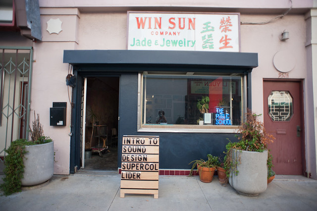
I’m taking a class through the LA chapter of The Public School on the SuperCollider, like..application, I guess it is. It’s more of a programming environment for making and processing sound. Good fun stuff. I really want to invest more time and energy towards the audio project and this seemed like a good way to start on that goal.

Ezra Buchla is teaching it.

SuperCollider is a rather terse programming environment with a kinda curious set up that requires services/servers to actually run the programs you write — or that are interpreted. I’m making assumptions that this was done so as to allow a distributed model of processing when things get hairy or maybe its just a fetish of the network and its possibilities for elastically distributing processing. In any case, what I’m most interested in is being able to real-time process sound and a little less interested in generative sound synthesis.

I never thought (just without even checking) at how rich and sort of — overwhelmingly weedy the SuperCollider API was. I mean — there’s tons there. I wish that some embedded hardware-y stuff could actually consume/interpret it somehow so that I could have really portable sound processing capabilities. What I’d like is a way to do process sound but I don’t want to have to do it on a laptop or something — should be able to do it in something the size of a 1/4″ stereo audio jack or something.

Sunday October 16 16:26

Sunday October 16 14:19

But, to contradict myself, I may in fact be also somewhat interested in generative sound synthesis — making sounds with things, objects and algorithms. It’s on the @2012 list of things to be some kind of music maker of some sort and meeting up with Henry Newton-Dunn (who made BlockJam a precursor and prior art of Siftables/Sifteo by a good 6 or 7 years) at the AIGA Pivot conference a couple of days ago was fortuitous because I remembered that he was a DJ back there in Tokyo. We had some excited conversations about sound and audio and DJ’ng and software to do all that. I feel a collaboration in the near future!

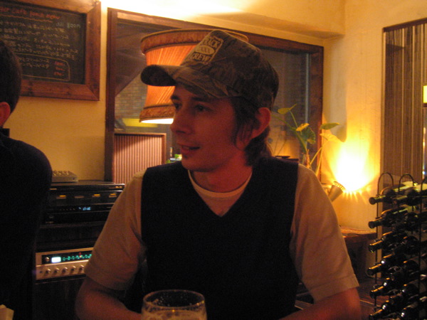
In fact, here’s Henry himself — this is probably when we first met in, like..2005 in Tokyo. Some hepcat spot. Check out that Hi-Fi “Set” in the background!

Henry

Speculative Design Workshop: The Era of Objects at V2_

Thursday September 29 22:14

Last week I was at V2_ in Rotterdam to participate in the event “Blowup: The Era of Objects”. It was a brief visit — too brief, of course — but well worth the time to help facilitate this workshop along with Alexandra Deschamps-Sonsino, Anab Jain and curated by Michelle Kasprzak.

There was an EPUB produced for the event containing short essays by Bruce Sterling, Ilona Gaynor, Anab, Alex, myself and others in this: The Era of Objects

The event started with Alex, Anab and myself giving a rapid-fire presentation to lay out some of our own perspectives and work on the theme of “speculative design” — which is an area of design akin to design fiction.

Parenthetically I think it would be worth spending a little bit of time excavating some of the distinctions and contrasts between these various ways of doing design — speculative design, design fiction, critical design — if only to be more specific and open a dialogue about the utility and techniques of these ways of seeing the world a bit differently in order to create new perspectives, principles, points-of-view and the resultant outcomes.

The presentations were short — 20 slides I think was the requirement, done almost pecha kucha style with automatic slide changing after about 30 seconds a slide, so I think we violated pecha kucha trademark rules.

In any case, I cobbled together a perspective on speculative design/design fiction that blurred the boundaries between the two, but also got me started thinking about how the two are distinct.

To start, I outlined three perspectives on what the future is and how it is useful as a way of thinking about what come to be. This is crucial insofar as it’s super important to think from a slightly different angle on what could come to pass. The future isn’t always bigger, brighter, better, better battery life or taller, &c.

To reinforce this I shared several of my “graphs of the future” — some crude hand drawings I made that show various ways in which the future is depicted — linear, logarithmic, a three-dimensional “spread”, a bumpy road of hype curves, &c. This helps reinforce this idea that the future is a point-of-view, which is crafted and created by humans based on a set of ideologies — not in a mean, evil way, but just plainly for the sake of framing what is understood as possible or desirable. Oftentimes though these sorts of points-of-view embedded in graphs are ideological in the sense that they are taken as “law” handed down from somewhere. They’re just points-of-view, like politics and therefore entirely flexible and free to be altered, subverted, re-interpreted and re-graphed.

I then presented what I consider three principles for speculating while designing with fiction:

1) It’s okay to let the imagination wonder — science, technology, design, fact and fiction are all knotted up anyway. By this I mean that once you are working in the broad territory of design, one should not be concerned about steering away from the austere pragmatics of “reality” — one should vector to-and-fro into weird, unexpected territory and flex the realm of what is considered possible. At the same time, be prepared to find that small components of the larger design problem are what one is really after — not so much space-age, fantastical luggage for the future but, in fact — just adding wheels to luggage may be the most significant outcome of getting a “future of luggage” design brief.

2) Realize that stories (and storytelling) are more significant than specifications, feature sets and engineering. As an engineer, this is hard to say, but I believe it more and more every time I’m forced to communicate. The list of sucks. The story, where you can take someone along a path and communicate to them in a way that is engaging and compelling — even if ultimately the base-level of what you are saying is a set of features and the engineering involved — is *much better than just saying what the features are. Show the experience of the design concept in a small story/film/animation/comic book. The hard thing is that telling good stories if really, really difficult. It requires practice and failure and refinement and iteration. I mean — there really aren’t that many good story tellers in the world, but it’s worth aspiring to be at least a satisfactory design storyteller. (Also, parenthetically — I’ve grown weary of the mantra that designers are storytellers. Not because I don’t believe it but because I’d rather see evidence of it, even to the point of workshops and curricula and all that. Maybe I’m overlooking something..a few are; most of course make fast-looking tooth brushes and over plastic-y bits and bobs of landfill.)

3) Science fiction/speculation can do things that science fact/pragmatic reality cannot. It’s more robust to speculate than to cordon off.

Then for the remaining few slides I gave some examples of HOW to speculate with design. These are three approaches/techniques/creative idioms..pastiche, re-enactment/re-imagining, making little films.

1) Pastiche is something I’m quite curious about — a way of moving in and out of reality and fiction, such as turning the reality of the Apollo 11 lunar lander into the cornerstone of an imaginary “owner’s manual” — as if normal humans might own Apollo 11 lunar landers and need to service them in their driveways like normal vehicles rather than highly specialized, hand-built space vessels.

2) Re-enactment/re-imagining, in the particular example I offer of the Tom Sachs project/art-piece “Space Program” is a form of pastiche — replaying an event but altering it subtly to explore alternative futures/pasts.

3) Making little films. I find it extremely useful to make small visual stories that capture the essential characteristics of a design idea. Done quickly without too much preciousness is a great way to iterate on a concept. It forces one to work through many of the aspects of a design fiction/speculation that are very easy to overlook in a static sketch or even a discussion. You have to figure out a number of the important albeit subtle aspects of the design problem. It’s a form of design work, definitely — the film is not just the final communication of an idea; it is design work itself..at least it should be.

Finally, I concluded with two WHY statements..Why speculate with design? Why do design fiction? First, to imagine and see the world from a different perspective. And then of course — speculating and fictionalizing things allows one to imagine and see the world from a non-dominant point-of-view..run against the grain..do the unexpected to nudge things into the realm of new possibilities. Like Dick Fosbury or the guy who decided to bolt some wheels onto the bottom of his barely luggable luggage and thereby roll free around the world.

*shrug.

Following our presentations we entered into a bit of a talk-show style discussion and thence onto the workshop itself. We had three “briefs” for a rapid-iteration design session that was only meant to last about 40 minutes total. Very quick, but these are where interesting things happen. Here were the briefs:

1) The Netherlands. Everyone knows the dikes are going to break and the North Sea is going to begin to cover Holland’s land mass. Despite the best efforts of Dutch engineering prowess, there are “preppers” who want to be sure to be prepared. One is Ries Von Doren — a rich guy who has the resources to do what he wants. In this case, he consults with a design agency to create a disaster communications device because he knows the existing infrastructure (cell phones, emergency networks, etc.) are going to fail. How will he and his family stay in touch?

2) China. Aging population. Robots. How will the robots support the needs of the aged when the numbers reach into the many hundreds of millions?

3) The EU. Things really fall apart in a few months. Deutche Bank takes ownership of Greece. Tensions rise. Travel becomes highly restricted so that engineers from one country cannot get into other countries and so conversations and meetings related to setting and evolving technical standards and interoperability are not able to happen. Soon, systems that connect one country to the other fail to work properly — some countries evolve their internets, others are not able to and very quickly the internet fails to cross borders. The network becomes heavily balkanized. What arises out of this sequence of events? How do people communicate across geographical borders?

I made up the Balkanized Internet one so I listened in on that group. It was good fun. The outcomes were varied but I particularly latched onto this idea that existing infrastructures and systems might be used to facilitate communication — and it may in fact not be the visual internet as we are presently used to. For example, the quaint old RF radio would come back into use, with people using voice and perhaps rudimentary modulation to communicate data/text. DIY low-earth orbit satellite, even buoyed by helium/lighter-than-air systems to set up comms networks. Tapping on rail lines to send low-bandwidth morse-code signals across borders. Slow communication over long-wave. Things like this were all very interesting to imagine.

Why do I blog this? Merely to capture a few points on the week I spent mostly traveling with a few hours doing a workshop. Well worth it, though. I also want to think about a schema of these design approaches — speculative, fiction, critical — to help formalize the distinctions in a useful way.

Speculative Design: Blowup – The Era of Objects

Just a quick note to say — I’ll be at this event at V2__ in Rotterdam (V2_, Eendrachtsstraat 10, Rotterdam) Thursday September 29..so if you’re around, you should come. If you’re not — you should dial-in: ((This event will be streamed live at http://live.v2.nl))

Beyond the flying car: join top designers Julian Bleecker (Nokia, Near Future Laboratory), Alexandra Deschamps-Sonsino (Really Interesting Group), and Anab Jain (Superflux) in an exploration of speculative design.

We are rapidly entering (and perhaps even have already entered) an era where we are able to print 3D objects at our desks, make and share laser-cut gifts for friends, and use off-the-shelf tools to plug these creations into the web and have them send status updates on our behalf. We have some commonly-held visions of the future, but what could our very wildest dreams (and nightmares) look like, beyond the cliché of the flying car? What answers can we find in speculative design? Our expert guests will explore these questions in collaboration with the audience in a hands-on, “open think-tank” format.

Addressing this contemporary issue will be Julian Bleecker: designer, researcher at the Design Strategic Projects studio at Nokia Design and co-founder of Near Future Laboratory; Alexandra Deschamps-Sonsino: product designer, entrepreneur, and partner at Really Interesting Group (London); and Anab Jain: interaction designer, founder of Superflux, and recent TED Fellow.

Following a brief talk show with Julian, Alexandra, and Anab, the audience will have the unique opportunity to collaborate with our invited experts in an “open think-tank”: a guided speculative design session wherein we’ll address the product design challenges of the near and not-so-near future.

Continue reading Speculative Design: Blowup – The Era of Objects

Design Fiction Workshop at UX Week 2011

So — enough yammering. Time for some hammering. It’ll be workshops from here to fore. Getting to work. Shirtsleeves. Lab coats. Smocks. Aprons. Hammers.

I’ll be doing a workshop later this summer — August 24 from 2-5:30, to be precise — at the UX Week week-ish long conference in San Francisco brought to you by the fine folks at Adaptive Path. It’s got the didactic title: How the Practice of Design Can Use Fiction to Create New Things. We’re done with fancy, clever, snarky titles for workshops.

It looks like a swell line-up. Old friends. New ones. Fun sounding workshops and methoducation sessions.

Sign up. It’ll be fun.

====

From Dick Fosbury to the guy who put wheels on luggage, creating disruptions to convention in positive ways has often meant looking at the world differently. Fiction, especially science fiction, is a way of telling a story about and then forcing one to think about the world by looking at it with a different lens.

Design can approach its creative and conceptual challenges to make things better, or to think differently or to disrupt convention by combining its practice with that of fiction.

In this workshop we will look at the practical ways of employing the rhetorical, creative and cinematic aspects of fiction to help think, act upon, design and create new things.

The principle is simple. If cinematic and literary fiction is able to help imagine and communicate things that may not be possible, how can these same forms of story telling help design practices create disruptive visions of the near future?

In the workshop will share a number of relevant case studies where design and fiction were brought together. The process and outcomes of these case studies will be discussed. Through these case studies we’ll discover approaches, techniques and principles for a pragmatic designing-with-fiction process.

Prerequisites:
An open mind, notebook, pen. Familiarity with science-fiction film, optional.

Outcomes:
A set of tools, approaches and processes for initiating practical design fiction in the studio.

Continue reading Design Fiction Workshop at UX Week 2011

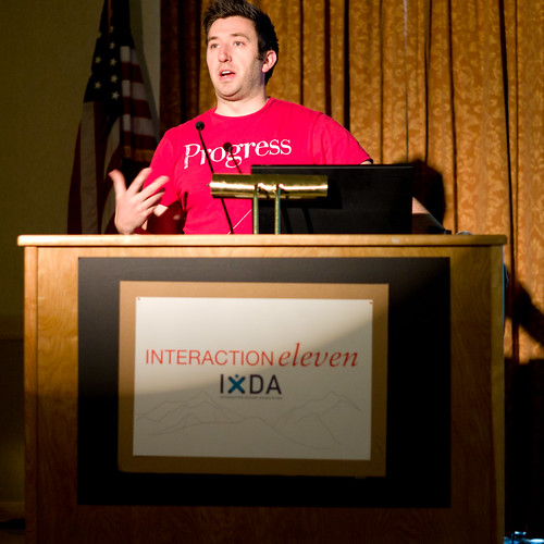
IxD 2011 Designing Advanced Design Workshop

Saturday February 12 10:36

Wednesday February 09 16:16

The problem that occurs when a clever, *advanced idea is inserted into a machine that is already optimized for itself — for efficiency. Just because it’s bright and clever and has colors doesn’t mean that it can find a place to fit in a process that is either (a) already humming along or, (b) unwilling or unable to change and adapt its workflow to allow something to drop into place. From my perspective, this means that it requires either a crisis which *forces the machine to stop and change itself — which is painful — or the machine needs to be changed from the outset to accommodate advanced design that does not come from left field but is accepted as something that is routine and part of the machine itself.

Some notes from Mike Kruzeniski‘s workshop at IxD11 on the topic of Designing Advanced Design. This is a fascinating topic to The Laboratory and equally fascinating to hear it from and participate with Mike, who is a good friend and former colleague at Nokia, of all things. Mike’s now at Microsoft so, like..now it might be like we’re colleagues again! At least partners in doing fascinating and unexpected things in the realm of design and technology.

Anyway. There were a number of highlights that I think are relevant. I’ll start with the general structure of the workshop, which was a workshop. ((Parenthetically, I’m a bit confused by workshops that are more someone presenting than people getting their hands a bit dirty, or going out in the world, or ignoring their iPad/iPhone update status checkers. I would even say that I don’t get the real-time twammering in a workshop. Either be there, or don’t be there. Bring a notebook. Sharpen your pen. Listen, do, speak. Okay, rant over.))

Wednesday February 09 15:06

Wednesday February 09 15:00

Wednesday February 09 14:45

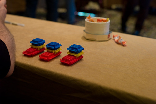
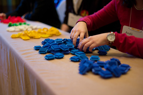
After introductions by Mike and a bit of a discussion about what advanced design might be ((I mentioned I was also quite interested in *advancing design in the sense of moving it closer to the locus of decision making, alongside of the business-y types)) Mike presented the workshop exercise. We were to build boats. Little boats. Made of plastic bits sort of like Legos but, as we would find out later — subject to subtle variations in how they can be assembled, even much more than the typical Lego brick. ((* Update: via @rhysys — they are called Stickle Bricks! *)) The group was broken up into several roles — customers, customer liaison, builders, suppliers, plant managers, quality assurance. Each group played the roles you would expect in the construction of to-spec boats. Customers would place orders which would be relayed to the operation. I was a builder so I basically tried to assemble boats as quickly as possible, making horrible but not-obvious mistakes which resulted in boats being delivered…and then rejected. Each round was broken up into 10 order cycles that ran for a short, fixed amount of time. In that period we’d try to assemble the requested amount of boats, which the customers could reject for flaws. Flaws were sent back to be disassembled so we could try again, but things moved quickly. At the end of the round ((which consisted of a number of order cycles)) a tally was made to determine the per-unit cost based on factors such as — number of workers, number of delivered boats, quantity of raw materials left over, etc. All the things you might understand to influence the cost of a boat. At the end of each round, there was a short amount of time to reconfigure the whole “plant” — increase builders, rearrange how materials moved from source to assembly, break apart assembly into multiple steps, fire people, etc. This was all in order to decreate the cost per boat. We actually did really horribly the first time — target cost: $15. our cost, like..$2500. miserable. We got better over two more rounds, but still only got down to about $30+ or something.

Some insights from this exercise, which is derived from a familiar MBA exercise. First, designers don’t seem to want to fire anyone. Second, MBA people are more than willing to fire workers (based on Mike’s description of when he participated in the exercise at a sort of MBA program). Third, companies that make things — even a few of them and not in the millions of them — are optimized for themselves to be efficient. Change breaks that kind of optimization, resulting in less efficiency, higher costs, etc.

((That third point is one reason I guess we here at the Laboratory prefer small refinements that make big impacts. Making something just a bit better, or refining it with such tenacity — simple, small, thoughtful refinements — that the consequences can become significant without significantly challenging the need for efficiency.))

In the lead-up to this exercise, Mike introduced a few simple yet important tenets surrounding advanced design. There are two basic ways for a company to compete: (1) It can be cheap; (2) It can be different (be something else.) And he introduced one of these curious “Laws” that we here at the Laboratory had never heard of: Parkinson’s Law which basically states that work expands so as to fill the time available for its completion. Or, stated another way: The demand upon a resource tends to expand to match the supply of the resource. ((And yet another way that the Laboratory’s Bureau on Time Management uses as an operating principle: If you wait until the last minute, it only takes a minute to do.))

So then we can think of advanced design as those resources set aside for other activities, which sort of means that it can get a bit out of control if we apply Parkinson’s Law. So — how does one do advanced design? What are some models and approaches?

For the workshop, Mike looked at three case studies of advanced design studios: Nokia, Microsoft and Nike. Each has somewhat different approaches to advanced design, which he laid out. ((I may get the details of the case studies slightly off, but the substance is what I recall and what I think is the significant points.))

3 Approaches to Advanced Design

1. The Outlier
This is the advanced design studio that thinks about “what if?” scenarios, and explores to the side, looking at perhaps total departures from the conventional wisdom. Real out-there stuff that challenges and provokes. He offered three examples of The Outlier: BMW’s Gina Concept car from 2008; Nokia’s Homegrown project; Xbox Kinect

2. The Pantry
A bit like squirreling things away in the pantry for when the weather goes all awry and you’re trapped and can’t get out and don’t want to starve. You do things even if they’re not assigned to go to market. The case study Mike offered was Nike who’s design studio maintains an active bit of work exploring, researching new materials and the like. In the case study, Nike was outdone by Under Armour sports kit who created an intense following amongst various gladiator sports like Football and the like. They broadsided Nike whose marketing people went to design and said, like..help. Design did not start a specific program from scratch to address this, but went to their “pantry” and put together a package from the existing “advanced design” material to create a bit of sports kit that made Football’rs look super scary..like robotic gladiators. Plus, presumably — it worked as equipment. One intriguing thing Mike mentioned was that some folks had been doing some studies on motion and the like with sports folks and found out that feet and hands move the most, so they highlighted feets and hands by bringing out these intense dayglo colorations to the materials used in gloves and sneakers so the players *look fast. I found this fascinating.

3. The Northstar
This is where design works towards an advanced goal, but it’s more an aspirational target that is steered towards, perhaps indirectly. This might best be described as evolving a vision, refining from what’s out there. This I think captures to a certain extent what *vision work does, although sometimes vision work is basically just a nice thing to look at without the tectonics that could activate design work. The challenge is to avoid just creating something that’s cool to look at but doesn’t give enough to make it start becoming material.

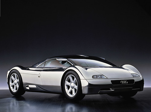
audi-avus-quattro

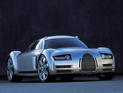
1991 Audi Avus Quattro Concept Car

The example Mike offered in this case was Audi Avus concept car that (I know nothing about cars except how to drive them, sorta) that provided some radical new lines in 1991. It became a sort of objective point in a way — guiding the evolution of their surfacing and configurations so that over time Audi cars begin to take on the features of this Avus concept over time. The Avus provides the “Northstar” for the design team. Now — whether its stated expressly as in a lead designer saying..in 20 years lets get *here, or if it is less formal perhaps does not matter so much. Its more that this vision becomes quite tangible over time, an evolution of the car DNA.

Audi-Rosemeyer

Audi Rosemeyer
audi-r8

Audi R8

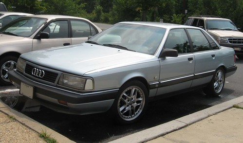
What I find most intriguing about this sort of vision-y Northstar case of Audi in particular is that they are able to stay on course. Twenty years is a long time — even, it seems to me, in the world of automobile design where things change exceptionally slowly because of the momentum and levels of commitment necessary for manufacturing and tooling and all the rest. Yet somehow they are able to keep their eyes on this objective that must’ve seemed quite radical at the time, especially if you consider what Audi looked like in 1991.

Audi-200-turbo-1

The 1991 Audi 200 Turbo

Some random insights that came up during the workshop.
* The Apple model isn’t reproducible perhaps because it is quite driven by the owners themselves and their personalities and abilities to drive change.
* Advanced design is about change. The instinct of a company is optimization; reduce risk and costs; it will reject change.
* Our role as advanced design is to help companies *prepare for change rather than execute it. In other words, be there when things go badly and people around you start losing their head and blame you while you keep yours, and you continue to trust yourself when all those around you doubt you — in other words, when panic and confusion sets in, advanced design can lead at those moments of epic, systemic change.

What is advanced design?
Let’s take this from the perspective of “advancing” design. The “advanced” moniker seems quite old fashioned. Advancing design, or advanced designing seem like useful semantic word play. The semantics help me think about design as something that can move forward (advancing design), rather than designing something in advance of something else (as advanced design would imply), or designing in a way that is different from what is designed today (or what is thought of as design today). In that way, advancing and poking and provoking means more than differentiation. It means more than using advanced techniques.

Some notes/thoughts about what advanced/advancing design or advanced designing might be:

* working through ideas differently
* designing the way of designing always, for each and ever
* iteration, refinement — put it up, strip it back, put it back up again
* communicating tangibly, materially
* storytelling — film, prose, language
* design fiction – actively suspending disbelief. making props and probes and prototypes.
* proto-typing – making stuff, in the shop, at the bench, learning by making and doing
* photography – way better than clip-art and it forces a different kind of conversation and moves things away from *only working at the screen in Illustrator

Why do I blog this? Because I went to the workshop; it made me think of a few useful things; I’ve been sitting on this in draft state for almost two months.

Continue reading IxD 2011 Designing Advanced Design Workshop