Airport Timer


There’s a passage in David Pascoe’s book Aircraft where he talks about how none of the airports of the time were prepared for the introduction of the 747. Specifically there was no part of the physical infrastructure of an airport that wasn’t overwhelmed by the size of and volume of the “jumbo” jet.

None of the waiting areas were large enough to accommodate the number of passengers getting on or off the planes. Often the planes themselves were too big to fit in the loading bays outside the terminals and the few enclosed jetways that had been in use up to that point were too small to even reach the doors on the planes.

Later in the book he goes on to describe a similar clusterfuck ushered in by the hostage taking during the 1972 Munich Olympics and the decision to install security checkpoints and passenger screening areas in airports. The just opened Dallas/Fort Worth airport was particularly hard hit. Although its design was modular and extensible from the outset (with all the terminals as simple semi-circles that could be snapped together like Lego up to the 10 miles in length) the buildings themselves were too narrow to retain any design or aesthetic after they been cut in two by x-ray machines and the lint trap of people waiting to go through them.

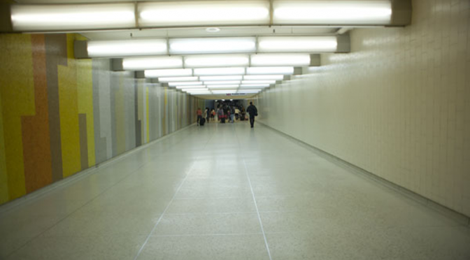
I was thinking about this last month when I had the misfortune of flying out of Terminal 7 at New York’s JFK airport. Architecturally, Terminal 7 resembles two staggered butter sticks. The first butter stick is where you check in and is connected to the second “stick” which houses the departure gates by a short flight of stairs. In between the two, just in front of the stairs, is where you go through airport security.

United Airlines flies out of Terminal 7 so at least some of the misery of the security process can be blamed on United poisoning any and everything it comes in to contact with. The rest, though, is a combination of the need for the Transport and Security Administration (and their international counterparts) to indulge itself in ever greater security theater of Broadway musical proportions; the inability of people to imagine any kind of personal efficiency or shared responsibility getting through the line; and a New York City scale “Fuck you, never again” attitude to the process born out of the reality of the 9/11 attacks. All multiplied by the ever increasing numbers of people flying to and from, and especially to and from New York City.

There isn’t much to say about the other terminals at JFK. Both Terminal 4 and the newer addition to Terminal 5 are little more than oversized cargo ship containers with drywall and designer handbag shops but at least they are big enough to dampen the indignity of the fear and paranoia that define contemporary air travel. Put another way: Terminal 7 is just too small and the security line is where everything grinds to a simultaneously depressing and rage-inducing halt and forces everyone to in to a shared despairing for all humanity, all the while with too little space to comfortably take off your shoes.

Untitled Intimacy #1076031825

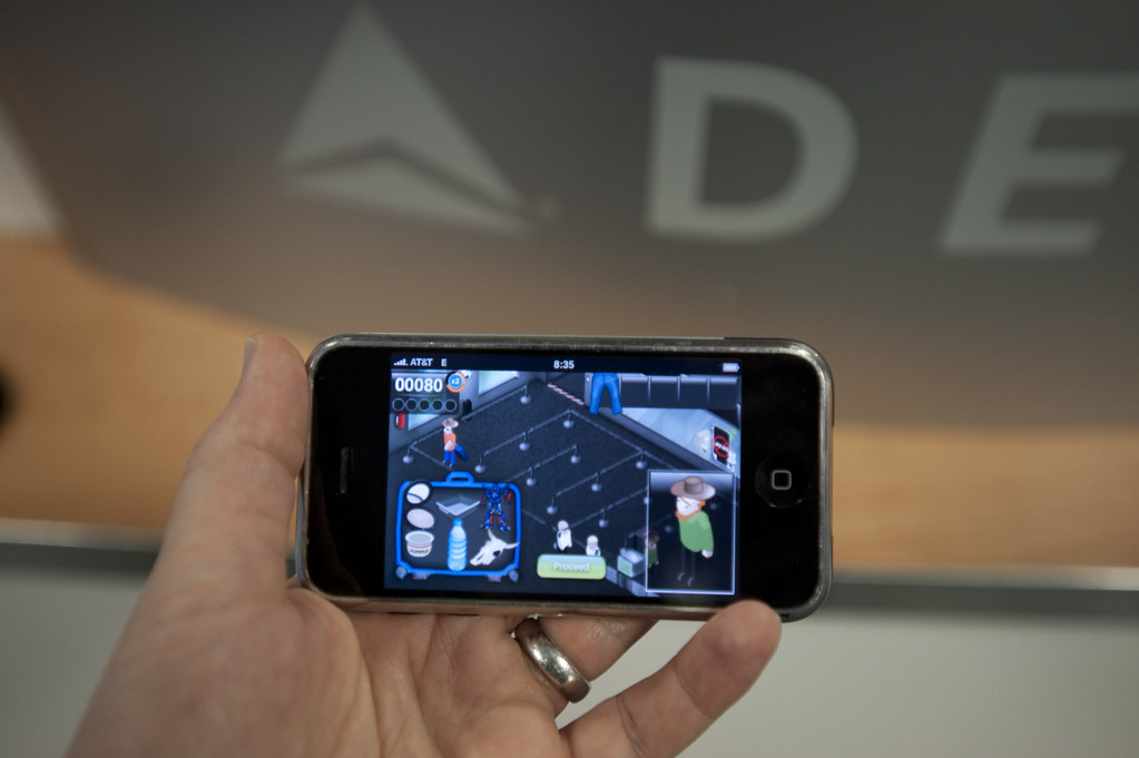
So I made a website: http://airport-timer.spum.org

Airport Timer is a simple web-based stopwatch application to record how long it takes to get through security at the airport.

Before you get in the screening line you enter, by hand, the three-letter airport code and the name of the terminal you’re in and then press the start button which launches a timer in the background. Then you put your phone (presumably) back in your pocket before you are disappeared for spooking the security agents. When you make it through to the other side you press the stop button which stops the timer and, after a confirmation screen, uploads the airport code, the terminal and the time you spent (measured in seconds) going through security to Pachube. There’s also an option to send a pithy message to Twitter.

That’s it.

The site uses the Twitter API as a single-sign-on provider but that’s mostly as a kind of half-assed throttle on the API that proxies and sends the timing data up to Pachube. Because of the way that the Twitter kids have built their Javascript widgets and because there’s currently no place to store the Twitter user associated with a given report in Pachube there’s a reasonable argument that you shouldn’t need to log in at all. Modulo the part where even Instapaper gave in and forced people to create user accounts on the site. Anyway, you need to log in with your Twitter account.

The sites also uses Pachube as a datastore because it seemed like an obvious place to test the claim, in a networked world, that “every human is a sensor”. Pachube’s data model consists of three nested pieces: Environments (airports), Data Streams (terminals) and Data Points (individual time through security reports). The first two can be assigned additional metadata (tags, location, etc.) but the data points can only contain a timestamp and a value.

Which makes sense but right away the inability to add metadata to individual data points means that I can’t record who just went through security or generate, easily, the “your stuff” style personal reports that people expect from social websites. Arguably Pachube is not a social site except for the part where, in a world where we are all sensors, any centralized time-series service that has humans as inputs will be measured on its ability to abstract the data. Robots may not care (or need) to see all that information bucketed by airport or by Wednesday versus Tuesday but we do.

You could just as easily write a backend for this kind of site using MySQL or Solr. Solr’s ability to facet by date and eventually to do nested faceting (for example, to facet by airport and then for each airport by week or to facet by user and then by airport) makes it an attractive possibility but I’m choosing to use Pachube because it is a logical meeting of minds.

There are no “report” style pages for individuals or airports yet. There’s actually a lot of stuff the site doesn’t do yet. It does not try to retrieve your GPS coordinates automatically or use them to auto-detect your airport or validate that you’re really at Charles de Gaulle aiport and not sitting at a coffee shop in Winnipeg. It does not have a magic auto-completing list of terminals for each airport. It does not (and will never) have heat maps.

Some of these things will come with time. I have already imported all of the whereonearth-airport data in to a Solr instance so auto-detection and validation are both more than theoretically possible. Auto-complete for terminals is little more wrapper code around the Pachube API to pull out the titles of terminals (datastreams) for a given airport (environment/feed). But for now, it’s just a simple thing to record the data and put it somewhere safe and public.

Weekending 10302011

Oh, okay. Last week I was in London.

There was some fun, cool Nokia stuff going on — besides Nokia World, which I didn’t attend only because there were also other things going on, including this event at the Design Museum called People Made in which a well-curated exhibition of Nokia’s contribution to the world of mobile social networked stuff. Despite assy and snarky remarks on the influence Nokia has had on the design of these sorts of things, I thought this was quite good, quite legible and just small enough to be digestible and large enough to note the important bits, like the evolution of mobile picture taking, degrees of portability and things to come in the near future.

There was a swell two day workshop for Project Audio with the fine folks at the Really Interesting Group. That included some days inside at Whitechapel Gallery and a field trip to the Science Museum, which has a great exhibit of audio things from the early 20th century into the networked age. Old radio sets and things with knobs are great for thinking about what the future holds for sound design and audio devices and talking to people. And, it was fun to see Listening Post there — I didn’t know that the science museum had bought one. That’d make the third exhibition space in which I’ve seen it — first at The Whitney when it premiered, I believe way back in the day. Then at the San Jose Museum during ISEA in 2009 I think it was. It holds up remarkably well. It’s quite prescient, too — in particular as regards this idea of “trending topics” in some sense. I’m not sure precisely what algorithm Mark Hansen is using to extract content (obviously chats and discussions in text) — but one gets the sense that the statistics is identifying things of import or interest. Now — it might not be what *most people are talking about, but they seem to become poignant statements indicating states of mind. There is also quite excellent use of silence in such a way that one is not thinking — huh..is this thing broken? Some ambience and machine noises give the device its mechanistic quality that is nice and sculptural and real and that of a thing with momentum. Which is very much unlike most digital/computational devices. I really like the machinic character of this thing, Listening Post.

I had a visit with James Auguer over at Design Interactions at the RCA. Nick Foster was there as well. That was fun. I’d never been. It felt like an art college. I gave a little impromptu talk to a clutch of students. And Noam Toran was there and gave me some lovely documentation of his projects. I especially like the series of objects he made called The Macguffin Library. It beautifully captures the way Hitchckock’s use of these opaque plot devices are objects to move a story — which is a concept that can be directly applied to the Design Fiction notion. These are things that are props that stand in for whatever it is that motivates and moves a story along. They’re nice as a concept because the thing itself matters even less than its functionality — except insofar as its functionality is to motivate a story.

There was a nice afternoon spent with the partner-in-crime Nicolas Nova discussing the future of the Near Future Laboratory and some exciting evolutions of our activities that will happen quite soon. Expect more to be going on here and some new folks coming along to make more things and create more weird implications and provocations. All discussed over toast, beans, sausages and eggs.

I was super excited that Geoff Manaugh rang to see if I’d be around to participate in this event at the Architectural Association called Thrilling Wonder Stories. I don’t know how to describe it except to say it was a full day of a seminar of presentations and discussions on a variety of Thrilling Wonder Story-like topics. I shared some thoughts and perspectives on designing with science fiction at the end, together with Bruce Sterling and Kevin Slavin. That was swell — fun and a great way to end the week in London.

That was pretty much it, except for one little thing that Bruce left me thinking about after that four hour dinner the last night. Venn diagrams. Evidently done by this fellow called Hugh Dubberly and the diagram contains the three circules and one is “DESIRABLE” the other is “BUILDABLE” and the other is “PROFITABLE”. The overlap in the center is what markets and capital understand as “real” stuff. You get these annoying debates within making-industries where that is the “real” deal. It was the introduction to my brief 15 minute talk at Thrilling Wonder Stories — people get shy and apologetic when they discuss things outside of that center “sweet spot” of things that are all-of desirable, buildable and profitable. “Oh, sorry — this is just an idea” or — “Oh, this is only a demo” or — “Oh, this is just a concept/video/bit-of-fiction”

Needless to say — we here in the Shameless Speculation Department of the Near Future Laboratory think that position is rubbish. There should be no apologizing for the imagination. Everything counts. I’d say even that the things outside of the sweet-spot even more than those in it. That sweet-spot is modifiable. Just cause something can be built does not make it “more” than the thing that can be massively manufactured because it fits in someone’s measure of what that sweet-spot consists of — what its parameters of “sweet-spotiness” are. And then this introduces a discussion about those parameters and scale and what profitability consists of.

That’s it.

Continue reading Weekending 10302011

Interoperability

Sunday September 20, 17.43.18

A curious interoperability protocol, wherein the address for some weird place in Seoul has been found on an iPhone and must now be entered into the GPS of the taxi. A simple affair, with minimal bumps often enough, particularly because the map on the iPhone shows the address and streets in Korean, which is great for the taxi cab driver, but miserable for the the traveler who can only hope that the locale on the map is actually where he would like to be.

Why do I blog this? This are useful moments to capture, where language, culture, objects, data come into conflict and must work their way around one another. I am told the iPhone isn’t available in South Korea at the time of this photo, so you have this foreign object — one that is probably quite legible as the iPod Touch was spotted around the city — and a baroque assemblage of devices, machines, transaction mechanisms, remote controls, identity stickers, car controls, radios, etc. I would have to contrast this with the notion of seamless perfection and interoperability that is often the image of the future transportation dashboard.
Continue reading Interoperability

Design Fiction Chronicles: The Stability of Food Futures

Three ways observed recently to delivery food, in some sort of service stack hierarchy. Which got me thinking about food futures, generally. First, a sample of present food service and presentation protocols as depicted above.

First, catered in a way that provides the opportunity to pick and choose based on inspecting the available items.

Next, inspecting the descriptions of available items on a paper menu, that also conveniently serves two additional functions — as a place mat to sop up drinks spills and food that does not quite make it to the mouth (a distinct possibility when consuming noodle-y things with a fork). Second, it also serves as a marking pad with a number of unique attributes: to indicate when an ordering process has begun (the pink star) and when the meal is closed out and the check has been requested (the blue star); to indicate what is not available currently (item number written on the menu-mat and drawn when a “buster” mark — a circle with a line through it) which appears under my plate for item number 43 which, sadly, was what I wanted to eat; the menu-mat is also where one’s ordered items are written down in (to me) a barely legible set of chicken-scratches (upper right.)

Third, traditional, serif’d menu in a sit-down configuration, heavily serviced by waitstaff in a semi-formal, banquet setting. You wait for what has been determined to be your meal ahead of time. Interestingly, the young woman sitting next to me had to do a bit of dinner order off-roading, convincing the waitstaff to bring her the vegetarian plate. When you try and steer a pre-determined “on-the-rails” dinner service a bit off the tracks, things start grinding gears. This was possible to see in this context where the wiring had to be re-routed in various ways to accommodate this unexpected but relatively minor alteration to plans. (To those of you who have asked, the haggis was quite good, perhaps the formality of the context added something to an experience I genuinely feared. I thought quite seriously of deploying Mike Lewinsky’s powerful “Kosher Defense” which he painstakingly taught me after his experiences in China with the Rabbit Head appetizer. — I don’t think Mike’s China meal was in anyway a metaphor, btw.)

Ice cream from a street vendor amongst a small cluster of other vendors in a mini chocolate tasting/purchasing festival along the South Bank in London.

The dearth of street food in all of the cities I was in during that 12 days in the UK and Finland almost defines the Urban Scout’s conceptual boundary between countries in various parts of the world. There was street food during the day’s perambulation along the South Bank of a particularly pre-configured, organized and licensed sort. Despite that, the opportunity for Ice Cream in London in early April meant something. Besides these, the closest to genuine on-the-street food stalls was rather organized and festival-like. Which is fine. I mean — generally, I take the cautious Urban Scout approach to food consumption which is a minimum of experimentation, and smell but don’t ingest street-made street food.

A crowd of sweets taunting from behind a case at the delicious Indian restaurant called Tayyabs. Food taunting protocols. Display varieties in such a way as to evoke primal triggers for food consumption — like salivating and eye-widening. My restraint algorithm was employed to modest effect.

Thinking about food, and the future, and the future of food got me wondering about rather narrow future food imaginaries. It seems that there is basically food, also, in the future. Space foods of some sort or rudimentary staples. I collected a few science-fiction food future scenes from film that popped into my head right away. These are instances of rather stable food futures, consistent with today in a way that says, basically, food stays the same.

Zero-gravity space food as imagined in the late 1960s, right around the time that NASA in the United States was trying to figure out how astronauts would eat in their weightless journeys to the moon and back. Consistent with the rigor of his production design, Kubrick considered similar constraints on food and eating on long journeys, such as in his epic 2001: A Space Odyssey. Seen here are colored food products, delivered via straw to mitigate hunks floating off into the ship’s environment and gumming up the works. This is perhaps the most future-y food I could recollect in my own science fiction film library.

The future of the street vendor / outdoor noodle and sushi bar. Steamy, crowded, jostling, limited availability of specialty things, as seen in Blade Runner by Ridley Scott and P.K. Dick.

BladeRunner_Sushi512

At the noodle and sushi bar in Blade Runner by Ridley Scott and P.K. Dick.

Ridley Scott’s production design and extrapolation of Los Angeles downtown (?) into the future fiction of the film has been praised for the way it captured something that was visually articulate — it is an evocative projection into a legible future world. Spoken language mash-ups, bustling crowds, density and thickness of all sorts — weather, advertising, etc. It’s worth a quick look of this food futures scene, which only serves as a prop to turn the drama a bit toward Deckard. The production design here, though, captures an imaginable setting and atmosphere.

Blade Runner by Ridley Scott and P.K. Dick. (Blade Runner Noodle Bar — Food Futures).

Eating in the future, family style. Some grains and salads. From Alien by Ridley Scott.

A future instance of Pabst Blue Ribbon beer or something. Enjoying a cigarette. Quite consistent food futures. From Alien by Ridley Scott.

Box, sweetened, kid’s breakfast cereal. Suitable for snacking without milk by pouring directly into the mouth. Very familiar food and eating practice, projected into the year 2050. From Minority Report by Steven Spielberg and P.K. Dick.

An advert from the year 2050, where there is still Guiness, thank goodness. From Minority Report by Steven Spielberg and P.K. Dick.

There are some future food imaginaries where we find quite stable futures. We still eat in the future, it seems. I left out the future imaginaries like Soylent Green where “we” (people) get eaten or are alien food. That’s for another consideration.

Why do I blog this? Curious interfaces between people and their food and meals observed while out and about as an Urban Scout. I t is interesting to think about the stability of food, despite the high-end explorations with various delivery mechanisms like aerated food products and other delivery protocols and fancy concoctions.

Distinctive future imaginaries for food are few and far between, best as I can tell just thinking about it. Food is delivered. Space food becomes the same food as today, only constrained by the limits of things like preparation, weight and, bleech..consistency. Food becomes, in the future imaginary, quite instrumental in its consideration of necessary intake and so forth. It seems strange to me that there are not more design fictions that shape design practices that are directly concerned with what food might become. Maybe it’ll be closer to athletic food gels, formulated by food scientists. Bio-chemical genetic foods and the like, taken to their logical and insane conclusion.
Continue reading Design Fiction Chronicles: The Stability of Food Futures

The Map Is Here For You To Use

Sunday February 15, 09:19:01

Tucked away, a map there for me to use.

Departing Madrid early on a Sunday morning, I found this paper map of the Metro, tucked neatly within the seams of a pre-fab wall, ready for re-use. I wondered, who was on their way out of Madrid, thinking that they could not in good conscience throw away their worn map, looking about for a way to pass it along to another visitor.

Another instance of a Thoughtful Act.

Why do I blog this? Sudden interest in observing improvisatory social practices which are signals of a sort, not always of a “service” or designed object to adopt that practice into a commodified instantiation. But sometimes merely a curiosity that helps us better understand who we/people are, like waypoints along a contour of individual and collective humanities.
Continue reading The Map Is Here For You To Use

Media Diversity

Wednesday February 11, 14:47:23
Newsstand in central Madrid, Spain. Where?

Wednesday February 11, 14:47:09
A curious assortment of news and media products also in Madrid, Spain Where?

Wednesday February 11, 15:36:54
Some 5 Euro DVDs in a strange categorization schema. Not sure these all belong together in the same selection, as Boris pointed out. Disney? Al Pacino and Robert De Niro?Where?

A curious diversity of media selections at many of the newsstands seen out and about central Madrid. Most barely stopped short of selling small household items. You could get DVDs certainly, along with a variety of newspapers, both lauded broadsheets as well as the usual assortment of pulp hobby, entertainment, fashion and sports magazines. It’s curious to see these alongside of hardcover, shrink wrapped editions of the Life of Stalin, tomes titled the History of Philosophy and speciality, custom-published magazines with nattily groomed Barack Obama on the cover.

Why do I blog this? Observations bout media distribution practices. Curiously, I don’t exactly recall seeing DVD rental outlets, which I was not on the look-out for. I wonder if the newsstands also serve as DVD purchase/rental outlets. It is barely worth noting that I attempted to watch “Lost” during my nine days in Espana (a fella has his curious vices..) but was stymied by a notice that showed in the video frame — this show is not available outside of the United States. Hrm. In some ways, I suppose this is a signal of old media — both the institutions as well as the material. People more often than not seem to be turning to their peers and trusted allies to obtain the things they want, and those networks grow stronger as the one or several to many networks crumble and fall.
getGeocode(‘-118′,’34’);
Continue reading Media Diversity

Locative Play

Ian Bogost‘s and his Persuasive Games operation have introduced an iPhone game called JetSet
— a curious little gem that situates specific locations as the enforced zone for game play.

Very interesting play mechanic — a location-based game that you can basically only play when you’re at any one of a huge list of airports in the world. And, your score (if it’s good enough..) goes up on that airport’s leader board. The only way to play, say — Madrid Barajas International Airport is to go to Madrid Barajas International Airport. You have to physically be at the airport to play and get on that airport’s leader board, get that airport’s “souvenirs” (this game’s equivalent of blue gems), and so forth.

Oh, the game — okay, you’re a security screener dude screening passengers, and the "prohibited" list changes so you’re constantly having to figure out what to remove from the traveler, from the mundane — shoes? hat? water bottles? coffee? to the obscure — bacon? rocks? snakes? robots? pudding cups? hummus? There should be a way to put leader boards up along on my Dopplr page and Dopplr personal annual report!

It’s simple and an exciting play mechanic that’s intimates at the near future of all kinds of interactive experiences as the digital continues to leak out into the real world. Nicely done.
Continue reading Locative Play

GPS 9000

271108_160253

Anticipating the less-than-lovely side of ubiquitous computing scenarios, this photo is the end point of a circuitous GPS navigation FAIL on the way to relatives for Thanksgiving dinner last week. Looks like we’re driving into the river there. After what we went through, it wouldn’t surprise me if the GPS lady sent us right on into the ol’ Housatonic.

We made it unscathed but a bit dizzy from the miscues and miscommunications that were the result of an entangled navigation assemblage of people, roads, cellular telephony and satellite location practices. Along the route from northern New Jersey to somewhere in the woods of Connecticut we ended up departing from what seemed like the correct route along a major highway, but were told to exit by the lady in the GPS box, which I did with a little bit of raised eyebrows from the cohabitants of the car, including myself. I was skeptical initially, thinking that the GPS had been misprogrammed to another set of relatives whose home was somewhere around there. So, there was that, which implied a bit of skepticism tossed at the vehicle’s copilot, which caused some tension, on top of everything else. The GPS lady sent us down a couple of surface streets that constituted a short diversion around and then immediately back onto the same highway, in the same direction, toward the same goal.

This same “bug” (or whatever..) happened again further along, with the GPS lady taking us off route, onto some surface streets to make a long U-turn and then (conveniently and fortuitously) into the parking lot of a Dunkin’ Donuts, which allowed for a bathroom break. GPS lady then told us to get back onto the same highway.

This is either real HAL 9000 style Ubicomp, a test by “the man” to see how much people will blindly listen to their GPS ladies and do ridiculous things, or a case-in-point as to how sucky these things are to begin with. By this point, we were fairly skeptical about the ability of the GPS to navigate, and the conversations turned to things like — maybe the maps need to be updated and questions about Amazon’s return policy. Things like that. Meanwhile, alternative mechanisms were deployed to further entangle the navigation process — iPhones were fingered, alternative routes suggested, questions were raised about the fitness of one biway over another roughly parallel highway, calls were made to discuss alternatives and readjust anticipated arrival times, conversations on phone calls were taken as Gospel directions when they were really questions to the person on the other end (who couldn’t be heard except by the caller — as in “Take a left at the bridge.”, which really was “Take a left at the bridge?” and so a left was taken at the bridge, etc.) Confusion ensued (big time) as navigation became a group activity, which seems entirely a bad idea under even the most pleasant of circumstances. In summary — the same old sort of people-practices that have always gone into navigation and mobility practices, despite the GPS lady and her fancy tricks.

Why do I blog this?Another in a series of observations about the failure of technical instruments like GPS’s were meant to ameliorate, with a bit of cynacism towards the Ubicomp pink pony dream. Despite the dream and vision of fancy-futures, the entanglement of humans and non-humans into a knotted cooperative does not look like the advertising literature and product descriptions.
Continue reading GPS 9000

Self Explanatory: Street Level User Interface

I found this quite pervasive practice in Helsinki of giving restaurants a big hunk of didactic anchorage through these geographic names of cities or entire geographical regions. No guessing what sort of dish and style of food — even anticipating for you the decor you might find inside or style of service. It’s all implied in the name of the place.

Why do I blog this? Things observed — street level user interfaces. The readable, legible city without any need for data services or ubiquitous computing modules. Quite nice.
Continue reading Self Explanatory: Street Level User Interface

Old Mapping Alternatives and New Metaphors, Please

Some curious alternatives and conscious decisions made around map materials. When do we chose the local tourist map that has down-res’d nonessential features and up-res’d features more on the mind of weekenders, such as the location of airport, town squares, likely museums and sites? How do the fancy digital alternatives — a nearby iPhone with a really slick Google Maps interface — pale in comparison, and falter in their real navi utility? When is paper — which can be marked up, annotated, maintain its tangibility and foldability and non-battery-failability and non-data-roam-chargeability? Just paper.

Have a look at Aaron Cope’s paperMMap and other work in tangible, hybrid (digital-physical) cartography. I think this is exciting, mostly because maps and cartography may be on of the good, early connectors that laminate physical-digital thinking. We need better metaphors to capture the ambiguities between the physical and the digital — even writing them right there makes me anxious. The distinctions are quite arbitrary and I think “we” pioneers living in the near future would be doing a great thing to evolve the metaphors and language to point toward new hybrid realities. First to go? Second Life. Ahhem.. What a horrid name that might be tractable to the everyday notion of online/offline, but ignoring “1st Life” the way that Virtual Reality tried to do really does a disservice to the relevance and final import of the world in which we will ultimately be buried within, Timothy Leary’s insertion into an eToy USB drive notwithstanding.
Continue reading Old Mapping Alternatives and New Metaphors, Please