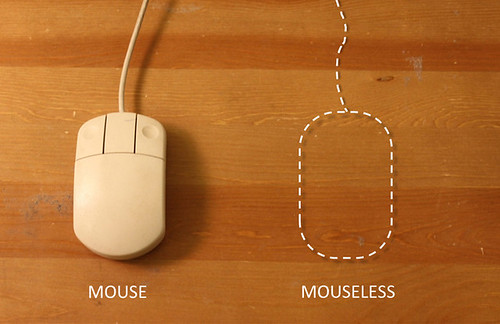
This is a curious project from some students at MIT. They’ve used a laser beam and a camera sensitive to the light reflected from that beam to track the motion and articulations of one’s hand as it moves and makes mouse-like gestures. So, effectively they’ve gotten rid of the mouse. Which is why they call their project *mouseless and why they’ve given it a bit of fun by an explanatory video ripped and sewn with some Tom and Jerry cartoon wackiness.
What I find curious here is the way they’ve extended the “mouse” metaphor even when the mouse has become “invisible” — or, rather — those bits of plastic and wire and so forth that constitute the mouse are now no longer necessary. But, we’re still operating with the same movements and gestures as if the mouse were there. Which makes me wonder why go through the hassles of taking it away, losing the physical tangibility of moving something with momentum and weight and texture and feedback and all that. It’s like one of these weird engineering efforts to do *something with the technology and then backfill the rationale. I mean — it’s all tiring in a way how little refinement and design and thinking and iteration goes into things like this. I’m exhausted just looking at the invisible mouse..that I can’t see. I mean — I guess the mouse not being there is as weird as the mouse suddenly appearing attached to a computer back in the day, but it’s easier to think of manipulating something material, no matter how weird and unexpected it might be, than it is to pretend that something’s there, that could just as easily be there if we just ditched the idea of an invisible mouse and kept a visible mouse there to begin with. Or something like that.
*sigh*
Well, I guess this is what to expect from the best and brightest. The simple obsession with refining and refining and refining rather than just doing something “’cause” seems to yield much more subtle *wheels-on-luggage designs, just making something a little better, as they say.
Why do I blog this? Thinking about the inevitability of metaphor in design while poking through Raphael Grignani’s remarks on Home Grown’s List UI inspired by Mike Kuniavsky’s draft chapters on metaphor for UI/UX for his forthcoming book, and a recent document that pleads for the end of metaphor and direct manipulation. With regard to *mouseless, I see this as another instance of moving from one extreme to another while missing anything in-between or even off to the side, which might be typical of engineering efforts when it plays in the UI/UX sandbox. ((It also is likely not their point at all, but rather a quick sketch of an idea to refine some thinking, or just a clever computer nerd stunt, but I’ll use their work *unfairly to make a perhaps not all that interesting remark on the blog, and to try to up my blog/writing quotient for practice.)) A bit like coming up with weird doorknobs and then looking for a house to put it on. Carts before horses, or gizmos first, humans last. Maybe somewhere we’re missing the subtleties and low-hanging fruit rather than the grand theatrics (engineers) and broad oratory (chatty design gurus who talk rather than make and refine and get into the material of things.)
Continue reading Is There Such A Thing As An Invisible Metaphors

