A Few Things The Laboratory Did In 2010

Friday December 10 15:28

Again, mostly in the notes-to-self column, I’d just like to capture a few things that we here at the Near Future Laboratory did in the year 2010.

It was a year chock full of Design Fiction actions and activities, an exhibition of some work, talks and discussions about projects and ideas. The usual, except there was a dearth of making-of-things, something which will be remidied one way or t’other in 2011. ((I shouldn’t discount the zealous skate photography, though.))

So, just a fool’s list:

Saturday March 13 12:27

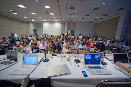
There was the panel at South by Southwest with Stuart Candy, Sascha Pohflepp, Jake Dunagan, Jennifer Leonard and Bruce Sterling. I think that was a highlight as it led to some great conversations from the dais and Bruce’s interjections and interceptions were quite inspiring. I think the best part of the panel was what we talked about getting the whole thing organized. There were some really intriguing Skype conference calls, just talking and learning from each other. That was good stuff.
(Audio Podcast of the SXSW Design Fiction Panel)

Friday September 17 17:06

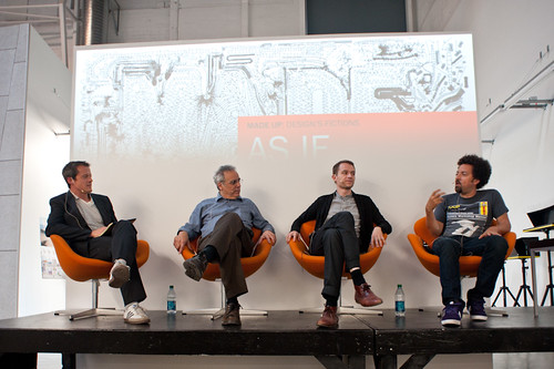
Art Center’s “Made Up: Design Fiction” theme was (and continues to be) an opportunity to further stretch and elaborate the Design Fiction theme — finding new ways to actually *do design, and then sponsor a number of works exploring the idea of making things up as a way to do advanced design. I love what the Media Design Program folks are doing over there. Participating in the “As If: Alternate Realities” panel discussion and other activities over there has been good, great fun. ((I was also super excited to go to the MDP MFA Thesis Reviews and see student work first-hand, give feedback and all those other good things..))
(http://www.nearfuturelaboratory.com/2010/09/10/made-up-panel-discussion-september-17/)

Tuesday October 26 15:22

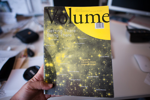
The original design fiction essay was rejiggered and reprinted in Volume Quarterly for their Issue No. 25 with the theme: The Moon. That was an interesting re-writing project because I had wanted to say a bit about how I understood architecture as perhaps the canonical design fiction enterprise — it is so imminently focused on what could be, and perhaps so finely tuned to tell a story — to *pitch what the future landscapes might look and feel like, and suggest how humanity might live and embody space. Architecture has this remarkable conundrum in that it likely spends most of its time constructing facsimiles of what could be as concrete gets poured based on most designs so infrequently. Sure — the big corporate architecture firms make their malls and condos and so on. But the speculative, richly imaginative contingent of architects — well..they enter competitions with models and renderings. In fact, I would guess that most of architecture does precisely this — it spends its time (not fruitlessly, I would say) telling stories through materialized forms: models, renderings, films, stories essentially. Designed fictions, I might say. In any case, the reviewers for this particular re-write didn’t find it substantive or something — it’s fine. It’s a theme I’d like to work on in some fashion for 2011, though. Even though I have a grumbling relationship to architecture.
(http://www.nearfuturelaboratory.com/2010/12/22/designing-fiction-in-volume-q/)

Monday December 13 14:19

Which might seem like it contradicts the fact that I participated in two reviews for USC Architecture, one in Neil Leach’s wonderful “Interactive Architecture” studio, and the other for Geoff Manaugh’s equally provocative Cinema City studio. Both were thoughtful and fun and engaging. I often felt that the students got a bit too ruffed up by the jurors/critics, but I have *no idea what the culture of that design practice is, so maybe that’s entirely normal. I always thought it was soft gloves before you went bare-knuckles in crits. Maybe its just all tough-love all the time.

My chum John Marshall and I had our essay appear in the Digital Blur: Creative Practice at the Boundaries of Architecture, Design and Art book. It’s an essay on Undisciplinarity — doing things without predefined boundaries, or without constraints and often without discipline. I think it’s a useful way of doing things differently and perhaps making new things. Just looking at the world and its possibilities from a sideways glance and without curmudgeonly bureaucracies to say you’re doing things the wrong way round. Pick up a copy, not for the essay but for the other great documentation by artists and designers.
(http://www.nearfuturelaboratory.com/2010/04/30/digital-blur-book-launched/)

Friday July 23 12:01

For the third time I was able to attend ThingM’s Sketching In Hardware event, this time held in Los Angeles at that crazy Encounter Restaurant. I’d share the presentation, but its 1GB because in 2010 I sort of went a bit crazy including film clips in my presentations. I wish there was a better way to share these enormous things.

The Laboratory had a spot presenting at Kicker Studio’s Device Design Day last August. Again, more elaborations and thinking about the Design Fiction stuff — “Design Fiction Goes From Props to Prototypes” — thinking about prototypes as ways to test ideas (not just their material forms): “Prototypes are ways to test ideas—but where do those ideas come from? It may be that the path to better device design is best followed by creating props that help tell stories before prototypes designed to test technical feasibility. What I want to suggest in this talk is the way that design can use fiction—and fiction can use design—to help imagine how things can be designed just a little bit better.”
(Kicker Device Design Day on Vimeo)

Habitar

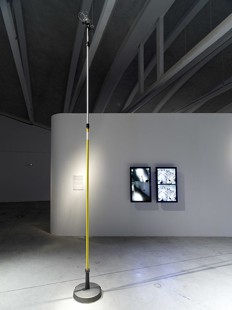
The Apparatus for Capturing Other Points of View was exhibited at the HABITAR Exhibition in Madrid. The concept of the exhibition is something that is quite close to the hearts of the Laboratory, so I will put it here: (you can download the exhibition catalog as well)

“Utopian and radical architects in the 1960s predicted that cities in the future would not only be made of brick and mortar, but also defined by bits and flows of information. The urban dweller would become a nomad who inhabits a space in constant flux, mutating in real time. Their vision has taken on new meaning in an age when information networks rule over many of the city’s functions, and define our experiences as much as the physical infrastructures, while mobile technologies transform our sense of time and of space.

This new urban landscape is no longer predicated solely on architecture and urbanism. These disciplines now embrace emerging methodologies that bend the physical with new measures, representations and maps of urban dynamics such as traffic or mobile phone flows. Representations of usage patterns and mapping the life of the city amplify our collective awareness of the urban environment as a living organism. These soft and invisible architectures fashion sentient and reactive environments.

Habitar is a walk through new emerging scenarios in the city. It is a catalogue of ideas and images from artists, design and architecture studios, and hybrid research centres. Together they come up with a series of potential tools, solutions and languages to negotiate everyday life in the new urban situation.

(http://www.nearfuturelaboratory.com/2010/05/31/apparatus-at-the-habitar-exhibition/)

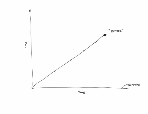
I participated in the University of Michigan’s Taubman College’s Future of Technology Conference, which was an interesting two days of sort-of lighting 15 minute presentations from a whole string of folks, mostly from in and around architecture (again!) to hold forth on the future and what it was. ((There are some good talks in there — Bruce Sterling, Usman Haque, Hernan Diaz Alonso. Note bene how mine is nearly spot-on 15 minutes. Architects love to speak, even if they go over their allotted time. I could’ve carried on. But I didn’t, out of courtesy. *shrug.) Most of them basically shared their work, which I guess is hopeful insofar as they imagine the future full of their work, I guess. I basically showed my “graphs of the future” thing — it was 8 graphs at the time. These are a few “graphs” that are sort of canonical ways of presenting what the future looks like, usually according to quantitative metrics.

Friday October 29 05:50

Then there was a nice close to the year with the Swiss Design Network Conference whose theme was Design Fiction (yesss…) It was a nice time in Basel, with a chance to meet some new friends and then people who I had only heard of or only talked to by email or phone. I gave one of the keynotes and helped Nicolas facilitate the workshop on Using Failures in Design Fictions.

I’d say in 2010 Design Fiction learned about itself as a practice of doing design, provoking and entertaining and suggesting new ways of seeing and understanding. It has been well-articulated and played with and used as a lever for all kinds of amazing work all over the place. I think the best go-to place is by @bruces wonderful Design Fiction category list — much more consistent and thorough than the Near Future Laboratory’s Design Fiction Chronicles and less-hampered by the ninnies at Vimeo who clearly don’t understand the way I was using film clips to discuss, in a scholarly sense, the role of science fiction film. *sigh. Anyway — @bruces is the real scout-about for what’s going on at the many fringes of thinking/making/doing.

Well..those are the highlights I can think of right now.

Continue reading A Few Things The Laboratory Did In 2010

How to Live Safely in a Science Fictional Universe

Wednesday November 10 13:07

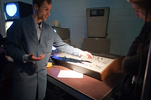
From the Laboratory’s Blog All Kindle ‘Dog-Earred’ Pages Desk, I bring you a few call-outs, quotes and passages from the brilliant bit of chronodiegetic gooeyness called “How to Live Safely in a Science Fictional Universe” by Charles Yu. Great good barely science-fictional novel here. Really a story about loss and our human nature to regain what has gone and re-do and re-play our lives. Its about travel through time but along the way you get to enjoy some good design fiction swerves and curves. A few good things to think about, ponder over and imagine. I particularly enjoy the way that time-travel is intimate with story-telling in the novel’s world — its a kind of technology and industry (military-industrial-narrative-entertainment complex) that goes along with it: conceptual technology, chronodiegetics and diegetic engineering! I’d say this is a strong-recommend. Pretty much no spoilers below.

On the subway, the guy next to me has his head in a news cloud. Paradox is up 16 percent. If I lean in a couple of inches, I can just make out what it says. Up 16 percent in the fourth quarter on a year-over-year basis...
The guy reaches his stop and gets off, leaving his news cloud behind. I love watching the way these clouds break up, little wisps of information trailing off like a flickering tail, a dragon’s tail of typewriter keys and wind chimes, those little monochrome green cloudlets, a fog of fragments and images and words. On busy news days, the entire city is awash in these cloudlets, like fifty million newspapers brought to breathing, blaring life, and then obliterated into a sea of disintegrating light and noise.

The air above our heads is a smoggy miasma: mostly a vaporous fog of news and lies, mixed in with gaseous-form gossip, meme-puffs, and as always, the mists of undirected prayers. Men on corners whisper about secret shows upstairs.

Chrono-Adventurer Survival Kit
There were no exclamation points or any squiggly lines indicating weirdness or jokiness, or any other graphics to signify, This is for kids, this is a toy, this is just make-believe. It just had those words, and it was dead serious..For five dollars and ninety-five cents, plus a self-addressed stamped nine-by-twelve envelope, sent to a PO box somewhere in a faraway state, the good people at Future Enterprises Inc. would send you a survival kit “of great use and convenience for any traveler who finds himself stranded on an alien world.”
Half of me knew it was stupid. I was old enough to know better, but on the other hand, that font! Those letters in all-caps. It didn’t look attractive and well formatted, the kind of thing a kid’s eye would be drawn to; it looked like it came from a typewriter, unevenly spaced, like there was too much text, too many ideas and words and things that someone had to say, had to let people know about, it looked like it came from the mind of a brilliant, lonely, forty-year-old man, sitting somewhere in a basement in that faraway state, half crazy, sure, but on to something.

Up the street a song cloud floats by, sagging a bit, but still intact. I walk faster and catch up with it just in time to hear the ending, a symphony orchestra, the sound full and resplendent, and it is one of those times, you know those times every so often when you hear the right piece of music at the right time, and it just makes you think, This music didn’t come from here, it was given, it fell from some other universe..

It is well established within the field of diegetic engineering that a science fictional space must have an energy density at least equal to the unit average level of a Dirac box, multiplied by pi.

Then Ed farts and its not good. TAMMY’s still crying but starts to giggle, and I’m gagging a little, and then TAMMY starts laughing so hard she almost crashes herself. Ed saves the day again.

We’re going to meet an important man, the director at the Institute of Conceptual Technology, a gleaming black building, behind gates, that sits on top of University Road, up the hill half a mile above town, where they worked on the hard problems. The big ones, like how to keep paradox from destroying the sci-fi world. They were the people my father aspired to be, this man in particular, they lived the lives he longed for, they drove up to those gates every morning and checked with the security guard and showed their ID badges and the gates opened for them, and they drove behind them, up into the compound, the castle of secrets and ideas that only a hundred people in the world knew about, ideas that only a dozen people understood.
Today is the day, that one glorious day in my father’s life. After waiting half a lifetime, half a career, his moment. Today is the day they come calling for him. They, the world, the outside institutional world of money and technology and science fictional commerce. I remember the call. Sometime after our first wobbly orbit and before he was completely sure he knew what he was doing (or rather, before he realized he would never be completely sure about what he was doing), someone had taken notice. They found him, the military-industrial-narrative-entertainment complex, and they wanted to hear his idea.

In Minor Universe 31, quantum decoherence occurs when a chronodiegetic system interacts with its environment in a thermodynamically irreversible way, preventing different elements in the quantum superposition of the system + environment’s wave function from interfering with one another.

Why do I blog this? To keep track of notes from this book. Some are good ideas for some design fiction experiments. In addition — since I read the Kindle edition (a reasoned alternative to buying the bulky hard cover — which I rarely ever buy — and reading it while on a long trip). I’m confident enough that a Kindle book will not likely be around for as long as a normal book that I feel I must spread my notes around the datasphere.
Continue reading How to Live Safely in a Science Fictional Universe

What Innovation

Up and to the Right


Just a super short set of notes from Steven Johnson’s book, Where Good Ideas Come From: The Natural History of Innovation. I don’t have anything too much in-depth mostly because it’s a fast read, when I found time to read it, and it made me squirm uncomfortably. There was not much that made me stop and smile although I did quite a bit of exasperated sighing along the way.

I think this is because Johnson chose to muddle the study and insights of biology and evolution with the activities of humans following their curiosity, their inspiration to make things, their will to create enterprises, their greed to overwhelm their competitors and make fortunes by whatever means necessary, their hubris, their social-political ambitions, their desire to leave a statue of themselves behind — whatever it is that drives individuals to build and create. Using the study of organisms, biology, the ocean reefs, species evolutions, ecosystems — all of these things as metaphors for creativity, innovation, good ideas in the making — well, that’s just problematic in my mind. You exhaust the really interesting work right out the tailpipe of your story and you’re left only with this pre-existing framework of biology and ocean science and these things to explain how Marconi’s innovations with radio. At some point the analogy becomes the story itself — it’s not like the innovation work *is like* ocean reefs accreting new material. The innovation work is a reef, with new ideas building upon old ones like so. At some points in Johnson’s story human endeavor to make new things and come up with new ideas lose out to the simplicity of the science analogy. Human ingenuity becomes the same thing as the study of species, reefs and other “up and to the right” style evolutionary stories. This makes for a good children’s allegory or grammar school analogy — or a good cocktail party explanation of the irreducibly complex activity of “innovating.” But, it makes a book-length treatment of the complexity of creativity fairly gaunt at best.

Somewhere muddled up in there is an argument that Cities breed innovation because people are so packed in together (like an ocean reef?) and ideas propagate more efficiently in density, which may be the case — but it feels like a vague generalization. It’s easy to get into an argument about whether NYC is more creative than Los Angeles, for example — and things quickly spiral out of control.

Perhaps the best part of the book is the last sentence which might be the argument and even the framework for how the book works — forget all the biology analogies. Just this tweetable little nugget.

Go for a walk; cultivate hunches; write everything down, but keep your folders messy; embrace serendipity; make generative mistakes; take on multiple hobbies; frequent coffeehouses and other liquid networks; follow the links; let others build on your ideas; borrow, recycle, reinvent. Build a tangled bank.

Had Johnson followed the walks of those innovators he was curious about, followed them along their mistakes and noted the ways they borrowed, recycled, reinvented he could have done away with the silly biology analogies. It’s all right there in the hands-on work that’s going on — there’s no need for a big, grand, one-size-fits-all theory about how ideas come to be and how they circulate, or don’t circulate and how they inflect and influence and change the way we understand and act and behave in the world. That’s the “innovation” story — or the way that *change-in-the-way-we-understand-the-world* comes about story.

What I think Johnson is trying to do is in fact deliver some material for that cocktail party conversation — to instill in readers’ minds the idea that good ideas don’t just happen in isolation. They happen because of this idea of the “adjacent possible” — Stuart Kauffman’s idiom describing the multiple possibilities for what can happen because things (science-objects in Kauffman’s notion, like molecules or elements that lead to new science-objects; idea-objects in Steven Johnson’s notion, like steam engines and wine presses that lead to new idea objects like locomotives and printing presses) are proximate. Here’s how Johnson introduces it to us — and he’s not really reminding us that he’s taking a scientific thesis by a guy and using it to describe how innovation works.

“The scientist Stuart Kauffman has a suggestive name for the set of all those first-order combinations [molecules becoming DNA, e.g.]: “the adjacent possible.” The phrase captures both the limits and the creative potential of change and innovation. In the case of prebiotic chemistry, the adjacent possible defines all those molecular reactions that were directly achievable in the primordial soup. Sunflowers and mosquitoes and brains exist outside that circle of possibility. The adjacent possible is a kind of shadow future, hovering on the edges of the present state of things, a map of all the ways in which the present can reinvent itself. Yet it is not an infinite space, or a totally open playing field. The number of potential first-order reactions is vast, but it is a finite number and it excludes most of the formst that now populate the biosphere. What the adjacent possible tells us is that at any moment the world is capable of extraordinary change, but only certain changes can happen.”

What could come to be in the world of combinations of molecules and atoms and so forth that happen to be swirling in the same goo — is the basis for Johnson’s thesis about what could be in the world of accreting and “exaption” of ideas. The adjacent possible is meant to describe the what could come to be based on the coexistence and proximity of materials. Things bump into other things and come to form new things under certain conditions. There’s not one possible outcome, but multiple possibilities.

What Johnson does is confuse this for the way that ideas — which are not molecules or atoms swirling in a primordial goo — evolve into possible “shadow futures.” Will and cunning and gile and ambition and money and access to money — these and many other non-biological factors shape how good ideas come to be. ((As well as horrible, wretched, resource-wasting ideas.)) I mean — this is a troubling way to make an argument from the get-go. I don’t think you can just willy-nilly take a thesis from biology (or hypothesis, or lens, or view of how things work) and then use it to describe something that is never as pure as what we understand “nature” to be or “natural history” — he is not creating a story that describes what happens in the world of ideas, spun and spurned by people with bodies, situated in time, space, culture and society and struggling for credibility and authority. And that’s just a problem. The coordinates and biases and ways-of-knowing are all wrong at some level. The units are way off. It’s an allegory at best that misses 99% of the mishegoss of creating knowledge and meaning; an analogy that basically filters out all the work of humans interacting in a different way than the way that molecules and atoms interact. It’s another one of those kinda annoying uses of science to explain society which starts you down the path of immediately assuming that science isn’t society by other means, or that science isn’t already a social enterprise or — worse — that science has it all figured out.

Anyway — I got suckered in because the book has the word “innovation” in it. These sorts of books with titles that are didactic are suckers bait. Its got this funny title about being a “natural history” of innovation and that seemed polite and humble, rather than prescriptive like a lot of business books tend to be. (“10 Steps to Improving Your Organizations Innovation Prospects!” — or things like that.) But then it’s less humble when you realize that this is The natural history of innovation that’s been written. N’ah — I know he’s probably being provocative with this title. But, still — I found it a bit bold. Because inside is not a natural history at all, but rather an argument made through a number of examples. The argument is to dispel the notion that good ideas — ideas that make incremental changes in the graph, making things move up and to the right to a greater or lesser degree — come from a guy sitting around by himself in a lab or basement. Rather, good ideas come about because of their proximity to other, perhaps disparate activities — other intriguing things happening nearby. Johnson’s prop is the ocean reef — and perhaps this is the joke in the title because the reef is understood to be something natural (as if) and therein lies the natural character of innovation.

Couple of notes, so long as they were jotted down while I was reading this:

He has a curiously muddled appendix of good ideas at the end, with the electric battery (1800) — every good idea has a date — sitting alongside of sunspots (1610), as if sunspots were a good idea as opposed to an observation that becomes relevant and topical. I can only imagine that these are intractably complex things that are as dense a knot of activities both purposeful, willful and incidental as one can imagine. Yet here they are rather cavalierly given a sentence or two and a date stamp as if they appeared as a good idea suddenly.

He diverts detractors to his approach of going broad and shallow by saying that there is value in surveying and drawing conclusions from many short case studies and drawing four quadrant graphs that even further simplify the points. The alternative is to be deep and thick, or to go into the laboratory — talking to people to suss out the meaning and history and all that of technology. The broad and shallow perspective is not as thorough. It’s a gloss, but even worse — it’s not substantive and opinion at best. This is fine, but the reader never really knows what they’re losing in the trade.

The argument is an engaging story — a good story. It’s an argument insisting on a POV and a thesis about an intractably complicated social/cultural/political/economic entanglement that cannot possibly be distilled to a core, to an essential character and way-of-being except in the most simple ways which never can possibly be much more than a fairy tale useful only for the most basic of explanations you might use to tell a child why the sky is blue, or as an allegory — it’s certainly not a history, natural or otherwise.

If you want to hear a really irksome panel discussion with Kevin Kelly and Johnson, check out this Radiolab podcast: What Does Technology Want?. It’s curious to me that Johnson and Kelly seem to jump on Robert Krulwich to the point of basically saying — “what’s wrong with you? don’t you believe in technology’s autonomy?”
Continue reading What Innovation

Design Fiction Principles: Notes from Design for Screen

Alien Food

A relevant short essay by Piers D. Britton in theThe Routledge Companion to Science Fiction underscores some of the loose principles (loose, because they aren’t quite principles — more a swirl of useful insights) the Laboratory has been gathering around the concepts of Design Fiction. ((Why gather principles? Well, to understand how better to create/construct/author *Design Fiction))

In the essay, Britton starts out by emphasizing the importance of the visual and aural aspects of science fiction on the screen. This is obvious, of course — but worth underscoring because it relates immediately to the appearance of things that may not be real but have to be perceived (“seem”) real. Our common sense has to extend from now to the visual story — the appearance of otherworldlyness should be coextensive with what we understand today.

The point Britton emphasizes at this point is that design in screen-based science fiction works to create the appearance of a coextensive world — extending now to then. And that design for science fiction is oriented toward verisimilitude.

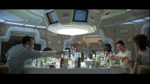
Well..so what, Britton asks. Verisimilitude is of limited value in itself. For him, the important corollary is that screen science fiction appeals to a “viewer’s sense of the tactile properties of unfamiliar phenomena.” I hadn’t really thought about the design elements in a film as textures, so I found this intriguing. Britton makes a broad cut through the history of screen science fiction delineating texture as an element of the design. ((For example, buildings, vehicles, weapons, etc.) He says that, in the 1920’s-60s, textures were modernist, sleek, streamlined, and that after the 70s, it becomes layered, scorched, rough-hewn, layered (cf. Star Wars, Blade Runner, Battlestar Galactica, Alien, etc.)

This I can follow — and its something I can vaguely recall thinking when I first saw Star Wars with my brother, with our much older half-brother carting us along. The banged-upness of the Millennium Falcon is one of these signals of a kind of verisimilitude that is drawn from the present to create a legible future (or past, in the case of Star Wars, but the direction of time matters less than the appearance of something that is *coextensive with today.)

Britton says that this by itself may not help understand the nuances of the screen science fiction genre. He’s curious about how design generate meaning? By looking at specific *texts, we may gather a fuller understanding of the role design plays in the story. But, first Britton takes a moment to point out his conviction that design imagery cannot possibly obscure the story. He says that design is spatial, narrative is teleological; narrative is words; design is not. “..rather than ask how design relates to narrative, as though the two had the potential to harmonize or quarrel, it is more productive to ask how design can operate within the whole imaginative and conceptual experience invoked by screen entertainment.”

((I guess there’s some sort of disagreement within the world of science fiction lit-crit people on this point — or maybe its just a disagreement between a couple of them — to emphasize the role design plays in the story. I think it may go along the lines of design and story being opposed in some fashion. Like — someone may feel that design ruins the story and, well I can imagine someone saying something along the lines of: “the book is so much better..the film just ruins the original story.” Or something like this. If I was still in school and not spending more time in the Laboratory, I might follow this one up. But — it could be an intriguing argument as, presently — I feel that design can tell a story, or pivot a story in a way that a narrative on its own cannot, which isn’t to say that a narrative is hobbled without design, but rather having a physical prop in the hand or on a screen does something that the story telling by itself is less capable of. And, even beyond this point — the making of the physical prop is a nice tangential, additional approach to figuring out the story itself.))

Britton then goes on to ask two questions:

* 1st: how does design uphold the “meta-reality effect” of science fiction?

* 2nd: how does design compel reflection and contemplation about the story’s underlying ideas?

These are two questions worth asking and I’d like to sort out the substance of them, but as far as how satisfying the answers, I’m only sure Britton answers them in a way that would be of use most directly to a lit-crit sort.

He uses two examples to address these questions — Blade Runner and Firefly. I’m not at all familiar with Firefly, but the point Britton makes about Blade Runner is easy enough to state to be worth mentioning.

Britton points out the specific textures of the fashion design in the film which serve to defamiliarize while still being evocative of recognizable forms. In Blade Runner, the costumes are drawn from the 1940s and the 1980s without becoming nostalgic. There is this *defamiliarization driven by texturing and contrasts (Deckard’s trench coats and Tyrrel’s vaguely art-deco octogonal glasses versus the punk-inspired costumes and hair styles of the rebel replicants, for example).

I find this bold contrast curious — this point about the collision of textures (punk versus the 1940s and art-deco) and the possibility that defamiliarization contributes either to this “meta-reality effect” or that it excites reflection on the underlying ideas of the story.

So, if I were to quickly conclude the most useful insight here it would be around this point — a subtle, defamiliarization that might compel the viewer/reader to step out of their routine, or what they might conventionally expect — this can go somewhere to “exciting” contemplation or a deeper engagement with the material than they might if they were seeing something they expected.

((Parenthetically, we’ve used this general principle I think to some modest success both in the design process and the communication of work — rather than showing things people might expect such as PowerPoint decks, bullet points or *slides — we might show a short visual loop and, much more often than not, the substance has nothing to do with what the audience might expect. It forces at least one question — what is this? And then you can answer the question and have a conversation.))

Why do I blog this? Some reading notes as I prepare some material for a talk on design fiction for the fall.

Approaches To Design

A brief post with a couple of pointers, mostly coming from a peculiar serendipity: A stack of The New Yorker often comes with me to be read during long periods where, otherwise, I would be staring at the back of someone else’s seat and head. Often times, when not on a long journey, sadly — these issues just pile up, maybe an article quickly read and that’s it. In this case, and one of the upsides of crossing a continent and an ocean and another additional bit, is that I end up reading just about everything, unless it’s another Sedaris, who has just about become another Keillor to me. Or even a Rooney (“..you ever wonder why..”). In other words – m’eh.

In any case, and back to the point, several months ago I skimmed through Richard Sennet’s book “The Craftsman” per a friend’s recommendation. I found the book intriguing in that it discusses the role of craft and handwork and the hands-on intimacy that obtains when designing and creating with an emphasis on the materiality of things and processes of construction. That is, different from the “screen-work” of disconnected finger-twitching and mouse-moving, for example. These things are topics near and dear to the Laboratory and, generally, thinking about new ways of making things, discovering new ideas, and so on. Things that have more that motivates them — the values and principles — that is not firstly, or even at all about the calculus of quantity produced, minimum profit opportunities, loss-leading market share swirls, derivative land grabs, fast-follows behind market leaders. Etcetera. Ad nasium.

On NPR recently, I heard an interview with Matthew Crawford, who has written a book called “Shop Class as Soulcraft: An Inquiry Into the Value of Work“, which sounds at least congruent with Sennett. This one I have not read, because it’s in hardback still. It certainly sounds intriguing — new ways of working and thinking, assessing the value of what you do and so forth.

Then, I came across this review titled Fast bikes, slow food, and the workplace wars in The New Yorker, which I had almost threw out, that brings Shop Class and The Craftsman together along with the canonical perspective, imho, Robert Pirsig’s Zen and the Art of Motorcycle Maintenance: An Inquiry into Values, which is a must read. (You know: stop-what-you-are-doing-now level of urgency, etc.)

Why do I blog this? This review provided a great perspective in my mind to the larger questions on our relationship to work, innovation, values and these things relationship to the larger world beyond our own desires to better ourselves. We need a kind of “design” where decisions are based upon principles of making the world a more habitable, playful place in some measurable way. This is a thoughtful approach to making things, rather than accounting-led practices that ends up making things that stuff our warehouses/delivery trucks/store shelves/homes/garbage cans/land fills with more crappy crap. Criteria for making things cannot be undergirded first, or only, or primarily by rules of accounting and engineering and counting the quantities of things made, or technical features for their own geeky sake. Quality — and not only the “styling” sort of quality — the quality of a thing’s presence in the world should account for its capacity to bring about a normatively more habitable place to live.
Continue reading Approaches To Design

Objectified

Thursday July 09, 21.39.57

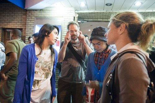
The small gaggle of friends of the Laboratory, tagging along to quietly and conveniently celebrate a birthday with a film and some Japanese food delicacies and some laughs. Charlie Becker..wonderful sculpter..he cracks The Laboratory up. This was taken here.

Finally, Objectified came to Los Angeles for a night. The Laboratory was a bit eager and a bit fan-boy-y. Some stages of hunger for the stories perspective and objectives of design, broadly. We felt like a small transition was made — there was a joke that the Laboratory “got”; there were personalities we recognized along with their subtle insider-quirks; &c.

Here are just a couple of short comments for the notebook.
Continue reading Objectified