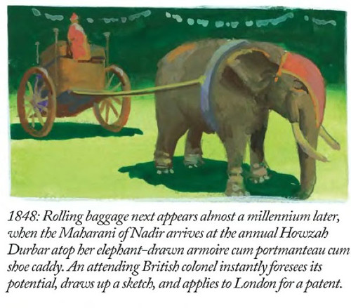
A Wry Look At Wheels On Luggage

Title

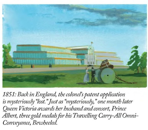
Panel-1
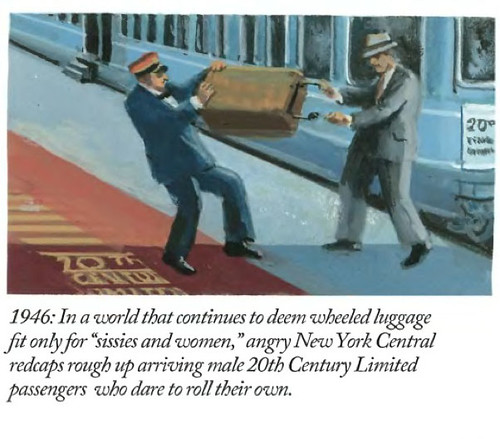
Panel-2
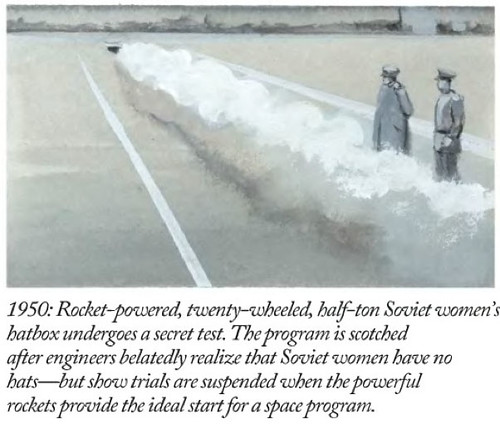
Panel-3
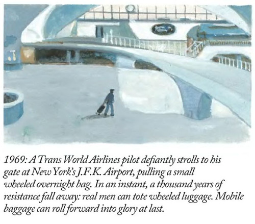
Panel-4
Panel-5
Panel-6

Why do I blog this? The idiom “wheels on luggage” has been one we’ve been exploring here, not so much to get the precise history of it (although that is interesting), but because of what it stands for. Change from one set of circumstances to another from which you look back and wonder — how could things have ever been otherwise? Or, because the change is not due to technological innovation (which is what so much is assumed to pivot) but from an innovation that is simple, direct and requires no billion dollar budgets, scores of PowerPoints, workshops galore and team off-sites. I love this kind of change — much more than the technical variety because they remind me that big change can come from small, simple alterations that just make things better. Some people like big technical imbroglios. While I don’t not like technical things — the power of one person to just sort of *shrug* and screw a couple of wheels onto the bottom of something is quite provocative. Small things done exceptionally well. ((A line of scholarly inquiry as to the social, cultural, political and technological concerns that broadly fit within the study of Science Technology and Society, or Science and Technology Studies. Fair Use, I’d say.))
Continue reading A Wry Look At Wheels On Luggage

James Dyson on Engineering Designers

Dyson Quote

An interesting article by John Seabrook in the occasional “Annals of Invention” column of The New Yorker just now with James Dyson — the guy who made vacuum cleaners suck better.

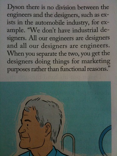
I captured this above while reading it on a short flight up to San Jose last weekend, afraid that I might not come back with the magazine and not wanting to get all messy and tear it up and then thinking that if I had the image, it’d compel me to jot it on the blog rather than squirrel it away in a drawer somewhere.

This is what he says:

..he said, “I think the main thing is that our products look like what they do — the engineering leads the design.” He explained that at Dyson there is no division between the engineers and the designers, such as exists in the automobile industry, for example. “We don’t have industrial designers. All our engineers are designers and all our designers are engineers. When you separate the two, you get the designers doing things for marketing purposes rather than functional reasons.”

Why do I blog this? The point of the relationship amongst engineering and design is something I’m quite interested in — that there should be some intense entanglements between the two roles and certainly not separated, but in constant dialogue. For instance — engineers should be better at telling the stories of their ideas and embedding them into the situations and practices of normal humans’ lives. Designers would do better design if they internalized the instrumental aspects of their craft rather than the gratuitous and the surface features. I had only clipped the part of this quote that started with “Dyson there is no division between the engineers and designers..” so I only now saw in the digital edition of the magazine that he says — “the engineering leads the design.” and I’m not entirely sure how I feel about that. I don’t think one should lead the other, although I do think that engineering has so much power and influence and hubris that it should try to humble itself and develop some really good listening skills and not expect that — just because you can think of something and it’s clever that it should be done like, for example Augmented Reality. ((Doorknobs looking for houses to fit on.))

This is a good read if you’re interested in these sorts of things. I think James Dyson has done a lot to put “wheels on luggage” with simple, left-field innovations, making things a little better than they are.

Continue reading James Dyson on Engineering Designers

Features Aren't A Measure Of Innovation

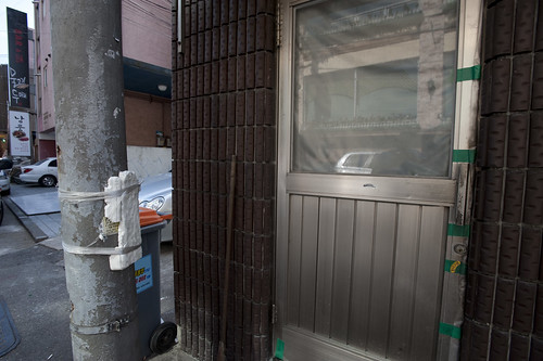
A fix to keep a door from clanging against an adjacent utility pole. Observed in Seoul, South Korea.

It’s too bad that the measure of results often must translate to quantities or business-y things, like numbers of meetings obtained or pages of PowerPoint presentations. Decanting often rich, qualitatively substantial ideas into boxes and “slides” and “decks” sloughs off so much richness that all that was learned often evaporates. The miscommunication is tragic in such instances. When asked for “the presentation”, I’ve taken to doing the electronic email version of a *shrug* — sorry, no “deck”. We can chat. I can send you some object-thing-embodiments-of-principles..if you like. If you want to stare at words, well..

The culture of PowerPoint is best described as a social disease. I don’t mean to gripe too much — it’s not a new thing, and it isn’t only a reaction to conditions as they exist for the Laboratory right now. The culture of the deck has been around us since the days at the advertising agencies and brand marketing agencies during the last cycle — where there were entire departments who did nothing but make presentation decks. Ugh. Can you imagine?

The Measure of Reality has been an obsession since I fully comprehended the made-up nature of reality, I suppose while thinking about the social and cultural parameters of science while over-educating myself. It’s good stuff — I’m not complaining — and it makes it positively frustrating at times to communicate something where you know that everything depends on how you communicate and not only the idea living in your head. No matter how much you believe in it, you have to materialize it in such a way that other people believe in it, too. You need to enroll people in your vision to the degree that they suit up and follow.

In the world of things the Laboratory works on — weird gizmos, gadgets and devices — this becomes particularly difficult when the basis for describing a design-led vision avoids touching on technology-specific features. For some reason lists of features are legible to accountants and engineers who often have the keys to the car and decide what gets done. Here, we wouldn’t offer something up that starts with a bit of technical kit — an augmented reality sensor array or whatever — and then build around that. We would start with a peculiar people-centric platform of experience — say, an otherworldly city guide as we did for the first analog edition of the Drift Deck and as Laboratory Associate Platinum Class Jon Bell is doing for the second digital edition of the Drift Deck. Our conceit has been that experiences for people offer a richer, more meaningful and legible way of creating new stuff. Innovating, only not by stacking lists of features and parts and stuff — but at least by starting with ways of creating opportunities and experiences that lead people in new, unexpected directions. That make space for experiences that go beyond expectation. Basically creating new user experiences. I don’t think you do that just by creating new features and bolting on new technologies.

When I first wrote the draft of this post, it came to mind when the folks at Tenyagroup asked permission to use a photo (that wasn’t even mine, but whatever..) I looked at their short article and found it intriguing. At one point they say:

..great brands change the game by changing the customer, not by changing the product. They become new platforms of opportunity for a new kind of customer, freshly empowered.

Those are weird words not really in the Laboratory lexicon, but somehow it makes sense. The “changing the customer” part might be stated plainly as: offering new sorts of interaction rituals and behaviors. Merely adding a bit of technology does not translate that technology into a necessarily compelling experience. It’s back to the doorknobs joke — if you can’t translate the technology into terms and experiences legible to a normal human, you’ve just stacked yet another unnecessary ornamentation on top of everything else.

This is all swirling around an argument not to design for features lists.


For brand builders, the following definitions of “features” might be useful:

Feature – Evidence of unfinished design.
Feature – The absence of brand vision.
Feature – Fear of freeing the customer–and raising him/her to the next level.
Feature – Footprint of the committee: more is less. As a rule, good design minimizes features and maximizes customers.

(inspiration via http://tenayagroup.com/blog/2009/02/21/customers-drive-brand-growth-not-features/)

Why do I blog this? This has been sitting in the Drafts pile for 18 months and I felt it was time to just post it before it got lost to some kind of data backup failure. But, I am continuing to hunt down ways of putting design-for-people as a guiding principle ahead of just adding meaningless features. Sometimes I see ideas from powerful decision-making people that basically lists the technologies du jour as specifications for what should be made. It’s infuriating — which is entirely my fault. I wish I had the techkwondo to flip that for real, and do so in an elegant way that helps people see the trouble of trying to stick doorknobs on everything they see. Also — trying to cohere some thoughts and scraps for the upcoming Device Design Day later this month.
Continue reading Features Aren't A Measure Of Innovation

*Wheels On Luggage

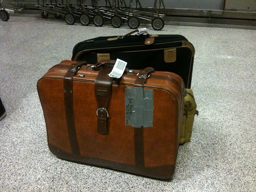
Luggage without wheels

A short-hand expression used in and around the studio to describe that one, usually small, unexpected and deceptively obvious designed feature that makes an artifact suddenly transformatively useful/helpful/up-graded. The kind of transformation that makes you look back and wonder how the heck you ever schlepped that awkward, sagging Samsonite with one arm across entire airports..cities..continents. Like..what took them so long to put wheels on luggage, anyway? I mean — I’m sure there’s a business case study on it ((if you know, please share with me..I’m curious..))

SwapDisplays

SwapDisplays_Zoomed

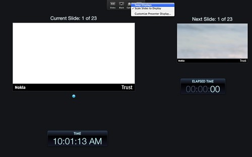
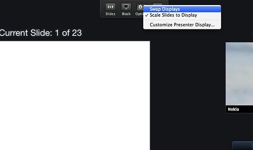
Above is just one example I came across and was prompted to mention briefly after Ian blogged about his feelings towards presentation software. This is a simple button to do the switch-a-roo between displays that is inevitably a big bump in getting set up to present from Keynote. Often enough, almost inevitably, your presentation notes screen gets piped to the audience display and you have to hunt about in display system settings to switch them. Always awkward to have people staring at your notes, or, worse — your desktop or email. Here’s a quick ejection button that toggles the displays right from within Keynote. No hunting for your System Settings, losing track of where the display mode modal dialog has gone, etc.

*Wheels on luggage.

More generally this idea of *wheels on luggage is useful to remind ourselves that things have not always been as they are — things have been different and they’ll be different again. It’s useful, to me at least, to think that we are in the Jurassic era for *something. Where are the exemplars around us that are waiting to have a set of four wheels put on to make things work a little bit better, a bit more humanely, or sanely? What is the relationship to all our “new” things today to what they will become sooner than we expect — E-waste? Something squirreled away in another bin of lost-and-forgotten things that we once thought we couldn’t live without? bits-and-bobs in a vintage shop display case?

Why do I blog this? I find it a very useful approach to design to imagine that I am making the past for some future, rather than the future itself. Artefacts that reflect ideas and inspiration but are things that someday will be quite ordinary, quotidian and unspectacular. Normalizing heroic ideas to the everyday yet exceptionally useful — such that they are impossible to imagine a world without. Like wheels on luggage.
Continue reading *Wheels On Luggage