Corner Convenience // The Near Future // Design Fiction

We did a Design Fiction workshop as a kind of follow on to the Convenience newspaper. Our idea was to take the observation that the trajectory of all great innovations is to asymptotically trend towards the counter of your corner convenience store, grocer, 7-11, gas station, etc. Discerning the details as to why this occurs isn’t our primary concern. It’s an observation that tells some stories about convenience as a cultural aspiration of some sort, broadly; it’s a way of talking about industrialization, capital, the trajectory of “disruptive innovations”; it’s a way of talking about the things we take for granted that we wouldn’t were convenience to go away in some sort of puff of apocalyptic dust; it identifies the net present value of things as 99¢ and buy 1 get 1 free.

But that was the newspaper version that took the things today and made them plain. (You can get a PDF of it here.) It also serves as the conceptual set-up for what we did next which was for Nick Foster and I to tramp to Tempe Arizona to the Emerge event at ASU in order to run a workshop that would take the Corner Convenience as our site to do a bit of Design Fiction gonzo filmmaking. We imagined the Corner Convenience in some Near Future.

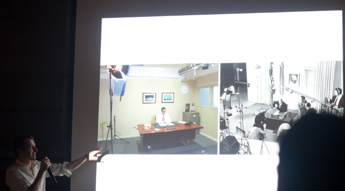
A couple of notes about the production of these films, but also the production of Design Fiction films generally. As the genre progresses — and it is progressing like crazy, which is fantastic — and evolves as a way to do design and make things rather than just film them, systems and structures and processes get informally put into place. I’m talking about things like styles and conventions and the visual language of Design Fictions. I’m attentive to these because it becomes useful in a Bruce Block sort of way to make use of the developing visual language and genre conventions.

One thing I notice is the way that now, early on in evolution of Design Fiction, tools have determined, or perhaps over-determined, what gets made to count as Design Fiction. Contemporary visual effects tools and software are incredibly sophisticated at what they do. I think they may have a tendency to over-determine the filmmaking. By that I mean to say that, now that we can do desktop motion capture, planar tracking, and animation in scenes — we end up with Design Fiction of surfaces as screen interfaces as if that’s the future of interaction. Which it might be, but seriously — what else? At the same time, things like green screen which is effectively a drop-down menu item in AfterEffects, or the insertion of CAD rendered objects composited seamlessly into scenes with (almost) drop-down menu item workflows, etc. That’s all a bit of the tool leading the ideas, which is generally disconcerting especially if you don’t realize or take notice of the way an algorithm is determining one’s thinking about what could be.

Don’t get me wrong — they are seductive eyeball candies. The Corning one is particularly enjoyable as pure visual experience. So is that Microsoft Office future fiction film. But these don’t feel real except for the degree of finesse in the visual effects. It almost feels like someone found the tools to do this and then the tools over-determined the diegetic prototyping. The tool was the door knob and then the designers or marketing people or whoever was behind this took the door knob and tried to build a house around it. And, in any case — they are so clean and almost fascistic in their fetish of the slick, glamorous, gleaming and super pricey stuff we’re being told we’ll live with in the near future.

What about the forgotten underbelly of the mundane futures? The ordinary and quotidian. The things that are so tangible as imminent as to be almost ignored. Like the things one would find in the Corner Convenience store but were once fantastic, extraordinary, mind-boggling disruptive stuff.

Using the Corner Convenience as our design fiction site directed us to consider things that were once amazing and are now 99¢ or $1.99 or 3 for 99¢. They’d be available *everywhere, which is as important to consider as some sort of silly ersatz coffee table that has a touch screen built into it. A thing that 1% of the world cares about, or can even comprehend or conjure some half-baked rationale to own and use before it gets tossed out when its planned obsolescence means it won’t show the antique JPEG format anymore without a firmware upgrade that probably won’t upload to it because of some byzantine tech issues that frustrates you to the point of not even caring about the thing anymore. You know? I’m still trying to get my brand new $99 5-star reviewed Brother laser printer (which replaced the 10 year HP I had that just stroked out and died) to run the crappy configuration software so I can use its built-in WiFi features. But, like..I’ll always be able to flick the flint-y scroll of a BiC lighter and make fire.

That was an aspect of the design principles that shaped these three films we made. We were deliberate in designing the production and the things in such a way that they were whiz-bang-y iPhone things with touch screens and surfaces. It was real stuff that would tip into that realm of convenience without missing a beat, and without Wieden+Kennedy running a campaign that seduces the 23-year-old bearded, skinny, waifish, Williamsburg/Brick Lane/SOMA hipsters into bending their knee — again — to the Palace of Apple.

In this Near Future Corner Convenience Store, Snow Leopard is a variety of synthetic meat jerky, not an operating system.

Anyway. Enjoy our three design fiction films.

The Players
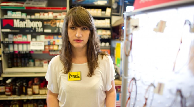
John Sadauskas — Ersatz Shoplifter
Julie Akerly — Clerk
Dan Collins — Caffeinated Drunk/Hangover Guy
Joshua Tanenbaum — Panda Jerky Porno Trucker Guy

Background Talent
Nicole Williams
Muharrem Yildirim

Workshop Props & Make Stuff Team
Alex Gino
Joshua Tanenbaum
Adiel Fernandez
John Sadauskas
Nicole Williams
Muharrem Yildirim
Byron Lahey
John Solit

2nd Unit Production
Byron Lahey & John Solit

Thanks To Tops Liquor Staff
Greg Eccles — Owner
Matt Bannon — Manager & Nametag Maker

Special Thanks To
Assegid “Ozzie” Kidane

Directed By Julian Bleecker
Produced By Nick Foster

A *Near Future Laboratory* Production

Just A Note: Design Fiction Is Not Design You'd Do Anyway + Motion Graphics

Just a thought and a note which is not an edict — just to say that Design Fiction can work as a way to have a thorough, sensible story that represents what could be. Yes, certainly it can. I’d argue that the work represented above called The Golden Institute and this other work called Super California: Forever Future by Sascha Pohflepp use Design Fiction to play around with what could have been and what could be in lovely, seductive visual narratives. Along with them go some fantastic exemplars and artefacts of those designed fictions. Those things — the artefacts and the films — are the design fiction itself. It’s more than the visual story, but the thoroughness of the stories with the artefacts that make them compelling and engaging. The films alone are great — but the projects come together in the coupling of the material with the visual documents.

There is a fine line between speculation in a way that throws things a bit off their track — gives some new, unexpected, perhaps illogical food for thought on a topic. The Golden Institute assumes that President Jimmy Carter’s ambitions for a comprehensive energy plan for the United States came to fruition. In the visual narrative we are given a documentary style government/corporate video of the plan and its possible outcomes. The objects help tell the story. Forever Future follows a rocket scientist as he explains how the hopes and ambitions for a future were not able to come about. He laments the failed ambitions but tirelessly archives new plans and new ambitions for future space programs — both those that succeed and those that feel.

The future when it arrives is more often than not as annoying, mentally stressful, mundane, boring and *blah as the present is. There’s lots to marvel about the today, about the present. But as much to ruefully shake one’s head about or decide — okay, this isn’t the future the zealous future pundits and moonbase architects said we’d get.

Okay. That may just be *me, but I prefer to think about what I consider truly novel, unexpected things rather than the same thing only done with a different brand on an existing object. That goes for failures as much as things that come to fruition, but often times in a different-than-expected form. Jet Packs exist — they’re just not commonplace or cheap or even safe. Doing Design Fiction is just as much about isolating unexpected outcomes — for example, the inevitable porn that will sustain any augmented reality future..it certainly won’t be mapping applications and city tours as the current augmented reality planners suspect to be that technology future’s economic lifeblood.

Doing Design Fiction as the normal, boring possibilities that are basically just visual narratives about the boring aspects of a new, provocative idea misses the grit and grime and disappointments and banality of most futures. That in my mind is closer to just doing traditional design — same stuff, different client; same stuff, only on the iPad instead of just the Web; same stuff, only with a different UI modality. Etc.

There are good reasons to use little films plus some motion graphics and, like..Mocha or SynthEyes or your favorite prosumer special effects package to make something look like it belongs in the scene and all that. I *get that. But in the case of doing normal design work, those little films are best suited to contributing to the refinement and iteration and exploration of a design project. It’s a perhaps more thorough way of figuring out how a UI should work because you have to go through the trouble of making a more resolved version than you might with static wireframes. That’s all. But, in this case — with due respect to what I am sure are fine, thoughtful, creative folks at Hotstudios — that ain’t Design Fiction in my book. That’s just good Design Prototyping with a little film.

Continue reading Just A Note: Design Fiction Is Not Design You'd Do Anyway + Motion Graphics

Design Fiction Chronicles: The Future Issue of The Book and iPad

The Future Issue

In a project we’re currently undertaking that has allowed us to work through and figure out the future of the photo book I was compelled to read through this book called “The Most Beautiful Swiss Books” and the 2009 edition is called “The Future Issue.”

I like the play on words there and didn’t see it until just now.

The Future Issue. Like..it’s the issue from 2009, because this is an annual. But, the future is an issue to consider. Get it? Well..I didn’t until my coffee took hold.

There are a few relevant passages in here on design, the future of reading and publishing and that sort of thing.

* Everyone seems to be considering the iPad. This book was published after the iPad was announced but before it was made available. There should be a follow on to the points made in there. Maybe I’ll do that. Follow up with the critics and ask them. There is the usual bulwark, which is to say that there is something about the tangibility and materiality of the book that is precious, seminal and defines book. Something that people would still want.

Other points related to iPad-mania were to indicate the distinction between book-dedicated readers like Kindle and platforms like iPad in that there is always something available with the iPad to do other than read, which can pose distractions like..*shrug..why not check email now?

There was some excitement about the evolution of book design in the pad-electronic form. What compliments and extends paper, pages, binding and all that.

* And then there was the wonderful canonical reference to 2001 – A Space Odyssey which made me very happy. I had never noticed in the movie poster that there is an iPad, which was referred to as a Newspad in the book upon which the film was based. Bonus design fiction future issues!

There's an iPad in the 2001: A Space Odyssey movie poster

* Mention was made to Wim Wenders seeking opinion on the extinction of movies in the context of the intrusion of television. Would books suffer the same fate as movies did when television appeared?

* Perhaps the most vibrant short essay questioned the phrase The future of. Something called “Experimental Jetset” — a collective of Graphic Designers in Amsterdam wrote that they dislike the three words “The future of..” saying they find “something about the phrase that completely puts us off.”

What bothers us most is the suggestion that the future is an unchangeable entity, something that develops completely independent of ourselves. A pre-determined path, to which we should adapt ourselves, whether we like it or not..

‘Our future’, is something that is manageable, shapeable, changeable, buildable, doable. ‘A future’ sounds pretty decent as well. A plural ‘the futures’? Why not? Just as long as we can get rid of the idea of the future as something that governs us, like some kind of pre-modern deity. Let us be reckless about it: we govern the future, not the other way around.

Perhaps this is the most encouraging perspective in the essays of the book, tucked neatly in near obscurity amongst the two other possible opinions: (1) veiled conceit for the iPad/nostalgic death-grip on the smell of leather, the artisinal bookbinders craft, &c.; (2) curious exuberance for this evolution in the rituals of reading.

Why do I blog this? Notes on opinions about the evolution of book writing, making and the cultural evolutions of reading and publishing practices. Plus the bonus design fiction chronicle on the iPad in 2001!
Continue reading Design Fiction Chronicles: The Future Issue of The Book and iPad

Design Fiction at UC Calgary's Environmental Design: A First Go At Design Fiction Genre Conventions

Friday November 19 07:02

From awhile ago, back at the end of last year I went to UC Calgary’s Environmental Design and presented a further iteration of the design fiction business. I realized I hadn’t put down on paper or on this blog some thoughts from the presentation — but mostly thoughts about what design fiction can do.

Just in terms of process, my basic routine is to extend the thinking in steps, using commitments to travel and give a talk or facilitate a workshop as the motivation to move the general thinking a bit further. Where it’s going is oftentimes vague sometimes — but generally it’s just a kind of extending conversation that helps me and I hope others think about the opportunities for collapsing design and science, fact and fiction together into a productive muddle.

In this talk I set the usual frame — placing science fiction alongside of science fact and leveraging David Kirby’s work on the diegetic prototype — the prototype that does more than an engineering or technical or instrumental prototype. ((That may be my emphasis to say that it does more — or a conceit on my part.)) The exemplary diegetic prototype is revealed through Minority Report — the film — and the role that John Underkoffler played in the technical design and technical production of the film’s gestural interface. Despite the challenges of such a system in practice, Underkoffler was able to work through technical issues pertaining to such an interface mechanism through the context of the film’s story. He had a basis upon which the interface would be employed in the future of P.K. Dick’s world of 2050. Moreover the film’s popularity and just its existence provided a way of circulating the concept of this specific kind of gestural interface. The film and the fictional technology that Underkoffler proposed and demonstrated in the film became a way of leveling-up the idea — giving it some exceptional circulation. In effect, the film became the logical extension of the M.I.T. Media Lab’s mantra of demo, demo, demo — or demo-or-die.

This is the stock presentation I’ve given on design fiction. Early on — I think the first time I explicated all this stuff was in Amsterdam where I gave a talk at the Sandburg Instituut Master Course during Halloween in 2008 — I was trying perhaps not successfully to integrate film clips as a way of describing the importance of the story, rather than just objects or props. That is — during that particular presentation in Amsterdam — I showed unusually long film clips. So — the first 3 minutes of Minority Report, for example. Let’s watch that and allow the cool technology to be part of a story that is more about humans as social beings and this lets the tech become social too — it’s not just a doorknob sitting by itself. It’s also a social-instrument, an artefact that has a role to play in this particular drama. What Spielberg is able to do is introduce the technology to us — it’s just a prop — without making the whole film *just about the gesture technology or even the pre-cogs, or the slick environmental advertising, or the jet packs. They are there, of course — but that’s not what the story is about, any more than the Maltese Falcon was about a statue of a falcon from Malta. The statuette was a prop — a way of spinning the story about a couple of crooked crooks.

The purpose was to give a larger context for the gestural interface rather than just its use in the 30 or 40 seconds we see it in the beginning of the film. I wanted to give the device a role and a purpose — an instrument that’s used routinely. I wanted to shift it from being a spectacle to being just an ordinary albeit sophisticated bit of technical kit. Just in the same way that a microscope in a forensics-heavy police procedural television show is not fetishized as a prop or device in that sort of story, neither should be the gestural interface in Minority Report — even though to our eyes as viewers, at least at the first screening, it is quite extraordinary. The point is that the film makes the device quite ordinary and routine. This is John Anderton just going about his business as a savvy, street-smart, afflicted cop. It just happens to be a future world to us, with all its trappings of things extraordinary.

From this I began thinking about the conventions, stylings, idioms and techniques that make the future seem like today. How do you make the extraordinary appear ordinary and quotidian? This seems to be an important way of depicting the future and making it seem possible. It’s just a way of designing — an understatement of perhaps novel, innovative and crazy ideas from the future. Why do this? Because in a way this is part of the work of design innovation. To make something spectacular routine, domesticated (to borrow from James Auger) and perhaps even boring and everyday. When you can do this, you’ve turned a corner into a new space that provides a setting for a kind of innovation that is chaste and modest and thereby, perhaps — entirely possible. This then communicates your innovative, crazy, off-the-hook idea as legible and something which can already be accomplished.

Thursday November 18 15:20

There’s much in the social, cultural and political history of science and innovation on the topic of modesty as a mode of conveying and communicating an idea. Scientists are especially guilty of this mode of communication — behaving only as unadorned and modest presenters of things-as-facts. Just revealing nature as it is. Simon Schaffer and Steven Shapin’s Leviathan and the Air-Pump: Hobbes, Boyle, and the Experimental Life and especially Schaffer’s A Social History of Truth: Civility and Science in Seventeenth-Century England (Science and Its Conceptual Foundations series) speak much on this topic. I think here I’ve internalized their insights and tried to find ways to leverage the modest proposal of a new, speculative idea — as was the air-pump in its time — as a way to communicate it convincingly. In part design fiction is about communicating a new idea, but of course it is also, perhaps mostly, about actually doing design through the modes and idioms of science fiction.

This way of presenting an idea and enrolling people in it is described quite convincingly by Shapin and Schaffer. It’s really an important read in this regard. It’s a great historical book. I seem to re-read it every few years because it’s almost tactical in its description of how ideas become materialized and circulated. It’s certainly much more thorough and convincing than popular surveys of how ideas evolve and develop — I kept thinking about how loosey-goosey Stephen Johnson’s Where Good Ideas Come From: The Natural History of Innovation end up being for its lack of rigor and its desperate hunt for a simple one-liner — this whole adjacent possible. It reads like a nursery rhyme that forgets that its okay that the world is an intractable complex and entangled place. ((G’aah. I’m all riled up now. I’ll get back to that one later.))

Thursday November 25 09:30
Thursday November 25 09:31

Cinematic Storytelling: The 100 Most Powerful Film Conventions Every Filmmaker Must Know. It sounds very vocational, but I find the idea of a catalog of ways of telling visual stories compelling. It would be nice to create a similar sort of thing for design fiction, I think. This is what is next.

Anyway — so what I’m trying to do now with the whole design fiction business is catalog a series of genre conventions — ways in which one can describe an idea or an object or a bit of thinking. How do we show ideas as they would be in the world? Or as they come to be? I’m thinking about mostly visual stories — little films or proper films, but mostly little films because they can be produced, we have a pre-existing language of visual story telling and now I’m convinced that that language can be used to also do the work of designing. What I and others are talking about is using film/visual explications as a means of prototyping and, perhaps more importantly — designing. It shouldn’t be just a way of showing a concept but also a way to feedback into the design process — or it should be a part of the design process, not just a final demonstration. They should be made in such a way that thinking is going on while they are being made. One should pay attention to lessons being taught by the little filmmaking process because effectively, then — you are also doing design, just with fiction which allows more freedom in the explorations.

Why do I blog this? Well — I’m doing a few design fiction workshops later this summer and fall and it seems like film is a viable way to think through how to set the scene for a near future world, or little moment of that world. It would be quite nice to do a workshop that included film making as the “hands-on” work part of the workshop. It actually takes a lot to think through things if you’re making a little movie, even a super little one. But, things get even more intriguing when the making of the film is actually part of the design process itself — allowing the extra work to be more than communicating the idea, but actually informing it quite directly. Some of the little films we’ve made in the studio were exceptionally useful to shape and challenge notions that work quite well in conversation, or on the screen or on big posters. It’s when things go in the hand and become materialized that you start to discover something about the design that needs more help to make its way into people hands.
Continue reading Design Fiction at UC Calgary's Environmental Design: A First Go At Design Fiction Genre Conventions

Primer: Inexplicable Ideas In Design Fiction

Something that the almost inscrutable science-fiction film Primer does quite well is to paint enough of the contours of its science and technology to give the viewer the sense that *something is going on that should make perfectly good sense..if I was only a bit more techo-literate in the arcane minutia of quantum mechanics, time travel and so on.

Early on we see the DIY garage tinkerers/hackers/engineers working on a proof-of-concept of…something. They’re in their *garage, and that’s where weird, misunderstood, works-of-passion happen, at least in the American suburbs _ like garage bands, garage science is populated in the cultural imaginary as where real, dyed-in-the-wool innovation happens. (Much like the time-travel science/design-fiction in How To Live Safely In A Science Fictional Universe, as it turns out.)

The scene above is a favorite. We watch a device of some sort — small, exposed printed-circuit board, with a LCD numerical display that changes on a little bit. Car batteries for power; roughly hewn bread boards. Shaking assemblies; slight bits of panic and confusion. Something is happening here, and you can only watch the visual story as it unfolds to fill in the gaps. The setting makes it all seem much more possible — garage, a couple of guys discussing their work in the vernacular of…whatever they’re working on. And somehow this makes it seem honest — it’s not didactic like some techoscience-based science-fiction — or even documentaries. We’re not meant to completely understand the quantum physics here, even if it were understandable. When the story telling becomes too didactic, it loses something. It should be as complex as it would be, and possibly completely impossible for anyone to understand but the six people in the world who are working on it, like String Theory or some such.

In an interview with the director:

From the start, he wanted his dialogue to sound absolutely authentic. The only way to accomplish this goal was to immerse himself in the study of physics — the shared fixation of his characters — until he became “conversant” in it. “I had never taken a physics course,” recalls [screenwriter/director/co-star] Carruth. “but I read a lot about it and consulted graduate student research projects I had found online.” In the movie, conversations among the characters are extremely realistic: they talk to each other using the kind of techno-speak that would come naturally to work-obsessed scientists.

The film itself is intriguing for its story and how its told on the screen, but also for the production. Shane Carruth — writer, director, film score, co-star, &c. — is an engineer who wanted to tell a story and so learned how to do so by teaching himself filmmaking. Done on the cheap — $7000 according to IMDB — it won the Grand Jury Prize at Sundance in 2004 and a $20,000 prize from the Alfred P. Sloan Foundation for films dealing with science and technology. (That’s cool.)

Further in the interview, he describes an insight on the aesthetic of new ideas and innovation, which is of course much more rough-hewn then was typical for the canon of science-fiction. It’s all about the DIY finish — things bought at the local hard-goods store, or McMaster and cobbled together as best as one can with, oftentimes, low-budgets. Perhaps something like what Google’s first server looks like.

The inspiration for PRIMER came to Carruth at a time when he was reading books about discoveries. He observed that “whether it involved the history of the number zero or the invention of the transistor, two things stood out. First, the discovery that turns out to be the most valuable is usually dismissed as a side-effect. Second, prototypes almost never include neon lights and chrome. I wanted to see a story that was more in line with the way real innovation takes place.”

Why do I blog this? To add some additional notes to the design fiction chronicles and their attendant style conventions.

Late Edition: Nicolas Nova has pointed us to a Time Line!

primer_timeline

Continue reading Primer: Inexplicable Ideas In Design Fiction

A Few Things The Laboratory Did In 2010

Friday December 10 15:28

Again, mostly in the notes-to-self column, I’d just like to capture a few things that we here at the Near Future Laboratory did in the year 2010.

It was a year chock full of Design Fiction actions and activities, an exhibition of some work, talks and discussions about projects and ideas. The usual, except there was a dearth of making-of-things, something which will be remidied one way or t’other in 2011. ((I shouldn’t discount the zealous skate photography, though.))

So, just a fool’s list:

Saturday March 13 12:27

There was the panel at South by Southwest with Stuart Candy, Sascha Pohflepp, Jake Dunagan, Jennifer Leonard and Bruce Sterling. I think that was a highlight as it led to some great conversations from the dais and Bruce’s interjections and interceptions were quite inspiring. I think the best part of the panel was what we talked about getting the whole thing organized. There were some really intriguing Skype conference calls, just talking and learning from each other. That was good stuff.
(Audio Podcast of the SXSW Design Fiction Panel)

Friday September 17 17:06

Art Center’s “Made Up: Design Fiction” theme was (and continues to be) an opportunity to further stretch and elaborate the Design Fiction theme — finding new ways to actually *do design, and then sponsor a number of works exploring the idea of making things up as a way to do advanced design. I love what the Media Design Program folks are doing over there. Participating in the “As If: Alternate Realities” panel discussion and other activities over there has been good, great fun. ((I was also super excited to go to the MDP MFA Thesis Reviews and see student work first-hand, give feedback and all those other good things..))
(http://www.nearfuturelaboratory.com/2010/09/10/made-up-panel-discussion-september-17/)

Tuesday October 26 15:22

The original design fiction essay was rejiggered and reprinted in Volume Quarterly for their Issue No. 25 with the theme: The Moon. That was an interesting re-writing project because I had wanted to say a bit about how I understood architecture as perhaps the canonical design fiction enterprise — it is so imminently focused on what could be, and perhaps so finely tuned to tell a story — to *pitch what the future landscapes might look and feel like, and suggest how humanity might live and embody space. Architecture has this remarkable conundrum in that it likely spends most of its time constructing facsimiles of what could be as concrete gets poured based on most designs so infrequently. Sure — the big corporate architecture firms make their malls and condos and so on. But the speculative, richly imaginative contingent of architects — well..they enter competitions with models and renderings. In fact, I would guess that most of architecture does precisely this — it spends its time (not fruitlessly, I would say) telling stories through materialized forms: models, renderings, films, stories essentially. Designed fictions, I might say. In any case, the reviewers for this particular re-write didn’t find it substantive or something — it’s fine. It’s a theme I’d like to work on in some fashion for 2011, though. Even though I have a grumbling relationship to architecture.
(http://www.nearfuturelaboratory.com/2010/12/22/designing-fiction-in-volume-q/)

Monday December 13 14:19

Which might seem like it contradicts the fact that I participated in two reviews for USC Architecture, one in Neil Leach’s wonderful “Interactive Architecture” studio, and the other for Geoff Manaugh’s equally provocative Cinema City studio. Both were thoughtful and fun and engaging. I often felt that the students got a bit too ruffed up by the jurors/critics, but I have *no idea what the culture of that design practice is, so maybe that’s entirely normal. I always thought it was soft gloves before you went bare-knuckles in crits. Maybe its just all tough-love all the time.

My chum John Marshall and I had our essay appear in the Digital Blur: Creative Practice at the Boundaries of Architecture, Design and Art book. It’s an essay on Undisciplinarity — doing things without predefined boundaries, or without constraints and often without discipline. I think it’s a useful way of doing things differently and perhaps making new things. Just looking at the world and its possibilities from a sideways glance and without curmudgeonly bureaucracies to say you’re doing things the wrong way round. Pick up a copy, not for the essay but for the other great documentation by artists and designers.
(http://www.nearfuturelaboratory.com/2010/04/30/digital-blur-book-launched/)

Friday July 23 12:01

For the third time I was able to attend ThingM’s Sketching In Hardware event, this time held in Los Angeles at that crazy Encounter Restaurant. I’d share the presentation, but its 1GB because in 2010 I sort of went a bit crazy including film clips in my presentations. I wish there was a better way to share these enormous things.

The Laboratory had a spot presenting at Kicker Studio’s Device Design Day last August. Again, more elaborations and thinking about the Design Fiction stuff — “Design Fiction Goes From Props to Prototypes” — thinking about prototypes as ways to test ideas (not just their material forms): “Prototypes are ways to test ideas—but where do those ideas come from? It may be that the path to better device design is best followed by creating props that help tell stories before prototypes designed to test technical feasibility. What I want to suggest in this talk is the way that design can use fiction—and fiction can use design—to help imagine how things can be designed just a little bit better.”
(Kicker Device Design Day on Vimeo)

Habitar

The Apparatus for Capturing Other Points of View was exhibited at the HABITAR Exhibition in Madrid. The concept of the exhibition is something that is quite close to the hearts of the Laboratory, so I will put it here: (you can download the exhibition catalog as well)

“Utopian and radical architects in the 1960s predicted that cities in the future would not only be made of brick and mortar, but also defined by bits and flows of information. The urban dweller would become a nomad who inhabits a space in constant flux, mutating in real time. Their vision has taken on new meaning in an age when information networks rule over many of the city’s functions, and define our experiences as much as the physical infrastructures, while mobile technologies transform our sense of time and of space.

This new urban landscape is no longer predicated solely on architecture and urbanism. These disciplines now embrace emerging methodologies that bend the physical with new measures, representations and maps of urban dynamics such as traffic or mobile phone flows. Representations of usage patterns and mapping the life of the city amplify our collective awareness of the urban environment as a living organism. These soft and invisible architectures fashion sentient and reactive environments.

Habitar is a walk through new emerging scenarios in the city. It is a catalogue of ideas and images from artists, design and architecture studios, and hybrid research centres. Together they come up with a series of potential tools, solutions and languages to negotiate everyday life in the new urban situation.

(http://www.nearfuturelaboratory.com/2010/05/31/apparatus-at-the-habitar-exhibition/)

I participated in the University of Michigan’s Taubman College’s Future of Technology Conference, which was an interesting two days of sort-of lighting 15 minute presentations from a whole string of folks, mostly from in and around architecture (again!) to hold forth on the future and what it was. ((There are some good talks in there — Bruce Sterling, Usman Haque, Hernan Diaz Alonso. Note bene how mine is nearly spot-on 15 minutes. Architects love to speak, even if they go over their allotted time. I could’ve carried on. But I didn’t, out of courtesy. *shrug.) Most of them basically shared their work, which I guess is hopeful insofar as they imagine the future full of their work, I guess. I basically showed my “graphs of the future” thing — it was 8 graphs at the time. These are a few “graphs” that are sort of canonical ways of presenting what the future looks like, usually according to quantitative metrics.

Friday October 29 05:50

Then there was a nice close to the year with the Swiss Design Network Conference whose theme was Design Fiction (yesss…) It was a nice time in Basel, with a chance to meet some new friends and then people who I had only heard of or only talked to by email or phone. I gave one of the keynotes and helped Nicolas facilitate the workshop on Using Failures in Design Fictions.

I’d say in 2010 Design Fiction learned about itself as a practice of doing design, provoking and entertaining and suggesting new ways of seeing and understanding. It has been well-articulated and played with and used as a lever for all kinds of amazing work all over the place. I think the best go-to place is by @bruces wonderful Design Fiction category list — much more consistent and thorough than the Near Future Laboratory’s Design Fiction Chronicles and less-hampered by the ninnies at Vimeo who clearly don’t understand the way I was using film clips to discuss, in a scholarly sense, the role of science fiction film. *sigh. Anyway — @bruces is the real scout-about for what’s going on at the many fringes of thinking/making/doing.

Well..those are the highlights I can think of right now.

Continue reading A Few Things The Laboratory Did In 2010

How to Live Safely in a Science Fictional Universe

Wednesday November 10 13:07

From the Laboratory’s Blog All Kindle ‘Dog-Earred’ Pages Desk, I bring you a few call-outs, quotes and passages from the brilliant bit of chronodiegetic gooeyness called “How to Live Safely in a Science Fictional Universe” by Charles Yu. Great good barely science-fictional novel here. Really a story about loss and our human nature to regain what has gone and re-do and re-play our lives. Its about travel through time but along the way you get to enjoy some good design fiction swerves and curves. A few good things to think about, ponder over and imagine. I particularly enjoy the way that time-travel is intimate with story-telling in the novel’s world — its a kind of technology and industry (military-industrial-narrative-entertainment complex) that goes along with it: conceptual technology, chronodiegetics and diegetic engineering! I’d say this is a strong-recommend. Pretty much no spoilers below.

On the subway, the guy next to me has his head in a news cloud. Paradox is up 16 percent. If I lean in a couple of inches, I can just make out what it says. Up 16 percent in the fourth quarter on a year-over-year basis...
The guy reaches his stop and gets off, leaving his news cloud behind. I love watching the way these clouds break up, little wisps of information trailing off like a flickering tail, a dragon’s tail of typewriter keys and wind chimes, those little monochrome green cloudlets, a fog of fragments and images and words. On busy news days, the entire city is awash in these cloudlets, like fifty million newspapers brought to breathing, blaring life, and then obliterated into a sea of disintegrating light and noise.

The air above our heads is a smoggy miasma: mostly a vaporous fog of news and lies, mixed in with gaseous-form gossip, meme-puffs, and as always, the mists of undirected prayers. Men on corners whisper about secret shows upstairs.

Chrono-Adventurer Survival Kit
There were no exclamation points or any squiggly lines indicating weirdness or jokiness, or any other graphics to signify, This is for kids, this is a toy, this is just make-believe. It just had those words, and it was dead serious..For five dollars and ninety-five cents, plus a self-addressed stamped nine-by-twelve envelope, sent to a PO box somewhere in a faraway state, the good people at Future Enterprises Inc. would send you a survival kit “of great use and convenience for any traveler who finds himself stranded on an alien world.”
Half of me knew it was stupid. I was old enough to know better, but on the other hand, that font! Those letters in all-caps. It didn’t look attractive and well formatted, the kind of thing a kid’s eye would be drawn to; it looked like it came from a typewriter, unevenly spaced, like there was too much text, too many ideas and words and things that someone had to say, had to let people know about, it looked like it came from the mind of a brilliant, lonely, forty-year-old man, sitting somewhere in a basement in that faraway state, half crazy, sure, but on to something.

Up the street a song cloud floats by, sagging a bit, but still intact. I walk faster and catch up with it just in time to hear the ending, a symphony orchestra, the sound full and resplendent, and it is one of those times, you know those times every so often when you hear the right piece of music at the right time, and it just makes you think, This music didn’t come from here, it was given, it fell from some other universe..

It is well established within the field of diegetic engineering that a science fictional space must have an energy density at least equal to the unit average level of a Dirac box, multiplied by pi.

Then Ed farts and its not good. TAMMY’s still crying but starts to giggle, and I’m gagging a little, and then TAMMY starts laughing so hard she almost crashes herself. Ed saves the day again.

We’re going to meet an important man, the director at the Institute of Conceptual Technology, a gleaming black building, behind gates, that sits on top of University Road, up the hill half a mile above town, where they worked on the hard problems. The big ones, like how to keep paradox from destroying the sci-fi world. They were the people my father aspired to be, this man in particular, they lived the lives he longed for, they drove up to those gates every morning and checked with the security guard and showed their ID badges and the gates opened for them, and they drove behind them, up into the compound, the castle of secrets and ideas that only a hundred people in the world knew about, ideas that only a dozen people understood.
Today is the day, that one glorious day in my father’s life. After waiting half a lifetime, half a career, his moment. Today is the day they come calling for him. They, the world, the outside institutional world of money and technology and science fictional commerce. I remember the call. Sometime after our first wobbly orbit and before he was completely sure he knew what he was doing (or rather, before he realized he would never be completely sure about what he was doing), someone had taken notice. They found him, the military-industrial-narrative-entertainment complex, and they wanted to hear his idea.

In Minor Universe 31, quantum decoherence occurs when a chronodiegetic system interacts with its environment in a thermodynamically irreversible way, preventing different elements in the quantum superposition of the system + environment’s wave function from interfering with one another.

Why do I blog this? To keep track of notes from this book. Some are good ideas for some design fiction experiments. In addition — since I read the Kindle edition (a reasoned alternative to buying the bulky hard cover — which I rarely ever buy — and reading it while on a long trip). I’m confident enough that a Kindle book will not likely be around for as long as a normal book that I feel I must spread my notes around the datasphere.
Continue reading How to Live Safely in a Science Fictional Universe

Design Fiction Chronicles: Before the iPad There Was the PADD

Saturday October 24, 19.35.51

Your author, considering his solution to the Kobayashi Maru during a shake-out run on a Class D starship.

There was recently a wonderful article on Ars Technica interviewing the production and prop designers for Star Trek. I highly recommend giving it a read, even if you’re not a Trekkie. What I find most curious is the creative constraints that the production design was under and their solution. With a limited budget for doing lots of physical design, they decided to draw the user interfaces, rather than assemble them from hardware like knobs and buttons and so on. The idea of a screen-based display that would change based on what it needed to do — a “soft” interface — arose.

“The initial motivation for that was in fact cost,” Okuda explained. “Doing it purely as a graphic was considerably less expensive than buying electronic components. But very quickly we began to realize—as we figured out how these things would work and how someone would operate them, people would come to me and say, ‘What happens if I need to do this?’ Perhaps it was some action I hadn’t thought of, and we didn’t have a specific control for that. And I realized the proper answer to that was, ‘It’s in the software.’ All the things we needed could be software-definable.”

(via http://arstechnica.com/apple/news/2010/08/how-star-trek-artists-imagined-the-ipad-23-years-ago.ars)
Continue reading Design Fiction Chronicles: Before the iPad There Was the PADD

Design Fiction Chronicles: Apollo 11 Owner's Manual

Friday July 23 15:48

Found another design fiction in the form of an Apollo 11 Owners’ Workshop Manual, published by the folks at Haynes. I remember having Haynes service manuals for the two service-it-yourself buckets I had — a 1980 VW Rabbit and that 1972 Toyota Landcruiser which probably spent more time being made drivable than driving around.

The curious thing to note here is the playful distortion of the genre convention of a service and owner’s manual. One would only reasonably have such a manual if you owned the thing you mean to service, or are planning to get it. Making it a routine sort of technical guide puts you in the position of a service technician or even an astronaut who perhaps bought one of these things and now needs to sort out how to get the glitchy STS Antenna system to reboot.

I’d put this in the same category of design fictions as the Star Trek Starfleet Technical Manual and the myriad Star Wars “Essential Guides”, although these take themselves less seriously.

Many of the technical manuals, operators guides and service manuals for the Apollo, Shuttle and Skylab programs are available online — the real-deal. Packaged in this way as a Haynes manual puts this in a whole different category. The manual itself is more of a Time-Life style book as was pointed out to me when I shared this at the recent Sketching in Hardware 2010 event. Inside are many technical diagrams and explanations of systems — as well as astronaut photographs, descriptions of the program and so on. The cover provides the design fiction device of making the extraordinary possibility of owning this thing quite ordinary — oh? that thing in the driveway? Yeah..that’s my lunar lander..stuck valve in the intake manifold I gotta sort out.

Why do I blog this? Trying to capture some of the genre conventions of design fiction to be a little more articulate about what design fiction is and how it works and what it is for.
Continue reading Design Fiction Chronicles: Apollo 11 Owner's Manual