Predictably Not Quite Failing

Sunday February 07 14:25

Since the *winter holidays here in Los Angeles, which is a strange thing for an East Coast boy, especially as I hear reports of epic dumps of man-killing snow in New York City, my favorite photography spot has been the recently opened Venice Beach Skate Park and the equally awesome Venice Skatepark. I’m not a skater, nor a Sk8r, nor a photographer inclined to action-y things, but being in the mix, under threat of kicked out boards and lawless aerials

Sunday January 03, 16.09.24

Saturday January 23 18:23

Saturday January 30 14:52

makes the park an invigorating and challenging photography playground — and quite addictive.

I don’t want to attempt a rough-shod bit of metaphor-stretching — or at least not too much — to try and rationalize sharing this *non sequitur of a post, except to say that, as pertains the last photo, I have been obsessed with these moments when something tried..fails. The failure has this curious, no-fear character to it. Trying the thing that seems impossible, over and over again. Getting closer, or moving away from the original idea and into something else, &c. It’s never a failure out right, at least as I see it through a viewfinder. There’s always something quite lovely about the moment when the board stays where it is, and the skater goes somewhere else.

Why do I blog this? *shrug.
Continue reading Predictably Not Quite Failing

Design Fiction Chronicles: Brainstorm

Opening credits, which encompasses also the early moments of the first scene of Brainstorm

Well, this is one popped into my head the other day, but not for the reasons I’ll mention in this post — I’ll save the initial motivation for a post in the near future. In the meantime, while I was watching this again I found deep enjoyment in the first few minutes of the film when the viewer basically has to learn what the heck the is the technoscience of the fiction proper so they can knit it into their interpretation of the story. Sometimes the technoscience is pure MacGuffin — nothing specific, but *the device or what-have-you. Other times, it’s speculative but connected in a legible way to existing ideas, conversations or prototypical exemplars of what one sees as science/technology fiction in a film. That is, the film plays with current technology *memes, extracting, manipulating and cleverly employing them to service the story and general entertainment.
Continue reading Design Fiction Chronicles: Brainstorm

The Week Ending 021910

Thursday February 18 19:59

Well, another week, another set of tardy week notes..it only seems like sheer anxiety about not being diligent propels me and that only when the subsequent week begins.

Onward.

It was a week of production of things related to project Trust; completing, debating, refinishing, redesigning as these things go, which seems classic completionist dyslexia, seeing as the next, next *done-by that we set was, technically, the end of February and already the calls are coming in to see it to help with whatever-whatever other thing someone else is doing that they feel could use a burnish or a braze from Trust. We’re genuinely excited to have these conversations — almost a dozen such over the next two weeks according to this scrap of paper with names, dates and locations.

In the midst of this, at this point is the curious letting-of-things-go insofar as the *intelligence or the *ideas in the project have been assumed embedded directly enough in their exemplars that actually figuring out what the ideas are, or refining them and so forth — this has gained little attention with a pure, slightly unnerving emphasis on the communication of them through small films, and a focus on the means and mechanics by which the communication happens. I suppose this is as these things go — for the writer in me (I mean this quite modestly), this is like the polishing and editing of the thought, with the thought and story quite well completed and beyond the point where major revisions can happen. If I can keep on this track of pure production, pure editing, I’d be surprised, knowing my penchant for rethinking at the last minute.

There was a short, two day trip to San Francisco to visit the facilities there and participate in an in-depth technical review, which was 2 parts engaging, 2 parts intriguing and 1 part exhausting. Communicating the experience of interaction touchpoints and *user (bleech..) journeys in order to feedback into the circuits of design, technology, logistics and accounting is something quite new to me, but something I genuinely want to understand and participate in, *only to know how design can shape an influence and be instrumental to the work that (a) engineers do; (b) software programmers do; (c) middling, junior designers do; (d) people under tremendous pressures with financial incentives calibrated to meeting some date in a calendar, um..do; (e) accountants and business people do..etc. ((This thinking calibrates with a talk Mike Kruzeniski gave at IxDA, which I hope to hear one day where he conveys this important, crucial notion that if you cannot make your design criteria, pattern, process, thinking — whatever — communicate to the sensibilities of the engineers making the stuff you draw in story boards, then you may as well take up horse shoeing.))

What also occurred to me during this workshop-y couple of days was the means and mechanisms by which one communicates *feedback. The spreadsheets and awkward photos seems positively medieval, which is not to register anything negative about the facilitators. I think we’re all meant to contribute to this new, new process of review and it got me thinking about another mechanism that is closely to small, short visual films (of course..it’s all we’re doing these days) that may be more impactful if less didactic.

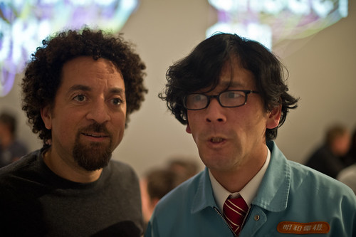
Finally, a lovely close to the week — I sprinted off of the bloated plane from SFO, jumped into my car (becoming the mayor of Parking Lot C on Foursquare, in the process, much to the ridicule of *friends) and headed over to the Gadget OK! exhibition, talk, dinner at UCLA’s D|MA. Sadly, I missed Maywa Denki perform, but I did get to see the exhibition and buttonhole Tosa-san for our obligatory weird photo. ((More photos of the exhibition and stuff are here: http://www.flickr.com/photos/julianbleecker/sets/72157623486756774/)

Thursday February 18 21:27

Design Fiction Chronicles – Demo and Die: RoboCop's Ed 209

Continuing the RoboCop theme — truly a prescient gem, this one. It’s got two things going on. One: a failure of technological hubris. Two: demo…and die, a quiet nod to the insane inane practice spawned by the Media Lab to be always demoing..demo..or die. Such a stupid proposition, whether it *works or not. Just do good work and don’t explode your head.

Why do I blog this? Thinking about ways of working and *demonstrating / *sharing / *communicating to an audience. What are the ways you can take an audience through to your world and way of seeing things? What are the various rhetorical, visual, prop elements that can effect the transit into another way of thinking? As *Rhys has been encouraging — what are the equivalents to the train in Harry Potter; the Wardrobe in The Lion, The Witch and The Wardrobe? Or the mechanics of establishing the new rules, the new physics of some other kind of logical universe. Thinking on this, I am now curious to gather up all of the inset graphics that play as adverts in science-fiction films that help establish the milieux of the near future worlds themselves. Do these adverts and other inset graphics play the role of establishing the ontological furniture of these stories?
Continue reading Design Fiction Chronicles – Demo and Die: RoboCop's Ed 209

The Week Ending 120210

Sunday February 07, 14.59.04

Well, this is getting preposterous, but I’ll keep plugging on in the hope that my weeknotes will be done, at the least, during the week they purport to cover.

Onward.

A stand-out last week was a second Skype by Southwest chat with Stuart Candy and Jake Dunagen in preparation for our Design Fiction panel at SXSW on March 13th. ((Sascha Pohflepp and Jennifer Leonard couldn’t make the call, but they’ll make the panel!)) In the midst of the organization mishegoss are some very cool discussions as to what *design fiction* might be, thinking about useful and productive distinctions amongst design fiction, science fiction, design — particularly designs’ more speculative aspects. The way the panel looks like it’ll go is that I’ll do a sort of backstory/overview of design fiction via a variety of succinct examples tracing vectors from science fiction ((*props)) and science fact/technology (**prototypes)) into this hybrid of designing things with fiction, which turns out might be a useful way to cohere elements of story telling and the making of things in a tangible way.

Next, there was more poking and prodding at the communication of Trust — the creation of these context movies meant to share-up with out the horrid fat drippings of PowerPoint, Keynote, &c. Further commitment to the things believed rather than just sparkling objects. And the thinking about how repetition can be of service to the communication in this form of visual stories. And — I’m still pondering how to show the way the design works, and how this distinct form of prototyping — making things that are not meant to test out technology, but as a means of thinking and discussing ideas before a conclusion is reached. The prototyping we did is closer to sketching and discussing than it is to testing how to best build *the thing. The conversations that creatively erupt in the midst of making what at first seems a mundane technical discussion indicates how productive prototyping can be — and not just with paper and sock puppets. I’m talking about the pragmatic technical + engineering sort of prototyping. Not to fetishize one form of creative, hands-on thinking over the other — but, rather, if you can’t engage the/we engineers at levels other than requirements specification, and if you can’t expand what prototyping means beyond the more instrumental *lets-just-make-electrical-schematics-and-API-specifications, then you have lost.

Design Fiction Chronicles: Robocop + Pre-Augmented Reality Augmented Reality

An update to the Design Fiction Chronicles. This one will be familiar to most science-fiction film fans out there — RoboCop being assembled and tested in the lab. The curious point-of-view shot — allowing us to see the various moments in which RoboCop is coming into being — sets up the anticipation about what RoboCop looks like. Seeing his point-of-view makes the transition to us assuming the role of the protagonist a bit didactic, but I would guess that this is Paul Verhoeven having good fun with the hubristic lab techs and the generally technofascism he so much seems to loathe in his films (cf. Starship Troopers and Total Recall, for example.)

Why do I blog this? There’s lots to say about this sequence, but what occurs to me right now is the way that the film clearly signals a particular kind of relationship between the engineers and executives. The engineers are willing to do the spectacular technical feats at the behest of the money-and-power grubbing executives, putting these interests in applying some sort of technical instrument and making it real, as opposed to working through the complexitiies of the larger contexts in which these things touch the real, real world. Which to my mind, right now, is a familiar protocol that sounds precisely like what not particularly clear-headed folks are doing with this *Augmented Reality mishegoss. They’re walking around with a *doorknob and trying to find some cool houses that *doorknob might look cool on. What is forgotten, largely, is the house, the neighborhood, the people in the house — and so on. When *doorknob is pushed to the background, thought less of, when it becomes mundane and ordinary to a sufficient degree (all houses have *doorknobs; practically and pragmatically speaking, doorknob-less houses are weird and out of the ordinary) — then you have nothing less to do but focus on the much more curious social practices that people engage in, and therein lie the — whatever *apps (bleech..) or experiences. It’s a source of endless amusement to see demonstrations of *AR where a camera is pointed at a box of cereal flakes and some well-intentioned bus-dev-tech-geek says — *see! this app can show you what’s in the box. It’s cereal flakes, for goodness sake. I’m not saying that pointing at something and opening up that gesture to be freshly inhabited with new signals and symbols and moments of goodness, but don’t start with what the technology can do, especially when it does so so exceptionally poorly. And if I hear about Tube Stop locators one more time, my head is going to explode. If I’m a guy walking around with a fuck-off $500 device I’d rather understand why I can’t (a) read a paper map; (b) ask someone; (c) self-navigate. This seems to be a much more curious social-technical challenge that may actually shape and inform how navigation is understood and works, perhaps with some technical whizzybangery discovered in the process of understanding why people today seem so fascinated with finding the nearest TubeStop, Pub, Taco Truck, &c.

*That’s just me. I’m being snarky this morning largely because I want to find the way to invert these sorts of design discussions and lead first with experiences and practices and histories of what has become *AR rather than start with a silly discussion that begins with – *AR is inevitable; there are billions of devices with screens and cameras and CPUs.* I’ve heard all this before with *Virtual Reality — and it really doesn’t play out well for creating intriguing, engaging, habitable near future worlds.

The Week Ending 050210

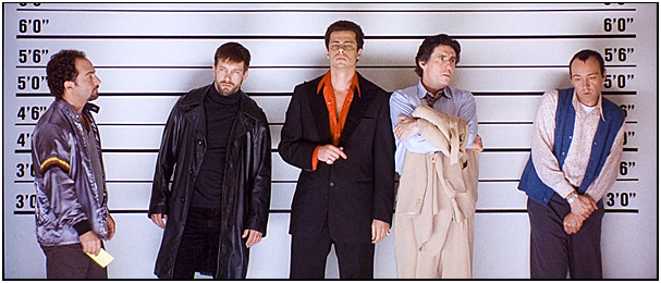
03Suspects_BD_lineup

Looking back on the calendar to see what notes I have from the week ending last week and poking through the notesbook, the thing that stands out is an engaging discussion with Kurt that, as it turns out, was about communicating ideas. You know *how do you enroll someone into your conversation and evolve intellect into action and materializations? Originally planned as a meeting to share with him the material of the project itself, we ended up spending the two+ hours talking about various strategies to make an idea compelling to someone who is perhaps not entirely inclined to ingest a rather unusual project, with (*quite potentially) rich implications. In an organization with the inertia of a planetary body, shifting trajectory and adjusting priorities is an epic task. (*With, here, only modest expectations here as to doing this, and certainly not alone.)

The conversation obviously perpetuated thinking about the theater, drama and story telling techniques that can benefit from a mix of design and fiction. How do you tell the story of *Trust through exemplars first rather than the usual front-first build up. As a story, could it be more intriguing to start *at the police line-up, for instance, tell the story as a knot of associations, linkages, encounters, coincidences — in other words, show the Latourian *knot and then walk folks through its unknotting — it’s *denouement? More of a story than a linear, beginning-to-end explanation. Do you start with the outcome, in the form of peculiar, confusing, provocative *evidence/*objects/*exemplars and tell the story backwards? Doing so could certainly begin to shift the conversation, to be a provocation that is not the ordinary tale that one sees in the usual suspect — mundane, boring, creaky, poorly crafted, baroquely illegible PowerPoints?

And then the *prototypes shift more into the role of *props — behaving as a different sort of story telling device. Somewhere along this rough continuum are *canonical prototypes (doing as they do, to test a proposition, idea, technique or technology), *diegetic prototypes (David A. Kirby’s formulation for ideas run through a story, simultaneously achieving their function to contribute to conversations about science, for example, that exist outside of/alongside of the film’s story, as well as serving a role as a bit of narrative glue in the film itself), and *props as used in films that serve no specific function except insofar as they help move the story of the film along (as in the Macguffin which need not be anything particular or have a legible meaning or function outside of anything except the film — the suitcase that all the characters want, for some reason we need not worry about — so long as our characters create drama that is the final source of enjoyment of the film.)

An exciting consideration that requires as much consideration, crafting, production as telling a good story. But, also — as difficult, if not more so, I am certain. What we’re ultimately trying to do is turn good intellect into something more than just that. The communication should be more than a rejuvinating *brown bag lunch chat. It should call people and things to action.

Weeknotes and <a HREF="weeknotes

Really the Fake: Derived, Diacritic'd, Differenced Things

Thursday February 04, 07.00.26

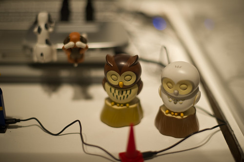
A Wii Mote and a Wii ‘KLIK-on’ Candy Dispenser which uses the ‘B’ trigger control to dispense little candy pills.

Wednesday February 03 13:42

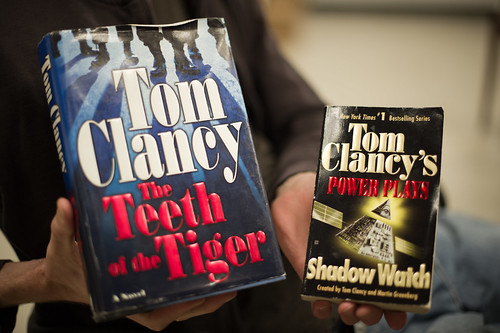
Something Tom Clancy — the guy who writes worlds he wishes he inhabited, which is always a good motivation for a riveting tale — and something written by someone who can write like Tom Clancy, but doesn’t have the surname value share but can participate in the *Branded story world owned/possessed by Tom Clancy…all signaled by the diacritic there — the apostrophe.

Thursday February 04, 06.57.14

The enormously popular video game Call of Duty 4…and a DVD about the *real-world sticky situations the kinds of people — Delta, SEALS, mercenaries, Blackwater/Xe, Rangers, Special Ops guys — Call of Duty 4 simulates, all done up in a DVD case that clearly signals in its visual design the simulation game.

A trio of things found over time that came together in their pattern of derived associations. I’m sure these were done in a pragmatic fit of trying to get some uptake by resonating with existing things/objects/markets and so on. Pretty standard stuff, with the Wii and the Call of Duty thing being the more dodgy instances. The apostrophe’d Tom Clancy business was certainly a planned business franchising effort, along with all the other *Tom Clancy Presents sort of derivatives, like video games and bomber pilot jackets and aviator style sunglasses, all designed to inhabit the personas and worlds authored by Tom Clancy’s genre of mil-intel-tech fiction. (And probably inhabited by those least likely to actually have the extra bit of *umph to *actually participate in such worlds.)

Why do I blog this? These patterns of reproduction, derivation and so on are intriguing. Perhaps less so from the pragmatic, business perspective — like, the cringe I sometimes feel when one thing is clearly done so as to participate in the swirl of interest that a canonical, market-making product/idea/service/new-interaction-ritual. Which comes first, what does this kind of priority really matter or even mean? When does *doing it right trump *doing it first? And, anyway — what are the measures of *doing it right? Most sales? Most uptake? Beautiful to use? I’m thinking of things other than candy dispensers, story franchises and FPS’s, of course.

You know, like — *touch quite clearly forced everyone to talk/make/market *touch devices in such a knee-jerk way it was embarrassing to watch (and participate in, I suppose) quite frankly. The same thing is happening with *Moleskine-sized pad/slate/tablet things. There will be lots of things that signal a new kind of computing (*casual, *livingroom, *sofa) and we’ll call them (with a rueful, dubious look in the direction of the naming guys) *Pad’s, which will be like calling a box of generic brand tissues you buy from your corner drugstore — Kleenex.

The point here but the ways in which variants, originals, mix-matched and mismatched continuations of *something circulate, imbricate, overlap and so on — this I find intriguing. I guess it’s less about what is real, original, fake or a morph — more about these physical, material metaphor of continuity and perpetuation and derivation.

At the end of the end of the day, does it matter *who put the wheels on luggage? Or does it matter, in a make-the-world-a-more-habitable-place kind of way — that someone mustered the resources/people/alliances to put the damn wheels on there and save us all from having crooked backs and Popeye-big forearms? Mixed opinions here at the Laboratory on how and in what way the *original matters.
Continue reading Really the Fake: Derived, Diacritic'd, Differenced Things

Design for Failure

04102008_100526

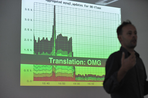
With regrets to Aaron for the blurry, noisy photo of himself..Taken in Montreal Canada at Design Engaged 2008.

For no particular reason — perhaps a salute to Nicolas who will be presenting his work on design for failure at IxDA this week — I bring you this image taken during DE2008 in which Aaron Straup Cope discusses designing engineering systems with failure contingency as the critical path.

Why do I blog this? I find this perspective intriguing — it assumes system meltdown, anticipates it and delivers appropriate data to indicate when it might happen. If I remember correctly, there is no specific interest in being exact about failure, just that it will happen and you might be told roughly how long until it happens. So the effort is to help stave it off by various means — adding more servers to spread activity loads around, optimize queries, increase caching, whatever you need to do. This makes me think of the intractability of designing for deletion. If someone wants to extricate themselves from the databases of a service or system, there is almost certainly no quick and easy way — in fact, I doubt there is anyway at all, and most services are not obligated to handle these situations. If I told Google that I wanted to check out fully and completely, even if they wanted to do this, it is doubtful they could. Would someone have to run through all the backup *whatever — tapes? — wherever they may be? It’s not just the live systems, and its not just purging caches and so on. All of our data is on its own, like orphaned snapshots of moments in our lives, somewhere. I don’t necessarily find this chilling or anything like that. I’m just curious about this notion — designing for intractable, ugly, messy circumstances, like failure or deletion. Things that run counter to the intuition — we usually design for the beautiful, full, glorious 32-bit conditions.
Continue reading Design for Failure

The Week Ending 291210

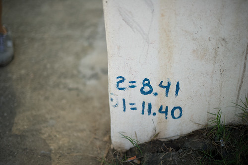
2=8.41 1=11.40

Rules, instructions, parameters? Embedded inscriptions of some nature, found on a wall in Sayulita Mexico.

Well, maybe weeknotes are from the *week ending* but posted at the *week commencing*. One advantage of being one’s own blog boss, I suppose.

It was a decidedly *quick* week for some reason — perhaps because the Laboratory’s brother was visiting these last couple and action, thinking and events seem to accelerate the time. There was plenty of discussions of stories and filmmaking, which ties nicely into what *must* happen this month: the re-making of several short (30 seconds or so) of this visual design fiction stories meant to communicate some of our principles of Trust as embodied in some props/prototypes. This proves quite creatively engaging and challenging.

There was a pleasant slaloming conversations with the curious and effervescent Natalie, discussing the Latourian design sensibilities and the ways that debates and conversations embed themselves with artefacts. It was lovely to have this chat, if only to begin trying out the various *props* that we’ve been making that are exemplars themselves of these arguments/theories/perspectives. The question remains — what is new here, as an argument? It was encouraging to here Natalie’s excitement and the geneology of this sort of thinking, reaching back to here canonical Live Wire and Rich Gold’s Evocative Knowledge Objects (to which the Theory Object owes everything.)

This decanted into thoughts on a Latour essay presently at desk side.

The third connotation of the word design that seems to me so significant is that when analyzing the design of some artefact the task is unquestionably about meaning — be it symbolic, commercial, or otherwise. Design lends itself to interpretation; it is made to be interpreted in the language of signs. In design, there is alwas as the French say, un dessein, or in Italian, designo. To be sure, in its weakest form design added only superficial meaning to what was brute matter and efficiency. But as it infiltrated into more and more levels of the objets, it carried with it a new attention to meaning.

[[A Cautious Prometheus? A Few Steps Toward a Philosophy of Design (with Special Attention to Peter Sloterjdijk. Bruno Latour]]

[[And special sideways inspiration from Karen, whose present reading/thinking I seem to be accidentally following alongside.]]

And then, I was thinking about Trust in this context and this precise basis for the process of *embedding* the sensibilities and sensitivities of Trust as a design practice. More as this idea develops.

There was a round of planning for future projects at the Nokia Design Strategic Projects studio, which meant thinking about what from Trust moves forward and in which ways and by what means. Similarly, we are beginning to share Trust. And wondering — to whom and to what ends? I am intrigued by this — how do you circulate ideas and with what goals so you know — in a more actionable way — how the ideas materialize and create other goals, especially within such a byzantine organization. This, I think, is one of the larger 2010 *professional* goals, I suppose (seeing as I have not really captured what those might be yet — bit tardy on that objective — I like to have New Year’s goals rather than New Year’s resolutions) — how to communicate ideas such as these, do so without PowerPoint and do so in such a way that you snap people out of a corporate stupor, or whatever it is — and do more than just scrape a bit of paint on the battleship. Rather, help set a different course heading.