A trajectory from academia to entrepreneurship

The other day I took part of a round table on entrepreneurship for investigators organized by Universitat Pompeu Fabra to promote their latest incubator in collaboration with Barcelona Activa. Since I finished my PhD and co-founded Lift Lab one and a half year ago, young researchers have frequently inquired on my personal experience to move from academia to a private research agency. I often explain how we modeled our research methods and analysis techniques to fit into processes. Or I point our techniques to transform results into insights and solutions for diverse audiences (engineering, design, marketing, management). Beyond the evolution of our practice, there are a couple of ingredients that I believe greatly help initiating the trajectory of a business that spins out of an extended investigation (the PhDs of Nicolas and I in the case of Lift Lab):

Nurture a mixed network…

Lift Lab was already taking shape during our research as part of our constant efforts to communicate our ideas and results, using our blogs, pamphlets, talks and workshops as echo chambers. It was particularly important for us to confront our findings outside of a single research community as much as outside of academia. Reaching out of the walled gardens of academia, listening and reading about other practices is particularly important to refine and polish a voice, the kind of voice that makes research finding more tangible and accessible in a life after academia. In our case, it helped us capture the interest of what-would-then-become clients and create diverse channels of communication with people that challenged our intuitions, confront our points of view and ultimately made our methods evolve. Prior to move out of academia, these contacts were already grasping the value we could produce in their contact. Ultimately, these channels exposed, nurtured and also generated some sense of legitimacy that we use to further inspire and provoke.

… to benefit from a community …

As a consequence, our business thrives on this ability to involve multiple practices and networks for question formulations, data collection and solution creation. Our links to academic institutions (e.g. following master or PhD students) provide unique opportunities to further polish our research methods and well as new techniques and latest findings. With our experience in academia, it comes at very little cost and it is very rewarding. In parallel, we like to expend our network based on our curiosity with partners, “extreme users” and anybody we can learn from. The Lift community reflects very well this access to different practices, the confrontation of ideas/methods/interests and the access to domains and problems we never suspected we could be engaged int. When mobilized, this type of network provides resources for a small agency like ours to extend the range of our services and share risks in a bid.

… that helps (among other things) correct the execution …

A few concepts spun out of our PhDs, but none of them were ready to even remotely consider a product or service. Nevertheless, we like to engage with our clients to test the maturing concepts (e.g. social navigation). It helps refining the ideas, evaluate them with users and our network. Through this iterations, clients and partners might invest in the idea and engage resources. In any case, the exercise delivers keys that shape the execution of a concept that is very often more important than the idea itself. Once again the capacity to transfer results and intuitions into innovative prototypes is deeply rooted in our ecosystem of friends and partners.

… and forces to stay humble but assertive.

We found out that leaving academia improved our ability to formulate our methods particularly thanks to the diversity of constraints that demand a diversity of techniques. However, we make efforts in keeping the ideological approach of a researcher intact. It implies staying humble, not starting an investigation with a priori assumptions and not being afraid to express dots. When conveyed with assertiveness, this posture of the researcher driven by doubts but confident in its methods is what makes our value.

Why do I blog this: The paths out of academia are not paved, particularly because completing a PhD today differs from 15 years ago. Researchers must adapt to the increasing speed of knowledge sharing without necessarily grasping the opportunities to cross-pollinate. Beyond incubators, the mixed networks I describe here represent a support that helps concepts and a business mature
Slide Deck of Lecture at ENSCI

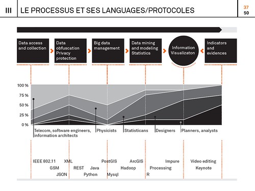
Below are the slides of a lectures I gave a couple of weeks ago at the ENSCI (Ecole nationale supérieure de création industrielle) in Paris. The content (in French) is mainly directed to design students and practitioners intrigued about the new digital urban actors and the process to materialize layers of network data into information. I based my discourse on the recent investigations and experimentations we perform at Lift Lab (e.g. study of hyper-congestion, mobility, social navigation). Particularly, I highlighted the bestiary of practices, tools, languages and protocols that we articulate our approach with:

The bestiary of practices, tools, languages and protocols that we engage with in our works on network data

Un nouveau monde de données, ENSCI, May 18, 2001 (15.8MB)

The ENSCI offers a particularly compelling approach to its student by confronting them with concepts and practices at the frontiers of design. Thanks to David Bihanic and Licia Bottura for the invitation!

Why Good Design Isn't Eye Candy

Sunday November 28 11:58

An acquaintance of The Laboratory I met while in London that last time is a design consultant guy who told me this story about Eye Candy. Him and his studio/team were offered a commission of work. It was design work, or at least that was the premise of the offering. A high-profile team of well-meaning technologists of various stripes — engineers, engineer marketers, chest-thumping Valley types — were in the midst of preparing a presentation of some work to finance guys. The finance guys were, like.. money men who make decisions and were hopefully going to throw money at their project idea before they hopped off on their flying jet aeroplanes that I guess one of the hubris-y entrepreneur Valley guys actually flew, or used to fly as a fighter jock or something. ((You get the personality profile here.))

The engineer-y team had some ideas that basically took a very hot trend and doubled and tripled it — the up-and-to-the-right extrapolation of today and made it *more..which I understood to mean not necessarily better…just more of the thing that exists today. Maybe two or three buttons instead of one; or 7 inches instead of 3.5 inches and we’ll blow the competition out of the water. Something. It might’ve been something like making quad axle wheels for luggage, or a tablet with a car battery so it lasts a full *week without a recharge or something. I have no idea, but this is the image that comes to mine for the story I heard. Well-meaning, but not well-thought-through stuff.

Wednesday February 09 16:16

Anyway, the guy who the engineers approached is a guy with a depth and breadth of design experience. He’s a creative guy, and his studio has a really good sense of strategy and ways of communicating..and he can make stuff for real, like — model making; deep CAD expertise, mechanical and electronic prototypes. Really incredibly thoughtful, experienced guy and as I understand it, a designer with integrity who would turn something down based on his instinct about whether or to what degree the work will build his credibility as a designer and that credibility is directly tied to how much the work will make things better. He’d be the last to do something that’d just be landfill fodder, or work that is, like — just poorly thought-through, or lacking in depth and consideration.

And then here come these entrepreneur-engineer guys who I was told asked integrity-designer guy to help them with their presentation by giving them some “eye candy” to put in the PowerPoint. This went on for half a day. The engineer-y team shared their idea and then explained that they had this pressing meeting coming up and — would his studio be able to just pull something out of their inventory of cool physical models and CAD renderings to put into the presentation deck? What they needed, they said — was Eye Candy. Some seductive treats on their dessert cart of a good idea that would have the finance-y jet pack guys licking their chops, slobbering capital all over the models.

Even in retelling this story, my brow perspires from frustration because – I know the tendency to consider the work of design as either providing cool looking stuff absent the integrity of its intent; or thinking of design as styling to the point of absurdity.

But — what’s the big deal? Why *not make some eye candy? I mean, if it satisfies the eyes and makes people ooh-and-aah, isn’t that a good thing? People don’t ooh-and-ahh about something they don’t like, and making people ooh-and-ahh is a goal in some entertainment circles, so — what gives? Why does this story make my head want to explode all over the place?

Well, firstly — it’s a bad precedent for design, generally speaking, if I can speak for “design” for a moment. It’s design without integrity, in the service of surface glitz and glam. It’s design that only exists on the surface, like styling that says not too much about the intent. It lacks thinking beyond the “what looks good” sort of thinking. It’s *thin — you can’t dig into the thing itself because there is nothing behind it except a desire to wow someone. There’s no logic or reasoning behind it, except to wow someone. It’s pure Id, pure instinct — not that instinct is something that should not inspire design, but by itself it’s selfish in a way. It accounts for nothing but what something looks like, rather than the larger context of where, when, why, for what.

In a word, just doing something to pad a page in a presentation or to put on a table is dishonest. Pulling something from another project out of a drawer that *looks like it could be the thing these guys were trying to sell, is dishonest. There’s no integrity — you can’t tell the story of this thing and why it has come to be or what principle informs the action or contours or IxD of the thing. You have to lie, basically. Or not say anything about it at all which makes one wonder — why put it there to begin with.

No, right? That’s just a bad way of going about things. It’s not quite as bad as industrial designers making toothbrushes that look like they should be moving fast because they *really wish they were designing cars, but it’s pretty bad to do eye candy designs on their own when such eye candy would be disconnected from the initial vision. Or even question that initial vision by running a more proper, considered design process that *might lead to something with integrity, and with the satisfaction of being complete and thorough. Something that would be the result of a superlative, principle-led design practice. And that takes time — or at least more time than digging around for something that looks like it could belong to the idea these guys had.

Bleech.

Why do I blog this? It’s a good story, with a good lesson in it. Integrity is crucial for design to continue doing what it’s able to do. Eye candy is dishonest and lacks the integrity that connects it to good, thoughtful work. And it means the work is crap, poorly considered and fails to make things better. It’s the equivalent of doing design “’cause” — or worse.
Continue reading Why Good Design Isn't Eye Candy

Design Advances

General Designs Delivery. Remnant of some sort found on the wall beyond the model shop.

I’m going to paraphrase something I read in a recent issue of The New Yorker that immediately made me think of things we bunch of folk in the studio are thinking long and hard about — doing advanced design, but even before the “doing”, understanding what it is to be an advanced design studio and what the heck is “advanced design.”

The article was about Quantum Physics called Dream Machine by Rivka Galchen on David Deutsch and efforts to create a Quantum Computer. It’s a fascinating article and I recommend it. Good science fact-fiction stuff. These guys in laboratories with elaborate support apparati to make a four bit computer. Awesome. I can easily imagine the wisps of dry ice-like condensation puffing out of copper-clad plumbing and fittings.

Okay, back to the article. Now — this is just a word substitution not meant to equate what brainiac quantum physicists do with what a bunch of (pepper this with humility) clever creatives do in a little design studio. Just word substitution. In the article, as Galchen is trying to frame the sensibilities of Quantum Physicists and describes it thus:

Physics advances by accepting absurdities. Its history is one of unbelievable ideas proving to be true..

That simple statement stopped me in my reading tracks. There was something deceptively simple in that — an expectation that, or almost rule in a way that in order to move the field along, in order to advance physics, or do advanced physics, or to determine whether or not one was advancing physics — well, one had to be prepared or make sure that you were accepting absurdities.

The word substitution will be obvious to you by now: doing advanced design requires a bit of accepting things that, on the face of it, are absurd — at least at first.

Accepting absurdities, or designing things that are absurd, or realizing that what you’re doing seems a bit absurd are various measures of advancing the state of a practice idiom, like design.

Design advances ..by accepting absurdities

There’s a bit of facing adversity built into that sort of discipline. It means that people are going to look at what you do as absurd — as disconnected from the state of the world right now; as idle experimentation; as just a bunch of weird stuff.

I think the challenge is around the degree of “advance.” Sometimes rather than making “big disruption” sorts of advances, small, simple, low-hanging-fruit sorts of things are more tractable and, potentially — more disruptive for their simplicity. This is where the phrase “wheels on luggage” comes from. Just doing something that, in hindsight seems so obvious, yet is exceptionally, blindly simple to accomplish (again, in hindsight.) Often these “little things done much better” sorts of disruptions effect human behavior in an unexpectedly profound way. Sadly, the hubris of the main players in constructing the future — engineers and technologists — consider a disruption to be wholesale system change of some sort rather than making little things better than they already are. It’s also a battle between complex programs or teams, versus relatively simple ideas with small teams executing a clearly stated vision.

Why do I blog this? There was something about that quote that has stuck with me. I’m not sure I’ve teased it all out — but its resonant and I need to figure out how best to describe what it is that “advanced design” is so I know it when I see it; and what activities “advancing design” consists of so I can tell myself what to do. Accepting absurdities and finding the way to get others who perhaps are less inclined to is a small, fitful start towards this goal.

Continue reading Design Advances

Design Fiction at UC Calgary's Environmental Design: A First Go At Design Fiction Genre Conventions

Friday November 19 07:02

From awhile ago, back at the end of last year I went to UC Calgary’s Environmental Design and presented a further iteration of the design fiction business. I realized I hadn’t put down on paper or on this blog some thoughts from the presentation — but mostly thoughts about what design fiction can do.

Just in terms of process, my basic routine is to extend the thinking in steps, using commitments to travel and give a talk or facilitate a workshop as the motivation to move the general thinking a bit further. Where it’s going is oftentimes vague sometimes — but generally it’s just a kind of extending conversation that helps me and I hope others think about the opportunities for collapsing design and science, fact and fiction together into a productive muddle.

In this talk I set the usual frame — placing science fiction alongside of science fact and leveraging David Kirby’s work on the diegetic prototype — the prototype that does more than an engineering or technical or instrumental prototype. ((That may be my emphasis to say that it does more — or a conceit on my part.)) The exemplary diegetic prototype is revealed through Minority Report — the film — and the role that John Underkoffler played in the technical design and technical production of the film’s gestural interface. Despite the challenges of such a system in practice, Underkoffler was able to work through technical issues pertaining to such an interface mechanism through the context of the film’s story. He had a basis upon which the interface would be employed in the future of P.K. Dick’s world of 2050. Moreover the film’s popularity and just its existence provided a way of circulating the concept of this specific kind of gestural interface. The film and the fictional technology that Underkoffler proposed and demonstrated in the film became a way of leveling-up the idea — giving it some exceptional circulation. In effect, the film became the logical extension of the M.I.T. Media Lab’s mantra of demo, demo, demo — or demo-or-die.

This is the stock presentation I’ve given on design fiction. Early on — I think the first time I explicated all this stuff was in Amsterdam where I gave a talk at the Sandburg Instituut Master Course during Halloween in 2008 — I was trying perhaps not successfully to integrate film clips as a way of describing the importance of the story, rather than just objects or props. That is — during that particular presentation in Amsterdam — I showed unusually long film clips. So — the first 3 minutes of Minority Report, for example. Let’s watch that and allow the cool technology to be part of a story that is more about humans as social beings and this lets the tech become social too — it’s not just a doorknob sitting by itself. It’s also a social-instrument, an artefact that has a role to play in this particular drama. What Spielberg is able to do is introduce the technology to us — it’s just a prop — without making the whole film *just about the gesture technology or even the pre-cogs, or the slick environmental advertising, or the jet packs. They are there, of course — but that’s not what the story is about, any more than the Maltese Falcon was about a statue of a falcon from Malta. The statuette was a prop — a way of spinning the story about a couple of crooked crooks.

The purpose was to give a larger context for the gestural interface rather than just its use in the 30 or 40 seconds we see it in the beginning of the film. I wanted to give the device a role and a purpose — an instrument that’s used routinely. I wanted to shift it from being a spectacle to being just an ordinary albeit sophisticated bit of technical kit. Just in the same way that a microscope in a forensics-heavy police procedural television show is not fetishized as a prop or device in that sort of story, neither should be the gestural interface in Minority Report — even though to our eyes as viewers, at least at the first screening, it is quite extraordinary. The point is that the film makes the device quite ordinary and routine. This is John Anderton just going about his business as a savvy, street-smart, afflicted cop. It just happens to be a future world to us, with all its trappings of things extraordinary.

From this I began thinking about the conventions, stylings, idioms and techniques that make the future seem like today. How do you make the extraordinary appear ordinary and quotidian? This seems to be an important way of depicting the future and making it seem possible. It’s just a way of designing — an understatement of perhaps novel, innovative and crazy ideas from the future. Why do this? Because in a way this is part of the work of design innovation. To make something spectacular routine, domesticated (to borrow from James Auger) and perhaps even boring and everyday. When you can do this, you’ve turned a corner into a new space that provides a setting for a kind of innovation that is chaste and modest and thereby, perhaps — entirely possible. This then communicates your innovative, crazy, off-the-hook idea as legible and something which can already be accomplished.

Thursday November 18 15:20

There’s much in the social, cultural and political history of science and innovation on the topic of modesty as a mode of conveying and communicating an idea. Scientists are especially guilty of this mode of communication — behaving only as unadorned and modest presenters of things-as-facts. Just revealing nature as it is. Simon Schaffer and Steven Shapin’s Leviathan and the Air-Pump: Hobbes, Boyle, and the Experimental Life and especially Schaffer’s A Social History of Truth: Civility and Science in Seventeenth-Century England (Science and Its Conceptual Foundations series) speak much on this topic. I think here I’ve internalized their insights and tried to find ways to leverage the modest proposal of a new, speculative idea — as was the air-pump in its time — as a way to communicate it convincingly. In part design fiction is about communicating a new idea, but of course it is also, perhaps mostly, about actually doing design through the modes and idioms of science fiction.

This way of presenting an idea and enrolling people in it is described quite convincingly by Shapin and Schaffer. It’s really an important read in this regard. It’s a great historical book. I seem to re-read it every few years because it’s almost tactical in its description of how ideas become materialized and circulated. It’s certainly much more thorough and convincing than popular surveys of how ideas evolve and develop — I kept thinking about how loosey-goosey Stephen Johnson’s Where Good Ideas Come From: The Natural History of Innovation end up being for its lack of rigor and its desperate hunt for a simple one-liner — this whole adjacent possible. It reads like a nursery rhyme that forgets that its okay that the world is an intractable complex and entangled place. ((G’aah. I’m all riled up now. I’ll get back to that one later.))

Thursday November 25 09:30
Thursday November 25 09:31

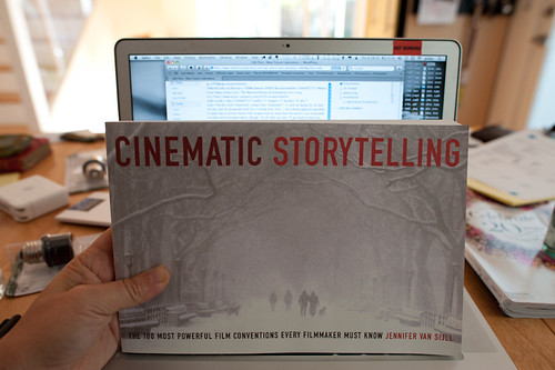
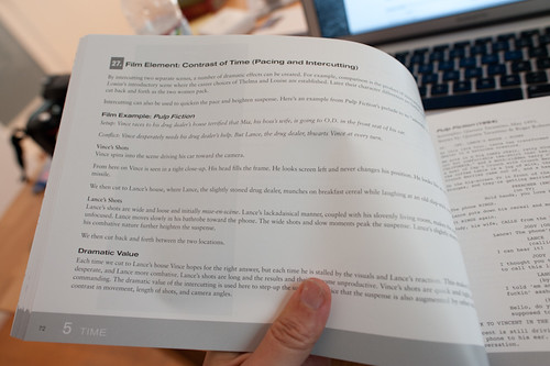
Cinematic Storytelling: The 100 Most Powerful Film Conventions Every Filmmaker Must Know. It sounds very vocational, but I find the idea of a catalog of ways of telling visual stories compelling. It would be nice to create a similar sort of thing for design fiction, I think. This is what is next.

Anyway — so what I’m trying to do now with the whole design fiction business is catalog a series of genre conventions — ways in which one can describe an idea or an object or a bit of thinking. How do we show ideas as they would be in the world? Or as they come to be? I’m thinking about mostly visual stories — little films or proper films, but mostly little films because they can be produced, we have a pre-existing language of visual story telling and now I’m convinced that that language can be used to also do the work of designing. What I and others are talking about is using film/visual explications as a means of prototyping and, perhaps more importantly — designing. It shouldn’t be just a way of showing a concept but also a way to feedback into the design process — or it should be a part of the design process, not just a final demonstration. They should be made in such a way that thinking is going on while they are being made. One should pay attention to lessons being taught by the little filmmaking process because effectively, then — you are also doing design, just with fiction which allows more freedom in the explorations.

Why do I blog this? Well — I’m doing a few design fiction workshops later this summer and fall and it seems like film is a viable way to think through how to set the scene for a near future world, or little moment of that world. It would be quite nice to do a workshop that included film making as the “hands-on” work part of the workshop. It actually takes a lot to think through things if you’re making a little movie, even a super little one. But, things get even more intriguing when the making of the film is actually part of the design process itself — allowing the extra work to be more than communicating the idea, but actually informing it quite directly. Some of the little films we’ve made in the studio were exceptionally useful to shape and challenge notions that work quite well in conversation, or on the screen or on big posters. It’s when things go in the hand and become materialized that you start to discover something about the design that needs more help to make its way into people hands.
Continue reading Design Fiction at UC Calgary's Environmental Design: A First Go At Design Fiction Genre Conventions

Kitchen of the Future

Knobs

I wonder about the various settings and contexts used to re-imagine what the world might be like in the future. Often times those contexts, objects, environments are associated with what wealthy people would like for themselves in order to drive sales of new stuff. This is understandable in a mostly capitalist world, of course.

Often times one finds rather naive, un-encumbers, un-troubled extrapolations of desires or behaviors for and within these spaces of human endeavor (the car, the bathroom, the workspace/place, the kitchen) based on somewhat awkward and thin assumptions about what the world will be like, and what people want from these spaces. The kitchen is such a place where sometimes wacky ideas about the evolution of behaviors in these spaces tips into the absurd — like 3D printed food in a world where people seem to be enjoying the visceral world of preparation and chopping and stewing and all that. The kitchen is a place where just making simple things just a little bit better seems the best path toward the near future — such as no microwave nagging beeps; refrigerators that are smart enough to either be told (with a *button, not a context sensor) that, yes..the door is open..its open because I’m loading the goddamn groceries..no need to beep at me). Big change — those things should be consistent with the real, global, epic-scale challenges to living in the near future world — which have nothing to do with a refrigerator that lets you know you need more damn milk. I mean..really? Why does that get to be the enginerds scenario for a better kitchen?

*Sigh.

I recently found this Ikea’s Kitchen of the Future and it made me think of a number of topics related to imagining the future. Firstly, it is worth considering why the typical western kitchen becomes the subject for future fictioning.

Why imagine the future of the kitchen, practically thinking? Is this going to save the world from itself? Well — perhaps it could and that actually would be a fantastic design project — reconsider the kitchen in light of (and then list your parameters having to do with ecological collapse/civil liberty infractions/pro-democracy uprising/emergency water rationing/$12 a gallon heating fuel/&c.)

But, as for the kitchen that Ikea imagines, I suppose there are a number of reasons why the kitchen is a seductive setting for setting the components of the future. These probably have to do with perhaps the fact that the kitchen in the West is quite modular and therefore subject to study of the various individual components — refrigerator, cabinets, dishwasher, sink, stove, oven, etc. The kitchen also has a history of reconsideration in this regard if you consider things such as the Frankfurt Kitchen. Such was a purposeful, design-principle led modernization in the height of, you know — modernism. It was designed to be as efficient as possible in a small space using very modern “workflow study” techniques. This meant that it was designed for specific flows of activity, like a factory in a way.

This idea of every-increasing efficiency would be consistent with the Jetson’s kitchen from the old fantastic cartoon. Maximum efficiency — just select what you would like using a physical paper punch-card and it gets issued from the machine (complete with consistently type-faced names for the items.)

In my anecdotal experience and without any exhaustive survey or study — it seems to me that, despite predictions there is quite a move back towards more “artisinal” (*shudder) kitchen activities. Rather than anything indicating that machines will 3D print our food, the craft of cooking appears to be alive and well as indicated by such things as celebrity chef restaurants, a never ending stream of cooking shows on television, various food movements/philosophies that desire a deeper, conscientious connection to the food chain (where has the veggie/beast come from? how was it fertilized/fed?), &c.

I think this example of the Ikea kitchen also embodies the challenges of future-fying anything well. Too much fetish of the object and very specific, naive and — old fashioned — ideas about what people want in the future. ((Isn’t that ironic.))

Why do I blog this? I’m trying to tap into the various parameters by which the future is really crappily represented in models and speculations and scenarios. I think one component of this has to do with an over-emphasis on the artifcats themselves — making faster things, or smaller things, or more silver-y or white things, or 3D food printers because, like..3D and printing are a Wired Magazine meme, or other poorly considered reasons. ((Meanwhile, I would be satisfied with making whoever invented the microwave beep-beep-beep-beep to indicate the timer has expired to have to listen to beeping forever..in perpetuity..until their earballs explode.)) I understand that the Ikea thing is more marketing puff than proper, considered design and it drives me nuts that entities with the ability to bring about real, substantive change in the world bother to spend their money with this crap that’ll just be torn down after the annual investors meeting or the stupid trade show is over. While the kitchen may not be terribly exciting to me specifically (perhaps because of these speculations that ruin the excitement of really making a better more habitable future) everyone has to eat, and those eat’ns need to be prepared — and finding new ways to do that preparation in the near future should be taken seriously without pandering to the whims of deliriously rich people who can afford to redo their kitchen every other year. There should be a kind of agency or consultancy that looks at this sort of thing seriously and re-imagines the near future of the kitchen using principle-led design and maybe even design fiction techniques.
Continue reading Kitchen of the Future