Weekending 19062012

Nicolas: A quite academic week with two days as an expert in a design school in Switzerland (Neuchatel) and polishing a research project submitted to a funding body. Being external jury judging student’s work is always intriguing, especially when projects are very diverse. In this case, it ranged from a new generation of mouses to kite-surf devices and mountain bikes parts. Industrial design is fascinating because of the whole range of constraints that have to be taken into consideration: physical, cognitive, social, political, etc. Commenting on the projects, I realize how hard it was to play with all these parameters and , at the same time, create something new and meaningful.

Julian: Quite a busy programming-the-computer-at-night week. Yes. Programming it to make it do things. I have a hunch of an idea for a thing that wouldn’t make my life easier? But would make it more fiddily. Based on an observation: most social network services require that you go to the service to find out what your peoples are up to // have shared // took a photo of // checked-into // &c ad infinitum. What about going to the people first? An Internet of Me & Mine rather than an Internet of Things or an Internet of Services. You know? As if all my friends had a stats card like a 1970s era baseball player. Or something. Like — shouldn’t your people be the point of entry for these things in a very bold, upfront fashion? And you get to pick who you browse rather than seeing *everyone/thing as if you could sift through it all? Maybe you have to pick some small number of true-blue friends — or the algorithm enforces true-blueness by making sure the relationship is two-way. You know? So — ObjectiveC land for me last week/weekend/nights-til-late.

Oh — also? The Marshall Stack speaker project came to a happy point of a milestone with a very good share and a lovely looking thing. Thanks to Simon and Vids for their hard-making-things work. That’s Simon up there. He’s not a grumpy fella, but sometimes I ask him to do a lot. He also had a new little one the other day! Congratulations Simon! Take the rest of the week off. 😉

Monster sticky note on cell-phone screen

Last month, when involved in a teaching seminar in France, I ran across this utterly curious scene. It’s basically a cell-phone with a piece of paper that shows a drawing, stuck on the device’s display. The drawing features a sort of animal quickly scribbled.

This is exactly the sort of artifact that I like to find in my peripheral vision. Quick drawings, paper, duct tape and a technological devices: those are the ingredients that generally leads the observer to spot a bottom-up innovation of sort. De Certeau at its best probably. Seeing this, I thought that the user of this device had a specific use for this: perhaps aesthetical (a kid’s present), most likely functional.

Fortunately, the “user” of this phone was close and I had the opportunity to ask her what it meant. She told me it was a reminder. Interestingly, in French, a reminder is called “pense-bête”: literally “a reminder for stupid people” but “bête” not only means “stupid”, it’s also a term employed for “beast”. This user thus created a drawing of a small beast on a piece of paper as way to signify it’s a reminder.

The thought process is clear here: the stick note is put in a convenient place (the phone display) and for both aesthetic/functional reasons, it takes the form of a piece of paper with a quick drawing. It’s also stunning to see how the phone screen is used as surface to put additional information (and subsequently cover up the screen itself!).

Why do I blog this? This is a fascinating example of bottom-up creativity that corresponds to how users create their own personal (and meaningful) personal solutions in everyday life. What is important is that the phone itself supports that very same functionality (reminder/virtual stick note). However, the user preferred the use different material (paper, pen, duct-tape) to do it. This can be seen as a good example of the difference between a feature and its instantiation from the user’s POV. It’s not because the phone has a reminder system that it’s going to be used… simply because the whole system is different and does offer the same level of personalization.

betaknowledge.tumblr.com as a compilation of weak signals about the future

Btw, I started a tumblr few days ago to accumulate insights, data points and “weak signals” in a very basic/raw way… I use to put that material into delicious but I’m not satisfied with the service anymore.

It’s called beta knowledge and it can be seen as material that can be turned into long posts here on Pasta and Vinegar, in articles/books/reports, or, even better, into design objects.

I’m trying to integrate that into the feedburner RSS feed.

Weekending 12062012

Nicolas: last week was quiet because of May 1st but I spent few days on different things. First, I worked on preparing a wall of game controllers with Laurent Bolli for a summer exhibit at mudac in Lausanne. Since the collection of official gamepads are already in Yverdon, we’re going to show the ones that reveal various aspect of interface evolution: personification (a pad with the shape of a game character), miniaturization (small pads), hybridization (the merging of a pad and a keyboard, etc.).

I also prepared the summer project at Art Center in Pasadena, discussing with potential interns there over Skype. The idea is to work on gestures and rituals in the 21st Century:

Teaching design ethnography and conducting various projects in this area, I am interested in how people use artifacts (digital or not). Especially given that it helps framing the design space, find some inspiration and understand people’s needs. But I am also fascinated by how exploring human practices can be a way to speculate about the future, in order to create design fictions.

This project is about gestures and digital rituals that typically emerged in the 21st Century : gestures such as recalibrating your smartphone doing an horizontal 8 sign with your hand, the swiping of wallet with RFID cards in public transports, etc. These practices can be seen as the results of a co-construction between technical/physical constraints, contextual variables, designers intents and people’s understanding. I see them as a very intriguing focus of interest to envision the future of material culture.

The aim of the project will be to envision the future of gestures and rituals based on:
1. A documentation of existing “new” gestures
2. The making of design fictions that speculate about their evolution


(“The Boat Of Love: Playing Disaster”, Franco Brambilla)

Finally, I went to Paris for a design jury at ENSCI and visited an interesting exhibit about steampunk and “yesterday’s tomorrows”.

Me? In Los Angeles? *shrug. Well – a bit of organizing of things for the Detroit Design Summit this fall. I’ve slowed down on the Ear Freshener for the time being as the Marshall Stack project’s first most refined prototype (of three different types of prototype) is completed and sent off to some folks. I wish I could say more about it — but, I will sometime later. There’s lots of good insights and experiences learned from that project.

But, on the other hand — I’ve been getting back into programming stuff, which has been torturous and fun, but mostly fun.

Also, some planning for a couple of talks and workshops coming up over the next couple of months. I want to try some workshopping techniques that Nick and I had planned for a team here — but that workshop got postponed. They are some fun but I think highly evocative approaches to designing new, disruptive things.

Here in Barcelona, we celebrated the release of Quadrigram, “The visual programming environment to gather, shape, and share living data” created in collaboration with our friends at Bestiario. The 8-months journey from shaping a software product to shipping it has been particularly gratifying. Aters years in academia and then consulting, it is a territory I wanted to discover, learning and applying new methodologies to create both from technological and user experience stand points. I will probably need to write a post-mortem to properly debrief the adventure. Expect to hear more on the subject in the upcoming weeks.

Virilio on “statistical image” and perception #newaesthetic

Read in Paul Virilio, The Vision Machine:

But by way of conclusion, let us return to the crisis in perceptive faith, to the automation of perception that is threatening our understand- ing. Apart from video optics, the vision machine will also use digital imaging to facilitate recognition of shapes. Note, though, that the synthetic image, as the name implies, is in reality merely a ‘statistical image’ that can only emerge thanks to rapid calculation of the pixels a computer graphics system can display on a screen. In order to decode each individual pixel, the pixels immediately surrounding it must be analysed. [...] As a mode of representation of statistical thought today dominant thanks to data banks, synthetic imagery should soon contribute to the development of this one last mode of reasoning.

Why do I blog this? As usual, there’s always a French philosopher to refer to something we’re discussing nowadays. Although I’m not necessarily a big fan of Virilio, I’m often fascinated by some insights one can find in his essays. The above quote struck me as interesting with regard to the New Aesthetic meme.

Z/Z/Z/ describing the dimension of cultural artifacts that are difficult to explain using natural language

Via Daniel Rehn:

Z/Z/Z/ is a project hatched by Daniel Rehn and Sarah Caluag dedicated to “describing the dimension of cultural artifacts that are difficult to explain using natural language”. This endeavour deploys a custom visualization workflow to break down footage from film, animation and games and reconstitute this source material into stills and animated GIFs using a range of image analysis techniques.
(…)
While the underpinnings of Z/Z/Z/ predate our creative partnership, its dual-mission of research and aesthetic-production mirror the goals of our overall practice. The ability to analytically, quantifiably describe these visualizations while also revelling in their beauty is ideal for us


Why do I blog this? Intriguing approach/objective/purpose. Relevant for an upcoming course.

Robot Mori: a curious assemblage from the Uncanny Valley

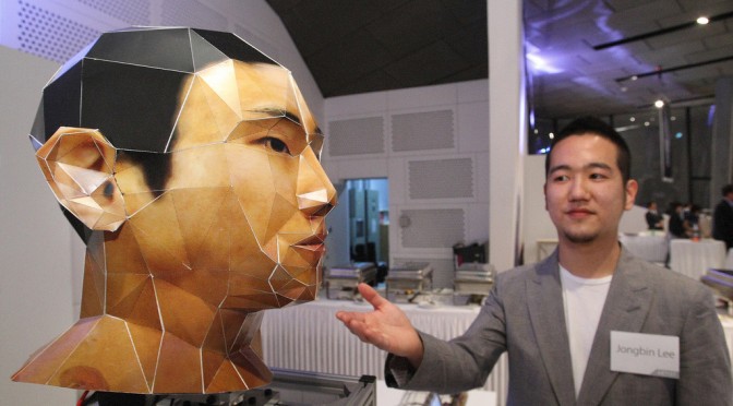
Perhaps the weirdest piece of technology I’ve seen recently is this curious assemblage exhibited at Lift in Seoul: it’s called “Robot Mori” and, as described by Advanced Technology Korea:

Meet Mori, the alter ego of a lonely boy who wants to go out and make friends but is too shy. Mori, on the other hand, isn’t shy at all. He swivels his head, looking around for nearby faces. Once he detects your face, he takes a picture and uploads it to his Flickr page.

Why do I blog this? The focus on face, and the visual aesthetic produced by the whole device is strikingly intriguing. Definitely, close to the Uncanny Valley… which made me realize that whatever sits in the valley often belong to the New Aesthetic trope. I personally find it fascinating that robots can have this kind of visual appearance and wonder whether some people might get use to that after a while… in the same sense that they got used to moving circle pads as vacuum cleaners.

Fosta's Ye Olde Aesthetic

(Nick wrote this over on his blog. It deserves more blogginess, so I’m re-blogging it here as well. – Julian)

The New Aesthetic. People are all over this one. It’s Bridle’s baby and a worthwhile endeavour it is too. The main issue with the New Aesthetic appears to be in defining it, and a swathe of heavyweights have stepped up to give their view. Rather than join them, I want to try and frame the New Aesthetic a little, give it some context perhaps.

So what do we know?

The New Aesthetic is a crowd generated lucky dip in the shape of a tumblr. Some of the content makes sense and some of it doesn’t, but there’s enough there to make out a theme: machine intervention. From pixellated architecture (which might have simply been considered mosaics prior to the New Aesthetic tag) to glitch-laden pop promos, there’s the whiff of technology about all of it. But in order to understand the art (if that’s what it is), perhaps we need to understand the artists.

I work in San Francisco, at the heart of the new technology revolution. Everywhere one turns there’s a feisty startup, technology hot-house, or band of programmers hunting for a VC. In a very real sense this place is where the future is being made. One could expect to see folks in Cardin costumes, zipping around on neon bedecked segways through some proto-Tron grid. But no, the people crafting the future aren’t ‘futuristic’ in any tangible sense. The futurists I know are more interested in hearty pies, farmer’s markets, fine wines, old bicycles, hand-made clothes, leather shoes and hard-backed books. The futurists are retronauts. This isn’t solely a San Francisco phenomenon. From London to New York and beyond, one cannot fail to notice the rapid growth of heritage manufacture, and a diet of artisanal bread, heirloom tomatoes and fine-tuned coffee have fueled a growing obsession with with the old. Not the old per se, but a version thereof, a simulacrum even. The ‘Olde’. This has led to an emerging paradox in the world of objects. We love the perfection, modernity and reliable consistency of our iThings, but we also feel the need to pop them into a handmade leather pouch.

In case any of you are unsure what I mean, take a look at this: fuckyeahmadeinusa

Some of these little movies are lovely, but watch five or six of them and it’s clear that there’s a strong thread of values running throughout. The delivery aesthetic is also consistent: the short focal length; the folksy soundtrack; the slow tracking shots; the gnarled old signs; the well worn tools – they’re all there. If ever there was a well defined current aesthetic, it’s this. The Olde Aesthetic is organic, it’s slow, it’s irregular, it’s ethical. The Olde Aesthetic is worthy, has longevity, has heritage. The Olde Aesthetic is expensive.

Speaking of expensive, a lot of brouhaha has been made of the recent sale of Instagram to facebook, much of which has focused on the addition of filters to make photos appear older, as if taken with a classic camera from a bygone era. Nostalgia aside, a level of imperfection is becoming a noticeable focus in design. The creation of something consistent, elegant and ‘perfect’ is no longer as much of a manufacturing challenge as it once was. Somewhat counter-intuitively, signs of human intervention are now increasingly difficult to achieve in the era of mass automation. As a result, people are becoming numb to technological perfection and are increasingly seeking out products which evidence the skill and actions of a human, with all the associated flaws, faults and individuality.

In the world of digital products quality means consistency. If paint colors don’t match, if fit and finish is misaligned, if the product functions differently to it’s neighbor, the product is considered a failure and is dispatched to a waiting dumpster (or more likely shipped off to a grey market street seller). The same is true of digital content. Consistency is king across platforms, applications and operating systems. Tools are put in place to achieve this very goal.

But let’s look at the finer things in life, those RedWing boots, heritage style clothes, fine food, furniture and bicycles. Signs of mass production, consistency and homogeneity are undesirable in these products. The movies of the Olde Aesthetic fetishize the machines used in production, but also feature loving portraits of the wise old owls who operate them. Contrast this with the dustmasked anonymity of the Foxconn workers, tethered to their machines producing a blur of cookie cutter devices. Perhaps futurists need to live in the Olde Aesthetic in order to more clearly visualise, synthesize and ultimately understand the New Aesthetic? Perhaps the Olde Aesthetic has arisen as a counter to the reliable fast-food repetitiveness of the digital world? Perhaps the comfort of an Olde Aesthetic life leads to better clarity of thought when considering the future? Maybe they should remain polar opposites, but I think it’s important to understand potential overlaps in the Venn.

When the team at Apple signed the inside of the casing of the mac plus computer they did a very powerful and emotional thing – they stated “this thing was made by people”. Whilst the signatures were etched into the injection molding tool and reproduced with the same reliable regularity of the neighboring screw bosses and air vents, it’s still one of the most beloved elements in Apple’s design history. The very notion of electronics is repetitive and binary, but the overall product experience needn’t be. Let’s be clear here, I’m not talking about personalization, widgets or custom fonts, just as I’m not talking about dropping circuit boards into hand carved teak encasements. There must be something deeper.

Back when we lived in London we arranged a regular delivery of vegetables. In that peculiarly middle class way, they arrived in a drab cardboard box, wrapped in brown paper. They were muddy, and every now and then we would find a grub. Far from complaining, it actually added to the experience, as if the reality of our position at the end of a very long production line of human beings was suddenly made evident. In a world of perfection we actively sought out imperfection, with the express intent of breaking free from the reliable, regular produce from the supermarket. In a world of machine-perfect digital objects, are there any which have grubs? Are there any digital experiences where finding the grub is actually considered a plus? Are there artisanal, organic or heirloom digital products?

If you have anything to add, I’d love to know. In Olde Aesthetic style, send your contributions not via tumblr, but by postcard: Nick Foster – 200 South Mathilda Avenue, Sunnyvale CA 94086.
Weekending 04292012

Julian: Literally? I spent the week in the model shop doing three things, sometimes at the same time. First, getting ahead of myself and making a third edition of Ear Freshener. That’s right. A third edition. I think I’m deferring/procrastinating doing the sound design until I can find a proper sound designer to help out. What I’m thinking now is to add multiple tracks because the layering and transitions between one sound and the “next higher up” sound might be more effective and less rocky if you have two sound sources at once. That’s the thinking. Best test I think is to build the hardware.

Otherwise, sculpting the framework for a design workshop next week with the Gear team. I’m actually quite excited by the prospect of working together with a team that knows how to do production properly. And swirling around the design of design workshops is the prospect of taking some of these templates for creating new things and working them in other contexts to test the way they work. I mean — they work quite well in the studio, but we’re used to them, understand their rules and the general guidance around how they are wielded. It’ll take several runs to refine them for consumer use.

And I’m working more diligently on Nostalgia, a little prospect of a just-for-me iPhone app, which means a ridiculous amount of time relearning how to get my head in a place to program the computer to make it do things.

Fabien: I started the week giving a 1-day seminar at BDigital on the materialization of value from network data. With a group of participants mainly made of engineers, I first launched into my spiel about a ‘new world of data’ and the implications of this evolution. I particularly stressed my discourse on the necessary skills necessary on projects aiming at extracting information from large datasets and present something of use to non-data experts (i.e. a definition of a ‘data scientist’). I like use Ben Fry’s dissertation Computational Information design (acquire, parse, filter, mine, represent, refine, interact) to lead the audience through various examples of each skill. Then I illustrated the mulch-disciplinary process we employ at the lab to transform data into sketches, prototypes, insights, indicators or evidences. This quote from Dan Hill in a recent interview summarizes quite well the state of our practices:

The basic principle is that all urban problems today are multidisciplinary – […] so no one discipline can solve anything meaningful by themselves, nor can one discipline ‘lead’. So the basics of collaboration – respect, openness, listening, sketching in an ‘open’ fashion, pushing back on ideas but not blocking them, constantly learning – are absolutely paramount.

Consequently, the tools we employ and build embrace this evolution. I find this a rather good introduction to Quadrigram with which we want stakeholders to build feedback loops where they can actually figure something out collaboratively (e.g. find answers and ask new questions). In the seminar I highlighted this important shift that consists in manipulating data in real-time. The second part of the seminar was dedicated to hands-on activities focused in the design of urban services, their evaluations and their implications. Thanks to Marc Pous for the invitation!

This week I also gave an interview to Mosaic in which I discuss about personal heroes, curiosity, the lab, network data, Quadrigram, linking these elements into what I hope is a coherent whole. Thanks to Zzzinc for the inspiring questions!

The rest of the week was filled with meetings and clean up tasks to get Quadrigram ready for its launch. More on that next week.

Nicolas: Last week was a mix of teaching (innovation and foresight in Annecy on Thursday, creative approaches at EPFL on Wednesday), lecturing (about the evolution of space/level design in video games in Geneva on Tuesday) and participating in a panel about User Experience approaches in Lausanne. I also spent some time writing the game controller book, after a good meeting with our editor in Lyon, France last Friday. And oh, one last bit, there’s a new game controller exhibit that we’re working on… with a specific focus on odd and peculiar controllers that reveal various insights about the evolution of these devices, as well as game culture.