Janet Cardiff Sound Art

JCB_25072011_080845_9970

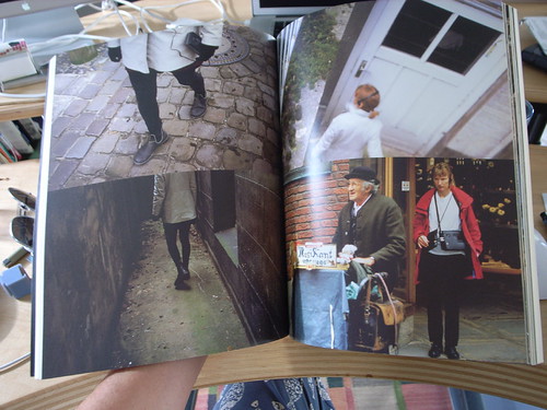
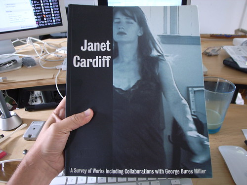
Just a quick note on some material in this hard-to-find catalogue resume of Janet Cardiff‘s work.

It’s called Janet Cardiff: A Survey of Works, with George Bures Miller

Cardiff is well-known for her early-days “sound walks” where participants were given a Walkman or similar device to listen to as they walked about. Stories were told or experiences recounted in the audio track. The idea is simple, but from what I understand (never had the pleasure..) it was the story that made the experience engaging.

I first came across Cardiff’s work while doing sort of informal background research for the PDPal project where we were trying to understand interaction in the wild — away from desks and keyboard and all that.

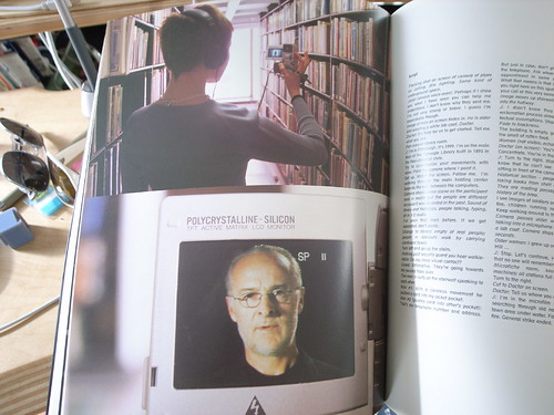
What I find curious about her work is the way it augments reality before people even really thought about all this augmented reality stuff — but, it does not fetishize little tiny screens and orientation sensing and GPS and all that. It uses our earballs rather than our eyeballs — and somehow that makes it all much less fiddly. Although — if you look carefully at the bottom image you’ll see an image from a project in which one does use a screen — from a small DV camera which is playing a movie for you as you go along.

Janet Cardiff

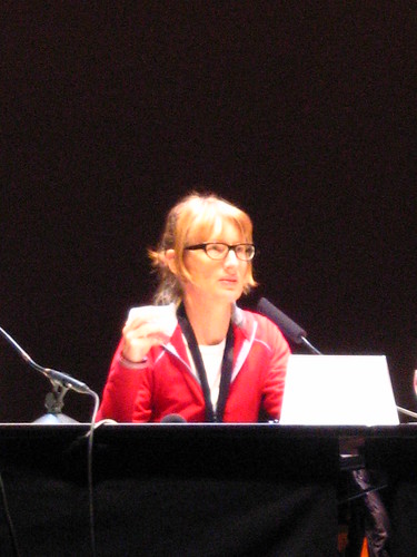
Parenthetically, I think Cardiff had one of the best augmented reality projects with her telescopes. I’ve only seen this as documentation when I saw Cardiff talk in Berlin at Transmediale 08. There should be more documentation of this somewhere, but the effect was to look through the telescope and see a scene in a back alley that was the back alley — only with a suspicious set of activities being committed — perhaps a crime. The illusion was in the registration but the story was in the sequence of events that one saw, effectively the story. So much augmented reality augments nothing except coupons and crap like that. There is no compelling story in much augmented reality, but I don’t follow it closely so maybe things have changed.

JCB_25072011_080858_9971
JCB_25072011_080945_9972

Continue reading Janet Cardiff Sound Art

Design Fiction Chronicles: The Future Issue of The Book and iPad

The Future Issue

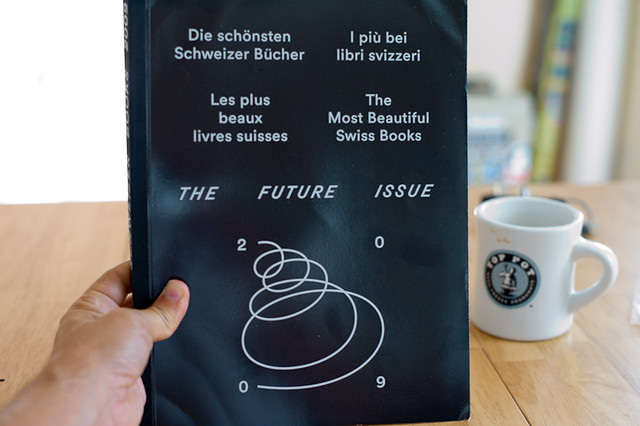
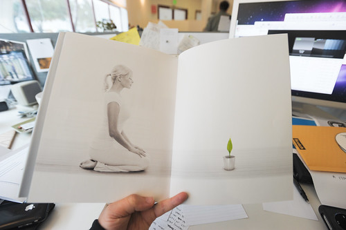
In a project we’re currently undertaking that has allowed us to work through and figure out the future of the photo book I was compelled to read through this book called “The Most Beautiful Swiss Books” and the 2009 edition is called “The Future Issue.”

I like the play on words there and didn’t see it until just now.

The Future Issue. Like..it’s the issue from 2009, because this is an annual. But, the future is an issue to consider. Get it? Well..I didn’t until my coffee took hold.

There are a few relevant passages in here on design, the future of reading and publishing and that sort of thing.

* Everyone seems to be considering the iPad. This book was published after the iPad was announced but before it was made available. There should be a follow on to the points made in there. Maybe I’ll do that. Follow up with the critics and ask them. There is the usual bulwark, which is to say that there is something about the tangibility and materiality of the book that is precious, seminal and defines book. Something that people would still want.

Other points related to iPad-mania were to indicate the distinction between book-dedicated readers like Kindle and platforms like iPad in that there is always something available with the iPad to do other than read, which can pose distractions like..*shrug..why not check email now?

There was some excitement about the evolution of book design in the pad-electronic form. What compliments and extends paper, pages, binding and all that.

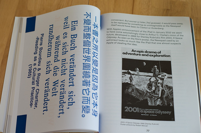
* And then there was the wonderful canonical reference to 2001 – A Space Odyssey which made me very happy. I had never noticed in the movie poster that there is an iPad, which was referred to as a Newspad in the book upon which the film was based. Bonus design fiction future issues!

There's an iPad in the 2001: A Space Odyssey movie poster

* Mention was made to Wim Wenders seeking opinion on the extinction of movies in the context of the intrusion of television. Would books suffer the same fate as movies did when television appeared?

* Perhaps the most vibrant short essay questioned the phrase The future of. Something called “Experimental Jetset” — a collective of Graphic Designers in Amsterdam wrote that they dislike the three words “The future of..” saying they find “something about the phrase that completely puts us off.”

What bothers us most is the suggestion that the future is an unchangeable entity, something that develops completely independent of ourselves. A pre-determined path, to which we should adapt ourselves, whether we like it or not..

‘Our future’, is something that is manageable, shapeable, changeable, buildable, doable. ‘A future’ sounds pretty decent as well. A plural ‘the futures’? Why not? Just as long as we can get rid of the idea of the future as something that governs us, like some kind of pre-modern deity. Let us be reckless about it: we govern the future, not the other way around.

Perhaps this is the most encouraging perspective in the essays of the book, tucked neatly in near obscurity amongst the two other possible opinions: (1) veiled conceit for the iPad/nostalgic death-grip on the smell of leather, the artisinal bookbinders craft, &c.; (2) curious exuberance for this evolution in the rituals of reading.

Why do I blog this? Notes on opinions about the evolution of book writing, making and the cultural evolutions of reading and publishing practices. Plus the bonus design fiction chronicle on the iPad in 2001!
Continue reading Design Fiction Chronicles: The Future Issue of The Book and iPad

Nonobject Short Notes

Nonobject_01

Just some short notes for myself on this book NONOBJECT by Branko Lukic with words by Barry Katz and a foreword by Bill Moggridge. I’ve been eagerly awaiting the arrival of Nonobject, a book that reveals quite a number of speculative objects — that are described as experience-centric design research that push the boundaries of possibility. The objects themselves do innovation through design beyond physical boundaries. As the New York Times describes it — the objects are about freeing form from function.

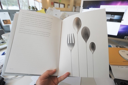
What I appreciate about the objects are the way they take a theme and then stretch it to extremes along a particular experience axis. For example, this set of flatware that has these very long impossibly thin handles to them — made of the impossible, whimsical material “Thinium.”

JCB_15022011_122516_1205

The book is chockfull of luscious renderings, gooey wordy designer-y descriptions of beautiful CAD models. There are beautiful human models serenely poised over expertly rendered CAD objects. The pages are thick and smooth, like pulled sugar-y ribbon candy. You want to lick the pages and their CAD models to see if they will have an impossibly rich, whimsical taste as well.

There are some curious things in here that tip into the realm of design fiction where the design actually brings me to the point of confusion, where I am unwittingly compelled to suspend my disbelief such as when one sees something and wonders if it isn’t actually real, already on Engadget. These are things that are just on the cusp of believability because they are consistent with the ways that ideas and their materialization evolve. Like — you could believe that a couple of future-forward thinking venture capitalists pooled $5 million to finance the design, tooling and short-tun manufacture of some especially curious bit of digital product concept work.

JCB_15022011_122430_1204

JCB_15022011_122737_1206

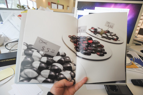
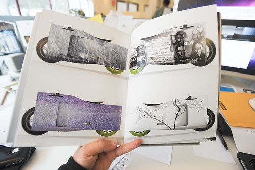
Most of the things in Nonobject deflect away from design fiction — at least the sort that closes the gap between idea and its possibility. They are truly more like speculative knowledge objects. Things to ponder over and go — hmmmm..curious. Nonobjects don’t make you want to do a google search to find out when the thing is going to be released, or search the leaked items on Gizmodo or something, or place a pre-order. For the Laboratory’s Bureau of Design Provocations, this sort of diegetic prototype is much closer to being there, in the world — than a gooey CAD render could ever be. Evolved visual literacy in this day and age does not CAD renders as much more than what is created by the designer, sitting with their modeling software, satisfying their primal designers’ urges to dream about a world in which everything looks like it should be moving very fast, or have organic, hand-made pebble-like forms, &c.

Some of the nonobjects tip into the realm of plausible. The “Behind the Scenes” camera tips into that sort of thing. A camera that captures what’s in front of the lens in a traditionally way — but also what’s behind. This is intriguing design fiction in that it seems quite possible, despite not existing. And it gets one thinking about the experience for people in the world, not just the form and un-functionality of a spectacular dinette set. But — even this makes one stop for a moment. Wouldn’t there be lots of photos of half of the photographer’s head? As soon as you start down that path, you *sigh and slump..just a concept.

Now, I’m not saying that concept-ing and vision-ing and all that does not serve a useful purpose in advancing design. It raises questions and provides material to ponder priorities and principles. It points to unusual things that help those less versed in the possibilities of design to see more broadly as to what the capabilities of this craft might be. It allows free exploration without material constraints. It’s far-fiction, unabashed dreaming and pondering. It distances itself from the material world, the world of tangible needs, constraints and exists almost exclusively in the imagination.

JCB_15022011_122404_1203

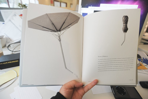
“All products serve, in one way or another, to protect us from the elements, but by separating ourselves from nature we become separated from ourselves. Take the humble umbrella. It shelters us from the rain, but this implies that the rain is our enemy, a hostile force from which we need to be protected. Kisha brings us into a different kind of relationship with nature. Its upturned, windproof form reaches up like a flower to capture the falling rain, and its hollow handle directs it where it needs to go. The rain nourishes the flower, reminding us that we need nourishing too.”

JCB_15022011_122757_1207

At some point this sort of concept-ing and vision-ing tips into the obscure poetry of design that is for designers themselves and really misses the opportunity to translate ideas into the material of the world in which humans live and die. Umbrellas have potential and possibility for being better and different, of course. I have to say though — this particular near future umbrella just confuses the bejezus outta me. This would be curious and even a good design-joke if it said less about watering a lone flower than the rhythms of cheap $5 umbrellas that you get on the corner that end up failing and turning inside out. I mean — a design fiction umbrella that could turn inside out if a torrent of wind decided to do so and *still remained functional as an umbrella..now, that’d be something much more legible and perhaps even tip into the category of “wheels-on-luggage” — like..someday we’d say to ourselves: “what took Totes so long to make the wind-accomodator umbrella?” If Totes cooked the Nonobject “Kisha” I’d get very French and *pffft with a *shrug.

This is sort of where I lost a bit of enthusiasm. While I like the direction and motivation here, this did not feel like the sort of design fiction that I lust after. It seemed very designer-ywith a heavy emphasis on the perfect render. Good design fiction in my mind tends more towards believable, pushing towards the suspension of disbelief as a core tenent — because then you enter into that middle space of confusion tending towards possibility, rather than the dead-giveawy of an expert CAD render in Keyshot or Hypershot or Rhino or whatever.

Now, this is a bias. I’m a design fiction guy, a design fiction-y designer. I believe that a design that tells stories about how the world could be, or what it may come to be is one that serves a purpose in a deep, ideological way to make things better. And, in the two or so years that we here have been exploring and producing design fictions we’ve found that they should be props that live in the corners so that the attention they draw to themselves in only a secondary or tertiary fashion. Fetishize them too much and the magic falls apart. Ancillary things aren’t highly rendered on white backgrounds. So — maybe nonobjects are just something entirely different. They aren’t convincing they way I think a good bit of near future science fiction can become a motivator to create (or avoid) the world it describes. In an important way, design fiction is more than fantasy renderings of impossible worlds and their contents. Design fiction is motivated to bring about change; to make things a bit better. Speculating and fantasizing is fine — an important function. But it leaves one wanting for a set of more tangible objectives, goals, principles or scripts to getting from here to a “there” that’s better than what we have now. It motivated by a loose philosophy that underscores the fact that real, material, hand work *can bring about change. When I see CAD renders, that’s only a small step towards that because our visual culture has adopted and become quite sophisticated — when something is rendered, we can tell. And that erodes the important illusion of possibility, the illusion that closes the gap and makes one wonder if this thing is real, or is this story I’m being told journalism? Or fiction?

These are perfectly captured, fantasy objects. For me, they look too fast, too impossible, too much like the Industrial Designer’s dreams rather than props reflecting the complexity of a fraught, much-less than perfect world. It’s singular — one person in charge of everything, which may indeed be the Industrial Design fantasy par excellence.
Continue reading Nonobject Short Notes

How to Live Safely in a Science Fictional Universe

Wednesday November 10 13:07

From the Laboratory’s Blog All Kindle ‘Dog-Earred’ Pages Desk, I bring you a few call-outs, quotes and passages from the brilliant bit of chronodiegetic gooeyness called “How to Live Safely in a Science Fictional Universe” by Charles Yu. Great good barely science-fictional novel here. Really a story about loss and our human nature to regain what has gone and re-do and re-play our lives. Its about travel through time but along the way you get to enjoy some good design fiction swerves and curves. A few good things to think about, ponder over and imagine. I particularly enjoy the way that time-travel is intimate with story-telling in the novel’s world — its a kind of technology and industry (military-industrial-narrative-entertainment complex) that goes along with it: conceptual technology, chronodiegetics and diegetic engineering! I’d say this is a strong-recommend. Pretty much no spoilers below.

On the subway, the guy next to me has his head in a news cloud. Paradox is up 16 percent. If I lean in a couple of inches, I can just make out what it says. Up 16 percent in the fourth quarter on a year-over-year basis...
The guy reaches his stop and gets off, leaving his news cloud behind. I love watching the way these clouds break up, little wisps of information trailing off like a flickering tail, a dragon’s tail of typewriter keys and wind chimes, those little monochrome green cloudlets, a fog of fragments and images and words. On busy news days, the entire city is awash in these cloudlets, like fifty million newspapers brought to breathing, blaring life, and then obliterated into a sea of disintegrating light and noise.

The air above our heads is a smoggy miasma: mostly a vaporous fog of news and lies, mixed in with gaseous-form gossip, meme-puffs, and as always, the mists of undirected prayers. Men on corners whisper about secret shows upstairs.

Chrono-Adventurer Survival Kit
There were no exclamation points or any squiggly lines indicating weirdness or jokiness, or any other graphics to signify, This is for kids, this is a toy, this is just make-believe. It just had those words, and it was dead serious..For five dollars and ninety-five cents, plus a self-addressed stamped nine-by-twelve envelope, sent to a PO box somewhere in a faraway state, the good people at Future Enterprises Inc. would send you a survival kit “of great use and convenience for any traveler who finds himself stranded on an alien world.”
Half of me knew it was stupid. I was old enough to know better, but on the other hand, that font! Those letters in all-caps. It didn’t look attractive and well formatted, the kind of thing a kid’s eye would be drawn to; it looked like it came from a typewriter, unevenly spaced, like there was too much text, too many ideas and words and things that someone had to say, had to let people know about, it looked like it came from the mind of a brilliant, lonely, forty-year-old man, sitting somewhere in a basement in that faraway state, half crazy, sure, but on to something.

Up the street a song cloud floats by, sagging a bit, but still intact. I walk faster and catch up with it just in time to hear the ending, a symphony orchestra, the sound full and resplendent, and it is one of those times, you know those times every so often when you hear the right piece of music at the right time, and it just makes you think, This music didn’t come from here, it was given, it fell from some other universe..

It is well established within the field of diegetic engineering that a science fictional space must have an energy density at least equal to the unit average level of a Dirac box, multiplied by pi.

Then Ed farts and its not good. TAMMY’s still crying but starts to giggle, and I’m gagging a little, and then TAMMY starts laughing so hard she almost crashes herself. Ed saves the day again.

We’re going to meet an important man, the director at the Institute of Conceptual Technology, a gleaming black building, behind gates, that sits on top of University Road, up the hill half a mile above town, where they worked on the hard problems. The big ones, like how to keep paradox from destroying the sci-fi world. They were the people my father aspired to be, this man in particular, they lived the lives he longed for, they drove up to those gates every morning and checked with the security guard and showed their ID badges and the gates opened for them, and they drove behind them, up into the compound, the castle of secrets and ideas that only a hundred people in the world knew about, ideas that only a dozen people understood.
Today is the day, that one glorious day in my father’s life. After waiting half a lifetime, half a career, his moment. Today is the day they come calling for him. They, the world, the outside institutional world of money and technology and science fictional commerce. I remember the call. Sometime after our first wobbly orbit and before he was completely sure he knew what he was doing (or rather, before he realized he would never be completely sure about what he was doing), someone had taken notice. They found him, the military-industrial-narrative-entertainment complex, and they wanted to hear his idea.

In Minor Universe 31, quantum decoherence occurs when a chronodiegetic system interacts with its environment in a thermodynamically irreversible way, preventing different elements in the quantum superposition of the system + environment’s wave function from interfering with one another.

Why do I blog this? To keep track of notes from this book. Some are good ideas for some design fiction experiments. In addition — since I read the Kindle edition (a reasoned alternative to buying the bulky hard cover — which I rarely ever buy — and reading it while on a long trip). I’m confident enough that a Kindle book will not likely be around for as long as a normal book that I feel I must spread my notes around the datasphere.
Continue reading How to Live Safely in a Science Fictional Universe

What Innovation

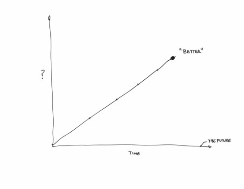
Up and to the Right


Just a super short set of notes from Steven Johnson’s book, Where Good Ideas Come From: The Natural History of Innovation. I don’t have anything too much in-depth mostly because it’s a fast read, when I found time to read it, and it made me squirm uncomfortably. There was not much that made me stop and smile although I did quite a bit of exasperated sighing along the way.

I think this is because Johnson chose to muddle the study and insights of biology and evolution with the activities of humans following their curiosity, their inspiration to make things, their will to create enterprises, their greed to overwhelm their competitors and make fortunes by whatever means necessary, their hubris, their social-political ambitions, their desire to leave a statue of themselves behind — whatever it is that drives individuals to build and create. Using the study of organisms, biology, the ocean reefs, species evolutions, ecosystems — all of these things as metaphors for creativity, innovation, good ideas in the making — well, that’s just problematic in my mind. You exhaust the really interesting work right out the tailpipe of your story and you’re left only with this pre-existing framework of biology and ocean science and these things to explain how Marconi’s innovations with radio. At some point the analogy becomes the story itself — it’s not like the innovation work *is like* ocean reefs accreting new material. The innovation work is a reef, with new ideas building upon old ones like so. At some points in Johnson’s story human endeavor to make new things and come up with new ideas lose out to the simplicity of the science analogy. Human ingenuity becomes the same thing as the study of species, reefs and other “up and to the right” style evolutionary stories. This makes for a good children’s allegory or grammar school analogy — or a good cocktail party explanation of the irreducibly complex activity of “innovating.” But, it makes a book-length treatment of the complexity of creativity fairly gaunt at best.

Somewhere muddled up in there is an argument that Cities breed innovation because people are so packed in together (like an ocean reef?) and ideas propagate more efficiently in density, which may be the case — but it feels like a vague generalization. It’s easy to get into an argument about whether NYC is more creative than Los Angeles, for example — and things quickly spiral out of control.

Perhaps the best part of the book is the last sentence which might be the argument and even the framework for how the book works — forget all the biology analogies. Just this tweetable little nugget.

Go for a walk; cultivate hunches; write everything down, but keep your folders messy; embrace serendipity; make generative mistakes; take on multiple hobbies; frequent coffeehouses and other liquid networks; follow the links; let others build on your ideas; borrow, recycle, reinvent. Build a tangled bank.

Had Johnson followed the walks of those innovators he was curious about, followed them along their mistakes and noted the ways they borrowed, recycled, reinvented he could have done away with the silly biology analogies. It’s all right there in the hands-on work that’s going on — there’s no need for a big, grand, one-size-fits-all theory about how ideas come to be and how they circulate, or don’t circulate and how they inflect and influence and change the way we understand and act and behave in the world. That’s the “innovation” story — or the way that *change-in-the-way-we-understand-the-world* comes about story.

What I think Johnson is trying to do is in fact deliver some material for that cocktail party conversation — to instill in readers’ minds the idea that good ideas don’t just happen in isolation. They happen because of this idea of the “adjacent possible” — Stuart Kauffman’s idiom describing the multiple possibilities for what can happen because things (science-objects in Kauffman’s notion, like molecules or elements that lead to new science-objects; idea-objects in Steven Johnson’s notion, like steam engines and wine presses that lead to new idea objects like locomotives and printing presses) are proximate. Here’s how Johnson introduces it to us — and he’s not really reminding us that he’s taking a scientific thesis by a guy and using it to describe how innovation works.

“The scientist Stuart Kauffman has a suggestive name for the set of all those first-order combinations [molecules becoming DNA, e.g.]: “the adjacent possible.” The phrase captures both the limits and the creative potential of change and innovation. In the case of prebiotic chemistry, the adjacent possible defines all those molecular reactions that were directly achievable in the primordial soup. Sunflowers and mosquitoes and brains exist outside that circle of possibility. The adjacent possible is a kind of shadow future, hovering on the edges of the present state of things, a map of all the ways in which the present can reinvent itself. Yet it is not an infinite space, or a totally open playing field. The number of potential first-order reactions is vast, but it is a finite number and it excludes most of the formst that now populate the biosphere. What the adjacent possible tells us is that at any moment the world is capable of extraordinary change, but only certain changes can happen.”

What could come to be in the world of combinations of molecules and atoms and so forth that happen to be swirling in the same goo — is the basis for Johnson’s thesis about what could be in the world of accreting and “exaption” of ideas. The adjacent possible is meant to describe the what could come to be based on the coexistence and proximity of materials. Things bump into other things and come to form new things under certain conditions. There’s not one possible outcome, but multiple possibilities.

What Johnson does is confuse this for the way that ideas — which are not molecules or atoms swirling in a primordial goo — evolve into possible “shadow futures.” Will and cunning and gile and ambition and money and access to money — these and many other non-biological factors shape how good ideas come to be. ((As well as horrible, wretched, resource-wasting ideas.)) I mean — this is a troubling way to make an argument from the get-go. I don’t think you can just willy-nilly take a thesis from biology (or hypothesis, or lens, or view of how things work) and then use it to describe something that is never as pure as what we understand “nature” to be or “natural history” — he is not creating a story that describes what happens in the world of ideas, spun and spurned by people with bodies, situated in time, space, culture and society and struggling for credibility and authority. And that’s just a problem. The coordinates and biases and ways-of-knowing are all wrong at some level. The units are way off. It’s an allegory at best that misses 99% of the mishegoss of creating knowledge and meaning; an analogy that basically filters out all the work of humans interacting in a different way than the way that molecules and atoms interact. It’s another one of those kinda annoying uses of science to explain society which starts you down the path of immediately assuming that science isn’t society by other means, or that science isn’t already a social enterprise or — worse — that science has it all figured out.

Anyway — I got suckered in because the book has the word “innovation” in it. These sorts of books with titles that are didactic are suckers bait. Its got this funny title about being a “natural history” of innovation and that seemed polite and humble, rather than prescriptive like a lot of business books tend to be. (“10 Steps to Improving Your Organizations Innovation Prospects!” — or things like that.) But then it’s less humble when you realize that this is The natural history of innovation that’s been written. N’ah — I know he’s probably being provocative with this title. But, still — I found it a bit bold. Because inside is not a natural history at all, but rather an argument made through a number of examples. The argument is to dispel the notion that good ideas — ideas that make incremental changes in the graph, making things move up and to the right to a greater or lesser degree — come from a guy sitting around by himself in a lab or basement. Rather, good ideas come about because of their proximity to other, perhaps disparate activities — other intriguing things happening nearby. Johnson’s prop is the ocean reef — and perhaps this is the joke in the title because the reef is understood to be something natural (as if) and therein lies the natural character of innovation.

Couple of notes, so long as they were jotted down while I was reading this:

He has a curiously muddled appendix of good ideas at the end, with the electric battery (1800) — every good idea has a date — sitting alongside of sunspots (1610), as if sunspots were a good idea as opposed to an observation that becomes relevant and topical. I can only imagine that these are intractably complex things that are as dense a knot of activities both purposeful, willful and incidental as one can imagine. Yet here they are rather cavalierly given a sentence or two and a date stamp as if they appeared as a good idea suddenly.

He diverts detractors to his approach of going broad and shallow by saying that there is value in surveying and drawing conclusions from many short case studies and drawing four quadrant graphs that even further simplify the points. The alternative is to be deep and thick, or to go into the laboratory — talking to people to suss out the meaning and history and all that of technology. The broad and shallow perspective is not as thorough. It’s a gloss, but even worse — it’s not substantive and opinion at best. This is fine, but the reader never really knows what they’re losing in the trade.

The argument is an engaging story — a good story. It’s an argument insisting on a POV and a thesis about an intractably complicated social/cultural/political/economic entanglement that cannot possibly be distilled to a core, to an essential character and way-of-being except in the most simple ways which never can possibly be much more than a fairy tale useful only for the most basic of explanations you might use to tell a child why the sky is blue, or as an allegory — it’s certainly not a history, natural or otherwise.

If you want to hear a really irksome panel discussion with Kevin Kelly and Johnson, check out this Radiolab podcast: What Does Technology Want?. It’s curious to me that Johnson and Kelly seem to jump on Robert Krulwich to the point of basically saying — “what’s wrong with you? don’t you believe in technology’s autonomy?”
Continue reading What Innovation
Medical Fiction

A curious book won the Pulitzer Prize, I just heard. It’s called Tinkers What I found most intriguing about the news story is that the book was published by a small specialty publisher — Bellevue Literary Press, which is associated with the Bellevue Hospital in New York City. Probably one of the scrariest hospitals in my imagination. Big, imposing, vaguely Gothic hospitals aren’t cool, as any horror film production designer knows. The floors are inevitably wet and mildewy and the wheels of gurney’s clank from lack of maintenance, which is only the surface of what isn’t maintained.

Anyway, this book is intriguing to me because of the press typically does medical books, which makes sense, but they also publish fiction books that have medical themes — combining fiction with the traditionally very terse, fact-based themes of medical books. Something that sounds kin to design fiction.

Bellevue is a major center for emergency services in New York City, but it is probably best known in the public imagination as a mental hospital. The hospital’s literary press was established five years ago, mainly for the publication of high-end medical books. But Goldman, a veteran of the publishing business, is also committed to releasing works of fiction with a scientific or medical theme.

via NPR
Continue reading Medical Fiction

Buzz Aldrin Signs Teh Bookz

The second guy to walk on the moon — Buzz Aldrin — has been doing the rounds, signing his new book Magnificent Desolation talking about how his life was destroyed cause he was famous for being the second guy to walk on the moon. And how we should go back to the moon. And stuff like that.

Anyway, he was signing books like a machine for four hours the other day. The queue wrapped around the stationary / shredders / valu-pak post-its aisle, down along bulk pet food and turning around into the army-sized tins of name brand coffee. Some people were using the ginormous Costco shopping carts (like..1.5x normal, everyday ones making adults look like diminutive game characters) to shuttle 12, 15, 18 books for an astronaut to sign. He never stopped — sign, shove..sign, shove. It was a little disheartening. I occasionally will go to a book signing — anytime T.C. Boyle’s local with a new one, or Martin Amis — I remember a Martin Amis signing..I even went to a Brenda Laurel signing when I was writing my dissertation about VR and thought I should read her book on, like..computers and theater or whatever. Now I have two books with Buzz Aldrin’s name in them cause his hand scribbled it. I didn’t get to say even hello or welcome home or anything. Pfft. So industrial. Perfect for a Costco. I imagine these are going to 20% above list on EBay or something.
Continue reading Buzz Aldrin Signs Teh Bookz

Plastic Happens

Plastic Slippers

Plastic slippers, found in Seoul, South Korea

To go along with the previous *blog all dog-eared pages* post, an additional description of *what plastic is* — to include alongside of all the others chemical, political, economical, historical, technical, medical, fictional, &c — done in the story-told style, again from a dog-eared page in Richard Powers’ *Gain* — a fictional industrial historical novel of a soap-making company alongside the memoir of those implicated in its adventures to make the world clean, we find this formula:

Plastic happens; that is all we need to know on earth. History heads steadily for a place where things need not be grasped to be used. At a shutter click, a bite-sized battery dispatches a blast through a quartz tube filled with halogens. Excited electrons, falling back down the staircase of available energy states, flash for a second, to dissipate the boost that lifted them briefly into rarefied orbitals. This waste energy bounces off the lines of a grieving face and back down the hole of the aperture, momentarily opened. Inside, reflected light ruffles the waiting film emulsion like a child’s hand impressing a birthday cake. Years from now, metal from the flash battery will leach into runoff and gather in the fat of fish, then the bigger fish that eat them.

Why do I blog this? I like these adjunct descriptive-formulae for things that reframe things in contexts as suited-for and as relevant as what one might typically consider *the* description. Plastic may almost always be framed as in the context of its chemical properties, or chemical architecture. Perhaps also in its marketing terms — how it is sold, or how to frame it as a useful, beneficial part of one’s life. Which of its many varieties can be recycled, which is often never *just* an aspect of its chemical properties, but also a municipal decision or even a legal ordinance that dictates that it *must* be recycled if it is sold in a specific geography. An so on. These multivalent, multiple terms that *are* what make something what it is — their ontological furniture of all sorts, not just the habitual, common-place or “common knowledge”, but those valences of a thing that go alongside of it as well, that are as material and as relevant as the proto-typical and everyday. Perhaps even more relevant, as the Powers’ passage above suggests. More everyday and experienced rather than the rarefied industrial-chemical.

Can these alternatives provide a more legible basis for telling a story about something, and do so in a way that is more meaningful and with deeper, thicker, world-changing impact?
Continue reading Plastic Happens

Thickly Imbricated

Knot Thatch Structure

I just finished Richard Powers’ intriguing industrial historical novel Gain, which was brought to my attention by a couple of passages in Bruno Latour’s Reassembling the Social, which was brought to my attention by..&c.

One of the passages in the Latour is a sidebar in which he deploys an extended quotation from Powers in order to capture the multivalent prismatic network of associations that invigorate what a corporation is. There are no singular definitions — there are associations of the firm from a legal perspective, from the perspective of the guy working on a loading dock, from the point of view of shareholders who own lots of a company, and those who only own enough to have a modest retirement (they hope), from the perspective of environmental activists, from a historical point of view in the sense of corporate history, or a historical point of view from the perspective of labor history — and so on. The multivalent identity of a corporation is a complex thing, and even more complex to represent.

In this quotation, Powers’ captures the complexity of the corporation in a wonderfully succinct fictional historical moment. We’re in the denouement of the novel. The Clare company has come from a rich history of family enterprise in the American colonial days to today. Starting as an intrepid candle making trio (two Claire brothers and an Irish widower who is a candle craftsman) to a multinational, multiproduct conglomerate. As the CEO prepares for an interview on public television about this storied company, he ponders a question the producer has asked him to consider, jotting notes on a legal pad.

To make a profit. To make a consistent profit. To make a profit in the long run. To make a living. To make things. To make things in the most economical way. To make things for the longest possible time. To make things that people need. To make things that people desire. To make people desire things. To give meaningful employment. To give reliable employment. To give people something to do. To do something. To provide the greatest food to the greatest number. To promote the general welfare. To provide for the common defense. To increase the value of the common stock. To pay a regular dividend. To maximize the net worth of the firm. To advance the lot of all the stakeholders. To grow. To progress. To expand. To increase knowhow. To increase revenues and to decrease costs. To get the job done more cheaply . To compete efficiently. To buy low and sell hight. To improve the hand that humankind has been dealt. To produce the next round of technological innovations. To rationalize nature. To improve the landscape. To shatter space and arrest time. To see what the human race can do. To amass the country’s retirement pension. To amass the capital required to do anything we want to do. To discover what we want to do. To vacate the premises before the sun dies out. To make life a little easier. To make people a little wealthier. To make people a little happier. To build a better tomorrow. To kick something back into the kitty. To facilitate the flow of capital. To preserve the corporation. To do business. To stay in business. To figure out the purpose of business.

Kennibar thinks of adding: “To beat death,” but he’s afraid he’ll forget what he meant when the cameras roll this afternoon.

Richard Powers. Gain: A Novel. p. 398

What is the relevance of this? In part, reflecting upon the capability of a good story teller to capture a richness that escapes even the most well-researched corporate histories. In this sense, the power and force of the well-written word resonates with the sensibilities of “design fiction” to convey an idea, a concept, a *new thing* or even an *old thing* in a more compelling way than wireframes and storyboards.

Latour makes this point in an earlier passage — the wonderful dialogue chapter between the student and his professor — when the persistently baffled and obstinate student fights the losing fight for *objectivity*, not realizing that this moves him so far away from his material, from his site of curiosity that he conveys nothing but clichés. And in part the dialogue encouraged me to find this book, Gain.

S: But certainly nothing is objectively beautiful — beauty has to be subjective…taste and color, relative…I am lost again. Why would we spend so much time in this school fighting objectivism then? What you say can’t be right.

P: Because the things people call ‘objective’ are most of the time the clichés of matters of fact. We don’t have a very good description of anything: of what a computer, a piece of software, a formal system, a theorem, a company, a market is. We know next to nothing of what this thing you’re studying, an organization, is. How would we be able to distinguish it from human emotions? So, there are two ways to criticize objectivity: one is by going away from the object to the subjective human viewpoint. But the other direction is the one I am talking about: back to the object. Positivists don’t own objectivity. A computer described by Alan Turing is quite a bit richer and more interesting than the ones described by Wired magazine, no? As we saw in class yesterday, a soap factory described by Richard Powers in Gain is much livelier than what you read in Harvard case studies. *The name of the game is to get back to empiricism.*

Why do I blog this? A question of the the how and why of conveying material and ideas and histories in a way that is both empirical and with the powerful disbelief-suspension mechanics of a good story. Using fiction to do the work of designing as well using fiction in the work of communicating design that moves away from silly knee-jerk assumptions about what is “good” or what will make a profit. What is conceptual and innovative beyond the borders of ho-hum least-common denominator kruft?
Continue reading Thickly Imbricated

Innovation and Design

Roberto Verganti’s Design-Driven Innovation, a business book on how “firm’s” can participate in larger networks of design discourse in order to achieve radically innovative stuff. Mostly an argument with a three-step “how-to” addressed chiefly to executives. An intriguing argument with a fistful of examples presented over and over to drive these points home. In the “good” column, I would say that it is not bad to have (another) book addressed to (potentially) skeptical executives who are more motivated by features and bottom line bill-of-materials/profit/margin sorts of things. On the “m’eh” column, I would say that the book, like most business books, simplifies the really curious, intriguing and fun challenges of leading an organization that has fiduciary and legal responsibilities to make as much money as it can; that has cultures that are led chiefly by engineering and accounting; that thinks design is putting lovely curves around rectangular circuit boards; &c; &c; It would be a much more interesting read to hear the knotty, thorny challenges of design-led innovation. Rather than the “pat” case studies, I would like to have more of a deep/thick investigation of what happens really when one leads with design. It’s more than partying with the well-known, hipster designers Verganti highlights.

I’m reading two books at once, a dangerous thing to do because one is always interpreted alongside the other, changing what it may have been and my perspective, necessarily. But, in hindsight I would say that I am doing this on purpose. One of the books is Reassembling the Social: An Introduction to Actor-Network-Theory (Clarendon Lectures in Management Studies) by Bruno Latour, which I am reading for the second time. The other book is Design Driven Innovation: Changing the Rules of Competition by Radically Innovating What Things Mean by Roberto Verganti, which I only bought because of the suggestive, business-y title and because business books are things I can make short work of during a 5 hour airplane flight. You know — they basically tell you everything you discover in the title, and then repeat it for no more than 200 or 250 pages, only with snap-to-grid, spic-and-span examples.

* Skip right on past my rambling to my executives’ summary *

What could be the relationship between a noted sociologist-of-associations and a tailored-suit-with-french-cuffs-wearing business professor / management consultant? Perhaps nothing useful. But, one of the roughly constructed graphics in Verganti’s book resonated with Latour’s notion of the collective — and it was even described as a drawing of “a collective research laboratory” — and being a good Latourian, I had to follow the links in my head. These are just some sticky-notes between these two books and my own interest in the role of design in changing things, as well as the ways that organizations can be led by design sensibilities or design studios, rather than engineering efforts and accounting principles. Both are things that are lurking below the surface of these two books, Verganti more explicitly than Latour.
Continue reading Innovation and Design