New Aesthetic // OOO // Future of Things

It’s very gratifying to see how the #newaesthetic discussions are popping and percolating across the networks. There’s something to it, I think. Specifically the observations that something here under the New Aesthetic rubric is worth considering, thinking-through, working-towards.

What is that *something? It is perhaps an aesthetic thing. Perhaps it is symptomatic of the whole algorithmic life thing. Perhaps quite a good bit of articulate insights and cleverly stated things by some smart fellas. Also, perhaps those fellas having the *gumption to get up and say some things in a highly entertaining way. Perhaps it’s the thing of a bit of well-deserved very vocal network meme pot-stirring. Certainly some combination of all of these and likely more, you know..things.

Giving a name to an observed phenomena to muster hunches and instincts and observations and focus the meaning-making of things helps to organize thinking around it. That’s the upside.

The downside is that the thing sort of reifies in a way that isn’t always helpful. Or, you know — when things get a bit too academic. Too yammery..less hammery.

Another downside? The art-tech wonks claiming they’ve been doing it all along — of course they have..of course they have..It’ll get worse when it gets theorized as an aesthetic. Then it’ll get all ruined. An aesthetic about the cultures we live in? How do you get to such a thing? Do you use a really tall ladder?

And there’s some linkage to the #OOO // Object-Oriented Ontology world. Ian’s book Alien Phenomenology, or What It’s Like to Be a Thing points towards the inexplicable (as of yet) dark matter // God Particle // elusive ionized Bogoston particle behind it all, I suspect.

The questions that loosely link #OOO // New Aesthetic // Future of Things in my mind are still quite loose and inarticulate. THere’s something amongst them if only because they each point to “things” as having a sort of uncanny role in our networked world. They’re idiotic things, like Siri and algorithmic Cows. They’re the Long Follow Droid. They’re P.K. Dick style Dazzle Camouflage .

I’m trying to nail down the un-nail-downable. Clarity comes whilst in the middle of a night cycle when I’m utterly convinced of my lucid train of thought, which inevitably disappears into a “what? that makes *no sense” recollection after putting the bike away. But here goes..Questions that somehow wrangle these things:

* What are the ways our things of (presumably) our creation begin to express/articulate themselves in unexpected and weird ways? What is the catalyst for these differently animated, chatty things? Sensors? Networks? It’s been done before — talismans, tea leaves, idols, urns. We talk to thing and let them talk back to us, guide us from beyond. What different now? A bathroom scale that tweets your weight. Plants that yammer for water. I tried to figure this out a fistful of years ago when I wrote a short essay called Why Things Matter (The blog post was called A Manifesto for Networked Objects.) I’m not much further along in understanding why, but I think Alien Phenomenology is helping.

* What are these new things? They seem to be articulate enough to express themselves across the digital-physical barrier, in whatever way, with whatever assumptions one might make about the capabilities of the network+algorithms+human+imagination to produce collectively. When architecture expresses digital sensitivities in a physical way, should we be rolling our collective eyeballs at the irony? Or take it as a weak signal of systemic brake pads weeeing and screeching?

* Something is going on in the world of bespoke things, I think. Things made that capture sensibilities that are far away from what can be made en masse. What is that something-going-on? Is it an aesthetic? Is it new again? Is Kickstarter (uh..) equally #newaesthetic and #thefutureofthings an indicator that massively made is old fashioned and highly particular // nearly custom // curated is fun again?

* Things that live in the networked age and with the sensibilities and expectations we have now for what things are capable of, suggest something new is going on. Drones, wondering, autonomous, robotic vision (absent HAL-like autonomous / artificial intelligence), bots, droids, listening things. That’s weird. It’s uncanny. Unsettling and seductive all at once. Look at that droid following that dude. He can’t get away. I mean — if it’s lugging crap for me, cool, I guess. If it’s following me like a hungry, zealous, huge, disgustingly fast man-eating Possum..not so cool..

I think the #newaesthetic is best left as it is for the time being. A simmering stew of lightly curated matter scrolling by with a giant *shrug across James’ New Aesthetic Tumblr. Inexplicable, by definition. Lightly joked about. Sought out, hunted for, skinned and stuffed and mounted on the Tumblr by the rogue curious.

Please, don’t make me throw wet cabbage at you. It’s the symptom of the algorithm. It’s what comes out of the digital-political-economy of cultures that live by networks and the machinary (soft/hard/hashtag-y) that underpin it all. All this #newaesthtic #ooo #futureofproduction stuff is the excess. The unexpected, unplanned for result. It’s the things that happen without one self-consciously *going after* #newaesthetic / object-oriented ontological / future of network connected things sensibilities.


You can’t force this one. You can’t “do” New Aesthetic. It’s a Zizekian-Lacanian symptom of the networked world smushed up with overzealous design-technology and real aspirations to get things done. It’s horrifyingly beautifully unappeallingly seductive. It’s the nostril that must be picked. It’s the *shrug of bafflement upon seeing connected porn vending machines on a Lisbon Alto Barrio street corner with a screen built-in for watching right there. It’s what results from kooky, well-meaning stuff that gets connected, gets digital and gets inexplicable and comes out weird.

The Wall

Thursday December 02 09:48

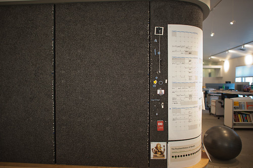
This is an interesting paper called The WALL: participatory design workspace in support of creativity, collaboration, and socialization written about workspaces using various techniques to support creativity, collaboration and “socialization.” The paper describes and advanced design studio for a “Nordic EU” country and the use of a wall — in this case, a real wall, not a video wall or something like this — and the ways in which design work forms on, in and around the wall. This is interesting to me because of the direct opposite of typical assumptions from the world of technology where high-tech is often used — video conferencing systems, telepresence devices, and so on. In this particular studio, the wall becomes a place where work happens. Things that go up on the wall become projects or intersect or leak-into other projects.

The challenge in this particular study (two or three days of observation) is that the studio has a sibling that is a great distance away so the team is separated by space as well as a significant time difference. THe challenges in this case are to share the wall in some fashion — which is not entirely solved. Various approaches are tried — sending high resolution photographs, creating large format plotter-prints to create a facsimile of the wall from one studio to the other, etc. Some video conferencing can happen, but even this is only effective at communicating verbally because the persistence of shared images, sketches and so on is low — it is only around for the call. The bulk of the design activities happen with people together, in the same physical space, standing/sitting/couching/laughing at and near the wall. Casual encounters while walking by a team working on a specific bit of material at the wall can inflect and inform the work in substantial ways — even by members of the design team not directly assigned to a specific project. In fact, it sounds like every member of the team is working on every project to one extent or another by virtue of the fact that the projects wrap around the studio on the wall. Walking by representations of a project can spark an insight or ideas for other projects. Material from one stream of work can find its way into another quite naturally as the boundaries of ownership, share-ability, and so on are made permeable in a creative, productive way by the maturity of the team, the transparency the wall facilitates (everything is there), the rather flat-ish structure of the design team, and the implicit trust amongst the team (no one needs to be policed or watched; attendance isn’t taken, &c.)

Why do I blog this? I’m very interested in what makes creative, productive, advanced design/technology teams work well. This idea of the analog wall — a pin-up wall — is simple, does not need to be plugged-in, allows for sharing and viewing and collaborating.
Continue reading The Wall

Weekending 08222010

photo.JPG

The disadvantage of having so much fun taking photos of skateboarders is that I have less “design research-y” photos to go along with the dispatches here from the Laboratory. So..I’m reusing some and digging deep into the archives.

Anyway. I’ve missed a week in here somewhere. I can say that the last two weeks have been weeks of wrangling thoughts into diagrams..wrangling and rustling and cow-branding and then, in the evening, playing lonely harmonica melodies and sipping coffee ’round the campfire. And early rising to count the herd, chase back the strays and move them along a little further to the, well..taking the allegory to its logical conclusion would ruin everything so, no good ideas really go to the slaughterhouse, they just get assessed and assayed for bits and pieces.

One continuing realization has been that these are definitely times where doing good projects is enough — and if they do good then that’s enough, too.

There was the usual cross-continental calls to update and share and exchange ideas. Some reviews and research proposals. Very exciting cross-silo puddle jumping going on. I’ve long been intrigued by the possibility that engineering and design cross-pollinate in some fashion and there may be a chance to try in the coming months.

Went to a concert at the Greek — Rodrigo y Gabriela — and normally this wouldn’t make it into a weekending post, except that it formalized the scourge of personal portable video recording devices, mostly the iPhone as there are the inevitable block-heads who just hold the thing up video recording entire songs so that you “enjoy” your time at The Greek — the canonical intimate medium-sized venue — with some jackhole holding a little video screen up in front of your view of what you should just be watching just right over there.

So — in the context of the material of this blog, I wonder how these little mobile devices that allow us to do these fascinating things like record experiences for later playback are changing behaviors. Clearly there is some kind of time shifting and hoarding and collecting and sharing rituals are in play here. Also something is going on with our ability to pay attention and maybe level-up our ability to recollect experiences without these devices — just as moments or translated perhaps into a diary or as a memory. And finally — the selfishness of that guy holding up his iPhone and blocking and impeding the view of the rows of people behind him? What’s up with that sort of willful disregard for fellow tribesman? Or whatever?

Anyway — onward. I think I am going to try to read “The Mirror, the Window, and the Telescope: How Renaissance Linear Perspective Changed Our Vision of the Universe“, the more legible follow-on to Samuel Y. Edgerton’s much more academic “The Renaissance Rediscovery of Linear Perspective“. I guess it’s weird putting a “to-do” in a “weekending”, but I started reading it, so I guess this is a marker in time-space so I can go back and note when I started sometime in the future when I realize I didn’t finish it..again. But, I’m curious for more useful stories in the catalog of useful stories about “how things were different” in the past — sort of a high road around the “wheels on luggage” conversation. I was encouraged to collect more “wheels-on-luggage” stories — moments where you realize that something happened to bring us to where we are today and things have not always been as they are, even if it seems incredibly obvious that anything other than what we have today seems silly — like not having wheels on luggage. In the case of the Edgerton books, he’s looking at how Renaissance linear perspective changed how we see and even understand the world around us, and it’s impossible in a sense to imagine that we could have seen the world differently. That may not be the best “wheels on luggage” example because it’s quite a big thing, different from small bits of design work that just make things a little better and do so in a subtle, understated way, but it’s one other story amongst hopefully many other useful examples. (I’m also curious if something like AR will do what the mirror and the window and the telescope have done to the way we see, understand, describe, discuss the world — will AR have its Brunelleschi moment where all of a sudden our “view” of the world, the way we see, changes?)

And finally — there was the Device Design Day talks brought to the world by Kicker Studio. I gave a presentation — some updates and re-workings of the Design Fiction material based on an essay that is quite well over due for the Swiss Design Network conference in late October. And a renewed committment to myself to do this remake of Kubrick’s 2001, as well as some small threads of the underpinnings of this based on some of the notes on HAL and “strong AI” found in the AIAA’s Special 2001 issue from April 2008, Volume 33 Issue 2. A note to self — I realized I wasn’t able to give any prescriptive thoughts as in — here are the three steps toward better device design. And that was okay — this need not be medicine, although people want a cure. It may be enough to think of Design Thinking as an approach rather than a process. Anyway — Bob Ryskamp has some brief notes on the entire Device Design Day, um..day..

Continue reading Weekending 08222010

When Not To Use Doorknobs

3D Magazines

A familiar challenge is to translate the seemingly unyielding demand to put a specific technology into something because it is expected, or because the name of the technology is the new great thing. It doesn’t matter what it is in particular — I use “doorknob” as a stand-in for whatever the latest “doorknob” of the day might be.

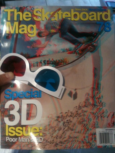
For example — we’re going through an Augmented Reality “doorknob” phase presently, as most of you know. As evidenced by the recent issue of “The Skateboard Mag (78)”, we’re also continuing to go through another, another 3D “doorknob” phase. Which is fine, I guess. 3D is fun when the impact is light, like a magazine.

What do I mean by doorknob? Doorknobs are things that rarely mean anything at all to normal human beings but they mean everything in the world to doorknob enthusiasts who spend most of their time trying to put doorknobs onto everything they possibly can — coffee tables, lampposts, patio chaises, kid’s t-shirts, wrist watches, fancy cameras, car dashboards, toasters, clock radios, keychains, tea kettles, baseball hats.. I could go on, but I’ll let the “doorknob” enthusiasts go crazy themselves.

Rarely, on occasion — someone puts a doorknob on a door because, perhaps, they lead their thinking and ideas and making with principles that focus on people and their practices before they just think of shoving doorknobs on kitten collars or broom handles.

Rather than specifying design first based on technology and engineering-based *parts, fashion small, short stories around the people-based principles that might, in the end, specify that a doorknob be used. But, only at the tail end of things. If you start to feel like you’re bolting doorknobs onto stuff cause some guy in a yellow tie and blue shirt had a graph that suggests that competition is going to start using Baroque, mother-of-pearl encrusted doorknobs on their 2013 saw horses — then obviously something is backwards with the design process. Increasingly — or maybe at this point completely — my own opinion is that, for the near future at least, design can play a much larger role in fashioning and specifying and coordinating the activities between all the other participants in the making of things. Amongst engineering, marketing, operations, production, sourcing and so on. Not that all that is fun at all — but it may be crucial and necessary for creating a legible, sensible “output” at the end of a lot of hard work. Something that communicates and represents value in a people-centered way. It’s incredible how much kruft comes out at the end of markets-led decisions — it’s simply unsustainable, and often done just to keep a foot in the door and so that conversations (good or bad) continue to float around.

Alternatively is the translation of the *doorknob into something else. Doorknobs can be props that stand in for something else that is more people and experience-centric — say, access. A way in. Even an ornamental way in that suggests something wonderful lies beyond. Translating that experience could make a doorknob more than an inappropriate proboscis on something it has no business being part of, I suppose. That feels like a middle ground compromise, as opposed to starting with experiences that are legible to whomever you are hoping to make something for — making those experiences the best they can be (or even just a little better than they already are.)

*shrug*

Okay. Back to it, then.

Why do I blog this? Honestly, don’t read much into this or try to interpret what might *really be going on. I’m just capturing some caffeine-fueled notes on a thorough-going set of questions about how to effectively lead “innovation” or the making of things with design principles and design practices that then themselves specify “the parts.” How can design lead with the respect and authority that engineering and business and marketing-type activities have already? And do so without the hubris of “John H. Doe Design Agency” sort of stuff. If engineering and “research” start with, say — doorknobs that operate without touching them and business and marketing start by assessing what sort of doorknob ornamentation will the market expect down the road what is the way for design to contribute a perspective and translates that language in such a way that, perhaps — doorknobs themselves are questioned and new propositions appear that aren’t specifications based on what is available, but specifications based on what should be, that based on principles more thoroughly considered than “just ’cause.”
Continue reading When Not To Use Doorknobs

Design Fiction Studio for Young Minds

Friday July 23 18:16

The Innovation Center for Young Minds as an enviable-sounding studio for Fall 2010:

In “Design Fiction Studio,” we will focus on experimental ways to combine science fiction story telling with new forms of media production. The students will be asked to write a short science-fiction story and expected to illustrate it in an experimental book. We will explore ways to combine alternative materials –such as very basic electronic elements, conductive inks, phase- and color-changing materials– with new kinds of fabrication and production techniques to learn both about the materials and the way they can be used in different kinds of fictional products.

Topics to be covered:
– Basic science fiction writing skills to develop a short story or concept that will address a problem we may have in the near future.
– Experiment with new kinds of smart materials, design and interaction techniques to build an interactive book to illustrate the story.
– Discuss how writing fiction and building fictional objects can contribute to our thinking and allow us to bring into attention problems before they may even emerge.

Why do I blog this?Curious to see the ways science-fiction is used in design to think, write and make speculative new stuff. And I’m looking for good examples of design-fiction beyond the theory and principles behind it. Also — this is one of the first times I’ve seen the design-fiction stuff connected so directly to science-fiction writing — I mean, besides those folks who are already science-fiction writers. The idea that basic science fiction writing skills are taught as well as the gooey, arduino-y making-of-things.
Continue reading Design Fiction Studio for Young Minds

Design Fiction Chronicles: Apollo 11 Owner's Manual

Friday July 23 15:48

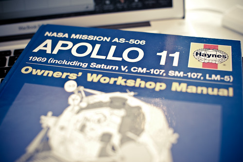
Found another design fiction in the form of an Apollo 11 Owners’ Workshop Manual, published by the folks at Haynes. I remember having Haynes service manuals for the two service-it-yourself buckets I had — a 1980 VW Rabbit and that 1972 Toyota Landcruiser which probably spent more time being made drivable than driving around.

The curious thing to note here is the playful distortion of the genre convention of a service and owner’s manual. One would only reasonably have such a manual if you owned the thing you mean to service, or are planning to get it. Making it a routine sort of technical guide puts you in the position of a service technician or even an astronaut who perhaps bought one of these things and now needs to sort out how to get the glitchy STS Antenna system to reboot.

I’d put this in the same category of design fictions as the Star Trek Starfleet Technical Manual and the myriad Star Wars “Essential Guides”, although these take themselves less seriously.

Many of the technical manuals, operators guides and service manuals for the Apollo, Shuttle and Skylab programs are available online — the real-deal. Packaged in this way as a Haynes manual puts this in a whole different category. The manual itself is more of a Time-Life style book as was pointed out to me when I shared this at the recent Sketching in Hardware 2010 event. Inside are many technical diagrams and explanations of systems — as well as astronaut photographs, descriptions of the program and so on. The cover provides the design fiction device of making the extraordinary possibility of owning this thing quite ordinary — oh? that thing in the driveway? Yeah..that’s my lunar lander..stuck valve in the intake manifold I gotta sort out.

Why do I blog this? Trying to capture some of the genre conventions of design fiction to be a little more articulate about what design fiction is and how it works and what it is for.
Continue reading Design Fiction Chronicles: Apollo 11 Owner's Manual

Weekending 07232010

Thursday July 15 20:05

Okay, well..Now the week is ending today. Whatever.

Couple of things to note this week.

I finally finished the Kicker Studio’s Six Questions. They’ll put it up coming up here. I really didn’t make a big thing about it, just finished it, but it was a good set of questions to think about why I’m doing this design thing. I’ll be sharing some thoughts and stuff at their upcoming Device Design Day up in San Francisco in August.

There were some fascinating all-day review sessions in the studio for some in-development stuff. It’s quite fascinating to see things as they’re being made and refined and perfected. The conversations themselves and the sort-of meta discussions about what makes compelling, usable, engaging UI/UX/ID are for me great learning experiences. There were some related discussions in the studio more generally about the impossibility of distinguishing the “industrial design” (which generically and perhaps wrongly only means the physical material of something) and the “interface design.” Sort of a design philosophy thing. It bakes my brain when people stare blankly and don’t get this idea.

The Media Design Program at Art Center started its Ideas In The Making 2010, so I went to the rooftop opening event, where Ben Hooker and Sascha Pohflepp and other residents presented their work. It sounds like an enviable residency for all these folks and I hope to spend a bit of time over there checking out the work as it develops, for sure.

We had a toolpathing tool-torial this Tuesday’s Tangible Tuesday (err..alliteration alert..uhh..). That’s the bit for going from a 3D digital model to the program (really a large list of numbers and tool changes) that tells the Fanuc CNC machine how to cut stock. Or, how to make stuff with a CNC machine. Nikolaj has done some amazing stuff to make that process much, much easier so basically learning how that all works. I predict running through this process in the near future.

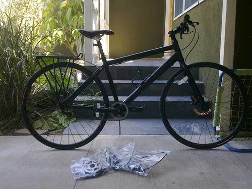
Rhys took most everything off of my bike turning it into a single speed. Pedaling faster, going a little slower, but basically covering the same ground in the same amount of time. These are both almost identical routes, done at about the same ungodly hour in the morning in Venice which is flat as a pancake. I won’t even note elevation change.

Single Speed Bad Boy Made Single Speed By Rhys. Thanks!

27 Speed
Time: 00:36:44
Distance: 9.14 mi

Moving Time: 00:35:54
Elapsed Time: 00:38:50
Avg Speed: 14.9 mph
Avg Moving Speed: 15.3 mph
Max Speed: 18.6 mph

Heart Rate
Avg HR: 159 bpm
Max HR: 170 bpm

Cadence
Avg Bike Cadence: 85 rpm
Max Bike Cadence: 102 rpm

Single Speed
Time: 00:39:20
Distance: 9.62 mi

Moving Time: 00:39:08
Elapsed Time: 00:39:48
Avg Speed: 14.7 mph
Avg Moving Speed: 14.7 mph
Max Speed: 17.3 mph

Heart Rate
Avg HR: 144 bpm
Max HR: 162 bpm

Cadence
Avg Bike Cadence: 90 rpm
Max Bike Cadence: 160 rpm

Continue reading Weekending 07232010

Creative Corporate Cultures

Pixel Spout

An intriguing short article in the Economist from weeks ago, that I just read in what will surely be a failed attempt to *catch-up on back issues. In this one the article looks briefly at some of the things that Pixar does to maintain its 11-0 record of producing top-notch creative entertainment. A few points are worth repeating from the article.

* Creative reviews, even for stuff you’re not working on. Oftentimes a company gets to a size in which no one knows everything that is going on elsewhere, which results in overlap, duplication, inefficiencies and just plain bad organizational structures. Even at 1,200 people, evidently Pixar overcomes this by having people from everywhere come together and share what they are working on. ((“Employees show unfinished work to one another in daily meetings, so get used to giving and receiving constructive criticism.”))

* People before ideas. Creative individuals trump project ideas. Bring in creative talent and allow the ideas to come from that. ((“Most Hollywood studios start by hunting down promising ideas and then hire creative teams to turn them into films. The projects dictate whom they hire. Pixar starts by bringing in creative people and then encourages them to generate ideas.”))
This is a tricky one, but I think many technology heavy companies — if I can awkwardly translate a film production company from a gadget/software/network-services/internet production company — start with a doorknob and then try to find the family with a house and convince them to put this doorknob on the front door without understanding the life/practices/rituals of the people in the house. Perhaps curious, novel, patentable ideas without a clue as to how it might make sense to normal humans.

* Constructive post-mortems on projects. I think this is crucial. The time to consider what was done and what went right and wrong is a requirement if a team/company/studio is to learn from what it spent so much time and energy to create. ((“Pixar also obliges its teams to conduct formal post mortems once their films are complete…Pixar demands that each review identify at least five things that did not go well in the film, as well as five that did.”))

The article concludes with a warning and a reminder that there are no formulas for creative success — just a few ingredients, some luck and the benefits of leadership that is mindful that creativity is not something you can plan for.

“Managing creativity involves a series of difficult balancing acts: giving people the freedom to come up with new ideas but making sure that they operate within an overall structure, creating a powerful corporate culture but making sure that it is not too stifling. Few organisations can get this balancing act right in the long term—particularly as the formula can change over time.”

Continue reading Creative Corporate Cultures

Gibson And The New *Quotidian. A Quote.

27092008_103620

Paper map next to its alternative.

From William Gibson’s recent Book Expo American luncheon talk?

“..the future, be it capital-T Tomorrow or just tomorrow, Friday, just means more stuff, however peculiar and unexpected. A new quotidian. Somebody’s future, somebody else’s past.”

Something that may have once been routine will transform into a curiosity and then to old-fashioned, quaint, peculiar, ancient, confusing, a lost art, alien, &c. On the other hand, today’s fascinating, spectacular will go the way of the normal, routine, everyday, banal, quotidian, boring, unspectacular, old-fashioned, a relic, collectible, museum quality, a prop to tell a story about history and how things once were, to an unknown artifact to be puzzled over in order to understand a bygone era. This perspective of seeing something as even so banal as to be boring is useful, I think, in the design process. A slight shift of perspective that adds temporality to the work one does, puts it on a timeline that is more than the rush-rush of go-to-market working schedules. At the end of it all — it’s either trash or on a pile of other crap in a flea market in Ankara or a vintage shop in Austin or something.

Why do I blog this? A nice juxtoposition that I find useful to consider. When designing things that are meant to be the new, great object, or idea — think of it also, or maybe to start, as the new normal, everyday, perhaps even boring or discarded thing. Why, I am not sure, but I think it helps to round out the considerations, and to look at something fascinating as also something boring, or quaint or even illegible — as if a kid today were to look at a rotary wall phone or paper map.

[Update: Nicolas has his own related remarks on Gibson’s talk at his Liftlabs blog.]
Continue reading Gibson And The New *Quotidian. A Quote.

Design Fancies

Just came across this one, via @bruces over on <a href="“>Beyond the Beyond — a series of *design fancies created by Matt Brown which appear to be cleverly fictionalized designers to go along with these designers design fictions. Wonderfully inventive and I could see this sort of thing being quite therapeutic for normal, factual designers. You know — either imagine a colleague, or take a piss on the designer jackhole.

The image above is a book done by this designer — with two editions, one particularly rare.

Kurt Manchild was an author and inventor born in Jackson, MO in 1952.

From a fairly young age Manchild found that he had ridiculously vivid dreams of finished inventions. He spent his teenage years thinking that dreams like this were normal. It wasn’t until the ’72 National Sleep Science Association (N.S.S.A.) convention that he found out his dreams were unique. He spent the next few years talking with bartenders, clergymen, and designers about his deep sleep brainstorms and formed a whole new philosophy. Armed with this knowledge he wrote his first and only book, Silent Brainstorm: Ten Dreams That Every Designer Should Have at Least Once a Week. In the book he describes ways to trick your brain into certain dreams. He writes about the “Garage Sale Dream” where you go to a garage sale and see new products and then wake up and draw them. He also writes a lot about “Museum Dreams” where you would go to a design museum and it would be filled with amazing stuff that again, you would draw out upon waking. His book was a best seller in most of Europe and was available in two editions. The black version is semi-rare.

Why do I blog this? A very intriguing way of constituting an imaginary, design fiction concept. The strength of the imaginary thing — the design fiction — is elevated by the story surrounding it — it’s *backstory or moment of production, including the designer with a personality and a home town and so on. It’s a bit of an intriguing special effect of a sort that I should add to my modest catalog of design fiction genre conventions. Nice work.
Continue reading Design Fancies