Design Fiction + Advanced Designing + Trust in Volume Quarterly

The most recent — now a month or two old — issue of Volume Quarterly was on the topic of The Internet of Things. And within that was a small sub-volume of essays and articles on Trust compiled by Scott Burnham who has been running a project called Trust Design for Premsela which I understand to be The Netherlands Institute for Design and Fashion.

((The Laboratory seems to be a recurring guest in Volume Quarterly. We were in one a couple of issues back — their issue on The Moon.))

Scott started his project on Trust just as we in the Advanced Projects (then Design Strategic Projects) Studio at Nokia were beginning a project with the same name and some of the same questions. One of our questions was to understand what Trust is and how Design can somehow illuminate where Trust exists and its paths and relationships. When I say “illuminate” the image that comes to mind is one of a special detective’s forensic UV light illuminating something under specific conditions that would otherwise not be seen. Or, in those weird 1950s era medical treatments in which a subject drinks some wretched fluid or is injected with something that shows the paths of digestion or the networks of arteries when shown under X-Rays or something. (Maybe it isn’t wretched, but the thought gives me the willies for some reason.)

In any case there were many facets of the Design work we did in the studio, one of which was this Alarm Clock which was meant to operate precisely in this fashion — to focus our attention on a simple interaction ritual in which we were forced to consider characteristics of Trust.

The essay far below below was my contribution to the Volume Quarterly issue.

But first..

There’s a thing or two to add as well, that have more to do with this particular way of doing Design — or Design Fiction. The process of *making these clocks — which were made out of plastic and aluminum and electronics and solder and all that — was only partially about the specifications that determined how those things would be configured. Beyond those pragmatic, specified things were the ideas we sought to force to the surface — the concepts that we wanted to make ourselves address and consider directly. The preposterousness of the interaction ritual that the alarm mechanism forces was a deliberate way of compelling us to think and talk and design for this ephemeral social bargain called Trust. There was no way around it. We couldn’t lose ourselves in the geekery of circuit design; or choosing a color for the LED numerical displays; of obsessing over compound curves in the industrial design of the thing; or fetishizing any aspect of the “Design” as it is traditionally understood — a material instantiation of an already-accepted and well-understood object. There’s not much movement these days in Alarm Clocks. They are what they are and the variations come in things like…size. Like…color. Like…brand. Like…AM/FM or longwave. Like…number of alarms. Like…style. Like…box-y or round-y. Etc. You get it.

You’ll get stuck with those sorts of boring variations if you think about Alarm Clocks traditionally. Rather, thinking *not about Alarm Clocks but about waking up, and the rituals around it changes one’s approach. All of a sudden, you’re mucking with tradition. You’re getting people upset. You’re not responding to the client’s brief the way they expected. You’re not just doing color and materials variations.

Pfft. So what? Well — looking at things a little sideways is, for lack of a better moniker, advancing design. Advancing it beyond the expected. Doing the Fosbury Flop for Alarm Clocks.

The other thing to say about the project is that the making of the thing — all that plastic prototyping; all that circuit design; all that figuring-out-of-colors-and-materials; all that CNC machining; all that figuring out of tool paths; all that figuring out of firmware and interaction algorithms..why was all that done? Yes, of course — to make the thing *work, in the plainest sense. But, more than that — it was all done to do the Design. The making of the thing is *also a way of doing the Design of the thing. We didn’t figure everything out and then said, “right. now we can make it!” The making was the designing. Assumptions and questions are raised. We interrogate our own ideas and create new ones, whilst making and building and handling material and trying out little scenarios. The peculiar nature of the clock was such that we had debates, one in particular was about what the display should do when the little keyfob alarm-buzzer part was removed to be given to a friend. I felt quite strongly that the display on the main clock should go off, so that you’d have to Trust completely the person who was meant to be your human alarm. Otherwise, you can wake up and check the time, which is an implicit way of not really trusting that human alarm person.

This was the bit of fiction insofar as a clock like this would be quite otherworldly. There would be a very different set of assumptions about how relationships work; about what waking up entails and what it is for (getting to a meeting on time; making sure the kids are ready for school; not missing a flight and all the weight and significance of what happens if you *don’t do these things when and what time they need to be done.)

It would be a very different world if we just *woke up when we woke up, rather than waking up to the same time nearly every day. It’s a slightly skewed universe that this clock came from, but it’s crucial to do this kind of design. Why? Well — it advances the realm of possibilities and begins one considering quite directly about creating new, more curious and sensible interaction rituals. It is also a way of advancing design — doing design differently; questioning and challenging assumptions not only of materials and colors and forms and such, which is good. But questioning the actions and rituals and behaviors of the humans, even to the point of something so seemingly absurd as waking up in different ways. This isn’t to say that people will want to wake up to other people knocking on their doors or shaking their pillows, but it forces a number of unexpected considerations and questions and new ideas that plainly wouldn’t come about if one just focused on different colors for clock displays or snooze button styles. Its a kind of advanced design that is able to engage in its topic by throwing out all base assumptions and free-fall a bit into a weird world and then *not allow the usual questions to arise. Sink into the discomfort zone and do some advanced designing.

How does the underpinnings of social relationships become a design principle? How does one design for trust? Can an intangible like trust become embedded in an object?

The principle that “theory” can be expressed in an object plays a part in this question. Substitute “Trust”, a kind of philosophical principle that is perhaps, in my mind, best expressed through exemplars that represent it, rather than the abstractions of philosophical discourse.

The topic of “Trust” presented itself in October 2008 with a tremendous force. The world rattled as global networks of “Trust” institutions collapsed on a scale that sent apcoloyptics scurrying for Old Testament passages consistent with the sequence of events witnessed across the globe. “Trust” became a keyword for these events as macro social institutions that were once “too big to fail” failed despite their size. These institutions that were once the bedrock of society cracked and dissipated and in their failure, revealed what Trust is, at its core. It is, of course – people and the networks of relationships that define what it is to be a social being.

In the Advanced Design studio at Nokia, we were curious about Trust and what it means. Trust is recognized as a core values of the Nokia brand. The worldwide events brought the topic to the fore and provided an impetus for a design-based experiment. Our question was — what is Trust and how could one design with Trust as a guiding principle? How do you embed Trust in the material of a designed object?

The project walked around the topic, building up the studio’s expertise on the topic through the Design equivalent of a “literature review”, both in the sense of readings as well as a more tangible equivalent. We collected essays and books and made things — objects. We brought in both internal to Nokia and external experts on the topic. A social psychologist talked to us about how ordinary people become extraordinary liars. We followed closely the daily events of the macro level systemic failures of insurance companies, banks, economies and entire governments.

Our goals were deceptively simple — to develop a set of principles that could become “actionable” and be “designed-to” in order that Trust could be embedded in the material of an object.

Amongst a dozen principles, one is worth highlighting and is best paraphrased and represented in one of our tangible exemplars. The principle goes something like this: facilitate the trust network — allow people to trust the people they already trust.

Our tangible prototype was, of all things — an alarm clock. We called it the Trust Alarm Clock. The design brief was simply to make an alarm clock that embodied the principle — an alarm clock that highlighted the idea that trust is a relationship between people. At the same time, it was a platform that allowed us to experiment with this simple principle. As you will see, it is an almost absurd object. But it was the response to the brief that we made, without questioning our motivations, but rather following our curiosity on the topic of Trust.

The clock is best described directly. It consists of two components. The main component is not unlike a conventional bedside alarm clock. The second sits nearly where one would expect the canonical “snooze” button of a conventional alarm clock. This second piece is a small, removable “fob”. When one sets the desired time to wake up, the fob is programmed with a digital count down timer. The alarm setting ritual starts when one sets the wake-up time using a dial on the back of the clock. While doing this, the fob timer is configured so that its count down would expire and the fob would “alarm” when the alarm clock setter would like to wake up. The ritual is completed when the fob is removed from the main component and given to a most trusted friend. In that ritual of handing over the fob, the network of trust is established and embodied. The “handshake” of the passing represents the creation, or the invigoration of trust in its most elemental form. Handing over the fob signals that there is Trust amongst this small, two-person social network. If one wants to wake up — or be woken up — one must first consider a number of things. Primarily — who do I trust to wake me up? Who would I want to be woken up by? To whom do I want to convey that I do indeed trust them?

Short animation of an interaction ritual.

We did not suppose that a bedside alarm clock like this has mass-market appeal. It’s a theory object — a way of questioning and probing and exploring the idea of Trust as made into this provocative material exemplar. In a way it is a bit of fiction, only not written, rather made as a physical object that compels one to think of the stories and “user experiences” that may surround it. The fiction is established through a provocation created through design practices.

Theory objects are like material instantiations of ideas — perhaps even our hopes and our imagination. Theory objects refract some social practice in a peculiar and hopefully thought-provoking way. They are “theory objects” in this sense, ways of shaping refining, refracting and altering social practice hopefully in a way that creates more habitable worlds.

The theory object is a way to think about “technology” as something that does more than utilitarian or instrumental. It is an embodiment of some sort of practice that is not outside of the realm of social action. In other words, the theory object is a social object — one that can shape and mutate social practice. Technologies are mutable. They can be what we need them to be, and shape how we experience the world and in that way, are social. What we are doing here is over-emphasizing this point by skirting around the usual assumptions about technology in order to make this point about their social nature more evident and obvious and provocative.

Why should we care enough to make this point that technologies are embodiments of social practice? Because we need to reveal the human hand in their creation and their possibility. Once we can see that people put these things together (and show this process plainly, through images and descriptions without secrets) it becomes possible to talk about how they could be different, or obey different laws and assumptions — possibly become more environmentally conscientious, or help us find playful ways to be more compassionate to mean people, or find ways to be kind to strangers (whatever..need some concrete examples, perhaps anticipating the projects.)

In the case of the Trust Alarm Clock, we were confronted with a rather exciting and unconventional direction for ways of waking up, which everyone does, with the regrettable exceptions, of course. The question evolves beyond *who do I want to wake me up, and who do I trust the most to, say — make sure I get up to make an unusually early meeting or airplane departure. Rather, through this theory object we were drawn into thinking about other *things one may wake up to besides the time of day. What sort of alarm clock might the near future bring that represents a trusted evolution of the waking-up ritual. Perhaps an alarm clock that allows someone in my networked social graph to wake me up. Or — are there things that I trust more than people in these circumstances? Somethings that are beyond the rather mechanistic and mundane ritual of waking to the time, which, after all — is not particularly exciting. Might the things that are more relevant or consistent with our connected age be what wakes us in the near future? In the near future, might we trust more an alarm clock that wakes us up when other people start waking up in order to facilitate that sense of being amongst a larger group of people who are also starting their day. Who are we to say that the now common ritual of waking to a specific time become as antique as luggage without wheels.

Why Good Design Isn't Eye Candy

Sunday November 28 11:58

An acquaintance of The Laboratory I met while in London that last time is a design consultant guy who told me this story about Eye Candy. Him and his studio/team were offered a commission of work. It was design work, or at least that was the premise of the offering. A high-profile team of well-meaning technologists of various stripes — engineers, engineer marketers, chest-thumping Valley types — were in the midst of preparing a presentation of some work to finance guys. The finance guys were, like.. money men who make decisions and were hopefully going to throw money at their project idea before they hopped off on their flying jet aeroplanes that I guess one of the hubris-y entrepreneur Valley guys actually flew, or used to fly as a fighter jock or something. ((You get the personality profile here.))

The engineer-y team had some ideas that basically took a very hot trend and doubled and tripled it — the up-and-to-the-right extrapolation of today and made it *more..which I understood to mean not necessarily better…just more of the thing that exists today. Maybe two or three buttons instead of one; or 7 inches instead of 3.5 inches and we’ll blow the competition out of the water. Something. It might’ve been something like making quad axle wheels for luggage, or a tablet with a car battery so it lasts a full *week without a recharge or something. I have no idea, but this is the image that comes to mine for the story I heard. Well-meaning, but not well-thought-through stuff.

Wednesday February 09 16:16

Anyway, the guy who the engineers approached is a guy with a depth and breadth of design experience. He’s a creative guy, and his studio has a really good sense of strategy and ways of communicating..and he can make stuff for real, like — model making; deep CAD expertise, mechanical and electronic prototypes. Really incredibly thoughtful, experienced guy and as I understand it, a designer with integrity who would turn something down based on his instinct about whether or to what degree the work will build his credibility as a designer and that credibility is directly tied to how much the work will make things better. He’d be the last to do something that’d just be landfill fodder, or work that is, like — just poorly thought-through, or lacking in depth and consideration.

And then here come these entrepreneur-engineer guys who I was told asked integrity-designer guy to help them with their presentation by giving them some “eye candy” to put in the PowerPoint. This went on for half a day. The engineer-y team shared their idea and then explained that they had this pressing meeting coming up and — would his studio be able to just pull something out of their inventory of cool physical models and CAD renderings to put into the presentation deck? What they needed, they said — was Eye Candy. Some seductive treats on their dessert cart of a good idea that would have the finance-y jet pack guys licking their chops, slobbering capital all over the models.

Even in retelling this story, my brow perspires from frustration because – I know the tendency to consider the work of design as either providing cool looking stuff absent the integrity of its intent; or thinking of design as styling to the point of absurdity.

But — what’s the big deal? Why *not make some eye candy? I mean, if it satisfies the eyes and makes people ooh-and-aah, isn’t that a good thing? People don’t ooh-and-ahh about something they don’t like, and making people ooh-and-ahh is a goal in some entertainment circles, so — what gives? Why does this story make my head want to explode all over the place?

Well, firstly — it’s a bad precedent for design, generally speaking, if I can speak for “design” for a moment. It’s design without integrity, in the service of surface glitz and glam. It’s design that only exists on the surface, like styling that says not too much about the intent. It lacks thinking beyond the “what looks good” sort of thinking. It’s *thin — you can’t dig into the thing itself because there is nothing behind it except a desire to wow someone. There’s no logic or reasoning behind it, except to wow someone. It’s pure Id, pure instinct — not that instinct is something that should not inspire design, but by itself it’s selfish in a way. It accounts for nothing but what something looks like, rather than the larger context of where, when, why, for what.

In a word, just doing something to pad a page in a presentation or to put on a table is dishonest. Pulling something from another project out of a drawer that *looks like it could be the thing these guys were trying to sell, is dishonest. There’s no integrity — you can’t tell the story of this thing and why it has come to be or what principle informs the action or contours or IxD of the thing. You have to lie, basically. Or not say anything about it at all which makes one wonder — why put it there to begin with.

No, right? That’s just a bad way of going about things. It’s not quite as bad as industrial designers making toothbrushes that look like they should be moving fast because they *really wish they were designing cars, but it’s pretty bad to do eye candy designs on their own when such eye candy would be disconnected from the initial vision. Or even question that initial vision by running a more proper, considered design process that *might lead to something with integrity, and with the satisfaction of being complete and thorough. Something that would be the result of a superlative, principle-led design practice. And that takes time — or at least more time than digging around for something that looks like it could belong to the idea these guys had.

Bleech.

Why do I blog this? It’s a good story, with a good lesson in it. Integrity is crucial for design to continue doing what it’s able to do. Eye candy is dishonest and lacks the integrity that connects it to good, thoughtful work. And it means the work is crap, poorly considered and fails to make things better. It’s the equivalent of doing design “’cause” — or worse.
Continue reading Why Good Design Isn't Eye Candy

The Week Ending 291210

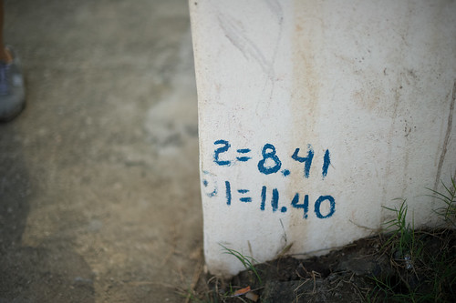
2=8.41 1=11.40

Rules, instructions, parameters? Embedded inscriptions of some nature, found on a wall in Sayulita Mexico.

Well, maybe weeknotes are from the *week ending* but posted at the *week commencing*. One advantage of being one’s own blog boss, I suppose.

It was a decidedly *quick* week for some reason — perhaps because the Laboratory’s brother was visiting these last couple and action, thinking and events seem to accelerate the time. There was plenty of discussions of stories and filmmaking, which ties nicely into what *must* happen this month: the re-making of several short (30 seconds or so) of this visual design fiction stories meant to communicate some of our principles of Trust as embodied in some props/prototypes. This proves quite creatively engaging and challenging.

There was a pleasant slaloming conversations with the curious and effervescent Natalie, discussing the Latourian design sensibilities and the ways that debates and conversations embed themselves with artefacts. It was lovely to have this chat, if only to begin trying out the various *props* that we’ve been making that are exemplars themselves of these arguments/theories/perspectives. The question remains — what is new here, as an argument? It was encouraging to here Natalie’s excitement and the geneology of this sort of thinking, reaching back to here canonical Live Wire and Rich Gold’s Evocative Knowledge Objects (to which the Theory Object owes everything.)

This decanted into thoughts on a Latour essay presently at desk side.

The third connotation of the word design that seems to me so significant is that when analyzing the design of some artefact the task is unquestionably about meaning — be it symbolic, commercial, or otherwise. Design lends itself to interpretation; it is made to be interpreted in the language of signs. In design, there is alwas as the French say, un dessein, or in Italian, designo. To be sure, in its weakest form design added only superficial meaning to what was brute matter and efficiency. But as it infiltrated into more and more levels of the objets, it carried with it a new attention to meaning.

[[A Cautious Prometheus? A Few Steps Toward a Philosophy of Design (with Special Attention to Peter Sloterjdijk. Bruno Latour]]

[[And special sideways inspiration from Karen, whose present reading/thinking I seem to be accidentally following alongside.]]

And then, I was thinking about Trust in this context and this precise basis for the process of *embedding* the sensibilities and sensitivities of Trust as a design practice. More as this idea develops.

There was a round of planning for future projects at the Nokia Design Strategic Projects studio, which meant thinking about what from Trust moves forward and in which ways and by what means. Similarly, we are beginning to share Trust. And wondering — to whom and to what ends? I am intrigued by this — how do you circulate ideas and with what goals so you know — in a more actionable way — how the ideas materialize and create other goals, especially within such a byzantine organization. This, I think, is one of the larger 2010 *professional* goals, I suppose (seeing as I have not really captured what those might be yet — bit tardy on that objective — I like to have New Year’s goals rather than New Year’s resolutions) — how to communicate ideas such as these, do so without PowerPoint and do so in such a way that you snap people out of a corporate stupor, or whatever it is — and do more than just scrape a bit of paint on the battleship. Rather, help set a different course heading.

Props, Prototypes and Design With No Spec: Notes on Heliotropic Smartsurfaces

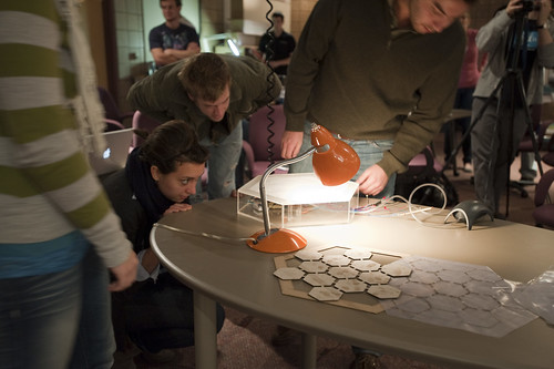
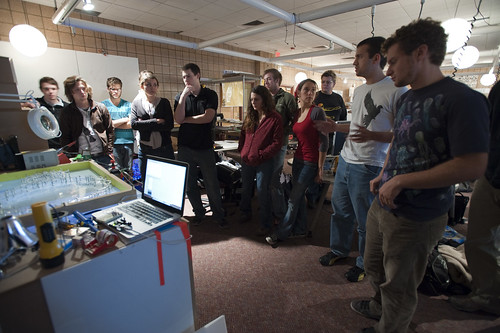
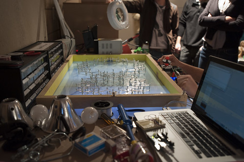
It was working, and it will again. And even in a mode of very temporary failure, the design happens. Here, some students assembly their assemblage for demonstration of their material-semiotic reflection on heliotropic smartsurfaces.

What did I learn from visit to “M” — University of Michigan — and the School of Art & Design, Taubman College of Architecture + Urban Planning? Two things, mostly.

First, huge universities in tiny midwestern towns, with really big footballers really only need one letter to stand in for themselves.

Second, the importance and relevance of props to communicate an idea – a reinforcement of the significance of objects that always contain ideas and possibilities and thereby play a role in the expression of the future. I am perhaps misguidedly and with reckless-abandon reading and practicing both design and actor-network theory..at the same time.

What follows are some scraps and notes, mostly around a combo of two things: design fiction props and the virtues and challenges of design without specification.

After a lecture Thursday night and a bit of a lecture Friday morning, I participated in the Smartsurfaces studio (which also has blog and is run by John Marshall, Karl Daubmann and Max Shtein.

Is there a reluctance to design with partial specifications? Routinely, one can assume that there is development and design first, then there is execution. As if they are distinct “phases” of design work. I understand the tendency — I mean…I’m an engineer. You specify, describe an interface and then just go ahead and build it.

But what about building as specification? Or making to define the specifications and the design principles, and the stories? And doing this over-and-over again, redoing things and refining in the process of making — even making away from the screen?

Normally, one might ask when given a “project”:

What are we going to do?

What are we going to make?

The tenses are all mucked up.

What about instead, when given the chance to project into some near future:

What are we now making?

What are we doing now?

Designing through partial-reflections and partial-knowledge and partial-specifications as a conglomerated design-develop-execute activity — a continuous iterative doing. Brewing and creating controversy in the midst of things — making things not possible, or impossible, or highly speculative, or disagreeable. Or moving with full confidence in the face of overwhelming vagueness and excruciatingly deserted requirements documents.

Perhaps starting from the end — as if the design has been unearthed in the future, by an archeologist who laminates meaning on the thing. Introducing fictional explications with all the seriousness of science-fact making. Creating an object and saying — this is what it is, it is a heliotropic smartsurface and it means these things, and had been used to do such-and-so.

This is the sorts of questions and concerns that make the Smartsurfaces studio so intriguing. I welcomed the opportunity to participate. It is keeping me thinking.

Friday October 16, 12.25.19

The project description.

Let me describe one of the team’s presentations as a way to explicate some of these ideas.

As described in their presentation, Team 3 had started its heliotropic smartsurface project with an offering by one of the team members of a Hoberman Sphere as a prop to accrete ideas and focus the effort. The team created an articulated 2-D sculpture borrowing mechanical idioms from the initial Hoberman Sphere prop. It was a mechanical, moving object consisting of many connected armatures that collectively formed a giant figure-8 lying flat on a smooth surface that was, I would guess, about 1.5 feet x 2.5 feet. The entire assemblage was articulated by a stepper motor with two bobbins that spooled monofilament. The spools turned via the stepper motor. On the spools and running through a simple network of small bobbins, the monofilament line gathered the armatures in such a way that one or the other side of the figure-8 was pinched closed or pulled open. One spool of monofilament ran to around to one side of the It was described that this could lead to a surface that let sunlight in or blocked it off. The control mechanism was a Macbook connected to an Arduino with a light sensor. The Arduino also controlled the stepper motor. An earlier prototype had been constructed using chipboard as the main component of the armatures. This chipboard prototype was not as durable as the demonstrated version which consisted of clear plastic for the armatures. The spooling posed a problem on occasion and had to be tended-to. It was pointed out that this was one of the main problems with the assemblage. The spools were not reliably gathering the monofilament and keeping it neatly coiled on the bobbins that were attached to the stepper motor. The team had ‘burned out’ a couple of Arduinos along the way to this presentation. They had to borrow a larger stepper motor from one of the studio professors a few hours before the project reviews.

Friday October 16, 12.26.22

Demonstration. A flashlight creates the effect of the Sun beams on a sensor connected to an Arduino, connected to a Macbook connected to a stepper motor. Sensor readings are interpreted by firmware in the Arduino’s microcontroller. This then sends control signals to the stepper motor and articulates the armatures via spools attached to the stepper motor which run through bobbins on either side of the box the whole thing sits in.

Team 3’s presentation was a very refined, complete, articulate and functionally robust design. It was seductive to watch the mechanism and listen to the quite articulate description of the process. It was a clear, thoughtful bit of work and the detailed construction was impressive.

My remark — and it was only for the productive discussion, and not a dismissive criticism by any means —  was to focus on this point about the spooling being finicky, requiring tending during the demonstration. In my own interpretation this was the ‘main problem’ the team faced — a remaining point to ‘work through.’ In fact, it was barely seen as a problem in my eyes. It was an excuse for the presentation, or a begging-of-forgiveness for this distraction of a team member stepping to the assemblage and tugging on some monofilament or fussing with the kit.

Friday October 16, 12.26.45

The ‘problem’ as an issue to be addressed is that the spools don’t spool the monofilament consistently. Things get a bit tangled up and the issue is handled with a bit of hand-work to get the assemblage back on its feet.

This is a side-issue in a sense. It’s not even really a problem in the sense that it is something that can be easily figured out. After all, spooling monofilament is a black box at this point — an intermediary of sorts. The ‘problem’ no longer exists — this is something that has been solved, closed off, handled already so it’s just a matter of extracting one of those ‘black boxed’ solutions (e.g. by traveling to the world of sewing machine design, fishing rod reels, ships-anchor-mechanisms, &c.)

The use of a stage prop to frame their design/discussion work of what is being done, or what could be done seemed to move this team from a broad range of possible design-expressions of a ‘heliotropic smartsurface’ into a specific thing whose materialization had a form that could be pointed to — the Hoberman Sphere prop. The prop provided a seed that could crystalize a material goal.

Setting a goal in terms that allows iteration and rethinking and, perhaps most importantly — failing — in the design process open up the possibility of unexpected possibilities. Which is to say the possibility of making things different from what might be expected, or pre-supposed. The tactic comes with maturity and the no-fear sense that, no matter what, things will happen and get ‘done.’

What I might say here is that there could have been more intense failure in the midst of all this. Either failure or iteration. The design ended up as a 2D Hoberman Sphere, just as specified from the beginning.

It is a useful design strategy to not expect/specify a particular, instrumentally functioning, pre-specified thing as the ‘final conclusion’ in the process of designing. When introducing the Hoberman Sphere, I believe this very talented group defined their conclusion with the evidence of this presupposed vision of the designed future being, in my Latour-infested mind, this point that the remaining issues are few, or perhaps even just one point of fixing the spooling issue.

As a tactic for designing new things, my own preference is to allow for the possibility that the thing in the end will become something different along the way, so that where you end up may not be where you thought you would conclude. Each moment in the process evolves into its own refresh and re-invigoration of possibilities. The design is never done. There is no hard distinction between ‘research’, ‘exploration’, ‘design’, ‘development’, ‘execution’ — &c. The Gantt Chart attempts to organize and marshall phases that tick into other phases ultimately reaching a conclusion. It won’t help create new things — there are no gaps, no bumps, the future is determined with no opportunities for explicit failure or remaking or starting-over-again.

Why do I blog this? Some notes to reflect on the challenges of design without stepping through a ladder of design-development-execution. Flattening these hierarchies and combining the action of making/destroying/failing/refining as design itself.

[[Thanks to my hosts, John, Cezanne Charles, Karl, Malcolm McCollough, Amy Catania Kulper, &c. and all the wonderful students in Smartsurfaces.]]

Continue reading Props, Prototypes and Design With No Spec: Notes on Heliotropic Smartsurfaces

Gradually Undisciplined. Stories Not Titles.

Life: A Game. Played that evening in downtown Los Angeles.

Not directly in conversation, but in the topics that happen between people, especially when they share the same studio space (as well as the same city), Mr. Chipchase’s posting about his ACM CHI keynote had me dig this dispatch out of the “pending drafts” depot of the blog (where it’s been sitting since last year, pondering itself and fermenting..) Between re-re-reading Jan’s post, and being asked last weekend at a family gathering by a friend of the family who I had never met — what do you do? — and thence answering by getting another beer and telling a short story about a guy, justified in his over education, wearing a janitor’s shirt with his name and Near Future Laboratory emblazoned on the back, with a diploma signed by The Terminator an iPhone in his pocket and a paycheck from Nokia, etc. — I thought it was time to ask myself again — what have I become?. Perhaps the sort like Jan, myself and the countless others who operate in between things, the question is better put in the more ontological tense — what am I always becoming?. The answers for me are always the stories, not (job) titles.

Crossing into a new practice idiom, especially if it offers the chance to feel the process of learning, is a crucial path toward undisciplinarity. The chance to become part of a practice — with all of its history, ideology, languages, norms and values, personalities, conferences — is an invigorating process. Embodying multiple practices simultaneously is the scaffolding of creativity and innovating, in my mind. It is what allows one to think beyond the confines of strict disciplinary approaches to creating new forms of culture — whether objects, ideas or ways of seeing the world.

I’ve been an engineer, working on the Motorola 88000 RISC processor at Data General back in the day. I studied how to think about the “human factor” as an engineering problem while I was working at the Human Interface Technology Lab at the University of Washington where I got my MSEng. The human factor has a less instrumental side, I discovered — it’s not just median heights and inter-ocular distances. So, I went to study culture theory and history of ideas at UC Santa Cruz where I got my Ph.D. I wanted to understand how people make meaning of the (technology-infused) world around them. Shortly after that, and quite accidentally, I entered the art-technology world when I recognized that I could do a form of “research” that was simultaneously technical and cultural. Four years in academia on the other side of the lectern provided a useful opportunity to try a different way of circulating knowledge, and a different set of constraints on what can and cannot be done in the area of practice-as-theory.

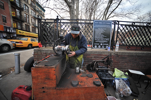
Upcycling materials in a street trade cobbler, Chinatown, New York City.

These disparate practices actually have a satisfying arc, in my opinion. It’s a combination of instrumental and practical skill, together with a sense of the meaning-making, theory and aesthetic possibilities of mostly technical and engineered objects.

Objects, I have learned, are expressive bits of culture. They make meaning, help us understand and make sense of the world. They are knowledge-making, epistemological functionaries. They frame conversations and are also expressions of possibility and aspiration. In many ways, they are some of the weightiest and expressive forms of culture we have. Being able to make objects and understand them as expressive, as able to tell or start or frame larger conversations and stories about the world is very satisfying.

Objects express the cultural, aesthetic, practical knowledge of their making — in their “design”, and in their crafting as “art”, or also in their “engineering.”

This is not a revelation for most of you, of course. For me, though, it has been a revelation to understand this kind of statement from the perspectives of multiple practices or disciplines.

Objects and culture are reciprocally embodied, certainly. But what object? And what culture? Certainly not one solidified, rock-solid meaningful object. If I take a phone (there are lots around me nowadays) and try to understand it, it matters from what “culture” (or discipline, or community-of-practice) I study it. At the same time, making an object, and how it is made, and what it will mean, and when I will know it is finished — all of these things depend on what culture or practice or body of knowledge from which you choose to look at it.

Put an engineer, a model-maker, an industrial designer, a marketing guy all around a table, staring at a phone. What will they see? Where will they agree on what they see and where will they look blankly and wonder — what is that guy talking about? How much time is spent — minutes? months? — negotiating what is seen?

What practices fit in the middle? Is that inter-disciplines? And what practices run across many? Is that multi-discplines? Do trans-disciplines work above and beyond? What about undisciplinary? What way of seeing that object will make it into something new and unheard of? What way of seeing will materialize new objects, innovative ideas and conversations that create new playful, more habitable near future worlds? (And not just smart refrigerators and clothes hangers that automatically dry clean your shirts, or whatever.)

What are your stories?

Continue reading Gradually Undisciplined. Stories Not Titles.

Designed Implications

Anthony Dunne // Dunne & Raby from Innovationsforum on Vimeo.

Anthony Dunne of Dunne & Raby, holds forth in characteristic modesty about design not for applications of technology, but for implications — creating a basis for dialogue and debate, rather than creating new, faster, shinier things. In this talk he discusses approaches to designing implications through his experiences and work that students in the RCA’s Design Interactions program have done through a course called “Complicated Needs”, approaching design not for “users” but people, with complicated emotions and desires and imperfections that are beyond the generic “user” we often consider when designing interactions.
Continue reading Designed Implications

Crossing all the wires: Cultural Engineering and Electrical Theory?

20080317_143800

In order to do interdiscplinary work, it is not enough to take a ‘subject’ (a theme) and to arrange two or three sciences around it. Interdisciplinary study consists of creating a new object, which belongs to no one. Roland Barthes in “The Rustle of Language”(1)

With a background in multiple disciplines, it’s been an ongoing search to find a comfortable place where my practical and professional interests can operate. In most situations, one or more are either surpressed, discouraged or hidden to the point of not even mentioning this or that expertise. (Witness, as I did recently, several versions of my “human resources” style resume that does not mention a Ph.D.)

Under what circumstances might one be in a position to be un-disciplined? Another way of saying — how can a diversity of expertises, approaches, points-of-view and perspectives become actionable means for shaping material culture beyond the conventions that disciplinary norms enforce. By disciplinary norms, I mean the carefully plotted points-of-view and networks of knowledge (épistémè) creation and circulation that allow specific ways of “doing work” rather than others. Ways of doing work is a broad way of stating that disciplines are defined by what can be said, written, constructed, explained — and specifically by what instrumental, creative and normative means that is accomplished. Like the tradecrafts, there are well-defined things that specific disciplines take as “their problem” and their approach to defining and working on what that discipline stakes out as their problems.

Engineers, to be vague, have specific problems that they take on. Designing more energy efficient, green-disposable power sources, for example. Things get confusing if an engineer decides to work outside of, or stretch the boundaries of, their discipline, say by prioritizing the aesthetic rather than instrumental functionality of a circuit board design.

This ongoing search took me through enough disciplined environments to know that disciplinary work practices are far too efficient for innovation. Every gear in enterprise knows perfectly well what it’s supposed to do and what the linkages around it are meant to do to couple the system into a smooth, producing machine. If a gear decides that it’s going to start operating like a cam — well, that just can’t happen.

What do you do with an engineer’s obsession with making things and a cultural theorists passion for deeply understanding all the crazy new ways we have for creating, circulating and making culture? And what do you do when you want to cross all the wires and make cultural engineering projects with engineered theory?

Step 1. Pretend you don’t have a doctorate and just engineer stuff. Just make digital things and shrug absently when people ask you what you mean when you make off-hand references to Goffman and Foucault.

Step 2. Art-technology. The “Art” prefix — it opens up the possibility for discussions about culture to be invested in engineering work, which is a terribly brilliant and deceptively simple work-around. Ideally, at best, it allows the engineering of technology to be understood as a cultural practice, which it always has been. The hyphenation is a band-aid though for what should evolve into an entirely distinct undisciplined approach to materializing ideas beyond the confines of routine “product” manufacturing. What I mean is, in one scenario that would be awesome to consider, things-made are not least-common denominator sorts of routine objects. They are rich in their diversity and provoke one to curiosity, encourage new perspectives or ways of seeing the world. Rather than seeing the world as a place to be exhaustively photographed, for example, and making zillions of subtly varying but essentially identical digital cameras and shoving them in anything (like telephones) that do not already have cameras — what sorts of things-made would encourage me to do something else exhaustively — like monitor my consumption of unrenewable resources, for example?

I spent years in the dot-com where there was at least a small bit of opportunity space for exploring strange, new ideas with multi-talented and multi-disciplinary groups. I had a committed and earnest foraging within the art-technology world that the largesse of bloated dot-com enterprises bolstered.

I would like to go to the CES show one year and catalog as an explorer to a new land might, the product phylum. Would it be diverse and thick, or unsettingly flat and repetitive — “things that play sound”, “things that play sound and are black”, “things that play sound, are black, and also make telephone calls”.

Step 3. Academia. This could be a place — it turns out it isn’t, I’m just saying — where rigorous interdisciplinarity is practiced. My realization of the challenges here are best described with a story. One day early on I walked across campus to the engineering quad to see about using the machine shop there. There was one of those “we’ll be back” style clocks that indicated a short window of opportunity to get ahold of someone in there. I think it was about four hours a day. The doorbell to the shop door had been removed so I had to knock hard on the door. The knocking was answered by a shop guy. When I explained I was a professor from just across campus at another school, he only said — “I don’t know if we’re supposed to work with you.”

I knew what he meant — there was probably some allocation of resources from budget centers or whatever the hell, and that meant that there were only certain ways he could get paid, based on hours worked on specific job numbers or something similar. That’s the practical side of it. But, the systemic side is that, despite the lofty words in university presidents’ addresses, the institutions themselves have epic inertial forces that will not make them anything close to interdisciplinary. Definitely not when the research agendas from major support centers (Microsoft, NSF, Google) emphasize research that is strictly “pure” — a keyword for “back to basics” style disciplinarity. So long as universities have “schools” containing disciplines, their politics and squabbles and mud-wrestling over who gets what money and requisitions for jobs and crap — interdisciplinarity will remain a useful meme for five-year master plans and the like. What a mess.

I’m a bit skeptical these days about what interdisciplinarity is meant to accomplish, or has been able to accomplish. My criticism is that one sees work that has disciplinary terrains butting up against each other, and nothing transformative or unexpected. You can see the “statistics” influence with the “art component” — data visualization, for example, that creates meaning and has a refreshing legibility over pie charts, for example. In my mind there are entirely new practice idioms to be discovered that interdisciplinary won’t find. Interdisciplinarity creates hyphenated practices — art-technology; data-visualization. What I hope for are undisciplined ideas that transcend and create entirely new practices, new ways of thinking and new ways of seeing.

Academia was supposed to be the place where rigorous interdisciplinary practice can thrive, or at least be explored as a possible new way of creating and circulating culture of all sorts. This was a naive expectation, but I suspected a certain degree of naivity on my part. It’s difficult to get things done and expensive when you are able to find support. I enjoy quick sketches of ideas, rather than drawn out, epic, multi-year projects. I tend to work with very light infrastructures that do not need huge overheads. The Near Future Laboratory projects entail a few people, a computer or two, some low-cost components, writing our own code, open-source kits. There are no cyclotrons or gene sequences or tons of beakers and bunsen burners or huge administrative staffs or someone at the top who taxes your hard work by taking overhead expenses or anything.

I’ll just bullet the serious challenges academia poses to The Near Future Laboratories way of getting stuff done:

* Disciplinary despite the lip-service given to interdisciplinary. But even interdisciplinary is bunk — lots of walls exist on the ground, and interdisciplinarity is flawed philosophically.

* Innovation for me means probing existing boundaries, frameworks, ways of seeing the world, understanding for porousness. Disciplinarity hates porous borders.

* There’s little interest in probes and sketches. It’s either an epic project or nothing at all. The short incursions don’t count for much. I find them invigorating.

* You end up publish/sharing your work to about 500 people. At a pay-per-view conference that costs about $3000 to attend, all-in. I get more single-user visits on a blog post for a three weekend project that costs me $300 out-of-pocket to put together. No kidding. The old publishing/circulating practice is a dead skunk. And that it counts for “more” on the resume than knitting together new practice communities, developing soft toolkits through your blog and sharing insights, ideas and work as it happens rather than 8 months later — that just doesn’t make sense. And most of it is perpetually locked away in institutional journals that no one without a university affiliation will likely ever, ever see. No wonder academics question their relevancy — their institutions are still in the 19th century.

* You get peer reviewed by people who literally are not your peers.

* 36% overhead tax on every dollar you bring in to do your work.

Enough said.

shop

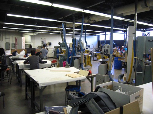
Step 4. Design-Technology. That episode at the machine shop door emphasized the intractable nature of practicing undisciplined creative work in a setting with well-policied disciplinary schools. Some time after this episode, I happened to be at Art Center College of Design. There, while walking to a student’s studio, I came across their shop. It was a hive of activity — lots of students working on stuff. Shop supervisors were around and seemed eager to assist students. Most of all, I was drawn to the openness of the shop. It ran along a long corridor with a window showing you what was going on inside. It was a strong contrast to the other shop..with the door and the removed doorbell and the four hours a day of access.

Seeing this shop made me think about design — something about which I had only the barest of knowledge. I don’t really know what design is, other than the idea that there are designers who design things. There are practices like industrial design, furniture design, lighting design, and so forth. There are design schools where design is learned and taught. But, something was going on here, as I saw just on the surface in this shop. Things were being made; ideas were being explored and probed and materialized here.

Considering design broadly — still without knowing precisely what it is — that experience in early 2006 made me start to consider seriously how I could learn from design to broaden my practice. What was there in design that I could draw from to knit to my history and experience with engineering/technology/art/culture-theory? What would a hybrid, undisciplined design-technology-engineering-art-culture-theory practice look like?

I’m going to find out.
Continue reading Crossing all the wires: Cultural Engineering and Electrical Theory?

Nokia Remade

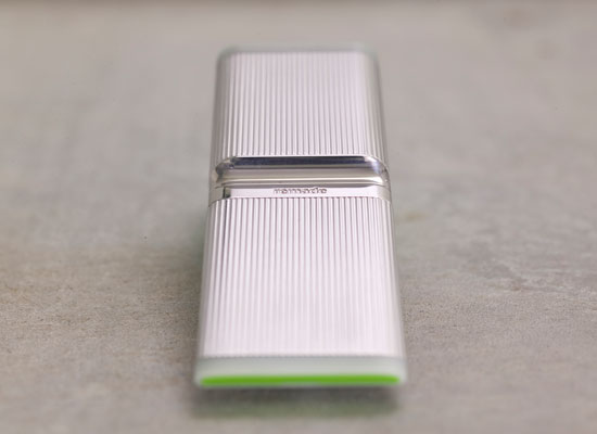
Remade

Nokia Design’s Calabasas Studio has done something fantastic. They’ve taken design thinking and created an impactful concept initiative called &quote;Remade". It’s what I would call a Theory Object — it is a provocation for serious conversations at the tippy-top of the Nokia enterprise to seriously consider how upcycling can become part of the design, construction and consumption of mobile phones. Materialized ideas on a really impactful concept.

The fantastic folks there at the Studio who worked on this include Andrew Gartrell, Duncan Burns, Rhys Newman, Raphael Grignani, Pascal Wever, Tom Arbisi, Simon James, Pawena Thimaporn and Peter Knudsen.

Raphael Grignani has a better description than I could put together on his blog. I’ll steal a paragraph or two here (see, also, Jan Chipchase’s remarks on Future Perfect)

The intent was to create a device made from nothing new.

We drew on a simple insight that in the not too distant future humanity will have extracted and worked much of the valuable minerals once buried in planet Earth. We will be compelled to reuse and celebrate what is essentially “above ground”. Thus we explored the use of reclaimed and upcycled materials that could ultimately change the way we make things.

In remade, recycled materials from metal cans, plastic bottles, and car tyres are used beautifully; whilst helping reduce landfill and preserving natural resources. The concept also addresses cleaner engine technologies, and energy efficiency through power saving graphics.

This is important stuff, particularly when you consider that Nokia makes a phone, like..every two seconds. They have to go somewhere — better they get “remade” than tossed in a heap somewhere.

Variations

20080203_131208

20080203_131123

20080203_131311

20080203_130546

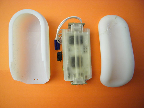
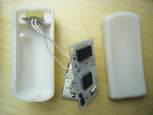
I got an instructive challenge to one of the hand-held forms I’ve been modeling. It’s a bit hard to see in white plastic, but the form is basically smaller, with some simple articulations that in my early days here, have been difficult to execute in software.

I like this form — it’s compact and smooth and feels comfortable to hold. I’d like it in wood, frankly, so I’m starting to think about how to design for milling rather than for printing. Like a buffoon, I cracked the top fitting while I was trying to remove a small section of this swept guide that keeps the thing closed. I should have either sawed or filed it down. Instead, I took a pair of snips to it and, even thinking that it might break, went ahead and tried to snip it. So, that crack? With the gobs of glue? That’s that.

I whipped up a small mounting package to help contain the loosey-goosey bits — the PCB could fit in clips and such, but I’m thinking that it may be easier to fit things in one “fixed” package and then allow the package to go into a variety of things that may have different geometries. There are a bunch of problems with this particular design, or challenges — mostly trying to get the light to be as ambient and non-directional (or to not appear like it’s coming from these very bright sources). The white plastic helps, but I think a lot more can be done. The shadows created by the mounting package itself is a distraction.

Kombolói: An Anti-Anxiety Device

R0010572

This is a quick, quick sketch for an idea I had for a intimate personable device that is best described as a digital worry bead or Kombolói — not so much a worry bead as something to capture and diffuse your anxiety. It works by capacitively linking your tension through a unique capacitive touch sensor and then harnessing that energy, turning it into light and then diffusing it into more soothing energy.

It’s just an idea I had on the plane. I don’t think I was having an anxious feelings on the plane, but I thought — what would an “activated” (digital/electronic) version of the Kombolói look like? What would it do? What would it make me feel?

I happened to see a few of these over the last couple of months in peoples’ palms — maybe some where actually prayer beads. And in at a breakfast meet-up with Linda Stone last week in Munich at DLD08, I learned of some of her very interesting vectors of research beyond her fascinatingContinuous Partial Attention that has to do with the deleterious physical downsides to simply reading email. (Evidently, we go into the wrong sort of state when engaging in what can be an anxious moment — opening your email program. We hold our breath and/or our breathing state goes into a non-flow state that has these terribly noxious effects on our body chemistry. The various levels of oxygen and nitrogen and all kinds of things I should’ve learned more about if I had paid attention during high school biology — they just go nuts with really bad consequences. Who would’ve known? Well, Linda does, and so does the NIH which is taking this stuff seriously.)

R0059379

R0059378

R0010570

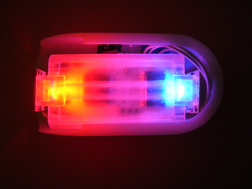
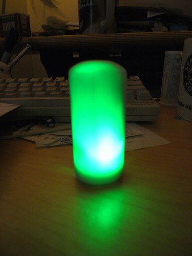
I wanted to find a way to make it luminesce brightly. I’m still working on that — because of the fittings inside and the printed circuit board, etc. — it’s proving difficult to make it glow exceptionally bright, and without shadows. I may have to lower my expectations and change things around in some fashion. Perhaps only a small part of the object will glow. I’m also thinking about ways to make the interior reflective to bounce light around and mitigate the effects of shadows on the surface.

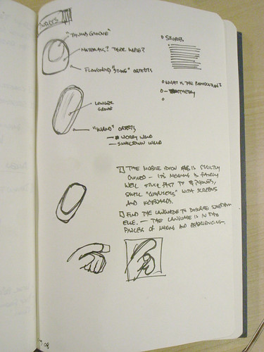
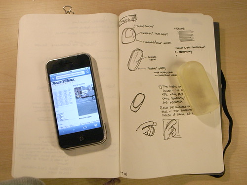
I started with a simple form for the object that was quite small, just to try it in the hand. Generally, people thought the shape and form was right in this early shape. I sort of awkwardly modeled the form in as few strokes as possible, but clearly I need to learn how to be more patient with the modeling stage of the sketch, including allowing myself multiple steps for each larger feature — sketch, revolve, cut, extrude steps, for example, for just one articulation in the form. In other words, just getting the basic overall shape and then cutting away to get more detail. I had been trying to get most of the form in one quick step, with an extrude or whatever, and not paying attention to where tangents were falling, etc. For example, when I started with this form (the small thumb-sized transparent model below) and then moved to a second version (the white plastic one above) I tried to make small improvements to account for the engineering that had to happen inside (mountings, slots, clips, etc) and ended up breaking many of the external features, and making hard points that defeated my goal of a smooth, informal form.

Today's Desktop

R0059380

R0059384

This of course yet another mechanism through which I am exploring how Touch, Motion and Time can become the basis for experiencing different sorts of interactive experiences. My conceit is that these are elemental forms of human experience that are largely dismissed in the digital era, but they are crucial and distinct aspects of how we humans experience and make sense of the world around us. So, to understand this more completely, and to have a stronger basis for discussing it and creating new things that are more than button clicks and mouse florishes, I have been making some template components that articulate these elements in various ways. This is just one more that occurred to me a couple of weeks ago. The touch aspect of these Kombolói — that you hold them and they can be seductive enough in the hand to compel you to roll them in your palm or run your thumb along them as a gesture that soothes and calms; the motion of moving them around and such in the same fashion; and the durational aspect of them, that you spend time, slowing yourself and focusing and loosing yourself as time passes and as you begin to relax, rather than the immediate and instantaneity of many digital and networked interactions — these all seemed to be captured in this social object. So, the question is — what would be a way to explore these elements in my small catalog of devices?

I made a variation of the template component I’ve been making for many months now. This time, I tried to find some simplifications and tweaks to change the geometry of the component. Yet again. (Sigh..) The process of iterating these designs is both exhilirating and exhausting. I end up taking very similar electrical schematics and sweeping them through physical changes, moving components around in the printed circuit board to try and compress things, sourcing alternative replacement components or learning new little tradecraft tricks.

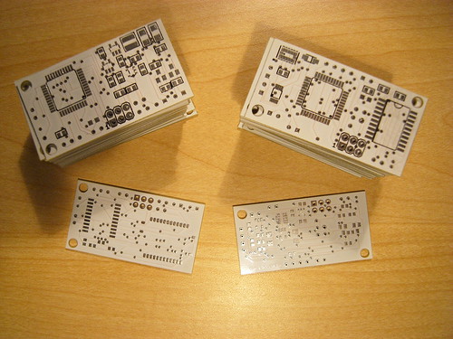
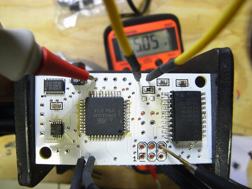
I quickly redid some circuits and board layouts on the flight back and got the form factor down to a geometry that’s got one long axis and was as narrow as I could make it. I’m still trying to find easy ways to program the ATMega microcontroller without taking up a big footprint on the circuit board. Haven’t quite found the right way yet. But, I’ve foregone putting the FT232RL device on the board, which was the rather large chip to do USB to serial conversions. Very convenient, but very large. My strategy now, such as it is, is to use a small external breakout board that the FTDI people manufacture that does the same thing, only with a much smaller footprint version of that chip (one that’d be a challenge to place by hand on my board) and which includes a mini USB connector on it. So, using that breakout board, I only need to run a few wires to it, and I can put it off to the side in the device with a simple mounting bushing or slot into which it fits.

R0010537

R0010539

The overall design is meant to be something that feels good to hold — comforting or soothing.

Moving Forward

There’s a strange anomaly with the electrical circuit that I need to figure out — it appears to drain the battery completely even when it is “off.” I have a kind of untested mechanism for shutting off power to the main logic rail (VCC) while keeping the output of the regulator powering the real-time clock’s battery backup input so that it maintains the time. Perhaps there is a problem there, although I’m a bit puzzled that this design would cause a problem. This part of the design process is less interesting to dwell on, so I won’t. Suffice it to say that there is some problem, and part of documenting the design process is to mention and ponder problems, so, well..there you go.

I also had some good feedback from folks yesterday regarding some technical issues and design issues. It seems that the illumination aspect is still a bit krufty — it’s tricky to illuminate the body, particularly with the translucent material, because because of the shadows cast by the internal parts. I am going to try making some sort of light guide to help mitigate this problem — perhaps a tube or some such that runs along the long axis of the part. Jed suggested this, and it immediately made good sense. Something that caps at the LED and fits on it. Also, this provision for two LEDs — one on either end, facing towards each other — means that I can make the light guide attach to both of them along the long axis.

Semaphore Communication

For communication to the data network, I am thinking about a color-based semaphore system using the built-in camera that many computers come with. The idea is that a simple color sequence can relay certain information could encode the state of the device which could be interpreted by a simple Processing sketch or something. It wouldn’t communicate the kind of robust information that the current firmware is able to do over USB (or..maybe it could?), but it would be a compact mechanism for doing this, and eliminate the necessity for USB hardware and so forth. I’m looking forward to exploring this further. We were discussing it in relation to Veronica Perdes class project on this very exciting idea of a "Fugitive Object" and how we could create a simple mechanism for communication back to the mothership.