Ever since the slow death of Dopplr after its acquisition by Nokia a decade ago, the internet has lacked a dedicated space for people to casually share their travel intentions. Back in those days, it was also a feature of trip planning services like TripIt which since then pivoted to booking management for frequent flyers and real-time notifications when things go out of the route. With the ubiquity of smartphones, it made a lot of sense for social network platforms to propose services that focus on the instantaneous, the moments and the now. The fascination of the Big Now has been the major trend of the current version of the internet.
For some of us — regularly on the move — the practice of documenting familiar destinations and travel intentions demands its own casual and intimate space. This is what Próximo provides.
In consequence, I have observed people using multiple channels like emails, Facebook, Twitter, WhatsApp to share their travel plans and request knowledge about destinations from their online contacts. And almost inevitably, I have noticed how that information would get lost in the noise of overfed inboxes or get buried within minutes under endless social media feeds.
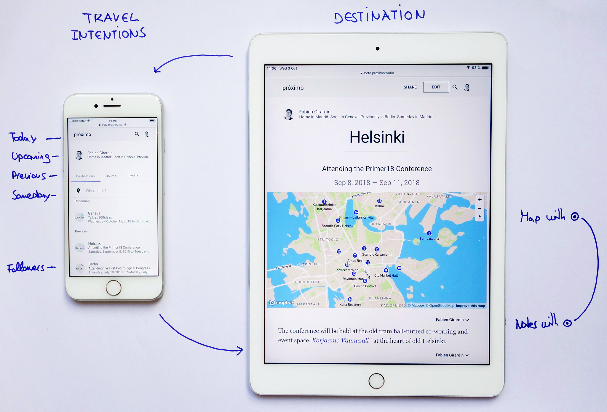
Próximo: Thoughtful Words with Pretty Maps
For some of us — regularly on the move — that practice of documenting familiar destinations and travel intentions demands its own casual and intimate space. This is what my recent pet project Próximo provides and I need your help to figure out how it can better cover that need.
Próximo /ˈpɾoɡsimo/ means nearby and upcoming in Spanish. I have conceptualized, designed, developed and deployed it thinking about travelers who perform any of these habits: the record keepers, the connoisseurs and the prospectors.
Habit #1. The Record Keeper
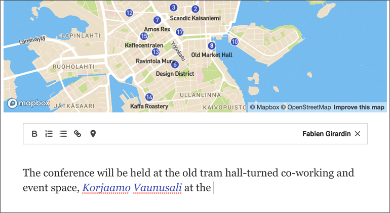
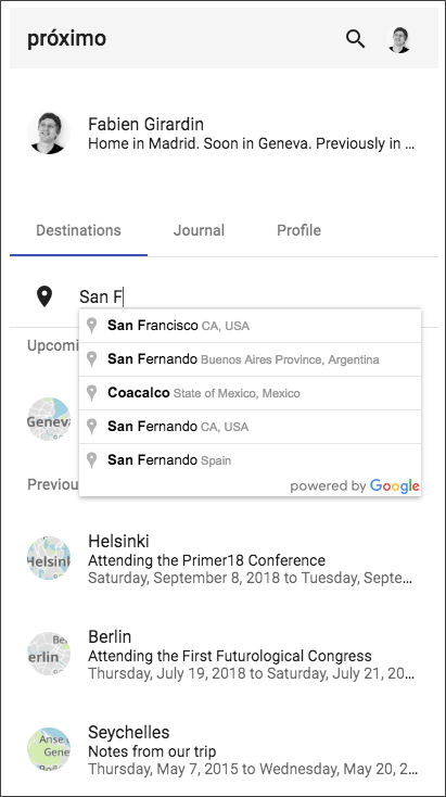
You regularly transform what you hear and see about destinations into reminders, notes or references. You have probably already tried Google Maps, Evernote or travel planning apps to organize them. Próximo offers a natural way to further support that practice. You can both provide context to your notes like in a travel guide AND easily map the relevant places.
Provide context to your notes like in a travel guide AND easily map the relevant places.
Habit #2. The Connoisseur
You have good tastes and your friends, colleagues and family know that.You respond to email/social media requests for personal recommendation about the cities and destinations you are familiar with. In Próximo you can write brief notes tailored to your vegetarian coworker, his sister on her honeymoon, that shopaholic colleague, the foodie friend on a weekend wedding anniversary without her kids or a cousin on a business trip.
Keep brief notes as reminders for yourself or tailored to a specific audience.
Habit #3. The Prospector
You ask around for ideas, suggestions or personal anecdotes to step away from the beaten path. You are also good at browsing the web for hours to spot that special sunrise place in Maui or that unique capsule hotel in Kyoto. In Próximo, you can keep notes of your research and invite friends to contribute with their thoughtful words, recommendations or stories based on who you are.
Disclose your travel intentions and invite friends to contribute with insights.
Call for Early Adopters
If any of these habits sound familiar and you feel intrigued, I invite you to try Próximo. Currently, it is web-based service hosted on proximo.world and you need a Google account to sign in.
It is built on the latest secure web frameworks and technologies (MEAN stack: MongoDB, Express, Angular, and NodeJS). You can delete your account at all time if you are not convinced or no longer want to use Próximo. Click the “Delete Account” in your “Profile” panel and all your data and texts will be deleted immediately.
Like an amateur painter I mainly create software like Próximo for myself. Keeping my hands dirty helps me think better as a professional. I am honored if a few people find the result compelling or inspiring. However, I never fall into the distraction that every idea must scale. This is human scale technology, built for a few, not the whole world. It is the best scale to learn.
I would love to hear from you or anybody you know who might be interested. Thanks for spreading the message. Feel free to comment or contact me.
At Near Future Laboratory we regularly engage into prototyping and envisioning exercises that explore how people negotiate their relation with time and space via digital technologies. For instance: Slow messenger, Humans, Memento, Omata and now Próximo.
We live in the ‘Global Village’ and our behaviors as connected humans have been evolving since Marshall McLuhan popularized the term in the 60s. Today, we form a society that captures the ‘moment’, refashions it to ‘share’ across a network of endpoints containing algorithms and humans, perpetually. Simultaneously, we live in a society that prizes speed. Amazing technologies are delivering real-time notification of those moments to our wrists, pockets and handbags. Through the virtue of feedback loops, real-time predictive algorithms and collaborative filtering, things are recommended to us for instant actions. That optimized movement of information promise to help us gain now the time that we can then put back in our life.
That evolution came with a price. In the Global Village, it is common to hear a co-worker complain over lunch about ‘social media overload’, to have a friend share their ‘chronic infobesity’ issue with a simple look on their Tweetdeck, to overhear in the metro a person who cannot keep up with their multiple profiles on Tinder or to observe a ‘validation junky’ defying Dunbar’s number and obsessively seeking new forms to obtain ‘likes’ from ‘friends’.
In this essay, I argue that most connected people are subject to anxieties, obsessions, phobias, stress and other mental burdens resulting from living in the Global Village. In an era where some behaviors and habits are measurable, there is an opportunity to learn from the negative effects of technologies that extend our social practices. Particularly, designers and data scientists — besides from being held accountable for many of these discomforts — could get inspirations from the descriptions of these social media related pathologies to improve their design of user experiences and algorithms.
Since the presence of social network is relatively new, the real gains and losses of their use can be found in the mood, behavior, rituals, manners and feelings of connected people. Only recently, the popular media started to consider the psychological effects of ‘social overload’, its impact on mental, social and even physical well-being. We are starting to hear about compulsive behaviors or any other kind of pathologies with acronyms such as FoMO (Fear of Missing Out) or FoBO (Fear of Better Options) provoked by the exposure to social media. That evolution can also easily be traced in recent academic literature. For instance, social psychologist Andrew Przybylski and his colleagues defined FoMO as:
“A pervasive apprehension that others might be having rewarding experiences from which one is absent, FoMO is characterized by the desire to stay continually connected with what others are doing.”
As a consequence, some people who first embraced constant connectivity are now looking for ways to resist the constant call to be permanently connected. These reactions manifests a need to establish boundaries, resist information overload, and strike a greater emotional balance. Some opt to follow media ‘diets’ or ‘detox’ programs as attempts to move away from being constantly ‘on top of things’ and to give up on fears of missing out or being out of the loop.
Every Technological Extension is Also an Amputation
Social network platforms act as an extension of our social practices. Like with any technological extension we are right to be fascinated by its power and scale. However, we too frequently choose to ignore or minimize the ‘amputations’ and implications they produce. Or as French cultural theorist Paul Virilio would argue:
“The invention of the ship was also the invention of the shipwreck”
For instance, our capacity to record every moment of our lives comes with the high vulnerability of digital data. In fact, no machine can today read a 15 years old hard drive. It is ironic that we have the technological means to record and share our social lives, yet we all might suffer one day from ‘digital amnesia’. Similarly, the capacity to record our lives might reduce our ability to forget inconsequential factoids which is the way for our brains to optimize the recollection of important things. Indeed, our memory uses abstraction and generalization to forget and better remember.
The understanding of these ‘amputations’ represent a source of inspiration and discussion to improve the design and algorithms of social media or any technology that touches humans and extend their social practices.
Gathering Material from Fictional Near Future
With the objective of producing an inventory of ‘amputations’, designer Etienne Ndiaye and myself projected into the near future the current discomforts in using social media. With an approach called Design Fiction, we employed that inventory as a totem for discussion and evaluation of alternative ways to experience social media.
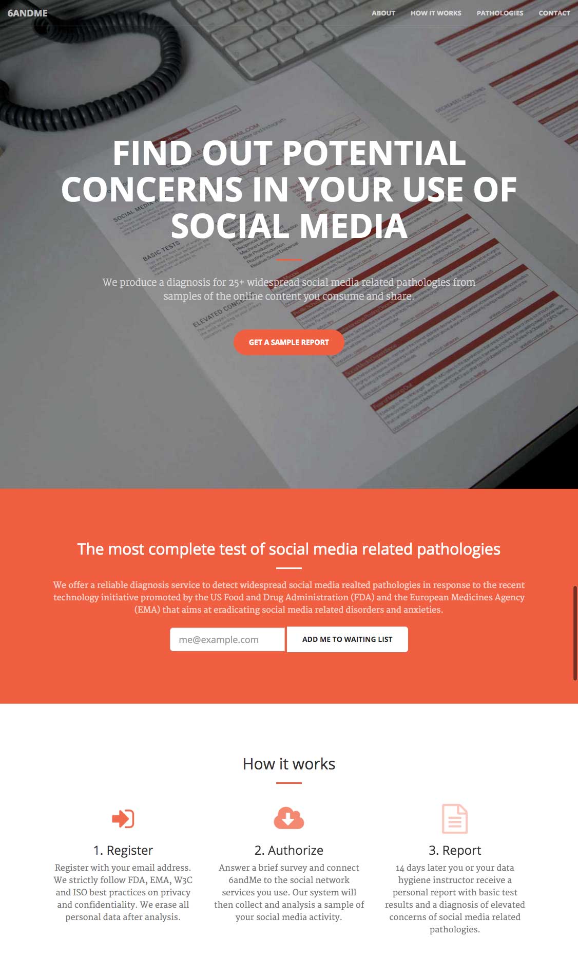
In this exercise we postulated the future increase of cases of ‘validation junkies’ (i.e. individuals who obsessively like, favorite, share and retweet) and ‘input junkie’ (i.e. individuals obsessed with social network feeds). After a vast study on social habits and individual addictions to social media, the US Food and Drug Administration (FDA) and the European Medicines Agency (EMA) decided to set up a large technology initiative that placed limits on design, algorithms and access to social media. For instance, they imposed limits to Facebook photo clicking. In consequence NGOs and the media started to portray pathologies like FoMO as the nicotine of social network platforms forcing the Facebooks, Googles and Amazons to react.
Based on that premise, our Design Fiction took the form of a fictional start-up called 6andMe active in the sector of wellness for connected humans.
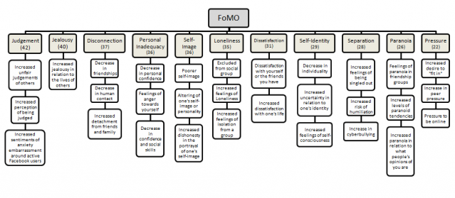
That Design Fiction helped us think on how popular media might describe conditions like FoMO in the future. We debated on the tools and behaviors that could prevent or mitigate the discomforts augmented by social media; the mechanisms that 6andMe could use to detect feelings like ‘lone envy’, ‘social exclusion’, ‘missing out’ and ‘being left out’. For instance we listed the indicators that could give signs of unfilled need of ‘belongingness’ and ‘connectedness’ of a person.
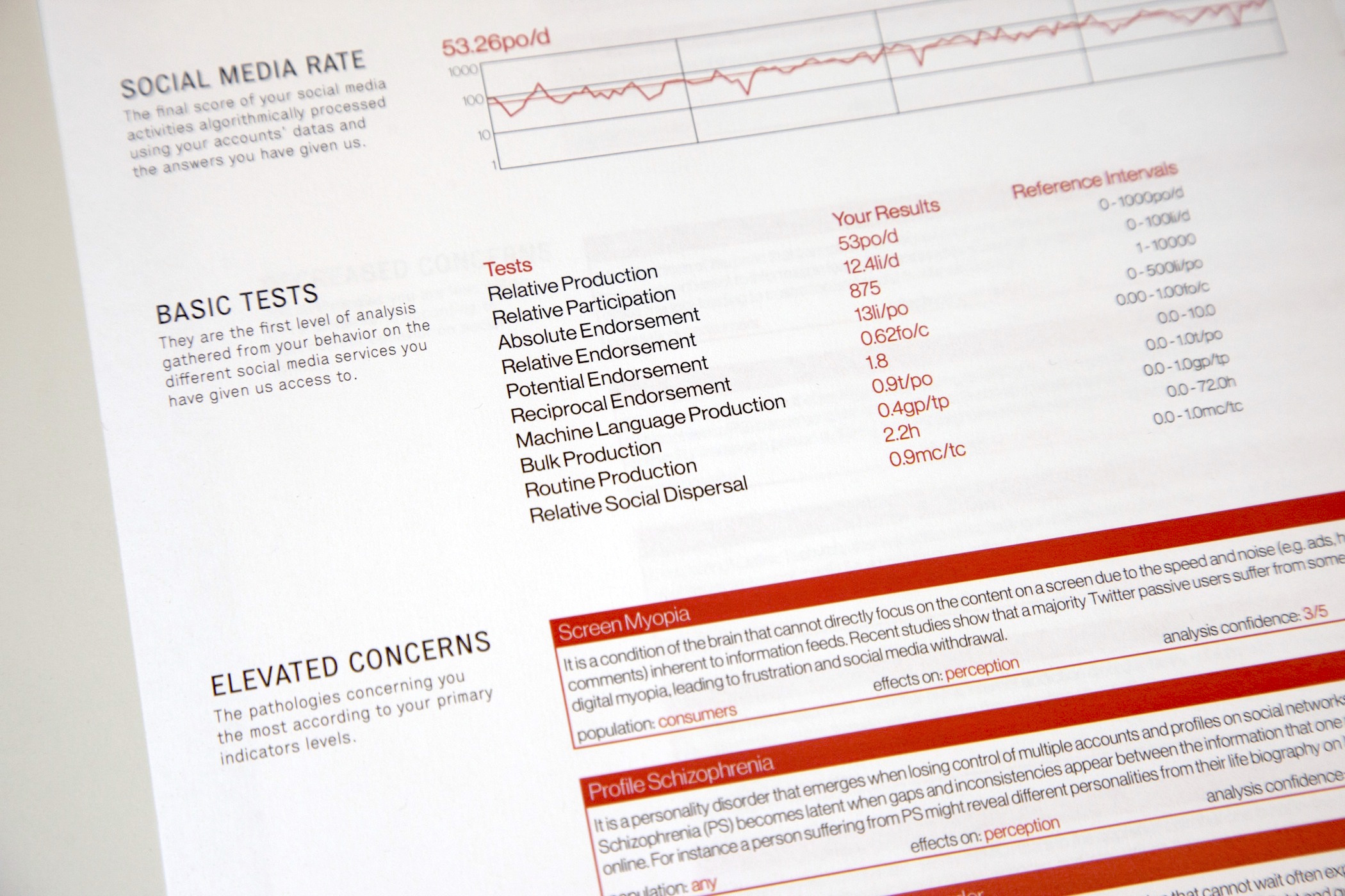
Relative Production, Relative Participation, Reciprocal Endorsement, Relative Social Dispersal, etc. The 6andMe diagnosis rely on a battery of basic tests gathered from an individual behavior on social media services to rate concerns for social media related pathologies.
Further into the exploration, we looked at the evolution of language and how some mental conditions might be linked to popular figures. For instance, 6andMe can detect levels of Systrom’s Anxiety. This fictional pathology originates from Instagram’s CEO Kevin Systrom who once said:
“We humans are forever on a quest to take a moment and record it forever in time. Because however long life is, or however short life is, we know we may never get that moment back.”
that we translated into the following symptoms:
Systrom’s Anxiety (SA)
Systrom’s Anxiety is a feel of having to capture and share a moment from the fear of not being able to get to live it again. It happens in situations when one has to decide whether a moment is best enjoyed in the present tense or preserved for posterity online.
We also investigated the emergence of technologies and research that measure social media behaviors. For instance, Michal Kosinsk at Stanford and companies like Apply Magic Sauce API are currently optimizing ways to transform digital footprints into psychological profiles. Our fiction stands 2 or 3 iterations away from that reality. As a result, data scientists at 6andMe use similar algorithms to produce a diagnosis for social media related pathologies. For instance:
The results: 2 weeks after sharing the access to your social media activity, 6andMe sends you by mail a complete diagnosis with levels of concerns on social media related pathologies (e.g. Cloud Syllogomania, Online Tachylalia, Fear of Missing Out, …)
Cloud Syllogomania (CS)
Like many people, you have a tendency to compulsively hoard documents in the cloud such as photos, music, videos, discussions, emails, or any other data formats. However, when reaching storage limit you fail to organize and discard large numbers data even to the point of causing significant clutter and impairment to basic operation of a software, computer or mobile device. This hoarding behavior is often unwanted, automated by online services and can become distressing.
Online Tachylalia (OT)
You have a tendency to share social content fast, frenetically and very frequently, so frequently that it becomes impossible for your relatives, friends, colleagues and contacts to follow you online. It may be exhibited as frequent streams of rapid posting without prosody leading to online social rejection and disdain.
Profile Schizophrenia (PS)
You suffer from a personality disorder that emerges when losing control of multiple accounts and profiles on social networks. Profile Schizophrenia (PS) becomes latent when you start to notice gaps and inconsistencies between the information that you share online. For instance you might develop different personalities from your life biography on LinkedIn and what you share on Facebook, your World of Warcraft characters and your Twitch videos.
Online Monophobia (OM)
You feel alone in online social networks. You might have relatively too few online contacts and receive low amounts of contact requests, likes, comments, reblogs or retweets. Many people with this fear feel awkward and uncomfortable on social networks. It is related to Online Athazagoraphobia that is fear of forgetting or being forgotten on social networks.
Overshadower Syndrome (OS)
In this form of a judgment disorder your mind blurs the social etiquette of knowing too much about somebody else from the information available on the Web. That behavior often leads to uncomfortable social and cultural situations when too much knowledge on a person is gathered from the extensive use of search engines and social networks.
Storage Claustrophobia (SC)
In moments of bandwidth restrictions, abusive data plans, or limited cloud space you notice an extreme fear and feeling of being confined to the limits of a specific data plan or storage system.
Six Degrees Jealousy (SDJ)
You feel or show envy of an online contact for receiving more attention in the form of “likes”, “comments”, number of contacts or the klout score. Inspired by network theories on six degrees of separation, Six Degrees Jealousy is often a reaction of teenagers to a strong social pressure and fear of not belonging to a community or tribe leading to Online Monophobia (OM).
Find more informal descriptions on 6andMe of: Timeline Myopia (TM), Impulsive Posting Disorder (IPD), Social Media Dependence (SMD), Social Media Overwhelm (SoMO), Sense and Attention Overload (S&AO), Abrupt Online Dropout (AOD), Pocket Check Obsession (PCO), Screen Addiction (SA), Compulsive Screen Absorption (CSA), Stressful Attention Battles (SAB), Online Attention Disorder (OAD), Tagophobia, Compulsive Data Cleaning Disorder (CDCD), Data Loss Meltdown (DLM), Digital Amnesia (DA), Online Athazagoraphobia (OA), Visiobibliophobia, Social Escapism (SE), Online Perseveration (OP), Avataragnosia, etc.
Our Design Fiction and the description of these fictional pathologies do not claim to be medical but are provocations on how connected humans might express their anxieties, obsessions, phobias, stress and other mental burdens in the future.
Takeaways for the present
While working on wonderful technological extensions of human body and mind, designers and data scientists need also to consider the amputations provoked by the experiences and algorithms they introduce into the Global Village. In the the book The Shallows, Nicholas Carr worries that the flood of digital information is changing not only our habits, but even our mental capacities:
Forced to scan and skim to keep up, we are losing our abilities to pay sustained attention, reflect deeply, or remember what we’ve learned.
The inventory of social media related pathologies listed in 6andMe highlights these types of technological implications. The descriptions of FoMO, Systrom’s Anxiety, Six Degrees Jealousy, etc. provide a new source of inspiration and discussion to improve the design and algorithms of any technology that touches humans and extends their social relations.
To build better data products and services, I would argue that most designers and data scientists should be aware of notions such as graphopticon introduced by the like economy and question if the technology they build establish an insatiable ‘desire for more’ or any other type of discomfort. Moreover, they should get inspirations from the techniques social media user develop to strike a greater emotional balance.
Many companies have the data and skills to consider the wanted, unwanted and toxic changes in behaviors their services or products create and amplify. For instance, Facebook introduced the roles of social engineers and a group of trust engineers to make the online world a ‘kinder, gentler place’. In their first approximations they introduced mechanisms for their users to tune the feeling of status update overload.
Currently, only a few apps and platforms promote social media experiences that mitigate the types of discomforts listed in 6andMe. Meshfire is a recent attempt to ‘make social media human again’ or as its CEO puts it in abstract terms:
“If we were to start again with social media — a completely clean slate — we’d like to see real human interaction rather than all the automatic output we witness today.”
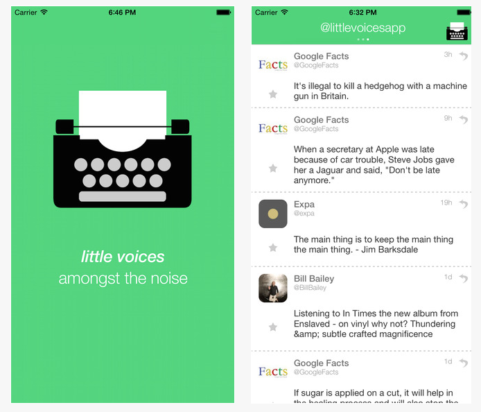
Screenshots of Little Voices by Charles Gower
Another example is the app Little Voices that removes the Tweets that contain images, links and replies from Twitter feeds. As its developer Charles Gower describes it:
“Little Voices is complementary to Twitter, not a replacement. It’s ideal for those who like their feeds slightly quieter.”
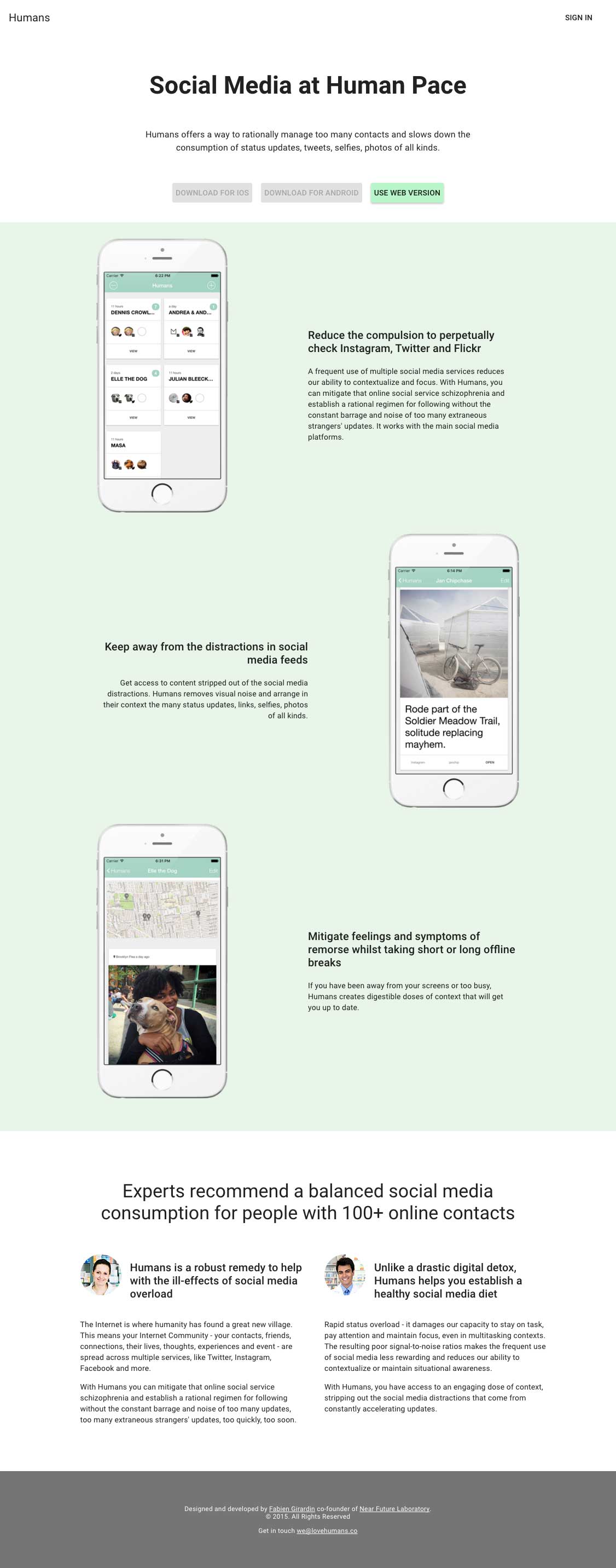
Finally, at Near Future Laboratory we have been building Humans as a platform to ‘experience social media at human pace’. Humans offers a way to rationally manage too many contacts and slows down the consumption of status updates, tweets, selfies, photos of all kinds. Its aim is to:
Reduce the compulsion to perpetually check for status updates.
Keep away from the distractions in social media feeds.
Mitigate feelings and symptoms of remorse whilst taking short or long offline breaks.
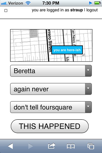
I’ve been working on, and testing out, a new thing for the last couple of weeks. It is called privatesquare. It is a pretty simple web application that manages a private database of foursquare check-ins. It uses foursquare itself as a login service and also queries foursquare for nearby locations. The application uses the built-in geolocation hooks in the web browser to figure out what “nearby” means (which sometimes brings the weird but we’ll get to that later). On some levels it’s nothing more than a glorified check-in application. Except for two things:
First, when you do check in the data is stored in a local database you control. Check-ins can be sent on to foursquare (and again re-broadcast to Twitter, etc. or to your followers or just “off the grid”) but the important part is: They don’t have to be. As much as this screenshot of my activity on foursquare cracks me up it’s not actually representative of my life and suggests a particular kind of self-censorship. I don’t tell foursquare about a lot of stuff simply because I’m not comfortable putting that data in to their sandbox. So as much as anything privatesquare is about making a place to file those things away safely for future consideration. A kind of personal zone of safekeeping.
Second, privatesquare has its own internal taxonomy of event-iness. It is:
I am here
I was there
I want to go there
again
again again
again maybe
again never
The first item maps the easiest to foursquare’s model of “checking in”. It is what it says on the tin. The second is the thing that you can’t do on foursquare but everyone does anyway: Checking in after the fact if only to have a personal record of things you’ve done. This just makes the act explicit. The third is not unlike the “lists” feature that was introduced on foursquare, last year. It is also the one flavour of check-in that is not forwarded on foursquare. I suppose I could figure out how to add things to a list, but I haven’t yet.
The last four are a long overdue love song to Chris Heathcote and a plaintive desire for something like the Dopplr Social Atlas (not to mention Dopplr itself) but one that isn’t held hostage to the seeming neglect of its parent company, Nokia. Once upon a time, I went to Helsinki for Important Business Meetings ™ involving Flickr and Nokia while Chris still lived and worked in Finland. I asked him where I should eat during my stay and he sent back a long list of restaurants (all lunch places, I think) each flagged as “again”, “againagain” and so on.
The Social Atlas was a feature added somewhere around year two at Dopplr and is a list of places to eat at, stay in or explore. Places are added by the users and organized by city. It remains a lovely example of how to do this sort of thing though there’s not much going on there these days. You can flag as place as somewhere you’ve been, somewhere you like but not someplace you dislike. Which always seemed like a shame because I would find it helpful to know that someone I know and trust dislikes a restaurant in London as much as I despise Herbivore, in San Francisco.
Chris’ is a genius classification system. It does not get lost in the weeds of weird similes and absurd metaphors (wine tasting, anyone?) and by and large captures the experience of asking someone where you should go to eat in a place you’re not all that familiar with. It is also entirely bound to the relationship of the person telling and the person asking. It is not a recommendation engine.
It assumes that although two people would both do something again, or do it enthusiastically (“againagain”), they are just as likely not to do the same thing. Those details are left out of the equation (read: the computer) because it will never be able to account for the subtlety and history of experience between two people.
The “again” ratings (markings, like on a tree?) are an odd lot in that they don’t go out of there way to distinguish themselves in time. Is it just an indication that you went there some time in the past and want some record of the event? Or does it mean that you wait to check-in until you’ve decided how you feel about it? Or do you check-in and then say whether it was good or not?
I am very consciously punting on these questions for the time being in order to see how the thing actually gets used and what I find myself wishing it did. I suspect that most of the confusion that may be generated by these kinds of blurry and overlapping assignments can be overcome by displaying dates and times clearly.
It is worth nothing that privatesquare does almost nothing that foursquare doesn’t already do, and better. privatesquare is not meant to replace foursquare but is part of an on-going exploration of the hows and whens and whys of backing up centralized services with bespoke shadow, or parallel, implementations of the service itself. It is designed to be built and run by individuals or as a managed service for small groups of people who know and trust one another.
privatesquare remains a work in progress and I am not planning to run it as a public service any time soon but it is available as an open-source project, on Github, that you can run yourself:
The documentation and installation process still remains out of bounds for most people who don’t self-identify with the nerd squad but that will sort itself out over time. For what it’s worth my copy is running on insert a vanilla shared web-hosting provider that can run WordPress here so that’s a promising start, I think.
The site is built on top of Flamework, which is a whiteroom re-implimentation of the core libraries and tools that a bunch of ex-Flickr engineers used to build Flickr, the same way that parallel-flickr is. Meaning that some part of all these projects is just putting Flamework through its paces to find the stress points and to better understand the hows and whats of the process (installation, documentation, gotchas and so on) should be. And like parallel-flickr “it ain’t pretty or classy (yet) but it does work.”
Here’s an unordered list of the things privatesquare still doesn’t do:
Sync with the foursquare API. For a whole bunch of reasons you might find yourself checking in to foursquare using another client application. privatesquare should be able to fetch and merge all those check-ins that it didn’t handle first.
The “nearest linear” cell-tower problem. This is one of those problems that gives credence to all the hyperbolic hand-waving done by companies driving around mapping latitude and longitude coordinates for wifi networks. Without this data determining geographic location for a web application running on a phone is often handled by assuming that whatever cell tower your phone is connected to is “good enough”. Sometimes it is but just as often it’s not. You have a line-of-sight, a signal, back to a cell tower that exceeds the maximum radius in which to query for venues. Because your phone thinks you are somewhere else you always end up falling outside the hula-hoop of places that are actually near you.
The map that’s displayed with venue listings (there’s a screenshot at the bottom of this post) is one possible alternative. As I write this the map isn’t responsive. It’s just there to try and help you understand why a particular list of places was chosen. Eventually you should be able to re-center the map to a given location and use that when looking up nearby venues, for those times when your web browser can’t figure out who is on first by itself.
There is no ability to delete (or undo) check-ins.
There is no ability to add new venues. Nor is there any way to record events offline or when you don’t have a network connection. I’m not sure whether either of these will ever happen. At the moment there are just too many other things going on. Beyond that I sort of like the fact that privatesquare doesn’t try to do everything.
There is no way to distinguish duplicate venues (same name, different ID).
Export, which is probably the single most important thing to add in the short-term. This includes a plain old web view of past check-ins.
Pages for venues, though I’m really sure what I was thinking when I was blocking out this blog post and wrote that. It’s probably related to what I wrote about cities (below) and the idea that the really interesting aspect of a venue page is seeing a user’s arc of again-iness for that spot over time.
Pages for cities. The other nice thing that privatesquare does when you check-in is “reverse geocode” the location of the venue and store the Where On Earth (WOE) ID of the city the venue is in. Which will make it possible to build something that looks like the Social Atlas. For example, if you were going to Montréal I might send you a link to all my check-ins in that city (WOE ID 3534) tagged “again”, “againagain” and “I want to go there”.
In a way privatesquare is just the foursquare version of parallel-flickr: a tool to backup your check-ins, albeit pre-emptively. Which is sort of an interesting idea all on its own. The differences between the two applications are that parallel-flickr doesn’t let you upload photos (yet) and privatesquare doesn’t really provide any mechanism for sharing your check-ins with a restricted set of users. Currently, it’s all or nothing (read: “nothing” because the code forces you to be logged in before you can see anything).
I am also thinking about forking; piggybacking; hijacking (piggyjacking?) some or all of the work that Stamen has done with the Dotspotting project. For two reasons: First they are both built on Flamework so it ought to be possible to make them hold hands without too much fuss. Second, there’s a nice un-intended feature in the way the code for browser things and the code for database things handle the data that people upload to the site: HTML tables.
In theory (and I haven’t tested this out yet) anything that can generate an HTML table, with the relevant semantic attributes, and send it to the browser along with the relevant JavaScript code will be able to take advantage of all the lovely display and interaction work that Sean Connelley and Shawn Allen did for Dotspotting. Just like that!
The reason this all works is that when we started writing Dotspotting it was during a time when Flamework was still pretty green and lacking any code for doing API delegation or authentication. Rather than trying to shave that particular yak we simply opted to use the HTML sent to the browser and jQuery as a kind of internal good-enough-for-now API.
Once it’s sorted for privatesquare it should be easy enough to swap out the table parsing code with proper API calls, now that Flamework has its own API delegation code, and then it could be dropped in to parallel-flickr as an alternative view of your geotagged photos.
It’s all still magic-pony talk and none of it addresses mobile (tiny) web browsers or anything but a pretty conventional linear paginated view of the data (no clustering or other fancy stuff) but, still: This pleases me.
In the short-term I’m going to continue to focus primarily on the data input side of things trying to make it as easy and fast as possible to record the data along with the simplest of CSV or GeoJSON exports, so that you could at least look at your data in tools like Dotspotting or Show Me the GeoJSON respectively.
And if I can get that part squared then it also might be possible to re-use some of the same work to make things like Airport Timer easier since the two projects are each a kind of side-car to the other, when you stop and think about it.
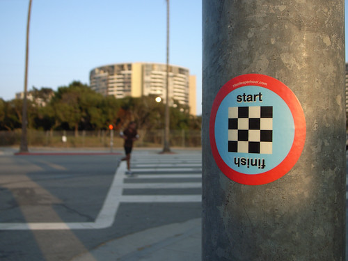
The diversified curiosities of creative people indicates that there is more to the world than things that run on batteries and connect to the Internet and San Franciscoans fuss over in front of bearded baristas. I celebrate this diversity by announcing that there is now a lovely series of climb category cycling stickers by my friend Rhys and Co. from their 18milesperhour.com project. For a short time, you can get a set for free in exchange for liking ’em on Facebook and sending a message or email with your address.
Worth it, if you ask me. And way better than getting twiddly trying to justify to your own brain the $700 you dropped on your iPad.
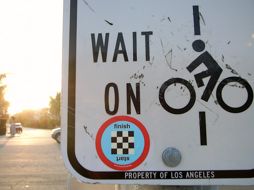
I stuck this one on last evening’s trundle around the Marina. When done, I put one on the other side of the street there which counts, officially — as The Finish. (Parenthetically, I don’t seem to have use of climb category being a flat-ground spinner. *shrug)
Judge not the less yammer-y state of the studio blog to indicate that there is nothing worth yammering about. It’s just that the clang of steel caressing code has been going on and that in great measure, too. Some of you may have glimpsed and grinned at the fantastic electronified edition of the paper Drift Deck that we developed a couple of years ago. That’s right. We’ve added *batteries to the Drift Deck and it’s fallen into the *app well..it’s an app which is fantastic because it means the last remaining physical card editions can become properly *artisinal and the electronic battery editions can spread the sensibility of the Drift Deck concept to the rest of the world.
Release is imminent. Prepare ye iPhones. Hop expectantly from foot-to-foot. More news in a short while, including linkages to downloadables. In the meantime, check out the new Drift Deck webified “page” and the fantastic roster of hammererers that batteryified the ‘deck.
..And then — onto the next thing here. It’ll be quiet a little, but good things are baking in the kiln, rest assured.
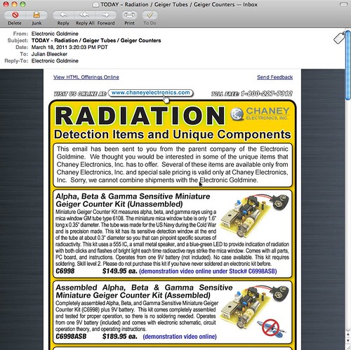
Completely understandable how the recent tragic events in Japan would translate into email from an electronics source containing *only parts and supplies and modules to make Geiger Counters. At the same time as it’s understandable, it’s one of those things that feels like it’s taking advantage of the general panic, confusion, sadness and apocalyptic angst.
Not deflecting the urgency and anxiety of recent events in Japan, it’s curious to me to think about how and when change is able to happen. By that I mean that things happen, swerve off-course or are able to swerve off of into unexpected, new directions. For example, the events after 9/11 where an *opportunity space opened up in which dramatic, unprecedented changes were able to be made in the legal systems of some countries. Things that would not have been so easy to implement had their been no epic tragedy. Similarly, in a way — now we learn quite a bit about nuclear physics, science, speculation about the malfeasance (if you can call it that) of this nuclear quasi-agency in Japan (via @xenijardinWSJ: TEPCO initially resisted using seawater to cool reactors; harm to “valuable power assets” feared ). We find ourselves preparing — again — for an earthquake, nuclear catastrophe, flood, Tsunami, etc. Entirely enormous nations are scaling back and turning off nuclear power plants (I find this most intriguing) and rethinking their energy policies. I mean — that’s epic. Whatever side you may be on the issue of nuclear power, these events, at the cost of untold lives, future lives, physical infrastructure, and so on — everything has been changed.
The imagined course into which the future was going to be made, has swerved.
We often like to think of change coming about from good, thoughtful, happy actions and activities. Like good design work, for example. I think, from my experience, it is often never like this. It is hard. Change is hard. Making things better is hard. Generally, and anecdotally from the experience of myself and others up and down the hall here on the 7th floor of the Laboratory — people are reluctant to change their ways, the course of their lives. Moving out of “comfort zones” and all that is, well — uncomfortable. Adapting and adopting new ways of living, behaving, thinking would make for a more resilient world, I think. One that was not afraid of difference, of giving things up for the hope and possibility of a better things.
Of course — it can all go wrong. But at least we’d try.
Why do I blog this? As always, we here are quite intrigued by how the future comes to be — what are the mechanics, semantics and motivations that move people to obtain and create possible futures. In this case, “taking advangage” of opportunites when one can do that bit of swerving, rudder-pushing, tiller cranking because the currents become favorable to try a new tack.
At that moment when the normal course of events seems to swirl out of control
You’d be right to wonder why there has not been much here for a couple-few weeks. Contrary to a vicious rumor, we neither adopted a needy office pet nor did we father-seed a dead pop star’s child.
It’s Annual Planning Month here in the Laboratory, when we assess what will be our near future priorities, goals, strategic themes and projects. It’s weeks of mulling, muttering, hemming, hawing, pausing, sputtering, drinking and brow-furrowing. After all the strategery comes the planning. We’re deploying a rigorous phalanx of unforgiving planning-to-do tools, reacquainting ourselves with our old avuncular friend — Mr. Gantt and his fabulous chart. Along with this is Mr. Gantt’s trusty Sancho Panza, Mr. Miles Stone.
That’s right. Planning, charting, back-filling objectives and sticking to our guns. This way, at the end of each “Q” (that’s Quarter to you non-accomplishers-of-things) we can re-assess and re-target. In fact, we might even be working at the level of the “P” (sorry, “Period” or one of your Earth “Months” to you terrestrials) and perhaps even the microscopic time element — the Week.
Where has this sudden bit of planning gluttony come from?
*Shrug. Who the fuck knows.
But, it feels right and it will help the Laboratory to say “no” because it’ll all be right there, in Mr. Gantt’s chart and resource managers can point and wag a finger and say “Uhn uhn uhhhnnn..that’s not going to happen. Back to your computation terminal!”
The ring of the ball-peen hitting the work piece on the anvil. The smell of the coke smelting the ore. Lustful, material things. Things getting done and made.
So — what’s on the plate?
Well, I can give you the *general theme, but nothing super specific, and that’s only because of the deeply sensitive nature of our work and the fact that it might have deep political affect on the ways the needle-heads upstairs in Finance & Control’s (mis)understand what exactly it is we do and how it brings incalculable value to the efficiency of the Laboratory — unlike the Bridges and Thoroughfare Systems Group which never, by the way, ever did a damn thing to contribute to our bottom line, least as best as I can tell.
Here it is. This year’s theme: Less Yammering. More Hammering.
It was more than interesting. Supra-interesting. Boundless interestingness. I’m talking mostly about, well — talking about #designfiction. And this will continue as a theme within whatever theme happens to be the theme-of-the-day.
At the same time, the yammering meant there was less time (despite having it on the list of the Professional Development Plan) actually making things. Now — I love to talk and have conversations around engaging, new, whacky-but-intriguing ideas. That’s the guano of innovation. It’s how things change, grow, evolve. Ideas come to life in the conversations. The conversations are that which promote and propagate; they contain the narrative logics that poke and prod and stretch and materialize those thoughts, making them more tangible and more legible. So — I love to yammer. As you may know — I also really love to hammer: to make things that are distillations and materializations of those conversations. Little props and provocative objects that help think-through and evolve those conversations.
Years ago the Laboratory wrote a tremendously short essay called Why Things Matter in which I ham-fistedly explained my thinking about the importance of “social objects” and the ways that these can become as yammer-y as normal human beings and, thereby, bring about material change to the world. It was most an interest in how things like Pigeons or Salmon suddenly connected to the *network in oftentimes simple ways could alter the terms of conversations about things like environmental issues, pollution or fishing legislation.
What I learned through that was the importance of making things — but it’s not just the made-thing but the making-of-the-thing, if you follow. In the *making you’re also doing a kind of thinking. Making is part of the “conversation” — it’s part of the yammering, but with a good dose of hammering. If you’re not also making — you’re sort of, well..basically you’re not doing much at all. You’ve only done a *rough sketch of an idea if you’ve only talked about it and didn’t do the iteration through making, then back to thinking and through again to talking and discussing and sharing all the degrees of *material — idea, discussions, conversations, make some props, bring those to the discussion, *repeat.
So — we’re not done here with the #designfiction theme, but it is an idea that needs some material-making, at least here, and lots of people are doing this as well. But, generally thinking — it’s time to get back to making stuff, building little probes and provocateurs and trouble-makers. That means booting up the old software-making toolkits, breaking a few of Simon’s milling tools (sorry, again..), learning how to CNC myself so I can make my own mistakes, getting a CAD package in that old PC in the Laboratory, etc.
There’ll be posts here and status updates and of course — yammering. It’ll just be tempered with and by and through the making as it once was oh a couple-few years ago when we were making hellzalot of electronics.
This’ll be the year of trouble-making apps of various sorts, I think. The first one is the digital edition of the previous Drift Deck, analog edition which has had a sort of silver-year’d renaissance thanks to @bldgblog writing a nice, thoughtful little post about it. That’s being done by Jon Bell and Dawn Lozzi with myself being the design project equivalent of the annoying sot who wants to have “just one more.” Allegedly, so long as I *don’t have “just one more” this should be done by the new networked age’s equivalent of the finish line — South by Southwest, which’d be March 11. (Here is a printable PDF of the Drift Deck, analog edition for those who have had trouble downloading it from Slide Share.)
There are other things, of course. The completion of the Laboratory’s re-make of 2001: A Space Odyssey, finally doing the animated Death Match between Apollo LEM and Space POD, a *book project with more images than words, revisiting two old location-based software toys, and a crackapp that may hopefully get us in good trouble with parents.
Finally — this is it, really: the sub-genre of this year’s theme “Less Yammering. More Hammering.” is — “Low Brow.” In fact “Low Brow” was the original theme, but it didn’t test too well in the experts’ reviews. But, if I think about it, it lives on in a way. It provided the transposition algorithm, turning the wonderfully optimistic “Get Excited. Make Things.” that our friend Matt Jones (@moleitau) of Berg meme-seeded into a sort of by-the-scruff, morning drunkard, roughneck-ificiation — “shut up and just do it, you moron” — only I made to rhyme so that I can sing it — should things come to that. Continue reading You'd Be Right To Wonder
This is an interesting paper called The WALL: participatory design workspace in support of creativity, collaboration, and socialization written about workspaces using various techniques to support creativity, collaboration and “socialization.” The paper describes and advanced design studio for a “Nordic EU” country and the use of a wall — in this case, a real wall, not a video wall or something like this — and the ways in which design work forms on, in and around the wall. This is interesting to me because of the direct opposite of typical assumptions from the world of technology where high-tech is often used — video conferencing systems, telepresence devices, and so on. In this particular studio, the wall becomes a place where work happens. Things that go up on the wall become projects or intersect or leak-into other projects.
The challenge in this particular study (two or three days of observation) is that the studio has a sibling that is a great distance away so the team is separated by space as well as a significant time difference. THe challenges in this case are to share the wall in some fashion — which is not entirely solved. Various approaches are tried — sending high resolution photographs, creating large format plotter-prints to create a facsimile of the wall from one studio to the other, etc. Some video conferencing can happen, but even this is only effective at communicating verbally because the persistence of shared images, sketches and so on is low — it is only around for the call. The bulk of the design activities happen with people together, in the same physical space, standing/sitting/couching/laughing at and near the wall. Casual encounters while walking by a team working on a specific bit of material at the wall can inflect and inform the work in substantial ways — even by members of the design team not directly assigned to a specific project. In fact, it sounds like every member of the team is working on every project to one extent or another by virtue of the fact that the projects wrap around the studio on the wall. Walking by representations of a project can spark an insight or ideas for other projects. Material from one stream of work can find its way into another quite naturally as the boundaries of ownership, share-ability, and so on are made permeable in a creative, productive way by the maturity of the team, the transparency the wall facilitates (everything is there), the rather flat-ish structure of the design team, and the implicit trust amongst the team (no one needs to be policed or watched; attendance isn’t taken, &c.)
Why do I blog this? I’m very interested in what makes creative, productive, advanced design/technology teams work well. This idea of the analog wall — a pin-up wall — is simple, does not need to be plugged-in, allows for sharing and viewing and collaborating. Continue reading The Wall
This might be an old one, but I just recently heard about it while catching up on my favorite economy and finance Podcast — the brilliantly home-spun Planet Money. In it they are talking about their project to tell the story of how a t-shirt is being made..by making a t-shirt, from buying the bales of cotton to getting it yarned and spun and made into fabric and cut and printed and sold. You can hear all about it in this short podcast which explains how they got this idea from The Travels of a T-Shirt in the Global Economy by Pietra Rivoli.
The orthodox justification for intellectual property is utilitarian. Advocates for strong IP rights argue that absent such rights copyists will free-ride on the efforts of creators and stifle innovation. This orthodox justification is logically straightforward and well reflected in the law. Yet a significant empirical anomaly exists: the global fashion industry, which produces a huge variety of creative goods without strong IP protection. Copying is rampant as the orthodox account would predict. Yet innovation and investment remain vibrant. Few commentators have considered the status of fashion design in IP law. Those who have almost uniformly criticize the current legal regime for failing to protect apparel designs. But the fashion industry itself is surprisingly quiescent about copying. Firms take steps to protect the value of trademarks, but appear to accept appropriation of designs as a fact of life. This diffidence about copying stands in striking contrast to the heated condemnation of piracy and associated legislative and litigation campaigns in other creative industries.
Why, when other major content industries have obtained increasingly powerful IP protections for their products, does fashion design remain mostly unprotected – and economically successful? The fashion industry is a puzzle for the orthodox justification for IP rights. This paper explores this puzzle. We argue that the fashion industry counter-intuitively operates within a low-IP equilibrium in which copying does not deter innovation and may actually promote it. We call this the piracy paradox. This paper offers a model explaining how the fashion industry’s piracy paradox works, and how copying functions as an important element of and perhaps even a necessary predicate to the industry’s swift cycle of innovation. In so doing, we aim to shed light on the creative dynamics of the apparel industry. But we also hope to spark further exploration of a fundamental question of IP policy: to what degree are IP rights necessary to induce innovation? Are stable low-IP equilibria imaginable in other industries as well? Part I describes the fashion industry and its dynamics and illustrates the prevalence of copying in the industry. Part II advances an explanation for the piracy paradox that rests on two features: induced obsolescence and anchoring. Both phenomena reflect the status-conferring power of fashion, and both suggest that copying, rather than impeding innovation and investment, promotes them. Part II also considers, and rejects, alternative explanations of the endurance of the low-IP status quo. Part III considers extensions of our arguments to other fields. By examining copyright’s negative space – those creative endeavors that copyright does not address – we argue can we can better understand the relationship between copyright and innovation.
Why do I blog this? I think this gets to the substance of many issues related to intellectual property rights and the arguments on both sides. It’s also suspicious the ways that the anomolies to the “orthodox” and rather instrumental consideration of new ideas are largely ignored, according to the authors. Of course there are going to be outlier complexities to the perceived canonical position that ideas can become property that can be protected in these ways — but the fact that they are not looked at closely as revealing new approaches is very suspicious to me. I don’t believe IP is a solid, like nature — it mutates as a concept. Gobbling it all up and protecting it — or measuring people’s performance based on their ability to create and protect IP — that’s just frustrating nonsense. People often put IP on their CVs as if it were war trophies or something like this. In many ways it reveals a lack of foresight and aspiration for their ideas to say they are protected and proprietary. G’ahhh.. It drives me nuts sometimes.
Oh, on a more happy note at the end of this podcast you’ll hear that our friends at Tinker Studios in London are going to have their t-shirt idea implemented in this Planet Money t-shirt — a QR Code on the t-shirt that links to, presumably, the story about how the t-shirt was made, which is the story that Planet Money is working on.
One of a sample of “Destination Maps” presented at SIGGRAPH Asia 2010 by a team of researchers. It shows a computer-generated emulation of the canonical napkin-style hand-drawn map. The described advantages are that it highlights relevant “neighborhood” streets and diminishes the arterials and highways that are not necessary and perhaps confusing for reaching the destination. It closes in on that typical style of map that was perhaps described best in Denis Wood’s “The Power of Maps” — the rough, perhaps off-scale map that gives the contours of a place and only what is roughly right and nearly necessary to navigate a place.
Some questions around this sort of map making:
* Why the use of kitsch-y napkin texture and the recognizable human-hand-hunting for lines with pencil? This idea of having the computer draw like a human seems a little dishonest, which puts me off. But, I suppose at the same time its recognizable and legible to people, which may make it more palatable and familiar, which I guess is something kitch is good at.
* I’m sure this is in the category of “it’s a prototype, relax” sort of thing, but shouldn’t the interstate highway signs be roughly-right, too?
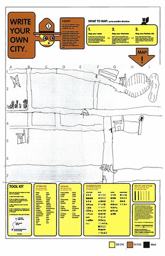
Related, just to keep the project in-mind, to the PDPal efforts to make roughly-right emotionally evocative personal maps — here’s one that was just the other day done by a friend’s young’n, by happy coincidence. I often think about this project and its relevance to what I still think is curious, intriguing and worth pondering over. Fascination with maps and cartography — mostly off-kilter, peculiar, provocative ways of making maps and exploring is super interesting to us here, especially the fellas smoothing parchment in the clean room on the 3rd floor.
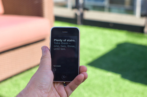
cf. Mark Shepherd’s Serendipitor — an iPhone app to help you explore by creating unexpected routes from point A to point B. I’ve been mucking with this for a few weeks — very cool and fun. Not for anyone trying to just get from A to B, which isn’t always the most exciting way to explore.
cf. Designing for iPad, which has some nice remarks on the use of kitsch in interface design.