Mobile Defense and Chinatown Cobbler

Defender

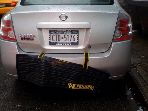
Curious strategy for preventing bumper dings — a bumper for the bumper, you might say. It’s the Mobile De-fender. (Get it? De Fender?) You will see material like this for preventing a lower category of bump, such as a “light tap” from negotiating a tricky parallel parking job, or even the deliberate tap to inch a car up a bit to fit better in the spot. As I was the victim of an a**hole who just steady backed up way more then he had to, willfully unaware that we were behind him, lights on and about 5 meters clear of him, steaming his ridiculous enormous 80’s Cadillac while we were waiting for him to vacate his spot, probably tipsy from a pitcher of beer at the Pizzaria we were going for family dinner, I can empathize with the necessity of additional rubberized armaments to prevent these kinds of minor dings. Fortunately, there was no noticeable damage — I think bumpers are pretty well designed these days to take a 3-5 mile per hour kiss.

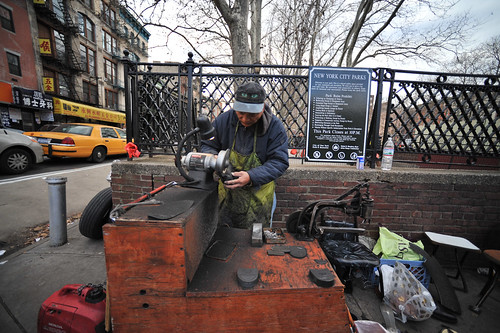
Related somehow is this cobbler seen in Chinatown in New York City, working on fixing some woman’s busted heel or something. How is it related to the rubber bumper bumper? I noticed his materials — recycled rubber from a full tire (on the left, along the wall running into the frame) and a scrap of rubber from a tire on the right bottom. A resourceful, resource-reusing cobbler here. Bravo, I guess.

Why do I blog this? Observations of curious human improvisational practices for preventing abuse and renewing the use of their various mobile artifacts.
Continue reading Mobile Defense and Chinatown Cobbler

A Story In Fragments

There’s a story here. The bottle smashed on the ground is a lovely blue-green glass with a Sake label of some sort on it, probably from the pocket-sized Sake specialty store 10 meters or so back down the block. I don’t know if the smashed bottle, and the janky protective garbage bag over the driver’s side window here have anything to do with one another, but I wonder..

Why do I blog this?Thinking about how fragments of past experiences leave lingering traces to be interpreted and pondered over. Nothing forensic. Just materialized historic traces.
Continue reading A Story In Fragments

Ubicomp is like a 5 year old wishing for a pink pony

Complete Ubicomp fail. I mean..they can’t even get this most simple of scenarios straightened out and they want to put my refrigerator and toaster oven on the network? WTF. Seriously. Anytime I hear the alpha futurist-y featurists get all excited about some kind of idea for how the new ubicomp networked world will be so much more simpler and seamless and bug-free, I want to punch someone in the eye. They sound like a 5 year old who whines that they want a pink pony for their birthday. Ferchrissake. Just think even once about all the existing hassles that pink pony wishers have brought into the world and be happy that you can still breath the air around you.

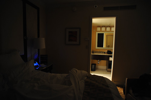
Okay. Fancy hotel with all the bells and whistles. Sensor in the bathroom because some over competent architect/engineer or other member of a hubris-heavy discipline assumes I can’t find a light switch because I’m stupid/drunk/tired. Sensor detects my buffoonish/loaded/sleepy body in the bathroom and turns the light on for me. End of “use case.” Only, this sensor just cuts the light on whenever it pleases. In the middle of the night.

Solution: Door closure.

Result: Less sleep and a resentful blog post.

Why do I blog this? Observations about why Ubicomp is done better in sci-fi movies than in real life.
Continue reading Ubicomp is like a 5 year old wishing for a pink pony

Dead objects preserved

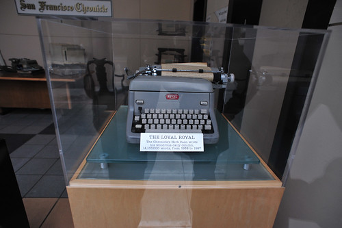
Observed on a walk-about San Francisco, curious antique objects and their preservation, or lack of. I stumbled across this diorama-like recreation at an unused entranceway to the San Francisco Chronicle building (at least, I think that’s what this building was.) It was Herb Caen’s office frozen in time, with his old typewriter preserved under glass.

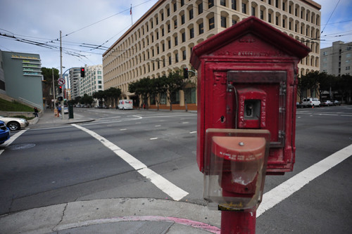
Nearby I found this old somewhat vandalized fire alarm call box and wondered if these are still active and in use, or if they’ve been taken over by the near ubiquity of mobile phones to call in emergencies.

Why do I blog this? No nonsense observations about objects that become deactivated and their continuing role as socialized intermediaries that continue to relate to distant cousins, in this case, the mobile phone as emergency callbox, and the keyboard — or, more generally, networked computer.
Continue reading Dead objects preserved

What does $5 get you, anyway?

Slideshow from The Five Dollar Comparison on Flickr

In the silty ash of this latest economic meltdown, I’m wondering — what does a fin (or its equivalent in the other legal mechanisms of value exchange) get you these days, anyway?

Good question. Really good, when you think that someday soon, with reductions in manufacturing and materials costs, secondary sales markets and other factors will make the cost of owning a phone around that $5 mark. Half the world’s population already owns a mobile phone. It is a very real possibility that some of the world’s remaining 3.3 billion may also participate in mobile communications practices. What does that world look like? How do fundamental aspects of human social life change when personal communication is accessible to almost anyone? Certainly we can only speculate, maybe do some informed speculation.

Recently studio chum Rhys Newman presented “The Five Dollar Comparison” during a Nokia Design roadshow to introduce the question and ask people to participate in discussing the $5 question. We’re doing it simply, without big name thinkers and prognosticators. Just people, taking pictures of things they bought for about $5. Photographs are shared in the fivedollarcomparison group on Flickr. It’s a far ranging, exciting conversation through images, telling stories about how $5 can get you an English speaking taxi driver for door-to-door service in Kabul, or $5 will get you a delicious bowl of pork ramen in Shibuya, or a porter to carry your 25 kilo load for half a day up the Inca Trail in Peru, or a thick fancy Sunday newspaper in Venice Beach.

Photo by svanes

Personal communications for $5. Sounds noble in the age of iPhones and Google Phones and overpriced double-billed phone plans — toys for people with jobs and maybe a bit of a fear of not having the latest and greatest that their friends have. Or, maybe just good business sense in a world where the Nokia 1100, the number one selling phone in the world, has sold 200 million units — the biggest single consumer electronics device out there in the world. Count them. It’s true. No joke.

Access to a way to project oneself across town, or across the world. It puts into question the meaning of distance and time; changes how authority and trust are managed; changes who participates, where conversations start and how communities are formed. Somewhere a phone will mean the possibility to begin interest-bearing savings. Somewhere else, a phone will mean finding out where work for the day might, rather than guessing and perhaps losing a day’s wages. Somewhere else again, phones will become disposable, one-off objects that, hopefully, do not clutter the mountains of waste already choking us.

This is where we’re starting. Asking a question to start a conversation about five dollars. There is no one answer. There may just likely be 3.3 billion answers, each as personal as the communications a five dollar phone affords.

Discussions around the consequenes of a truly connected planet have been going on for some time and the fivedollarcomparison.org is a small step to broaden the discussion and explore how the impact might vary across cultures and contexts by asking this simple question: what can you buy for five dollars?

Participate. Let us know what kind of object or service you can buy for $5 dollars wherever you are, and wherever you go. Email your submissions to add@fivedollarcomparison.org or adding them to the fivedollarcomparison group on Flickr Please read through the guidelines on fivedollarcomparison.org/participate.

Studio mates Raphael Grignani and Jan Chipchase have some thoughts on this topic, too.

Continue reading What does $5 get you, anyway?

Drift Deck (Analog Edition) Card Art

View SlideShare document or Upload your own. (tags: psychogeography cards)

The Drift Deck (Analog Edition) is an algorithmic puzzle game used to navigate city streets. A deck of cards is used as instructions that guide you as you drift about the city. Each card contains an object or situation, followed by a simple action. For example, a situation might be — you see a fire hydrant, or you come across a pigeon lady. The action is meant to be performed when the object is seen, or when you come across the described situation. For example — take a photograph, or make the next right turn. The cards also contain writerly extras, quotes and inspired words meant to supplement your wandering about the city.

More project details here.
Continue reading Drift Deck (Analog Edition) Card Art

Institute for the Future: Blended Realities Fall Technology Exchange

08112008_165532

While I’m still in Helsinki I’m projecting myself into the near future, thinking about this upcoming seasonal “Fall Technology Horizons Exchange” with the Institute for the Future, November 18 and 19. I’ll be on a small panel with the lovely Kati London of Botanicalls fame and with whom I shared an all-too brief stage at DLD in Munich last February.

Our panel topic is described thus: By giving plants, trees and other inanimate objects online identity, people are bringing awareness and sentience to the objects around us. What happens when trees, plants, and things we carry acquire online presence and can communicate with us and with each other? How do you respond when your wallet pings you?

Good stuff.

The full event is on physical-digital hybridity, under the title “Blended Reality: Reports from the Digital/Physical Future.”

Get ready to immerse yourself in a new blended world, a place where people
weave together digital and physical environments as they go about their daily
lives. It’s a world where the virtual and the physical are seamlessly integrated,
and Cyberspace is not a place you go to but rather a layer tightly integrated into
the world around us.

Continue reading Institute for the Future: Blended Realities Fall Technology Exchange

Self Explanatory: Street Level User Interface

I found this quite pervasive practice in Helsinki of giving restaurants a big hunk of didactic anchorage through these geographic names of cities or entire geographical regions. No guessing what sort of dish and style of food — even anticipating for you the decor you might find inside or style of service. It’s all implied in the name of the place.

Why do I blog this? Things observed — street level user interfaces. The readable, legible city without any need for data services or ubiquitous computing modules. Quite nice.
Continue reading Self Explanatory: Street Level User Interface

Design Fiction / Science Fiction

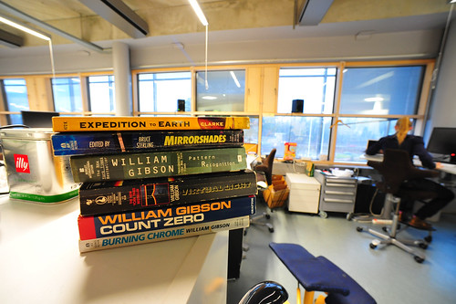
Spied about while meeting-and-greeting Helsinki colleagues at Nokia House, some materials that I couldn’t help but recognize in the context of the early morning writing I’ve been trying to do, refining the last three presentations I’ve given last month on “Design Fiction.”

There’s a curious practice here that I don’t think is entirely new, but there are some exciting directions from whence the idea has circulated, drawing me back to the relationship between the science of fact and the science of fiction, and then to the old science-technology-studies principles, and Latour, who taught me to not have anything to do with clearly delineated boundaries between much of anything, particularly any kind of science. This is where it starts.

I can imagine a practice that can comfortably work in between and even be comfortable swapping properties between fact and fiction for the purposes of telling a story that is a materialization of an idea, or one’s imagination. It’s like science fiction made real, without the weight and burden of the whole truth.

Why science fiction? Because it’s a literary genre that can comfortably stretch the now out toward a possible near future world better than other ways of story telling. (I’m perfectly happy to accept that there are others — the symmetry though between the hubris of science fact and the imaginative whimsy of science fiction is too hard to resist.) That practice is some derivation of design probably.

Why design? Because so far it seems to be less inclined to be as disciplined as the other practices I’ve tried, it has a vocabulary that includes the word “people”, it can work with vernacular, everyday, even mundane practices quite well, it implies working with one’s hands and head and even risking a nicked finger, etc.

While a restless graduate student at the University of Washington I worked at a place called the Human Interface Technology Lab, or HITLab. The lab was working quite hard on virtual reality (VR), another (again) of a kind of immersive, 3D environment that, today, one might experience as something like Second Life. The technology had a basic instrumental archetype canonized in a pair of $250,000 machines (one for each eyeball) called, appropriately, the RealityEngine. With video head mount that looked like a scuba-mask, one could experience a kind of digital virtual world environment that was exciting for what it suggested for the future, but very rough and sparse in its execution. As I was new to the new HITLab (still in temporary trailers on a muddly slope by the campus’ steam plant), I went through the informal socialization rituals of acquainting myself to the other members of the team — and to the idioms by which the lab shared its collective imaginary about what exactly was going on here, and what was VR. Anything that touches the word “reality” needs some pretty fleet-footed references to help describe what’s going on, and a good set of anchor points so one can do the indexical language trick of “it’s like that thing in..” For the HITLab, the closest we got to a shared technical manual was William Gibson’s
“Neuromancer” which I was encouraged to read closely before I got too far involved and risked the chance of being left out of the conversations that equated what we were making with Gibson’s “Cyberspace Deck”, amongst other science fiction props. I mean — that’s what we said. There was no irony. It was the reference point. I’m serious. I mean..this is from a paper that Randy Walser from Autodesk wrote at the time:

In William Gibson’s stories starting with Neuromancer, people use an instrument called a “deck” to “jack” into cyberspace. The instrument that Gibson describes is small enough to fit in a drawer, and directly stimulates the human nervous system. While Gibson’s vision is beyond the reach of today’s technology, it is nonetheless possible, today, to achieve many of the effects to which Gibson alludes. A number of companies and organizations are actively developing the essential elements of a cyberspace deck (though not everyone has adopted the term “deck”). These groups include NASA, University of North Carolina, University of Washington, Artificial Reality Corp., VPL Research, and Autodesk, along with numerous others who are starting new R&D programs.

(PDF: http://tr.im/zoj)

There’s nothing wrong with this — it’s all good stuff. It’s a way of creating that shared imaginary that knits the social formations together. Latour would remind us that this is the socialization practices — this is an instance of the “how” and the “why” of technology. Technology is precisely the socialization of ideas.

It’s refreshing when you come across some good fiction — science or otherwise — positioned to be read, referred back to or just as a kind of badge to mark the contours of that shape and influence. Nothing literal — just literary, the edges of design fiction practices.
Continue reading Design Fiction / Science Fiction
Refinement in Degrees

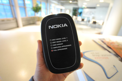
A scale of design models in these check boxes suggests refinement from basic form to mechanical, color, materials and so forth — stopping at full appearance. Appearance absent functionality, which can only be inferred based on what it is a model of. In the world of mobile phones, the functionality is implicit — making calls and so a design prototype need not concern itself with use and operation.

Or does it?

What are the ways design can dig below the appearance, into actual use in order to better understand the contexts and vernacular aspects of people and their practices? Can it be done rapidly — quick enough to place things in context so that the freshness of the idea from its inception is decanted into the “model”? What about fictionalizing that experience — making props, instead of prototypes?
Continue reading Refinement in Degrees