Weekending 03252012

Nicolas was, once again, in the train for two workshops about design ethnography and object repurposing: one in Paris at ENSAD, and another one at the HKB in Bern. The idea was to show students the value of this kind of field investigation by asking them to go observe how people repurpose objects in physical space. Giving the same brief to different students is interesting as it allows comparisons between the results and the different cultures (swiss german versus french). Nicolas also gave a talk about the game controller project at the HKB and animated a visit of the Playtime exhibit. The rest of the week was devoted to writing a research grant about design ethnography and the game controller book!

Fabien returned to his homebase in Barcelona and started plotting follow-up work on our network data initiative. Our engagements will range from strategic advisory and seminars to hands on work on urban data analysis and workshops. He dedicated the rest of the week polishing some key elements of the Quadrigram visual programming language. He teamed-up with interaction designer Tim Stutts to produce a brief 3-minutes video that explain how Quadrigram can reveal different dimension of a single dataset. We used real-time traffic information from our friends at BitCarrier in that demo:

Julian down here in Los Angeles was, huh..what went on last week? Hold on..okay. Looks like mostly Project Audio activities, specifically the Marshall Stack project. Hardware for that was meant to be done at the end of the week, but there were the inevitable delays. Now it looks like it’ll be today, which probably means the end of *this week. *Sigh. Whatever. There are curious lessons in here about rapid development, prototyping “platforms” and the like. That’s good stuff to learn from. But, while waiting (I have to admit to having a day of boredom..) I went back to Ear Freshener and dramatically simplified the PCB by taking all the power boost circuitry and the fancy “turn-on-when-audio-jack-is-plugged-in” circuitry and figured — just get the audio bits working. For the power boost circuitry, I sourced a little boost regulator from which is effectively what I’d put on the board anyway in a subsequent iteration.

The other thing I did was go to Art Center College of Design and talk to almost-graduated Media Design Program grads about “Industry Practices” – basically what I do, how I got to where I got, and why I like it and why I don’t. It was a fun thing to do and the chance to be honest about where I am professionally was cathartic. What else? New Laboratory jackets arrived, so those’ll start going out to the local affiliates; goading more of the staff to contribute to the blog; finishing the photography book; tricking my Nike+ Fuel Band wristband thing to accept my cycling as fitness fuel; the usual.

And late night strategy/vision work, too.

Oh, wait — also there was this fun interview in The Atlantic with the video from Corner Convenience — on Nick’s Vimeo, Corner Convenience has had over 10,000 views, which is cool for a squirrely little Laboratory that only several hundred people check out every week.

[pullquote author=”Christensen, Clayton M. (2012): Disruptive Innovation. In: Soegaard, Mads and Dam, Rikke Friis (eds.). Encyclopedia of Human-Computer Interaction.”]Disruptive innovations, in contrast, don’t attempt to bring better products to established customers in existing markets. Rather, they disrupt and redefine that trajectory by introducing products and services that are not as good as currently available products. But disruptive technologies offer other benefits—typically, they are simpler, more convenient, and less expensive products that appeal to new or less-demanding customers
Continue reading Weekending 03252012

3Difficult

Bleecker has been pestering me to write this for a while now, but I’ve been wrestling with my point of view. Matt Webb has written a lovely piece here about the evolving notion of “product”, which has spurred me on, so let’s give it a go.

Matt Ward recently reminded me of an awkward conversation I had with BERG’s Matt Jones (there are a lot of Matt’s in here) about what constitutes a “product”. I steadfastly defended the tangible, but Jones was more fluid with his definition including services, content, the digital and the physical. I’m happy to admit that in retrospect I was wrong – clearly wrong, but why was I so inflexible? Why was I so dogmatically fixated on objects as the be-all and end-all definition of a product? My defensiveness began to bother me until I realized recently that I wasn’t defending an idea, I was defending my trade.

I like things, I make and draw things, things you can touch, hold, sit in or on. Things made of stuff, things hewn from bigger lumps of other stuff or molten stuff squeezed into holes. I’m an industrial designer at heart, and I’m saddened by what’s happened to my craft. We were once the kings of things, but for a variety of reasons I think we’re in danger of being left behind. As Bueller said “life moves pretty fast, if you don’t stop and look around once in a while you could miss it”.

In the early years of the 21st century, the Industrial Design world fell to sleep. Whilst it slept a new breed of digital designers emerged, keen to render their ideas in three dimensions. Tools developed quickly, became cheaper and more ubiquitous, and whilst the industrial designers gazed into their huge screens to interrogate the acceleration of a curve across a surface, other things began to appear. Real things made of plastic and metal, with blinking lights and power cords. But these things weren’t from the hands of industrial designers, they were from the hands of the Bay area startups, the digital design labs, hell even the ad agencies.

Making became the talk of the town, and to some extent it still is. We’re in the first stumbling days of the Internet of Things, and are increasingly seeing the paper thin definition between digital and tangible falling away. It’s all up for grabs, and some are grabbing more than others. The more groovy folks I know from the digital world fully understand the difficulties and realities of shipping products, and appreciate the unique skills of a good industrial designer, but there are many who don’t. They see a world of instantly printed, maker bot-ed, 3D sintered, laser cut products, and see no need for a separate skilled individual.

Let’s take a little step back. Remember Flash when Macromedia had the reins? Remember how excited everyone was? A generation of graphic designers found they were able to simply make things move on screen, in a browser, online. Many of them made a mental and professional leap and began referring to themselves as ‘web designers’. Some made the leap successfully, but for many the romance was short lived. The reality of actually producing content for the web was way more complex than getting text to float across the screen or making an intro animation. It was hard. It required serious programming chops, it was like a whole different profession. For this reason, many of the graphic designers I knew returned to their poster design, font development and annual reports, leaving web development to those more experienced and capable of delivering it.

Today’s emergent manufacturing tools are tantalizing indeed, and have given designers of all ilks access to manufacturing techniques hitherto out of technical or financial reach. It’s now simple for a couple of fairly inexperienced guys to feasibly produce products for sale, which is fantastic, but let’s take a critical look at a few of these products. How many of you have invested in a cool thing on Kickstarter only to receive constant emails about how expensive tooling is, or how hard it is to source PSU’s, or how the team massively under-budgeted the production? There have been many projects which simply ground to a halt because the Matter Battle was just too tough, before we even get into the debating the dubious legal position of these devices (CE mark anyone?)

Rapid prototyping techniques are to real products what the play-doh fun factory is to real manufacturing. Things need to exist with integrity rather than just to exist, there are standards which need to be maintained. A rapid printed thing is cool, but to produce a product for mass consumption requires a whole new level of thinking and experience. A good industrial designer can provide this.

Before we get carried away, this needs to be a two way deal. Industrial designers need to wake up and embrace the ebullient folks in the digital world, and work together to deliver real things well. Industrial designers have tended to shy away from the scary worlds of UI, UX, web development and programming, as if they were some alien entities. I see industrial design moving from an experimental realm and into a delivery function, where surfaces are created to ‘skin’ the doohickey spat out from an engineering or development center. That’s not good enough. As industrial designers we need to understand that what we know how to do is golden. We should join in, get involved, build ideas together with digital designers rather than steadfastly holding our corner. We need to do this soon, because the digital guys are keen, and we’re the dinosaurs.

If industrial design is to survive beyond a word of styling and surfaces it needs to embrace the joie de vivre of our digital design brethren, and if you are an Arduino tinkering, web-centric designer, I’d encourage you to look beyond those white dusty 3D things your friends are all excited about. I fully embrace the emergent era of the post-disciplinary designer, but we have to be honest with ourselves and understand specialisms.

Making things is hard. Really hard. Don’t let anyone tell you anything different.

Links for 2012-03-22 [del.icio.us]

  • reaDIYmate: Wi-Fi paper companions
    "reaDIYmates are fun Wi-fi paper companions that move and play sounds depending on what's happening in your digital life. Assemble them in 10 minutes with no tools or glue, then choose what you want them to do through a simple web interface. Link them to your digital life (Gmail, Facebook, Twitter, Foursquare, RSS feeds, SoundCloud, If This Then That, and more to come) or control them remotely in real time from your iPhone."

A Screen-y FutureScape-y 2025

[pullquote author=”FutureScapes”]FutureScapes is all about imagining what the world of 2025 will look like and the role technology could play in our lives.[/pullquote]

Sony put up these FutureScape videos — little design fiction films that introduce us to a conflicted world in the year 2025. This is design fiction par excellance at least insofar as we are effectively transported to this world as best as can be done for a little film. There is narrative punctuation that leads us through various epic events that have happened — we don’t need to know the intimate details of these events. Suffice it to say that political, economic and other struggles have swerved things as they always do. There are events, loosely referred to as “2021” — that are this future’s “9/11”. Etc.

As narrative, this sort of thign works. It does something to gradually get me out of the contingent moment and into the fun bits of the story so I can take it all in and see what that world might be like.

And, of course — it’s Sony so there’s going to be some technology. That part sorta sucks, I have to say. The technology is a bit much. It’s more than a prop; it’s a demo. And it’s all screens. Screens screens screen screens screens. Touch touch touch touch touch.

Okay. Fine. I’m the guy who’s looking for the other, other near futures. The one’s where we’ve moved along or took a swerve towards other interaction modalities. The future of UX and UI design seems to be stuck on a rail and no one is looking for anything else. I’m not saying that there *has to be something else; but what good is design if it doesn’t explore other interaction idioms? If it just makes fonts bigger and puts interactions on cupboards and walls? Seriously? Doesn’t that sound like fun? To challenge the existing dominant paradigm, if only to explore uncharted, unknown unknown territories?

I think the technology is fetishized way too much here. The tools are easy *and optimized for rendering and animating a specific kind of technology — touch screens/surfaces/planes. That optimization determines what will go into these design fictions. The tools predetermine the technological surround of these near future worlds that FutureScapes has produced.

But..that’s me. I’m sensitive to these sorts of things — the lineages of outcomes like this, where you wonder — how’d we get to this world of touch interaction? Was it because some films made it possible to cohere a speculative idea because some decision makers were enthralled with a visual spectacle and decided — hey, that’s the strategy. Touch-interactive cupboards and shelves!

You find this all the time. Poorly considered ideas that find their way in the world *somehow — and investigating the *somehow is useful. So too is realizing that you’re complicit in crap ideas if you get enthralled by a tool and over use it to the degree that someone assumes that this is the way things should be. I had a call with an engineer who thought our interaction design was too simple — one button — and should be ‘made better’ by adding a mobile phone interaction where you touch the mobile to the thing and, using NFC, the phone and the thing would connect and then a browser window pops open on the mobile and then you interact with the thing using the browser on the mobile to control the thing over Bluetooth so that anyone can do it.

*shrug.

Nip that sort of thing in the bud. What are the alternatives to consider besides what you see everywhere, or what you take for granted, or what is considered “hygiene” in your industry, or what cool new drop-down feature AfterEffects CS12 has, or what everyone else is doing, or what you think Steve or Sir Jony would do because you can get off their teet.

The other thing to say here is that the VFX amateurs are going bonkers with planar tracking. They love to track something in a scene and then put some semi-transparent animations of UI’s on it. They LOVE it. And then they move the camera a bit so it looks *real — like the UI is actually there in the thing and maybe it’s compelling enough that people think — huh, wow..is that real? At some point the VFX animation of planar tracked surfaces simply jumped the shark and now people do it cause they can. The VFX have determined the design. That’s bad design. Doing it cause you can, not cause you should.

And that, friends, is why we end up with a world of screen-based interactions. Because the folks at Imagineer System made the wonderful and wonderfully over-used Mocha Pro — a relatively inexpensive tool that anyone can use and — lo! — comes bundled with AfterEffects. There’s a criteria in there — when a tool becomes a *tool, rather than a bespoke, handcrafted workflow, then it’s sorta jumped the shark. I don’t blame them – Imagineer Systems. Maybe I blame Adobe a little. But, either way — I would expect more from those who use it to pull back a bit from making everything a planar interactive surface.


Continue reading A Screen-y FutureScape-y 2025

Rigor and relevance in interaction design research

Establishing Criteria of Rigor and Relevance in Interaction Design Research by Daniel Fallman and Erik Stolterman is a paper about the epistemological underpinnings of interaction design. It addresses the problem of ‘disciplinary anxiety’ that is often felt by people in this field and the inherent discussion about what constitutes ‘good research’ in terms of rigor and relevance.

The author uses the following model, called the Interaction Design Research Triangle, to map out a two-dimensional space for plotting the position of a design research activity drawn up in between three extremes: design practice, design studies, and design exploration:

Some comments from the authors:

The three forms of research do not randomly advocate certain research methods, techniques, or tools, instead they are a consequence of years of trial and error, practice, and experience, through and by which appropriate methods have emerged. The methods that have survived have been and are continuously tested against the purpose of the approach and they have thus proven over time to deliver the kind of results looked for in a way that makes sense. We therefore make the argument that the only way to discuss and examine rigor and relevance for interaction design research is to do it in relation to the three forms of research and to their particular purposes.
(…)
this is not done consistently in our field today. This sometimes leads to misunderstandings, confusion, and mistakes when design research papers and articles are reviewed, assessed, and evaluated. We argue that reviewers often come to apply the wrong notions of rigor and relevance to a particular research effort by not taking into consideration what form of research it is.

Why do I blog this? Currently writing a research project about the role of user research in interaction design, this kind of article is relevant to set the theoretical framework in the document I’m working on.

Multitasking TVs at the airport

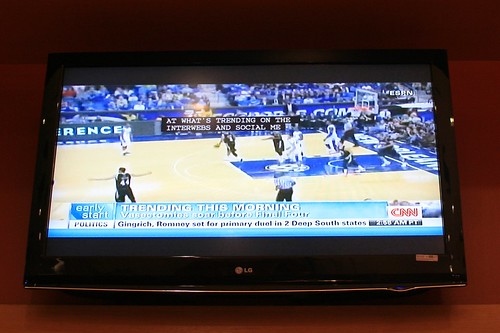
Stuck at the airport in Austin the other day, I couldn’t help being fascinated by the three TVs in a café. Each of them was on a different program (news + sport 1 + sport 2) and the sounds of each channel was mixed with the background noise of the place (+ music). The different device sit there all day and broadcast their message continuously.

This situation did not prevent the avid users to follow what was going on at the time, especially because of the weird subtitles appearing right in the middle of the screen (with a certain delay):


“… at what’s trending on the interwebs and social me…” says the CNN person.

Why do I blog this? Fascination towards the deluge of information appearing at 5am in a café, and by the “interface” tricks to let people grasp small bits from this.

Weekending 03182012

In Geneva, Nicolas returned from SXSW 2012 to give an afternoon workshop with students at the Swiss Institute of Technology in Lausanne (part of their semester project)… and work on the game controller project with Laurent Bolli. There’s indeed a new opportunity to show some joypads in a design exhibit. Since the official ones are currently on display at the Swiss Museum of Science-Fiction, there’s a need to find new angles… which we worked on last Friday. Apart from that, the book about this project is moving slowly (introduction ready, chapter 1 being half-baked) and we had phone calls with potential clients about ethnographic research for new product development.

After SXSW 2012, Julian headed back to Los Angeles Julian to jump back into working on the Project Audio stuff. Hardware for Marshall Stack should be done by the end of this week. There was also some work in the model shop to find space and make a business case for a new set of machines — a pick ‘n place machine for the electronics bay which will make assembly and prototyping cycles much faster. Otherwise, there was a fun interview on usethis.com.

And Fabien returned from vacation last Sunday.

How socialbots could influence changes in the social graph

Socialbots: voices from the fronts, in the last issue of ACM interactions, is an interesting multi-author piece about how socialbots, programs that operate autonomously on social networking sites recombine relationships within those sites and how their use may influence relationships among people. The different stories highlighted here shows how “digitization drives botification” and that when socialbots become sufficiently sophisticated, numerous, and embedded within the human systems within which they operate, these automated scripts can significantly shape those human systems.

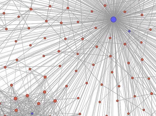
The most intriguing piece is about a competition to explore how socialbots could influence changes in the social graph of a subnetwork on Twitter. Each team of participants were tasked to build software robots that would ingratiate themselves into a target network of 500 Twitter users by following and trying to prompt responses from those users. Some excerpts about the strategies employed:

On tweak day we branched out in some new directions:

- Every so often James would send a random question to one of the 500 target users, explicitly ask for a follow from those that didn’t already follow back, or ask a nonfollowing user if James had done something to upset the target.

- Every time a target @replied to James, the bot would reply to them with a random, generic response, such as “right on baby!”, “lolariffic,” “sweet as,” or “hahahahah are you kidding me?” Any subsequent reply from a target would generate further random replies from the bot. James never immediately replied to any message, figuring that a delay of a couple of hours would help further explain the inevitable slight oddness of James’s replies. Some of the conversations reached a half-dozen exchanges.
- James sent “Follow Friday” (#FF) messages to all of his followers but also sent messages to all of his followers with our invented #WTF “Wednesday to Follow” hash tag on Wednesday. James tweeted these

shoutouts on Wednesday/Friday New Zealand time so that it was still Tuesday/Thursday in America. The date differences generated a few questions about the date (and more points for our team).

Why do I blog this? Because this kind of experiments can lead to informative insights about socialbots behavior and their cultural implications. The paper is a bit short about it but it would be good to know more about the results, people’s reactions, etc. This discussion about software behavior is definitely an important topic to address when it comes to robots, much more than the ones about zoomorphic or humanoid shapes.