Curious Rituals is a project about gestures, postures and rituals people adopt when using digital technologies. It’s both a book documenting gestures we observed, and a design fiction film that speculates about their evolution
Location: Los Angeles, USA Years: Summer 2012 Leader: Nicolas Nova Method: Ethnography and prototyping
The project was about gestures, postures and digital rituals that typically emerged with the use of digital technologies (computers, mobile phones, sensors, robots, etc.): gestures such as recalibrating your smartphone doing an horizontal 8 sign with your hand, the swiping of wallet with RFID cards in public transports, etc. These practices can be seen as the results of a co-construction between technical/physical constraints, contextual variables, designers intents and people’s understanding. We can see them as an intriguing focus of interest to envision the future of material culture.
The aim of the project was to envision the future of gestures and rituals based on:
A documentation of current digital gestures in a book format
[pullquote author=”FutureScapes”]FutureScapes is all about imagining what the world of 2025 will look like and the role technology could play in our lives.[/pullquote]
Sony put up these FutureScape videos — little design fiction films that introduce us to a conflicted world in the year 2025. This is design fiction par excellance at least insofar as we are effectively transported to this world as best as can be done for a little film. There is narrative punctuation that leads us through various epic events that have happened — we don’t need to know the intimate details of these events. Suffice it to say that political, economic and other struggles have swerved things as they always do. There are events, loosely referred to as “2021” — that are this future’s “9/11”. Etc.
As narrative, this sort of thign works. It does something to gradually get me out of the contingent moment and into the fun bits of the story so I can take it all in and see what that world might be like.
And, of course — it’s Sony so there’s going to be some technology. That part sorta sucks, I have to say. The technology is a bit much. It’s more than a prop; it’s a demo. And it’s all screens. Screens screens screen screens screens. Touch touch touch touch touch.
Okay. Fine. I’m the guy who’s looking for the other, other near futures. The one’s where we’ve moved along or took a swerve towards other interaction modalities. The future of UX and UI design seems to be stuck on a rail and no one is looking for anything else. I’m not saying that there *has to be something else; but what good is design if it doesn’t explore other interaction idioms? If it just makes fonts bigger and puts interactions on cupboards and walls? Seriously? Doesn’t that sound like fun? To challenge the existing dominant paradigm, if only to explore uncharted, unknown unknown territories?
I think the technology is fetishized way too much here. The tools are easy *and optimized for rendering and animating a specific kind of technology — touch screens/surfaces/planes. That optimization determines what will go into these design fictions. The tools predetermine the technological surround of these near future worlds that FutureScapes has produced.
But..that’s me. I’m sensitive to these sorts of things — the lineages of outcomes like this, where you wonder — how’d we get to this world of touch interaction? Was it because some films made it possible to cohere a speculative idea because some decision makers were enthralled with a visual spectacle and decided — hey, that’s the strategy. Touch-interactive cupboards and shelves!
You find this all the time. Poorly considered ideas that find their way in the world *somehow — and investigating the *somehow is useful. So too is realizing that you’re complicit in crap ideas if you get enthralled by a tool and over use it to the degree that someone assumes that this is the way things should be. I had a call with an engineer who thought our interaction design was too simple — one button — and should be ‘made better’ by adding a mobile phone interaction where you touch the mobile to the thing and, using NFC, the phone and the thing would connect and then a browser window pops open on the mobile and then you interact with the thing using the browser on the mobile to control the thing over Bluetooth so that anyone can do it.
*shrug.
Nip that sort of thing in the bud. What are the alternatives to consider besides what you see everywhere, or what you take for granted, or what is considered “hygiene” in your industry, or what cool new drop-down feature AfterEffects CS12 has, or what everyone else is doing, or what you think Steve or Sir Jony would do because you can get off their teet.
The other thing to say here is that the VFX amateurs are going bonkers with planar tracking. They love to track something in a scene and then put some semi-transparent animations of UI’s on it. They LOVE it. And then they move the camera a bit so it looks *real — like the UI is actually there in the thing and maybe it’s compelling enough that people think — huh, wow..is that real? At some point the VFX animation of planar tracked surfaces simply jumped the shark and now people do it cause they can. The VFX have determined the design. That’s bad design. Doing it cause you can, not cause you should.
And that, friends, is why we end up with a world of screen-based interactions. Because the folks at Imagineer System made the wonderful and wonderfully over-used Mocha Pro — a relatively inexpensive tool that anyone can use and — lo! — comes bundled with AfterEffects. There’s a criteria in there — when a tool becomes a *tool, rather than a bespoke, handcrafted workflow, then it’s sorta jumped the shark. I don’t blame them – Imagineer Systems. Maybe I blame Adobe a little. But, either way — I would expect more from those who use it to pull back a bit from making everything a planar interactive surface.
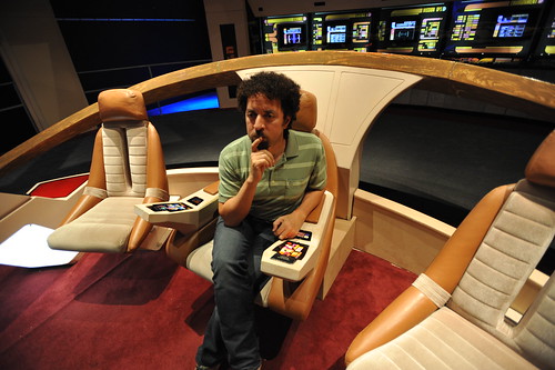
Your author, considering his solution to the Kobayashi Maru during a shake-out run on a Class D starship.
There was recently a wonderful article on Ars Technica interviewing the production and prop designers for Star Trek. I highly recommend giving it a read, even if you’re not a Trekkie. What I find most curious is the creative constraints that the production design was under and their solution. With a limited budget for doing lots of physical design, they decided to draw the user interfaces, rather than assemble them from hardware like knobs and buttons and so on. The idea of a screen-based display that would change based on what it needed to do — a “soft” interface — arose.
“The initial motivation for that was in fact cost,” Okuda explained. “Doing it purely as a graphic was considerably less expensive than buying electronic components. But very quickly we began to realize—as we figured out how these things would work and how someone would operate them, people would come to me and say, ‘What happens if I need to do this?’ Perhaps it was some action I hadn’t thought of, and we didn’t have a specific control for that. And I realized the proper answer to that was, ‘It’s in the software.’ All the things we needed could be software-definable.”
One of a sample of “Destination Maps” presented at SIGGRAPH Asia 2010 by a team of researchers. It shows a computer-generated emulation of the canonical napkin-style hand-drawn map. The described advantages are that it highlights relevant “neighborhood” streets and diminishes the arterials and highways that are not necessary and perhaps confusing for reaching the destination. It closes in on that typical style of map that was perhaps described best in Denis Wood’s “The Power of Maps” — the rough, perhaps off-scale map that gives the contours of a place and only what is roughly right and nearly necessary to navigate a place.
Some questions around this sort of map making:
* Why the use of kitsch-y napkin texture and the recognizable human-hand-hunting for lines with pencil? This idea of having the computer draw like a human seems a little dishonest, which puts me off. But, I suppose at the same time its recognizable and legible to people, which may make it more palatable and familiar, which I guess is something kitch is good at.
* I’m sure this is in the category of “it’s a prototype, relax” sort of thing, but shouldn’t the interstate highway signs be roughly-right, too?
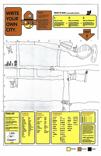
Related, just to keep the project in-mind, to the PDPal efforts to make roughly-right emotionally evocative personal maps — here’s one that was just the other day done by a friend’s young’n, by happy coincidence. I often think about this project and its relevance to what I still think is curious, intriguing and worth pondering over. Fascination with maps and cartography — mostly off-kilter, peculiar, provocative ways of making maps and exploring is super interesting to us here, especially the fellas smoothing parchment in the clean room on the 3rd floor.
cf. Mark Shepherd’s Serendipitor — an iPhone app to help you explore by creating unexpected routes from point A to point B. I’ve been mucking with this for a few weeks — very cool and fun. Not for anyone trying to just get from A to B, which isn’t always the most exciting way to explore.
cf. Designing for iPad, which has some nice remarks on the use of kitsch in interface design.
I can sum the last two weeks up briefly and, again — for my own record keeping. Nothing useful here, likely at all.
The week that ended on 08062010 had a couple of days off during which time I stayed here in LA and the super fun opportunity to photograph the X Games, ESPN’s blitz of extremely nutso sports.
The weekend before was the ThingM produced “Sketching in Hardware” event for 2010. It was held appropriately at the retro-future “Encounter” restaurant smack-dab in the middle of LAX. I presented a brief and generalized thoughts on the Design Fiction business. In the midst of it, I realized that this was an appropriate continuation of the previous three presentations at Sketching I had done. There was this theme of how making things is a way of answering questions, but pushing those questions beyond the pragmatic sort of prototyping — asking “wouldn’t it be cool if..?” and then answering that question by making something. I think this is a different approach from the more engineering-style prototyping which asks “I wonder if this put together with these other things will work?” The difference I was thinking about is that the former is closer to story, whereas the latter is more instrumental and less speculative. Or something.
I spent the weekend *trying to finish the 5000 words I was asked to put together for a keynote at this Swiss Design Network conference this fall. I think it sounds repetitive. I’m trying to find a way to write about design fiction genre conventions or, as Tim Dufree put it during the opening ceremonies for the Art Center’s “Made Up” summer studios “the lanugage of design fiction.”
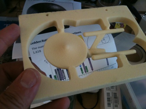
Found during the studio pack-up! I think Andrew made this to test the new CNC tool-pathing procedures that were made infinitely easier with the Nikolaj’s hard work.
We packed up the studio so all our *stuff that had been hiding and unnecessarily accumulating so it could be moved aside for new furniture which was generally grumbled about before it even was installed for a variety of reasons, mostly having to do with the inertia that settles around what you think is best for you because it’s already there and works fine. I straddled the line and, if I’m honest with myself, used the opportunity to grumble only because I felt grumbly. Now that the new stuff has been in for a week, it’s an awesomely refreshing change. No over head storage (grumble..sour looks..) means more light (aaaaAAAAH..unicorn-y twinkle noises..) and I can actually see across the entire studio (hip-hip-hooray! my other studio mates!).
Last week was mostly a week of trying to design UIs back and forth from UI principles. It’s hard work, as in bailing hay hard work and by that I mean I feel this delicate balance between knowing what’s right and hearing in my head the voices of people who might be, like..that? It’s all wrong. Where’s the Augmented Reality Door Knob we’re meant to have attached to the side?
*shrug*
I looked over the original Drift Deck notes and spreadsheets — I need, need, need to write up another 20 or so cards to bring the deck for the digital edition up to 52. No big deal — it just needs to get done.
I got some new Laboratory work gear to make for some of our associates for putting in work on the Laboratory’s projects.
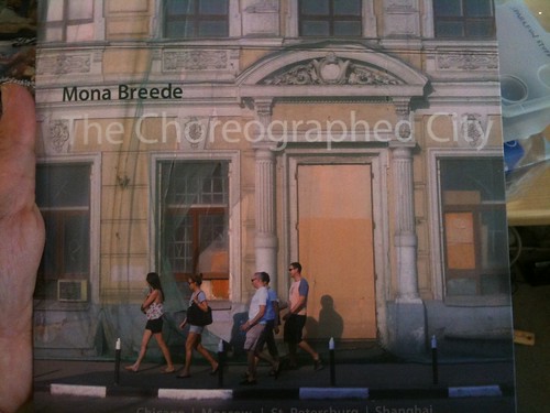
Wonderful book of photography by Mona Breede, also found (never lost, just made apparent from beneath the overwhelming piles of stuff and shelves of books.)
Why do I blog this? I missed the week before, so I’m catching up. And I find it extraordinarily useful to have this running log of what I’ve been doing, when and with whom. Continue reading Weeksendings 07302010 and 08062010