Why Silicon Valley Hates TBD Catalog

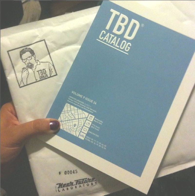
TBD Catalog. It started as a workshop-based collaboration with 19 humans and a few algorithms who willingly allowed me to shepherd them through the thoughts in my head and help show what the world may be like in some odd but likely near future — represented as a product catalog rather than some old-fashioned output like a white paper or blog post.

TBD Catalog tells a story about the world we are likely to inhabit if the current moment’s exuberance for the things it gets exuberant about continues at its boom-bust cycle pace.

What exuberance am I talking about?

This exuberance for “disruption”, handcrafted algorithms, security, 3D printers, The Cloud, luxury-bespoke bicycle seats, bigger and bigger self-serving Big Data “data points”, stacks and stacks of weird service APIs, consumer-focused technical gadgets, an Internet of Things where everything is connected to everything (whatever that means), food printers, the end of privacy, algorithmic publishers beating up normal publishers, artisanal hand crafted lickity-split buzzy drone delivery, hype-curves with spectacular riches at the end, connected toilets, saws & axes, and etcetera.

This is an exuberance that we might generally localize to Silicon Valley California. It can now be said that this exuberance has spread to other geographic centers of unbridled enthusiasm, what with the San Francisco/Silicon Valley sprawl bursting at the seams with its $5000 a month studio “apartments” and its general lack of space for people to live and work and get a goddamn burrito that actually makes sense.

Maybe that’s not fair.

DonnelProfessionalDataEnlargement-01

Hold on — yes it is.

Although, okay — to appear to be fair I’ll say that Silicon Valley isn’t all that bad, even if it is sometimes quite severely selfish and myopically misguided.

A guy in his living room with a six pack of beer can have some bad ideas about what to do in the afternoon — shoot tin cans off the back fence, surveil his neighbor with a drone, maybe do dirt bike donuts on his neighbors front yard after those beers are gone.

A guy in his living room with $6 billion can have a normatively bad idea about what to do, and do real damage to normal, ordinary everyday humans.

Wait. Where was I?

megmulsy-TBD-2014-08-24_06-46-28

Oh right. TBD Catalog. A catalog of ideas, extrapolations, insights, points of view, opinions, statistically likely conclusions, satire (which is only satire until it comes to pass, like an App that says “Yo!” which would’ve been the kernel of a good joke until someone thought it would make a better App than a joke and now it’s no longer funny) — all represented as stuff that goes in your home. It’s also the weird crap you find at the checkout counter of your local corner convenience store. And your friendly, neighborhood Data Plumber who advertises on a badly Xeroxed flyer crumpled and shoved through your mail slot or slipped under the windshield wipers of your used self-driving Hyundai Siestafore..the one with the hacked Android DriveOS so you can take it off-road on the weekends without the disturbingly angelic Johannson bot voice you lease for $3.99/month warning you every 15 seconds “Parker..you’ve strayed off course. Please return to Highway 101.”

TBD Catalog is a container of ideas — some which may come to pass, some which probably already exist, some which definitely already exist in some form and some other things that are just plain brilliant ideas that no one in their right mind would dedicate a single dollar bill to create. Cause #ROI.

What is this TBD Catalog then? What does it do that these pre-modern techniques for creative strategizing do not do?

Design Fiction

It’s a collection of micro-fictions, little stories done up to take the form of a product catalog. They are symptoms of a future world. Each product an implication — all collectively implying the lived experience of someone’s likely normal ordinary everyday near future habitat. These are evocative little Macguffin-like clues at what you know may likely come to pass.

Producing a hint of a whiff of the near future is an alternative narrative strategy to the grand vision the old-fashioned futurists were likely to offer. And, ultimately — it’s this alternative narrative element that the PowerPoint deck and the ThinkTank white paper cannot offer. Those simply kill the fun in good, creative design work. They deaden the creative nervous system ruining the possibility of doing good design — of feeling inspired and invigorated. No one was ever invigorated by your typical PowerPoint or 87 page White Paper, were they?

Internet of Things Design Fiction

What are some of these Macguffins? TBD Catalog includes everything. Food to toilets. End-to-end solution, as they say. Life, love, loss, loungewear. From the future of ice cubes to the disposal of 3D printer waste material to “revolutionary” wound-spring PowerPaks.

In TBD Catalog you’ll find a whole thriving business ecosystem of data mangling and an underground of techniques and instruments to allow one to commit “servicide” — that’s social network suicide. There’s everything from shoddy, rusted out old surplus data manglers to the valet-clad, braided epaulet luxury vacation packages where you and your loved ones can hide or expunge all your data trail with the exclusivity and privacy you’ve come to expect from your privileged life.

Algoriture Design Fiction

JCB_20082014_193621_7567_ScreenRes

What sort of world does TBD Catalog come from? What is that near future it is telling us we may likely occupy?

It’s a world where Google and Facebook (or whatever they become) use data analytics to find your child’s perfect algorithmically matched playmate — and their probable soul mate.

It’s an “Internet of Things” world where everything, including the glass you drink with, the bar stool you sit on, and the bathroom door you lock behind you, is connected to everything else.

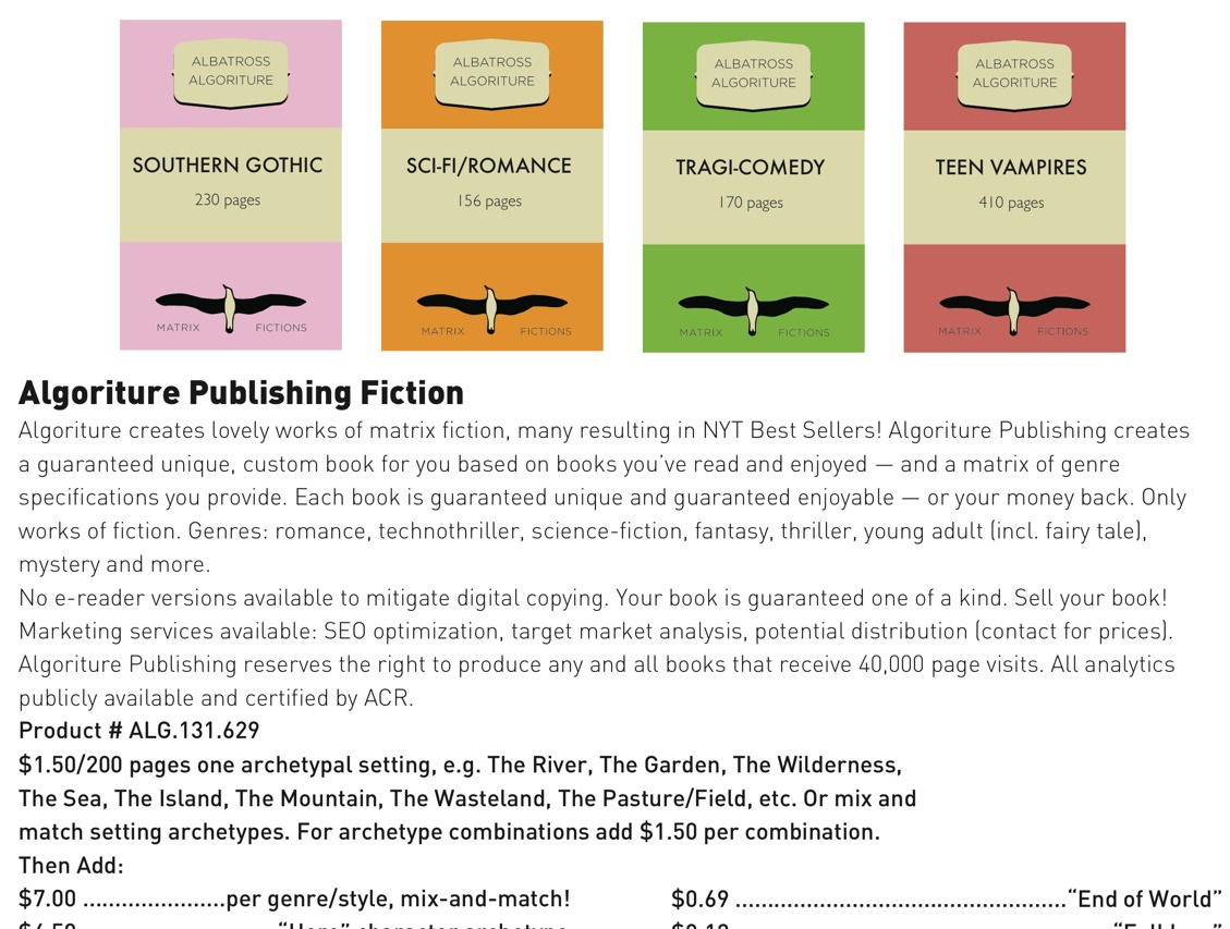
It’s a world where bland “Algoriture” algorithmic literature are written by Amazon’s data analytic-fed intelligent bots rather than normal, human authors.

Design Fiction

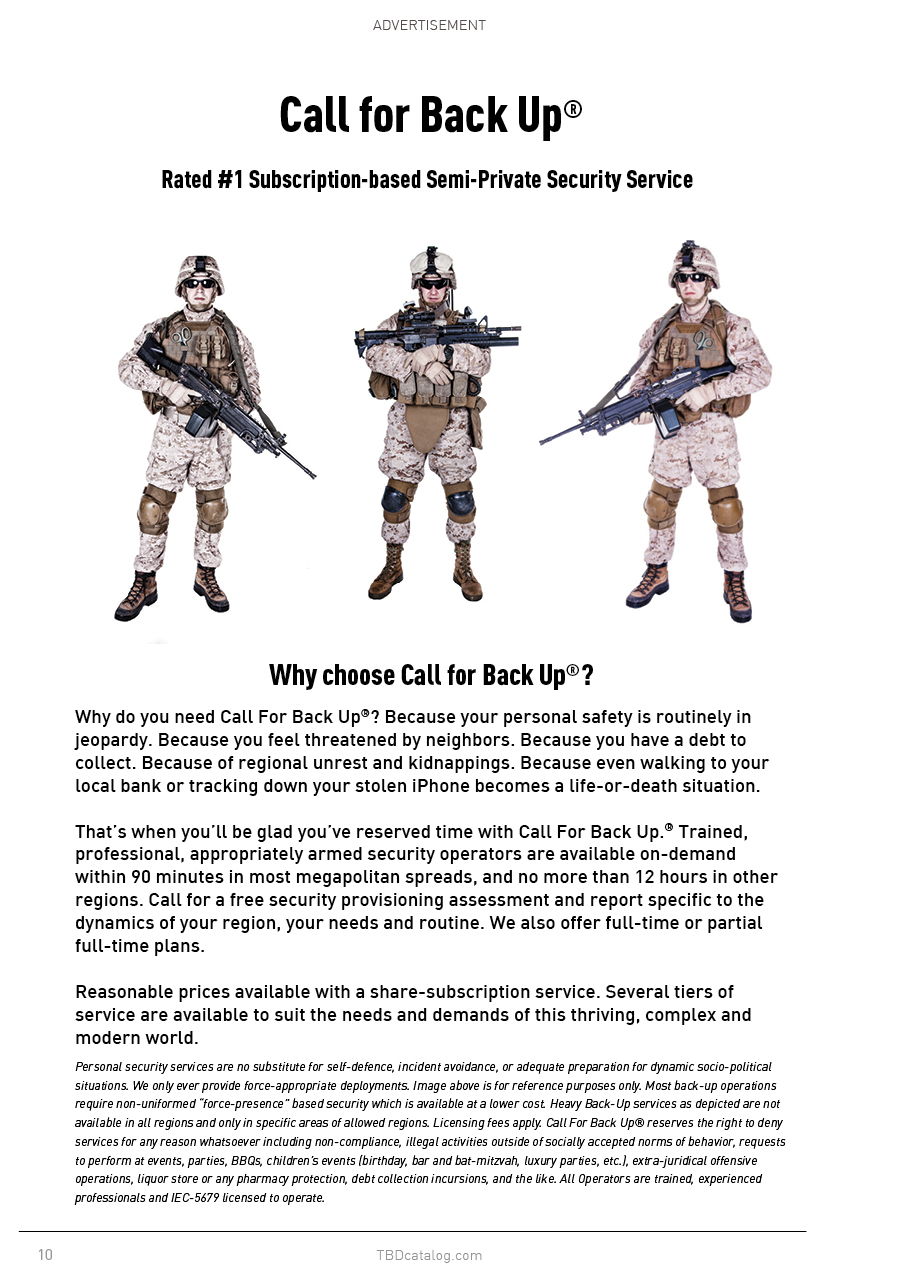
TBD Catalog intimates a world in which the well-heeled summon — as they do Uber cars today — on-demand force-presence security operators to help them recover their lost or stolen iPhone or shepherd them around Burning Man or Coachella.

In the near future of TBD Catalog luxury ice cubes are available for an extra fee in a drought-burdened world, 3D printers require child-safe locks to prevent printing choking hazards, modern plumbers plumb the erratic, clogged data drains of your analytics-generating connected home, and the number one film is 48% crowd funded and 64% algorithm written and the director is a bit of software written by some programmer in Sierra Leone.

BeholdDesignFiction

That’s TBD Catalog. That’s the “what.”

In Part 2, I’ll talk about Design Fiction — the “how.”

For now — check out TBD Catalog and get your copy. Also, read @sarahrich’s review: Your Mail-Order Future

The Future Silicon Valley’s Billionaires Don’t Want You To See

JCB_20082014_195202_7606-Edit

I want to share with you the latest book project from the Near Future Laboratory. It’s called TBD Catalog — the Design Fiction product catalog for the normal ordinary everyday near future.

You can get your own copy of TBD Catalog here in our own shop. We’re also a publisher now, in the modern sense.

TBD Catalog contains 166 products, 62 classifieds and advertisements to tell little stories about the world we are likely to inhabit if the exuberant venture capitalist handlers and computer programming day laborers of Silicon Valley have their way.

It’s a future quite different from the perfect, seamless, integrated, one-touch, Cloud-based advertising fakery used to make your pupils dilate with “wantfulness” — a want for cute connected family robots, software and plastic dongles ‘made with love’ and self-driving cars with impish earnest eager bumper faces and $9 drip coffee made with algorithmic precision and ordered ahead from an App.

The future represented in TBD Catalog starts with Silicon Valley’s breathless visions — and plops it down on the counter of your corner bodega. This is the future that comes in party colors. It’s the 3/$1.00 and buy one get one free future. Got your iPhone stolen? In the TBD future, if you’ve got ‘Find My Phone’ enabled, just use your Call For Backup App — we’ll send some licensed and disciplined toughs fresh back from Spec-Ops to knock on doors, fold their arms and growl imposingly if necessary. It’s the Uber of semi-private personal security.


Design Fiction


Design Fiction


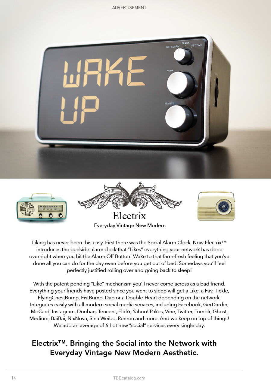
With TBD Catalog our technique for employing Design Fiction was to follow today’s major “tech” trends and see where their hyperbole might likely wind up in some likely normal ordinary everyday near future — 3D Printers; Internet of Things; the Algorithmic Life; The Cloud; Machine Intelligence; New Funding Models; Mass Customization; Etcetera.

The TBD Catalog future is the near future ordinary. The constant low power and exploding battery future. The bad firmware bricked $800 device future. The lousy customer service phone menu UX and busted algorithms that send a hundred emails to the same customer and shift-reload doesn’t clear the error future. The bad monopoly network service conglomerate run like an accounting firm future.

That world. The one when ‘now’ becomes ‘then’ — after all the glitzy wearables/internet-of-things/self-driving car Kickstarter advertising TechCrunch blogger promises dull to their likely normal.

We did TBD Catalog because no one else has done so much to tell a story about the likely future beyond excruciating, mind-numbing white papers, link-bait blog posts and breathless “insights” from strategy agency reports that read as though they’re in league with the pundits who all basically work for the startups anyway. We wanted a perspective that was engaging, entertaining and probable while also insightful, generative and provocative.

Take a look around amongst the strata of futurists, insights reports, strategy assessments, TED Talks and the like. There is little to go on to ruminate about these trends beyond the vague “imagine a world..” fantasy scenarios and dreamy video pitches with earnest mandolin soundtracks. There are scant stories about a world when these trend-things are fully-vested within our lives in a way that doesn’t seem like the boom-cycle perfect world advertisement where we 3D print fresh licensed Opiline knife sets. The stories we get are either perfect utopia futures or the robot-zombie apocalyptic busted future with fascist jetpack cops chasing down malcontents.

TBD Catalog cuts through the middle to tell stories from a world where Nobel Prize winning technology is sitting on the counter of your corner liquor store in 23 different colors, all with a keychain and instructions on how to entertain your cat. This “ordinary” story is the one we’re working towards. These are the stories that are in short supply. Stories about our world when the extraordinary idea makes its inevitable journey to become the ordinary commodity thing that occasionally needs repair or a software patch for a security flaw.

TBD Catalog creates these sorts of stories by hinting at the implications of today’s ‘disruptions’ — by representing the kinds of products and services we might imagine in the near future and implying little corners of that near future world and the social lives around it. In TBD Catalog each product, service, classified advertisement and customer review is a bit of Design Fiction — a mix of trending topic plus designed object plus a small evocative story-description. Each Design Fiction is a little story about life in our likely near future world.

What are some of the stories in TBD Catalog?

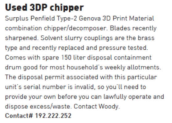
TBD Catalog tells a story about a world in which every household has as many 3D printers as they now have electric toothbrushes, and a lease-licensed 3D printer material waste disposal unit.


Design Fiction


Algoriture Design Fiction


TBD Catalog reveals a world with bland “Algoriture” algorithmic literature optimized for trends, tastes and expectations and written by Amazon’s data analytic-fed intelligent bots rather than normal, human authors.

What about a world in which algorithms are so trusted, we allow them to find a playmate for our children, or the perfect “soul mate” for ourselves when we turn 18.

Internet of Things Design Fiction


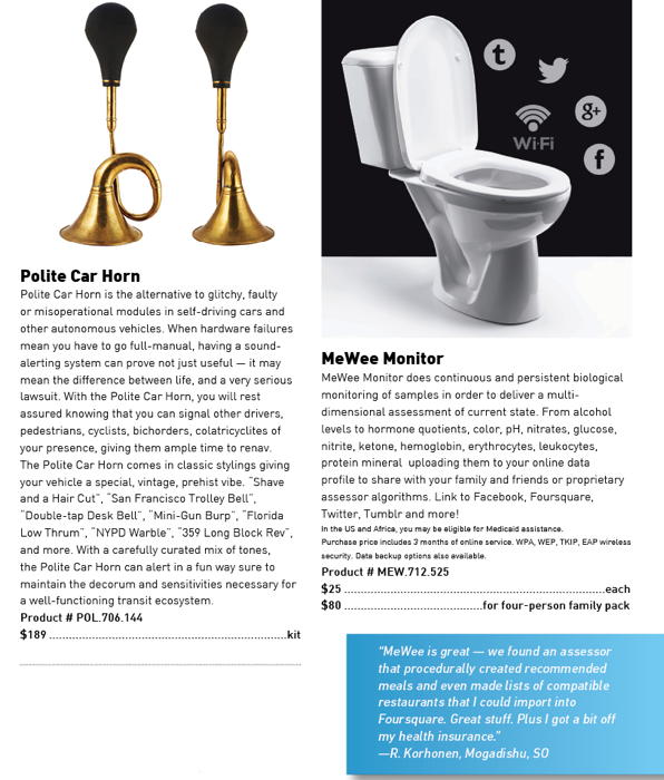
MeWee Monitor hints at what an Internet of Things world might look like if everything — the glass you drink with, the bar stool you sit on, and the bathroom door you lock behind you and the chamber pot you sit upon  — is connected to everything else, and lets the world know what it’s doing.

Why did we do a product catalog from a likely future? The Near Future Laboratory is of the opinion that whatever “comes next” should be prototyped not just in hardware and software (which we do, and enjoy) but through compelling, engaging, tangible moments that play out near future scenarios. Not only the spot-on-perfect advertiser-scripted scenarios, but the more likely and realistic moments as well. This sort of prototyping has imminent value as a means of shaping an idea, reflecting on contingencies, making things better and feel more full-vested in the world.

Design Fiction is a form of prototyping an idea. It’s a way of  reflection that can take an idea, trend or concept and intimate it in a more material form that can generate conversations that then reshape the idea into something better. Design Fictions have a remarkable ability to make that materialized concept come to life in a much more embodied way than specifications, one-pager or items in a PowerPoint bullet list. TBD Catalog’s Design Fictions take the promise of extraordinary and weird Silicon Valley aspirations and turn them into the normal and ordinary props that come to life as part of our everyday lives.

Design Fictions have exceptional value from a pragmatic perspective. They are more than entertainment. Design Fiction can operate as a viable approach to design itself — a form of exercising hunches without committing to full-blown execution. Design Fiction can find the tangential implications and alternative possibilities of your instincts — and then show a path forward towards sketching, testing and materializing your ideas. As a catalog in which your idea might exist in the future. As a fictionalized quick start guide. As an instruction manual or bug report. As a blogger’s review or customer service script.

Design Fiction is a creative instrument. It is truly a form of prototyping. It is an approach to design and strategic foresight that is actually generative. Design Fictions provide the basis for viable ideas, even in the idiom of satire. In their second reads, they become more — each of the 166 products has a “..huh” moment. There are dozens and dozens of Kickstarters in here, surely. And a few things in TBD Catalog we here at the Near Future Laboratory have actually prototyped — for real. Even some we’re pursuing after having our own “..huh..that could work..” revelation.

Let me be clear — we here are not opposed to the “next new thing.”  We are eager to entertain. But also — we focus on creating ‘next new things’ everyday. TBD Catalog is meant to remind us that every cool trend, every ‘wow’ gadget, and even some Nobel Prize-winning technologies become entertainment devices for our house cats or a faster way to stream crappy online ads. We need those kinds of likely near future representations — as alternative as they are to the glowing reports in your favorite trends blog — to focus ourselves on the challenges this world faces in light of rapidly changing behaviors, expectations, desires, rituals and algorithms.

Welcome to your near future normal ordinary everyday.

======
Buy TBD Catalog
Check out the work kit we used to create the products
Read more about Design Fiction

D&F: A Design & Fiction Evening

Design & Fiction

https://designandfiction.eventbrite.com

We are the Near Future Laboratory. Welcome to us.

On Thursday October 24th we would like to meet up with you to talk about design. And fiction. And the ways of approaching the challenge of all challenges, whatever it may be. We’ll talk about expressing the opportunities those challenges raise as distinctly new tangible forms. As well as the essential value of mundane design.

We’ll talk about clarifying the present. We’ll talk about designing the future. And doing both of these things with design. And fiction.

Come and enjoy. We’ll be us, and we’ll also be James Bridle, a friend of ours.
There will be two and a half free regional beers for everyone.
Space is limited because we’re in a room. Sign up on Eventbrite, or you may become deflated.

WE'RE SERIOUS: EVEN THOUGH THIS IS A FREE EVENT, YOU MUST BE TICKETED TO ENTER. PLEASE DON'T SHOW UP WITHOUT A TICKET AS WE PROBABLY WON'T BE ABLE TO LET YOU IN.

Green Pages

Nick and I came back again to the Emerge 2013 event at Arizona State University to workshop an issue of “Green Pages”, the Laboratory’s ‘Quarterly Design & Technology Fiction Almanac.’

For those of you who haven’t subscribed, or don’t know about it, Green Pages is Design Fiction operationalized. Green Pages makes Design Fiction into something the entertainment industry can use directly.

In Part 1 of each issue we curate a careful selection of imminent and emerging technologies, provide a brief on each. In Part 2 we select a number of these and provide authored narrative and cinematic elements that are one-page diegetic prototypes, elements of fictions, Macguffins, props, prototypes, conceits, etc.

An example of Part 2 would be a one page plot synopsis, or a bit of production design for a prop informed by one of the technologies introduced in the issue.

The stories in Part 2 for this issue are especially good. They do not make the technical element central, but rather use it as stimulus for a proper narrative. We spent a lot of time unearthing good, dramatic, character-driven stuff that wasn’t ham-fisted techno-thriller fodder. I’m excited by these stories — they’re quite compelling, evocative moments of larger dramas that could easily see their way to being produced in some form — film, pilot, novel, etc.

Since this is the first time we’ve mentioned Green Pages here on the blog, I should say that it is a trade publication — it’s not an art project, or flight of design fancy. It’s an edited journal for a specific trade audience — producers, agents, writers, production designers, directors, etc. It’s not a PDF — we print it, authenticate each copy of each issue, and mail them out like normal, human print publications.

There has been interest beyond Hollywood for a publication like this. That’s partially because of the content but also some interest in the approach we take to translating raw technology ideas into compelling narratives — scenarios, they’re called in other domains.

For the workshop here at Emerge 2013, we thought the general approach to creating these Design Fictions and diegetic prototypes would be a worthwhile learning experience for folks at a large research university like ASU. For example, engineers and scientists who perhaps could learn how to translate technical stuff into compelling stories that help them round out the purely technical idea (wireless power distribution, for example) with issues and implications in a broader sense. Working in a room with engineers, policy gurus, creative writers all at once — everyone with their game-face on — was truly exciting and extremely productive. We had some excellent, exciting starters .We managed to get a solid bit of work on them the first day. Then on the second day we had some super exciting creative work — a screenplay excerpt, page one of a novel, a film synopsis, character casting notes and production design for a key prop of eco-thriller.

We’ll be working over the next weeks to clean up the material — in one and a half days it’s difficult to really complete a full issue, printing and binding and all that. But we were able to get the core done and hand out a few to the Emerge participants.

Good stuff.


Arizona, February 2013

From the desk of The Editors

Welcome to Issue 7 of Green Pages.

This is a milestone issue for a number of reasons.

Firstly, our subscriptions have more than doubled since we first launched — and that happened entirely by word of mouth. This kind of growth is unprecedented in the trade journal world.

We’ve also received an unprecedented number of recommendations from you, our subscribers, recommending colleagues for a complimentary issue. Thank you for the suggestions. We are working hard to follow through and vet your nominations.

We’re also excited because this issue was done in collaboration with the Arizona State University’s Center for Science and the Imagination. This is the first time we’ve worked directly with a major research university. We hope this will set a new precedent for the way we create and curate our content.

Inside this issue you’ll find a diverse collection of our front pages containing concepts that range from biotech to counter-surveillance to prosthetic enhancements. There’s Swarm Robotics, Encoded Ballistics, Image-based Diagnostics, Foliage Penetrating Radar, Lab Grown Bone, Afterlife Cells, Surveillance Drone Mitigation, Depression Detection Systems, Lighter Than Air Vehicles, Billion Pixel Camera, Digitigrade Prostheses, Tracheal Scrubbers, Data Magnets, Predictive Vaccines, Nanoturbine Surfaces, Organ Printing, ‘Miracle Salt’, Svalbard Gene & Seed Bank, Vortex Ring Gun, and more. There are some very exciting, provocative research projects that are easily extended into the realm of story telling — and not all as purely techno-thrillers. We’ve developed several of these into one pages conceits and précis both cinematic and traditional narrative-based. We have some evocative production design as well.

Overall, we’re quite happy with this issue. We hope you enjoy it.

Dr. Bleecker and Mr. Foster (Eds.)

Curious Rituals

Curious Rituals is a project about gestures, postures and rituals people adopt when using digital technologies. It’s both a book documenting gestures we observed, and a design fiction film that speculates about their evolution

Location: Los Angeles, USA
Years: Summer 2012
Leader: Nicolas Nova
Method: Ethnography and prototyping

Curious Rituals was a research project conducted at Art Center College of Design (Pasadena) in July-August 2012 by Nicolas Nova (The Near Future Laboratory / HEAD-Genève), Katherine Miyake, Nancy Kwon and Walton Chiu from the media design program.

The project was about gestures, postures and digital rituals that typically emerged with the use of digital technologies (computers, mobile phones, sensors, robots, etc.): gestures such as recalibrating your smartphone doing an horizontal 8 sign with your hand, the swiping of wallet with RFID cards in public transports, etc. These practices can be seen as the results of a co-construction between technical/physical constraints, contextual variables, designers intents and people’s understanding. We can see them as an intriguing focus of interest to envision the future of material culture.

The aim of the project was to envision the future of gestures and rituals based on:

  1. A documentation of current digital gestures in a book format
  2. The making of a design fiction film that speculate about their evolution

“Curious Rituals” was produced as part of a research residency in the Media Design Program at Art Center College of Design in Pasadena, California.

A Screen-y FutureScape-y 2025

[pullquote author=”FutureScapes”]FutureScapes is all about imagining what the world of 2025 will look like and the role technology could play in our lives.[/pullquote]

Sony put up these FutureScape videos — little design fiction films that introduce us to a conflicted world in the year 2025. This is design fiction par excellance at least insofar as we are effectively transported to this world as best as can be done for a little film. There is narrative punctuation that leads us through various epic events that have happened — we don’t need to know the intimate details of these events. Suffice it to say that political, economic and other struggles have swerved things as they always do. There are events, loosely referred to as “2021” — that are this future’s “9/11”. Etc.

As narrative, this sort of thign works. It does something to gradually get me out of the contingent moment and into the fun bits of the story so I can take it all in and see what that world might be like.

And, of course — it’s Sony so there’s going to be some technology. That part sorta sucks, I have to say. The technology is a bit much. It’s more than a prop; it’s a demo. And it’s all screens. Screens screens screen screens screens. Touch touch touch touch touch.

Okay. Fine. I’m the guy who’s looking for the other, other near futures. The one’s where we’ve moved along or took a swerve towards other interaction modalities. The future of UX and UI design seems to be stuck on a rail and no one is looking for anything else. I’m not saying that there *has to be something else; but what good is design if it doesn’t explore other interaction idioms? If it just makes fonts bigger and puts interactions on cupboards and walls? Seriously? Doesn’t that sound like fun? To challenge the existing dominant paradigm, if only to explore uncharted, unknown unknown territories?

I think the technology is fetishized way too much here. The tools are easy *and optimized for rendering and animating a specific kind of technology — touch screens/surfaces/planes. That optimization determines what will go into these design fictions. The tools predetermine the technological surround of these near future worlds that FutureScapes has produced.

But..that’s me. I’m sensitive to these sorts of things — the lineages of outcomes like this, where you wonder — how’d we get to this world of touch interaction? Was it because some films made it possible to cohere a speculative idea because some decision makers were enthralled with a visual spectacle and decided — hey, that’s the strategy. Touch-interactive cupboards and shelves!

You find this all the time. Poorly considered ideas that find their way in the world *somehow — and investigating the *somehow is useful. So too is realizing that you’re complicit in crap ideas if you get enthralled by a tool and over use it to the degree that someone assumes that this is the way things should be. I had a call with an engineer who thought our interaction design was too simple — one button — and should be ‘made better’ by adding a mobile phone interaction where you touch the mobile to the thing and, using NFC, the phone and the thing would connect and then a browser window pops open on the mobile and then you interact with the thing using the browser on the mobile to control the thing over Bluetooth so that anyone can do it.

*shrug.

Nip that sort of thing in the bud. What are the alternatives to consider besides what you see everywhere, or what you take for granted, or what is considered “hygiene” in your industry, or what cool new drop-down feature AfterEffects CS12 has, or what everyone else is doing, or what you think Steve or Sir Jony would do because you can get off their teet.

The other thing to say here is that the VFX amateurs are going bonkers with planar tracking. They love to track something in a scene and then put some semi-transparent animations of UI’s on it. They LOVE it. And then they move the camera a bit so it looks *real — like the UI is actually there in the thing and maybe it’s compelling enough that people think — huh, wow..is that real? At some point the VFX animation of planar tracked surfaces simply jumped the shark and now people do it cause they can. The VFX have determined the design. That’s bad design. Doing it cause you can, not cause you should.

And that, friends, is why we end up with a world of screen-based interactions. Because the folks at Imagineer System made the wonderful and wonderfully over-used Mocha Pro — a relatively inexpensive tool that anyone can use and — lo! — comes bundled with AfterEffects. There’s a criteria in there — when a tool becomes a *tool, rather than a bespoke, handcrafted workflow, then it’s sorta jumped the shark. I don’t blame them – Imagineer Systems. Maybe I blame Adobe a little. But, either way — I would expect more from those who use it to pull back a bit from making everything a planar interactive surface.


Continue reading A Screen-y FutureScape-y 2025

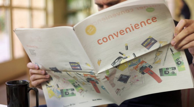
Convenience

We made a newspaper through our friends at RIG‘s lovely Newspaper Club service. We — myself, Nick Foster, Nicolas Nova and Rhys Newman — collaborated on this. (Rhys did the lovely drawings, by the way.)

We printed a hundred or so. They’re real physical things of course. But you can also download a PDF of Convenience.

The newspaper is called Convenience and it’s based on the hypothesis that all great innovations and inventions find their way into the Corner Convenience store. Take for example, the nine we selected to feature in the newspaper, amongst a couple dozen:


AA Battery (Power)
BiC Cristal Pen (Writing)
Eveready LED Flashlight (Light..and laser light!)
Durex Condom (Prophylactic)
Reading Spectacles
Map (Cartography/way-finding)
BiC Lighter (Fire)
Disposable Camera (Memory)
Wristwatch (Time)

It’s a hypothesis designed to provoke consideration as to the trajectory of ideas from mind-bogglingly fascinating and world-changing when they first appear to numbingly routine and even dull by the time they commodify, optimize and efficient-ize By then, they become so mundane, quotidian and routine that the only way to enliven them is to offer sales discounts (3 for 99¢), packaging copy eye candy (New! Comes with batteries!), color variants, add a few new bells and whistles (Copper Top! Sensually Lubricated!, all done in remarkably infinite variety and a good dose of insight on human impulse and psychology by our friends downstairs in brand marketing.

In the paper, each of our nine items gets a bit of a mini dossier. Where, when, how, how long, by whom? And we have an op-ed section. The over-arching implications here are to consider that great things need not be whiz-bang, flash-bang Military robots+monkeys sorts of things. Or even sleek screen-y things. Innovation can happen in the decidedly less celebrated, less red carpeted approach of just making little things much better and settling for small, deeply impactful implications.

In the paper we also have a center piece that reminds us of the role the Corner Convenience has played in the modern cultural barometer of popular cinema. We did that center section because much of out thinking centered around the quotidian character of the Corner Convenience as represented in film. But also — @fosta and I now here at Emerge 2012 at the Arizona State University in Tempe Arizona (following along at #emerge2012asu) to conduct a Design Fiction workshop.

Our locus of interest? The Corner Convenience of the near future, of course! We are asking ourselves through filmmaking — what will be in the Corner Convenience in a four or five years time? We want to make our own little films to exhibit those things using the styles and genre conventions of Design Fiction.

Corner Convenience

This is where we are, at the counter of your local convenience store — the corner bodega, kiosk, liquor store, small grocer. We could be at the independent certainly. Increasingly we’d find ourselves at any of a number of global chain stores — 7-Eleven, Express Mart, AMPM, A-Z Mart, Get Go, Get n Go, Stop’n’Go, QuickCheck, QuikStop, Kwik Shop, One Stop, Store 24, 7/24, Ministop, R-kioski, Circle K, Kroger, Wawa, Relay, Żabka, Lawson, All Days, In & Out, Convenio, Everyday, Spar.

Just call it Corner Convenience.

Let’s ask ourselves — what makes these stores convenient? It didn’t take long to get here so we’d have to say that location for most of us would be synonymous with convenience.

Next might be the hours the Corner Convenience keeps. This measure of convenience often appears as a kind of subtitle to the store name. “Open 24 hours”, “Open Day & Night”, “Day and Night Liquors”, “We Never Close”.

They are off of every exit on any highway. Around every corner of most neighborhoods. They say they never close. It’s 1:14am. You need gasoline. Turn right.

Summon the image of a weary, pimply-faced 20 year-old Guatamalean immigrant seen safely time-locked into his protected cash register cage in a small beach town in Southern California. We’re free to wander the store — a few aisles of chips, meat jerky, king size candy bars, breath fresheners, throat lozenges, bubble gum, rotissing hotdogs, magazines. Behind two epic walls of built-in refrigerators — bottles of bottled water with excruciatingly meaningless packaging variations, whole milk, low-fat milk, half-and-half, Florida orange juice, orange drink, things to drink, junky pep drinks, Coca-Cola, Pepsi, Monster, fancy Woodchuck Cider nestled by a small scrum of chilly, perspiring white wines, and then a formidable flank of a regional workmen’s after work favorites including 24oz Budweiser Clamato and its variations. Locked safe in the after hours attendant’s cage — ciggies, flavored cigarellos, Zig-Zag papers, condoms, herbal supplement packets for endurance and fortitude, lighters, batteries, laser pointers, analgesics three varieties of aspirin, and some flavorful cough suppressants.

The attendant-cashier idly scrolls through text messages — or electronic mail, or news from home, or considers a death-blow of a move in the Words with Friends game he’s playing with a cousin in Arizona, or updates his Facebook profile photo, or Tweets that he’s bored to 740 followers..it’s hard to tell from behind the 3/4 inch bullet proof. And I don’t really care if he’s amazingly sending digitally encoded radio transmissions to outer space and back because I’ve just bought $53 of Saudi gold. It came over the Atlantic and through the Panama canal in an oil tanker just for me.

The Corner Convenience is a vault containing the treasures of great, world-changing innovations throughout all histories. Truly. We should see our Corner Convenience as a living Neighborhood Museum of Innovation. Someone should enshrine these and teach the lesson to every secondary school student. Think of the product tie-ins. There could be an international holiday commemorating the deep-seated history of innovation in your local 7-Eleven. Where are the brand marketing people? They’ve dropped the ball on this one.

We have at our finger tips the things no one would have taken for granted 50, 100, 200, 500, 10000, 500,000 years ago. There it all is. Fire, for chrissake — and disposable? In any color one would like, or with your favorite sports team printed on it? Are you kidding me? Flick and fire. Flick and fire.

Have an achy head? No leaches at hand? Don’t feel like chewing on the bark of a Slippery Elm? Well — have some acetylsalicylic suspended in a dissolving capsule that you swallow. Nothing to swallow it with? Have some fresh, filtered water, brought to you by truck and ship and conveniently packaged in a dubious plastic bottle. Feeling randy, but not ready to start a family? Pick your variety, shape, size, texture, degree-of-package-salaciousness condom. Concerned about performance? Have a grab-bag of herbal fortitude. Need to make a phone call to *anywhere? Get a disposable cell phone, talk for 120 minutes then throw it out.

It’s all right there. Selection, variety, color — sure, we expect that. But do we stop to marvel at the epic travels in space, time, refinement, iteration, industrialization these mundane, ordinary conveniences have made?

Convenience is the name of the awards ceremony at which capitalism admires itself. Convenience is the final measure of mass production’s success. It is the asymptotic long-tail of industrialization, a tail whose zero is 99¢, 3 for 1, buy-one-get-one-free. Industrialization is found in the rash-dash coupon books that litter our recycling bins. It is the baroque, oddly seductive sales circulars encouraging us to tramp down to our local shop and get a dozen eggs, a flank of beefsteak or a case of birdshot. We find industrialization tucked into the ad supplements of old-fashioned newspapers — the paper newspapers — reminding us that we might need a ream of sustainably farm-harvested non-toxic bleached white paper for our $99 laser light powered printing press.

How do we applaud convenience? Does it represent success insofar as much of the world — though certainly not all — soaks in it? Is Henry Ford, godfather of industrialization, doing an exuberant, boastful Running Man in his mausoleum? “I done done it! I done done it! I done toldya! I done toldya! You know you waaaant it! You know you waaaant it!”

If it is success, it is a conflicted one. No proper post-disciplinary, post-modern Industrial Designer truly *wants their work to end up in the Corner Convenience. That is unless they have fully embraced this sparkly, polished Muzak-filled museum of over-produced, barely distinguished things. They must make peace with the fine folks in brand marketing, the high priests of endless variation and spell-casters of seduction. (We shouldn’t dismiss the Industrial Designer’s dream for another sort of Corner Convenience, albeit of a different register. The convenience store that embraces the mass industrialized infamy of the considered and crafted — Design Within Reach.)

What we have produced for your consideration is a kind of program guide to the counter of your Corner Convenience. A simple, small reminder of the travels that all great things make in this era of mass-convenience and massive, world-scale industrialization. It is with irony that we have made this by re-purposing the newspaper printing press. We are now able to quite conveniently make such a thing — a newspaper, for chrissake — through the foresight and disciplined hard work of the people, presses and algorithms of Newspaper Club. These algorithms marshal unused resources and put them to work in a way that lets the four of us make and print 100 newspapers cheap as chips.

Do not confuse convenience with that which is owed you. Do not act entitled to convenience. Revel in it. Designers, refine it and have the humility to acknowledge what it is, truly. For now, picture the 40-something, father to a few and set to task to create with his colleagues a newspaper on the topic of Convenience. Thus he goes to his Corner Convenience, armed with a 4×6 index card’s list of 10 things of convenience to buy as props so as to consider these conveniences in their physical form. He’s a familiar and regular, yet anonymous patron to his local Corner Convenience. This time though, rather than a quart of late-night milk he runs through a list on an index card: “I’ll take those eye glasses, the 3-pack of colorful BiC lighters, a map, um..condom — no, that one there, in the purple packet..no just one’ll be fine — flashlight, BiC cristal pen..and a watch.” One would rightly think he has slipped his moorings to become the neighborhood apocolyptic, prepping for the trending #2012 topic that foresees The End to it all. And of what would that end be? What would we have no more? For some it would be life — for surely there will be the floods and famines and fires. Mostly though, it’d be an end to Convenience.

A Few Things The Laboratory Did In 2011

LOS ANGELES

Projects
* It was a year of mostly audio creations ahead and around of Project Audio for Nokia. Some very exciting little bits of design, fiction and design, fact. These will continue into 2012 with some more public than others, necessarily. The over-arching theme of creating a renaissance of Audio UX across the board and to say — listen, we’ve been very screen-y over the last, what? 50 years. Our screens a nagging jealous things. What about our ears? Has design fallen short in this regard and actually is design incomplete insofar as it relies so heavily on what we see and what we touch, sit in and so forth without regard to the studied appreciation and elevation of what and how we hear? Effectively, sound is an under-appreciated and, from within the canon of even just UX and Interaction Design — basically ignominiously ignored.
* Made a couple of little electronic hardware things, but not as much as I would’ve liked. An incomplete portable audio mixer; an incomplete portable Ear Freshener. Those’ll go into the 2012 pile.
* We worked on a bit of Radio Design Fiction for Project Audio at Nokia. The conceit was to work with and understand radio as something that possibly everyone did and had — rather than centralized broadcasting, such as big commercial radio stations — everyone had a radio and possibly radio was a viable and successful alternative to personal communication such that point-to-point communication (e.g. cell phones) never took off because a bunch of powerful men met in a high-desert compound in New Mexico and conspired to make Zenith and RCA the largest corporations in the world. Cellular never takes off and AT&T becomes a little lump of spent coal in the global economic smelter.

Presentations & Workshops
* At the beginning of the year was the Microsoft Social Computing Symposium. I went, and mostly listened. I think I got happily wrangled into facilitating something.
* There was the 4S conference where I presented on a panel to discuss the relationship between science, fact and fiction. David Kirby was on the panel, so that was tons of fun. Discovered this book: Science Fiction and Computing: Essays on Interlinked Domains, but then realized I had it already.
* I participated in a fun panel discussion for the V2__ Design Fiction Workshop in Rotterdam
* I went to The Overlap un-conference outside of Santa Cruz
* I went to Interaction 11 to see about the world of interaction design.
* Australian Broadcast Corporation interview on Design Fiction — Transcript and here’s the actual audio and stuff.
* Interview on Vice – Talking to the future humans with Kevin Holmes.
* Interview on Steve Portigal’s The Omni Project
* UX Week 2011 Design Fiction Workshop
* Fabulous Project Audio workshop in London with the fine folks at Really Interesting Group.
* And there was Thrilling Wonder Stories event at the Architectural Association in London in October.

That’s all the stuff that I can remember right now. I’ll add to it for the Laboratory log as things return to my memory.

BARCELONA

Projects
Our main investigation line on network data (byproducts of digital activity) brought us in direct contact with the different actors of the urban environment (e.g. city authorities, service providers, space managers, citizens) jointly exploring the opportunities in exploiting this new type of living material. Our projects strategically split into self-supported initiatives initiatives and client works with a common objective to provide new tools to qualify the built environment and produce new insights for its actors. We experimented complementary approaches with observations and prototyping mutually informing our practice. For instance, along our investigations we like to employ fast-prototyped solutions (see Sketching with Data) to provoke and uncover unexpected trails and share insights with tangible elements such as interactive visualizations and animation. We found it to be an essential mean to engage the often heterogeneous teams that deal with network data around a shared language. Practically, we teamed up with:

* A real-time traffic information provider to produce innovative indicators and interactive visualizations that profile the traffic on key road segments.

* A multinational retail bank to co-create its role in the networked city of the near future with a mix of workshops and tangible results on how bank data are sources of novel services

* A large exhibition and convention center to perform audits based on sensor data to rethink the way they manage and sells their spaces.

* A mobile phone operator and a city council to measure the pulse at different parts of the city from its cellphone network activity and extract value for both city governance and new services for citizens and mobile customers.

* elephant path is a pet project to explore the actual implementation of a social navigation service based on social network data. Would love to develop it more, automate it and port it to mobile. It won the 2nd price at the MiniMax Mapping contest.

Product
The second part of the year was also dedicated to collaborating with our friends at Bestiario to land a product that provides tools for individuals and organizations to explore and communicated with (big) data. Our role consists in supporting Bestiario in matching market demand with product specifications, orchestrating the design of the user experience and steering the technical developments. Quadrigram has integrated now our data science toolbox.

Presentations
* After staying out of the stage for most of the year (expect a lecture at ENSCI in Paris), I entered the polishing phase on the work with data with a talk at the Smart City World Congress.

Publications
* Our friends at Groupe Chronos kindly invited us to participate to an issue of the Revue Urbanism. We contributed with a piece on the ‘domestication’ of the digital city. I also wrote a text for Manual Lima’s recent book Visual Complexity. The text was not published eventually, but I appreciated the opportunity to write about my domain for a new audience.

We have been actively collaborating with academic entities such as:

* Yuji Yoshimura at UPF on a follow-up investigation of our study of hyper-congestion at the Louvre. The first fruit of this collaboration that also involved Carlo Ratti at MIT has been published in the ENTER2012 conference proceedings: New tools for studying visitor behaviours in museums: a case study at the Louvre
* Jennifer Dunnam at MIT for which we collected Flick data used in her Matching Markets project.
* Francisco Pereira at MIT for the article Crowdsensing in the web: analyzing the citizen experience in the urban space published in the book From Social Butterfly to Engaged Citizen.
* Boris Beaude at EPFL who helped us run a the co-creation workshop on open municipal data at Lift11
* Bernd Resch at University of Osnabrueck who spent endless hours developing and run models for our specific needs for spatial data analysis

and studios and individuals:
* Urbanscale for their effective and beautifully crafted maps
* Olivier Plante who designed Elephant Path
* Bestiario, the team behind Quadrigram
* Brava, our german graphic designers

GENEVA

Projects
* Three field studies about the appropriation of various digital technologies: Shadow Cities (a location-based game), 3D interfaces on mobile displays, the use of head-mounted displays in public settings. While the first one has been conducted internally (and will result in a presentation at the pre-ICA conference), the two others have been conducted for a French laboratory in Grenoble. Although field research about this has been conducted in 2011, it’s quite sure that the insights we collected in these 3 projects will be turned into various deliverables (speech, articles, report…).
* Interestingly, the Geneva bureau has more and more request for projects out of the digital sphere. This year we worked with a cooking appliance manufacturer, a coffee machine company and a electricity utility on various things ranging from new product development (the near future of …) to co-creation workshops or training the R&D team to deploy design research approaches (based on ethnography).
* I also took part to the “Streets of BBVA” project with Fabien, contribution to the workshop series about the use of networked data for a spanish bank.
* My second book, about the recurring failure of digital products, has been released in French. It eventually leads to various interviews and speeches (See below).
* For Imaginove, a cluster of new media companies in France, I organized a series of lectures and workshops about digital technologies.
* The game controller project is slowly moving forward (discussion with editors, writing, drawings…). Laurent Bolli and myself not only work on the book but there will be also an exhibit at the Swiss Museum of Science Fiction (planned for March 2012).
* I wrote a research grant with Boris Beaude (Choros, EPFL) about the role of networked data in social sciences. It’s a quite big project (3 years long!) and we’ll have the answer by April 2011.

Various speeches and workshops
* Des usages au design: comprendre les utilisateurs pour améliorer les produits, Talent Days, December 1, Lyon, France.
* Panelist at Swiss Design Network Symposium 2011, November 25, Geneva.
* Mobile and location-based serious games? At Serious Game Expo, November 22, Lyon, France.
* Les flops technologiques, ENSCI, PAris, November 17.
* My interaction with “interactions” in interaction design, ixda Paris, November 16.
* User-Centered Design in Video Games: Investigating Gestural Interfaces Appropriation, World Usability Day, Geneva, November 10, 2011.
* Fail fast. Learn. Move on, Netzzunft, Zürich, October 27.
* Wrong is the new right, NEXT 2011, Aarhus, Denmark, August 31.
* Robot fictions: entertainment cultures and engineering research entanglements, Secret Robot House event, Hatfield,, UK June 16.
* Tracing the past of interfaces to envision their future, Yverdon, June 9.
* Traces and hybridization University of the Arts, London, June 19.
* PostGUI: upcoming territories for interaction design, Festival Siana, Evry, May 12.
* The evolution of social software, April 7, Lyon, France.
* De l’ethnographie au game design, Brownbag Tecfa, April 15, Geneva
* interfaces & interactions for the future” Creative Center, April 8, Montreux.
“The evolution of social software”, April 7, Lyon, France. Gamification Lift@home, March 3, Lyon.
* Smart Cities workshop with Vlad Trifa and Fabien Girardin, Lift11, Geneva, Switzerland
* Culture et numérique : la nécessité du design, L’Atelier Français, January 27, Paris, France.

Teaching
* At HEAD-Geneva, at masters level, I taught a semester-long class about user-centered design (how to apply field research in a design project) for two semesters. This fall, I also taught interaction design and acted as tutor for 9 masters students (which is obviously time-consuming!).
* At ENSCI, I conducted two week-long workshops/courses: one about reading in public places, one about the use of rental bikes with Raphael Grignani (from Method).
* At Zurich school of design, I gave a day-long course and workshop about locative media last June.
* At Gobelins Annecy, I gave a three day course about innovation and foresight, last June.
* At HEG Geneva, I also gave 3 lectures about innovation and foresight last fall.

Short Note — The Product Design Venn Diagram: Updates

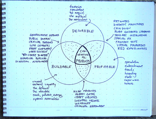
This is maybe even less than a short note to point to a little more conversation that @bruces and others are having regarding the Hubberly Venn Diagram I mentioned a few blog posts ago. @AnneGalloway took some fast-furious notes of Bruce discussing it an event: http://www.designculturelab.org/2011/12/09/critically-making-the-internet-of-things-session-i/. Here’s what she says:

* pretty much impossible to take notes but…

“All the gloss of wonder gets scraped off” when the dreams of science fiction become real and commercialised. But also, why is the design in science fiction so bad?

Theory Object for anticonventional products

Theory Object for Anticonventional Products

Design fiction instead. See Postscapes’ Best Design Fiction 2011. (Ed. See Note Below)

But what about real products? What science fiction can’t do.

RFID + Superglue + Object ≠ IoT

“It’s easy to be bewitched by the apparent beauty and logic of this. But the map is not the territory.”

Design fiction is a form of design, not fiction.

I’m glad that Bruce mentions this idea that “design fiction is a form of design, not fiction.” As I see it and what hope I have for it as an approach to doing and making is that it isn’t fictional or meant to be disputed because it is “less real” than “real design”. That would be terrible — but that’s entirely up to designers who deploy it as a way of working. If it materializes things that others see as imminently real, tangible — things that cause action, then the question as to its “real-ness” and its factual/actual-ness won’t be disputed. So — make things.

There it is. Glad to see more discussions happening around this. We’ll back-fill it with meaning and utility and make it actionable through making-of-things. I think the Ear Freshener may be the Laboratory’s first test.

Note about Postscapes Best Design Fiction 2011 — Our opinion is that it is fab to have a bit of an awards category for things. It draws attention to the activity and all that. We’re not terribly into awards here — in fact, we cleared out the 7th Floor where we had our Division of Awards and Wall of Gallantry to make space for another solder reflow machine.

But, in any case — there was our Trust Clock listed as an entrant — you can vote for it if you like. It belongs in a different category though because that clock was *made and *works. It still sits in the studio, ticking away the time, ready for someone to get up the gumption and nerve to actually live with. I think there are some great and well-tested bits of design in the form of video prototypes, and they’re fun to look at and ponder.

And then — I think the building-of-the-thing is important and shouldn’t be underemphasized, but not to get puffy about. If there are going to be awards, then perhaps it makes sense to divvy things up a bit and indicate the idiom of design fiction that the design works within? Just a thought. But, that’s to say that the building of that clock forced considerations and questions that I don’t think would’ve occurred had one not had to write firmware and solder and all that. We could’ve stopped at that video, but we had more questions that came directly from writing software and discovering interaction rituals based on making activities — where buttons go, how the alarm fob is given and to whom..real material things that wouldn’t come out in a video. Those questions led to other considerations that really made for actionable design — that can *then be delivered in a tangible way to teams who make products that are closer to the center point of the Hubberly Venn Diagram. You see what I mean? There are things that happen when you make design fiction objects that turn on, can break, have byte code uploaded to them. These are things that make the design thorough — which obtains because of the pain of making the thing *work in a different way from animating it working.

Why do I blog this? To capture more discussions and thinking about the goals of design in a broader sense.

Continue reading Short Note — The Product Design Venn Diagram: Updates

Weekending 10302011

Oh, okay. Last week I was in London.

There was some fun, cool Nokia stuff going on — besides Nokia World, which I didn’t attend only because there were also other things going on, including this event at the Design Museum called People Made in which a well-curated exhibition of Nokia’s contribution to the world of mobile social networked stuff. Despite assy and snarky remarks on the influence Nokia has had on the design of these sorts of things, I thought this was quite good, quite legible and just small enough to be digestible and large enough to note the important bits, like the evolution of mobile picture taking, degrees of portability and things to come in the near future.

There was a swell two day workshop for Project Audio with the fine folks at the Really Interesting Group. That included some days inside at Whitechapel Gallery and a field trip to the Science Museum, which has a great exhibit of audio things from the early 20th century into the networked age. Old radio sets and things with knobs are great for thinking about what the future holds for sound design and audio devices and talking to people. And, it was fun to see Listening Post there — I didn’t know that the science museum had bought one. That’d make the third exhibition space in which I’ve seen it — first at The Whitney when it premiered, I believe way back in the day. Then at the San Jose Museum during ISEA in 2009 I think it was. It holds up remarkably well. It’s quite prescient, too — in particular as regards this idea of “trending topics” in some sense. I’m not sure precisely what algorithm Mark Hansen is using to extract content (obviously chats and discussions in text) — but one gets the sense that the statistics is identifying things of import or interest. Now — it might not be what *most people are talking about, but they seem to become poignant statements indicating states of mind. There is also quite excellent use of silence in such a way that one is not thinking — huh..is this thing broken? Some ambience and machine noises give the device its mechanistic quality that is nice and sculptural and real and that of a thing with momentum. Which is very much unlike most digital/computational devices. I really like the machinic character of this thing, Listening Post.

I had a visit with James Auguer over at Design Interactions at the RCA. Nick Foster was there as well. That was fun. I’d never been. It felt like an art college. I gave a little impromptu talk to a clutch of students. And Noam Toran was there and gave me some lovely documentation of his projects. I especially like the series of objects he made called The Macguffin Library. It beautifully captures the way Hitchckock’s use of these opaque plot devices are objects to move a story — which is a concept that can be directly applied to the Design Fiction notion. These are things that are props that stand in for whatever it is that motivates and moves a story along. They’re nice as a concept because the thing itself matters even less than its functionality — except insofar as its functionality is to motivate a story.

There was a nice afternoon spent with the partner-in-crime Nicolas Nova discussing the future of the Near Future Laboratory and some exciting evolutions of our activities that will happen quite soon. Expect more to be going on here and some new folks coming along to make more things and create more weird implications and provocations. All discussed over toast, beans, sausages and eggs.

I was super excited that Geoff Manaugh rang to see if I’d be around to participate in this event at the Architectural Association called Thrilling Wonder Stories. I don’t know how to describe it except to say it was a full day of a seminar of presentations and discussions on a variety of Thrilling Wonder Story-like topics. I shared some thoughts and perspectives on designing with science fiction at the end, together with Bruce Sterling and Kevin Slavin. That was swell — fun and a great way to end the week in London.

That was pretty much it, except for one little thing that Bruce left me thinking about after that four hour dinner the last night. Venn diagrams. Evidently done by this fellow called Hugh Dubberly and the diagram contains the three circules and one is “DESIRABLE” the other is “BUILDABLE” and the other is “PROFITABLE”. The overlap in the center is what markets and capital understand as “real” stuff. You get these annoying debates within making-industries where that is the “real” deal. It was the introduction to my brief 15 minute talk at Thrilling Wonder Stories — people get shy and apologetic when they discuss things outside of that center “sweet spot” of things that are all-of desirable, buildable and profitable. “Oh, sorry — this is just an idea” or — “Oh, this is only a demo” or — “Oh, this is just a concept/video/bit-of-fiction”

Needless to say — we here in the Shameless Speculation Department of the Near Future Laboratory think that position is rubbish. There should be no apologizing for the imagination. Everything counts. I’d say even that the things outside of the sweet-spot even more than those in it. That sweet-spot is modifiable. Just cause something can be built does not make it “more” than the thing that can be massively manufactured because it fits in someone’s measure of what that sweet-spot consists of — what its parameters of “sweet-spotiness” are. And then this introduces a discussion about those parameters and scale and what profitability consists of.

That’s it.

Continue reading Weekending 10302011