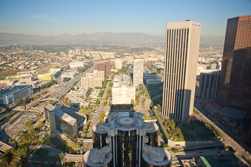
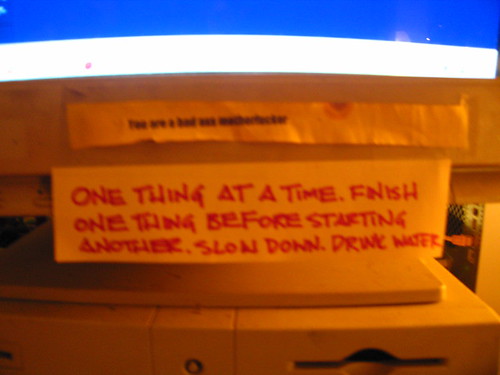
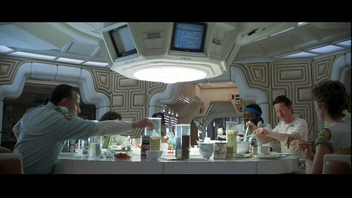
And I decided to pimp my new moleskine. Satisfied. ((That’s Pod C from 2001: A Space Odyssey, btw..))
Category: General
Whittling Away at Audio
I’ve become almost over-interested in audio as a new, untapped frontier for IxD and UX. In contrast to what our quite busy, jealous, overburdened screens offer us audio has the opportunity to form a kind of interaction experience and engagement with “stuff” (sorry early days…not sure how to be more precise..) and other people seems woefully antique. Could be some good wheels-on-luggage insights and opportunities to do design that makes things better — and makes what we have now embarrassing.
This is an unfolding theme and there have been some “observations” of things that just seem like they were never really designed so much as bolted on without a care or a concern that could be done better.
Some considerations:
I need a category of aspects of audio and it’d also be nice to become a bit more expert at audio and sound and the variances, cultures and interstices of the terrain.
Screens are all well and good, and HD audio may possibly become *more HD and surround-y, but even the small, low-hanging simple stuff is super interesting, like..
* Kitchen appliances that beep like a yelping puppy what that just got its tail stepped on
* Car horns and their abusive honk when you just want a chime to summon a friend or lightly remind that sleeping wanker at the head of the red light queue to move on
* Cars and their noises in the era of purring-whirring barely noticeable electric engines — I know this is a terrain that’s being actively explored
* Audio processing to make sound more expressive — are there alternatives and extensions to volume and tone control as ways of manipulating sound without getting goofy?
* What’s the Instagram of sound?
* What would a proper sound designer do if given a brief to design the audio experience for an operating system? Or a microwave oven? Or an airplane cabin interior?
* Consider that the high water mark of sound design for devices and the like are start up tones, beeps on notifications, &c. That’s not much — there could be more.
What would the world be like if proper, thoughtful sound designers came into the UX/IxD mix?
What’s the Design Fiction for the world in which, in some future/historical moment humans have enormous ears and pin-hole eyeballs..and they needed design work done? In other words — if we were more reliant on our ears rather than our eyes what would “X” (computer/smart device/car/chair/bicycle) look & behave like?
* Software to learn more about audio:
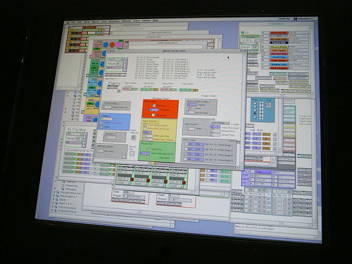
* Max/MSP (I end up using this about once every year anyway — and now it seems like it can “talk” to Abelton Live..need to figure out why this is interesting)
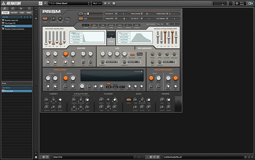
* Reaktor
* Logic
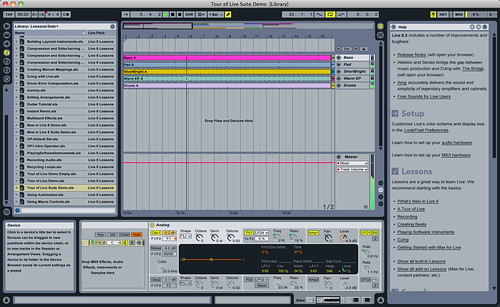
* Abelton Live
These are audio making softwares, mostly tilted towards making music or composing sound into rhythmic melodic assemblages or something like that. While the idea of being a DJ with throbbing thumping crowds manipulated by my expert mixing and all that sounds like fun, I’m actually more interested in the ways these tools and playthings can help design audio experiences of other sorts — like even mundane moments of sound..a new car horn, for example — or an intriguing car alarm that brain paralyzes the would-be car-jacker into doing the polka. ((I don’t know why I’m fixated on car sounds – maybe it’s LA getting to me..))
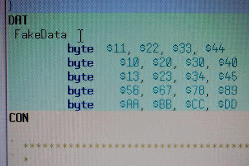
A curious side note to this world of audio software you’ll notice from those screen shots above: it’s entirely baroque in its UI design, which is both super intriguing and somewhat annoying, but actually more intriguing than annoying.
An experiment:
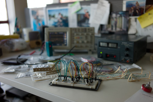
I’m *trying to make a DIY small, portable, audio mixer with a variety of stereo and mono inputs and some “effects sends” so that I can experiment with mixing multiple sound sources and sound sensors while on the go — walking and riding around.
Seems simple enough but I’m having a bear of a time with it. More about that in a subsequent post.
That’s it. Rough early days. I can say that its super exciting. And nice to be tagging along with Russell as he experiments with some similar questions. (cf. Secondary Attention and Little Boxes of Sound, Secondary Attention and The Background Noises. I especially like the idea in the latter post about the “Ghost Box” concept of a thing that inserted sound effects, effectively into the environment.
Why do I blog this? Because if I didn’t, I’d forget what I was doing in the past when I’m in the future. Also it’s good to share things that are going on because then you hear from other people who are working on similar threads and friends should know what friends are thinking about even when separated by the Internet.
A Few Things The Laboratory Did In 2010
Again, mostly in the notes-to-self column, I’d just like to capture a few things that we here at the Near Future Laboratory did in the year 2010.
It was a year chock full of Design Fiction actions and activities, an exhibition of some work, talks and discussions about projects and ideas. The usual, except there was a dearth of making-of-things, something which will be remidied one way or t’other in 2011. ((I shouldn’t discount the zealous skate photography, though.))
So, just a fool’s list:
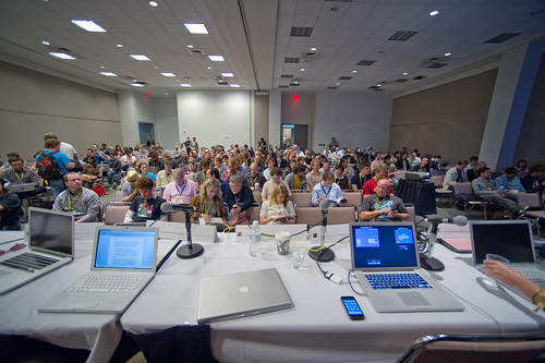
There was the panel at South by Southwest with Stuart Candy, Sascha Pohflepp, Jake Dunagan, Jennifer Leonard and Bruce Sterling. I think that was a highlight as it led to some great conversations from the dais and Bruce’s interjections and interceptions were quite inspiring. I think the best part of the panel was what we talked about getting the whole thing organized. There were some really intriguing Skype conference calls, just talking and learning from each other. That was good stuff.
(Audio Podcast of the SXSW Design Fiction Panel)
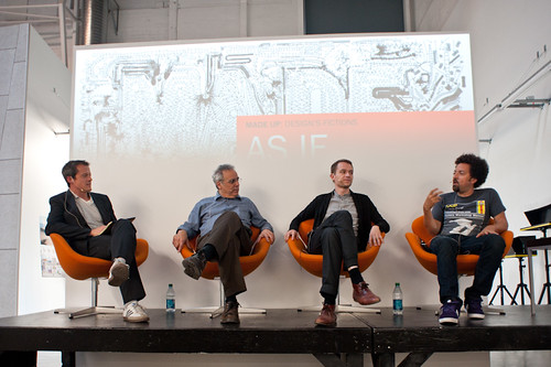
Art Center’s “Made Up: Design Fiction” theme was (and continues to be) an opportunity to further stretch and elaborate the Design Fiction theme — finding new ways to actually *do design, and then sponsor a number of works exploring the idea of making things up as a way to do advanced design. I love what the Media Design Program folks are doing over there. Participating in the “As If: Alternate Realities” panel discussion and other activities over there has been good, great fun. ((I was also super excited to go to the MDP MFA Thesis Reviews and see student work first-hand, give feedback and all those other good things..))
(http://www.nearfuturelaboratory.com/2010/09/10/made-up-panel-discussion-september-17/)
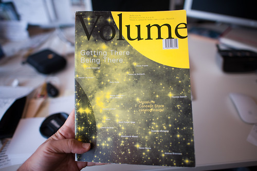
The original design fiction essay was rejiggered and reprinted in Volume Quarterly for their Issue No. 25 with the theme: The Moon. That was an interesting re-writing project because I had wanted to say a bit about how I understood architecture as perhaps the canonical design fiction enterprise — it is so imminently focused on what could be, and perhaps so finely tuned to tell a story — to *pitch what the future landscapes might look and feel like, and suggest how humanity might live and embody space. Architecture has this remarkable conundrum in that it likely spends most of its time constructing facsimiles of what could be as concrete gets poured based on most designs so infrequently. Sure — the big corporate architecture firms make their malls and condos and so on. But the speculative, richly imaginative contingent of architects — well..they enter competitions with models and renderings. In fact, I would guess that most of architecture does precisely this — it spends its time (not fruitlessly, I would say) telling stories through materialized forms: models, renderings, films, stories essentially. Designed fictions, I might say. In any case, the reviewers for this particular re-write didn’t find it substantive or something — it’s fine. It’s a theme I’d like to work on in some fashion for 2011, though. Even though I have a grumbling relationship to architecture.
(http://www.nearfuturelaboratory.com/2010/12/22/designing-fiction-in-volume-q/)
Which might seem like it contradicts the fact that I participated in two reviews for USC Architecture, one in Neil Leach’s wonderful “Interactive Architecture” studio, and the other for Geoff Manaugh’s equally provocative Cinema City studio. Both were thoughtful and fun and engaging. I often felt that the students got a bit too ruffed up by the jurors/critics, but I have *no idea what the culture of that design practice is, so maybe that’s entirely normal. I always thought it was soft gloves before you went bare-knuckles in crits. Maybe its just all tough-love all the time.
My chum John Marshall and I had our essay appear in the Digital Blur: Creative Practice at the Boundaries of Architecture, Design and Art book. It’s an essay on Undisciplinarity — doing things without predefined boundaries, or without constraints and often without discipline. I think it’s a useful way of doing things differently and perhaps making new things. Just looking at the world and its possibilities from a sideways glance and without curmudgeonly bureaucracies to say you’re doing things the wrong way round. Pick up a copy, not for the essay but for the other great documentation by artists and designers.
(http://www.nearfuturelaboratory.com/2010/04/30/digital-blur-book-launched/)
For the third time I was able to attend ThingM’s Sketching In Hardware event, this time held in Los Angeles at that crazy Encounter Restaurant. I’d share the presentation, but its 1GB because in 2010 I sort of went a bit crazy including film clips in my presentations. I wish there was a better way to share these enormous things.
The Laboratory had a spot presenting at Kicker Studio’s Device Design Day last August. Again, more elaborations and thinking about the Design Fiction stuff — “Design Fiction Goes From Props to Prototypes” — thinking about prototypes as ways to test ideas (not just their material forms): “Prototypes are ways to test ideas—but where do those ideas come from? It may be that the path to better device design is best followed by creating props that help tell stories before prototypes designed to test technical feasibility. What I want to suggest in this talk is the way that design can use fiction—and fiction can use design—to help imagine how things can be designed just a little bit better.”
(Kicker Device Design Day on Vimeo)
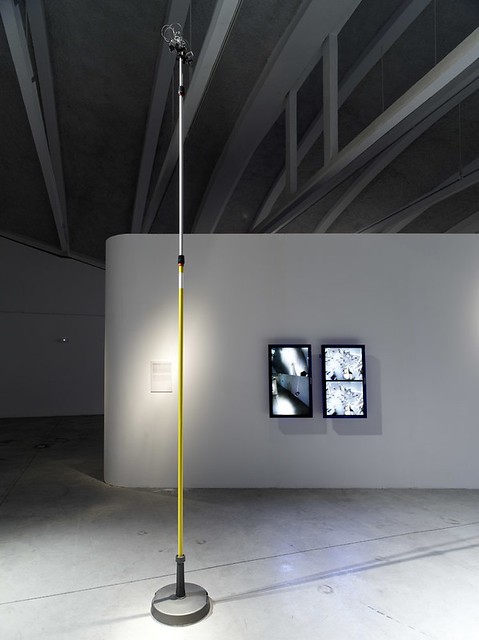
The Apparatus for Capturing Other Points of View was exhibited at the HABITAR Exhibition in Madrid. The concept of the exhibition is something that is quite close to the hearts of the Laboratory, so I will put it here: (you can download the exhibition catalog as well)
This new urban landscape is no longer predicated solely on architecture and urbanism. These disciplines now embrace emerging methodologies that bend the physical with new measures, representations and maps of urban dynamics such as traffic or mobile phone flows. Representations of usage patterns and mapping the life of the city amplify our collective awareness of the urban environment as a living organism. These soft and invisible architectures fashion sentient and reactive environments.
Habitar is a walk through new emerging scenarios in the city. It is a catalogue of ideas and images from artists, design and architecture studios, and hybrid research centres. Together they come up with a series of potential tools, solutions and languages to negotiate everyday life in the new urban situation.
(http://www.nearfuturelaboratory.com/2010/05/31/apparatus-at-the-habitar-exhibition/)
I participated in the University of Michigan’s Taubman College’s Future of Technology Conference, which was an interesting two days of sort-of lighting 15 minute presentations from a whole string of folks, mostly from in and around architecture (again!) to hold forth on the future and what it was. ((There are some good talks in there — Bruce Sterling, Usman Haque, Hernan Diaz Alonso. Note bene how mine is nearly spot-on 15 minutes. Architects love to speak, even if they go over their allotted time. I could’ve carried on. But I didn’t, out of courtesy. *shrug.) Most of them basically shared their work, which I guess is hopeful insofar as they imagine the future full of their work, I guess. I basically showed my “graphs of the future” thing — it was 8 graphs at the time. These are a few “graphs” that are sort of canonical ways of presenting what the future looks like, usually according to quantitative metrics.
Then there was a nice close to the year with the Swiss Design Network Conference whose theme was Design Fiction (yesss…) It was a nice time in Basel, with a chance to meet some new friends and then people who I had only heard of or only talked to by email or phone. I gave one of the keynotes and helped Nicolas facilitate the workshop on Using Failures in Design Fictions.
I’d say in 2010 Design Fiction learned about itself as a practice of doing design, provoking and entertaining and suggesting new ways of seeing and understanding. It has been well-articulated and played with and used as a lever for all kinds of amazing work all over the place. I think the best go-to place is by @bruces wonderful Design Fiction category list — much more consistent and thorough than the Near Future Laboratory’s Design Fiction Chronicles and less-hampered by the ninnies at Vimeo who clearly don’t understand the way I was using film clips to discuss, in a scholarly sense, the role of science fiction film. *sigh. Anyway — @bruces is the real scout-about for what’s going on at the many fringes of thinking/making/doing.
Well..those are the highlights I can think of right now.
Weekending 10172010
Well, got about half way through the new Steven Johnson book Where Good Ideas Come From: The Natural History of Innovation and still going. He tells a good story and I believe much of it. There’s something funny going on in there, though. I’ll sort it out. Seems maybe a bit simple in its argument — things alongside of things, or the adjacent possible. It makes sense and I don’t want to do the typical academician’s “but it’s more complicated than that.” As an alternative to the more popular imaginary of the genius in a basement working alone when inspiration strikes, this is much better.
So..there was that. Then lots of work and time in the studio corralling several (not a few, several) projects into their present state to be shared. Shared, not finished off or anything — but raked and slightly burnished to a semi-finished finish. It’s a good exercise to begin to bring that level of overview and organization to the work. And it’s all good stuff, all well-done. ((I’m slightly eager to get into the material more tangibly. More on that in the coming weeks, I suspect. Or, wait. Not “I suspect” because I can if I want to, so it’s more like — I will make the material more tangible, and make the time to do such. Except — oh, bugger. Look at that calendar for the coming months.))
Anyway, there was also some preparation for the upcoming Design Fiction components of the 6th Annual Swiss Design Network Conference. I’m excited. The line up for both Friday and Saturday look great. I’ll be there with earballs wide open. In preparation, aside from the paper I prepared some months ago, I’ve been continuing my process of cataloging Design Fiction in Science Fiction Film for the DVD collection the Laboratory will be releasing.
I was thinking about what possible projects either way on the back burner or up front, sizzling right now that I could send off to a design project *challenge. Thought about that back and forth wondering what the consequences might be of doing so. Best case, I get to run the project. Worst case, I still get to run the project, but maybe in another context or just *later, at some other time. Should it be something I’ve always wanted to do or force myself to think about enough to put it before someone. Or something to make a point, even if I never get to say anything more about it because, *shrug*..someone’s going to look at it and think, why’d he put this in front of us, anyway?
I had flounced off of the skate photography thing, but that didn’t last long and it was more of a joke to myself, but not doing it for 10 days made it seem like I hadn’t been doing it for months. Went to the indoor ramp around the way. With the winter light setting so much earlier, a drive-by the park becomes less possible these days. Anyway.
Continue reading Weekending 10172010
The Faint Scent of Brimstone with Notes of Sulfur
If I followed this to its logical yet design fiction-y conclusion, I’m sure I’d find the devil himself. <a href="The New York Times does a slightly fluffy anecdotal piece on toddlers strangely addicted to iPhones. If I were in charge I’d consider legislation to slap little warning labels on these damn things. Apple lovers — many of whom have fancy jobs enough to afford a new iPhone to replace the perfectly good one from last year — are probably huffing with hands-on-hips (thumbs forward) dismissing the early warning signs which I am sure are weak signals of a species transformation of the sort that shifts the gray matter around in a horrifyingly Crichton-esque fashion.
Continue reading The Faint Scent of Brimstone with Notes of Sulfur
Week Ending 052110
Good to my habits, I’m nearly a week behind weeknotes. No matter — they are more notes-to-self than anything else.
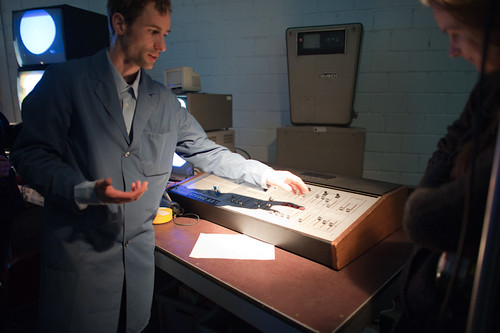
Last week — the one that ended on Friday the 21st — was a week of busy-bodying some knowledge for a small audio electronics prototype, which included remembering how the heck Op-Amps work. Clearly I was in need of some making activities because this one became obsessive. ((I haven’t been in the shop in weeks and I’m becoming symptomatic.))
Matt Biddulph visited the studio, which was awfully nice to be able to share some of our work with a sympathetic earball, and then to hear of what he is doing in and around the Nokia battleship.
Started reading Obliquity in the hopes of finishing it to write up a small review but, well — it’s another one of those business books that was derived from a newspaper essay and probably should’ve stayed at that. There’s not much more that should be said, unless you’re into endless examples shoe-horned into a principle, about taking the *oblique approach to achieving a goal, enjoying the journey, following your curiosity and passion. And this translates, in the business idiom, roughly to examples of those who claim to have gone after what they believed rather than shareholder value and profits, which, in the examples, are shown to just *come when business leaders just do what their heart tells them to do. Actually kinda silly, really. I mean that in the kindest way, but, you know.. ((I was hoping for something closer to The Craftsman. ((Parenthetically, I found this other Obliquity: Speculative Fiction from the Pacific Northwest
while poking around for the business-y Obliquity..maybe I should read that instead as a purgative.
Those are the highlights, I would say.
Design Fiction Principles: Notes from Design for Screen
A relevant short essay by Piers D. Britton in theThe Routledge Companion to Science Fiction underscores some of the loose principles (loose, because they aren’t quite principles — more a swirl of useful insights) the Laboratory has been gathering around the concepts of Design Fiction. ((Why gather principles? Well, to understand how better to create/construct/author *Design Fiction))
In the essay, Britton starts out by emphasizing the importance of the visual and aural aspects of science fiction on the screen. This is obvious, of course — but worth underscoring because it relates immediately to the appearance of things that may not be real but have to be perceived (“seem”) real. Our common sense has to extend from now to the visual story — the appearance of otherworldlyness should be coextensive with what we understand today.
The point Britton emphasizes at this point is that design in screen-based science fiction works to create the appearance of a coextensive world — extending now to then. And that design for science fiction is oriented toward verisimilitude.
Well..so what, Britton asks. Verisimilitude is of limited value in itself. For him, the important corollary is that screen science fiction appeals to a “viewer’s sense of the tactile properties of unfamiliar phenomena.” I hadn’t really thought about the design elements in a film as textures, so I found this intriguing. Britton makes a broad cut through the history of screen science fiction delineating texture as an element of the design. ((For example, buildings, vehicles, weapons, etc.) He says that, in the 1920’s-60s, textures were modernist, sleek, streamlined, and that after the 70s, it becomes layered, scorched, rough-hewn, layered (cf. Star Wars, Blade Runner, Battlestar Galactica, Alien, etc.)
This I can follow — and its something I can vaguely recall thinking when I first saw Star Wars with my brother, with our much older half-brother carting us along. The banged-upness of the Millennium Falcon is one of these signals of a kind of verisimilitude that is drawn from the present to create a legible future (or past, in the case of Star Wars, but the direction of time matters less than the appearance of something that is *coextensive with today.)
Britton says that this by itself may not help understand the nuances of the screen science fiction genre. He’s curious about how design generate meaning? By looking at specific *texts, we may gather a fuller understanding of the role design plays in the story. But, first Britton takes a moment to point out his conviction that design imagery cannot possibly obscure the story. He says that design is spatial, narrative is teleological; narrative is words; design is not. “..rather than ask how design relates to narrative, as though the two had the potential to harmonize or quarrel, it is more productive to ask how design can operate within the whole imaginative and conceptual experience invoked by screen entertainment.”
((I guess there’s some sort of disagreement within the world of science fiction lit-crit people on this point — or maybe its just a disagreement between a couple of them — to emphasize the role design plays in the story. I think it may go along the lines of design and story being opposed in some fashion. Like — someone may feel that design ruins the story and, well I can imagine someone saying something along the lines of: “the book is so much better..the film just ruins the original story.” Or something like this. If I was still in school and not spending more time in the Laboratory, I might follow this one up. But — it could be an intriguing argument as, presently — I feel that design can tell a story, or pivot a story in a way that a narrative on its own cannot, which isn’t to say that a narrative is hobbled without design, but rather having a physical prop in the hand or on a screen does something that the story telling by itself is less capable of. And, even beyond this point — the making of the physical prop is a nice tangential, additional approach to figuring out the story itself.))
Britton then goes on to ask two questions:
* 1st: how does design uphold the “meta-reality effect” of science fiction?
* 2nd: how does design compel reflection and contemplation about the story’s underlying ideas?
These are two questions worth asking and I’d like to sort out the substance of them, but as far as how satisfying the answers, I’m only sure Britton answers them in a way that would be of use most directly to a lit-crit sort.
He uses two examples to address these questions — Blade Runner and Firefly. I’m not at all familiar with Firefly, but the point Britton makes about Blade Runner is easy enough to state to be worth mentioning.
Britton points out the specific textures of the fashion design in the film which serve to defamiliarize while still being evocative of recognizable forms. In Blade Runner, the costumes are drawn from the 1940s and the 1980s without becoming nostalgic. There is this *defamiliarization driven by texturing and contrasts (Deckard’s trench coats and Tyrrel’s vaguely art-deco octogonal glasses versus the punk-inspired costumes and hair styles of the rebel replicants, for example).
I find this bold contrast curious — this point about the collision of textures (punk versus the 1940s and art-deco) and the possibility that defamiliarization contributes either to this “meta-reality effect” or that it excites reflection on the underlying ideas of the story.
So, if I were to quickly conclude the most useful insight here it would be around this point — a subtle, defamiliarization that might compel the viewer/reader to step out of their routine, or what they might conventionally expect — this can go somewhere to “exciting” contemplation or a deeper engagement with the material than they might if they were seeing something they expected.
((Parenthetically, we’ve used this general principle I think to some modest success both in the design process and the communication of work — rather than showing things people might expect such as PowerPoint decks, bullet points or *slides — we might show a short visual loop and, much more often than not, the substance has nothing to do with what the audience might expect. It forces at least one question — what is this? And then you can answer the question and have a conversation.))
Why do I blog this? Some reading notes as I prepare some material for a talk on design fiction for the fall.
iotaSalon: The City @ UCLA
This sounds like fun.
May 6, 2010, 7pm
Experimental Digital Arts at UCLA.
iotaCenter’s mission is to inspire both new and existing artists in a historically dispersed and constantly changing technological environment.
The theme for our next iotaSalon is THE CITY. We will be investigating the way urban environments are depicted in abstract and experimental works. How does construction influence image creation? How does the urban environment surrounding an artist inform or invade their work? How does the process of abstraction change our view of the city? How have architectural tools and thinking affected abstract and experimental moving images?
Screening on 16mm ((16mm FTW!!)) as part of the historic film segment:
Sausage City (1974) – Adam Beckett
Diagram Film (1978) – Paul Glabicki
Commuter (1981) – Mike Patterson
Screening on video for the contemporary segment:
Giant Steps (2001) – Michal Levy
Communicate (2009) – Erick Oh
Berlin Skin (2007) – Kim Collmer
Continue reading iotaSalon: The City @ UCLA
The Week Ahead: SxSW 2010 — Design Fiction Panel

So, early heads-up and there’ll be more — if you’re heading to SxSW this year, I’ve organized a panel under the rubric of *Design Fiction. The full title is Design Fiction: Props, Prototypes, Predicaments Communicating New Ideas, and I feel prescient with that title because it captures much of what’s been going on in the studio over the last, like..3 months.
It’s going to be good. It’ll be Jake Dunagan from the Institute for the Future; Sascha Pohflepp from Supercalifornia (whatwha?!), Stuart Candy from The Long Now Foundation and Jennifer Leonard from IDEO, with perhaps a special delta-net guest operator to flash-bang this one all to hell and gone. We’ve actually done planning and have had *skype conference chats to discuss what we’ve been thinking on this one.
Add this to your conference schedule..and see you with a plate of dry rub in front of me.
Design Fiction: Props, Prototypes, Predicaments Communicating New Ideas
Continue reading The Week Ahead: SxSW 2010 — Design Fiction Panel
CfP. Twelve 2 Week Residencies in…Synthetic Biology!
We seek participants for a research project on synthetic biology, design, and aesthetics. The project will provide funding to bring together scientists and engineers working in synthetic biology with artists, designers, and other creative practitioners. Resources will be made available for ‘embedded residencies’, in which artists and designers will spend time in laboratories, and scientists and engineers in artistic studios and design workspaces. It is our intention that such collaborations will produce presentable results, although the form these take is entirely open to the participants. Travel and accommodation expenses will be covered by the project.
We aim to construct the groundwork for future collaborations that could inform new types of engineering, new schools of art and design, and innovative approaches to the study of synthetic biology in society.
((This just recently in the inbox from Daisy Ginsburg who lives in that middle space between science and design that is positively the right place to be if you have interests in both of these practice idioms and have a deep commitment to creatively mucking things all to hell and gone. Isn’t this cool? There are two different rules for submitting your bona fides depending on whether you think you’re a scientist/engineer or an artist/designer? More details on the residency and the project are below.))
Here is a PDF of the Call for Participants.
Further Details
Continue reading CfP. Twelve 2 Week Residencies in…Synthetic Biology!
