Fake for Real

Saturday September 19, 13.24.47

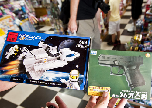
Found in a small toy/novelty store in Jeju, South Korea.

Two forms of fakery. On the left, a faux Lego set using all the cues and clues of the real, Danish deal for a Lego build set of the Space Shuttle complete with astronaut. On the right, a *toy* Glock pistol. Both kids toys (n’aach on the gun), but each with its own degree of imitation. The Lego bit is a fake of a toy. The gun — well, to the best of my knowledge that’s a real imitation of a Glock, making it a legitimate toy.

Saturday September 19, 13.08.58

Why do I blog this? A curious mish-mash of really fake stuff that outlines the boundaries amongst imitation, flattering imitation, and arguably nasty real fake toys taht don’t seem particularly playful. Is it even worth fussing over the clear delineations between real/fake; virtual/digital; really me/avatar me? What are the stakes that make these lines of distinction things to fuss and argue over?

But wait..there’s more!

Saturday September 19, 13.19.40

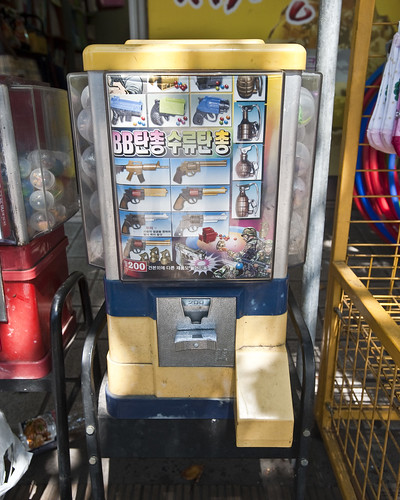
More in the category of the *trinket*, as opposed to the refined, detailed and thoughtfully sculpted imitation of a real really dangerous thing that might fool someone who is handling the real, real thing — a gumball machine with a miniature arsenal, for those who just can’t do without the seductive power of things that go boom and blam.
Continue reading Fake for Real

Brand Obama


In the Itaewon neighborhood of Seoul, where every other store-keep on the main drag is trying to measure a tattered, soaked urban scout for a new suit, this garment was spied — a rather natty, silky, shiny shirt with a monogrammed cuff with another man’s name. Not an unusual fashion idiom — wearing someone else’s name — but this one sort of moves things in an unusual direction. I don’t know if I have ever seen a garment adorned with the name of a sitting United States President, especially overseas. Now, I’m not talking about a pejorative protest t-shirt or some such. There are plenty of those — I don’t even need to guess about that one. This here? It’s meant to imbue its wearer with a special power. Much more than Calvin or Tommy. Or even Shaq or LeBron.

Related, somehow is this bit of work by studio brother Andrew Gartrell, riffing on some peculiar image I found in the New York Times of an Obama-Spock photoshop. What is curious here is the ways in which images, names, stories swirl in a vortex of possibility, hope, lawsuits, fair-use and fashion. It’s in the making that the social exists, always becoming and this sort of riffing on what “Obama” is — something that happens rather than something static.

What is in a name, anyway? Sometimes nothing, sometimes everything.

Continue reading Brand Obama

Interoperability

Sunday September 20, 17.43.18

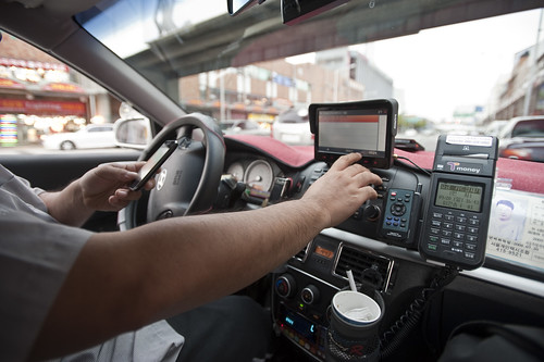
A curious interoperability protocol, wherein the address for some weird place in Seoul has been found on an iPhone and must now be entered into the GPS of the taxi. A simple affair, with minimal bumps often enough, particularly because the map on the iPhone shows the address and streets in Korean, which is great for the taxi cab driver, but miserable for the the traveler who can only hope that the locale on the map is actually where he would like to be.

Why do I blog this? This are useful moments to capture, where language, culture, objects, data come into conflict and must work their way around one another. I am told the iPhone isn’t available in South Korea at the time of this photo, so you have this foreign object — one that is probably quite legible as the iPod Touch was spotted around the city — and a baroque assemblage of devices, machines, transaction mechanisms, remote controls, identity stickers, car controls, radios, etc. I would have to contrast this with the notion of seamless perfection and interoperability that is often the image of the future transportation dashboard.
Continue reading Interoperability

Street Furniture

Wednesday June 17, 15.04.24

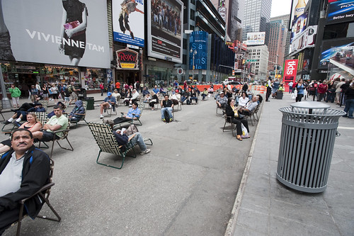
Times Square beach, complete with tourists (as any beach should), found here.

Friday June 19, 12.10.57

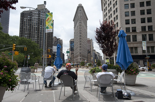
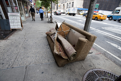
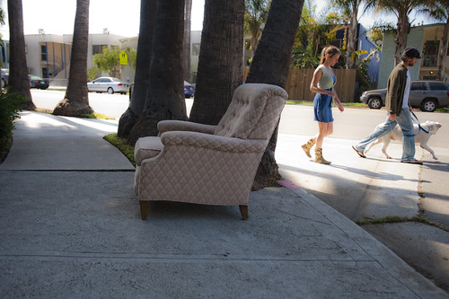
Urban Lounge found near Madison Square, New York City.

This is probably old hat for current New Yorkers certainly, and something that makes visits home really interesting, these street furnishings and people zones are incredible interventions and nice experiments about alternative urban landscaping. When arriving in Times Square with my brother for a quick screech through of High POV shots, we managed to get one of these curious middle-of-the-avenue parking spots so you basically park right smack in the middle of Times Square. Which is good because you cannot drive through the square itself, only around it, because of these pedestrian urban “beaches”, complete with lawn chairs. According to one of the local business improvement district rangers or whatever they are, tourists quite like it. I wonder if locals find these useful or an annoyance to their conveyance around the city.

Tuesday June 16, 10.28.00

Saturday April 25, 10.07.27

Not quite the same, but in a different category of street furniture — the dispensed with sort.

Why do I blog this? A fascinating example of a reconfiguration of the canonical gridded city. Turning pavement into a more human, habitable space that evokes other leisures is a fantastic way to create new opportunities and to think about new sorts of design practices for urban space. This is an area that many people are curious about of course, and it is something that has attracted the attention of the laboratory quite a bit recently. For some reason, we have been thinking about new kinds of principles, rituals and scouting toolkits for finding new ways to look at the city, using these to think about new kinds of interactive urbanscapes…and not interactive in the “UX” sort of digital-y way. Playful interactions, thoughtful interactions — new rules of occupancy; new social interaction rituals.

Design Fiction Chronicles: Aram Bartholl's Vision of Augmented Reality

Still moment from Aram Bartholl‘s workshop and project WoW an “intervention in public space that uses computer play-worlds as a means of calling attention to the changing ways people deal with privacy and identity in the public sphere.” In my mind, this is one of the better depictions of what the widely anticipated but really super deflating future of “augmented reality” will be like. It’s funny, but I think this vision embeds an obvious critique of some sort.

In discussions these days about Augmented Reality — really vintage high technology if there ever was such — I am reminded of Aram Bartholl‘s workshop and project WoW, which is quite relevant. For some reason — I suspect Freemason conspiracy of the highest order — Augmented Reality is making some sort of bid to regain its previous stature as “the future” of, well — something. What gives? (I really want to know.) It had a chance in 1995 or something, as well as lots of half-baked promises, popular magazine articles, and crappy overpriced plastic eyeglasses that’ll enhance your movie watching experiences that you could buy out of those catalogs you find in the backseat pocket on airplanes.

Why has it come back? Okay — now I’m asking the question seriously because it seems like people are spending serious money hiring people and setting up things to get back into this “hold-up-a-screen-and-be-told-what-you-could-read-in-a-tour-guide” kind of high technology. There must be a better way to spend money to create a better world, no? (Answers to this inquiry will be taken seriously. I’m only snarky because the afternoon coffee has taken hold, but good.)

Aram Bartholl’s WoW project explores public space depicted with some of the interface elements of many multiplayer role-playing games. The name derives from World of Warcraft, perhaps the canonical such game. I tried it once, for about two hours, maybe? It just didn’t take hold in the least, but that’s a personal judgement. I don’t necessarily go for that sort of thing.

Besides this point, which is perhaps an allergic reaction to all the hype that surrounded the game a year or so ago — with it being the new golf and crap like that, which I would not wish on any earnest creative effort — there was lots of attention paid to the bloated interfaces of the game. It’s nearly illegible as far as I can tell. But, literacy is learned and in the eye of the literate. If the literacies of the future force one to adjust to “reading” the world as a “dashboard” of this sort:
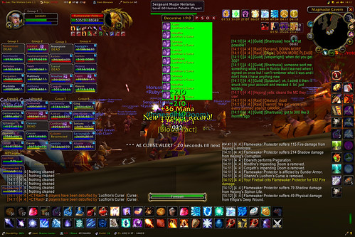
Joi Ito’s crazy, over-the-top WoW dashboard screen thing. Legibility taken to a whole new territory.

Well, then it will be a weird world of data points, avatars, 140 character conversations and emoticons.

*shrug*
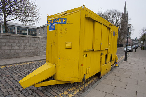
Friday April 03, 15.42.33

A weird secured box — a database of physical materials or something — found without trying on the streets of Aberdeen, Scotland. How much more augmentation does reality really need? I mean..

Aram’s project, in my mind, playfully pokes at the vision of a near future world of such things augmenting our daily, pedestrian realities. I’m a bit skeptical when it comes to the levels of alteration to quotidian life by glasses that tell you compass bearings or map sites of interest. All that kind of stuff that would turn spatial experiences into some kind of database inquiry seem very much different from what I enjoy about the world when it is mixed with humans — curious interpretations of objects and moments that are not salted with uniform resource locators, pop-ups, soft synthesized voices telling me that I’ve got mail or to turn right at the next intersection. Sometimes, I like getting a bit lost, or learning my way about a new place. (That might be my own rationalizing — I get lost with such a frequency that lost is my new found.) I enjoy doing the urban scout adventures in places to look at the world slightly differently, and in a way, I am afraid, no algorithm in some augmented reality telephone-glasses can enhance.

Here’s a video that Aram and his workshop attendees produced for their activities in Gent, Belgium. (Thanks Aram, for the lovely and perpetually relevant project.)

WoW from aram bartholl on Vimeo.

See also Mixing Realities.
Continue reading Design Fiction Chronicles: Aram Bartholl's Vision of Augmented Reality
Paper Maps

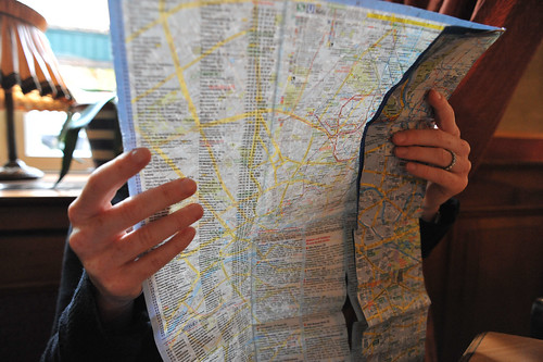
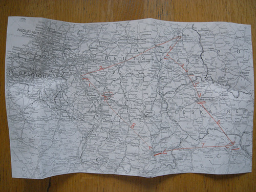
36 hours in Berlin right SHiFT 2008 and there’s only time for one or two things to do, really. Despite geek sensibilities, it turns out a paper map serves better than a digital one. This janky one from the hotel, flimsy and easily smudged and tattered, was actually spot-on perfect. Every street we needed to find, and U Bahn was easily navigated to. (Although, not by virtue of my lousy sense of direction.) Using a paper map makes me think — when will the still-Jurassic digital maps at lease orient themselves according to compass direction?

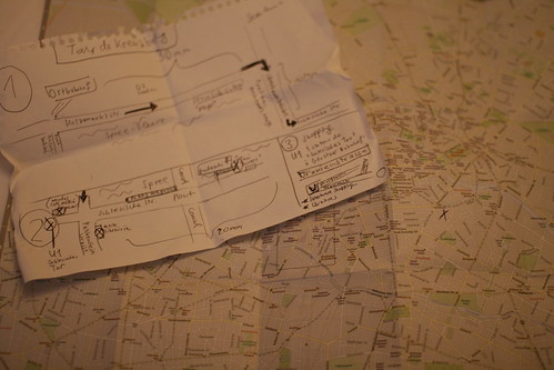
(I will add my friend Nicolas Nova’s map he also received while in Berlin just after I left, while we’re on the topic of paper and maps..I’m sure he wouldn’t mind me sharing this fantastic specimen.)

19102008_153730

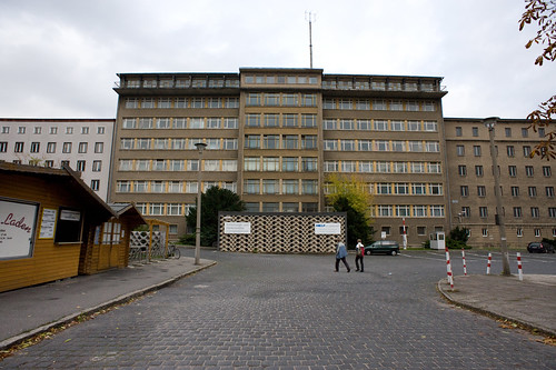
Tourist highlight of the 36 hours was the Stassi Museum, my curiosity peeked especially after viewing “The Lives of Others”. The history in here is fascinating, and in German. I was fortunate to have a native German speaker with me, and one who lived through this period as well. Between the drama in the exhibitions and the real-life experiences, it was well worth the time. (Curiously the museum is not well indicated in the surrounding neighborhoods. We had to ask a couple of well-liquored gents knocking back a few in a box-bar about bit enough to fit a keg and a television in.)

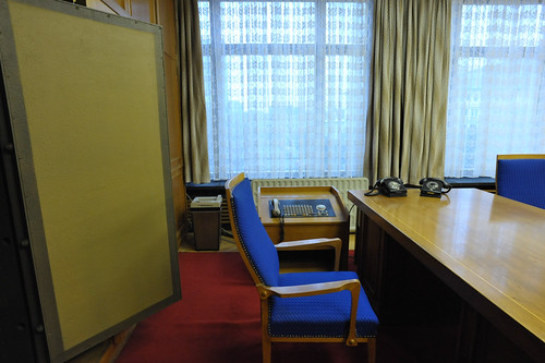
Here’s Markus Meckel’s desk where I’m sure zillions of horrific deeds were executed. Check out the accoutrements of tyranny here — an enormous safe (you can see the door), a shredder (on the left of the chair), a chair, a switchboard phone thing, phone and desk. Despite the tyranical history, I was awestruck by the furniture. It was so evocative of the period in a way that brought the stillness to life. You have to check out the other photos — there’s spy gear, more room furnishings (including the side room with a bed, I guess for late nights or trysts or something) and some amazing swivel chairs.

More photos from the museum exhibits are in my Berlin Flickr set.
Continue reading Paper Maps

Manhole Compass

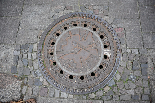
A functionally-decorative manhole cover that emulates the features of a compass rose for those who care not to navigate by dead-reckoning, rather feature or landmark-reckoning. I know these are all over the place, the image of it summoned up a recent conversation about how much built-in navigation cities should provide. The pro-argument being that it helps tourists to get around a city when they don’t have the vernacular, experienced wayfinding abilities of a native or someone who has had time to acclimate and grow accustom to the nuances of what is where. The con-argument is that these sorts of waypoints and navigation aids makes cities over mapped, removing the unexpected encounter that can only happen when you’re lost, or eroding the experience and feeling of becoming “native” and used to a city’s ways on ones own.

GPS Experiment

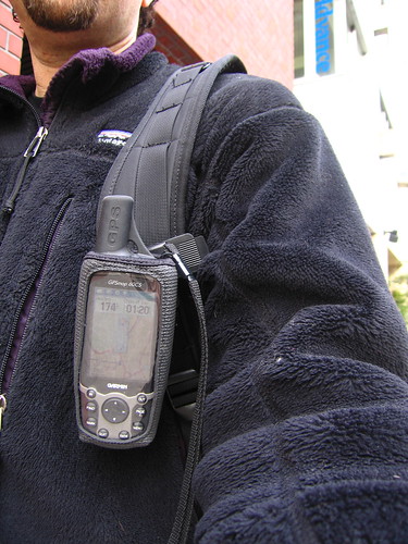
I can see something in each perspective, although I would generally prefer to leave a little more to chance when navigating a city. This photo is of me in Tokyo, 2005 after I managed to get a Tokyo map uploaded to my Garmin GPS. I had absolutely 0% navi experience in Tokyo and was pretty sure I’d get completely lost, which I did on an occasion or two, but was able to rely on the GPS to get me back on track. (There were no navigation features, just top-down POV and compass.) I’m certain it changed the experience, but there was not a whole lot left to rely upon besides my own wits and my trusty Tokyo City Bilingual Atlas.

Continue reading Manhole Compass

Icon Mania

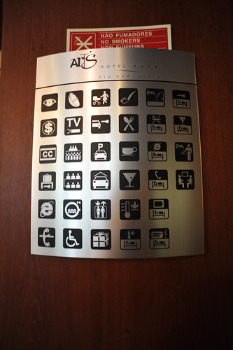
Look at this thing! Seen at the lobby of the Arts Hotel in Lisbon, this beautiful matrix of familiar and also baffling icons indicating the services or rules or functions of the various parts of the hotel assemblage. There are some I understand — but the one with the svelte Martini glass hovering over a sleeping person? What’s that, anyway? You can dream of getting a load on? You can get drunk and pass out comfortably on our exclusive bed linens? And the two people sitting opposite each other with a floating box above them? And — what!? — an Internet Explorer icon? Like..um..I guess that’s for the business center or something. Any ideas?
Continue reading Icon Mania

Old Mapping Alternatives and New Metaphors, Please

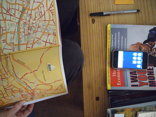
Some curious alternatives and conscious decisions made around map materials. When do we chose the local tourist map that has down-res’d nonessential features and up-res’d features more on the mind of weekenders, such as the location of airport, town squares, likely museums and sites? How do the fancy digital alternatives — a nearby iPhone with a really slick Google Maps interface — pale in comparison, and falter in their real navi utility? When is paper — which can be marked up, annotated, maintain its tangibility and foldability and non-battery-failability and non-data-roam-chargeability? Just paper.

Have a look at Aaron Cope’s paperMMap and other work in tangible, hybrid (digital-physical) cartography. I think this is exciting, mostly because maps and cartography may be on of the good, early connectors that laminate physical-digital thinking. We need better metaphors to capture the ambiguities between the physical and the digital — even writing them right there makes me anxious. The distinctions are quite arbitrary and I think “we” pioneers living in the near future would be doing a great thing to evolve the metaphors and language to point toward new hybrid realities. First to go? Second Life. Ahhem.. What a horrid name that might be tractable to the everyday notion of online/offline, but ignoring “1st Life” the way that Virtual Reality tried to do really does a disservice to the relevance and final import of the world in which we will ultimately be buried within, Timothy Leary’s insertion into an eToy USB drive notwithstanding.
Continue reading Old Mapping Alternatives and New Metaphors, Please

Functionally Finished Architecture

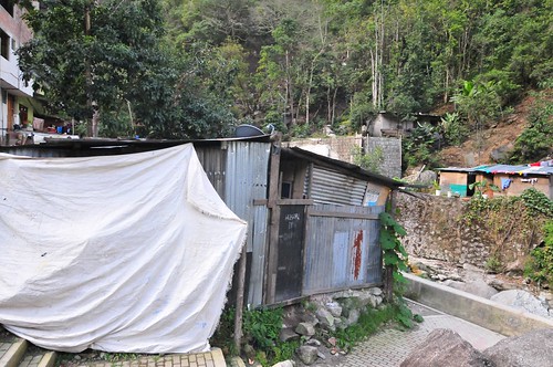
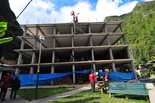
Some curious structures and dwellings seen in the very touristy town of Agua Caliente, which serves as the out-and-about place just at the base of the mountain where Machu Picchu rests. The town is under heavy construction for nice, small refined hotel rooms for tourists to stay in comfort. There are many hostels tucked in whatever corner can be found. Mostly an incredible number of restaurants offering up to 4-for-1 drinks specials and Pizza Gigante, both of which were the most tempting things swirling in my head after four dry days on the trail. (Our food was quite good, btw, and hot chocolate from powder after 8 hours of trekking never tasted so good.)

I found the top building the most peculiar. It looks as though it is unfinished by my own standards, but it is clear that it is pretty much done. The top right habitat appears to be a kind of porch, open to the outside. It’s finished, in that it’s been painted and the wall appointed with a nice painting or something. I tried to find evidence of renovation to account for the fact that there’s basically a missing wall with a perilous drop, but this is just how the structure is architected. There is no OSHA standard kind of safety rail or bannister, very much like the Inca Trail where there are no real measures to prevent a loss of balance resulting in a drop down hundreds of meters. Truly a mountain home.

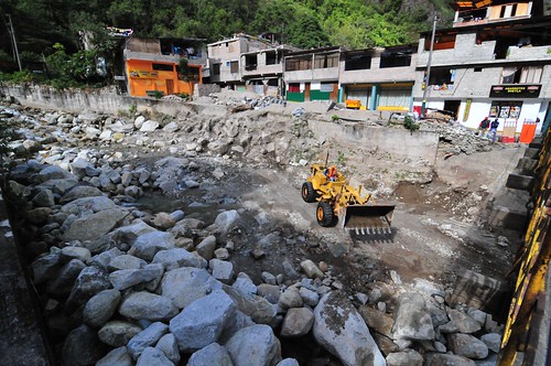
The usual kinds of reconstruction to accommodate the bustling tourist trade, including some new hotel at the end of the road and re-channeling the river for some reason.