Pretty Maps – 20×200 Editions

Some of you may have noticed, mostly probably not — but the Laboratory has expanded its ranks. It’s starting to feel like a proper design collective in here. One of the lovely attributes of the people in the Lab are the broad sectors of activity they cover that doesn’t make it seem like they do a zillion different things, but do many things to work though a relatively core set of interests.

Take Aaron Staup Cope. He writes algorithms that tell computers what to do. He makes maps out of paper. He makes maps out of algorithms. He makes you think about the ways that algorithms can do things evocative of map-ness..on paper.

Etc.

What I’ve learned from all of Aaron’s exploits in Dopplr-land, Open Street Maps-land, Walking Maps-land is that maps are dynamic, living things that should never be fixed in their format, style, purpose. They should never be taken for granted — even if the Google Map-ification of the world is doing just this. They should come in a bunch of sizes and shapes and colors and purposes. Etc.

Check out Aaron’s 20×200 Editions of his Pretty Maps. Get yours. I did. LA’ll go on one side of the wall. NYC will go on t’other.

Here’s what they say about Aaron over on 20×200.

For now, let’s set our eyes West, on L.A. County. Like prettymaps (sfba), prettymaps (la) is derived from all sorts of information, from all over the internet. Its translucent layers illuminate information we’re used to relying on maps for–the green lines are OSM roads and paths, and orange marks urban areas as defined by Natural Earth. They also highlight what’s often not seen–the white areas show where people on Flickr have taken pictures. It’s an inverse of a kind of memory-making–a record of where people were looking from instead of what they were looking at, as they sought to remember a specific place and time.

Interaction Awards 2012: Drift Deck for People's Choice

Drift Deck is up for the IxDA Interaction Awards in the “People’s Choice” category. Which isn’t the “Jury’s Choice” but — whatev. It’s the People, so we’re hustling to make you, the People, aware of this chance for you to choose what is the Choice of the People. For Interaction Design Awards.

Please give it a vote.

What makes Drift Deck chooseable? Well — it does something different and provocative in the world of interaction design for the things we do when we’re going/finding. The canon of interaction design for what were once fondly called “maps” is pretty stuck in the mud. Nothing extraordinary going on there that you wouldn’t expect from the next generation of mapping things.

What we did with Drift Deck was look at the world a little sideways and imagine a world in which the map was a bit dynamic and the act of going/finding was a bit less, you know — purposeful in a tedious, dogmatic sort of way.

It’s an otherworldly map app, if you will. Drift Deck is meant partly to be pragmatic for those times I find myself somewhere and have no idea what to do if I have an hour to wander about. (Sometimes we all need a bit of a start, or a script to follow.) And of course, it’s playful in it’s nod to the Situationists and their experiments with re-imagining urban space.

The principles led directly from the Drift Deck: Analog Edition that you can find here and more here.

These are the kinds of projects we do here. They’re not “Conceptual.” That cheapens the hard work that goes into them. We write code. We do illustrations of things that get properly printed on big Heidelberg presses. We put together electrical components and have printed circuit boards made and populated with parts to create new sorts of interaction rituals, new sorts of devices — new things that are different from the old things. These are ways of evolving the ordinary to make possibily otherworldly, extraordinary things. They come from ideas that we then evolve into material form so that the ideas can be held and dropped and switched up, on and off to be understood properly.

So, just to be clear — Drift Deck isn’t a conceptual bit of wankery. It’s a thing that got made. Ideas turned into lines of code turned into compiled bytecode. Oh, look! It’s running on my iPhone! Doesn’t feel very concept-y to me.
Continue reading Interaction Awards 2012: Drift Deck for People's Choice

Hand Drawn Maps..Drawn By Computer

ours

One of a sample of “Destination Maps” presented at SIGGRAPH Asia 2010 by a team of researchers. It shows a computer-generated emulation of the canonical napkin-style hand-drawn map. The described advantages are that it highlights relevant “neighborhood” streets and diminishes the arterials and highways that are not necessary and perhaps confusing for reaching the destination. It closes in on that typical style of map that was perhaps described best in Denis Wood’s “The Power of Maps” — the rough, perhaps off-scale map that gives the contours of a place and only what is roughly right and nearly necessary to navigate a place.

Some questions around this sort of map making:

* Why the use of kitsch-y napkin texture and the recognizable human-hand-hunting for lines with pencil? This idea of having the computer draw like a human seems a little dishonest, which puts me off. But, I suppose at the same time its recognizable and legible to people, which may make it more palatable and familiar, which I guess is something kitch is good at.

* I’m sure this is in the category of “it’s a prototype, relax” sort of thing, but shouldn’t the interstate highway signs be roughly-right, too?

Related, just to keep the project in-mind, to the PDPal efforts to make roughly-right emotionally evocative personal maps — here’s one that was just the other day done by a friend’s young’n, by happy coincidence. I often think about this project and its relevance to what I still think is curious, intriguing and worth pondering over. Fascination with maps and cartography — mostly off-kilter, peculiar, provocative ways of making maps and exploring is super interesting to us here, especially the fellas smoothing parchment in the clean room on the 3rd floor.

JonseyPDPalMap-08102010

cf. Mark Shepherd’s Serendipitor — an iPhone app to help you explore by creating unexpected routes from point A to point B. I’ve been mucking with this for a few weeks — very cool and fun. Not for anyone trying to just get from A to B, which isn’t always the most exciting way to explore.

cf. Designing for iPad, which has some nice remarks on the use of kitsch in interface design.

via http://johanneskopf.de/publications/destination_maps/index.html
Continue reading Hand Drawn Maps..Drawn By Computer

A Curious Crosswalk Clarification

Friday January 08, 14.46.08

Friday January 08, 14.46.21

A curious inscription left by someone to clarify which button expedites which crosswalk signal. Someone has written with an indelible marker “B” and “W” on each button (for Broad Street and Watchung Avenue respectively), as well as writing an abbreviation on the pole (“WAT”, for example.) What is interesting here is that an official sign also indicates which direction is controlled by the button (“Push button to cross *arrow* Watchung”) making me wonder if this was an addition made after some complaints about the confusing buttons. What made this confusing initially was probably the fact that there are two crossings in roughly a straight line. You cross a small bit of one-lane street that subsequently does an easy turn onto Broad Street from Watchung, and then stand on this island with the buttons. Then you cross a larger street — Watchung Avenue proper — with several lanes. Approaching the island after a nervous crossing and then looking out into a daunting sea of fast-moving traffic on your way to a quick sugar fix at Holsten’s, you might think the first button you see is the one to hit, which would be wrong.

Why do I blog this? I find these sorts of thoughtful, improvised inscriptions fascinating. A different kind of “read-write” city or read-write urbanism, where people in their everyday moments take it upon themselves to make additions, hacks, DIY improvements and adjustments to make the city more livable and agreeable to their sensibilities. The points where urban design from the top-down meets urban living from the bottom-up.
Continue reading A Curious Crosswalk Clarification

Generative Urban Design

LAIsland_001

LAMap_014

Get the flash player here: http://www.adobe.com/flashplayer

var so = new SWFObject(“http://www.db798.com/pictobrowser.swf”, “PictoBrowser”, “500”, “430”, “8”, “#E0E0E0”); so.addVariable(“source”, “sets”); so.addVariable(“names”, “LA Generative Procedural Maps”); so.addVariable(“userName”, “nearfuturelab”); so.addVariable(“userId”, “73737423@N00”); so.addVariable(“ids”, “72157622074827670”); so.addVariable(“titles”, “on”); so.addVariable(“displayNotes”, “off”); so.addVariable(“thumbAutoHide”, “off”); so.addVariable(“imageSize”, “medium”); so.addVariable(“vAlign”, “mid”); so.addVariable(“vertOffset”, “0”); so.addVariable(“colorHexVar”, “E0E0E0”); so.addVariable(“initialScale”, “off”); so.addVariable(“bgAlpha”, “71”); so.write(“PictoBrowser090818080648”);

These images are from a series of generative, algorithmic sketches to describe what Los Angeles might look like as an “augmented reality.” Specifically, one view of the city from my point of view, where the topography and built environments height-density were a function of my presence. An ego city or something.

This is more an idea that has been stuck in my head and needed some expression. I am not at all sure what one does with this or how one uses it in any instrumental way except as a proper augmentation of the one canonical reality. A bit of a Kevin Lynch (Good City Form which I haven’t finished but am enjoying and, of course, The Image of the City) style map of presence, sketched from accumulated presence data rather than specifically what I imagine or how my brain conceives of urban space.

These are simple, early sketches to see how home made cartography might create density maps that reveal some sort of cartographic indication of where you have been, leaving blank or perhaps more obvious the places you have not been. Or a GPS that shows a fog-of-war map, or constructs routes for you based on a principle of exploration — routing you through areas that you have yet to see or explore.

To be continued, as always. Just curious.

Why do I blog this? But, besides that point, I am anxious to find alternative perspectives of the city, especially ones that are dynamic and produced from closer to the ground-up, rather than from the top-down. Using occupancy as a measure, or as the algorithmic seasoning seems like a Lynchian natural first step. Based on the amount of time spent in particular areas, my own personal maps should reflect this somehow, either by fogging out all the rest of the space, drawing the rest of the space as blank or, as in these sketches, altering the terrain height and the built environment’s density and building heights, etc. (Of course, these are not actual buildings from Los Angeles — it is all a thought, a sketch of these ideas. These are the things I have been thinking about, and other kinds of algorithms and/or mechanisms to materialize these ideas, such as Drift Decks, Apparatus, Personal Digital Pal’s etc.

Also, I thought I lost these sketches after complete, well-founded frustration with the absolute most crappiest piece of over-priced software I have ever come across in the whole world.
Continue reading Generative Urban Design

Mail Call

Monday July 20, 12.14.48

JCB_21072009_095114_1417

Monday July 20, 20.25.01

Four parcels in one day, all good, gooey, design-y stuff.

What’d we get?

1. A collection of four “designmind” journals from Dawn up at Frog Design in Seattle.

2. A parcel from Zero Per Zero consisting of about 15 subway and city maps of various cities around the world — Barcelona rules, FTW.

3. A VHS Tape that is labeled “Back to the Future” — but I suspect it is something else about the future, from Chris Woebken. I’ll have to find a VHS deck at the studio or something to see this for real.

4. Nicolas Nova’s book recently released. Let me use the Laboratory’s brand-spankin’ new Universal Translator to tell you the title: “Les medias geolocalises”

That’s it.

Why do I blog this? We have never received four parcels of such promise in one day.

Continue reading Mail Call

Conflux Festival 2009 Call Proposals

11092008_162058_18

Conflux is having their 6th annual Conflux Festival! The deadline for submissions is soon — August 15th. At last year’s Conflux we brought our “Drift Deck” technology and had a swell time! Several years back, we did WiFiKu — we walked the streets of New York City neighborhoods and digitally scanning for the names of WiFi “Hot Spots” (Hot Spots…how quaint) and constructed a visual map containing Haiku from these found names. That was back when wireless networks were not as quotidian as they are today and we were all trying to make sense of this new puff of network leaking out into the streets. This year — who knows?

CONFLUX FESTIVAL 2009
CONFLUXCITY CALL FOR PROPOSALS
http://confluxfestival.org/

Conflux, the art and technology festival for the creative exploration of urban public space, is pleased to announce the 6th annual Conflux Festival will take place from September 17-20, 2009 and will be hosted by New York University.

In keeping with its commitment to urban artistic exploration, community participation, shared knowledge, and critical civic engagement, Conflux will organize a user-generated open format event on Sunday September 20th, 2009 from 10am-6pm.

Through an open submissions process, ConfluxCity will provide a platform for artists, urban geographers, technologists and others to organize and produce innovative activities dedicated to the examination, celebration and (re)construction of everyday urban life.

Drawing inspiration from Burning Man’s creed of radical self-reliance and BarCamp’s philosophy of openness and participation, ConfluxCity will adopt an open-space approach in which participants will be expected to organize, promote, and host their own activities and events. To facilitate this format, the Conflux Festival headquarters and website will serve as a central communications hub directing festival attendees outward to individual event websites and locations.

To submit a proposal to participate in the festival, please see the submission guidelines at the Conflux Festival website: http://confluxfestival.org/2009/submit-a-project/.

The deadline for submissions is August 15, 2009.

http://confluxfestival.org/

Street Furniture

Wednesday June 17, 15.04.24

Times Square beach, complete with tourists (as any beach should), found here.

Friday June 19, 12.10.57

Urban Lounge found near Madison Square, New York City.

This is probably old hat for current New Yorkers certainly, and something that makes visits home really interesting, these street furnishings and people zones are incredible interventions and nice experiments about alternative urban landscaping. When arriving in Times Square with my brother for a quick screech through of High POV shots, we managed to get one of these curious middle-of-the-avenue parking spots so you basically park right smack in the middle of Times Square. Which is good because you cannot drive through the square itself, only around it, because of these pedestrian urban “beaches”, complete with lawn chairs. According to one of the local business improvement district rangers or whatever they are, tourists quite like it. I wonder if locals find these useful or an annoyance to their conveyance around the city.

Tuesday June 16, 10.28.00

Saturday April 25, 10.07.27

Not quite the same, but in a different category of street furniture — the dispensed with sort.

Why do I blog this? A fascinating example of a reconfiguration of the canonical gridded city. Turning pavement into a more human, habitable space that evokes other leisures is a fantastic way to create new opportunities and to think about new sorts of design practices for urban space. This is an area that many people are curious about of course, and it is something that has attracted the attention of the laboratory quite a bit recently. For some reason, we have been thinking about new kinds of principles, rituals and scouting toolkits for finding new ways to look at the city, using these to think about new kinds of interactive urbanscapes…and not interactive in the “UX” sort of digital-y way. Playful interactions, thoughtful interactions — new rules of occupancy; new social interaction rituals.

GPX to DXF – Drawing GPS Tracks

Sunday March 29, 13.25.20

Lines and arrows and splines point the way. Taken in a parking lot near the beaches at Santa Monica.

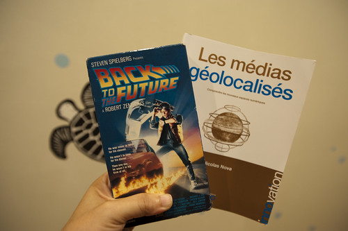
It has not been a quiet couple of days here in the Laboratory. Lots of gear and glassware about. Goggles, bunsen burners and all that sort of thing. And the report draft was just finished with Nicolas Nova, which occupied many early mornings. We almost spilled an organic, but toxic material on the draft which cause a collective gasp, but it was pulled out of the way, just in time before irrevocable damage was done. We’re writing with ink and pen these days, which feels so much more angelic and respectful, but are, through incidents like this, reminded that such may have nostalgic integrity, but it is also quite delicate and precious.

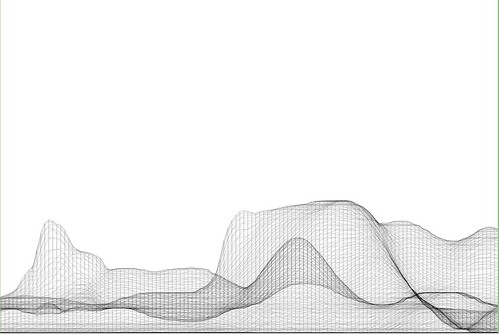
In the midst of all that was the need to translate a GPS track from GPX format to DXF. This was harder than I thought it would be, at least after poking around the Google. There are some tools that’ll do format conversions and so forth, but they were way more expensive than I thought was reasonable, seeing as we’re not making precious objects. It’s basically a translation of one connected graph format to another.

Okay, so — it was time to think about making our own tools, which took 10 times less time than the original set of Google searches, mostly because of the recently discovered ancient treasure of a Java library our buddy Tom Carden wrote back in the Precambian of the Age of the Network — somewhere’s around 1996 or some such…

This library provides enough functionality to read a GPX track and draw it on screen. The Processing.org DXF library can spit that drawing from the screen out as a saved DXF. So, that basically solves the problem. The DXF files that come out are flat lines that can then be serviced by other software to do other things. (There also exists this Kabeja library for consuming DXF and creating DOM models, which we’ll save for another day.

My lead toward the Carden code was found here on the Processing.org forums, where I found enough of a simple code snippet to get me out and through the chiseled hole in the brick wall I had hit.

Also to note is the small comment in the small simple bit of code that can cobble together many separate GPX files (tracks from a GPS) into one larger one, which can be quite convenient.

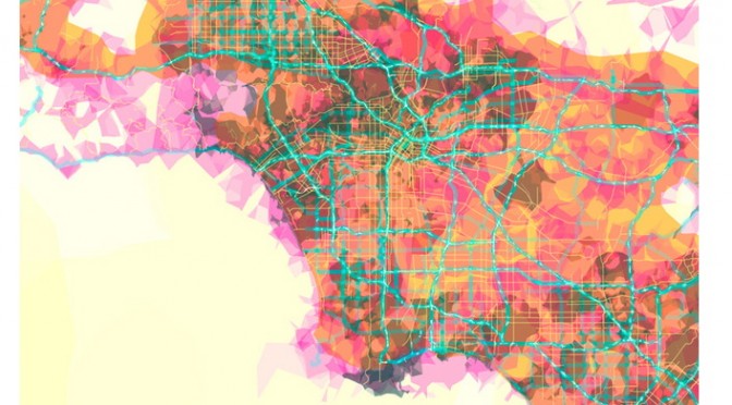
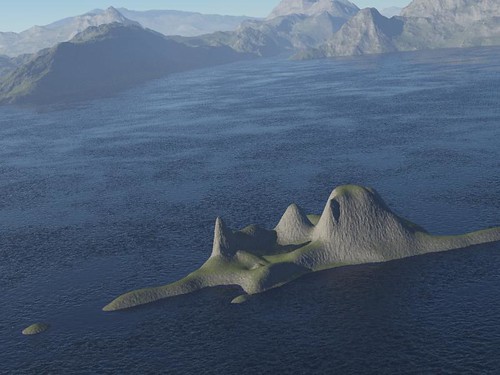
Why do I blog this? Mostly for my own recollection and notes as to how things are done. It’s been enough time in the jungle of small, utility challenges that, when on another project inevitably in the future, some small task I need to perform smells familiar — but, why? One gets the feeling — I’ve had to do this before? What project was it? How did I do it? Playing in the geo/map-making/cartography space has all these little formats and translation steps that are a bit zany to wrangle. Jotting a post with a bit of a reminder helps. Te bigger “why do I blog this?” has to do with using real-world GPS tracks as a basis for constructing other things — the input is movement in the world, an effort to figure out how a map might look that inverted the assumptions about static geographies and fluid movement, so that the ground moved and the things that moved became static. *shrug*


import processing.dxf.*;

// Based on Tom Carden's code and GPX library available at
// http://www.processing.org/hacks/hacks:gpx
// Press "R" and your track gets saved as a DXF file which
// you can use in lots of other things..

import tomc.gpx.*;

GPX gpx;

GPXTrack track;
GPXTrackSeg trackSeg;
String trackName;

double minLat, maxLat;
double minLon, maxLon;
double minEle, maxEle;
boolean record = false;

final static int SEPARATOR = 200;
String filename, filepath;

// I collapse lots of individual GPX files into one larger file
// using the free gpsbabel.
// At the command prompt (the GUI editions don't have enough features
// to do this) you'll do something like this:

/************

/Applications/GPSBabel+-1.3.5/gpsbabel -i gpx -f 20090321.gpx 
-f 20090401.gpx -f 20090402.gpx -f 20090403.gpx 
  -x transform,wpt=trk,del 
  -x radius,distance=5,lat=34.0236,lon=-118.4319,nosort 
  -x transform,trk=wpt,del  
  -o gpx -F foo.gpx

The "-x" filters do a couple of things.
The first -x filter turns the tracks into waypoints to work around
an issue that gpsbabel has with the "radius" filter
The second -x filters the output only to points that are within a
5 mile radius of the specified lat/lon, which is useful if you want
to limit the range of data you draw.
The final -x filter turns the waypoints back into tracks, which is what we want
Finally, we output as GPX formatted data and
write the whole thing to the file called foo.gpx.dxf


*************/

void setup()
{
  // Yep, hardcoded path to the GPX file we'll process
  filepath = "/Users/julian/Desktop/GPS Tracks/foo.gpx";
  // We'll use the name of the file for our DXF output, with the ".dxf" extension added
  filename = (new File(filepath)).getName();
  size(800, 800, P2D);
  gpx = new GPX(this);

  // you can load a file or a URL evidently..
  gpx.parse(filepath);

  // Find scope of track file so we can scale our drawing
  minLat = 2000; minLon = 2000; minEle = 100000;
  maxLon = -1000; maxLat = -1000;

  println("track count "+gpx.getTrackCount());
  for(int j=0; j < gpx.getTrackCount(); j++) {
  track = gpx.getTrack(j);
  println("track size "+track.size());
  for(int k=0; k<track.size(); k++) {
     trackSeg = track.getTrackSeg(k);
     println("track seg size "+trackSeg.size());
  for (int i = 0; i < trackSeg.size(); i++)
  {

    GPXPoint pt = trackSeg.getPoint(i);
    if (pt.lat < minLat)
    {
      minLat = pt.lat;
    }
    if (pt.lon < minLon)
    {
      minLon = pt.lon;
    }
    if (pt.ele  maxLat)
    {
      maxLat = pt.lat;
    }
    if (pt.lon > maxLon)
    {
      maxLon = pt.lon;
    }
    if (pt.ele > maxEle)
    {
      maxEle = pt.ele;
    }
  }
  }
  }
println("Lat: " + minLat + " to " + maxLat);
println("Lon: " + minLon + " to " + maxLon);
println("Ele: " + minEle + " to " + maxEle);
}

boolean hasDrawn = false;

void draw()
{
  if(record == true) {
    beginRaw(DXF, filename+".dxf");
    hasDrawn = false;
  }
  if(hasDrawn == false) {
  background(255);
  //stroke(#FF0000);
  //line(0, SEPARATOR, width, SEPARATOR);

  double distance = 0;

 for(int j=0; j < gpx.getTrackCount(); j++) {
  track = gpx.getTrack(j);
  //println("track size "+track.size());
  for(int k=0; k<track.size(); k++) {
     trackSeg = track.getTrackSeg(k);
     //println("track seg size "+trackSeg.size());
       GPXPoint prevPt = trackSeg.getPoint(0);
      PVector prevPos = GetPosition(prevPt);
      for (int i = 1; i < trackSeg.size(); i++)
      {
       GPXPoint pt = trackSeg.getPoint(i);

    // Show track
    PVector pos = GetPosition(pt);
    stroke(#FF8800);
    line(prevPos.x, prevPos.y, pos.x, pos.y);
    prevPos = pos;
  }
  }
 }
  }
  if(record == true) {
    endRaw();
    record = false; // stop recording to the file
    println("done writing "+filename+".dxf");
  }
  hasDrawn = true;
}

void keyPressed() {
  if (key == 'R' || key == 'r') {
    record = true;
  }
}

PVector GetElevation(int n, GPXPoint pt)
{
  return new PVector(
      map(n, 0, trackSeg.size(), 10, width - 10),
      map((float) pt.ele, (float) minEle, (float) maxEle, SEPARATOR - 10, 10)
  );
}

PVector GetPosition(GPXPoint pt)
{
  return new PVector(
      map((float) pt.lon, (float) minLon, (float) maxLon, 10, width - 10),
      map((float) pt.lat, (float) minLat, (float) maxLat, SEPARATOR + 10, height - 10)
  );
}

Embodied Viewing Platforms

Here and There a cartographic experiment by Shulze and Webb.

I think I figured out why I enjoy this map by Jack Schulze and Matt Webb — it can possibly induce vertigo, which means it’s human, real and embodied. The rolling coasting perspective that deliberately distorts the island of Manhattan shows the city from a fixed point of view, but still showing no horizon. The map is not these flat views that we’ve become so accustomed to, floating above the ground but yet firm, and sure and secure. A little more awkwardness in points-of-view is called for, I think.
Continue reading Embodied Viewing Platforms