Pretty Maps – 20×200 Editions

Some of you may have noticed, mostly probably not — but the Laboratory has expanded its ranks. It’s starting to feel like a proper design collective in here. One of the lovely attributes of the people in the Lab are the broad sectors of activity they cover that doesn’t make it seem like they do a zillion different things, but do many things to work though a relatively core set of interests.

Take Aaron Staup Cope. He writes algorithms that tell computers what to do. He makes maps out of paper. He makes maps out of algorithms. He makes you think about the ways that algorithms can do things evocative of map-ness..on paper.

Etc.

What I’ve learned from all of Aaron’s exploits in Dopplr-land, Open Street Maps-land, Walking Maps-land is that maps are dynamic, living things that should never be fixed in their format, style, purpose. They should never be taken for granted — even if the Google Map-ification of the world is doing just this. They should come in a bunch of sizes and shapes and colors and purposes. Etc.

Check out Aaron’s 20×200 Editions of his Pretty Maps. Get yours. I did. LA’ll go on one side of the wall. NYC will go on t’other.

Here’s what they say about Aaron over on 20×200.

For now, let’s set our eyes West, on L.A. County. Like prettymaps (sfba), prettymaps (la) is derived from all sorts of information, from all over the internet. Its translucent layers illuminate information we’re used to relying on maps for–the green lines are OSM roads and paths, and orange marks urban areas as defined by Natural Earth. They also highlight what’s often not seen–the white areas show where people on Flickr have taken pictures. It’s an inverse of a kind of memory-making–a record of where people were looking from instead of what they were looking at, as they sought to remember a specific place and time.

Hand Drawn Maps..Drawn By Computer

ours

One of a sample of “Destination Maps” presented at SIGGRAPH Asia 2010 by a team of researchers. It shows a computer-generated emulation of the canonical napkin-style hand-drawn map. The described advantages are that it highlights relevant “neighborhood” streets and diminishes the arterials and highways that are not necessary and perhaps confusing for reaching the destination. It closes in on that typical style of map that was perhaps described best in Denis Wood’s “The Power of Maps” — the rough, perhaps off-scale map that gives the contours of a place and only what is roughly right and nearly necessary to navigate a place.

Some questions around this sort of map making:

* Why the use of kitsch-y napkin texture and the recognizable human-hand-hunting for lines with pencil? This idea of having the computer draw like a human seems a little dishonest, which puts me off. But, I suppose at the same time its recognizable and legible to people, which may make it more palatable and familiar, which I guess is something kitch is good at.

* I’m sure this is in the category of “it’s a prototype, relax” sort of thing, but shouldn’t the interstate highway signs be roughly-right, too?

Related, just to keep the project in-mind, to the PDPal efforts to make roughly-right emotionally evocative personal maps — here’s one that was just the other day done by a friend’s young’n, by happy coincidence. I often think about this project and its relevance to what I still think is curious, intriguing and worth pondering over. Fascination with maps and cartography — mostly off-kilter, peculiar, provocative ways of making maps and exploring is super interesting to us here, especially the fellas smoothing parchment in the clean room on the 3rd floor.

JonseyPDPalMap-08102010

cf. Mark Shepherd’s Serendipitor — an iPhone app to help you explore by creating unexpected routes from point A to point B. I’ve been mucking with this for a few weeks — very cool and fun. Not for anyone trying to just get from A to B, which isn’t always the most exciting way to explore.

cf. Designing for iPad, which has some nice remarks on the use of kitsch in interface design.

via http://johanneskopf.de/publications/destination_maps/index.html
Continue reading Hand Drawn Maps..Drawn By Computer

Interoperability

Sunday September 20, 17.43.18

A curious interoperability protocol, wherein the address for some weird place in Seoul has been found on an iPhone and must now be entered into the GPS of the taxi. A simple affair, with minimal bumps often enough, particularly because the map on the iPhone shows the address and streets in Korean, which is great for the taxi cab driver, but miserable for the the traveler who can only hope that the locale on the map is actually where he would like to be.

Why do I blog this? This are useful moments to capture, where language, culture, objects, data come into conflict and must work their way around one another. I am told the iPhone isn’t available in South Korea at the time of this photo, so you have this foreign object — one that is probably quite legible as the iPod Touch was spotted around the city — and a baroque assemblage of devices, machines, transaction mechanisms, remote controls, identity stickers, car controls, radios, etc. I would have to contrast this with the notion of seamless perfection and interoperability that is often the image of the future transportation dashboard.
Continue reading Interoperability

Generative Urban Design

LAIsland_001

LAMap_014

Get the flash player here: http://www.adobe.com/flashplayer

var so = new SWFObject(“http://www.db798.com/pictobrowser.swf”, “PictoBrowser”, “500”, “430”, “8”, “#E0E0E0”); so.addVariable(“source”, “sets”); so.addVariable(“names”, “LA Generative Procedural Maps”); so.addVariable(“userName”, “nearfuturelab”); so.addVariable(“userId”, “73737423@N00”); so.addVariable(“ids”, “72157622074827670”); so.addVariable(“titles”, “on”); so.addVariable(“displayNotes”, “off”); so.addVariable(“thumbAutoHide”, “off”); so.addVariable(“imageSize”, “medium”); so.addVariable(“vAlign”, “mid”); so.addVariable(“vertOffset”, “0”); so.addVariable(“colorHexVar”, “E0E0E0”); so.addVariable(“initialScale”, “off”); so.addVariable(“bgAlpha”, “71”); so.write(“PictoBrowser090818080648”);

These images are from a series of generative, algorithmic sketches to describe what Los Angeles might look like as an “augmented reality.” Specifically, one view of the city from my point of view, where the topography and built environments height-density were a function of my presence. An ego city or something.

This is more an idea that has been stuck in my head and needed some expression. I am not at all sure what one does with this or how one uses it in any instrumental way except as a proper augmentation of the one canonical reality. A bit of a Kevin Lynch (Good City Form which I haven’t finished but am enjoying and, of course, The Image of the City) style map of presence, sketched from accumulated presence data rather than specifically what I imagine or how my brain conceives of urban space.

These are simple, early sketches to see how home made cartography might create density maps that reveal some sort of cartographic indication of where you have been, leaving blank or perhaps more obvious the places you have not been. Or a GPS that shows a fog-of-war map, or constructs routes for you based on a principle of exploration — routing you through areas that you have yet to see or explore.

To be continued, as always. Just curious.

Why do I blog this? But, besides that point, I am anxious to find alternative perspectives of the city, especially ones that are dynamic and produced from closer to the ground-up, rather than from the top-down. Using occupancy as a measure, or as the algorithmic seasoning seems like a Lynchian natural first step. Based on the amount of time spent in particular areas, my own personal maps should reflect this somehow, either by fogging out all the rest of the space, drawing the rest of the space as blank or, as in these sketches, altering the terrain height and the built environment’s density and building heights, etc. (Of course, these are not actual buildings from Los Angeles — it is all a thought, a sketch of these ideas. These are the things I have been thinking about, and other kinds of algorithms and/or mechanisms to materialize these ideas, such as Drift Decks, Apparatus, Personal Digital Pal’s etc.

Also, I thought I lost these sketches after complete, well-founded frustration with the absolute most crappiest piece of over-priced software I have ever come across in the whole world.
Continue reading Generative Urban Design

Mail Call

Monday July 20, 12.14.48

JCB_21072009_095114_1417

Monday July 20, 20.25.01

Four parcels in one day, all good, gooey, design-y stuff.

What’d we get?

1. A collection of four “designmind” journals from Dawn up at Frog Design in Seattle.

2. A parcel from Zero Per Zero consisting of about 15 subway and city maps of various cities around the world — Barcelona rules, FTW.

3. A VHS Tape that is labeled “Back to the Future” — but I suspect it is something else about the future, from Chris Woebken. I’ll have to find a VHS deck at the studio or something to see this for real.

4. Nicolas Nova’s book recently released. Let me use the Laboratory’s brand-spankin’ new Universal Translator to tell you the title: “Les medias geolocalises”

That’s it.

Why do I blog this? We have never received four parcels of such promise in one day.

Continue reading Mail Call

Embodied Viewing Platforms

Here and There a cartographic experiment by Shulze and Webb.

I think I figured out why I enjoy this map by Jack Schulze and Matt Webb — it can possibly induce vertigo, which means it’s human, real and embodied. The rolling coasting perspective that deliberately distorts the island of Manhattan shows the city from a fixed point of view, but still showing no horizon. The map is not these flat views that we’ve become so accustomed to, floating above the ground but yet firm, and sure and secure. A little more awkwardness in points-of-view is called for, I think.
Continue reading Embodied Viewing Platforms

Paper Maps

36 hours in Berlin right SHiFT 2008 and there’s only time for one or two things to do, really. Despite geek sensibilities, it turns out a paper map serves better than a digital one. This janky one from the hotel, flimsy and easily smudged and tattered, was actually spot-on perfect. Every street we needed to find, and U Bahn was easily navigated to. (Although, not by virtue of my lousy sense of direction.) Using a paper map makes me think — when will the still-Jurassic digital maps at lease orient themselves according to compass direction?

(I will add my friend Nicolas Nova’s map he also received while in Berlin just after I left, while we’re on the topic of paper and maps..I’m sure he wouldn’t mind me sharing this fantastic specimen.)

19102008_153730

Tourist highlight of the 36 hours was the Stassi Museum, my curiosity peeked especially after viewing “The Lives of Others”. The history in here is fascinating, and in German. I was fortunate to have a native German speaker with me, and one who lived through this period as well. Between the drama in the exhibitions and the real-life experiences, it was well worth the time. (Curiously the museum is not well indicated in the surrounding neighborhoods. We had to ask a couple of well-liquored gents knocking back a few in a box-bar about bit enough to fit a keg and a television in.)

Here’s Markus Meckel’s desk where I’m sure zillions of horrific deeds were executed. Check out the accoutrements of tyranny here — an enormous safe (you can see the door), a shredder (on the left of the chair), a chair, a switchboard phone thing, phone and desk. Despite the tyranical history, I was awestruck by the furniture. It was so evocative of the period in a way that brought the stillness to life. You have to check out the other photos — there’s spy gear, more room furnishings (including the side room with a bed, I guess for late nights or trysts or something) and some amazing swivel chairs.

More photos from the museum exhibits are in my Berlin Flickr set.
Continue reading Paper Maps

Manhole Compass

A functionally-decorative manhole cover that emulates the features of a compass rose for those who care not to navigate by dead-reckoning, rather feature or landmark-reckoning. I know these are all over the place, the image of it summoned up a recent conversation about how much built-in navigation cities should provide. The pro-argument being that it helps tourists to get around a city when they don’t have the vernacular, experienced wayfinding abilities of a native or someone who has had time to acclimate and grow accustom to the nuances of what is where. The con-argument is that these sorts of waypoints and navigation aids makes cities over mapped, removing the unexpected encounter that can only happen when you’re lost, or eroding the experience and feeling of becoming “native” and used to a city’s ways on ones own.

GPS Experiment

I can see something in each perspective, although I would generally prefer to leave a little more to chance when navigating a city. This photo is of me in Tokyo, 2005 after I managed to get a Tokyo map uploaded to my Garmin GPS. I had absolutely 0% navi experience in Tokyo and was pretty sure I’d get completely lost, which I did on an occasion or two, but was able to rely on the GPS to get me back on track. (There were no navigation features, just top-down POV and compass.) I’m certain it changed the experience, but there was not a whole lot left to rely upon besides my own wits and my trusty Tokyo City Bilingual Atlas.

Continue reading Manhole Compass

Old Mapping Alternatives and New Metaphors, Please

Some curious alternatives and conscious decisions made around map materials. When do we chose the local tourist map that has down-res’d nonessential features and up-res’d features more on the mind of weekenders, such as the location of airport, town squares, likely museums and sites? How do the fancy digital alternatives — a nearby iPhone with a really slick Google Maps interface — pale in comparison, and falter in their real navi utility? When is paper — which can be marked up, annotated, maintain its tangibility and foldability and non-battery-failability and non-data-roam-chargeability? Just paper.

Have a look at Aaron Cope’s paperMMap and other work in tangible, hybrid (digital-physical) cartography. I think this is exciting, mostly because maps and cartography may be on of the good, early connectors that laminate physical-digital thinking. We need better metaphors to capture the ambiguities between the physical and the digital — even writing them right there makes me anxious. The distinctions are quite arbitrary and I think “we” pioneers living in the near future would be doing a great thing to evolve the metaphors and language to point toward new hybrid realities. First to go? Second Life. Ahhem.. What a horrid name that might be tractable to the everyday notion of online/offline, but ignoring “1st Life” the way that Virtual Reality tried to do really does a disservice to the relevance and final import of the world in which we will ultimately be buried within, Timothy Leary’s insertion into an eToy USB drive notwithstanding.
Continue reading Old Mapping Alternatives and New Metaphors, Please

Urbanism, Data-Driven


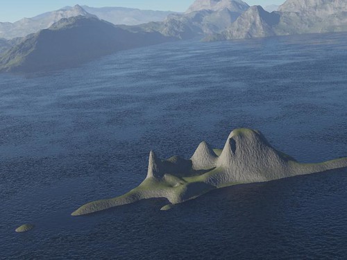
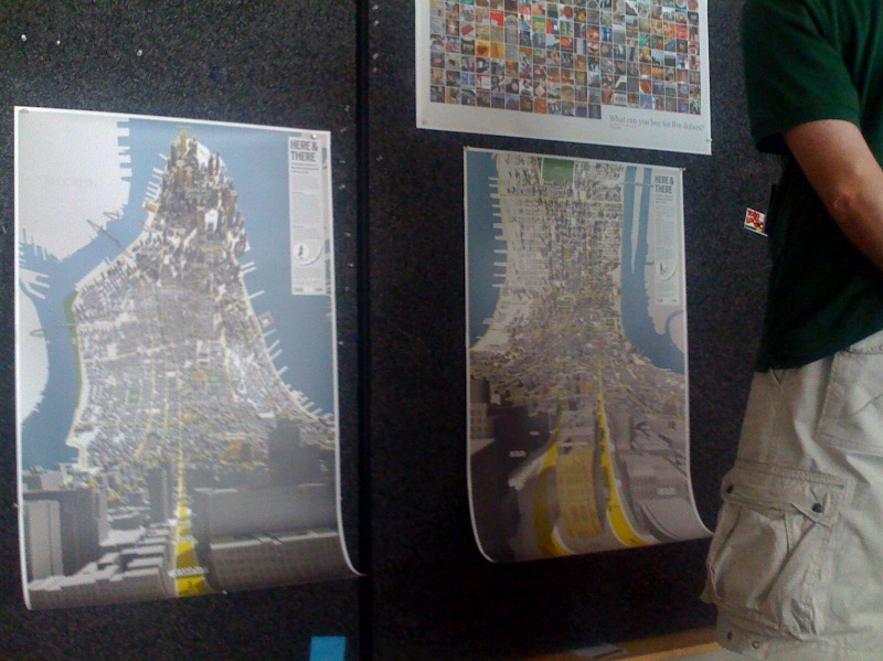
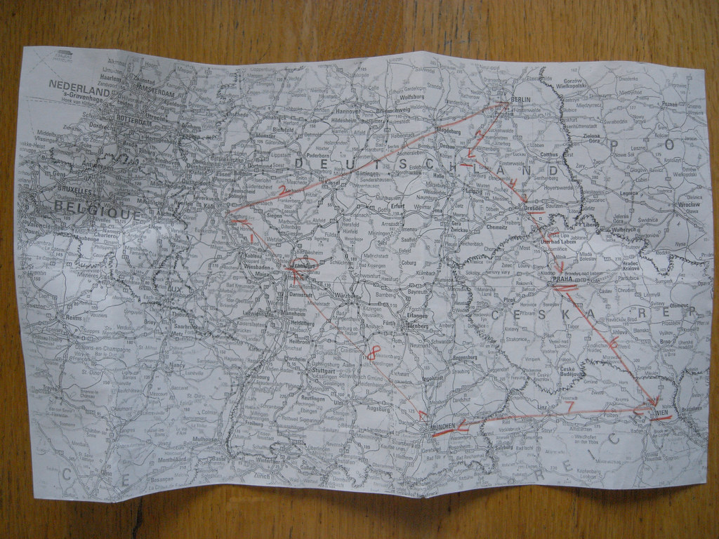
(Some cartogram structures and linkages Pascal created as sensor maps where the geography is an implied and driven — rather than the driving — parameter.)

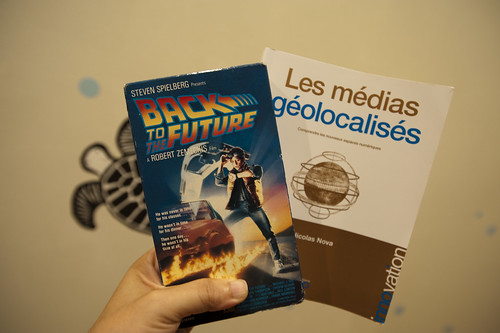
Fabien Girardin, MIT brainiac and a fellow Near Future Laboratory ‘naut presented his expert and insightful trinity of themes that appear to be the main motivators behind "urban computing", a bit of cocktail party conversation related to this short essay that Kazys Varnelis and Leah Meisterlin wrote, and that Nicolas poked a stick at.

Fabien describes three prime motivators behind the “urban computing” discussion and construction projects. Bears repeating, with some commentary.

1. Creating an opportunistic and optimistic urban environment that is somehow “better” than one without some sort of underlying computational infrastructure. This is the realm of the ubiquitous computing folks. The visions are aspirational — near-future signposts always already just out of reach and endlessly deferred — perhaps this is the definition of industry and academic R&D. Provide curious near-future fictions about possible near-future worlds. Effectively science-fiction expressed through objects and scenarios and large research (instead of film and television production) budgets. (Cf ““Resistance is Futile”: Reading Science Fiction Alongside
Ubiquitous Computing”, Paul Dourish and Genevieve Bell, forthcoming in Personal and Ubiquitous Computing.)

2. Study of the impacts and implications of computational systems and operations in an urban context, performed by GIS folk and urban planners and computer science people. These are studies of the dynamics of data-people sensed in the city, mapped and used to develop insights on urban conditions, or perhaps used as contributing information for design or re-design of urban geography. In some cases the data is interpreted in real-time, such as you might expect to be done to manage loads on cellular data networks, etc.

3. The action, postulating and creative exercises of independent and undisciplinary explorers and adventurers who shuffle and interleave the interesting data points that are anchored to geographies that can be re-mapped. This has brought us such interesting tidbits as the various crime data maps, for example, or the flows of automobiles throughout cities. (Using the geeky, horribly, self-deprecatingly named “mash-ups”.) What is happening here that is most compelling to me at least is that “GIS” activities are becoming something that anyone, without a license or professional sanction can do, inexpensively (i.e. for free and a bit of time). So, anything new here and worth glorifying is this fact — we can be our own map-makers. This is significant in the Foucauldian power-knowledge sense of significant. Cartograms such as the fundraising maps, which started out as a very DIY project, are important because they create new meaning and possibilities for action, or shifts in perspective that can lead to change, rather than stagnation. (There’s a normative element, of course. Visualizations of data with geographies, in the power-knowledge realm of things, are as free to interpretation as anything that alleges to be fact, so they can’t be counted upon to prove much of anything. At worst, they can be enrolled in larger conversations, just like any good knowledge agent.)


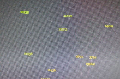
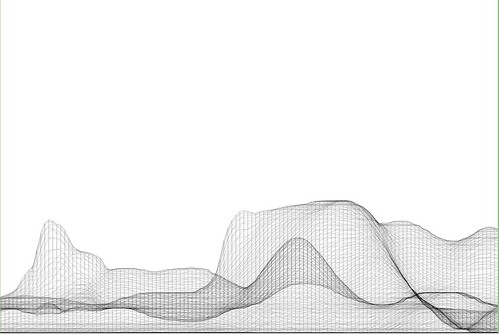
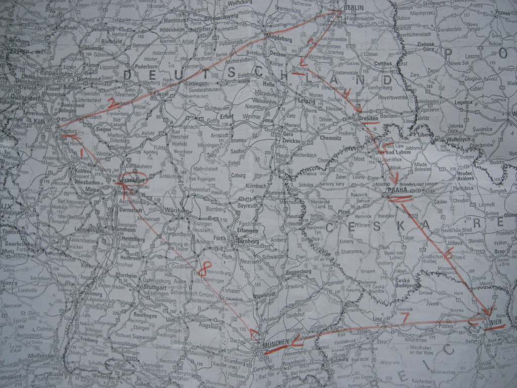
(Some more of Pascal’s cartogram structures and linkages. Sensor maps recorded amongst a small group of us and visualized such that the geography is an implied and driven — rather than the driving — parameter.)

I’d add a bit here. How can the experience of space — urban space, just to stick to the most discussed idiom — become fruitfully and playfully data-driven? Mapping data onto geographies by their instrumentalized location in space is okay. It’s a bit knee-jerk, though. What I mean is that re-mapping data with an entirely different basis could possibly produce an entirely different urban experience that may, at worst, be curious and playful. Just to see what comes of this. The Laboratory has been working for way too long on such re-mappings that do not assume that latitude and longitude are the canonical reference points for whatever data gets built on top.

I know..I know. This is weird. And the first project I was involved with that did this — an edition of PDPal that created maps based exclusively on interpreting an “experience” — fought a losing battle. But there are some indicators that this approach is at least worth exploring.

Creating “maps” that have a spatial aspect to them, but that do not use space as the primary or explicit reference datum can then emphasize people-practices or experiences first, with the geographic datum implicit or made into a driven, rather than driving, parameter. Paulos and Goodman’s “Jabberwocky” project comes to mind, as do Twitchr and other mappings of “encounters” and actions that are not expecting to use GPS first-and-foremost.

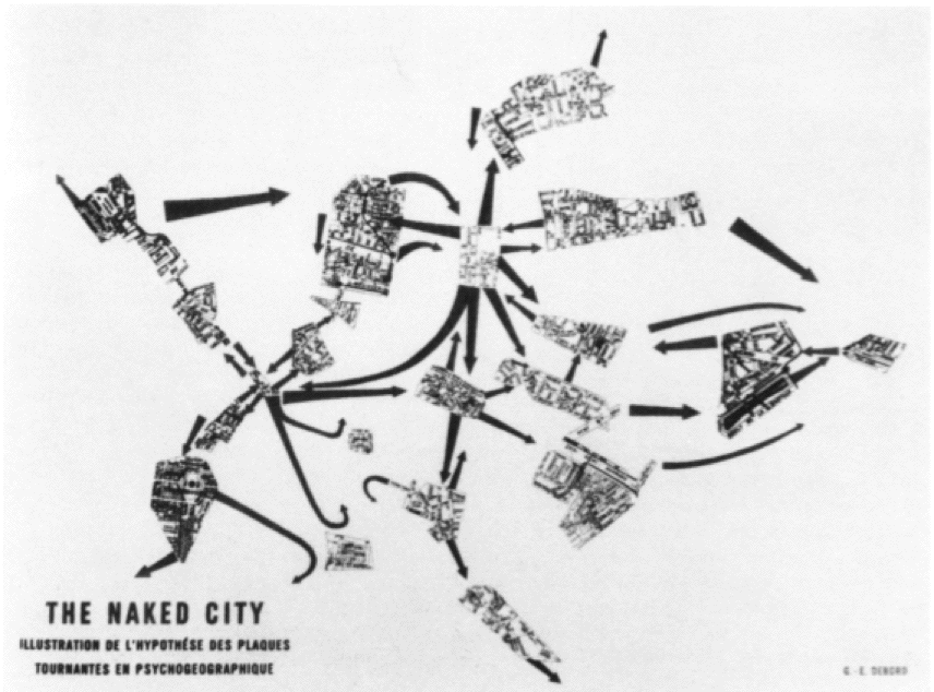
Situationist Space (Thomas F. McDonough)

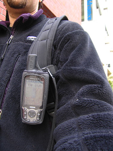
Here in the Laboratory we’ve been building several prototype devices that record Bluetooth encounters for later visualization. The first prototype was a small Python script running on a Nokia N70 phone. It was like a little data attractor that would sniff for Bluetooth devices, and then record them in a log file, and send them to a server to be persisted in a database.

Two recent editions used a small, custom-designed device that used the Bluetooth scanning mode of a radio to essentially do the same thing, storing the results in a Flash memory device to be later extracted with a simple USB interface. Lately a bunch of us in the studio have been working with a similar concept in the form of a background sensing application developed at Nokia R&D for S60 devices that does all of this, plus quite a bit more. (Currently in closed alpha, but soon to be available publicly.) The biggest challenge (besides running it on an S60 device..) is making meaning out of all of this. The strongest vectors for me, at least, lead to re-mapping and exploring possibilities playfully, with no specific expectations that there is intelligence in the maps by themselves.


# install first the following files to your phone
# (they will install automatically the needed libraries for the script below):
# aosocket-series60_v20.sis, pdis.sis
# found at: http://pdis.hiit.fi/pdis/download/pdis/

# this script was found from forum.nokia.com

import e32
import appuifw
##import aosocketnativenew
from pdis.lib.logging import *
##import httplib, urllib
from location import gsm_location
import time
import sysinfo
import select

cell = []
init_logging(FileLogger("e:\apache\htdocs\bt_probing.html"))

def tell(string):
    #logwrite(string)
    if e32.is_ui_thread():
        print string
        e32.ao_yield()

# ----------------------------------
from aosocket.symbian.bt_device_discoverer import *
#from socket import * # for obex file send

def discovered(error, devices, cb_param):
    if error == 0:
        global cell
        #tell("start discovery..")
        cell = gsm_location()

        #tell("devices: " + str(devices))
        tell(cell)
        #print location.gsm_location()
        for address, name in devices:
            logwrite("")

            tell(cell[0])
            tell(cell[1])
            tell(cell[2])
            tell(cell[3])
            print location.gsm_location()
            urllib.urlopen("http://smalltown.nearfuturelaboratory.com/upload_bt.jsp",
                           urllib.urlencode([('addr',address),('name',name),
                                             ('imei', sysinfo.imei()),
                                             ('batt', sysinfo.battery()),
                                             ('signal', sysinfo.signal()),
                                             ('cell_0', cell[0]), ('cell_1', cell[1]),
                                             ('cell_2', cell[2]), ('cell_3', cell[3])]))
    else:
        tell("device discovery failure: error %d" % error)
    _discoverer.close()


# -----------------------------------------------------------------------------


while(1):
    try:
        _discoverer = BtDeviceLister()
        _discoverer.discover_all(discovered, None)
        #tell("discovering")
        e32.ao_sleep(15)
        print "scanning again"
    except:
        tell("init failure")
        appuifw.note(u"Fatal error.", "error")

Continue reading Urbanism, Data-Driven