Weekending 03062012

Um. Well, here in Los Angeles it’s been lots of fun/frustrating days getting back into programming the computer. I’ve been getting a bit overwhelmed by the growing list of “ideas” that I thought would be good ways to get back into it. They’re mostly exercises that I thought would be better than following on in the usual lot of slightly mundane book exercises. The one I’m most curious about is a sort of social browser that, like Windows Phone 7’s live tiles, lets me flip through my friends social service “updates” and the like — but do so without having to go to the services, search for my friend, and then see what they’ve done. So — people first, rather than service first. Nothing brilliant there in that, but more a personal preference. Plus, also being able to see stuff from ancient history (many months or even a year ago) along with the latest stuff.

Some folks have mentioned that Path does this in some fashion. I’m still trying to see how. Right now? Path seems as noisy as Twitter. I’m looking for something a bit more — calmer. And the fact that Path is a kind of mobile Facebook status update yammery thing makes me want to enforce a simple rule that limits the number of slots for people. Or puts individuals in a special “Joker’s” slot based on which of your chums are being more yammer-y. Something like this. But, a couple week’s usage of Path leaves me thinking that there’s something that I want that is missing yet still. It’s still everyone. And sometimes you don’t want to share with or hear from everyone.

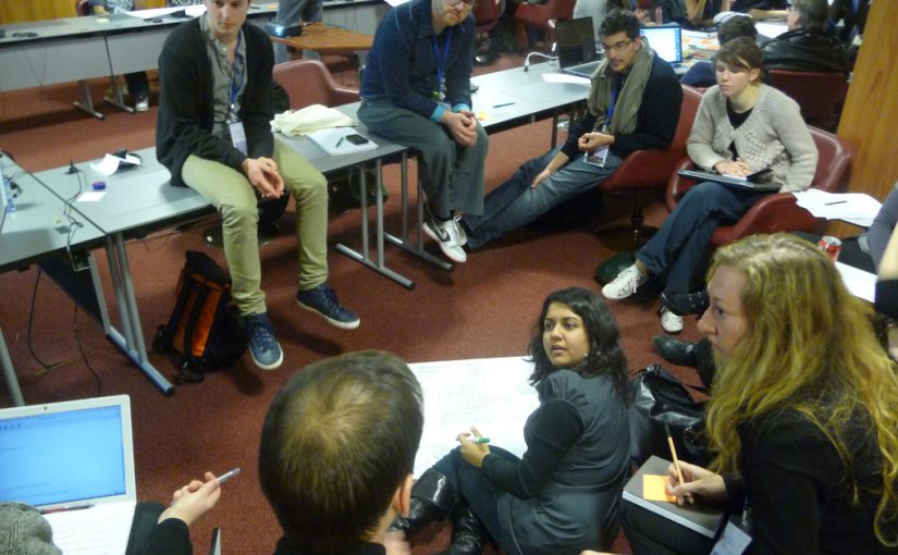
I also spent a bit of time preparing for a workshop at the Walker Art Center, where the staff is doing some work on the possibilities of speculation and interdisciplinarity for their own internal work. Looking forward to that a bit — especially to try some of the techniques we use in the studio on a group of people who I basically know nothing about.

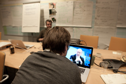
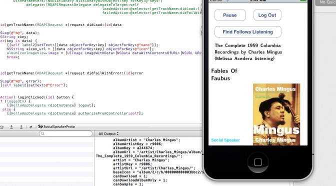
Oh, that photo? That’s me programming a networking app while flying in an aeroplane. I know it’s not a big deal, but it sorta is for me in a nostalgic sorta way. I think the last time I did that I was heading to the Walker Art Center in, like..2003. Programming in an airplane, that is. Certainly there was no networking going on at the time — but still. It’s sorta nostalgic and fun to get back to that sort of work.

On my side (Nicolas), the beginning of june is packed with different talks in Europe, the organization of a 3-days conference about video-games, preparing the Summer in Los Angeles and the writing of the game controller book… hence the quiet participation to the weeknotes here.

Corner Convenience // The Near Future // Design Fiction

We did a Design Fiction workshop as a kind of follow on to the Convenience newspaper. Our idea was to take the observation that the trajectory of all great innovations is to asymptotically trend towards the counter of your corner convenience store, grocer, 7-11, gas station, etc. Discerning the details as to why this occurs isn’t our primary concern. It’s an observation that tells some stories about convenience as a cultural aspiration of some sort, broadly; it’s a way of talking about industrialization, capital, the trajectory of “disruptive innovations”; it’s a way of talking about the things we take for granted that we wouldn’t were convenience to go away in some sort of puff of apocalyptic dust; it identifies the net present value of things as 99¢ and buy 1 get 1 free.

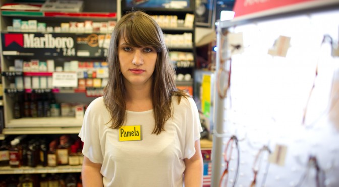
But that was the newspaper version that took the things today and made them plain. (You can get a PDF of it here.) It also serves as the conceptual set-up for what we did next which was for Nick Foster and I to tramp to Tempe Arizona to the Emerge event at ASU in order to run a workshop that would take the Corner Convenience as our site to do a bit of Design Fiction gonzo filmmaking. We imagined the Corner Convenience in some Near Future.

A couple of notes about the production of these films, but also the production of Design Fiction films generally. As the genre progresses — and it is progressing like crazy, which is fantastic — and evolves as a way to do design and make things rather than just film them, systems and structures and processes get informally put into place. I’m talking about things like styles and conventions and the visual language of Design Fictions. I’m attentive to these because it becomes useful in a Bruce Block sort of way to make use of the developing visual language and genre conventions.

One thing I notice is the way that now, early on in evolution of Design Fiction, tools have determined, or perhaps over-determined, what gets made to count as Design Fiction. Contemporary visual effects tools and software are incredibly sophisticated at what they do. I think they may have a tendency to over-determine the filmmaking. By that I mean to say that, now that we can do desktop motion capture, planar tracking, and animation in scenes — we end up with Design Fiction of surfaces as screen interfaces as if that’s the future of interaction. Which it might be, but seriously — what else? At the same time, things like green screen which is effectively a drop-down menu item in AfterEffects, or the insertion of CAD rendered objects composited seamlessly into scenes with (almost) drop-down menu item workflows, etc. That’s all a bit of the tool leading the ideas, which is generally disconcerting especially if you don’t realize or take notice of the way an algorithm is determining one’s thinking about what could be.

Don’t get me wrong — they are seductive eyeball candies. The Corning one is particularly enjoyable as pure visual experience. So is that Microsoft Office future fiction film. But these don’t feel real except for the degree of finesse in the visual effects. It almost feels like someone found the tools to do this and then the tools over-determined the diegetic prototyping. The tool was the door knob and then the designers or marketing people or whoever was behind this took the door knob and tried to build a house around it. And, in any case — they are so clean and almost fascistic in their fetish of the slick, glamorous, gleaming and super pricey stuff we’re being told we’ll live with in the near future.

What about the forgotten underbelly of the mundane futures? The ordinary and quotidian. The things that are so tangible as imminent as to be almost ignored. Like the things one would find in the Corner Convenience store but were once fantastic, extraordinary, mind-boggling disruptive stuff.

Using the Corner Convenience as our design fiction site directed us to consider things that were once amazing and are now 99¢ or $1.99 or 3 for 99¢. They’d be available *everywhere, which is as important to consider as some sort of silly ersatz coffee table that has a touch screen built into it. A thing that 1% of the world cares about, or can even comprehend or conjure some half-baked rationale to own and use before it gets tossed out when its planned obsolescence means it won’t show the antique JPEG format anymore without a firmware upgrade that probably won’t upload to it because of some byzantine tech issues that frustrates you to the point of not even caring about the thing anymore. You know? I’m still trying to get my brand new $99 5-star reviewed Brother laser printer (which replaced the 10 year HP I had that just stroked out and died) to run the crappy configuration software so I can use its built-in WiFi features. But, like..I’ll always be able to flick the flint-y scroll of a BiC lighter and make fire.

That was an aspect of the design principles that shaped these three films we made. We were deliberate in designing the production and the things in such a way that they were whiz-bang-y iPhone things with touch screens and surfaces. It was real stuff that would tip into that realm of convenience without missing a beat, and without Wieden+Kennedy running a campaign that seduces the 23-year-old bearded, skinny, waifish, Williamsburg/Brick Lane/SOMA hipsters into bending their knee — again — to the Palace of Apple.

In this Near Future Corner Convenience Store, Snow Leopard is a variety of synthetic meat jerky, not an operating system.

Anyway. Enjoy our three design fiction films.

The Players
John Sadauskas — Ersatz Shoplifter
Julie Akerly — Clerk
Dan Collins — Caffeinated Drunk/Hangover Guy
Joshua Tanenbaum — Panda Jerky Porno Trucker Guy

Background Talent
Nicole Williams
Muharrem Yildirim

Workshop Props & Make Stuff Team
Alex Gino
Joshua Tanenbaum
Adiel Fernandez
John Sadauskas
Nicole Williams
Muharrem Yildirim
Byron Lahey
John Solit

2nd Unit Production
Byron Lahey & John Solit

Thanks To Tops Liquor Staff
Greg Eccles — Owner
Matt Bannon — Manager & Nametag Maker

Special Thanks To
Assegid “Ozzie” Kidane

Directed By Julian Bleecker
Produced By Nick Foster

A *Near Future Laboratory* Production

Portals


I love the magically mundane virtual real world of Google Streetview, and like others I’ve longed for my 15 frames of blurry low-res Street View fame. So I’ve been wondering, how can I get into Street View without having to stalk the car and chase it down? Actually, I don’t just want to appear in Street View, I want to play in it and add things to it too. And I want to be able to invite my friends to join me on the street. I want to use Street View for more than looking at a random piece of the past. I want to use Street View as a place to make alternative presents and possible futures.

To help me fulfill this desire (and part of my thesis project), I’ve been prototyping magical portals to get into Google Street View.

I’ve also decided to launch a Kickstarter project to help take the prototype to the next level and see if other people might be interested in exploring this and other related ideas with me.


It turns out, making portals is also happens to be a good way to think about a lot of other things as well. For instance, why does the screen still feel like a glass wall between me an an interface? And how could I get around this wall in a fun and fluid way?

Lately, people have been really into using touch screens (pictures under glass) and gestures (lick a stamp!). But as cool as these things are, they still keep us on one side of the screen and the interface on the other. Not that I think we need to get rid of screens entirely and just have holograms in dark rooms every where. Screens are actually quite magical and we can take advantage of them. But what would happen if we could just make a little space for the real world between the screen and the interface?

Also, what other ways can we think about being co-present with people? There’s the completely CG virtual worlds, full of anonymity and low polygon fantasies. We also have plenty of banal desktop sharing and collaborative white boarding applications. Then there’s standard video conferencing which keeps people in their own separate boxes awkwardly avoiding eye-camera contact. And of course there’s always Real Life, but that’s bound by the rules of space and time. What if we could take a little from all these things and combine them into something that is both more real and more magical?

These are some of the things that I’ve been researching through making these portals. I’m not sure what other questions might come up as I move forward, but it’s a starting point for now.

If you’re interested in helping me explore these ideas while making these Portals, check out the Kickstarter project!

Continue reading Portals

A trajectory from academia to entrepreneurship

The other day I took part of a round table on entrepreneurship for investigators organized by Universitat Pompeu Fabra to promote their latest incubator in collaboration with Barcelona Activa. Since I finished my PhD and co-founded Lift Lab one and a half year ago, young researchers have frequently inquired on my personal experience to move from academia to a private research agency. I often explain how we modeled our research methods and analysis techniques to fit into processes. Or I point our techniques to transform results into insights and solutions for diverse audiences (engineering, design, marketing, management). Beyond the evolution of our practice, there are a couple of ingredients that I believe greatly help initiating the trajectory of a business that spins out of an extended investigation (the PhDs of Nicolas and I in the case of Lift Lab):

Nurture a mixed network…

Lift Lab was already taking shape during our research as part of our constant efforts to communicate our ideas and results, using our blogs, pamphlets, talks and workshops as echo chambers. It was particularly important for us to confront our findings outside of a single research community as much as outside of academia. Reaching out of the walled gardens of academia, listening and reading about other practices is particularly important to refine and polish a voice, the kind of voice that makes research finding more tangible and accessible in a life after academia. In our case, it helped us capture the interest of what-would-then-become clients and create diverse channels of communication with people that challenged our intuitions, confront our points of view and ultimately made our methods evolve. Prior to move out of academia, these contacts were already grasping the value we could produce in their contact. Ultimately, these channels exposed, nurtured and also generated some sense of legitimacy that we use to further inspire and provoke.

… to benefit from a community …

As a consequence, our business thrives on this ability to involve multiple practices and networks for question formulations, data collection and solution creation. Our links to academic institutions (e.g. following master or PhD students) provide unique opportunities to further polish our research methods and well as new techniques and latest findings. With our experience in academia, it comes at very little cost and it is very rewarding. In parallel, we like to expend our network based on our curiosity with partners, “extreme users” and anybody we can learn from. The Lift community reflects very well this access to different practices, the confrontation of ideas/methods/interests and the access to domains and problems we never suspected we could be engaged int. When mobilized, this type of network provides resources for a small agency like ours to extend the range of our services and share risks in a bid.

… that helps (among other things) correct the execution …

A few concepts spun out of our PhDs, but none of them were ready to even remotely consider a product or service. Nevertheless, we like to engage with our clients to test the maturing concepts (e.g. social navigation). It helps refining the ideas, evaluate them with users and our network. Through this iterations, clients and partners might invest in the idea and engage resources. In any case, the exercise delivers keys that shape the execution of a concept that is very often more important than the idea itself. Once again the capacity to transfer results and intuitions into innovative prototypes is deeply rooted in our ecosystem of friends and partners.

… and forces to stay humble but assertive.

We found out that leaving academia improved our ability to formulate our methods particularly thanks to the diversity of constraints that demand a diversity of techniques. However, we make efforts in keeping the ideological approach of a researcher intact. It implies staying humble, not starting an investigation with a priori assumptions and not being afraid to express dots. When conveyed with assertiveness, this posture of the researcher driven by doubts but confident in its methods is what makes our value.

Why do I blog this: The paths out of academia are not paved, particularly because completing a PhD today differs from 15 years ago. Researchers must adapt to the increasing speed of knowledge sharing without necessarily grasping the opportunities to cross-pollinate. Beyond incubators, the mixed networks I describe here represent a support that helps concepts and a business mature

Opportunism

RadiationDetection

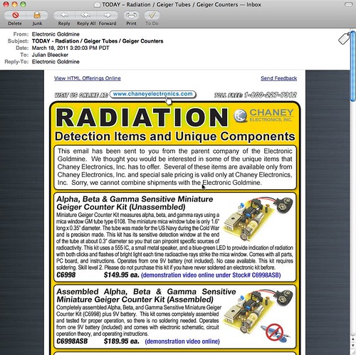
Completely understandable how the recent tragic events in Japan would translate into email from an electronics source containing *only parts and supplies and modules to make Geiger Counters. At the same time as it’s understandable, it’s one of those things that feels like it’s taking advantage of the general panic, confusion, sadness and apocalyptic angst.

Not deflecting the urgency and anxiety of recent events in Japan, it’s curious to me to think about how and when change is able to happen. By that I mean that things happen, swerve off-course or are able to swerve off of into unexpected, new directions. For example, the events after 9/11 where an *opportunity space opened up in which dramatic, unprecedented changes were able to be made in the legal systems of some countries. Things that would not have been so easy to implement had their been no epic tragedy. Similarly, in a way — now we learn quite a bit about nuclear physics, science, speculation about the malfeasance (if you can call it that) of this nuclear quasi-agency in Japan (via @xenijardin WSJ: TEPCO initially resisted using seawater to cool reactors; harm to “valuable power assets” feared ). We find ourselves preparing — again — for an earthquake, nuclear catastrophe, flood, Tsunami, etc. Entirely enormous nations are scaling back and turning off nuclear power plants (I find this most intriguing) and rethinking their energy policies. I mean — that’s epic. Whatever side you may be on the issue of nuclear power, these events, at the cost of untold lives, future lives, physical infrastructure, and so on — everything has been changed.

The imagined course into which the future was going to be made, has swerved.

We often like to think of change coming about from good, thoughtful, happy actions and activities. Like good design work, for example. I think, from my experience, it is often never like this. It is hard. Change is hard. Making things better is hard. Generally, and anecdotally from the experience of myself and others up and down the hall here on the 7th floor of the Laboratory — people are reluctant to change their ways, the course of their lives. Moving out of “comfort zones” and all that is, well — uncomfortable. Adapting and adopting new ways of living, behaving, thinking would make for a more resilient world, I think. One that was not afraid of difference, of giving things up for the hope and possibility of a better things.

Of course — it can all go wrong. But at least we’d try.

*Anyway..

Parenthetically, Studio 360 has an intriguing related radio story on this topic. It is called Japan: The Imagination of Disaster.

Why do I blog this? As always, we here are quite intrigued by how the future comes to be — what are the mechanics, semantics and motivations that move people to obtain and create possible futures. In this case, “taking advangage” of opportunites when one can do that bit of swerving, rudder-pushing, tiller cranking because the currents become favorable to try a new tack.
At that moment when the normal course of events seems to swirl out of control

Continue reading Opportunism

You'd Be Right To Wonder

Wednesday January 12 00:17

You’d be right to wonder why there has not been much here for a couple-few weeks. Contrary to a vicious rumor, we neither adopted a needy office pet nor did we father-seed a dead pop star’s child.

It’s Annual Planning Month here in the Laboratory, when we assess what will be our near future priorities, goals, strategic themes and projects. It’s weeks of mulling, muttering, hemming, hawing, pausing, sputtering, drinking and brow-furrowing. After all the strategery comes the planning. We’re deploying a rigorous phalanx of unforgiving planning-to-do tools, reacquainting ourselves with our old avuncular friend — Mr. Gantt and his fabulous chart. Along with this is Mr. Gantt’s trusty Sancho Panza, Mr. Miles Stone.

That’s right. Planning, charting, back-filling objectives and sticking to our guns. This way, at the end of each “Q” (that’s Quarter to you non-accomplishers-of-things) we can re-assess and re-target. In fact, we might even be working at the level of the “P” (sorry, “Period” or one of your Earth “Months” to you terrestrials) and perhaps even the microscopic time element — the Week.

Where has this sudden bit of planning gluttony come from?

*Shrug. Who the fuck knows.

But, it feels right and it will help the Laboratory to say “no” because it’ll all be right there, in Mr. Gantt’s chart and resource managers can point and wag a finger and say “Uhn uhn uhhhnnn..that’s not going to happen. Back to your computation terminal!”

The ring of the ball-peen hitting the work piece on the anvil. The smell of the coke smelting the ore. Lustful, material things. Things getting done and made.

So — what’s on the plate?

Well, I can give you the *general theme, but nothing super specific, and that’s only because of the deeply sensitive nature of our work and the fact that it might have deep political affect on the ways the needle-heads upstairs in Finance & Control’s (mis)understand what exactly it is we do and how it brings incalculable value to the efficiency of the Laboratory — unlike the Bridges and Thoroughfare Systems Group which never, by the way, ever did a damn thing to contribute to our bottom line, least as best as I can tell.

Wednesday December 29 17:00

Here it is. This year’s theme: Less Yammering. More Hammering.

Let me explain. In the recently deceased year, we spent the bulk of our informal projects time talking about things that were *more than interesting to us.

It was more than interesting. Supra-interesting. Boundless interestingness. I’m talking mostly about, well — talking about #designfiction. And this will continue as a theme within whatever theme happens to be the theme-of-the-day.

At the same time, the yammering meant there was less time (despite having it on the list of the Professional Development Plan) actually making things. Now — I love to talk and have conversations around engaging, new, whacky-but-intriguing ideas. That’s the guano of innovation. It’s how things change, grow, evolve. Ideas come to life in the conversations. The conversations are that which promote and propagate; they contain the narrative logics that poke and prod and stretch and materialize those thoughts, making them more tangible and more legible. So — I love to yammer. As you may know — I also really love to hammer: to make things that are distillations and materializations of those conversations. Little props and provocative objects that help think-through and evolve those conversations.

Years ago the Laboratory wrote a tremendously short essay called Why Things Matter in which I ham-fistedly explained my thinking about the importance of “social objects” and the ways that these can become as yammer-y as normal human beings and, thereby, bring about material change to the world. It was most an interest in how things like Pigeons or Salmon suddenly connected to the *network in oftentimes simple ways could alter the terms of conversations about things like environmental issues, pollution or fishing legislation.

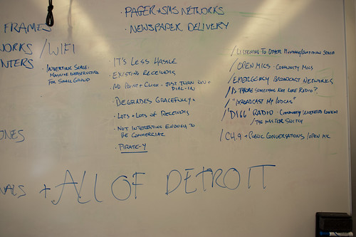
What I learned through that was the importance of making things — but it’s not just the made-thing but the making-of-the-thing, if you follow. In the *making you’re also doing a kind of thinking. Making is part of the “conversation” — it’s part of the yammering, but with a good dose of hammering. If you’re not also making — you’re sort of, well..basically you’re not doing much at all. You’ve only done a *rough sketch of an idea if you’ve only talked about it and didn’t do the iteration through making, then back to thinking and through again to talking and discussing and sharing all the degrees of *material — idea, discussions, conversations, make some props, bring those to the discussion, *repeat.
Friday January 14 12:04

So — we’re not done here with the #designfiction theme, but it is an idea that needs some material-making, at least here, and lots of people are doing this as well. But, generally thinking — it’s time to get back to making stuff, building little probes and provocateurs and trouble-makers. That means booting up the old software-making toolkits, breaking a few of Simon’s milling tools (sorry, again..), learning how to CNC myself so I can make my own mistakes, getting a CAD package in that old PC in the Laboratory, etc.

There’ll be posts here and status updates and of course — yammering. It’ll just be tempered with and by and through the making as it once was oh a couple-few years ago when we were making hellzalot of electronics.

This’ll be the year of trouble-making apps of various sorts, I think. The first one is the digital edition of the previous Drift Deck, analog edition which has had a sort of silver-year’d renaissance thanks to @bldgblog writing a nice, thoughtful little post about it. That’s being done by Jon Bell and Dawn Lozzi with myself being the design project equivalent of the annoying sot who wants to have “just one more.” Allegedly, so long as I *don’t have “just one more” this should be done by the new networked age’s equivalent of the finish line — South by Southwest, which’d be March 11. (Here is a printable PDF of the Drift Deck, analog edition for those who have had trouble downloading it from Slide Share.)

There are other things, of course. The completion of the Laboratory’s re-make of 2001: A Space Odyssey, finally doing the animated Death Match between Apollo LEM and Space POD, a *book project with more images than words, revisiting two old location-based software toys, and a crackapp that may hopefully get us in good trouble with parents.

Thursday January 13 17:56

Finally — this is it, really: the sub-genre of this year’s theme “Less Yammering. More Hammering.” is — “Low Brow.” In fact “Low Brow” was the original theme, but it didn’t test too well in the experts’ reviews. But, if I think about it, it lives on in a way. It provided the transposition algorithm, turning the wonderfully optimistic “Get Excited. Make Things.” that our friend Matt Jones (@moleitau) of Berg meme-seeded into a sort of by-the-scruff, morning drunkard, roughneck-ificiation — “shut up and just do it, you moron” — only I made to rhyme so that I can sing it — should things come to that.
Continue reading You'd Be Right To Wonder
A Few Things The Laboratory Did In 2010

Friday December 10 15:28

Again, mostly in the notes-to-self column, I’d just like to capture a few things that we here at the Near Future Laboratory did in the year 2010.

It was a year chock full of Design Fiction actions and activities, an exhibition of some work, talks and discussions about projects and ideas. The usual, except there was a dearth of making-of-things, something which will be remidied one way or t’other in 2011. ((I shouldn’t discount the zealous skate photography, though.))

So, just a fool’s list:

Saturday March 13 12:27

There was the panel at South by Southwest with Stuart Candy, Sascha Pohflepp, Jake Dunagan, Jennifer Leonard and Bruce Sterling. I think that was a highlight as it led to some great conversations from the dais and Bruce’s interjections and interceptions were quite inspiring. I think the best part of the panel was what we talked about getting the whole thing organized. There were some really intriguing Skype conference calls, just talking and learning from each other. That was good stuff.
(Audio Podcast of the SXSW Design Fiction Panel)

Friday September 17 17:06

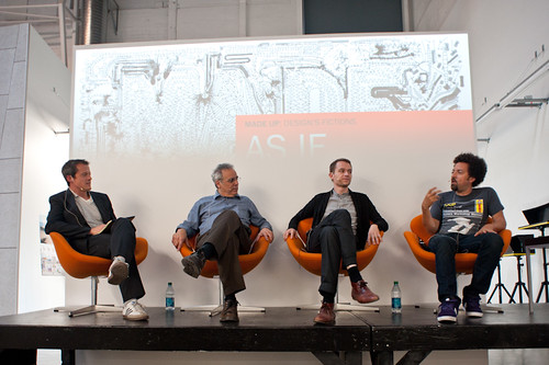
Art Center’s “Made Up: Design Fiction” theme was (and continues to be) an opportunity to further stretch and elaborate the Design Fiction theme — finding new ways to actually *do design, and then sponsor a number of works exploring the idea of making things up as a way to do advanced design. I love what the Media Design Program folks are doing over there. Participating in the “As If: Alternate Realities” panel discussion and other activities over there has been good, great fun. ((I was also super excited to go to the MDP MFA Thesis Reviews and see student work first-hand, give feedback and all those other good things..))
(http://www.nearfuturelaboratory.com/2010/09/10/made-up-panel-discussion-september-17/)

Tuesday October 26 15:22

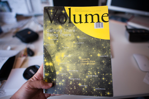
The original design fiction essay was rejiggered and reprinted in Volume Quarterly for their Issue No. 25 with the theme: The Moon. That was an interesting re-writing project because I had wanted to say a bit about how I understood architecture as perhaps the canonical design fiction enterprise — it is so imminently focused on what could be, and perhaps so finely tuned to tell a story — to *pitch what the future landscapes might look and feel like, and suggest how humanity might live and embody space. Architecture has this remarkable conundrum in that it likely spends most of its time constructing facsimiles of what could be as concrete gets poured based on most designs so infrequently. Sure — the big corporate architecture firms make their malls and condos and so on. But the speculative, richly imaginative contingent of architects — well..they enter competitions with models and renderings. In fact, I would guess that most of architecture does precisely this — it spends its time (not fruitlessly, I would say) telling stories through materialized forms: models, renderings, films, stories essentially. Designed fictions, I might say. In any case, the reviewers for this particular re-write didn’t find it substantive or something — it’s fine. It’s a theme I’d like to work on in some fashion for 2011, though. Even though I have a grumbling relationship to architecture.
(http://www.nearfuturelaboratory.com/2010/12/22/designing-fiction-in-volume-q/)

Monday December 13 14:19

Which might seem like it contradicts the fact that I participated in two reviews for USC Architecture, one in Neil Leach’s wonderful “Interactive Architecture” studio, and the other for Geoff Manaugh’s equally provocative Cinema City studio. Both were thoughtful and fun and engaging. I often felt that the students got a bit too ruffed up by the jurors/critics, but I have *no idea what the culture of that design practice is, so maybe that’s entirely normal. I always thought it was soft gloves before you went bare-knuckles in crits. Maybe its just all tough-love all the time.

My chum John Marshall and I had our essay appear in the Digital Blur: Creative Practice at the Boundaries of Architecture, Design and Art book. It’s an essay on Undisciplinarity — doing things without predefined boundaries, or without constraints and often without discipline. I think it’s a useful way of doing things differently and perhaps making new things. Just looking at the world and its possibilities from a sideways glance and without curmudgeonly bureaucracies to say you’re doing things the wrong way round. Pick up a copy, not for the essay but for the other great documentation by artists and designers.
(http://www.nearfuturelaboratory.com/2010/04/30/digital-blur-book-launched/)

Friday July 23 12:01

For the third time I was able to attend ThingM’s Sketching In Hardware event, this time held in Los Angeles at that crazy Encounter Restaurant. I’d share the presentation, but its 1GB because in 2010 I sort of went a bit crazy including film clips in my presentations. I wish there was a better way to share these enormous things.

The Laboratory had a spot presenting at Kicker Studio’s Device Design Day last August. Again, more elaborations and thinking about the Design Fiction stuff — “Design Fiction Goes From Props to Prototypes” — thinking about prototypes as ways to test ideas (not just their material forms): “Prototypes are ways to test ideas—but where do those ideas come from? It may be that the path to better device design is best followed by creating props that help tell stories before prototypes designed to test technical feasibility. What I want to suggest in this talk is the way that design can use fiction—and fiction can use design—to help imagine how things can be designed just a little bit better.”
(Kicker Device Design Day on Vimeo)

Habitar

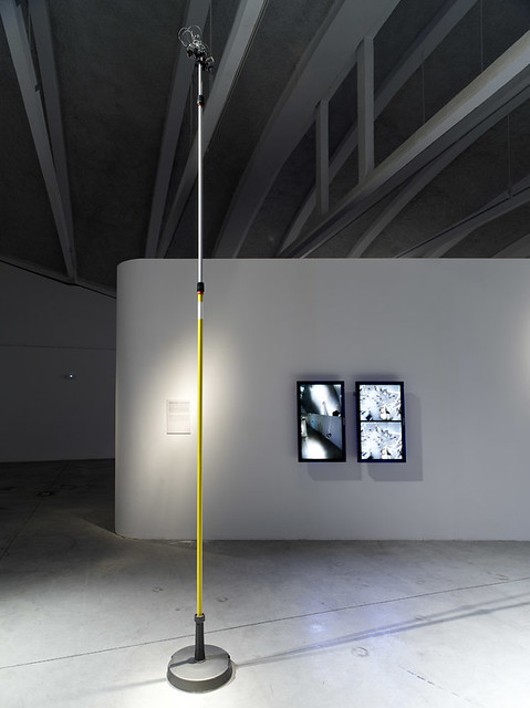
The Apparatus for Capturing Other Points of View was exhibited at the HABITAR Exhibition in Madrid. The concept of the exhibition is something that is quite close to the hearts of the Laboratory, so I will put it here: (you can download the exhibition catalog as well)

“Utopian and radical architects in the 1960s predicted that cities in the future would not only be made of brick and mortar, but also defined by bits and flows of information. The urban dweller would become a nomad who inhabits a space in constant flux, mutating in real time. Their vision has taken on new meaning in an age when information networks rule over many of the city’s functions, and define our experiences as much as the physical infrastructures, while mobile technologies transform our sense of time and of space.

This new urban landscape is no longer predicated solely on architecture and urbanism. These disciplines now embrace emerging methodologies that bend the physical with new measures, representations and maps of urban dynamics such as traffic or mobile phone flows. Representations of usage patterns and mapping the life of the city amplify our collective awareness of the urban environment as a living organism. These soft and invisible architectures fashion sentient and reactive environments.

Habitar is a walk through new emerging scenarios in the city. It is a catalogue of ideas and images from artists, design and architecture studios, and hybrid research centres. Together they come up with a series of potential tools, solutions and languages to negotiate everyday life in the new urban situation.

(http://www.nearfuturelaboratory.com/2010/05/31/apparatus-at-the-habitar-exhibition/)

I participated in the University of Michigan’s Taubman College’s Future of Technology Conference, which was an interesting two days of sort-of lighting 15 minute presentations from a whole string of folks, mostly from in and around architecture (again!) to hold forth on the future and what it was. ((There are some good talks in there — Bruce Sterling, Usman Haque, Hernan Diaz Alonso. Note bene how mine is nearly spot-on 15 minutes. Architects love to speak, even if they go over their allotted time. I could’ve carried on. But I didn’t, out of courtesy. *shrug.) Most of them basically shared their work, which I guess is hopeful insofar as they imagine the future full of their work, I guess. I basically showed my “graphs of the future” thing — it was 8 graphs at the time. These are a few “graphs” that are sort of canonical ways of presenting what the future looks like, usually according to quantitative metrics.

Friday October 29 05:50

Then there was a nice close to the year with the Swiss Design Network Conference whose theme was Design Fiction (yesss…) It was a nice time in Basel, with a chance to meet some new friends and then people who I had only heard of or only talked to by email or phone. I gave one of the keynotes and helped Nicolas facilitate the workshop on Using Failures in Design Fictions.

I’d say in 2010 Design Fiction learned about itself as a practice of doing design, provoking and entertaining and suggesting new ways of seeing and understanding. It has been well-articulated and played with and used as a lever for all kinds of amazing work all over the place. I think the best go-to place is by @bruces wonderful Design Fiction category list — much more consistent and thorough than the Near Future Laboratory’s Design Fiction Chronicles and less-hampered by the ninnies at Vimeo who clearly don’t understand the way I was using film clips to discuss, in a scholarly sense, the role of science fiction film. *sigh. Anyway — @bruces is the real scout-about for what’s going on at the many fringes of thinking/making/doing.

Well..those are the highlights I can think of right now.

Continue reading A Few Things The Laboratory Did In 2010

Weekending 12122010: Clarity via Complexity

Thursday December 09 17:50

A week spent last in the Nordic EU discovering the knots and twists and snarls and kinks of the imbroglio that goes along with executing on damn good design. On the one hand there was the work of workshops meant to work *upon the work; on the other hand, there are the traces that appear as — if illuminated by forensic investigators UV light — the trails of interconnected relationships, goals, aspirations, roadblocks, paths of hope, begrudging words, encouraging words, optimistic personalities and personality disorders, cues and clues as to how things work, or how they do not; who talks to who, and who does not; where things can get done, and where they will not, despite everything. Very intriguing. Certainly not unusual activities; just the analysis and awareness that comes with trying to understand, and that from the perspective of a science-technology-studies kind of person. It’s like being inside a Latourian analysis of the making of things. I should draw a map.
Continue reading Weekending 12122010: Clarity via Complexity

The Wall

Thursday December 02 09:48

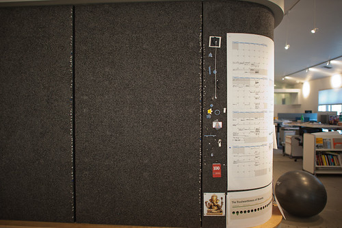
This is an interesting paper called The WALL: participatory design workspace in support of creativity, collaboration, and socialization written about workspaces using various techniques to support creativity, collaboration and “socialization.” The paper describes and advanced design studio for a “Nordic EU” country and the use of a wall — in this case, a real wall, not a video wall or something like this — and the ways in which design work forms on, in and around the wall. This is interesting to me because of the direct opposite of typical assumptions from the world of technology where high-tech is often used — video conferencing systems, telepresence devices, and so on. In this particular studio, the wall becomes a place where work happens. Things that go up on the wall become projects or intersect or leak-into other projects.

The challenge in this particular study (two or three days of observation) is that the studio has a sibling that is a great distance away so the team is separated by space as well as a significant time difference. THe challenges in this case are to share the wall in some fashion — which is not entirely solved. Various approaches are tried — sending high resolution photographs, creating large format plotter-prints to create a facsimile of the wall from one studio to the other, etc. Some video conferencing can happen, but even this is only effective at communicating verbally because the persistence of shared images, sketches and so on is low — it is only around for the call. The bulk of the design activities happen with people together, in the same physical space, standing/sitting/couching/laughing at and near the wall. Casual encounters while walking by a team working on a specific bit of material at the wall can inflect and inform the work in substantial ways — even by members of the design team not directly assigned to a specific project. In fact, it sounds like every member of the team is working on every project to one extent or another by virtue of the fact that the projects wrap around the studio on the wall. Walking by representations of a project can spark an insight or ideas for other projects. Material from one stream of work can find its way into another quite naturally as the boundaries of ownership, share-ability, and so on are made permeable in a creative, productive way by the maturity of the team, the transparency the wall facilitates (everything is there), the rather flat-ish structure of the design team, and the implicit trust amongst the team (no one needs to be policed or watched; attendance isn’t taken, &c.)

Why do I blog this? I’m very interested in what makes creative, productive, advanced design/technology teams work well. This idea of the analog wall — a pin-up wall — is simple, does not need to be plugged-in, allows for sharing and viewing and collaborating.
Continue reading The Wall