Nokia N900 Hacks

Nokia is a gigantic battleship, and in some of that ship’s little corners, quite intriguing things happen that are quite consistent with the sensibilities of play, exploration and making new meanings, and especially inverting existing assumptions or retracing histories. I think these sorts of things are some of a small number of ingredients that could make the world a more habitable place.

((And if you are one of the seven people who read this blog, you will recognize a congruency between these playful hacks and our general point-of-view on what is ‘worth-ful’ and what is worthless. Some of you may call these explorations “worthless” because you are tangled up in the constellation of meanings that assume value is only found in something that is so consistent with a “users needs” that they’ll buy it, even if their life is made no better with it than it was without it.))

This video shows some of these ingredients and explorations that activate the imagination and move away from the consistency of mindless incremental change. They are playful, “post-optimal” designs that serve as prompts and reminders and materializations of the experience and interaction metaphors that today we take for granted.

I have my reservations about what the N900 thingie will be or is or how it has come to be (and I’m eager to see it), but this corner of that “program work” gives me more hope for it than I have ever had.

((via Nokia Blog and this PUSH N900 competition.))

Continue reading Nokia N900 Hacks

Tipped.

Monday January 19 11:06

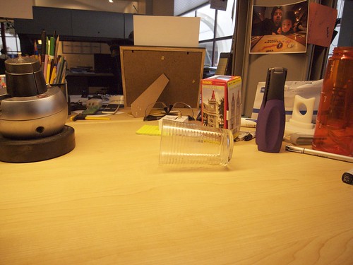
Photographic recollection of an accident that happened a few minutes before I cleaned it up. In the studio, morning — reaching to my left, I knocked over my coffee which did a fairly good job of soaking a couple of things. No biggie, except that what surprised me most was the failure of my peripheral vision and proprioception, which are both usually reasonably well-tuned. It all led to a discussion about how both of this bio capabilities may be losing their resolution with all the cone-of-activity work that ends up happening amongst people like me who tend to focus their attention into small cones of activity — at screens, both big and small, but mostly fairly small, from the cell phone display up to 24 inch LCD monitors. Andrew says we should tune to see our toes whilst looking straight ahead. Watching a West Wing rerun from season one, a Secret Service agent laments not being able to recall a crucial detail seen out of her periphery after President Bartlett and his entourage are shot at. In a recent episode of The Unit, an operator torments himself nearly to death after coming to the shock-induced, near-death realization that he missed the tell-tale miniscule details of a sniper stealthily getting into position at a high window.

Why do I blog this? Observations about how we observe and intriguing possible roles that our habits play in altering capabilities. Good, bad — not really interested. Just wondering, where do our observational abilities shift toward? Do we become like the bottom, steam-vent dwelling creatures that go around blind, sensing with touch, gesture interfaces finely tuned through millennia of playing with iPhones and game controllers?
Continue reading Tipped.

iCal Interface Fail

iCal Consistent Fail

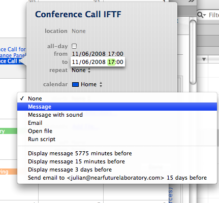
You’d think that scheduling would be one of the easier problems to work out, but clearly there are these simple little constant fails. Here’s a scheduling event for a conference call I will have in a couple of weeks. The call will likely happen when I’m in Helsinki, but the invite is for some other time zone. But, I can’t seem to assign a time zone to the appointment. That’s a hole, but, wait..there’s more. My computer won’t know what timezone it will be in — I guess it could check Dopplr or something — but it won’t just know based on context, or the orientation of the stars. I’d have to set the clock when I get there, but then I won’t know what time it is back home, which I like to know for staying in touch and not calling home at weird times or just to have some sort of lightweight affinity relationship back home.

But, here’s the real perplexing thing. What the f**k is up with iCal always giving me ridiculous numbers of minutes-prior-to.. alarm selections? I mean..really. I’m not being asshole-y, I actually really want to know why that is there? If it’s a bug, why is it still there after, like..years of iCal?

Anyone?

Design for Cardinality

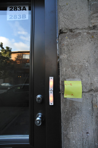
Interface fail. Evidently, the ordering of the apartments inside here is different from the screwed-on doorbells so one of the tenants improvised a new user interface. Hysterical.

The implied cardinality here of apartments — top to bottom? alphabetical? — must have been poorly communicated. But the question is — why not take the more robust and fault-tolerant solution to swap the order of the paper signs taped to the inside of the door’s glass? A passing prankster might find a small bit of amusement in putting up a new post-it, perhaps with “C” and “D” instead of “A” and “B”..(ahem..)

Why would Nicolas blog this? To consider when cardinal ordering schemas do or do not imply specific interface templates. Is it a design principle that letters lower in the cardinal alphabetical “scale” go on top? Or, do they go on the bottom, as in the heuristic that basement, underground apartments always have letters, such as the dingy Apt. B, next to the boiler room?

Continue reading Design for Cardinality

Scale

20080526_19-18-15

20080523_11-56-26

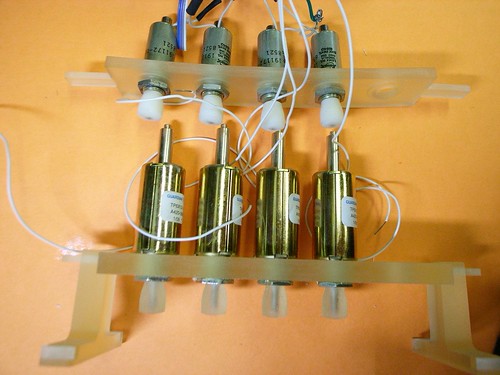
Not knowing a heck of a lot about solenoids in practice — I know what they do, and, as an example of the sometimes impracticality of higher-ed, am fairly fluent in the E&M principles at work here. But, when it comes to the practical matter of finding one with the necessary “umph” to articulate a simple controller’s buttons, it’s all guess work.

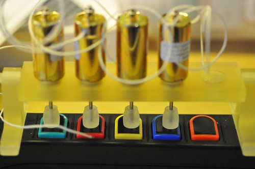
(Parenthetically, this mechanism is a subcomponent of a larger project called “Air Guitar Hero” which uses a remote glove controller to articulate the solenoids here. Yes. It makes no practical sense. It points to “something” as an experiment, if nothing more than to learn a few things about controlling solenoids and such all. But, mostly it is a design provocation. That’d be the easiest way of describing this whole thing, for those who have asked.)

The first solenoids I used were the smallish ones on top, bought at close-out prices from Electronics Goldmine for about $2 a piece. They couldn’t push the button completely, nor with the surety of purpose the design demanded. They would actuate, but not push the button closed. The best they could do was kind of rattling things around a bit.

Not really knowing precisely how to “engineer” a solution (probably something about determining the closing force of the switch and back-stepping to an appropriate solenoid), I just bought a few different sizes. The first one to arrive was enormous and, had I been a bit more careful, I would’ve realized that the centerline to centerline spacing of a row of four of these would’ve been wider than the center to center distance between the Guitar Hero buttons. Poppa Bear is a Guardian Electric TP12X19-I-24D, push style solenoid, runs at 24 volts. Way too big. So..that one is now a paperweight on my desk.

(Here’s a link to Guardian Electric that has specifications on their other tubular push/pull solenoids.)

The other two were closer, and I ended up using the “Momma Bear” solenoid — a Guardian Electric TP6X12-I-24D, also push style, with a load force of 18-0.06/2.5-0.75 Ounce-Inch. The data sheet is here.

I’m running all of these at 12 volts, which makes them less umph-y, but sufficient for what I’m doing. The solenoids have more push force at the low end of teir travel, so I designed the little supporting bridge there to hold the articulating shaft right on top of the controller button so that most of the force would be committed to pushing the button and not traveling through space.

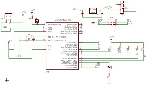
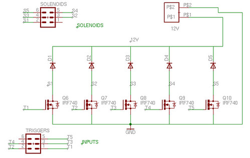
Speaking of scale, on the left there is the breadboard prototype circuit to drive five solenoids. The right is the PCB with the same circuit (minus a bunch of Arduino icing, just a plain vanilla Atmega168 and crystal). Scaled down, the circuit is much easier to manage and cart around than the relatively fragile breadboard edition, especially cause I’m using janky, untrimmed jumpers to make connections and so forth.

For the curious, here’s the circuit’s schematic and the PCB layout pictures.
Coffee Interfaces

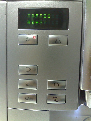
Bizarre interface syntax here. On the bottom left it’s Large, Small, Medium. That’s sort of peculiar — I’m never entirely sure what button to press. The Small and Medium seem almost identical when you’re feeling in need of a cup of coffee. Once, I pressed Large and it overflowed the cup. What are the contexts here for sizing, anyway? And why the mis-ordered buttons and icons?

Short Keys and Sheep Throwing

20080522_16-36-53

20080522_16-36-04

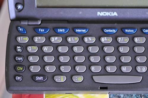
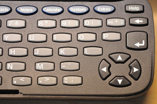
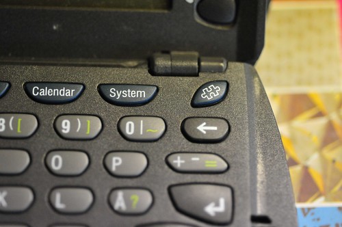
A hardwired, buttoned residue indicating the essentials. Some archaic (I still wince when someone, often a lawyer, asks me to send a Fax), and some now have become so vague as to be nearly meaningless in context — “Internet”?? “Extras”?? And a “Tel” short-key? Still working through interfaces for people. Close, but swinging wide in anticipation of zero-ing in on something the works, clearly.

20080522_16-34-00

20080522_16-37-27

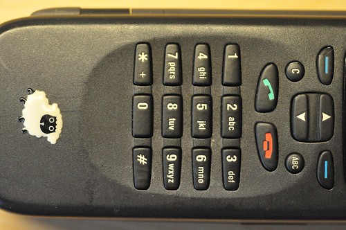
Has Facebook style “sheep throwing” been presaged by the relic above? And what’s up with the puzzle-piece short-key? Anyone?
Continue reading Short Keys and Sheep Throwing