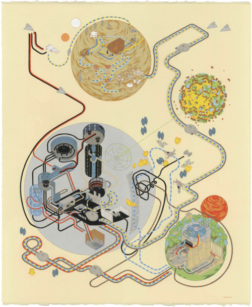
Star Wars map by Andrew DeGraff.
Some of you may have noticed, mostly probably not — but the Laboratory has expanded its ranks. It’s starting to feel like a proper design collective in here. One of the lovely attributes of the people in the Lab are the broad sectors of activity they cover that doesn’t make it seem like they do a zillion different things, but do many things to work though a relatively core set of interests.
Take Aaron Staup Cope. He writes algorithms that tell computers what to do. He makes maps out of paper. He makes maps out of algorithms. He makes you think about the ways that algorithms can do things evocative of map-ness..on paper.
Etc.
What I’ve learned from all of Aaron’s exploits in Dopplr-land, Open Street Maps-land, Walking Maps-land is that maps are dynamic, living things that should never be fixed in their format, style, purpose. They should never be taken for granted — even if the Google Map-ification of the world is doing just this. They should come in a bunch of sizes and shapes and colors and purposes. Etc.
Check out Aaron’s 20×200 Editions of his Pretty Maps. Get yours. I did. LA’ll go on one side of the wall. NYC will go on t’other.
Here’s what they say about Aaron over on 20×200.
For now, let’s set our eyes West, on L.A. County. Like prettymaps (sfba), prettymaps (la) is derived from all sorts of information, from all over the internet. Its translucent layers illuminate information we’re used to relying on maps for–the green lines are OSM roads and paths, and orange marks urban areas as defined by Natural Earth. They also highlight what’s often not seen–the white areas show where people on Flickr have taken pictures. It’s an inverse of a kind of memory-making–a record of where people were looking from instead of what they were looking at, as they sought to remember a specific place and time.
I think I figured out why I enjoy this map by Jack Schulze and Matt Webb — it can possibly induce vertigo, which means it’s human, real and embodied. The rolling coasting perspective that deliberately distorts the island of Manhattan shows the city from a fixed point of view, but still showing no horizon. The map is not these flat views that we’ve become so accustomed to, floating above the ground but yet firm, and sure and secure. A little more awkwardness in points-of-view is called for, I think.
Continue reading Embodied Viewing Platforms
36 hours in Berlin right SHiFT 2008 and there’s only time for one or two things to do, really. Despite geek sensibilities, it turns out a paper map serves better than a digital one. This janky one from the hotel, flimsy and easily smudged and tattered, was actually spot-on perfect. Every street we needed to find, and U Bahn was easily navigated to. (Although, not by virtue of my lousy sense of direction.) Using a paper map makes me think — when will the still-Jurassic digital maps at lease orient themselves according to compass direction?
(I will add my friend Nicolas Nova’s map he also received while in Berlin just after I left, while we’re on the topic of paper and maps..I’m sure he wouldn’t mind me sharing this fantastic specimen.)
Tourist highlight of the 36 hours was the Stassi Museum, my curiosity peeked especially after viewing “The Lives of Others”. The history in here is fascinating, and in German. I was fortunate to have a native German speaker with me, and one who lived through this period as well. Between the drama in the exhibitions and the real-life experiences, it was well worth the time. (Curiously the museum is not well indicated in the surrounding neighborhoods. We had to ask a couple of well-liquored gents knocking back a few in a box-bar about bit enough to fit a keg and a television in.)
Here’s Markus Meckel’s desk where I’m sure zillions of horrific deeds were executed. Check out the accoutrements of tyranny here — an enormous safe (you can see the door), a shredder (on the left of the chair), a chair, a switchboard phone thing, phone and desk. Despite the tyranical history, I was awestruck by the furniture. It was so evocative of the period in a way that brought the stillness to life. You have to check out the other photos — there’s spy gear, more room furnishings (including the side room with a bed, I guess for late nights or trysts or something) and some amazing swivel chairs.
More photos from the museum exhibits are in my Berlin Flickr set.
Continue reading Paper Maps