Weekending 18022012

This week was quite active with Nicolas visiting the laboratory in Los Angeles. The main reason for this was a workshop about locative media for Nokia Advanced Design team in Calabasas. Two days there with good discussions about current projects related to this field of application. This visit was also the occasion to give a talk about his approaches and methodologies over lunch.

Nicolas’ presence in California was also the occasion to move forward on “Convenience”: a project we (Julian, Nicolas, Nick Foster and Rhys Newman) are working on about the main objects you find in kiosks and convenience stores. The stuff you find at the check-out of your local news stand/kiosk/liquor store can be seen as representing the evolutionary curve of all fantastical things. At a certain point of time they were innovative and now they wind up as 99¢ a pop, or 3 for a $1, &c. Verifiable or not, this is a curious perspective on the evolution of things from magical rocket science to banal disposable crap.

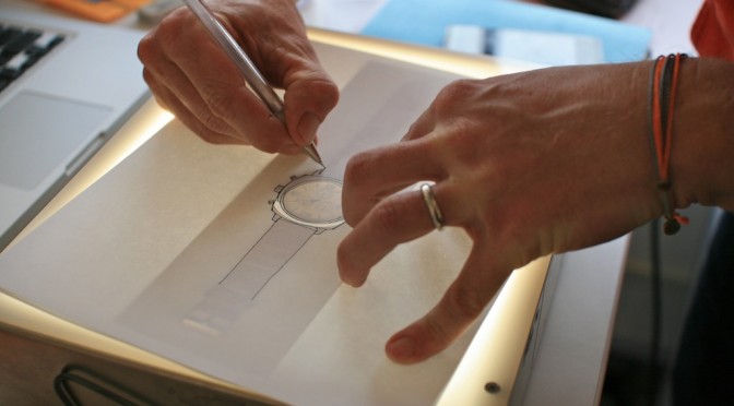
Based on this observation, we’re doing a bit of a history of those things from *today* and printing them in a Newspaper Club newspaper. The idea was to start from a limited list of items (from AA batteries to condoms, from Bic pens to lighters), have lovely little drawing of the things, a short description of each as well as a short text about their implications for the history of innovations. This material will be used very soon in a workshop about design fiction meant to focus on the future products one can find in convenience store.

After a quick hop over North America and the Atlantic ocean, Nicolas also spent the two last days of the week on a workshop at HEAD-Geneva with Etienne Mineur and Daniel Sciboz about pervasive games. The idea was to move forward with the game concepts that has been previously prepared two months ago. These games will be presented in an upcoming exhibit at Maison d’Ailleurs (the Swiss Museum of Science-Fiction) called “Playtime. And yes, this is exactly the same venue where the game controllers’ collection is going to be shown too.

While Nicolas was flying over the Atlantic, Rhys drove and Julian and his brother Marcus flew to the desert — Oracle, Arizona to be precise. Rhys and his 18milesperhour partner Brian road an endurance race — 24 hours in the Old Pueblo. Julian took the opportunity to stay up for 36 hours and photo document the conclusion of each lap of a couple dozen of the 24 hour solo riders, of which Rhys and Brian were two of 50-some Men’s Solo and 7 Women’s Solo cyclist.

In the meantime, Fabien was left alone in Europe to contemplate the results of produced by Interactive Things from our analysis of the mobile phone network activity in Geneva. The visualizations compiled in the Ville Vivante web site are now part also part of the streetscape of the city. This week, Nicolas will lead at Lift a co-creation workshop on the implications of this kind of materialization of network data.

Fabien also gave a class on the same matter with engineers, designers and journalist who follow a postgraduate course on Information Visualization at IDEC.

Northern Nordic

Monday December 06 23:06

Monday December 06 13:27

Just a quick note to remind myself that I’m in the northern Nordic for the week, translating and workshopping and clarifying much of the work that has gone on in the studio over the last many months. It’s quite interesting to see how important the communication work is in the design process. Not so much showing as alliance building and enrolling people into something that is new to them and foreign in the sense that it has come from *outside — not their studio, not their work. But then — how do you make it theirs so that it becomes “ours” all for the common good. It’ll be a fun, wintery few days doing this. Always learning. It’s also intriguing to bring advanced design, which has humility as represented by the people who have done the work — into the more execution-oriented variety of design. It’s just design at the end of the day, different ways of making things better, each with their own assumptions about what it takes to do the work of better-making.

Continue reading Northern Nordic

The Week Ending 220110

Sunday January 24 14:01

What one finds house hunting in Los Angeles and coming across one owned by a Hollywood set designer. Also looking at the same moment, a demure, polite and inquisitive actress vaguely recognized and thence confirmed to be the nitty Shannon from season one of Lost.

Diligent weeknotes are already eluding me. Perhaps because it was a short week last week and I wasn’t in the studio until Thursday. Nevertheless — mostly a couple of days of dusting off the desk and considering what remained to finish from the previous year and continue on into the new one.

Project Trust achieved its milestone late last year and the last couple of days last week were spent assessing it’s 2010 tributaries — where and to who does it get shared? How to distil what has been learned both in practical terms as well as in the very intriguing, curious *meta* terms such as — what did we learn about how to design in such a way as to achieve unexpected, new, perhaps innovative things? What about the friction of design that hones and reshapes and burnishes a nascent idea into a new, curious, future form that moves away from the hum-drum expected outcomes? What about the style of communication, which has moved away from PowerPoint / Keynote into visual stories? What is that and how can it be informally formalized as a new way of sharing ideas that, for the time being, while this style is still new — shock, excite and awe people into becoming fervent allies and help turn that idea into its deserved material form.

So. Decisions made, for the most part, about what prototypes find their way downstream, or up-the-ladder, or to new lands. Movies blocked and storyboarded, or at least decided upon. That was those two days last week.
Continue reading The Week Ending 220110

Nokia N900 Hacks

Nokia is a gigantic battleship, and in some of that ship’s little corners, quite intriguing things happen that are quite consistent with the sensibilities of play, exploration and making new meanings, and especially inverting existing assumptions or retracing histories. I think these sorts of things are some of a small number of ingredients that could make the world a more habitable place.

((And if you are one of the seven people who read this blog, you will recognize a congruency between these playful hacks and our general point-of-view on what is ‘worth-ful’ and what is worthless. Some of you may call these explorations “worthless” because you are tangled up in the constellation of meanings that assume value is only found in something that is so consistent with a “users needs” that they’ll buy it, even if their life is made no better with it than it was without it.))

This video shows some of these ingredients and explorations that activate the imagination and move away from the consistency of mindless incremental change. They are playful, “post-optimal” designs that serve as prompts and reminders and materializations of the experience and interaction metaphors that today we take for granted.

I have my reservations about what the N900 thingie will be or is or how it has come to be (and I’m eager to see it), but this corner of that “program work” gives me more hope for it than I have ever had.

((via Nokia Blog and this PUSH N900 competition.))

Continue reading Nokia N900 Hacks

What does $5 get you, anyway?

Slideshow from The Five Dollar Comparison on Flickr

In the silty ash of this latest economic meltdown, I’m wondering — what does a fin (or its equivalent in the other legal mechanisms of value exchange) get you these days, anyway?

Good question. Really good, when you think that someday soon, with reductions in manufacturing and materials costs, secondary sales markets and other factors will make the cost of owning a phone around that $5 mark. Half the world’s population already owns a mobile phone. It is a very real possibility that some of the world’s remaining 3.3 billion may also participate in mobile communications practices. What does that world look like? How do fundamental aspects of human social life change when personal communication is accessible to almost anyone? Certainly we can only speculate, maybe do some informed speculation.

Recently studio chum Rhys Newman presented “The Five Dollar Comparison” during a Nokia Design roadshow to introduce the question and ask people to participate in discussing the $5 question. We’re doing it simply, without big name thinkers and prognosticators. Just people, taking pictures of things they bought for about $5. Photographs are shared in the fivedollarcomparison group on Flickr. It’s a far ranging, exciting conversation through images, telling stories about how $5 can get you an English speaking taxi driver for door-to-door service in Kabul, or $5 will get you a delicious bowl of pork ramen in Shibuya, or a porter to carry your 25 kilo load for half a day up the Inca Trail in Peru, or a thick fancy Sunday newspaper in Venice Beach.

Photo by svanes

Personal communications for $5. Sounds noble in the age of iPhones and Google Phones and overpriced double-billed phone plans — toys for people with jobs and maybe a bit of a fear of not having the latest and greatest that their friends have. Or, maybe just good business sense in a world where the Nokia 1100, the number one selling phone in the world, has sold 200 million units — the biggest single consumer electronics device out there in the world. Count them. It’s true. No joke.

Access to a way to project oneself across town, or across the world. It puts into question the meaning of distance and time; changes how authority and trust are managed; changes who participates, where conversations start and how communities are formed. Somewhere a phone will mean the possibility to begin interest-bearing savings. Somewhere else, a phone will mean finding out where work for the day might, rather than guessing and perhaps losing a day’s wages. Somewhere else again, phones will become disposable, one-off objects that, hopefully, do not clutter the mountains of waste already choking us.

This is where we’re starting. Asking a question to start a conversation about five dollars. There is no one answer. There may just likely be 3.3 billion answers, each as personal as the communications a five dollar phone affords.

Discussions around the consequenes of a truly connected planet have been going on for some time and the fivedollarcomparison.org is a small step to broaden the discussion and explore how the impact might vary across cultures and contexts by asking this simple question: what can you buy for five dollars?

Participate. Let us know what kind of object or service you can buy for $5 dollars wherever you are, and wherever you go. Email your submissions to add@fivedollarcomparison.org or adding them to the fivedollarcomparison group on Flickr Please read through the guidelines on fivedollarcomparison.org/participate.

Studio mates Raphael Grignani and Jan Chipchase have some thoughts on this topic, too.

Continue reading What does $5 get you, anyway?

Refinement in Degrees

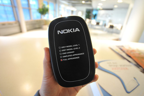
A scale of design models in these check boxes suggests refinement from basic form to mechanical, color, materials and so forth — stopping at full appearance. Appearance absent functionality, which can only be inferred based on what it is a model of. In the world of mobile phones, the functionality is implicit — making calls and so a design prototype need not concern itself with use and operation.

Or does it?

What are the ways design can dig below the appearance, into actual use in order to better understand the contexts and vernacular aspects of people and their practices? Can it be done rapidly — quick enough to place things in context so that the freshness of the idea from its inception is decanted into the “model”? What about fictionalizing that experience — making props, instead of prototypes?
Continue reading Refinement in Degrees

Nokia Design Needs You

20080518_14-18-53

The Service and UI Design within Nokia Design – is expanding, and they’ve got jobs going in Palo Alto and Helsinki/Espoo for both visual and interaction designers. You’d be working directly with Chris, Adam, Younghee and Raph, and just along the org chart from Jan and myself and the rest of the Design Strategic Projects studio. I just saw the org chart the other day; you’d be in a pretty sweet neck of the woods, frankly. Something’s going on at Nokia, or some kind of celestial bodies are lining up. Whatever the case, it’s a great opportunity for the right sort of designers.

There are six openings. You’ll need to apply through the Nokia recruitment site. The jobs to search for are:

Interaction designers, Espoo: ESP0000022U, ESP0000022T

Comms designer, Espoo: ESP0000022V

Interaction designers, Palo Alto: SAN000000BQ, SAN000000BP

Comms designer, Palo Alto: SAN000000BV

Continue reading Nokia Design Needs You

Nokia Homegrown

Homegrown Project

Today in London Rhys Newman presented the studio’s "Homegrown" project to an audience of 150 journalists. Rhys is part of the newly minted Design Strategic Projects studio that I will be joining in a few weeks.

The Homegrown presentation starts with a brief, top-level description of Design Strategic Projects. 14 people, International (I’m one of only two United Statesians — quite nice, that), 3 locales. Our (broad) mandate? Clarifying and translating business objectives through design. This is an amazing foundation, and the emphasis on design is quite significant within Nokia. It means design at Nokia is more than styling and appearances. It’s about informing and shaping the strategic direction of Nokia. Helping make decisions that are based on design principles that are also good business principles.

Why is this significant? Design can base its objectives on principles that business would not normally use as its decision criteria. Such things as so-called design thinking where creative thinking and probes into unknown areas is encouraged — even if it results in some “cost” or, in a business idiom, “red ink.” What might be seen as a preposterous experiment can yield valuable insights just by going through the process of thinking outside the box. Design can process ideas, theories, hunches and speculations much more freely and effectively that a project that is bound to hitting one’s quarterly revenue targets.

So — principles in action? Here’s what the Homegrown project entails.

Zero Waste — a charger. What? A charger? Chargers often have a persistent power draw — 300mW or there abouts. Even if it’s charging cycle is done. That’s a terrible waste across a massive scale. Through a principle of small actions, across massive scales, big changes can come about. Scale? Count one second — Nokia has just made 16 phones. Every phone comes with a charger that can be expected to consume this .3 watts of power that we’ll never turn back into the resources consumed to produce it. And that’s just phones and one phone manufacturer. What about digital cameras? Game players? Camcorders? MP3 players?

There’s strong evidence of designed simplicity and a consideration of even the most routine of human -machine interactions here — the button. It has become the sine qua non of interaction modalities. In fact, it is the button that undergirds the bulk of interaction design, I’d argue. Here, with Zero Waste, the button is an soft but emphatic reminder that one is consuming power, however little. When the charger has finished its task of topping off your device, it turns off. In order to turn it on again, you have to push the button. Push a button. Charge. Push a button. Consume. The ritual of turning your attention to the Zero Waste button is a reminder and a call to consider what one is doing. Not that people will necessarily not charge their devices. They’ll just be forced to be cognizant of what is taking place. The persistent reminder to be mindful and considerate of the resources consumed is a designed-in implication of Zero Waste.

Nokia Remade

Remade — a phone (It exists. It works. I’ve held it. It was announced by Nokia’s CEO in Barcelona a bit ago. It’s not (yet) widely available.) Continue reading Nokia Homegrown

Where To Next? Design..

20080327_115751

Time for the next chapter. Shortly, I’ll be officially joining a fantastic little studio within Nokia Design called Design Strategic Projects. It’s a studio of very clever, insightful and thoughtful designers and researchers. It’s a playground of big ideas, and plenty of support to work them through. There are some big questions and even bigger opportunities to continue the work I’ve been doing in the gaps between creative practices, technology and critical analytic thinking.

(To give you a sense of what I mean, check out this Sunday’s New York Times Magazine, which features the work of Jan Chipchase and Duncan Burns, two new colleagues in the studio.)

Everything I’ve been doing for the last 15 years has brought me here. Last 15 years? There was the engineering chapter, the computer-human interaction chapter, the critical theory chapter and then the dot-com chapter. Academia was like an inverse sabbatical. It was a great opportunity to think how to bring all of these things together into one un-hyphenated undisciplinary craft. Sadly, academia turns out to be way too conservative and, despite quotidian wisdom, a thin veneer of intellectual and creative freedom behind a very conventional and super risk averse for-profit business, full of the usual political rough-housing.

The question of relevance also comes to mind with regard to academia, which was arguably the one thing you might guess I was preparing for. I mean, why else get a PhD in an area of inquiry that’s as close to Philosophy and Critical Theory as anything. I’m not hating too hard, but there are challenges ahead for academia if it wants to participate in the idea/knowlege/insight/culture circulation networks beyond the greenways of its campuses. There’s the insularity of its publishing practices. Who really reads the swirl of endlessly regurgitated write-ups that sluice through the ACM and Springer-Verlag presses every year. They’re locked away behind password protected and over-priced journals, have citation practices that have no qualms with incest and, let’s face it, peer-review? P’lease.

Where I’ve been, and its only one place, there’s a shortage of emphasis on critical thinking and fundamentals like analytic writing. Across the board there should be some context for “studios” where students put into practice the ideas developed and discussed so that “practice-theory” allows students to develop the trans/inter/undisciplinary skillsets that will allow them to understand how to shape the worlds they occupy in analytically-focused material ways. By “across the board” I mean in most disciplines where people are expected to practice what they’re been theorizing and reading and writing about. Which is, basically, everyone. I could go on, and I will — I think there’s good work to be done there, and I will continue to do that work. It’s more a systemic problem. The context for discussing these issues and addressing them has to be from a position that is protected from political and institutional vulnerability, and where there’s real, honest support. That is not the case now.

The next bit of kit to add to my practice is Design. As soon as the opportunity presented itself to become a part of a design studio and learn how design fits in with this larger goal of being able to do work through multiple-simultaneous practices, and to focus on problems and how to approach them, rather than disciplines and their nutty boundary maintenance politics.

With engineering I can make things. I’ve learned how “art-technology” is a great kind of practice idiom for exploring strange new near future ideas, the kind of research & development that you just can’t get away with as a disciplinary engineer. Design is the right addition to the engineering, my modest art-technology practice, and my predilection towards critical thinking as an approach to making and understanding new near future things. On top of that, there are some new things to be done in the area of prototyping and sketching new ideas relying on engineering fundamentals together with design principles.

This is a continuation of present interests, questions and areas of activity. The Near Future Laboratory remains the home for bright ideas and their playful execution. The decision to become a part of the Design Strategic Projects studio was largely based on a clear indication that I am expected to continue and expand upon the themes and approaches and insights we’ve been excavating at the Near Future Laboratory. A perfect expansion and continuation of what Nicolas and I started a couple of years ago, with the resources of Nokia. It’s time for some serious play.

Parenthetically, in and around the time I was contemplating this next chapter, Adam Greenfield was too, as it turns out. He’ll be joining as the head of Nokia’s Design Direction, working in the service and user interface domain. Adam and I are friends, and have been IM’ng over these moves over these last months. It was a nice affirmation to hear him considering this. Adam’s someone who I trust, and I’m looking forward to the chance to ponder big things and play around with some new ideas over at Nokia House.

More about Design Strategic Projects. The studio was formerly called Insight and Innovation. The work they did in that guise is pretty much exactly the sort of work I should be involved in. It combines analysis, visual storytelling, probes about new interaction paradigms, and speculative near future inquiries into new interaction rituals. One project that recently bubbled up to the public spotlight is called Remade, a phone made entirely from upcycled and recycled materials. It’s actually one central theme in a larger network of principled design projects that are incredibly exciting. What’s more, we’re going beyond talking the talk — appearance models and styling are well and good, but this is a design studio that will be making objects that function, turning their design principles and theory and coupling it tightly to everyday practice. There’s been some recent press about the studio and its people if you want some more insight. In the near future, there’ll be more of a public voice to the studio’s work. This was one of my central discussion points when we started late last summer chatting about my joining the studio, and every rung of the ladder up the leadership, across several international borders has indicated that this is indeed part of the mission.


Some Design Strategic Projects Stuff that explains a bit more about what I’ll be getting into.

NYT article on the studio, focusing on approaches to innovation, human fundamentals and how to design can make garbage beautiful. It features Rhys Newman, Raphael Grignani, Andrew Gartrell and Jan Chipchase.

Over hearing the raw interview while in the studio, I became increasingly convinced that I needed to be a part of this team. I couldn’t help smiling at the smart replies, like Jan’s response when asked if the studio felt pressure to design new phones quickly in an increasingly competitive market —

"Mr. Chipchase responded with a quizzical stare. “Why do you want to innovate faster?” he asked. “Are you innovating something gimmicky just to sell a product? Or is it saving the planet you are after?”"

(By the by, the studio doesn’t design phones in a fashion you might think. It’s an innovation studio, with no mandates to create market products in the way other design groups might. We use design to clarify broader, strategic concerns and themes, rather than tactical responses to 6-9 month product pressures.)

Jan and Duncan Burns were recently featured in a New York Times Magazine profile.

Raphael Grignani is an interaction designer who brings a great humor and fantastically Franco-critical eyeball to all the work around him.

Jan Chipchase is the brilliantly visual insight excavator. I’m particularly excited to be now officially a colleague with Jan. I have much to learn from this character.

Francesco Cara presentation at Lift08. Francesco leads the two DSP teams, one here in Los Angeles, the other in Helsinki.

Jan Chipchase — Digital Nomad

Continue reading Where To Next? Design..