Slow Media Manifesto

SlowMessenger Capsule

“One might almost say that truth itself depends on the tempo, the patience and perseverance of lingering with the particular.”

Via nettime and @bruces, we come across The Slow Media Manifesto, a 14 point statement capturing what slow media is and where its benefits ((and challenges to conventional understanding of what media is and how it travels)) lie. Makes good, slow reading.

My favorites:

2. Slow media promote Monotasking.

8. Slow Media respect their users

9. Slow Media are distributed via recommendations not advertising:

13. Slow Media focus on quality both in production and in reception of media content: Craftsmanship in cultural studies such as source criticism, classification and evaluation of sources of information are gaining importance with the increasing availability of information.

The Slow Media Manifesto also comes with a blog.

Why do I blog this? Well, the slow sensibilties are something I’m quite intrigued by. There were a couple of projects that the Laboratory has done in the past years that were attempts to understand and design with slow principles. There was the Slow Messenger and the Slow Mail efforts, along with some ideas within the the WiFi Art Cache project that played with ideas of location, speed and activity as presence-based — that is, not everything happens as fast as you want and interactions change based on proximity and so on.
Continue reading Slow Media Manifesto

Slow Down

Friday January 15, 21.24.48

Friday January 15, 21.25.45

Friday January 15, 21.27.17

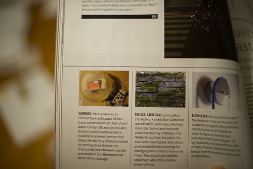
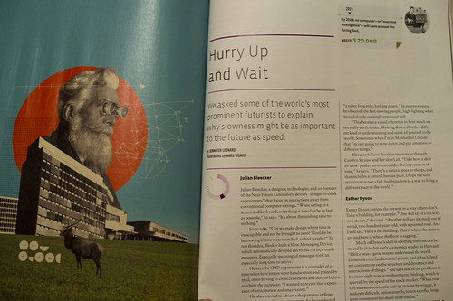
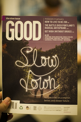
It’s not often we’re found in print, but this happened when the magazine Good did its “Slow Issue”. Jennifer Leonard chatted with us one morning about our perspectives on the slow movement because of our work on the Slow Messenger device and on-going collaborations with slowLab and Carolyn Strauss. There’s mention of the device and a brief interview with folks like Bruce Sterling, Esther Dyson and Jamais Cascio in the magazine and online.
Continue reading Slow Down

The Week Ending 080110

Sunday September 20, 12.53.26

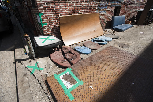
Markings for repair or warnings to mitigate accidents? Seen in Seoul, South Korea.

Whilst technically still on holiday, there were some things done as usual and *holiday* is never entirely just not doing nuthin’.

There was a quick visit to the studio to begin to finish the second of two commissioned Trust devices, which is looking simultaneously quite insightful and lovely. I hope some day that this becomes a lever to torque the rudder if even ever so slightly.

Jennifer Leonard’s interviews in Good Magazine’s Slow Issue (*Perspectives on a smarter, better, and slower future*) with Esther Dyson, Jamais Cascio, Bruce Sterling, John Maeda, Alexander Rose and myself appeared online. The topic of the short discussions? “We asked some of the world’s most prominent futurists to explain why slowness might be as important to the future as speed.”

And, prompted by Rhys’ clever insights into a richer, smarter less ROI-driven vector into thinking about this whole, you know..augmented reality mishegoss, I’ve been reading a fascinating history of linear perspective that has been helping guide more meaningful thinking. (I have yet to see anything that leaps much further beyond flags showing where something is by holding up a device in front of my face, which just seems momentarily cool and ultimately not particularly consonant with all the hoopleheaded hoopla.

I’ve started The Renaissance Rediscovery of Linear Perspective, which has a number of curious insights right off the bat, particularly ones that remind us that linear perspective is only a possibility and not necessarily something to be thought of as “realistic” from a variety of perspectives. In fact, it merely makes renderings that remove experience and abstract points-of-view, something that I recently learned from Latour’s Visualisation and Cognition (which, not unsurprisingly, led me to this Edgerton book via a reference and footnote.)

Configuration A - Binocular Form Factor

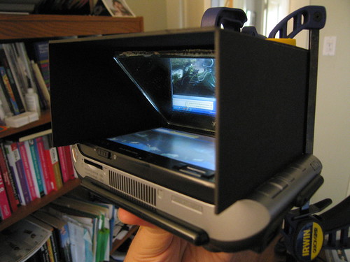
A Laboratory experiment from 2006 — *Viewmaster of the Future* — using a binocular-style form factor. ((The lenses are removed in this photo.))

And, the follow-on, which I haven’t started yet is the enticingly titled The Mirror, the Window, and the Telescope: How Renaissance Linear Perspective Changed Our Vision of the Universe, which immediately caught my eye as I am drawn more to the history, imagery, rituals and *user experience* dimensions of telescopes and binoculars as affordances for, bleech..*augmented reality* than this stupid hold-a-screen-up-to-my-face crap. ((cf. this stuff below — the screen-up-to-my-face configuration — never felt as good as the second iteration of this *Viewmaster of the Future* experiments we did a few years ago.))

Continue reading The Week Ending 080110

William H. Whyte Revisited: An Experiment With An Apparatus for Capturing Other Points of View

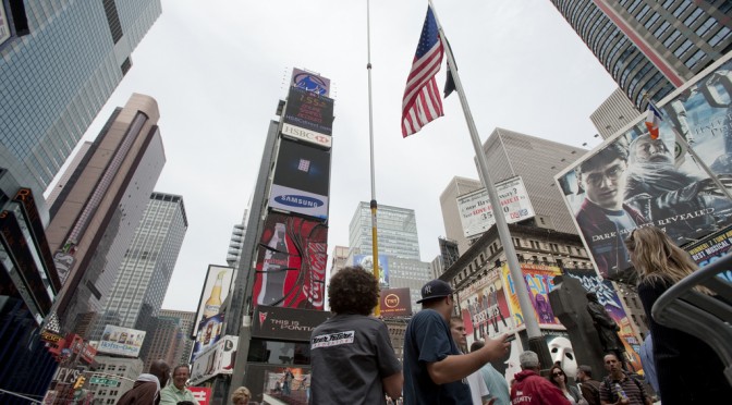
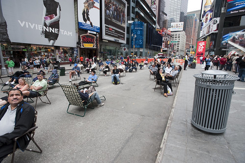
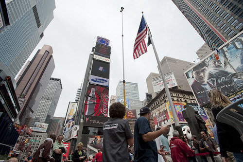
Times Square Urban Living Room from Julian Bleecker. More Apparatus Videos.

[[Update: The Apparatus was exhibited at the HABITAR show at LABoral in Gijón Spain this summer 2010.]]

A couple of months ago a colleague, Jan Chipchase, floated by my desk and handed me a book of his called “The Social Life of Small Urban Spaces” by William H. Whyte. I had no idea who this Whyte character was and I could only guess what it was about and, just by the title — I figured this would lead me down another rabbit’s hole of exploration and experimentation.

As I flipped through the pages, looking at the images of urban observations of New York City from the 1970s, I was enthralled by the technique as well as the substance of the material. Whyte and his team were capturing the intriguing, sometimes curious ways in which people adapt small corners of urban space and their habits and practices and rituals. The pace and momentum of pedestrian movement is intriguing. Without assuming anything in particular, Whyte’s work was capturing movement in a seductive way — even small scale jolts and shifts and gestures. Someone moving a chair just a small bit to indicate that he is not attempting to invade someone’s microlocal private space. You see the “fast-movers” bobbing and weaving quickly around a phalanx of slow moving tourists, window shoppers or a more elderly pedestrian.

Wonderful, intriguing stuff. Sold. Hooked. What’s the brief? Oh, what would I do? Follow footsteps and curiosities, I guess. I was curious — how can the momentum and pace and speed (or lack thereof) of the urban flows be captured, highlighted, brought into focus and revealed in such a way as to visually describe time, movement, pace, scales of speed and degrees of slowness?

There is lots to say about Whyte, I am sure. I have only begun to scratch the surface of this well-known urban sociologist, explorer, scout, observer. But, for the purposes here what happened as a result of this brief conversation with Jan was something that spread through the studio — a bout of curiosity that led to another, other project. It started simply by wondering if the observational studies that Whyte had done both in this book and in other projects could be done today? And, if so — what might they observe? What might be the questions? By what principles and assumption would small urban spaces be explored?

A copy of the films Whyte had made was secured in short order. Simple observations from ground level as well as from carefully chosen vantage points up high, above the ground. This intrigued me. There had been a project in the studio this time last year with things placed high for observational purposes (high chairs, periscopes, etc.) and it was filed away in the “lost projects” binder, so this seemed perhaps a way to revive that thinking. Over the course of a week, I made four trips to Home Depot, Simon jigged a prototype bracket on the CNC machine, and I had a retractable 36 foot pole that I imagined I was going to hang a heavy DSLR off of — it scared the bejeezus out of me and required two people to safely raise up. Too high, too floppy.

Another pole — 24 feet. Daunting but serviceable. It retracts to 8 feet, which is still quite high, but the range made it worth the embarrassment. After a brief bang around the reputation and suggestion networks, a wide field of view camera was identified and two ordered. Two cameras, secured to the pole produced a fair resolution, very wide field of view for displaced observations from a peculiar point of view. Good enough.

Penn Station Still Observation from Julian Bleecker on Vimeo.

Observation apparatus deployed at 7th Avenue main entrance to Pennsylvania Station, NYC, capturing ingress & egress flows, pedestrians waiting, deciding, waking up in the morning upon hitting the sidewalk, &c. The slow-scan mode highlights things which are not moving and therefore often discounted as to their import such as, for instance, the two peculiar characters to the far left who scarcely move (and were still there at the end of the day, around 7pm!), defensible space obstacles in the form of potted plants, people who wait for things, time to pass, people or taxi cabs, &c.
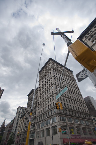
A notion interpreted and brought into focus by Rhys Newman.

Friday June 19, 16.17.17

15th Street and 5th Avenue, New York City.

Using some generative algorithms to show neutral zones of flow and highlighting areas of relatively stable inactivity. Somewhat mitigated by the windiness of the day which caused the cameras to move quite a bit.

Whyte was intrigued by the movement, flows, behaviors, but also emphasized the engaged observations — pen and paper, not just measurements and statistics. He was observing and analyzing both statistically — flows of people per time period over various widths of sidewalk, for example — as well capturing those things that one misses in abstracted data sets. In the film, his avuncular tone draws our attention to small curious practices. Things like someone to moving a chair in a public open space barely a few feet from where it was so as to indicate to a nearby fellow New Yorker that they were not intending to impose upon their public-privacy.

There was something about these sorts of couplings between the analytic data — numbers and so forth — and the observed, seen and demonstrated activities of people. Observed practices crafted into a kind of story about this subject — the social life of small urban spaces. Finding ways to observe and perhaps produce useful insights and design inspirations based on the observations seems a reasonable goal. There is only so much you can do with the books of abstracted data squirreled away some place before you have to go out in the world. Where I was most interested in exploring was somewhere “lower” than the high-level observations which produce intriguing visualizations but are many steps removed from the everyday, quotidian practices. Some empirical, rough-around-the-edges, observational data ethnography. A close cousin of the truly fascinating data visualizations we have grown to love. Perhaps close to Fabien’s notion of citizen sensors and citizen cartography.

We got plenty of guff with the Apparatus when we took it on the new Highline Park. One rather abrupt park minder — sort of behaving like an airline stewardess on a really bad day — was not pleased with the pole at all and let us know it. I had to talk to someone back at the offices of the "Friends of The Highline" via a cellphone given to me by a guy who was like a human surveillance entity. The woman on the phone explained – after listening to my perhaps overly analytic and historic description of the project, Whyte, &c. – that they do not allow tripods or, "you know..long poles" in the park.

Errr ahhh…

It was all very weird, and very un-appealing and put a cloud on what is a playful project, I think, but — *shrug*.

It’s all to be figured out. Or not. Perhaps its just observation. Scraps and visual thinking. Some notes in video. Constructed objects and anticipation of going mobile in Seoul and Helsinki and Linz and London. &c. Or some kind of exploration to suggest alternative ways of seeing the world around us. That may be closer to the point, at least now.

The post-processing stages of the activity are mostly explorations of ways in which individuals or small groups of people in movement could become their own producers of representations of what they do, in an aesthetic sense. What other sorts of systems might people-flows evoke or be reminiscent of? Weather patterns? Displacement grids? Where is there stillness in the bustle? Can the city’s flows be slowed down to evoke new considerations and new perspectives of what happens in the small urban spaces?

People themselves are often seen to be controlled in a top down fashion — even less insidious than “the man”, I think of the significant pedestrian operator — the “I want to cross” button at many busy intersections. It’s a point of contact with the city’s system of algorithmic, synchronized flows. But what about people as their own algorithms, by virtue of their occupancy of urban space? Not following specific top-down plans, but bottom up actions and movements. Not augmented reality but productions of realities. The center of what happens, displaced from the operational command center that articulates how the flows will operate.

I love these moments that countervene the system-wide control grids, which you can see if you watch carefully the raw footage from 15th Street and 5th Avenue where pedestrians spread themselves into the street, stretching the boundaries of the safety of the sidewalk in anticipation of the crossing. Or, perhaps something I love less but it is still something to note, a bicyclist turning the corner against traffic, possibly into pedestrians who may be less inclined to look from whence traffic should not be coming.

We push buttons to control the algorithms of the city, as in the buttons to control signals and so forth. Or roll our cars over induction loops – these are parameters to the algoithms of top-down controls over urban flows. Suppose we interceded more directly or suppose the geometry of the city were represented this way, as a product of the non-codified “algorithm” of movements.

What sort of world would this be? What would it look like?

Highlighting only things that are moving in the Union Square Farmers’ Market.

A cartesian grid distorted by flows around the Union Square Farmers Market.

Wednesday June 17, 15.04.24

Wednesday June 17, 14.44.17

Help thanks to Marcus Bleecker, Chris Woebken, Rhys Newman, Simon James, Jan Chipchase, Aaron Meyers, Noah Keating, Bella Chu, Duncan Burns, Andrew Gartrell, Nikolaj Bestle. And so on.

Videos live online and will accumulate over time. This is Times Square, NYC, Highline in Chelsea NYC, and a generative video done with Max/MSP Jitter
Zip In, Reach Over, Zip Out

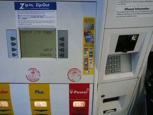
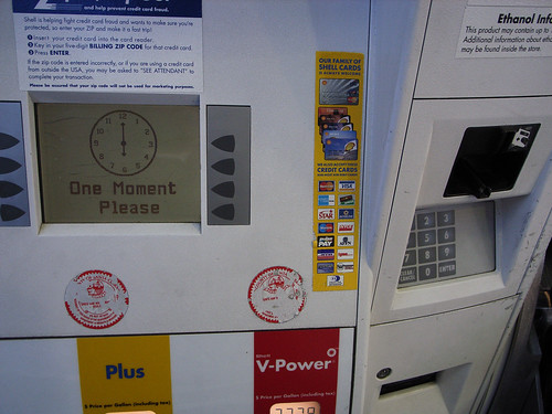
Seen just south of San Jose, California, another curious pragmatic interface that allows me to use my speedy, trusty debit card to complete a transaction without cash, but with a little dose of poor interaction design. After swiping my card, for security purposes (presumably) I must enter my postal zip code. So I can “Zip In, Zip Out.” This is all good stuff. If I were a thief who was a bit of a bungler, I might have swiped someone’s card and attempt to use it, but be stymied if I didn’t have the foresight to get their zip code, such as would likely be found on their drivers license, which is probably also in the wallet I just stole, or found, or whatever. So, I may have a consequential hurdle to charging up a $50 or $60 tank of gas. But the bigger hurdle might be searching for the obvious place to enter the zip code which is, of course, on the panel over around the little articulation in the otherwise flat-front of the pump. Now, this is nit-picky. Anyone would figure this out, that the entry point for numbers and such all is over on the number pad. But, I mean..why is it there and not as any considered design would place it — below or at least beside the display? And why, in a “Zip In, Zip Out” interaction should a “wait just a moment..” wait..wait..wait..clock appear at all? Even if it does take time to transact and validate, some other sort of graphic idiom that suggests zippiness seems like it would be more in keeping with the principle of fast service here.

Sigh.

Why do I blog this? Another in the continuing stream of design observations of failures, successes and imperfections to be considered.
Continue reading Zip In, Reach Over, Zip Out

SlowMessenger

Slow Messenger 2nd Design

Product Prototype: SlowMessenger

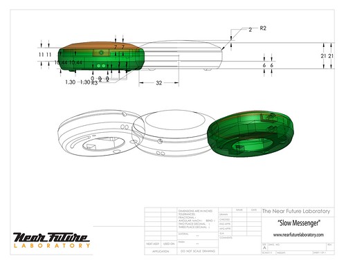
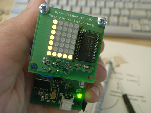
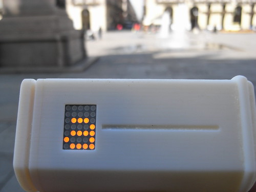
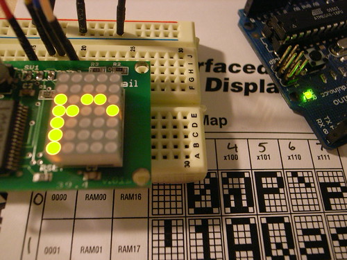
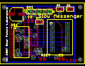
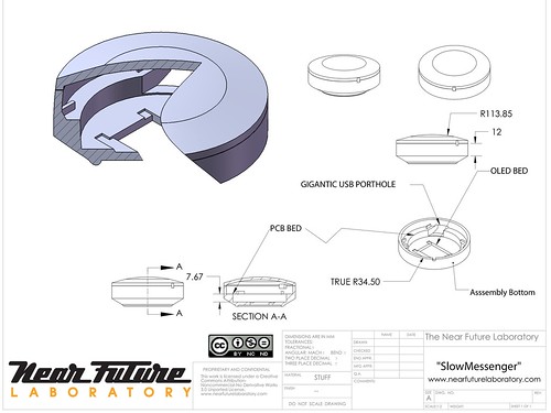
Slow Messenger is an instant messaging device that delivers messages exceptionally slowly. Built into the device is a messaging technology that unfolds its content based on an interface that borrows from the traditions of long-form letter writing, hand-carried mail sent through the post. The instant messaging device connects digital information channels — such as the Internets — to physical information channels — such as streets, hands and the friction of human contact.

SlowMessenger works by simply receiving the message from the message sender. Once the message is received, it is gradually displayed, one letter at a time based on two factors. The first is the relative amount of time that the device is held; the second is the amount of time the device is carried while walking. These factors — holding-by-hand and walking-with — are interaction rituals key to the conveyance of intimate messages. In “another era” that is not the “digitally networked era”, “taking the air” and “perambulating” were crucial interaction rituals for maintaining and knitting together “social network” relations. Friends and intimate couples would “walk hand-in-hand” and discuss matters on their minds. In this “other era”, in times when friends were not in proximity, perhaps because one or the other was off to war or at sea, long-form “letters” were composed to substitute for physical proximity and communication. Postal mail was used to maintain communications and “stay in touch” even if “physical touch” was not, in a literal sense, a possibility.

In this “digitally networked era” communications mechanics are designed to take advantage of the efficiencies of electronic networks. In this way, contact is perpetual and ubiquitous, often resulting in nearly meaningless communiques and dispatches. By “slowing down” the instantaneous message, the device saves time by allowing one to avoid inane drivel and focus on a meaningful connection to one special person.

Slow Messenger Flickr Set

R0013308

SlowMessenger Capsule

20080313_054916

World's Slowest Instant Messenger

I’ve been fixated on a story my wandering mind told me many months ago about a little theory object that forced me to think about how the connected things in the era of IP networks always do their thing as fast as possible, approaching speeds that are imperceptible to normal humans. Almost without question, this is seen as a good thing. But I wondered what it would take to disrupt that assumption. How hard would the apparatus of connected things fight back? Would it be hard to write slow networked communications software? What is “slow” in the era of connected things? Can their be a slow instant messenger device?

I decided the best way to figure these questions all out was to sketch out what a super slow communications device might be, how it would operate, what it would create in terms of affect for those participating in the messaging, and what it could be “good” for.

Naturally enough, I ran up against all kinds of brick walls. Most people thought I had definitely gone completely misheggeneur. Why in the world would I want something that communicated really, really slow? Everything is supposed to be faster, quicker, more instant that last year’s instant. I mean, processor speeds keep flying through the roof. Broadband gets thicker and quicker. Rates go up when it comes to speed, not down. And I had no clear way to explain why I was drawn to this idea, other than trying to do the opposite of the dominant trend for the sake of seeing what other possibilities for connected digital networking there might be.

moleskine_4_111706_6

This may not be as weird an experiment as it sounds, particularly in an age where the Internet is splitting up into all kinds of tiers of service, with for-pay super high speed networks and bottom-tier, low-rent slow networks. Is it really safe to assume that we’ll always have fast networks available to us? Suppose you had to make a choice for economic reasons – you can send this E-FedEx for $43 and it’ll get there in 1200 milliseconds, or send it E-Postal for $3.19 and it’ll arrive sometime early next week, probably. I mean, it wouldn’t surprise me if this were a likely near-future world. It really wouldn’t.

So, how can slow be good? In my wandering mind I imagined a little device that slowly, very slowly, spilled a message out one letter at a time. Like a slow-scan signal from an interplanetary probe, feeding back a nice galactic photo over the course of 32 hours. Some of those messages might have a certain enjoyable anticipation to them — that’s a good thing..affect in messages where we’ve perhaps re-oriented our sense of affect for communication because we’ve been learning how to expect our communications faster or we expect less from our communication because most of the electronic kind gets all gummed up with crap and spam?

I’m also sort of speculating that this experiment might teach me more about how the “weight” of pre-digital interaction rituals can be re-invested with their pre-digital semantic heft even in the age of electronic mail. That is, can the momentum and weight (of time, of material things moving so as to make connections between people, of haptic/touch/proximity connections based on material coming in contact with things) imbue digital communications with something other than the transfer of information?

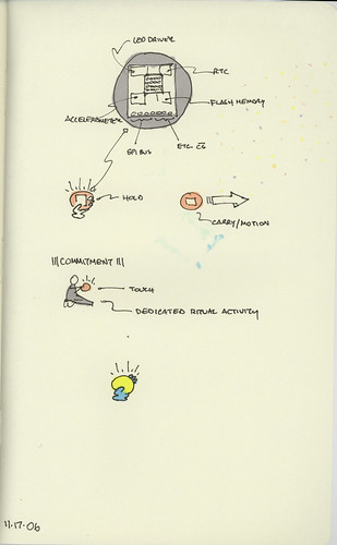
Boy, that’s out there. What I’m wondering is — what happens when I have to invest some material energy to get a message between (or from) someone and myself? That’s all this is — it takes three things to get the message going and finally delivered in its entirety.

1. Time, lots of it.

2. Commitment — the thing only works if I keep it close. If it’s off on its own, it slows down its delivery to glacial proportions.

3. Movement — I basically need to carry it with me wherever I go. And if I don’t go anywhere..if I sit at my computer all day, kind of like I did this entire afternoon and evening? That message just isn’t going to move anywhere.

At the end, perhaps a week or so, the message will start revealing itself, one character at a time.

Obviously, this is for the dedicated communicator, who enjoys the anticipation of a message from someone extra special.

Part II Is Here

Technorati Tags: , ,