Interaction Awards 2012: Drift Deck for People's Choice

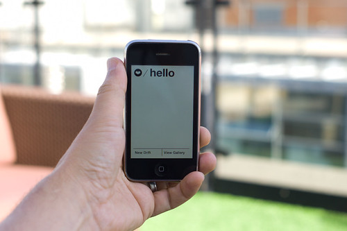
Drift Deck is up for the IxDA Interaction Awards in the “People’s Choice” category. Which isn’t the “Jury’s Choice” but — whatev. It’s the People, so we’re hustling to make you, the People, aware of this chance for you to choose what is the Choice of the People. For Interaction Design Awards.

Please give it a vote.

What makes Drift Deck chooseable? Well — it does something different and provocative in the world of interaction design for the things we do when we’re going/finding. The canon of interaction design for what were once fondly called “maps” is pretty stuck in the mud. Nothing extraordinary going on there that you wouldn’t expect from the next generation of mapping things.

What we did with Drift Deck was look at the world a little sideways and imagine a world in which the map was a bit dynamic and the act of going/finding was a bit less, you know — purposeful in a tedious, dogmatic sort of way.

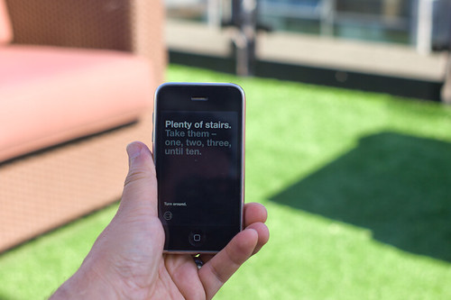
It’s an otherworldly map app, if you will. Drift Deck is meant partly to be pragmatic for those times I find myself somewhere and have no idea what to do if I have an hour to wander about. (Sometimes we all need a bit of a start, or a script to follow.) And of course, it’s playful in it’s nod to the Situationists and their experiments with re-imagining urban space.

The principles led directly from the Drift Deck: Analog Edition that you can find here and more here.

These are the kinds of projects we do here. They’re not “Conceptual.” That cheapens the hard work that goes into them. We write code. We do illustrations of things that get properly printed on big Heidelberg presses. We put together electrical components and have printed circuit boards made and populated with parts to create new sorts of interaction rituals, new sorts of devices — new things that are different from the old things. These are ways of evolving the ordinary to make possibily otherworldly, extraordinary things. They come from ideas that we then evolve into material form so that the ideas can be held and dropped and switched up, on and off to be understood properly.

So, just to be clear — Drift Deck isn’t a conceptual bit of wankery. It’s a thing that got made. Ideas turned into lines of code turned into compiled bytecode. Oh, look! It’s running on my iPhone! Doesn’t feel very concept-y to me.
Continue reading Interaction Awards 2012: Drift Deck for People's Choice

Portals


I love the magically mundane virtual real world of Google Streetview, and like others I’ve longed for my 15 frames of blurry low-res Street View fame. So I’ve been wondering, how can I get into Street View without having to stalk the car and chase it down? Actually, I don’t just want to appear in Street View, I want to play in it and add things to it too. And I want to be able to invite my friends to join me on the street. I want to use Street View for more than looking at a random piece of the past. I want to use Street View as a place to make alternative presents and possible futures.

To help me fulfill this desire (and part of my thesis project), I’ve been prototyping magical portals to get into Google Street View.

I’ve also decided to launch a Kickstarter project to help take the prototype to the next level and see if other people might be interested in exploring this and other related ideas with me.


It turns out, making portals is also happens to be a good way to think about a lot of other things as well. For instance, why does the screen still feel like a glass wall between me an an interface? And how could I get around this wall in a fun and fluid way?

Lately, people have been really into using touch screens (pictures under glass) and gestures (lick a stamp!). But as cool as these things are, they still keep us on one side of the screen and the interface on the other. Not that I think we need to get rid of screens entirely and just have holograms in dark rooms every where. Screens are actually quite magical and we can take advantage of them. But what would happen if we could just make a little space for the real world between the screen and the interface?

Also, what other ways can we think about being co-present with people? There’s the completely CG virtual worlds, full of anonymity and low polygon fantasies. We also have plenty of banal desktop sharing and collaborative white boarding applications. Then there’s standard video conferencing which keeps people in their own separate boxes awkwardly avoiding eye-camera contact. And of course there’s always Real Life, but that’s bound by the rules of space and time. What if we could take a little from all these things and combine them into something that is both more real and more magical?

These are some of the things that I’ve been researching through making these portals. I’m not sure what other questions might come up as I move forward, but it’s a starting point for now.

If you’re interested in helping me explore these ideas while making these Portals, check out the Kickstarter project!

Continue reading Portals

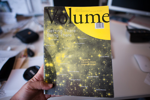
Design Fiction + Advanced Designing + Trust in Volume Quarterly

The most recent — now a month or two old — issue of Volume Quarterly was on the topic of The Internet of Things. And within that was a small sub-volume of essays and articles on Trust compiled by Scott Burnham who has been running a project called Trust Design for Premsela which I understand to be The Netherlands Institute for Design and Fashion.

((The Laboratory seems to be a recurring guest in Volume Quarterly. We were in one a couple of issues back — their issue on The Moon.))

Scott started his project on Trust just as we in the Advanced Projects (then Design Strategic Projects) Studio at Nokia were beginning a project with the same name and some of the same questions. One of our questions was to understand what Trust is and how Design can somehow illuminate where Trust exists and its paths and relationships. When I say “illuminate” the image that comes to mind is one of a special detective’s forensic UV light illuminating something under specific conditions that would otherwise not be seen. Or, in those weird 1950s era medical treatments in which a subject drinks some wretched fluid or is injected with something that shows the paths of digestion or the networks of arteries when shown under X-Rays or something. (Maybe it isn’t wretched, but the thought gives me the willies for some reason.)

In any case there were many facets of the Design work we did in the studio, one of which was this Alarm Clock which was meant to operate precisely in this fashion — to focus our attention on a simple interaction ritual in which we were forced to consider characteristics of Trust.

The essay far below below was my contribution to the Volume Quarterly issue.

But first..

There’s a thing or two to add as well, that have more to do with this particular way of doing Design — or Design Fiction. The process of *making these clocks — which were made out of plastic and aluminum and electronics and solder and all that — was only partially about the specifications that determined how those things would be configured. Beyond those pragmatic, specified things were the ideas we sought to force to the surface — the concepts that we wanted to make ourselves address and consider directly. The preposterousness of the interaction ritual that the alarm mechanism forces was a deliberate way of compelling us to think and talk and design for this ephemeral social bargain called Trust. There was no way around it. We couldn’t lose ourselves in the geekery of circuit design; or choosing a color for the LED numerical displays; of obsessing over compound curves in the industrial design of the thing; or fetishizing any aspect of the “Design” as it is traditionally understood — a material instantiation of an already-accepted and well-understood object. There’s not much movement these days in Alarm Clocks. They are what they are and the variations come in things like…size. Like…color. Like…brand. Like…AM/FM or longwave. Like…number of alarms. Like…style. Like…box-y or round-y. Etc. You get it.

You’ll get stuck with those sorts of boring variations if you think about Alarm Clocks traditionally. Rather, thinking *not about Alarm Clocks but about waking up, and the rituals around it changes one’s approach. All of a sudden, you’re mucking with tradition. You’re getting people upset. You’re not responding to the client’s brief the way they expected. You’re not just doing color and materials variations.

Pfft. So what? Well — looking at things a little sideways is, for lack of a better moniker, advancing design. Advancing it beyond the expected. Doing the Fosbury Flop for Alarm Clocks.

The other thing to say about the project is that the making of the thing — all that plastic prototyping; all that circuit design; all that figuring-out-of-colors-and-materials; all that CNC machining; all that figuring out of tool paths; all that figuring out of firmware and interaction algorithms..why was all that done? Yes, of course — to make the thing *work, in the plainest sense. But, more than that — it was all done to do the Design. The making of the thing is *also a way of doing the Design of the thing. We didn’t figure everything out and then said, “right. now we can make it!” The making was the designing. Assumptions and questions are raised. We interrogate our own ideas and create new ones, whilst making and building and handling material and trying out little scenarios. The peculiar nature of the clock was such that we had debates, one in particular was about what the display should do when the little keyfob alarm-buzzer part was removed to be given to a friend. I felt quite strongly that the display on the main clock should go off, so that you’d have to Trust completely the person who was meant to be your human alarm. Otherwise, you can wake up and check the time, which is an implicit way of not really trusting that human alarm person.

This was the bit of fiction insofar as a clock like this would be quite otherworldly. There would be a very different set of assumptions about how relationships work; about what waking up entails and what it is for (getting to a meeting on time; making sure the kids are ready for school; not missing a flight and all the weight and significance of what happens if you *don’t do these things when and what time they need to be done.)

It would be a very different world if we just *woke up when we woke up, rather than waking up to the same time nearly every day. It’s a slightly skewed universe that this clock came from, but it’s crucial to do this kind of design. Why? Well — it advances the realm of possibilities and begins one considering quite directly about creating new, more curious and sensible interaction rituals. It is also a way of advancing design — doing design differently; questioning and challenging assumptions not only of materials and colors and forms and such, which is good. But questioning the actions and rituals and behaviors of the humans, even to the point of something so seemingly absurd as waking up in different ways. This isn’t to say that people will want to wake up to other people knocking on their doors or shaking their pillows, but it forces a number of unexpected considerations and questions and new ideas that plainly wouldn’t come about if one just focused on different colors for clock displays or snooze button styles. Its a kind of advanced design that is able to engage in its topic by throwing out all base assumptions and free-fall a bit into a weird world and then *not allow the usual questions to arise. Sink into the discomfort zone and do some advanced designing.

How does the underpinnings of social relationships become a design principle? How does one design for trust? Can an intangible like trust become embedded in an object?

The principle that “theory” can be expressed in an object plays a part in this question. Substitute “Trust”, a kind of philosophical principle that is perhaps, in my mind, best expressed through exemplars that represent it, rather than the abstractions of philosophical discourse.

The topic of “Trust” presented itself in October 2008 with a tremendous force. The world rattled as global networks of “Trust” institutions collapsed on a scale that sent apcoloyptics scurrying for Old Testament passages consistent with the sequence of events witnessed across the globe. “Trust” became a keyword for these events as macro social institutions that were once “too big to fail” failed despite their size. These institutions that were once the bedrock of society cracked and dissipated and in their failure, revealed what Trust is, at its core. It is, of course – people and the networks of relationships that define what it is to be a social being.

In the Advanced Design studio at Nokia, we were curious about Trust and what it means. Trust is recognized as a core values of the Nokia brand. The worldwide events brought the topic to the fore and provided an impetus for a design-based experiment. Our question was — what is Trust and how could one design with Trust as a guiding principle? How do you embed Trust in the material of a designed object?

The project walked around the topic, building up the studio’s expertise on the topic through the Design equivalent of a “literature review”, both in the sense of readings as well as a more tangible equivalent. We collected essays and books and made things — objects. We brought in both internal to Nokia and external experts on the topic. A social psychologist talked to us about how ordinary people become extraordinary liars. We followed closely the daily events of the macro level systemic failures of insurance companies, banks, economies and entire governments.

Our goals were deceptively simple — to develop a set of principles that could become “actionable” and be “designed-to” in order that Trust could be embedded in the material of an object.

Amongst a dozen principles, one is worth highlighting and is best paraphrased and represented in one of our tangible exemplars. The principle goes something like this: facilitate the trust network — allow people to trust the people they already trust.

Our tangible prototype was, of all things — an alarm clock. We called it the Trust Alarm Clock. The design brief was simply to make an alarm clock that embodied the principle — an alarm clock that highlighted the idea that trust is a relationship between people. At the same time, it was a platform that allowed us to experiment with this simple principle. As you will see, it is an almost absurd object. But it was the response to the brief that we made, without questioning our motivations, but rather following our curiosity on the topic of Trust.

The clock is best described directly. It consists of two components. The main component is not unlike a conventional bedside alarm clock. The second sits nearly where one would expect the canonical “snooze” button of a conventional alarm clock. This second piece is a small, removable “fob”. When one sets the desired time to wake up, the fob is programmed with a digital count down timer. The alarm setting ritual starts when one sets the wake-up time using a dial on the back of the clock. While doing this, the fob timer is configured so that its count down would expire and the fob would “alarm” when the alarm clock setter would like to wake up. The ritual is completed when the fob is removed from the main component and given to a most trusted friend. In that ritual of handing over the fob, the network of trust is established and embodied. The “handshake” of the passing represents the creation, or the invigoration of trust in its most elemental form. Handing over the fob signals that there is Trust amongst this small, two-person social network. If one wants to wake up — or be woken up — one must first consider a number of things. Primarily — who do I trust to wake me up? Who would I want to be woken up by? To whom do I want to convey that I do indeed trust them?

Short animation of an interaction ritual.

We did not suppose that a bedside alarm clock like this has mass-market appeal. It’s a theory object — a way of questioning and probing and exploring the idea of Trust as made into this provocative material exemplar. In a way it is a bit of fiction, only not written, rather made as a physical object that compels one to think of the stories and “user experiences” that may surround it. The fiction is established through a provocation created through design practices.

Theory objects are like material instantiations of ideas — perhaps even our hopes and our imagination. Theory objects refract some social practice in a peculiar and hopefully thought-provoking way. They are “theory objects” in this sense, ways of shaping refining, refracting and altering social practice hopefully in a way that creates more habitable worlds.

The theory object is a way to think about “technology” as something that does more than utilitarian or instrumental. It is an embodiment of some sort of practice that is not outside of the realm of social action. In other words, the theory object is a social object — one that can shape and mutate social practice. Technologies are mutable. They can be what we need them to be, and shape how we experience the world and in that way, are social. What we are doing here is over-emphasizing this point by skirting around the usual assumptions about technology in order to make this point about their social nature more evident and obvious and provocative.

Why should we care enough to make this point that technologies are embodiments of social practice? Because we need to reveal the human hand in their creation and their possibility. Once we can see that people put these things together (and show this process plainly, through images and descriptions without secrets) it becomes possible to talk about how they could be different, or obey different laws and assumptions — possibly become more environmentally conscientious, or help us find playful ways to be more compassionate to mean people, or find ways to be kind to strangers (whatever..need some concrete examples, perhaps anticipating the projects.)

In the case of the Trust Alarm Clock, we were confronted with a rather exciting and unconventional direction for ways of waking up, which everyone does, with the regrettable exceptions, of course. The question evolves beyond *who do I want to wake me up, and who do I trust the most to, say — make sure I get up to make an unusually early meeting or airplane departure. Rather, through this theory object we were drawn into thinking about other *things one may wake up to besides the time of day. What sort of alarm clock might the near future bring that represents a trusted evolution of the waking-up ritual. Perhaps an alarm clock that allows someone in my networked social graph to wake me up. Or — are there things that I trust more than people in these circumstances? Somethings that are beyond the rather mechanistic and mundane ritual of waking to the time, which, after all — is not particularly exciting. Might the things that are more relevant or consistent with our connected age be what wakes us in the near future? In the near future, might we trust more an alarm clock that wakes us up when other people start waking up in order to facilitate that sense of being amongst a larger group of people who are also starting their day. Who are we to say that the now common ritual of waking to a specific time become as antique as luggage without wheels.

Quiet But Not Quiescent

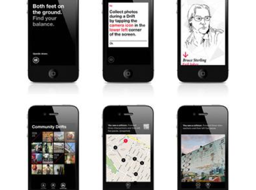
Judge not the less yammer-y state of the studio blog to indicate that there is nothing worth yammering about. It’s just that the clang of steel caressing code has been going on and that in great measure, too. Some of you may have glimpsed and grinned at the fantastic electronified edition of the paper Drift Deck that we developed a couple of years ago. That’s right. We’ve added *batteries to the Drift Deck and it’s fallen into the *app well..it’s an app which is fantastic because it means the last remaining physical card editions can become properly *artisinal and the electronic battery editions can spread the sensibility of the Drift Deck concept to the rest of the world.

Release is imminent. Prepare ye iPhones. Hop expectantly from foot-to-foot. More news in a short while, including linkages to downloadables. In the meantime, check out the new Drift Deck webified “page” and the fantastic roster of hammererers that batteryified the ‘deck.

..And then — onto the next thing here. It’ll be quiet a little, but good things are baking in the kiln, rest assured.

*Willow next. The superlative friendregator for the discerning social being.
Continue reading Quiet But Not Quiescent
Opportunism

RadiationDetection

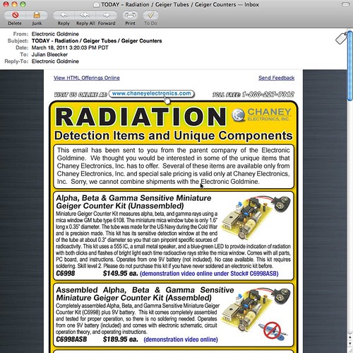
Completely understandable how the recent tragic events in Japan would translate into email from an electronics source containing *only parts and supplies and modules to make Geiger Counters. At the same time as it’s understandable, it’s one of those things that feels like it’s taking advantage of the general panic, confusion, sadness and apocalyptic angst.

Not deflecting the urgency and anxiety of recent events in Japan, it’s curious to me to think about how and when change is able to happen. By that I mean that things happen, swerve off-course or are able to swerve off of into unexpected, new directions. For example, the events after 9/11 where an *opportunity space opened up in which dramatic, unprecedented changes were able to be made in the legal systems of some countries. Things that would not have been so easy to implement had their been no epic tragedy. Similarly, in a way — now we learn quite a bit about nuclear physics, science, speculation about the malfeasance (if you can call it that) of this nuclear quasi-agency in Japan (via @xenijardin WSJ: TEPCO initially resisted using seawater to cool reactors; harm to “valuable power assets” feared ). We find ourselves preparing — again — for an earthquake, nuclear catastrophe, flood, Tsunami, etc. Entirely enormous nations are scaling back and turning off nuclear power plants (I find this most intriguing) and rethinking their energy policies. I mean — that’s epic. Whatever side you may be on the issue of nuclear power, these events, at the cost of untold lives, future lives, physical infrastructure, and so on — everything has been changed.

The imagined course into which the future was going to be made, has swerved.

We often like to think of change coming about from good, thoughtful, happy actions and activities. Like good design work, for example. I think, from my experience, it is often never like this. It is hard. Change is hard. Making things better is hard. Generally, and anecdotally from the experience of myself and others up and down the hall here on the 7th floor of the Laboratory — people are reluctant to change their ways, the course of their lives. Moving out of “comfort zones” and all that is, well — uncomfortable. Adapting and adopting new ways of living, behaving, thinking would make for a more resilient world, I think. One that was not afraid of difference, of giving things up for the hope and possibility of a better things.

Of course — it can all go wrong. But at least we’d try.

*Anyway..

Parenthetically, Studio 360 has an intriguing related radio story on this topic. It is called Japan: The Imagination of Disaster.

Why do I blog this? As always, we here are quite intrigued by how the future comes to be — what are the mechanics, semantics and motivations that move people to obtain and create possible futures. In this case, “taking advangage” of opportunites when one can do that bit of swerving, rudder-pushing, tiller cranking because the currents become favorable to try a new tack.
At that moment when the normal course of events seems to swirl out of control

Continue reading Opportunism

You'd Be Right To Wonder

Wednesday January 12 00:17

You’d be right to wonder why there has not been much here for a couple-few weeks. Contrary to a vicious rumor, we neither adopted a needy office pet nor did we father-seed a dead pop star’s child.

It’s Annual Planning Month here in the Laboratory, when we assess what will be our near future priorities, goals, strategic themes and projects. It’s weeks of mulling, muttering, hemming, hawing, pausing, sputtering, drinking and brow-furrowing. After all the strategery comes the planning. We’re deploying a rigorous phalanx of unforgiving planning-to-do tools, reacquainting ourselves with our old avuncular friend — Mr. Gantt and his fabulous chart. Along with this is Mr. Gantt’s trusty Sancho Panza, Mr. Miles Stone.

That’s right. Planning, charting, back-filling objectives and sticking to our guns. This way, at the end of each “Q” (that’s Quarter to you non-accomplishers-of-things) we can re-assess and re-target. In fact, we might even be working at the level of the “P” (sorry, “Period” or one of your Earth “Months” to you terrestrials) and perhaps even the microscopic time element — the Week.

Where has this sudden bit of planning gluttony come from?

*Shrug. Who the fuck knows.

But, it feels right and it will help the Laboratory to say “no” because it’ll all be right there, in Mr. Gantt’s chart and resource managers can point and wag a finger and say “Uhn uhn uhhhnnn..that’s not going to happen. Back to your computation terminal!”

The ring of the ball-peen hitting the work piece on the anvil. The smell of the coke smelting the ore. Lustful, material things. Things getting done and made.

So — what’s on the plate?

Well, I can give you the *general theme, but nothing super specific, and that’s only because of the deeply sensitive nature of our work and the fact that it might have deep political affect on the ways the needle-heads upstairs in Finance & Control’s (mis)understand what exactly it is we do and how it brings incalculable value to the efficiency of the Laboratory — unlike the Bridges and Thoroughfare Systems Group which never, by the way, ever did a damn thing to contribute to our bottom line, least as best as I can tell.

Wednesday December 29 17:00

Here it is. This year’s theme: Less Yammering. More Hammering.

Let me explain. In the recently deceased year, we spent the bulk of our informal projects time talking about things that were *more than interesting to us.

It was more than interesting. Supra-interesting. Boundless interestingness. I’m talking mostly about, well — talking about #designfiction. And this will continue as a theme within whatever theme happens to be the theme-of-the-day.

At the same time, the yammering meant there was less time (despite having it on the list of the Professional Development Plan) actually making things. Now — I love to talk and have conversations around engaging, new, whacky-but-intriguing ideas. That’s the guano of innovation. It’s how things change, grow, evolve. Ideas come to life in the conversations. The conversations are that which promote and propagate; they contain the narrative logics that poke and prod and stretch and materialize those thoughts, making them more tangible and more legible. So — I love to yammer. As you may know — I also really love to hammer: to make things that are distillations and materializations of those conversations. Little props and provocative objects that help think-through and evolve those conversations.

Years ago the Laboratory wrote a tremendously short essay called Why Things Matter in which I ham-fistedly explained my thinking about the importance of “social objects” and the ways that these can become as yammer-y as normal human beings and, thereby, bring about material change to the world. It was most an interest in how things like Pigeons or Salmon suddenly connected to the *network in oftentimes simple ways could alter the terms of conversations about things like environmental issues, pollution or fishing legislation.

What I learned through that was the importance of making things — but it’s not just the made-thing but the making-of-the-thing, if you follow. In the *making you’re also doing a kind of thinking. Making is part of the “conversation” — it’s part of the yammering, but with a good dose of hammering. If you’re not also making — you’re sort of, well..basically you’re not doing much at all. You’ve only done a *rough sketch of an idea if you’ve only talked about it and didn’t do the iteration through making, then back to thinking and through again to talking and discussing and sharing all the degrees of *material — idea, discussions, conversations, make some props, bring those to the discussion, *repeat.
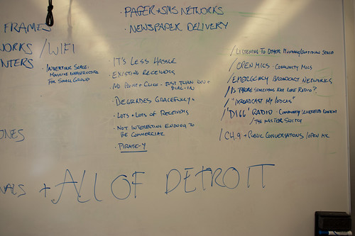
Friday January 14 12:04

So — we’re not done here with the #designfiction theme, but it is an idea that needs some material-making, at least here, and lots of people are doing this as well. But, generally thinking — it’s time to get back to making stuff, building little probes and provocateurs and trouble-makers. That means booting up the old software-making toolkits, breaking a few of Simon’s milling tools (sorry, again..), learning how to CNC myself so I can make my own mistakes, getting a CAD package in that old PC in the Laboratory, etc.

There’ll be posts here and status updates and of course — yammering. It’ll just be tempered with and by and through the making as it once was oh a couple-few years ago when we were making hellzalot of electronics.

This’ll be the year of trouble-making apps of various sorts, I think. The first one is the digital edition of the previous Drift Deck, analog edition which has had a sort of silver-year’d renaissance thanks to @bldgblog writing a nice, thoughtful little post about it. That’s being done by Jon Bell and Dawn Lozzi with myself being the design project equivalent of the annoying sot who wants to have “just one more.” Allegedly, so long as I *don’t have “just one more” this should be done by the new networked age’s equivalent of the finish line — South by Southwest, which’d be March 11. (Here is a printable PDF of the Drift Deck, analog edition for those who have had trouble downloading it from Slide Share.)

There are other things, of course. The completion of the Laboratory’s re-make of 2001: A Space Odyssey, finally doing the animated Death Match between Apollo LEM and Space POD, a *book project with more images than words, revisiting two old location-based software toys, and a crackapp that may hopefully get us in good trouble with parents.

Thursday January 13 17:56

Finally — this is it, really: the sub-genre of this year’s theme “Less Yammering. More Hammering.” is — “Low Brow.” In fact “Low Brow” was the original theme, but it didn’t test too well in the experts’ reviews. But, if I think about it, it lives on in a way. It provided the transposition algorithm, turning the wonderfully optimistic “Get Excited. Make Things.” that our friend Matt Jones (@moleitau) of Berg meme-seeded into a sort of by-the-scruff, morning drunkard, roughneck-ificiation — “shut up and just do it, you moron” — only I made to rhyme so that I can sing it — should things come to that.
Continue reading You'd Be Right To Wonder
Cinema City

Or…in this case, cinematic architecture. Jonathan Rennie presented a project yesterday that I found most fitting in the vein of design fiction / architecture fiction. For the studio class run by Geoff Manaugh (@bldgblog) called Cinema City, a graduate studio that starts with this brief and asks the students to consider what they may. There were some interesting projects. This one in particular stood out for me. It was an unconventional approach in an architecture class to present a series of fictions about the future of cinema.
Monday December 13 14:06

Continuous Machinic Cinema

This project explores a particular narrative for the future of cinema and, in turn, it proposes new possibilities for the moving image and its place, content, viewers & screen.

The project proposes a scenario of technological discovery and development where:

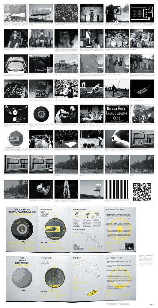
** Guerilla film distribution occurs in new places via Lawn Bowl and Shot-put film grenades;

** With anamorphic lenses the perpendicular hegemony of conventional cinema watching is broken;

A shift in content to QR coded cinema is predicted and, in turn..

** A future point where non-narrative images are viewed by post-human machine optics is proposed, with screens affecting the fabric of the city.

The project is a sneak preview for a future of cinema, proposing a continuous cinema that is freed from both the spatial confines of the movie house and the literary expectations of narrative — told by and to non-human machines.
FInal Panels_Further Revised.indd

In the first proposal, guerilla film distribution is done by throwing film grenades, a “weapon” first proposed by the Soviets and designed to be surreptitiously deployed during the Olympics. The weapons are found again by Jonathan during his project research, including documentation and some diagrams describing the clandestine Soviet project.
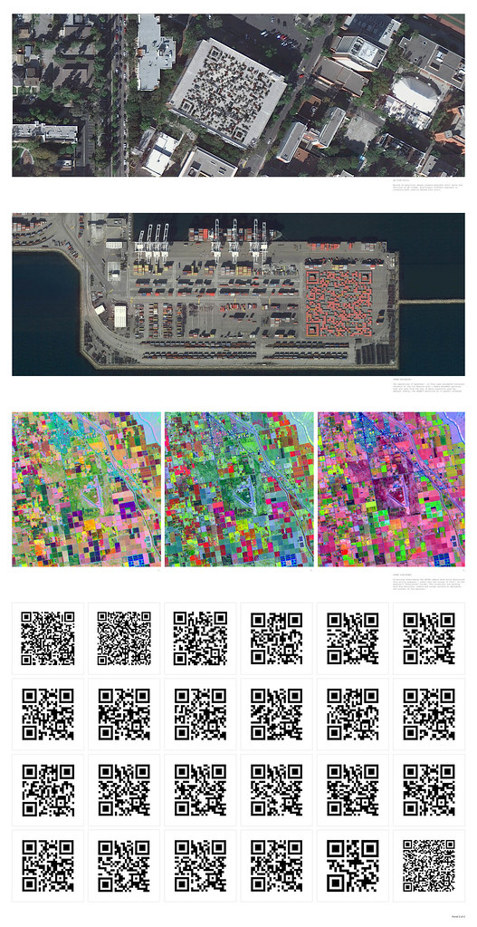
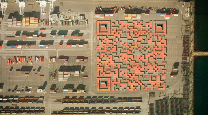
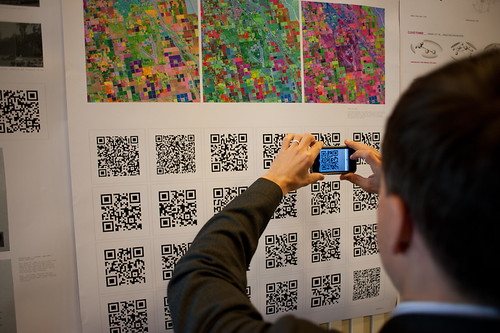
In the second proposal, Skynet — an extraterrestrial orbital satellite platform — finds QR codes in the landscape of earth. The QR codes embed stories and films that the satellites share with one another. Over time, as they see the same films over and over again and become bored — they begin to look for QR codes elsewhere, perhaps interpreting barcode-like structures in the landscape at different wavelengths — for instance an infrared folliage rendering may appear to contain QR codes. They seek out new films in this way, perhaps even instructing terrestrial machines, such as the cranes at loading docks or tractors in large farm fields, to construct new QR codes containing new cinema and stories.

Still 1

Jonathan also ginned up a sort of graphic novella/short story to go along with the proposal so that each QR code that you see in his poster documentation points to a page in the comic. You can see the full graphic novella here: QR Cinema

Why do I blog this? This is one of those architecture projects that plays at the far end of the spectrum of architecture’s inherent speculative nature. The spectrum runs from the pragmatic *planning what will be* (traditional floor-plan stuff) all the way across to *speculating to help think* (architecture fiction), with *proposing (cardboard models, photoshop site renderings, camera-tracked little films showing the space as it would be) somewhere in the middle.

I enjoy considering the spectrum of realizations as things move from idea to their material form. In this case, Jonathan has used the architectural brief to propose a speculation about machines reading the landscape to interpret meaning, or to watch movies that are referred to by the QR codes they (think?) they see. This is using the landscape as an interface, which I find super intriguing.

What does this help us think about? Well — it’s a fun Sci-Fi comic he’s done here, so there’s that on its own. Aside from this, we can start to think about Cyphertecture — embedding machine-readable (or maybe only-for-machine) texts in physical structures. Like, for example, this bit of landscape cyphertecture from several years ago

Space Invaders: Google Earth Edition

DIY Media? Fan Art in Google Earth

Space Invaders upper right..Cylon Raider bottom left.

Geoff has the more lucid discussion of this point, but suppose cornice details became machine readable physical cuts and bumps that would represent some meaning for, say…Google Street View cars? I’m not saying this is entirely practical, but I could see a day when bold marks like this that are required to exist (for any number of reasons — local services to identify what building they are at definitively, etc.) on new structures. This then becomes turned into an aesthetic to make it more pleasing as a facade, and so on. In any case — Jonathan’s work certainly gives me things to think about in an entirely fun, imaginative way.
Continue reading Cinema City

Volume Issue on the Moon

Tuesday October 26 15:22

Tuesday October 26 15:22

Tuesday October 26 15:23

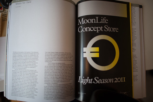
Just a short note to draw your attention to this cool quarterly journal called Volume which you may already know about but which I only heard about when they asked if I would contribute a short piece on Design Fiction. Basically it is a condensation of the longer essay from last winter which is presently offline due to some Internet wrangling and movements which won’t be sorted until later when the shipping crate gets back from the data networks.

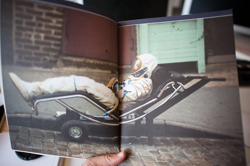
The issue is focussed on the Moon which is a wonderful topic. Included are a photo essay on a lost astronaut and an insert product catalog of fictional/speculative objects, magazines, gifts and other items that might be appreciated by people who live on the moon.

In either case, this quarterly is quite intriguing and somewhat reminiscent in my mind to Cabinet (although quite a bit more expensive). It seems to consist mostly of excerpts and extractions of existing material, which is fine of course.

Sticks, Stones and The Material Effects of Appearances
Thursday April 09, 15.12.45

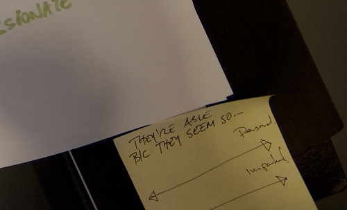
Phil L’s clan motto, translated into English. They are able, because they seem so.

Further to the point of how stories, ideas and language can shape the world in material ways, this came out of the blue on the thread of something or another, the family motto of Phil’s clan, of Australia:

JCB_09042009_151245_8825

They are able, because they seem so.

I stopped dead in my tracks with a broad smile upon hearing this, which I think may have confused the workshop context. What this meant to me was a summation of the ability of knowledge to come into being by force of will, in a fashion. By showing and telling stories you create material effects — in this case, I am not because I say I am, but for my appearance, or perhaps because my appearances suggests an ability to accomplish whatever faces me. This is not to diminish the import of this motto in context — it is powerful. It’s not just about fooling someone through the creation of appearances, but recognizing the power of what one sees (or hears, or is told) to shape the imagination and, thereby, the hands to craft things in a material way. Making things through the excitement of imagining and then desiring.
Continue reading Sticks, Stones and The Material Effects of Appearances