Cinema City

Or…in this case, cinematic architecture. Jonathan Rennie presented a project yesterday that I found most fitting in the vein of design fiction / architecture fiction. For the studio class run by Geoff Manaugh (@bldgblog) called Cinema City, a graduate studio that starts with this brief and asks the students to consider what they may. There were some interesting projects. This one in particular stood out for me. It was an unconventional approach in an architecture class to present a series of fictions about the future of cinema.

Monday December 13 14:06

Continuous Machinic Cinema

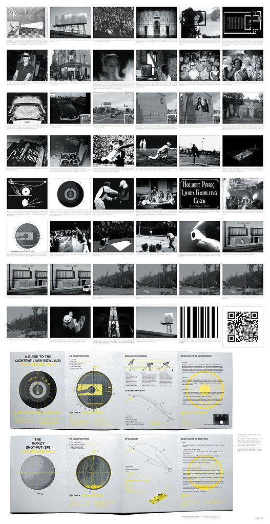
This project explores a particular narrative for the future of cinema and, in turn, it proposes new possibilities for the moving image and its place, content, viewers & screen.

The project proposes a scenario of technological discovery and development where:

** Guerilla film distribution occurs in new places via Lawn Bowl and Shot-put film grenades;

** With anamorphic lenses the perpendicular hegemony of conventional cinema watching is broken;

A shift in content to QR coded cinema is predicted and, in turn..

** A future point where non-narrative images are viewed by post-human machine optics is proposed, with screens affecting the fabric of the city.

The project is a sneak preview for a future of cinema, proposing a continuous cinema that is freed from both the spatial confines of the movie house and the literary expectations of narrative — told by and to non-human machines.

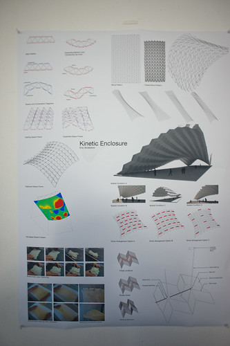
FInal Panels_Further Revised.indd

In the first proposal, guerilla film distribution is done by throwing film grenades, a “weapon” first proposed by the Soviets and designed to be surreptitiously deployed during the Olympics. The weapons are found again by Jonathan during his project research, including documentation and some diagrams describing the clandestine Soviet project.

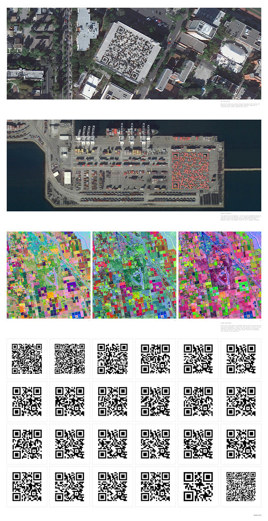
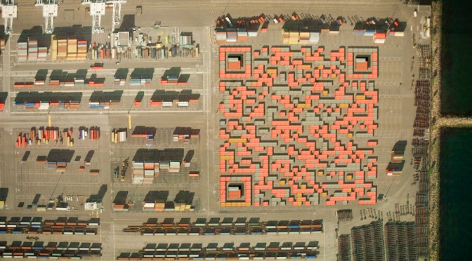
In the second proposal, Skynet — an extraterrestrial orbital satellite platform — finds QR codes in the landscape of earth. The QR codes embed stories and films that the satellites share with one another. Over time, as they see the same films over and over again and become bored — they begin to look for QR codes elsewhere, perhaps interpreting barcode-like structures in the landscape at different wavelengths — for instance an infrared folliage rendering may appear to contain QR codes. They seek out new films in this way, perhaps even instructing terrestrial machines, such as the cranes at loading docks or tractors in large farm fields, to construct new QR codes containing new cinema and stories.

Still 1

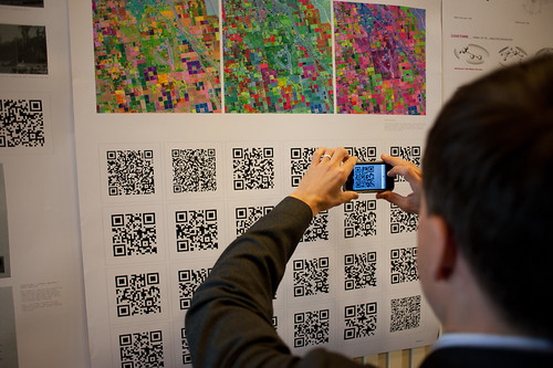
Jonathan also ginned up a sort of graphic novella/short story to go along with the proposal so that each QR code that you see in his poster documentation points to a page in the comic. You can see the full graphic novella here: QR Cinema

Why do I blog this? This is one of those architecture projects that plays at the far end of the spectrum of architecture’s inherent speculative nature. The spectrum runs from the pragmatic *planning what will be* (traditional floor-plan stuff) all the way across to *speculating to help think* (architecture fiction), with *proposing (cardboard models, photoshop site renderings, camera-tracked little films showing the space as it would be) somewhere in the middle.

I enjoy considering the spectrum of realizations as things move from idea to their material form. In this case, Jonathan has used the architectural brief to propose a speculation about machines reading the landscape to interpret meaning, or to watch movies that are referred to by the QR codes they (think?) they see. This is using the landscape as an interface, which I find super intriguing.

What does this help us think about? Well — it’s a fun Sci-Fi comic he’s done here, so there’s that on its own. Aside from this, we can start to think about Cyphertecture — embedding machine-readable (or maybe only-for-machine) texts in physical structures. Like, for example, this bit of landscape cyphertecture from several years ago

Space Invaders: Google Earth Edition

DIY Media? Fan Art in Google Earth

Space Invaders upper right..Cylon Raider bottom left.

Geoff has the more lucid discussion of this point, but suppose cornice details became machine readable physical cuts and bumps that would represent some meaning for, say…Google Street View cars? I’m not saying this is entirely practical, but I could see a day when bold marks like this that are required to exist (for any number of reasons — local services to identify what building they are at definitively, etc.) on new structures. This then becomes turned into an aesthetic to make it more pleasing as a facade, and so on. In any case — Jonathan’s work certainly gives me things to think about in an entirely fun, imaginative way.
Continue reading Cinema City
An Artist Statement To Remember

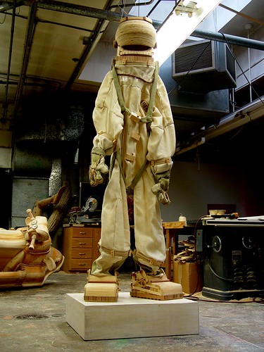
Spacesuit by Michael T. Rea

I just need to jot this down so I don’t lose it.

Mike Rea is an artist. This is his artist’s statement which brings together this wonderful relationship between fiction, underachievement, flaws, and failures. Lovely.

Standing on the shoulders of other people’s dreams could perhaps be the most pathetic of all dreams. The intent of my work is to create something short of its outcome. My goal is to create the idea of an object that remains a dream. The objects I create are based on fictions, rather than realities. I have always been interested in the ephemeral worlds established in film, or even in popular culture. Fictions or established hearsay allow for a flawed interpretation, which leads to a flawed result. The sublime is unattainable, and not an option. I further amplify this experience by only using my memory to construct my images. Failure is imminent. I find humor allows me to enjoy this experience, and I in turn build humor into the worlds established by my work. I have chosen to depict these states with unfinished wood, and other materials which convey a sense of the temporal. I find the beauty in life lies in between moments. My work offers a sense of what could be and what could never be simultaneously.

Continue reading An Artist Statement To Remember

Design Fiction Workshop: Failures

Saturday October 30 05:04

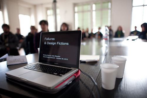
I’ve been away for awhile so obviously I’m just now catching up with some notes for the events and activities of the last few weeks. One thing I want to make a note about is the fun workshop that Nicolas and I facilitated at the Swiss Design Network conference in Basel Switzerland late last month. The workshop was largely Nicolas’ organization and we took advantage of the conference theme of “Design Fiction” to consider the topic of failure in design — failure as a guide and approach and provocation together with the considerations that design fiction can offer.

Saturday October 30 02:02

Nicolas has posted the notes from the workshop

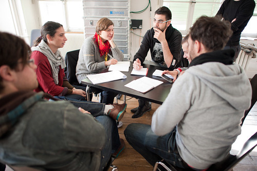
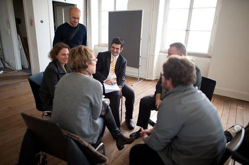
It was a relatively short workshop — a couple of hours in total. Initially I was nervous that there would be not enough guidance to allow the participants to grab onto the material enthusiastically. That proved to be wrong. After an initial presentation that went over the topic of design fiction and failures that Nicolas had prepared, we broke the approximately 30 or so participants into groups of four or five individuals. There were three assignments that we had prepared that each group was meant to conduct. After completing each assignment — which lasted from 20-25 minutes each — the group turned inward and shared some summary insights, results and conclusions. They didn’t know all the assignments ahead of time.

Saturday October 30 02:24

The first assignment was to consider where and when failure happens in design. Without a specific definition of what constitutes failure, the assignment was meant to warm things up by creating a debate and set of examples as to what failure was and when and how it occurs. From Nicolas’ notes (my notebook has escaped me temporarily):

  • #Wrong hair color, not the one that was expected
  • #Help-desk calls in which you end up being re-reroute from one person to another (and getting back to the first person you called)
  • #Nice but noisy conference bags
  • #Toilet configuration (doors, sensors, buttons, soap dispensers, hand-dryers…) in which you have to constantly re-learn everything.
  • #Super loud and difficult to configure fire alarms that people disable
  • #Electronic keys
  • #Garlic press which are impossible to clean
  • #On-line platforms to book flights for which you bought two tickets under the same name while it’s “not possible” from the company’s perspective (but it was technically feasible).
  • #Cheap lighter that burn your nose
  • #GPS systems in the woods
  • #Error messages that say “Please refer to the manual” but there is not manual
  • #Hotel WLAN not distributed anymore because hotel had to pay too many fines for illegal downloads
  • #Refrigerators that beep anxiously to indicate the door is open, but do so even when you’re busily loading groceries.

This assignment was useful to begin the thinking about failure. The goal was less about creating a definitive or definitional list and more about thinking beyond and using examples as motivators and things to think with.

Saturday October 30 02:39

The next assignment was essentially the first but to create examples that one might anticipate as a typical failure in the future — the design fiction failures. Things that could occur given that everything fails to meet our highest expectation or (as I’m particularly interested in) the highest of the hype that surrounds new designed stuff. Epic failures, or just routine annoyances were all open for consideration. How might the cloud computing promise fail in both the major disaster ways — as well as the small, wtf!? sort of ways.

Again, from Nicolas’ notes:

  • #Identity and facial surgery change, potentially leading to discrepancies in face/fingerprint-recognition,
  • #Wireless data leaking everywhere except “cold spots” for certain kind of people (very rich, very poor),
  • #Problems with space travelling
  • #Need to “subscribe” to a service as a new person because of some database problem
  • #People who live prior to the Cloud Computing era who have no electronic footprint (VISA, digital identity) and have troubles moving from one country to another,
  • #3D printers accidents: way too many objects in people’s home, the size of the printed objects has be badly tuned and it’s way too big, monster printed after a kid connected a 3D printer to his dreams, …
  • #Textiles which suppress bad smells also lead to removal of pheromones and it affects sexual desire (no more laundry but no baby either)…
  • #Shared electrical infrastructure in which people can download/upload energy but no one ever agreed on the terms and conditions… which lead to a collapse of this infrastructure
  • #Clothes and wearable computing can be hacked so you must now fly naked (and your luggage take a different flight)

I was particularly taken by the 3D printer example. There’s of course lots of excitement about the possibilities of 3D printers in the home so that everyone makes their own stuff that they need. But, making stuff is hard and inevitably open to all kinds of crazy failures such as described here. Also — what do people do with the materials when they mess something up? How is the plastic (or whatever it ends up becoming — maybe noxious nasty stuff) get recycled? Will there have to evolve an entire system of rematerializing the goop? What about the equivalent of the print failures we often experience where one document ends up printing one letter per page, after page after page and we don’t notice until fifty sheets of paper have been used? Or when we scale something wrongly and the machine blindly goes ahead and prints something at 3 meters when we meant 3 millimeters? All these sorts of things will happen — can we use these insights to help make decisions about what and how to design? Can we start to communicate these failures as a way to design not with the expectation that the world is perfect — but that the results of designs have chinks and kinks in them?

Saturday October 30 02:39

The final activity was to think about possible taxonomies for designed failures — what are the types and kinds of failures as we’ve discussed them in the previous two assignments?

  1. #Short sightedness/not seeing the big pictures
  2. #Failures and problems that we only realize ex-post/unexpected side-effects
  3. #Excluding design
  4. #Bad optimization
  5. #Unnoticed failures
  6. #Miniaturization that doesn’t serve its purpose
  7. #Cultural failures: what can be a success in one country/culture can be a failure in another
  8. #Delayed failures (feedback is to slow)
  9. #When machines do not understand user’s intentions/technology versus human perception/bad assumptions about people (”Life has more loops than the system is able to understand”)
  10. #Individual/Group failure (system that does not respond to individuals, only to the group)
  11. #System-based failures versus failures caused by humans/context
  12. #Natural failures: leaves falling from trees considered as a problem… although it’s definitely the standard course of action for trees)
  13. #Good failures: Failure need interpretation, perhaps there’s no failure… alternative uses, misuses
  14. #Inspiring failures
  15. #Harmless failures

Why do I blog this? Well — just mostly to get some notes from the workshop up to share. I’m learning quite a bit from Nicolas on the failures theme, and perhaps its a way to answer a question that Chairman Bruce has lofted — now that we “get” the idea of design fiction and it seems to be inspirational for folks and useful in that regard — witness the theme of the Swiss Design Network conference this year. But..okay. We get it. Now what? How does the idea of design fiction either operationalize or become part of specific sorts of design practices in some informal or formal ways? It’s happening of course — all over the place and not because of this idea of design fiction itself, either how I’ve discussed it over the last 18 months or so, or how it’s been described and enacted by many people and agents. It’s not just about science fiction of course — and this was the topic of a paper at the conference that I may have the energy to describe in an upcoming post. But it is useful in very direct ways with the activities and goals of design generally speaking, that much is clear.

Apparatus at The HABITAR Exhibition

Wednesday June 17, 14.44.17

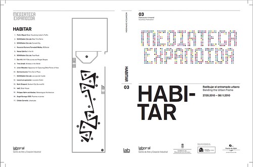
As Fabien has mentioned and due to his participation in curating the event, the laboratory’s Apparatus for Capturing Other Points of View will be exhibited at HABITAR. It’ snice to have this project reconsidered in an art & technology context. The exhibition catalog is available as a PDF here.

Originally this was a thought-collaboration after a Nokia colleague turned me onto this William H. Whyte small book called The Social Life of Small Urban Spaces. Whyte managed to capture the dynamics of urban parks and gathering points with the recording technoogy of the day — eyeballs, notebooks and some 16mm cameras. (You can watch some of it here and other places.)

HABITAR

It was a simple thing to get excited about — how might this sort of observation be redone in the early 21st century and what might be some curious things to look for? My own interest was to build the thing and make it a provocative instrument and then wonder what a video enhancement and post-processing of these images look like? Something algorithmic, I supposed — are there behaviors and movements that can be abstracted from the general hub-bub and rush of urban pedestrians’ lives?

You can find most of the videos here, and there are some new edits at the exhibition should you be in their neighborhood.

Continue reading Apparatus at The HABITAR Exhibition

The Week Ending 021910

Thursday February 18 19:59

Well, another week, another set of tardy week notes..it only seems like sheer anxiety about not being diligent propels me and that only when the subsequent week begins.

Onward.

It was a week of production of things related to project Trust; completing, debating, refinishing, redesigning as these things go, which seems classic completionist dyslexia, seeing as the next, next *done-by that we set was, technically, the end of February and already the calls are coming in to see it to help with whatever-whatever other thing someone else is doing that they feel could use a burnish or a braze from Trust. We’re genuinely excited to have these conversations — almost a dozen such over the next two weeks according to this scrap of paper with names, dates and locations.

In the midst of this, at this point is the curious letting-of-things-go insofar as the *intelligence or the *ideas in the project have been assumed embedded directly enough in their exemplars that actually figuring out what the ideas are, or refining them and so forth — this has gained little attention with a pure, slightly unnerving emphasis on the communication of them through small films, and a focus on the means and mechanics by which the communication happens. I suppose this is as these things go — for the writer in me (I mean this quite modestly), this is like the polishing and editing of the thought, with the thought and story quite well completed and beyond the point where major revisions can happen. If I can keep on this track of pure production, pure editing, I’d be surprised, knowing my penchant for rethinking at the last minute.

There was a short, two day trip to San Francisco to visit the facilities there and participate in an in-depth technical review, which was 2 parts engaging, 2 parts intriguing and 1 part exhausting. Communicating the experience of interaction touchpoints and *user (bleech..) journeys in order to feedback into the circuits of design, technology, logistics and accounting is something quite new to me, but something I genuinely want to understand and participate in, *only to know how design can shape an influence and be instrumental to the work that (a) engineers do; (b) software programmers do; (c) middling, junior designers do; (d) people under tremendous pressures with financial incentives calibrated to meeting some date in a calendar, um..do; (e) accountants and business people do..etc. ((This thinking calibrates with a talk Mike Kruzeniski gave at IxDA, which I hope to hear one day where he conveys this important, crucial notion that if you cannot make your design criteria, pattern, process, thinking — whatever — communicate to the sensibilities of the engineers making the stuff you draw in story boards, then you may as well take up horse shoeing.))

What also occurred to me during this workshop-y couple of days was the means and mechanisms by which one communicates *feedback. The spreadsheets and awkward photos seems positively medieval, which is not to register anything negative about the facilitators. I think we’re all meant to contribute to this new, new process of review and it got me thinking about another mechanism that is closely to small, short visual films (of course..it’s all we’re doing these days) that may be more impactful if less didactic.

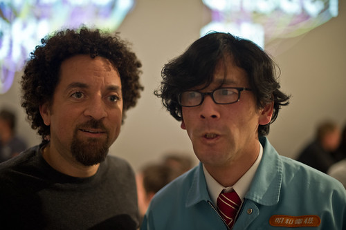
Finally, a lovely close to the week — I sprinted off of the bloated plane from SFO, jumped into my car (becoming the mayor of Parking Lot C on Foursquare, in the process, much to the ridicule of *friends) and headed over to the Gadget OK! exhibition, talk, dinner at UCLA’s D|MA. Sadly, I missed Maywa Denki perform, but I did get to see the exhibition and buttonhole Tosa-san for our obligatory weird photo. ((More photos of the exhibition and stuff are here: http://www.flickr.com/photos/julianbleecker/sets/72157623486756774/)

Thursday February 18 21:27

Design for Failure

04102008_100526

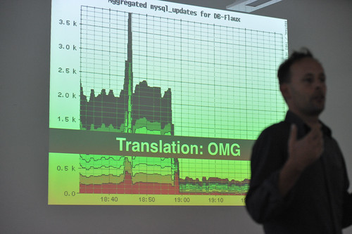
With regrets to Aaron for the blurry, noisy photo of himself..Taken in Montreal Canada at Design Engaged 2008.

For no particular reason — perhaps a salute to Nicolas who will be presenting his work on design for failure at IxDA this week — I bring you this image taken during DE2008 in which Aaron Straup Cope discusses designing engineering systems with failure contingency as the critical path.

Why do I blog this? I find this perspective intriguing — it assumes system meltdown, anticipates it and delivers appropriate data to indicate when it might happen. If I remember correctly, there is no specific interest in being exact about failure, just that it will happen and you might be told roughly how long until it happens. So the effort is to help stave it off by various means — adding more servers to spread activity loads around, optimize queries, increase caching, whatever you need to do. This makes me think of the intractability of designing for deletion. If someone wants to extricate themselves from the databases of a service or system, there is almost certainly no quick and easy way — in fact, I doubt there is anyway at all, and most services are not obligated to handle these situations. If I told Google that I wanted to check out fully and completely, even if they wanted to do this, it is doubtful they could. Would someone have to run through all the backup *whatever — tapes? — wherever they may be? It’s not just the live systems, and its not just purging caches and so on. All of our data is on its own, like orphaned snapshots of moments in our lives, somewhere. I don’t necessarily find this chilling or anything like that. I’m just curious about this notion — designing for intractable, ugly, messy circumstances, like failure or deletion. Things that run counter to the intuition — we usually design for the beautiful, full, glorious 32-bit conditions.
Continue reading Design for Failure

The Week Ending 150110

Saturday January 16 15:51

From here, the next week begins. Sayulita, Mexico to repast, float, read, drink and celebrate with friends, a friend’s birthday.

The week began with the Microsoft Social Computing Symposium, 2010 edition. I’ve put my notes from the event here in the immediately preceding blog post.

Back in the studio on Thursday and Friday to tidy up a few loosened ends with the Trust project and coordinating some final assembly particulars with Tom, Simon and the fine folks at the prototyping family house Aeolab for the second clock. The industrial design is fantastic and lovely which only complements the provocation of new interaction rituals embodied in the object itself. Next Tuesday should be close to the last hand-off of hardware and I suspect we’ll begin machining next week, and finalize some decisions about stock and some workarounds to avoid a rather expensive block of acrylic.

I did a share on the project in-house on Friday, sort of slipping and sliding over the story and the communication — it’s been probably a month since I’ve been up in it, what with the holiday break and all. Soon, it’ll be back on the tip of my tongue.
Continue reading The Week Ending 150110

Slow Down

Friday January 15, 21.24.48

Friday January 15, 21.25.45

Friday January 15, 21.27.17

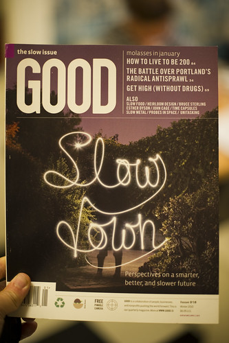
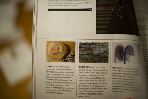
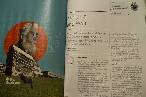
It’s not often we’re found in print, but this happened when the magazine Good did its “Slow Issue”. Jennifer Leonard chatted with us one morning about our perspectives on the slow movement because of our work on the Slow Messenger device and on-going collaborations with slowLab and Carolyn Strauss. There’s mention of the device and a brief interview with folks like Bruce Sterling, Esther Dyson and Jamais Cascio in the magazine and online.
Continue reading Slow Down

A Curious Crosswalk Clarification

Friday January 08, 14.46.08

Friday January 08, 14.46.21

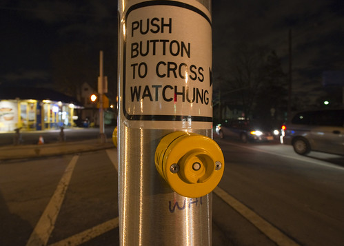
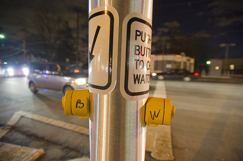
A curious inscription left by someone to clarify which button expedites which crosswalk signal. Someone has written with an indelible marker “B” and “W” on each button (for Broad Street and Watchung Avenue respectively), as well as writing an abbreviation on the pole (“WAT”, for example.) What is interesting here is that an official sign also indicates which direction is controlled by the button (“Push button to cross *arrow* Watchung”) making me wonder if this was an addition made after some complaints about the confusing buttons. What made this confusing initially was probably the fact that there are two crossings in roughly a straight line. You cross a small bit of one-lane street that subsequently does an easy turn onto Broad Street from Watchung, and then stand on this island with the buttons. Then you cross a larger street — Watchung Avenue proper — with several lanes. Approaching the island after a nervous crossing and then looking out into a daunting sea of fast-moving traffic on your way to a quick sugar fix at Holsten’s, you might think the first button you see is the one to hit, which would be wrong.

Why do I blog this? I find these sorts of thoughtful, improvised inscriptions fascinating. A different kind of “read-write” city or read-write urbanism, where people in their everyday moments take it upon themselves to make additions, hacks, DIY improvements and adjustments to make the city more livable and agreeable to their sensibilities. The points where urban design from the top-down meets urban living from the bottom-up.
Continue reading A Curious Crosswalk Clarification