Weekending 10232011

Okay. Maybe we will get back into the swing of the weekending note. This one won’t be comprehensive, but a note nonetheless to note a few things.

First, something I found while flipping through the Internet that got me thinking about using creative tension and inversion in the design fiction process and also connected to this Anthem Group, which has curious dispatches related to object-oriented ontology (which I barely understand) and Bruno Latour: this was an interesting post on the reason for having “intellectual fiends”. It helps me understand why, when I was studying Science and Technology Studies and just, you know…academic-y “theory” broadly, there was always this impulse to set ideas or discussions in opposition. To find ways to be critical of anything. Which gets annoying and I’m sure is the reason for general pissy-ness in the academic world.

It turns out it has its usefulness, if you stay optimistic and hopeful. It can be a way to move discussions always in some direction rather than allowing them to sit still and suffer the tyranny of undisputed acceptance. Of course, these things would always get quite squirrely — debates and the perpetual state of “crisis” over some theoretical position. That all becomes quite tiresome and you wind up with folks who are never, ever satisfied and always finding an argument to be had.

But, related to present work, it provides a logic for designing by inversion — taking the initial instinct or common assumption and then turning it on its head. I guess things like making physical, “embedded”, full-electronic prototypes rather than “apps” is one way of seeing this. Or doing the creative-opposite of something to really get into the *why of the natural, assumed, expected thing.

For example, when we made the social/trust alarm clock it was a way to invert commonly held assumptions about about the rituals of waking up in the morning. They don’t get inverted because we think the world should be hung upside down by its shoes — at least not routinely. But one can put “the normal” in relief by looking at things from the downside looking back up. Looking sideways. And it’s not until you actually *look at things through an unusual lens and make the assumption that the abnormal is actually “normal” — then you start seeing new curious opportunities and stories to explore that can then evolve and cause creative — rather than typical — disruptions that hopefully make the normal more engaging, fun, creative and curious.

Continue reading Weekending 10232011

Why Good Design Isn't Eye Candy

Sunday November 28 11:58

An acquaintance of The Laboratory I met while in London that last time is a design consultant guy who told me this story about Eye Candy. Him and his studio/team were offered a commission of work. It was design work, or at least that was the premise of the offering. A high-profile team of well-meaning technologists of various stripes — engineers, engineer marketers, chest-thumping Valley types — were in the midst of preparing a presentation of some work to finance guys. The finance guys were, like.. money men who make decisions and were hopefully going to throw money at their project idea before they hopped off on their flying jet aeroplanes that I guess one of the hubris-y entrepreneur Valley guys actually flew, or used to fly as a fighter jock or something. ((You get the personality profile here.))

The engineer-y team had some ideas that basically took a very hot trend and doubled and tripled it — the up-and-to-the-right extrapolation of today and made it *more..which I understood to mean not necessarily better…just more of the thing that exists today. Maybe two or three buttons instead of one; or 7 inches instead of 3.5 inches and we’ll blow the competition out of the water. Something. It might’ve been something like making quad axle wheels for luggage, or a tablet with a car battery so it lasts a full *week without a recharge or something. I have no idea, but this is the image that comes to mine for the story I heard. Well-meaning, but not well-thought-through stuff.

Wednesday February 09 16:16

Anyway, the guy who the engineers approached is a guy with a depth and breadth of design experience. He’s a creative guy, and his studio has a really good sense of strategy and ways of communicating..and he can make stuff for real, like — model making; deep CAD expertise, mechanical and electronic prototypes. Really incredibly thoughtful, experienced guy and as I understand it, a designer with integrity who would turn something down based on his instinct about whether or to what degree the work will build his credibility as a designer and that credibility is directly tied to how much the work will make things better. He’d be the last to do something that’d just be landfill fodder, or work that is, like — just poorly thought-through, or lacking in depth and consideration.

And then here come these entrepreneur-engineer guys who I was told asked integrity-designer guy to help them with their presentation by giving them some “eye candy” to put in the PowerPoint. This went on for half a day. The engineer-y team shared their idea and then explained that they had this pressing meeting coming up and — would his studio be able to just pull something out of their inventory of cool physical models and CAD renderings to put into the presentation deck? What they needed, they said — was Eye Candy. Some seductive treats on their dessert cart of a good idea that would have the finance-y jet pack guys licking their chops, slobbering capital all over the models.

Even in retelling this story, my brow perspires from frustration because – I know the tendency to consider the work of design as either providing cool looking stuff absent the integrity of its intent; or thinking of design as styling to the point of absurdity.

But — what’s the big deal? Why *not make some eye candy? I mean, if it satisfies the eyes and makes people ooh-and-aah, isn’t that a good thing? People don’t ooh-and-ahh about something they don’t like, and making people ooh-and-ahh is a goal in some entertainment circles, so — what gives? Why does this story make my head want to explode all over the place?

Well, firstly — it’s a bad precedent for design, generally speaking, if I can speak for “design” for a moment. It’s design without integrity, in the service of surface glitz and glam. It’s design that only exists on the surface, like styling that says not too much about the intent. It lacks thinking beyond the “what looks good” sort of thinking. It’s *thin — you can’t dig into the thing itself because there is nothing behind it except a desire to wow someone. There’s no logic or reasoning behind it, except to wow someone. It’s pure Id, pure instinct — not that instinct is something that should not inspire design, but by itself it’s selfish in a way. It accounts for nothing but what something looks like, rather than the larger context of where, when, why, for what.

In a word, just doing something to pad a page in a presentation or to put on a table is dishonest. Pulling something from another project out of a drawer that *looks like it could be the thing these guys were trying to sell, is dishonest. There’s no integrity — you can’t tell the story of this thing and why it has come to be or what principle informs the action or contours or IxD of the thing. You have to lie, basically. Or not say anything about it at all which makes one wonder — why put it there to begin with.

No, right? That’s just a bad way of going about things. It’s not quite as bad as industrial designers making toothbrushes that look like they should be moving fast because they *really wish they were designing cars, but it’s pretty bad to do eye candy designs on their own when such eye candy would be disconnected from the initial vision. Or even question that initial vision by running a more proper, considered design process that *might lead to something with integrity, and with the satisfaction of being complete and thorough. Something that would be the result of a superlative, principle-led design practice. And that takes time — or at least more time than digging around for something that looks like it could belong to the idea these guys had.

Bleech.

Why do I blog this? It’s a good story, with a good lesson in it. Integrity is crucial for design to continue doing what it’s able to do. Eye candy is dishonest and lacks the integrity that connects it to good, thoughtful work. And it means the work is crap, poorly considered and fails to make things better. It’s the equivalent of doing design “’cause” — or worse.
Continue reading Why Good Design Isn't Eye Candy

Quiet But Not Quiescent

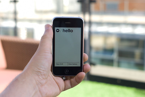
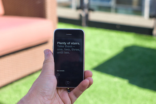
Judge not the less yammer-y state of the studio blog to indicate that there is nothing worth yammering about. It’s just that the clang of steel caressing code has been going on and that in great measure, too. Some of you may have glimpsed and grinned at the fantastic electronified edition of the paper Drift Deck that we developed a couple of years ago. That’s right. We’ve added *batteries to the Drift Deck and it’s fallen into the *app well..it’s an app which is fantastic because it means the last remaining physical card editions can become properly *artisinal and the electronic battery editions can spread the sensibility of the Drift Deck concept to the rest of the world.

Release is imminent. Prepare ye iPhones. Hop expectantly from foot-to-foot. More news in a short while, including linkages to downloadables. In the meantime, check out the new Drift Deck webified “page” and the fantastic roster of hammererers that batteryified the ‘deck.

..And then — onto the next thing here. It’ll be quiet a little, but good things are baking in the kiln, rest assured.

*Willow next. The superlative friendregator for the discerning social being.
Continue reading Quiet But Not Quiescent

Weekending 12122010: Clarity via Complexity

Thursday December 09 17:50

A week spent last in the Nordic EU discovering the knots and twists and snarls and kinks of the imbroglio that goes along with executing on damn good design. On the one hand there was the work of workshops meant to work *upon the work; on the other hand, there are the traces that appear as — if illuminated by forensic investigators UV light — the trails of interconnected relationships, goals, aspirations, roadblocks, paths of hope, begrudging words, encouraging words, optimistic personalities and personality disorders, cues and clues as to how things work, or how they do not; who talks to who, and who does not; where things can get done, and where they will not, despite everything. Very intriguing. Certainly not unusual activities; just the analysis and awareness that comes with trying to understand, and that from the perspective of a science-technology-studies kind of person. It’s like being inside a Latourian analysis of the making of things. I should draw a map.
Continue reading Weekending 12122010: Clarity via Complexity

Week Ending 04232010

Saturday April 10 17:30 Ver.1.01

Well, I missed the Week Ending last week so I’ll capture a couple of the things that happened then, now.

There were a cacophony of tasks to be done, some fun, some that should’ve been fun, and all that tipped me into a level of activity-stress that translated into too little sleep and various physical ailments. These aren’t complaints at all — just a note-to-self to either learn how to manage multiple concurrent fun commitments, or spread them out like butter on a baguette.

There was a Skype lecture between here and Seoul given for a design seminar at Art Center Nabi. That was a curious thing — to lecture with the audience *sort of* there. Basically akin to talking to yourself, or rehearsing a lecture. I’m not sure I could do that again, comfortably. Aside from the challenges of dialing back my weird circumlocutions and the litany’s I dispense midtalk while trying to remember what my next point should be, or might’ve been had I not forgotten it moments earlier — it’s just a bit impersonal. Or maybe it was just the fact that it was 11 in the evening after a proper day in the studio and I just wanted to have a belt and fall asleep.

It was a roilingly active week in the studio, with this sense that there was an intense and focused round of design work on the horizon, and the sort — systemically speaking — that Nicolas and I had pondered would be an ideal way of working, especially after we both made a turn from academic and formal approaches to making things. Looking at the world obliquely, learning from new perspectives and points-of-view, redefining or differently defining what *success and *achievement might be — not just up-and-to-the-right. Somewhat in line with this talk at Lift in 2008 7.5 Rules for Working Together. I’m quite excited by the prospect this bit of work allows for a more skunky/stinky untoward refrain to the normal ways in which things are done. A bit — tip-of-the-spear actions.

Via our weekly Skype, forward progress continues on the iPhone edition of The Drift Deck, with Jon Bell and Dawn Lozzi taking that bull by its horns. Of course, we’re all excited by the prospect of a second life for The Drift Deck — and curious by the translation of a physical deck of cards into its electronic kin. There are a couple of iterations already. Engaged simplicity is the goal. There were discussions that I prompted around game mechanics — don’t know why I, in particular, would be bringing this topic up — and I think the conclusion is that it is what it is. The deck, is the deck.

The Apparatus for Capturing Other Points of View was sent to LABoral Centro de Arte y Creación Industrial, where it — and the material produced — will be in an exhibition next month. ((More on that in the appropriate week note)). That was an epic undertaking — I mean the operational mishegoss of sending an 8 foot pole to Spain. DHL took it in stride..literally.

@ibogost was a house guest as he had some weird lecture to do, and that meant snifters of Port in the kitchen talking about #OOO, the shapes of things and a discussion of knob-turned-to-11 materializations of social practices, which is something I’m trying to figure out how to talk about beyond just saying that and, as it turns out — it might make more sense to materialize the “talk” about that than to just talk about it. And he’s on this *Carpentry thing, which I think would be our point of contact on this whole Object-Oriented Ontology vector he and his 12 friends appear to be all hopped-up about. ((They had a seminar on it last week — I hope it was captured in something ≫ 140 character tweets. ((That’s the 12 other people all hopped up on #OOO, and I might be number 13 based on our boozy conversation.))

Saturday April 10 17:30 Ver.1.01

This actual week — all that except @ibogost’s visit was the week before — started off with performing the duties of guest critic for the Art Center College of Design’s Media Design Program’s thesis year projects. That was a completely full day — almost 10 hours — of crits. Good work all around, with some curiously strong failures and seductively tenuous successes. Despite the work, which I certainly enjoyed in total, the crits were lots of fun, tiring and engaged. That culture of this sort of design critique was something sorely missing at the Interactive Media Program, leastways when I was there and I reflected on that contrast in the back of my mind. It’s something that is a way of working in the studio, frankly and only adds to the work. Patient, mindful intervention; conscientious and respectful criticisms; hard intellectual and creative framing that is only meant to make the work better.

The rest of the week consisted of some low-key efforts to have Design engage Research differently. We’ve been doing roughly monthly, completely casual, completely self-initiated link-ups with the Research part of the organization, mostly because there are friends there and it’s nice to share and discuss projects. Never really looking for *actionable points of collaboration — the collaboration is in the discussions. For me professionally, The Laboratory is much more interested in finding ways of working than specific things to work on, although sometimes specific things to work on are the ways you understand how different disciplines do what they are disciplined to do. Later in the week when there was another link-up, I found myself a bit sensitive to these different ways of working — Research wants a particular kind of action to unfold rather than action-as-reflection. It’s all sorted out somehow — we just need to make it, and that will be that. Rather than the *crit and the conversations that wonder in the first instance — why this and in this instantiation? Or — let’s throw out all that *work and start fresh with the possibility that we will come back to it at some point. Or, the journey rather than the finalé.

It all ended with a confidential review and excitement about the approaching National Pretzel Day, as well as the book launch of Digital Blur at The Architectural Association on Tuesday evening.

A Relevant Talk

Just two quick points on this great talk by Mike Kruzeniski. First, this idea of developing new languages to describe decision points in the creation of technical things is quite good and brought home quite effectively by a guy who has some experiences doing just this within the beheometh Microsoft. Translating “P0, P1, P2” into Soul, Heart, Body is not just a simple variable replacement — these new words are precisely design shaping the creation of technical systems. Somewhere in between “design-led” fantasies of designing being in charge, and, for designers, the more grumbly — *we have no influence — gripes is this approach Mike talks about — closer to real pragmatic stuff, and about partnerships and learning together and the *good kind of manipulation of existing engineering practices and project management procedures.

Second point. I’ve been wrong to think that design-led creation of technology *stuff is the way of the future, and Mike’s experiences plus a couple of things here and there that I’ve experienced more directly are what make me certain I was wrong. Between knowing what it takes in practical terms to materialize an idea that won’t blow smoke when you plug in the power, and knowing that you can’t force someone to do something that they don’t believe in, especially if they are a technologist — well, the in-between is this idea of working together. No one wants to create a crap experience, but defining what is a good experience is what helps you get there.

Anyway. Listen to Mike’s talk and try to avoid wondering if his shirt was made from the same material they use for table clothes in pizza restaurants.
Continue reading A Relevant Talk

Design for Failure

04102008_100526

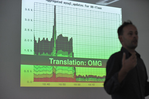
With regrets to Aaron for the blurry, noisy photo of himself..Taken in Montreal Canada at Design Engaged 2008.

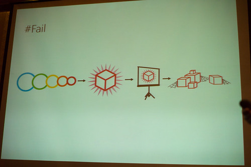
For no particular reason — perhaps a salute to Nicolas who will be presenting his work on design for failure at IxDA this week — I bring you this image taken during DE2008 in which Aaron Straup Cope discusses designing engineering systems with failure contingency as the critical path.

Why do I blog this? I find this perspective intriguing — it assumes system meltdown, anticipates it and delivers appropriate data to indicate when it might happen. If I remember correctly, there is no specific interest in being exact about failure, just that it will happen and you might be told roughly how long until it happens. So the effort is to help stave it off by various means — adding more servers to spread activity loads around, optimize queries, increase caching, whatever you need to do. This makes me think of the intractability of designing for deletion. If someone wants to extricate themselves from the databases of a service or system, there is almost certainly no quick and easy way — in fact, I doubt there is anyway at all, and most services are not obligated to handle these situations. If I told Google that I wanted to check out fully and completely, even if they wanted to do this, it is doubtful they could. Would someone have to run through all the backup *whatever — tapes? — wherever they may be? It’s not just the live systems, and its not just purging caches and so on. All of our data is on its own, like orphaned snapshots of moments in our lives, somewhere. I don’t necessarily find this chilling or anything like that. I’m just curious about this notion — designing for intractable, ugly, messy circumstances, like failure or deletion. Things that run counter to the intuition — we usually design for the beautiful, full, glorious 32-bit conditions.
Continue reading Design for Failure

Beyond Public Toilet Maps — Prehistoric Augmented Reality Devices

Saturday November 28 12:35

Saturday November 28 12:55

Saturday November 28 12:52

Saturday November 28 12:55

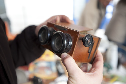
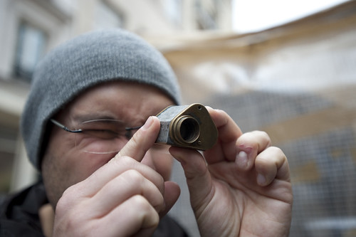
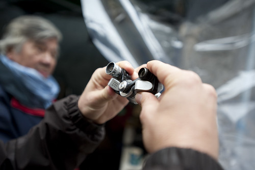
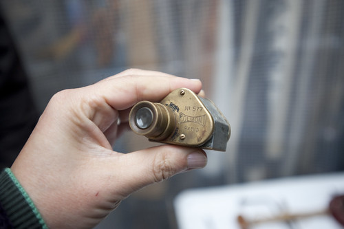
A small collection of historic augmented reality devices, found during a rake through a flea market in Paris with fellow Urban Scout Nicolas Nova last Saturday. Mostly bashed up, broken things — but evocative devices that, when run up against all the excitement surrounding “Augmented Reality”, suggest more to me than the more typical, canonical — hold-my-flat-screen-mobile-device-up-in-front-of-me mode of operation.

Tactically, the evolution of mobile practices like this might learn from the everyday pre-historic rituals, such as gazing through a telescope which, in its infancy, was probably quite close to a kind of augmented reality. It allowed merchants to gaze to the horizon while sitting at port to see what ships were coming in, with what loads. The more speculating merchants could foresee shifts in the local markets because cotton was coming in and eek out their profits with the foresight brought to them courtesy of their expensive, privileged optical devices. A kind of future-seeing device used to their advantage.

Today’s augmented reality has none of that sparkle and magic. The visions of the AR future as best as I can tell is overturned by the fetish of the technology. This truly is a bad approach to making new kinds of worlds. The instrument comes first — a display, compact electronics, embedded compass and network connectivity — are what guide the vision and the “scenarios” (if you can call them that) entail something that basically is an expensive way to ask someone standing right next to you, who probably speaks a language you speak anyway — where the nearest public toilet is. Or where the metro stop is. Or in what direction the museum is. All of these things are problems that have been well-solved and need no tax imposed upon them like data roaming fees, or the inconvenience of a [[bad network/crap GPS signal/annoyance of dropping your $500 toy//&c]].

Augmented Reality in this mode of “design” is a bit like finding a nice door knob…and then looking for the house that looks good around it. Starting with the door knob — the instrumental technical stuff — is a really bad way to design a house, I think.

Why do I blog this? Poking and prodding at a more satisfying set of metaphors, language, histories for what a looking glass / viewmaster / binocular of the near future might be and what lessons it might learn from its prehistoric kin. I’m curious about the possibility of learning from the evolution and development and cultural valance of these earlier devices — considering them in the mode of a magical, exciting bit of technical kit from their time. But what did they do and how were they used? How much of the device and technical characteristics guided what they became, like today? Was someone walking around with some carefully, expensively constructed optics, not entirely sure what to do with them? Or not sure how to sell them to people? How were they to be assembled, technically speaking? What was the level of knowledge of combined optics — was it similar in its sophistication and arcane incantations like programming embedded devices and mobile phones today? What did it take for someone to use the telescope as something other than a device for starring at the moon or constellations? And other questions like this…what can be learned from shifting contexts, moving to historic moments, fictionalizing alternative possibilities for those histories, or fictionalizing the near future of these weird “augmented reality” speculations.

What might “augmented reality” augment besides directions to a public toilet?
Continue reading Beyond Public Toilet Maps — Prehistoric Augmented Reality Devices

Construction of Things

20080729_13-41-46

What was sticking in my mind, and has been recently, and especially after dinner conversation and the lecture which was on Design Fiction with an emphasis on the relationship between props, prototypes, and the normalization/everyday-making of provocative ideas.

A few notes on this point, as reading notes from Latour’s *Reassembling the Social*

Making normal and everyday serves a purpose, I am thinking, in design and in the communication of design ideas.

1. As to the point that it serves the purpose of design, I mean that it brings it into the realm of the familiar, putting something or an experience or a moment into the world and making the engagement *exist* as if it needs no explanation — it is here, and perhaps even it is the case that it is near-obsolete so we can tell a story about its entire life. We defetishize newness and glamour, retreating to the mode of familiar, reliable blandness, as most things go that have lived a full life in the world. If something has not become everyday, chinked on a corner, or experiencing a glitch, or booting a little slowly this time, or making an aged complaint, it has not had a good, long life in the world ((discounting a normative assessment as to what is *good*, or the point that perhaps “it” is new and just crappy and poorly made.)) Which basically suggests it was here for one failed Christmas push and then dropped off the edge of the Earth. Or has just become a cherished relic, or is simply old and worn, but still precious and useful.

2. In the communication, making something everyday is meant to suggest that it has become part of life — perhaps not everywhere, which is not always the goal, nor is ubiquity. But, ‘part of life’ suggests that it’s a good idea and the effect is to communicate as much as this — that it could have been here, around and with us. The communication normalizes the thing to the point of routine blandness. Whether this happens by association or more directly is significant. In the communication, don’t have people smiling with glee when operating/experiencing/discussing the thing, and don’t explain what is going on as if the communication is a features-and-functions list. Didactic and apologetic explanations are a poor substitute for a well-designed thing that expresses itself through a story or fits into everyday life without a list of “whys” or “whats.” Cinematically speaking — *show it, don’t tell it.* Let the communication describe if it needs to — but don’t explain. If you still need to explain something, you need to *explain* in the material — go back and iterate the design. The explanation should be the product of the design, not a way of substituting for an opaque object — the materialization of your ideas in the object/thing/service/widget should effervesce from the communication.
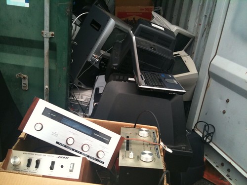
Dump of Crap

Once cool stuff

3. Rather than the design tactic of spectacle-making, what about making things normal so that designs move into their place in the world, perhaps even moved off to the utility drawer of the world to become either quaint or so routine and everyday that they are taken for granted. Like a AA battery. No one every made much of a spectacle of those things, except maybe Madison Avenue, once, together with a phalanx of Rabbit troubadours.

4. I am wondering about implementations and ideas that are two-way props/prototypes. A design tactic that is encouraged to go into the future by materializing new ‘near future worlds’ and then come back into the past, as in an archeological unearthing and investigation and un-constructing of what is around us today. On the one hand, forward-into-the-future design creating new worlds that are hopefully better than the ones we have today. On the other hand, taking what we have today and describing it in the way of sociology-of-associations, anthropology, science studies, &c. Dig something up that once existed and tell its story — or mis-tell it for the purpose of showing how a thing can be re-inscribed with unexpected contexts so as to remind us how significant the interaction and the experience is in making the object meaningful.

So..what? Why this strategy for design and communicating a speculation, or an idea, or something future-fictional?

**To help imagine what things will become and to defetishize the things that are normally elevated beyond themselves — like when new gadgets are oogled and ahhhhgle’d and beyond what they deserve because, ultimately, at some point, it all becomes crap that’s thrown out anyway. (The Near Future Laboratory Defetishization Bureau recently issued a Fatwah on all ‘unpacking’ blog posts and descriptions.)**

In plain English, to say something is constructed means it’s not a mystery that has popped out of nowhere, or that it has a more humble but also more visible and more interesting origin. Usually the great advantage of visiting construction sites is that they offer an ideal vantage point to witness the connections between humans and non-humans. Once visitors have their feet deep in the mud, they are easily struck by the spectacle of all the participants working hard at the time of their most radical metamorphosis. This is not only true of science but of all the other construction sites, the most obvious being those that are at the source of the metaphor, namely houses and buildings fabricated by architects, masons, city planners, real estate agents, and homeowners. The same is true of artistic practice. The ‘making of’ any enterprise — films, skyscrapers, facts, political meetings, initiation rituals, haute couture, cooking — offers a view that is sufficiently different from the official one. Not only does it lead you backstage and introduce you to the skills and knacks of practitioners, it also provides a rare glimpse of what it is for a thing to emerge out of inexistence by adding to any existing entity its time dimension. Even more important, when you are guided to any construction site you are experiencing the troubling and exhilarating feeling that things could be different, or at least that they could still fail — a feeling never so deep when faced with the final product, no matter how beautiful or impressive it may be.

Latour, Reassembling the Social [p88-89]

Also, consider failure and its opportunities. Cf. Nicolas Nova on failures. Failures are situations that reflect on the assembly of things — err – their disassembly or their accidental destruction in a perhaps inglorious fashion.

But still — why do we want to see the made-ness of things this way? Is there more to be seen below the surface that reveals..what? The possibility of reconnecting things in other ways? That reveals the contingency of the construction — who was involved? What they did? Where the principles and sensibilities and politics of the thing are? Why was this fastener chosen over another possible one? To make it more secure and stable? Or to make the BOM cheaper and more likely to fly apart when dropped? Can you point to a part and say something about the principles of the design?

One insight from Latour that reflects on the importance of revealing the in-progress, in-construction aspect of things — things disassembled, or in exploded-view. These sorts of indicators of construction, constitution, assembly suggest a made-thing — which we always know if pressed that everything must be. Showing the components in-assembly or in-explosion suggests to us that this could have been done differently.

Why is this important?

Momentary Visibility Ways of bringing the associations amongst things into view. “Social” is a fluid visible only when new associations are being made..a brief flash which may occur everywhere like a sudden change of phase.

Why make the social visible?

Develop and execute — is this the preferred pattern of constructing things? No? Rather, might a more considered approach that learns lessons all the way down be design as perpetual iteration?

A list of situations where an object’s activity is made easily visible

Fortunately, it is possible to multiply the occasions where this momentary visibility is enhanced enough to generate good accounts. Much of ANT scholars’ fieldwork has been devoted to trigger these occasions..

1. Study innovations in the artisan’s workshop, the engineer’s design department, the scientist’s laboratory, the marketer’s trial panels, the user’s home, and the many socio-technical controversies.

2. Second, even the most routine, traditional, and silent implements stop being taken for granted when they are approached by users rendered ignorant and clumsy by distance — distance in time as in archaeology, distance in space as in ethnology, distance in skills as in learning.

3. The third type of occasion is that offered by accidents, breakdowns, and strikes: all of a sudden, completely silent intermediaries become full-blown mediators, even objects, which a minute before appeared fully automatic, autonomous, and devoid of human agents, are now made of crowds of frantically moving humans with heavy equipment.

4. Fourth, when objects have receded into the background for good, it is always possible — but more difficult — to bring them back to light by using archives, documents, memoirs, museum collections, etc., to artificially produce, through historians’ accounts, *the state of crisis in which machines, devices, and implements were born.*

5. Finally, when everything else has failed, the resource of fiction can bring — the the use of counterfactual history, thought experiments, and ‘scientification’ — the solid objects of today into the fluid states were their connections with humans may make sense. Here again, sociologists have a lot to learn from artists.

Latour, Reassembling the Social [p.80-82]

What is relevant here – possible tactics for design, assuming something has been made, without making it, and back-tracing the ‘controversies’ of its assembly. Assume you have only fragments of ‘what the thing was’ or ‘what the thing will have been’ and unpack it as an investigator/sociologist-of-associations/anthropologist/archeologist-of-associations; track back through the associations and construct what it might have been.

However, we worry that by sticking to descriptions there may be something missing, since we have not ‘added to it’ something else that is often called an ‘explanation’. And yet the opposition between description and explanation is another of these false dichotomies that should be put to rest — especially when it is ‘social explanations’ that are to be wheeled out of their retirement home. Either the networks that make possible a state of affairs are fully deployed — and then adding an explanation will be superfluous — or we ‘add an explanation’ stating that some other actor or factor should be taken into account, so that it is the description that should be extended one step further. *If a description remains in need of an explanation, it means that it is a bad description.*…As soon as a site is placed ‘into a framework’, everything becomes rational much too fast and explanations beging to flow much too freely. The danger is all the greater because this is the moment most often chosen by critical sociology, always lurking in the background, to take over social explanations and replace the objects to be accounted for with irrelevant, all-purpose ‘social forces’ actors that are too dumb to see or can’t stand to be revealed. Much like ‘safe sex’, sticking to descriptions protects against the transmission of explanations.

Latour, Reassembling the Social [p. 137]

So..what? Why do I blog this?
Is there anything about the sociology-of-associations and Actor-Network Theory that can become a part of a design practice that does more than incremental innovation? Or, what does the sociology-of-associations and ANT have to say about design practice? Why might it? Because ANT concerns itself with the making of things — or, also, the un-making to implicate practice in the creation of stabilized systems. Here, at the Laboratory, we are makers of systems that stabilize and cannot see how it would not be beneficial to understand how these systems stabilize — or at least to have an articulate point of view on how an idea hatched in California plops off the end of an assembly line 15 times a minute, 11 months later, and then get buried in the ground 24 months after that. And, if you understand — or have one or two of many possible articulate points-of-view on this — you have a better grasp on how to do this better, or perhaps how to decide in particular situations how not to do this, or how to design differently so that we don’t drown in things coming off of assembly lines 15 times a minute..only to end up filling land 24 months after that.


Design Fiction in the Science Gallery

From Bruce’s Beyond the Beyond: Design Fiction in the Science Gallery: “

*Anthony Dunne and Fiona Raby carry on for over an hour about their practice of ‘critical design.’ What a class act these two are: like Robert Louis Stephenson at the monster-movie festival.

*If you’re coming in late to the concept of ‘design fiction,’ here’s the takeaway: Dunne and Raby mock-up some of the most provocative, edgy, unsettling gizmos in the world. They do this by modelling social relationships, emotional interactions and the political implications of objects and services, rather than the objects and services per se. So they do indeed create ‘fictions,’ in that Dunne and Raby designs are poetic, objective-correlative expressions of unstable social situations. These objects are ‘fictions’ about how we live — they perform much like Anthony Trollope’s 1875 social satire novel ‘The Way We Live Now’ once performed.

*Somewhere over the cultural horizon, there might be a modern paranormal-romance flick where all the set design and props are done by Dunne and Raby. That film would be a very Casablanca of the contemporary crisis.

http://en.wikipedia.org/wiki/The_Way_We_Live_Now

(’Only Paul seems to know or care whether the railroad actually exists.’ Trollope’s railroad in THE WAY WE LIVE NOW is a steampunk design-fiction.)

(Via Beyond The Beyond.)