Street Furniture

Wednesday June 17, 15.04.24

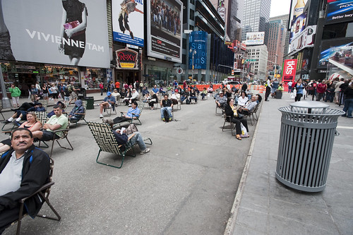
Times Square beach, complete with tourists (as any beach should), found here.

Friday June 19, 12.10.57

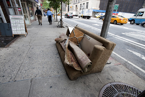
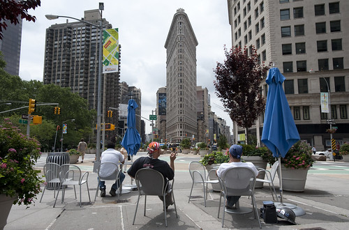
Urban Lounge found near Madison Square, New York City.

This is probably old hat for current New Yorkers certainly, and something that makes visits home really interesting, these street furnishings and people zones are incredible interventions and nice experiments about alternative urban landscaping. When arriving in Times Square with my brother for a quick screech through of High POV shots, we managed to get one of these curious middle-of-the-avenue parking spots so you basically park right smack in the middle of Times Square. Which is good because you cannot drive through the square itself, only around it, because of these pedestrian urban “beaches”, complete with lawn chairs. According to one of the local business improvement district rangers or whatever they are, tourists quite like it. I wonder if locals find these useful or an annoyance to their conveyance around the city.

Tuesday June 16, 10.28.00

Saturday April 25, 10.07.27

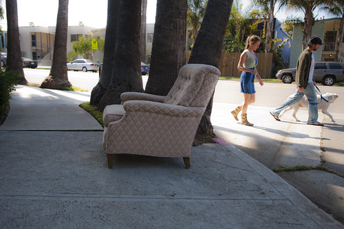
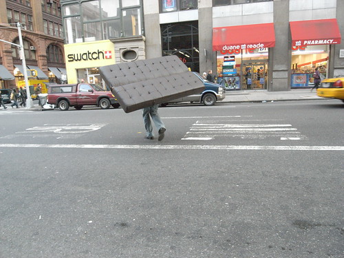
Not quite the same, but in a different category of street furniture — the dispensed with sort.

Why do I blog this? A fascinating example of a reconfiguration of the canonical gridded city. Turning pavement into a more human, habitable space that evokes other leisures is a fantastic way to create new opportunities and to think about new sorts of design practices for urban space. This is an area that many people are curious about of course, and it is something that has attracted the attention of the laboratory quite a bit recently. For some reason, we have been thinking about new kinds of principles, rituals and scouting toolkits for finding new ways to look at the city, using these to think about new kinds of interactive urbanscapes…and not interactive in the “UX” sort of digital-y way. Playful interactions, thoughtful interactions — new rules of occupancy; new social interaction rituals.

Variations

20080203_131208

20080203_131123

20080203_131311

20080203_130546

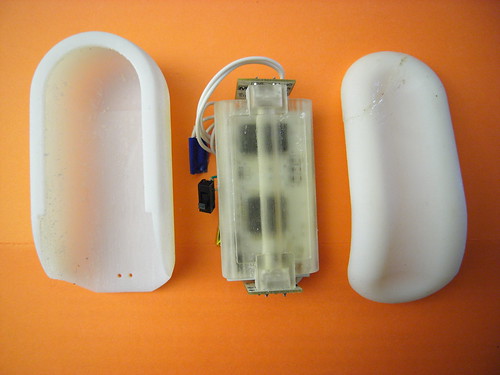
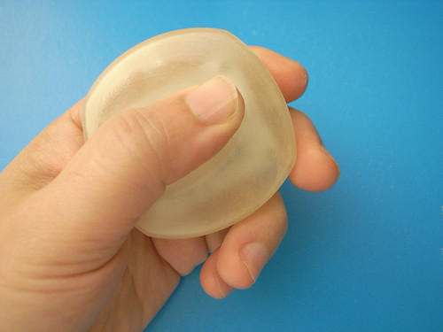
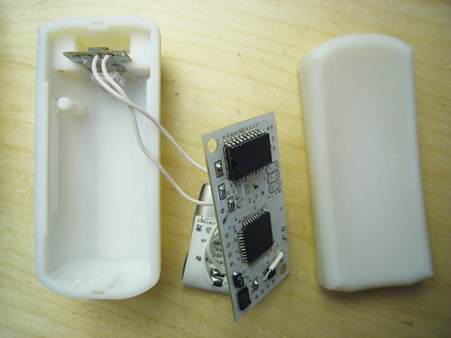
I got an instructive challenge to one of the hand-held forms I’ve been modeling. It’s a bit hard to see in white plastic, but the form is basically smaller, with some simple articulations that in my early days here, have been difficult to execute in software.

I like this form — it’s compact and smooth and feels comfortable to hold. I’d like it in wood, frankly, so I’m starting to think about how to design for milling rather than for printing. Like a buffoon, I cracked the top fitting while I was trying to remove a small section of this swept guide that keeps the thing closed. I should have either sawed or filed it down. Instead, I took a pair of snips to it and, even thinking that it might break, went ahead and tried to snip it. So, that crack? With the gobs of glue? That’s that.

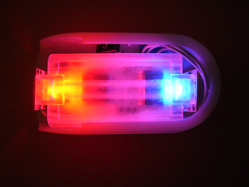
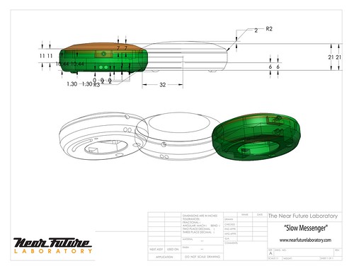
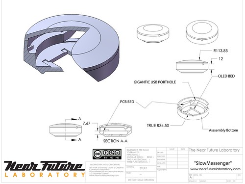
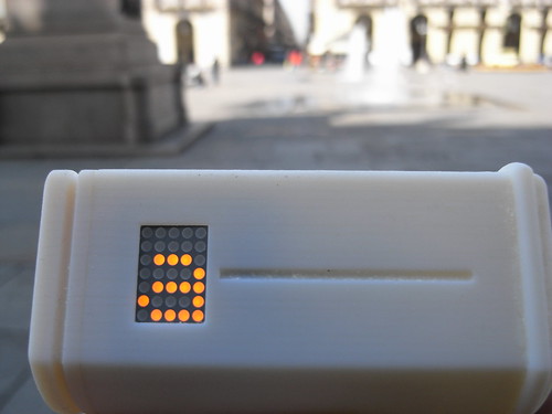
I whipped up a small mounting package to help contain the loosey-goosey bits — the PCB could fit in clips and such, but I’m thinking that it may be easier to fit things in one “fixed” package and then allow the package to go into a variety of things that may have different geometries. There are a bunch of problems with this particular design, or challenges — mostly trying to get the light to be as ambient and non-directional (or to not appear like it’s coming from these very bright sources). The white plastic helps, but I think a lot more can be done. The shadows created by the mounting package itself is a distraction.

Kombolói: An Anti-Anxiety Device

R0010572

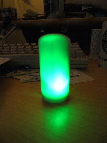
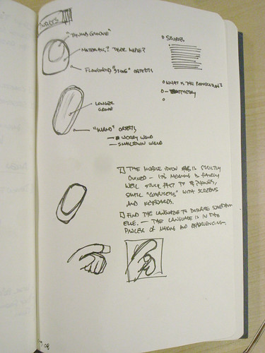
This is a quick, quick sketch for an idea I had for a intimate personable device that is best described as a digital worry bead or Kombolói — not so much a worry bead as something to capture and diffuse your anxiety. It works by capacitively linking your tension through a unique capacitive touch sensor and then harnessing that energy, turning it into light and then diffusing it into more soothing energy.

It’s just an idea I had on the plane. I don’t think I was having an anxious feelings on the plane, but I thought — what would an “activated” (digital/electronic) version of the Kombolói look like? What would it do? What would it make me feel?

I happened to see a few of these over the last couple of months in peoples’ palms — maybe some where actually prayer beads. And in at a breakfast meet-up with Linda Stone last week in Munich at DLD08, I learned of some of her very interesting vectors of research beyond her fascinatingContinuous Partial Attention that has to do with the deleterious physical downsides to simply reading email. (Evidently, we go into the wrong sort of state when engaging in what can be an anxious moment — opening your email program. We hold our breath and/or our breathing state goes into a non-flow state that has these terribly noxious effects on our body chemistry. The various levels of oxygen and nitrogen and all kinds of things I should’ve learned more about if I had paid attention during high school biology — they just go nuts with really bad consequences. Who would’ve known? Well, Linda does, and so does the NIH which is taking this stuff seriously.)

R0059379

R0059378

R0010570

I wanted to find a way to make it luminesce brightly. I’m still working on that — because of the fittings inside and the printed circuit board, etc. — it’s proving difficult to make it glow exceptionally bright, and without shadows. I may have to lower my expectations and change things around in some fashion. Perhaps only a small part of the object will glow. I’m also thinking about ways to make the interior reflective to bounce light around and mitigate the effects of shadows on the surface.

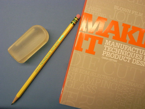
I started with a simple form for the object that was quite small, just to try it in the hand. Generally, people thought the shape and form was right in this early shape. I sort of awkwardly modeled the form in as few strokes as possible, but clearly I need to learn how to be more patient with the modeling stage of the sketch, including allowing myself multiple steps for each larger feature — sketch, revolve, cut, extrude steps, for example, for just one articulation in the form. In other words, just getting the basic overall shape and then cutting away to get more detail. I had been trying to get most of the form in one quick step, with an extrude or whatever, and not paying attention to where tangents were falling, etc. For example, when I started with this form (the small thumb-sized transparent model below) and then moved to a second version (the white plastic one above) I tried to make small improvements to account for the engineering that had to happen inside (mountings, slots, clips, etc) and ended up breaking many of the external features, and making hard points that defeated my goal of a smooth, informal form.
Today's Desktop

R0059380

R0059384

This of course yet another mechanism through which I am exploring how Touch, Motion and Time can become the basis for experiencing different sorts of interactive experiences. My conceit is that these are elemental forms of human experience that are largely dismissed in the digital era, but they are crucial and distinct aspects of how we humans experience and make sense of the world around us. So, to understand this more completely, and to have a stronger basis for discussing it and creating new things that are more than button clicks and mouse florishes, I have been making some template components that articulate these elements in various ways. This is just one more that occurred to me a couple of weeks ago. The touch aspect of these Kombolói — that you hold them and they can be seductive enough in the hand to compel you to roll them in your palm or run your thumb along them as a gesture that soothes and calms; the motion of moving them around and such in the same fashion; and the durational aspect of them, that you spend time, slowing yourself and focusing and loosing yourself as time passes and as you begin to relax, rather than the immediate and instantaneity of many digital and networked interactions — these all seemed to be captured in this social object. So, the question is — what would be a way to explore these elements in my small catalog of devices?

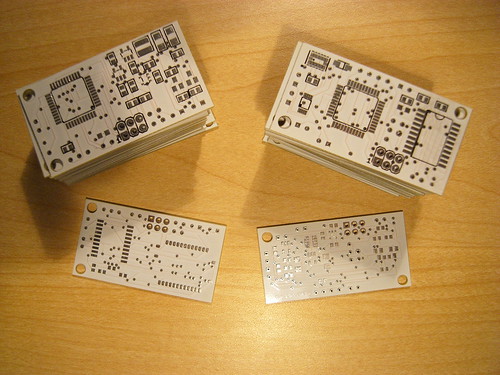
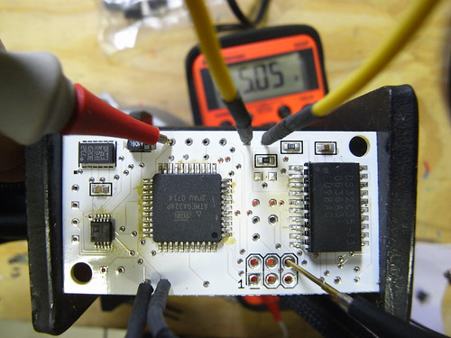
I made a variation of the template component I’ve been making for many months now. This time, I tried to find some simplifications and tweaks to change the geometry of the component. Yet again. (Sigh..) The process of iterating these designs is both exhilirating and exhausting. I end up taking very similar electrical schematics and sweeping them through physical changes, moving components around in the printed circuit board to try and compress things, sourcing alternative replacement components or learning new little tradecraft tricks.

I quickly redid some circuits and board layouts on the flight back and got the form factor down to a geometry that’s got one long axis and was as narrow as I could make it. I’m still trying to find easy ways to program the ATMega microcontroller without taking up a big footprint on the circuit board. Haven’t quite found the right way yet. But, I’ve foregone putting the FT232RL device on the board, which was the rather large chip to do USB to serial conversions. Very convenient, but very large. My strategy now, such as it is, is to use a small external breakout board that the FTDI people manufacture that does the same thing, only with a much smaller footprint version of that chip (one that’d be a challenge to place by hand on my board) and which includes a mini USB connector on it. So, using that breakout board, I only need to run a few wires to it, and I can put it off to the side in the device with a simple mounting bushing or slot into which it fits.
R0010537

R0010539

The overall design is meant to be something that feels good to hold — comforting or soothing.

Moving Forward

There’s a strange anomaly with the electrical circuit that I need to figure out — it appears to drain the battery completely even when it is “off.” I have a kind of untested mechanism for shutting off power to the main logic rail (VCC) while keeping the output of the regulator powering the real-time clock’s battery backup input so that it maintains the time. Perhaps there is a problem there, although I’m a bit puzzled that this design would cause a problem. This part of the design process is less interesting to dwell on, so I won’t. Suffice it to say that there is some problem, and part of documenting the design process is to mention and ponder problems, so, well..there you go.

I also had some good feedback from folks yesterday regarding some technical issues and design issues. It seems that the illumination aspect is still a bit krufty — it’s tricky to illuminate the body, particularly with the translucent material, because because of the shadows cast by the internal parts. I am going to try making some sort of light guide to help mitigate this problem — perhaps a tube or some such that runs along the long axis of the part. Jed suggested this, and it immediately made good sense. Something that caps at the LED and fits on it. Also, this provision for two LEDs — one on either end, facing towards each other — means that I can make the light guide attach to both of them along the long axis.

Semaphore Communication

For communication to the data network, I am thinking about a color-based semaphore system using the built-in camera that many computers come with. The idea is that a simple color sequence can relay certain information could encode the state of the device which could be interpreted by a simple Processing sketch or something. It wouldn’t communicate the kind of robust information that the current firmware is able to do over USB (or..maybe it could?), but it would be a compact mechanism for doing this, and eliminate the necessity for USB hardware and so forth. I’m looking forward to exploring this further. We were discussing it in relation to Veronica Perdes class project on this very exciting idea of a "Fugitive Object" and how we could create a simple mechanism for communication back to the mothership.
Today's Desktop

Today's Desktop

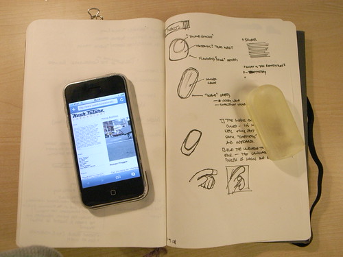
MacBook Pro display died. Or went all Arora Borealis on me. Turns out, it’s nice to return to paper and pencil every once and again. And the iPhone? I mean, you can surf and read email more-or-less, and the constraints make sure you don’t do too much of it before you get completely carried away and distracted. Plus, there’s plenty to do with your hands besides click little plastic chicklets. Like prototyping some worry wands, the near future of worry beads. And stuff like that.

Mixing Realities

20080106_Sun_160125

Human Frogger

Can I imagine an interface consisting of computational elements, digital semantics, networks that bridge and connect social elements that do not consist of screens and keys? Can the imagination of digital kids imagine a different set of interaction rituals that are not just about touching little plastic squares and staring at glowing, power-hungry screens? Or is it just inconceivable that digital kids could know anything else — the ones who have only ever known millions of colors and 1280×800 and learned to touch-type when they were 4. Can human-scale time, physical movement through urban paths, suburban cul-de-sacs or backcountry trails contain elements of possibility for digital experiences that are not just the hackneyed PDA/GPS/GSM tour guide blindly explicating the relevance of this or that locale? What do you even call that, when all the possibility for anything new has been bled out from all the idioms surrounding computation? Does anyone else think it’s positively moronic and fully lacking in any foresight that “mobile computers” are just little, battery draining desktop computers?? I heard of a project meant to research mobile computing that was precisely a mindless projects to get mobile phones handle advertising presentation technologies. I mean..

The Face of the Faceless User Interface

User Interface

User Interface

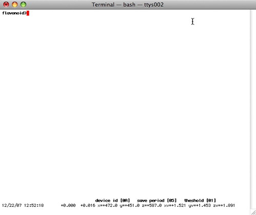
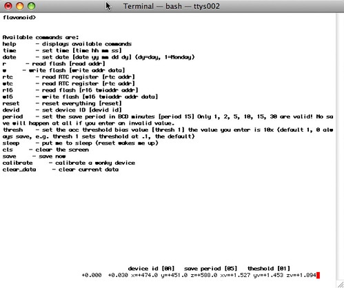
Ironically, a typing command user interface to do set-up stuff and manage the Flavonoid device itself. There were enough unknown variables in the design of the device and enough of my own obsession with preferences and configurations and such all, that I spent some time creating a configurable device.

Atavistic

Here at the Near Future Laboratory, Nicolas and I are interested in digital devices that are essentially faceless. Just blank, “blind” devices, like Sascha’s awesome “Blind Camera” project. They are intriguing because of the way they run counter to intuition and thereby raise questions and immediately make their expression curious and unknown, hopefully opening the possibility for accepting new kinds of interaction rituals besides just pressing little plastic squares and such sorts of interactions that we’ve come to expect.

The irony is that there are enough variables for parameterizing the device’s functionality that I needed some way to manipulate them, at least at the start. So, I created this behind-the-scenes interface for adjusting the properties and behaviors of the object. Most of the time you would not access this at all, certainly not while carrying the Flavonoid device with you.

SlowMessenger

Slow Messenger 2nd Design

Product Prototype: SlowMessenger

Slow Messenger is an instant messaging device that delivers messages exceptionally slowly. Built into the device is a messaging technology that unfolds its content based on an interface that borrows from the traditions of long-form letter writing, hand-carried mail sent through the post. The instant messaging device connects digital information channels — such as the Internets — to physical information channels — such as streets, hands and the friction of human contact.

SlowMessenger works by simply receiving the message from the message sender. Once the message is received, it is gradually displayed, one letter at a time based on two factors. The first is the relative amount of time that the device is held; the second is the amount of time the device is carried while walking. These factors — holding-by-hand and walking-with — are interaction rituals key to the conveyance of intimate messages. In “another era” that is not the “digitally networked era”, “taking the air” and “perambulating” were crucial interaction rituals for maintaining and knitting together “social network” relations. Friends and intimate couples would “walk hand-in-hand” and discuss matters on their minds. In this “other era”, in times when friends were not in proximity, perhaps because one or the other was off to war or at sea, long-form “letters” were composed to substitute for physical proximity and communication. Postal mail was used to maintain communications and “stay in touch” even if “physical touch” was not, in a literal sense, a possibility.

In this “digitally networked era” communications mechanics are designed to take advantage of the efficiencies of electronic networks. In this way, contact is perpetual and ubiquitous, often resulting in nearly meaningless communiques and dispatches. By “slowing down” the instantaneous message, the device saves time by allowing one to avoid inane drivel and focus on a meaningful connection to one special person.

Slow Messenger Flickr Set

R0013308

SlowMessenger Capsule

20080313_054916

Inverse Machinima and Interfaces for 1st Life Play


http://www.flickr.com/photos/guatevino/

We had a short little discussion after the Blur + Sharpen Machinima screening the other night. The screening was an hour of Machinima, a genre of visual story telling that uses video game stylings and form — especially the graphics and play dynamics “engine” — to produce the story experience.

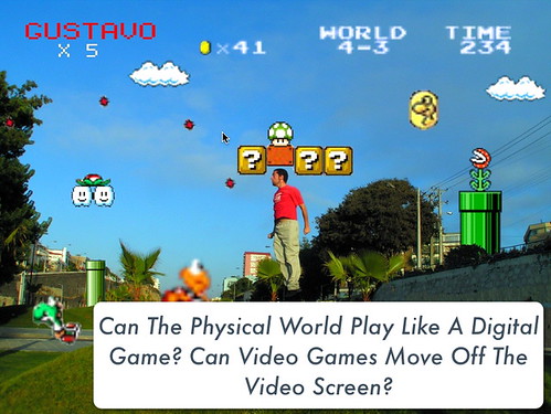
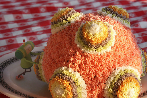
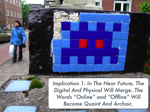
I started to think about this genre in relation to a presentation I gave recently on some insights into video games expressed in real world settings. It was a sort of brief on weak signals related to the increasing over flow of video game idioms into first life. Characters, graphics, game logic, game speak — find their way into practices beyond the video screen into the real world. I find this fascinating, largely because of this vector away from exclusively sedentary, desktop/screen/keyboard/mouse-based experiences towards ones that integrate the “real world” with digitally networked social practices. There’s also the manner in which these idioms appear — very similar in my mind to what you might call an inversion of the usual Machinima production. Video games appear as overlays with the real world serving as the “engine” for the experience. This happens in a diversity of ways — “Photoshopped” images, costumes, cakes..

http://www.flickr.com/photos/thesingingleaf/

In relationship to Machinima, I began to see the various bits of material such as this as a kind of inverse of the Machinima genre: instead of turning the video game mise en scène into a stage for showing a visual story, the real world is visualized as a setting that draws from video games.

The question is this: What are the near future possibilities of mixing and blending first life props, actions, movements, proximity relationships, time (especially time factors) into the core of what counts as the user interface? The canonical (and quite ancient, in digital technology terms) keyboard-video-mouse configuration that Douglas Englebart applied for in 1967(!) is perhaps ready for an evolution. This particular screen-keys-mouse-stick-thing arrangement frames very particular kinds of interactions that are suitable largely for sitting still and twiddling. Despite their fascinating and suggestive possibilities, touch interfaces and “mobile” computing do not in my opinion go terribly far beyond this, at least in terms of any new kinds of interaction practices. Things like location and proximity are beginning to creep into the interface space, as are motion and such things like this.


http://www.flickr.com/photos/rsdio


http://www.flickr.com/photos/inoneear/

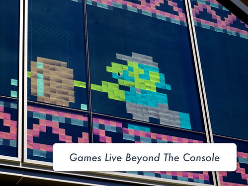
The “fan culture” of some of these more popular games, you find this expression of the game in other realms. People want to continue with the game beyond just the console, and have their “friends” within the game carry on with them in other contexts.

In some situations you can clearly see how the game imaginary and fiction lives just below the surface — especially when fans start seeing indications of the game world imprinting itself on real world objects. In this case, this fan saw this and tagged it as a Donkey Kong structure rather than a simple scaffold. It may indeed be both, or just a Donkey Kong apparatus — it would certainly possibly work as both if a context were available for it to be “played” as a Donkey Kong apparatus. Perhaps finding scaffolds in the real world is part of an extended, first-life Donkey Kong game — the scaffold means you get to pursue the princess up another level when you get back to your computer. Mixing first life and second life into a new kind of game play.

Photo sharing on site like Flickr is a way to perform a kind of digitally networked circulation of what lives in your imagination. Some of these imaginaries are weak signals for new kinds of hybrid play experiences. The inverse of Machinima seems to be in effect here — turning a real world scene into one that is a hybrid composite of video game graphics and play mechanics.


http://www.flickr.com/photos/jonlucas/

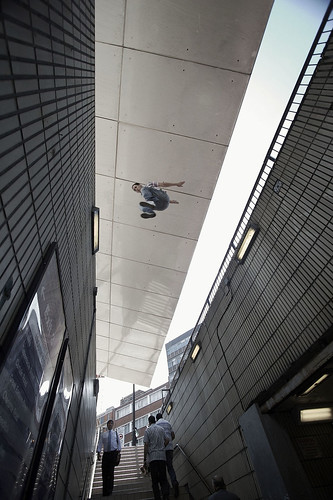
Parkour is a kind of structure-surfing action where participants find new ways to maneuver through diverse largely urban architectures doing anything but walking on the street. This appears to me to be a kind of classic, side-scroller video game play action executed in the physical world. For the purposes of giving some meaning to it in the context of new interfaces for digital play we might speculate that it is an expression of that dynamic, hop-jump-climb action of things like Super Mario Bros. and the like. Manuevering through a diverse landscape of architectural affordances for the simple set of “physical” actions your Mario game avatar has at his disposal. Only, instead of playing exclusively on the screen, sitting still somewhere, you turn the real world landscape into one “playable” like a video game.

The insight here is that it is no surprise that the real world looks like a video game to the digital kids who grew up with them. And, further, that experiencing video game worlds creates a template in ones mind that overlays other real-world experiences — the world and the things we do in it take on the meaning, systems and symbols — the idioms — of video games. The ritual of video game practices becomes the window through which we see and experience the world. This may be a weak signal for new kinds of playful interfaces that happen away from the canonical fixed-screen interface.

Now, I’m not making any sort of normative assessment here as to whether or not this is a good thing. What I am hopeful for is the possibility for extending some of the digital networked worlds’ social rituals into mixed, hybrid experiences. At least the social interaction rituals that seem to make for a more playful, habitable world. For that, you need new kinds of interfaces for interaction and new channels through which to circulate action. This is one of the reasons the Near Future Laboratory has focused so heavily on curious and sometimes preposterous interface devices that use non-keyboard-video-mouse interactions.


When Reality Feels Like Playing a Game, a New Era Has Begun

Slow Messenger Prototype (II)

Slow Messenger

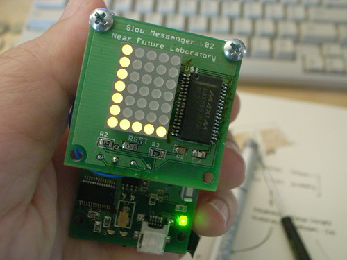
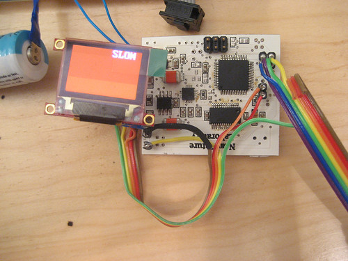
This is the second prototype hardware for the Slow Messenger project we’ve been working on. It’s slow going, naturally enough, probably the result of too many design projects for peculiar mobile devices going at once.

This prototype is using a small 96 x 64 pixel OLED display by 4D Systems and the idea is that you’d have your “instant” messages displayed over relatively long periods of time, and the more you carried the messaging device with you — the more you held it — the more of the message you would see. If you left the device by itself — thereby not really showing much commitment or affinity to the message — the longer it would take for the message to reveal itself.

The conceit of the project is to create a kind of “durable affinity” amongst the messaging participants. By coupling the message’s slow unfolding to a tangible object that the recipient must hold and carry around, the communication has a kind of interaction ritual that might be more intimate than punching little plastic squares while staring at a screen. Turning time, touch into a condition of affinity and commitment is the interaction ritual we are exploring.

The project is a “theory object” — not necessarily a product in the sense of something that could have a deep impact on the quarterly results of a large public company. It is meant to be a way to critique an aspect of digital networked interaction through a provocative designed object. Going beyond speculation to specification, design, fabrication, prototype experiences, iteration is significant. It creates something that helps me think about the questions that were initially raised in a day dream much, much more than only spinning the thoughts in my head and as writing on paper could ever possibly do. Constructing the device – taking the idea and making it artifact and then giving them to people to experience and provide their thoughts – is a crucial way to think about the questions and the larger problem of having sensible things to say about the near future of these sorts of interaction rituals.

Efficient, quick communication is a product of power-politics. In order to exert one’s influence geographically, it’s necessary to communicate one’s will over distances and do so in as little time and with as much efficiency as possible. Slow messaging just doesn’t make sense in that context. And that simple necessity has soaked through most of our forms of communicating, even when we are not particularly powerful. It just becomes an assumption that communication happens quickly – not because it cannot be any other way, but because it has become part of the unquestioned “DNA” of communication as a social practice.

But, as in most of our projects, we want to work from unconventional assumptions in order to see what the experiences of communication in a different “anti-” universe might be like. What can we learn about our existing social practices of communication – instant messaging, SMS, always-available styles of presence online – if we do an experiment where the assumption is the opposite. In this case, if we make communication much slower, what do we learn about new ways of relating and sharing with our friends and loved ones? We’re not necessarily assuming that this is the best way to communicate, for example. We’re not making a new product or something of this sort. It is very much an experiment in design as a way to answer some perplexing questions about the relationships we maintain through all these peculiar and compelling messaging systems.

Play at Picnic2007

R0014848

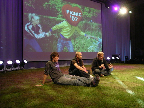
I had the great pleasure of participating again at Picnic, this time organizing a panel between Fabien Giardin, Nicolas Nova and Dennis Crowley on the topic “The Near Future of Pervasive Media Experiences.”

I gave a brief presentation on “New Interaction Rituals” (PDF available here) describing the curious prehistory of interactions between humans and keyboards that then evolved into the canonical desktop interactive computer setup of keyboard, mouse and visual display. Then the questions is — "what next?" Or, even better, "what else?" A small number of current projects are described briefly to outline interactions that expand beyond the current finger twittering, button twitching sort.