A persistent architectural geometry in the Andes, theorized to be resistant to damage from Earthquakes. All evidence indicates it mostly works.
Month: June 2008
Functionally Finished Architecture
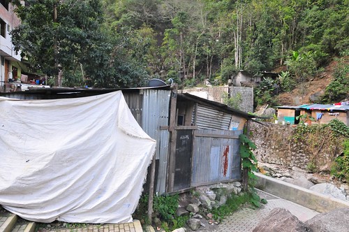
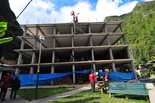
Some curious structures and dwellings seen in the very touristy town of Agua Caliente, which serves as the out-and-about place just at the base of the mountain where Machu Picchu rests. The town is under heavy construction for nice, small refined hotel rooms for tourists to stay in comfort. There are many hostels tucked in whatever corner can be found. Mostly an incredible number of restaurants offering up to 4-for-1 drinks specials and Pizza Gigante, both of which were the most tempting things swirling in my head after four dry days on the trail. (Our food was quite good, btw, and hot chocolate from powder after 8 hours of trekking never tasted so good.)
I found the top building the most peculiar. It looks as though it is unfinished by my own standards, but it is clear that it is pretty much done. The top right habitat appears to be a kind of porch, open to the outside. It’s finished, in that it’s been painted and the wall appointed with a nice painting or something. I tried to find evidence of renovation to account for the fact that there’s basically a missing wall with a perilous drop, but this is just how the structure is architected. There is no OSHA standard kind of safety rail or bannister, very much like the Inca Trail where there are no real measures to prevent a loss of balance resulting in a drop down hundreds of meters. Truly a mountain home.
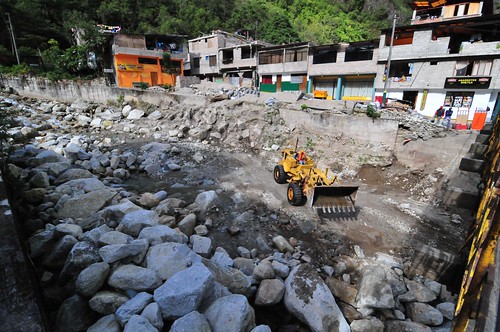
The usual kinds of reconstruction to accommodate the bustling tourist trade, including some new hotel at the end of the road and re-channeling the river for some reason.
Peculiar Dog Driving Practices and Other Mobile Daring-Do
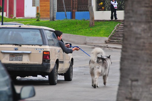
Definitely not a viable near future human social practice, especially with gas approaching its inevitable $5 USD per gallon prices, here in the US. This non-staged dog driving was seen recently in Lima Peru in the Barranco district, which reminds me of New York City’s Upper East Side (aka “Planet of the Apes” bizzarro land), only on the ocean. It’s a desirable, fancy district with new tall apartment buildings, lots of ground-floor security operatives, clean and well-manicured. Very quiet area compared to the rest of Lima which is as noisy as it can be — lots of cars honking as a matter-of-course, belching incredible amounts of exhaust fumes, general bedlam, basically. While wondering about, I saw this zaniness while basically waiting for a red-eye back to the US. I am not really sure exactly how to make sense of this peculiar dog driving practice.
What is most curious is that I first saw this car-dog-human hybrid and, as slow as they were going (no more than 5 miles per hour) I couldn’t get my camera out and change to an appropriate lens quickly enough, so I missed the shot. Somehow I knew they’d be coming back if I kept walking along this road and, sure enough — here they are. It was barely drizzling, so I can’t say that this is what lazy hydrophobes do to walk/drive alongside of their dog. Also, the dog didn’t seem to really have a chance to be anywhere except in the asphalt-y road — no real play time, just managing to keep up with the car.
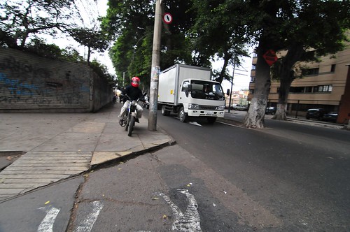
Another peculiar driving routine is this maneuver on the boulevards of Lima, Peru. Drivers switch back and forth between the parallel “local” bit of road (or, heck..just the sidewalk, why not?), lined with small shops, etc, and the main thoroughfare. And do so by whatever means necessary. It is also routine to honk your car horn aggressively, often, and seemingly without reason or justification.
There appear to be an exceptional shortage of proper intersections and stop-lights to go along with them. There are more of these speed bumps than there are stop-lights. On one trip, we seemed to speed up as fast as possible and then downshift/brake abruptly for a speed bump about every 100 meters. There was a palpable frustration that you couldn’t just go for a good bit, which is almost worse than having a network of lights that sometimes can be timed. I think the speed bumps were likely responsible for avoiding the many near-close-call pedestrian accidents. The protocol for pedestrian street crossing is basically to just do it and not flinch when cars swerve quite close to you. It’s a delicate dance between pedestrians and large, heavy vehicles.
Traffic cops (armed, I should add), were stationed at particularly fast-moving areas to help manage the inevitable flow issues, including illegal left-hand turns made from the far-right lane and such all. There signalling mechanisms were incredulous shrugs, bird-like whistle-blowing and no-no-no finger waving gestures — as if to say, “what’re you thinking!?”
Pre-Columbian Internet Geography
This photograph is my second “Truman Show” moment, near the end of day four of walking the Inca Trail, with this bit of exposed infrastructure along the seam where mountain meets trail. An abrupt reminder that the trail is maintained in the contemporary sense, pretty much exclusively for visitors using it as I was — to have a nice if a bit grueling four day trek through the Andes. (Likely this bit of electrical plumbing ran power and communications between a restaurant/lodge a few kilometers from the final “Sun Gate” milestone.)
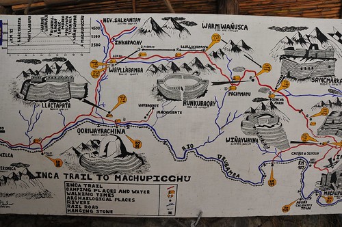
The trail was presumed built by order of an Inca back in the day to allow for a proper system of communicating messages as well as goods. It connected all of the villages throughout the Empire, which extended throughout what is now Peru, as well as today’s Bolivia, Ecuador, Chile and Argentina.
It’s often described as a road system, but the Near Future Laboratory can only grok it as a larger system of communication very much like today’s Internet, mostly because of the mechanics of its formal protocols. It was not just something for one to walk along to get from point A to point B. It’s possible to speculate that it was built as a way of adhering social / power relations, creating an assemblage that included royal (the Inca King) control through messaging, maintaining control over borders, dispersing warriors and their power, transporting food, routing vital water along its intricate right-of-way. The protocol allowed for a system of runners operating in relay moving impossibly fast along the trail.
Every four years a race is held, running the trail from kilometer 82 to Machu Picchu, about 45 kilometers total. The current record time? 3 hours and 12 minutes. Today, it’s traveled by at most 500 people a day so that, for the typical 4 day trek, you’re on the trail with 2000 other people. (Only near the beginning at kilometer 82 did it appear to be bustling. Along the way, it was only occasionally that we ran into other people.)
Related:
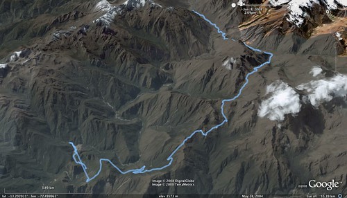
A Google Earth KML file of the trek, recorded along the way with a GPS device.
How Hard Hardware
I’ve been pondering a comment Michal Migurski made on Adam Greenfield’s blog about how hard hardware is (he says how easy software is, but in the context of doing hardware)
Even as I plug jumper wires into my breadboard, I’m aware of how much more powerful and easy it is to do things in software, and how much more reach you get through a web browser. Olinda has physical slots for six “friends” on its hardware social unit – revolutionary for a radio, but a meh replacement for an iChat buddy list that *scrolls*.
Why is hardware harder and less powerful than writing some software that can be experienced through, for example, a web browser, or an operating system? Or..is it something about the materiality of hardware that changes things into hard problems to solve. Certainly software is “easier” in the sense that you can more-or-less sit still, get zen and code. And finding the right tools nowadays, with online communities and such makes the route to solving problems less onerous.
I tend to think that it has something to do with the communities — the real toolkits — and their ability, from the grassroots, to work with the material. Both software and hardware have been (and in many instances, continue to be) economic commodities — someone’s trying to make a buck. Nothing wrong with that, of course. But hardware has been particularly expensive, partly because it’s material stuff, with weight and elaborately toxic and costly process costs. But, also because very few companies have had the foresight to consider how free or subsidized hardware could be a smart, strategic investment. Atmel, makers of the microcontroller that goes into Arduino’s, had that kind of foresight. They’ve underwritten most of their development kits so that they literally loose money. Their kits and programming tools are top-notch and it’s barely fair to complain, although some do, and I bristle when a tinkerer grouses about a $30 programming module. This of course from the vantage point of a hardware geek going back to the late 80s, where scoring a Xerox 820 at a Ham Radio fair set me and some buddies back a few hundred bucks, no O/S, barely any documentation. Now you get an open model — everything is revealed to you, there’s support for GCC, etc.
Continue reading How Hard Hardware
Scale
Not knowing a heck of a lot about solenoids in practice — I know what they do, and, as an example of the sometimes impracticality of higher-ed, am fairly fluent in the E&M principles at work here. But, when it comes to the practical matter of finding one with the necessary “umph” to articulate a simple controller’s buttons, it’s all guess work.
(Parenthetically, this mechanism is a subcomponent of a larger project called “Air Guitar Hero” which uses a remote glove controller to articulate the solenoids here. Yes. It makes no practical sense. It points to “something” as an experiment, if nothing more than to learn a few things about controlling solenoids and such all. But, mostly it is a design provocation. That’d be the easiest way of describing this whole thing, for those who have asked.)
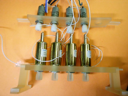
The first solenoids I used were the smallish ones on top, bought at close-out prices from Electronics Goldmine for about $2 a piece. They couldn’t push the button completely, nor with the surety of purpose the design demanded. They would actuate, but not push the button closed. The best they could do was kind of rattling things around a bit.
Not really knowing precisely how to “engineer” a solution (probably something about determining the closing force of the switch and back-stepping to an appropriate solenoid), I just bought a few different sizes. The first one to arrive was enormous and, had I been a bit more careful, I would’ve realized that the centerline to centerline spacing of a row of four of these would’ve been wider than the center to center distance between the Guitar Hero buttons. Poppa Bear is a Guardian Electric TP12X19-I-24D, push style solenoid, runs at 24 volts. Way too big. So..that one is now a paperweight on my desk.
The other two were closer, and I ended up using the “Momma Bear” solenoid — a Guardian Electric TP6X12-I-24D, also push style, with a load force of 18-0.06/2.5-0.75 Ounce-Inch. The data sheet is here.
I’m running all of these at 12 volts, which makes them less umph-y, but sufficient for what I’m doing. The solenoids have more push force at the low end of teir travel, so I designed the little supporting bridge there to hold the articulating shaft right on top of the controller button so that most of the force would be committed to pushing the button and not traveling through space.
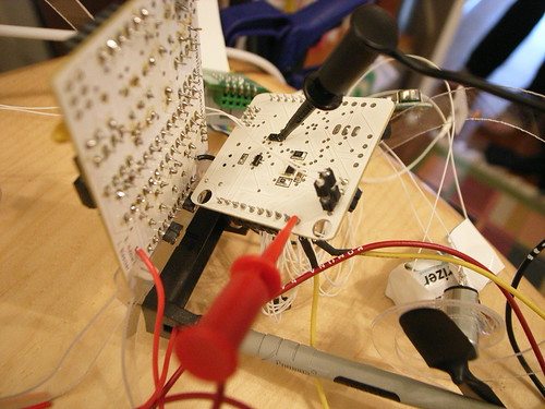
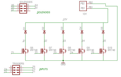
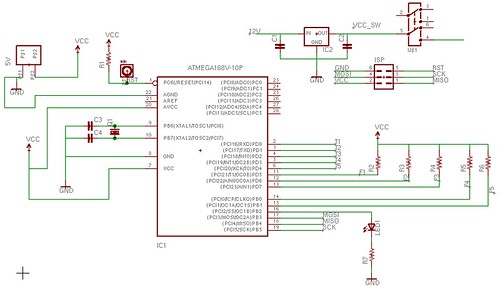
Speaking of scale, on the left there is the breadboard prototype circuit to drive five solenoids. The right is the PCB with the same circuit (minus a bunch of Arduino icing, just a plain vanilla Atmega168 and crystal). Scaled down, the circuit is much easier to manage and cart around than the relatively fragile breadboard edition, especially cause I’m using janky, untrimmed jumpers to make connections and so forth.
For the curious, here’s the circuit’s schematic and the PCB layout pictures.
Undisciplinary Design / People-Practice
Crossing into a new practice idiom, especially if it offers the chance to feel the process of learning, is a crucial path toward undisciplinarity. The chance to become part of a practice — with all of its history, ideology, languages, norms and values, personalities, conferences — is an invigorating process. Embodying multiple practices simultaneously is the scaffolding of creativity and innovating, in my mind. It is what allows one to think beyond the confines of strict disciplinary approaches to creating new forms of culture — whether objects, ideas or ways of seeing the world.
I’ve been an engineer, working on the Motorola 88000 RISC processor at Data General back in the day. I studied how to think about the “human factor” as an engineering problem while I was working at the Human Interface Technology Lab at the University of Washington where I got my MSEng. The human factor has a less instrumental side, I discovered — it’s not just median heights and inter-ocular distances. So, I went to study culture theory and history of ideas at UC Santa Cruz where I got my Ph.D. I wanted to understand how people make meaning of the (technology-infused) world around them. Shortly after that, and quite accidentally, I entered the art-technology world when I recognized that I could do a form of “research” that was simultaneously technical and cultural. Four years in academia on the other side of the lectern provided a useful opportunity to try a different way of circulating knowledge, and a different set of constraints on what can and cannot be done in the area of practice-as-theory.
These disparate practices actually have a satisfying arc, in my opinion. It’s a combination of instrumental and practical skill, together with a sense of the meaning-making, theory and aesthetic possibilities of mostly technical and engineered objects.
Objects, I have learned, are expressive bits of culture. They make meaning, help us understand and make sense of the world. They are knowledge-making, epistemological functionaries. They frame conversations and are also expressions of possibility and aspiration. In many ways, they are some of the weightiest and expressive forms of culture we have. Being able to make objects and understand them as expressive, as able to tell or start or frame larger conversations and stories about the world is very satisfying.
Objects express the cultural, aesthetic, practical knowledge of their making — in their “design”, and in their crafting as “art”, or also in their “engineering.”
This is not a revelation for most of you, of course. For me, though, it has been a revelation to understand this kind of statement from the perspectives of multiple practices or disciplines.
Objects and culture are reciprocally embodied, certainly. But what object? And what culture? Certainly not one solidified, rock-solid meaningful object. If I take a phone (there are lots around me nowadays) and try to understand it, it matters from what “culture” (or discipline, or community-of-practice) I study it. At the same time, making an object, and how it is made, and what it will mean, and when I will know it is finished — all of these things depend on what culture or practice or body of knowledge you choose to look at it from.
Put an engineer, a model-maker, an industrial designer, a marketing guy all around a table, staring at a phone. What will they see? Where will they agree on what they see and where will they look blankly and wonder — what is that guy talking about? How much time is spent — minutes? months? — negotiating what is seen?
What practices fit in the middle? Is that inter-disciplines? And what practices run across many? Is that multi-discplines? Do trans-disciplines work above and beyond? What about undisciplinary? What way of seeing that object will make it into something new and unheard of? What way of seeing will materialize new objects, innovative ideas and conversations that create new playful, more habitable near future worlds? (And not just smart refrigerators and clothes hangers that automatically dry clean your shirts, or whatever.)
What do I call myself?
Disclose or Discover?
Aram Bartholl’s project “WoW” suddenly popped into my head as I was discussing the good old Mobile Social Software knee-jerk project — proximity-based friend finders. (Here is a decent video of Bartholl’s project in action.)
Proximity-based friend finders — these are the MoSoSo application/ideas in which people find people near them who share their interests, or what have you. It’s like friend searching online, or finding people with common interests, as we do directly or indirectly every so often online, only it’s done in physical space. The early canonical example is the LoveGetty device in which people key into the device certain simple parameters as to their preferences and people nearby whose devices find compatible preferences are alerted. It makes since, but truly only for a gag, or for a good cocktail party conversation. It’s simple disclosure of yourself — wearing your identity loudly in public, broadcasting it literally over the air for all to see.
We’re all used to various levels of identity disclosure online, almost always done on purpose, and deliberately. Sometimes it’s way over the top; other times its a simple, subtle representation of oneself in a modest Facebook page, or Twitter feed. Online is one thing, and the social people-practices engaged online are arguably just crawling out of the primordial goo. Aggregates of activity represent ourselves, still quite disparate and barely knit together — and it takes lots of effort to try and create a more cohesive quilt of identity, even in this age of feeds, aggregations and open APIs.
But in “real life” — in 1st life — people and their practices have had time to distill and refine the ways in which we create and represent and share who we are. in 1st life, we don’t so much disclose our identities — in the way WoW has a floating banner of our (avatar’s) name. Rather, we allow a sometimes baroque, sometimes simple process of discovery of identity.
And this is what makes Bartholl’s project so incisive and funny at the same time. How ridiculous to “broadcast” who we are in this fashion? It’s simply not consistent with the people-practices that are the norms in 1st life. And this is perhaps where Mobile Social Software can learn and understand that it’s not about the technology, no matter how simple it may seem to create linkages over networks in the real world. It’s about finding the consonant social practices that Mobile Social Software can facilitate, leading with people-principles before technology principles. That is where the design disruption lies.
Coffee Interfaces
Bizarre interface syntax here. On the bottom left it’s Large, Small, Medium. That’s sort of peculiar — I’m never entirely sure what button to press. The Small and Medium seem almost identical when you’re feeling in need of a cup of coffee. Once, I pressed Large and it overflowed the cup. What are the contexts here for sizing, anyway? And why the mis-ordered buttons and icons?


