Brand Obama


In the Itaewon neighborhood of Seoul, where every other store-keep on the main drag is trying to measure a tattered, soaked urban scout for a new suit, this garment was spied — a rather natty, silky, shiny shirt with a monogrammed cuff with another man’s name. Not an unusual fashion idiom — wearing someone else’s name — but this one sort of moves things in an unusual direction. I don’t know if I have ever seen a garment adorned with the name of a sitting United States President, especially overseas. Now, I’m not talking about a pejorative protest t-shirt or some such. There are plenty of those — I don’t even need to guess about that one. This here? It’s meant to imbue its wearer with a special power. Much more than Calvin or Tommy. Or even Shaq or LeBron.

Related, somehow is this bit of work by studio brother Andrew Gartrell, riffing on some peculiar image I found in the New York Times of an Obama-Spock photoshop. What is curious here is the ways in which images, names, stories swirl in a vortex of possibility, hope, lawsuits, fair-use and fashion. It’s in the making that the social exists, always becoming and this sort of riffing on what “Obama” is — something that happens rather than something static.

What is in a name, anyway? Sometimes nothing, sometimes everything.

Continue reading Brand Obama

Tangled Knots

Found in the Itaewon neighborhood in Seoul — a tangled web of the old carted off to make way for the new. The muck and mess of an old building taken away and hidden off in a landfill or perhaps it will be smashed, melted and repurposed. That tangle could be good steel if redone. I can think of no more appropriate physical metaphor for the ways in which things made become something else again, in time. The intractable tangle and knotted hair ball embodies the history — Latour’s “knots” and “entanglements” are more apropos of the complexities of social collectives than the finished, burnished glass-and-steel that will likely replace whatever had been here in this spot.

I often get peculiar looks when photographing these sorts of half-built/half-broken objects and crap — definitely not tourists sights. For the most part, these sorts of things are compelling physical metaphors of ‘social assemblages’ — the things that hold us all together. Seeing them in “ruined” form and not as generically photogenic resonates the “made” qualities of the world around us, and brings to the foreground the sense that the world is constructed and always in process — always changing, always being re-made.

Perhaps the most concise appreciation or understanding of what “the social” is can be seen in this image — it is what holds us together, and not the result of that ‘holding together.’ But, it is more than a physical metaphor because we should not, to paraphrase from Latour, limit what gets to participate in ‘the social’. That is, it is not only people — humans — who do the structural holding-together. Things, as well — things of all sorts participate as much as normal (and not-so-normal) human beings shape and mold and vector the entire collective, stretching it into odd shapes and enrolling all kinds of human and non-human ‘hybrids’ into something new. A good reason to think about new ways to map these associations and assemblages with things other than just people, for example.

Why do I blog this? I find myself again reading Reassembling the Social: An Introduction to Actor-Network-Theory (Clarendon Lectures in Management Studies) simultaneous with The 33 Strategies of War (Joost Elffers Books) so as to gain additional (perhaps better? perhaps ultimately worse?) perspectives and points-of-view on the ways social-technical assemblages function and survive. A mix of tactics and strategies to create these assemblages, which always look more disciplined in their final presentation, but are always somehow much more intriguing in the process of their making. The ways things come to be is always much more than the technical particulars of their components, which is a point I think I misunderstood until my first professional job designing mini-computers while the mini-computer industry was well into its tumble off the cliff created by the X86 and 68000 architectures. Shifting into new territories requires epic degrees of flexibility, insight and guile perhaps above all. Luck, I am fairly certain, has nothing to do with responding successfully and reacting quickly to system altering changes.
Continue reading Tangled Knots

Interoperability

Sunday September 20, 17.43.18

A curious interoperability protocol, wherein the address for some weird place in Seoul has been found on an iPhone and must now be entered into the GPS of the taxi. A simple affair, with minimal bumps often enough, particularly because the map on the iPhone shows the address and streets in Korean, which is great for the taxi cab driver, but miserable for the the traveler who can only hope that the locale on the map is actually where he would like to be.

Why do I blog this? This are useful moments to capture, where language, culture, objects, data come into conflict and must work their way around one another. I am told the iPhone isn’t available in South Korea at the time of this photo, so you have this foreign object — one that is probably quite legible as the iPod Touch was spotted around the city — and a baroque assemblage of devices, machines, transaction mechanisms, remote controls, identity stickers, car controls, radios, etc. I would have to contrast this with the notion of seamless perfection and interoperability that is often the image of the future transportation dashboard.
Continue reading Interoperability

Incongruence Between Public & Private

Incongruence

A vertical style urinal in a private bathroom. Curious introduction of a fixture normally found in a public “men’s room.” Made me think about the incongruity introduced between public and private space and the meaning of things when the thing moves into other contexts. Found in a home in Venice Beach, California.

A private bathroom, introducing an element of the public with this urinal. Quite an incongruity, if you ask me.

Why do I blog this? A curious artefact, the urinal. It is quite ordinary in one setting but clearly out of place (at least in my mind) in the setting of a private, residential bathroom. It’s almost like a prank or something. I have no idea why it is here, but there it is.

What struck me most is the public ritual that is inferred by this fixture.  You know what I mean. It’s a common ritual, everyone does it. Men do it in a particular fashion distinct from women, but nonetheless, it gets done. The full-length, stand-up urinal switches the context though. It does not seem to make sense in a private setting. It may in fact be more efficient (it’s hard not to be cheeky here), but it interrupts the sense of what this room actually is when found in a private home.

Portable Public Toilet

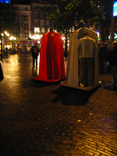
Efficient means of managing farm animal behaviors. Weekend nights in Amsterdam, servicing the largely UK-based influx of brawlers.

Friday February 13 19:00

A confusing placement of toilets. The angles of the two urinal fixtures makes for an awkward bit of maneuvering and probably several moments of immodesty. Seen in Madrid, Spain.

IMG_1978.JPG

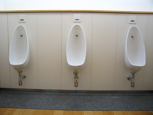
Neat. Orderly. Clean. Considered. Urinals in Japan, with a comfortable spacing between stations, although no modesty wall. Tokyo, Japan.

It makes me think quite clearly about the appropriateness of “the object” (in general terms, not just a toilet) and how much more “things” surpass their mere engineered utility. Things in themselves are not their function, which is obvious to me as a principle of design. In the most crass sense, things become styled to elevate or inflect their meaning to people. Urinals become horizontal troughs in some settings, which is closer to a refined sort of piss-pot for farm animals, which some men become when heavy-footed and heavy-lidded with drink. The horizontal piss trough means something distinctly different from the vertical urinal, and that again from the vertical with a modesty wall, and that again from the private stall. but so much more when exhibited in a bizarre incongruity. For example, telephones, or mobile phones, lets say, that do more then one would expect a phone to do and all of the effort that goes into inserting a new bit of functionality for the sake of the functionality. Consistent with their intent and the context of their intent, designed objects “work”. There are lines that can be easily crossed. That line is all about context and social rituals, not the sort of sense in which a very instrumentally-minded person might say — well, it serves a basic purpose, so what’s the problem?

The conclusion for design is that one, as a maker of things must think carefully not only about the technical, instrumental bits, but also the normal, humans (who are more than likely not like you, particularly if you are an engineer) who will introduce this thing into their more everyday, quotidian settings. (I am thinking here mostly of the thing that is on my mind quite a bit — communications devices that end up being more like something an astronaut would use than what a normal, everyday person would introduce into their everyday practices of connecting to other people.) In this example of the toilet, it is clear that it is more than a instrument for flushing waste appropriately. This example will certainly do that, but design is also about context, and contexts of use and consideration of the setting in which such action happens. This bathroom becomes something else (closer to a public restroom? more crass? more suggestive of these other places, etc.) with this thing in it, for sure.
Continue reading Incongruence Between Public & Private

David Byrne Urbanism

Saturday April 11, 21.54.27

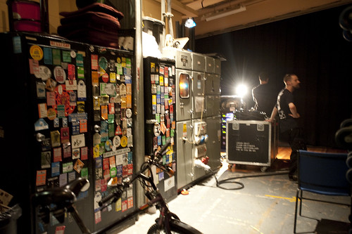
Backstage, this plus bicycles, Notingham, England.

This is a nice, succinct reflection on the characteristics of cities, and the characteristics personally likable by David Byrne, titled David Byrne’s Perfect City. Worth the quick read. The short essay also serves as a reminder for the new Byrne book, Bicycle Diaries.

Why do I blog this? It’s no big secret that the Laboratory is a big fan of David Byrne because of the music, certainly. But, also, and as importantly, for the expanse of his creative wingspan, this article being one symptom of that. It’s also quite nice to have these sorts of insights into the urban condition presented from the ground, from a bicycle, from someone who carts his bicycle wherever he goes. And, having recently completed a world tour — I mean, you have to think that this level of insight reaches way beyond tooty, snooty urban theorists. Or, maybe that’s too harsh — it has a perspective that not many others can share just for lack of on-the-ground experience. We’re not bragging, but recently while visiting family who are in David Byrne’s band, we were struck by what we overheard while heading towards the buses: OH: “We still have to load the bikes.” I asked — “Besides all this equipment, you bring bikes?” Well..naturally.
Continue reading David Byrne Urbanism

Drama, Boredom, Simply Infovisualized

Found on this blog by David Sivers.

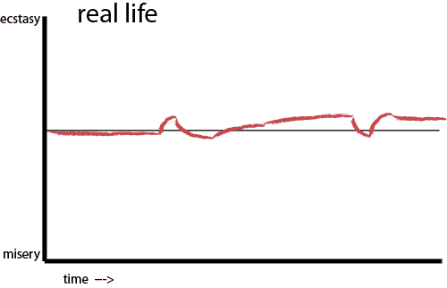
A sketch in 2D of real life as David Sivers reflects on remarks and a drawing done at a talk by Kurt Vonnegut where he is explaining his perspective on why people like drama. The conclusion, summarily: life is boring and without change. Drama brings that rollercoaster ride into our experience. And, if I remember my high school biology correctly, the human sensory apparatus responds to change more so than steady state. Which may be the biometric quantification of boredom. You know..”quantified-self” in its most fundamental, meaningful sense. Whoever’s graph does not normalize out to “boredom”, wins.

So the question here that is intriguing circles around this question of communicating ideas, socializing ideas by pumping them into the circulatory system of human meaning-making, human ear-listening, creating knowledge and insight from ideas and then inciting the will in such a way as to bring about material change in the world. A “boredom” graph won’t do this. There is no change, no inflection into other experiences and other possible near future worlds. What sort of change and inflections might one (or me, I suppose) strive for? The kind of change that creates more habitable ways of living. This is the change that matters, and why design is, from my mind, so important in shaping the world into a richer, more meaningful, less boring place. Objects, let’s say for the moment, that can create these dramatic stories around themselves. Certainly not by themselves, but like the MacGuffin, something that takes you on a pursuit, or makes something meaningful and ultimately rewards you in a way that makes life more worthwhile to live.
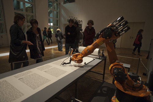
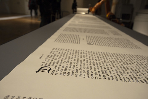
This is called bios [bible] by robotlab (Matthias Gommel, Martina Haitz and Jan Zappe). A machine in the ritual action of inscribing perhaps the world’s most widespread dramatic stories — the Bible. This machine will inscribe, as a scribe, in this style of drawing letters, the full text. It will take seven months. The plain motivation by the artists comes down to this: “The installation emphasizes scripture as the elementary function for religion and science — two cultural systems that are fundamental for societies today.”

A bit bland, and arguable, of course, but this only comes from the “wall text” found in the exhibition documentation, which always limits the discussion out of production constraints. That’s fine.

Whatever it says in this brief remark, being the sort to invest more attention in systems of meaning-making and knowledge circulation, to me it is less the script — the ritualize handwriting — than about stories that activate the imagination and thereby the will to make material change in the world.
Why do I blog this? Story telling is not only intriguing to us here at The Near Future Laboratory, it is a crucial socialization ritual. A friend remarked recently that we tell stories to remind us of who we are, or, variously, to refashion our own image of who we are — even if they are the same little silly “small talk” chatter about some experience. Okay, this may not be the insight of the year or anything like that, but it helps with the comprehension of various things — like, why an idea or object or something needs to exist in time, over time if it is to become comprehensible. Even if we see some weird designed fiction object that has no previous relationship — it’s foreign in a way — a story must be told about it that brings it into the quotidian, “boring” everyday. This is why I am intrigued by this sort of design fiction style of representation where the thing that would normally be exciting — a new gizmo, or something that indicates an evolution of today’s interaction rituals into a near future — that thing is made ordinary, or even burned-out and chipped and broken in places. So the fantastic exciting dramatic thing of today, has moved into a near future and become either ordinary, or underwhelming in a way. It reflects the graph of promises of great new things, and great new ways of interacting, or making toast — whatever — and then just fulfills the inevitable conclusion of — “ho, hum” present tense worlds, with your klunky, problem-prone, Ono-Sendei Industries Super Deluxe Near-Time Traveling dongle (the one you got from the Sky Mall catalog) asking you to update its firmware..again..and then shutting down, leaving you stranded and making you late for your meeting three days ago.

Continue reading Drama, Boredom, Simply Infovisualized

National Science Foundation Creative "IT" RFP

Jedi Council Chambers

Funding Opportunities from the National Science Foundation CreativeIT Program

http://www.nsf.gov/funding/pgm_summ.jsp?pims_id=501096&org=CISE&from=home

DUE DATE

Full Proposal Deadline Date: October 13, 2009

I. INTRODUCTION

Creativity, design, and research all contribute new knowledge and artifacts. The CreativeIT program focuses on the commonality of these three processes and solicits proposals that bring creative practice and creativity research to play a role in transformative research in specific contexts of computer science, cognitive science, information technology, education, engineering design and science. The program considers design as a type of research in which the definition of the problem may change in response to the exploration and development of alternative solutions, leading to creative solutions and innovation. The program’s objective is to bring together different disciplines associated with creative and scientific advances in a way that is mutually beneficial. This program encourages new ways of thinking about one discipline in terms of another, so that the interdisciplinary nature of the project is a means to an end rather than an end in itself.

II. PROGRAM DESCRIPTION

Information technology is playing an increasing role in extending the capability of human creative thinking and problem solving, and conversely, creative uses of information technology are leading to new areas of research and innovation. Creativity is often the result of a design process in which the exploration of possible designs changes our perspective on what the design can or should achieve. A designer develops new artifacts in the context of a perceived need or problem specification. In creative design, the reflection on problem finding becomes as important as problem solving. The combination of creativity and design thinking in information technology, science, and engineering has the potential to define new areas and lead to increased successful innovation. Advances: CreativeIT seeks proposals for projects whose objectives are new models of creativity, new models for research and education, or creativity enhancing tools developed in the context of a specific discipline.

Research Areas: The following research areas elaborate on these potential types of advances as guidelines for describing how the objectives of the project contribute to CreativeIT.

Understanding Creative Cognition and Computation. Research in this area develops or applies cognitive models that serve as inspiration for computational models of creativity, support for human creativity, or approaches for educating people to be more creative. This research is typically done by adopting or adapting a model of cognition and evaluating its creative performance in different contexts, or developing a new model of creativity based on empirical or ethnographic studies. The emphasis in this area is the development of new models of cognition and computation that explain or simulate creativity and how these models open up new research areas in computing and cognitive science.
Creativity to Stimulate Breakthroughs in Science and Engineering. This area considers the role and performance of creative professionals in developing new technologies, discovering new patterns in information, and in finding new ways of seeing, knowing, and doing computing, science and engineering. This area seeks to foster research that is conducted with groups of people from different backgrounds in which the creative synergy is focused on a specific context, problem, or perceived need. The result of this research is a new product, new model, or new area of research. The evaluation of the results of this kind of research does not follow directly from existing metrics or performance criteria and therefore may need to redefine relevant performance criteria.
Educational Approaches that Encourage Creativity. This area considers a broad range of approaches to learning that encourages creativity: multi-disciplinary teaching and learning, design studio environments, skills development through making and doing, serious games, and open-ended problem-based learning. This area includes the development and evaluation of innovative computational environments for learning that reward creativity leading to transformative changes in curriculum objectives and structure.
Supporting Creativity with Information Technology. This area develops new software and interaction design to support people in being more creative and evaluates their performance through user studies either in controlled environments with empirical studies or in the context of a complex problem or situation with ethnographic studies. The emphasis in this area is the development of new computing environments where the environment itself may be a creative product, and the environment is intended to support people in their creative activities.

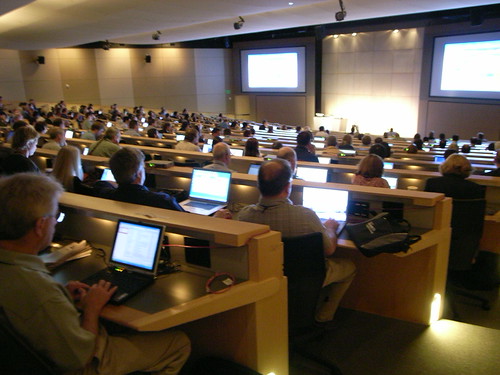
[Wow. Really? This sounds more like an EU or Canadian art-tech-society RFP than the NSF I know. Looks quite promising, at least in the principles outlined. What’s up with the photo above? This was the Microsoft Faculty Research Summit a couple summers ago, where an announcement was made that chilled me bones — more pure CS research support from the NSF. I’m not hatin’ here, it’s just this turn towards purity rather than hybridity that I heard. Rather than considering the complexities of creating awesome people-focused design technologies, it sounded like it was back to files, folders algorithms and data. I don’t know if the NSF remit has changed any in the new administration, but this RFP is at least a bit of palette cleanser.]

Continue reading National Science Foundation Creative "IT" RFP