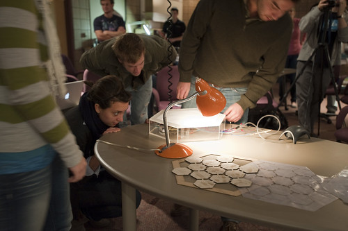
Design Fiction in the Science Gallery

From Bruce’s Beyond the Beyond: Design Fiction in the Science Gallery: “

*Anthony Dunne and Fiona Raby carry on for over an hour about their practice of ‘critical design.’ What a class act these two are: like Robert Louis Stephenson at the monster-movie festival.

*If you’re coming in late to the concept of ‘design fiction,’ here’s the takeaway: Dunne and Raby mock-up some of the most provocative, edgy, unsettling gizmos in the world. They do this by modelling social relationships, emotional interactions and the political implications of objects and services, rather than the objects and services per se. So they do indeed create ‘fictions,’ in that Dunne and Raby designs are poetic, objective-correlative expressions of unstable social situations. These objects are ‘fictions’ about how we live — they perform much like Anthony Trollope’s 1875 social satire novel ‘The Way We Live Now’ once performed.

*Somewhere over the cultural horizon, there might be a modern paranormal-romance flick where all the set design and props are done by Dunne and Raby. That film would be a very Casablanca of the contemporary crisis.

http://en.wikipedia.org/wiki/The_Way_We_Live_Now

(’Only Paul seems to know or care whether the railroad actually exists.’ Trollope’s railroad in THE WAY WE LIVE NOW is a steampunk design-fiction.)

(Via Beyond The Beyond.)

Design Fiction Chronicles: Star Trek's Historical Time Line

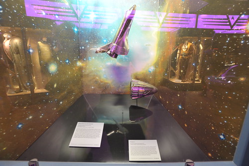
Historical diorama of the Space Shuttle Enterprise alongside of the next significant space vehicle in the evolution of, you know — space travel — Zefram Cochrane’s Phoenix. A curious shift within the setting of an exhibition of many things from the Star Trek fiction.

An indulgement, visiting the Star Trek Exhibition at Hollywood and Highland the other day to just see what it was all about. Turns out, it was mostly about a few ways to get visitors to say — oh, alright.. — when it came to liberating them from $20 here and $20 there for photos, lenticular gizmos and admission. But, I think it was worth it if only because I get a blog post out of it all.

One curiosity that made me chuckle, although not entirely unexpected, I was amused at how this one component of the exhibition — a long, multi-wall science-museum style “march of history” models-in-dioramas — made a tongue-in-cheek transition in historical timelines, from the *real* to the designed future history of Star Trek.

This one particular exhibit consists of a dozen or so Enterprises throughout history, starting with two US aircraft carriers, telling of their exploits in World War II in the Pacific; the Gulf War more recently, and so on. Okay, heard of them — a factoid or two. Then, onto the Space Shuttle Enterprise, named partially at the urging of ardent Star Trek fans. A gesture befitting the strength of the story to push the imagination toward space exploration. The materialization of an aspiration in the form of composite materials, redundant computer navigation systems, enormous engines and a phalanx of command-and-control tracking systems, pilot training programs, a number of firsts-into-space for various nationalities and professions, a spectacular disaster, the normalization of space travel, an X-prize, etc., etc.

Immediately next to the Space Shuttle Enterprise — is Zefram Cochane’s Phoenix — huh? The simple descriptive text, normalizing this future history’s first faster-than-light spacecraft, made me chuckle. Cheeky and clever little cognitive shift that made this part of the exhibit fun. The displays continue on, of course — to all the various Enterprises, with allusions to their demise, Captain’s, a touch and gesture toward a defining moment in their adventures/stories/shows (getting lost forever in the Delta Quadrant, equipped with wild Romulan technology, etc.)

Space Shuttle Enterprise
Prototype Reusable Orbital Spacecraft
NASA registry OV-101
Commanders: Fred W. Haise, Jr., Joseph H. Engle

The Space Shuttle Enterprise was the prototype vehicle for NASA’s fleet of reusable orbital spacecraft. Built in the mid-1970s by North American Rockwell, the Enterprise flew a series of critical test flights in 1977. The shuttle was released in mid-air by a Boeing 747 mother ship, after which it glided to landings at the desert lakebed at Edwards Air Force Base. The Enterprise paved the way for NASA’s space shuttle program, which carried numerous scientific payloads and space probes into orbit (including the Hubble Space Telescope), as well as a large portion of the International Space Station.

Phoenix
Experimental Warp-Powered Spacecraft
Designer, Builder, and Pilot: Zefram Cochrane

Earth’s first faster-than-light spacecraft was built in 2063 by Zefram Cochrane and Lily Sloane. Cochrane and Sloane built the Phoenix on an abandoned nuclear base, left over after Earth’s Third World War. Cochrane piloted the Phoenix’s historic first warp flight on April 5, 2063, a short jaunt, traveling just a few light minutes. During the flight, Phoenix’s warp signature was detected by a passing Vulcan survey ship, leading directly to Earth’s first official contact with extraterrestrial life. The ship now resides in the Smithsonian Insitution.

Why do I blog this? Just following and noting various simple strategies and literary devices to create moments of fiction within a blurrily factual world. In this case the future is assumed, and the past is reimagined to bring into alignment this future fictional world. Similar in many ways to Sascha’s The Golden Institute.
Continue reading Design Fiction Chronicles: Star Trek's Historical Time Line

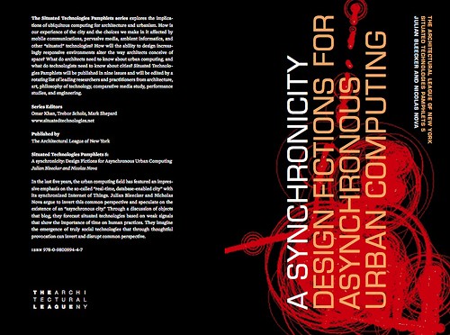
A synchronicity: Design Fictions for Asynchronous Urban Computing

This just in: A Synchronicity: Design Fictions for Asynchronous Urban ComputingNicolas Nova and myself conversing about what we’re calling asynchronous urban computing — has been released by the Architectural League of New York. It’s a dialogue on an inverted urban computation framework, with material embodiments of the peculiar designed artifacts we cooked up to help explicate our upside down worlds.

A synchronicity: Design Fictions for Asynchronous Urban Computing

Here’s what the editors have to say:

In the last five years, the urban computing field has featured an impressive emphasis on the so-called “real-time, database-enabled city” with its synchronized Internet of Things. In Situated Technologies Pamphlets 5, Julian Bleecker and Nicholas Nova argue to invert this common perspective and speculate on the existence of an “asynchronous city.” Through a discussion of objects that blog, they forecast situated technologies based on weak signals that show the importance of time on human practices. They imagine the emergence of truly social technologies that through thoughtful provocation can invert and disrupt common perspective.

It’s available from Lulu, which means you can download it for free, or buy it for real and augment the reality of your book pile. I suggest buying it. We don’t get a penny, but the folks over at The Architectural League and the Situated Technologies genies need to keep doing the cool, curious things they do.

Thanks to the Situated Technologies editors, Omar Khan, Trebor Scholz and Mark Shepherd.

SXSW 2010 Design Fiction Panel

Saturday September 05, 18.51.47

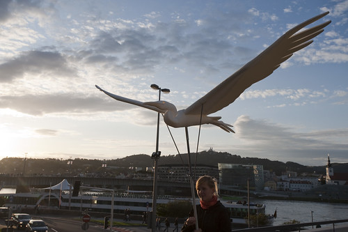
Bird Puppet, in Linz, Austria.

It’s so far away I can barely see to it, but at SXSW 2010, in March a bunch of us will be doing a panel called Design Fiction:Props, Prototypes, Predicaments Communicating New Ideas. I managed to wrench the longer description I had written into the SXSW panel proposal form with some edits, but I’ll give you the original here, along with the original title, which wouldn’t fit..

Design Fiction: Using Props, Prototypes and Speculation In Design

This panel will present and discuss the idea of “design fiction”, a kind of design genre that expresses itself as a kind of science-fiction authoring practice. Design fiction crafts material visions of different kinds of possible worlds.

Design’s various ways of articulating ideas in material can be seen as a kind of practice close to writing fiction, creating social objects (like story props) and experiences (like predicaments or scenarios). In this way, design fiction may be a practice for thinking about and constructing and shaping possible near future contexts in which design-led experiences are created that are different from the canonical better-faster-cheaper visions owned by corporate futures.

This panel will share design fiction projects and discuss the implications for design, strategy and technology innovation. In particular, how can design fiction bolster bolster the communication of new design concepts by emphasizing rich, people-focused storytelling rather than functionality? How can design fiction become part of a process for exploring speculative near futures in the interests of design innovation? What part can be played in imagining alternative histories to explore what “today” may have become as a way to underscore that there are no inevitabilities — and that the future is made from will and imagination, not determined by an “up-and-to-the-right” graph of better-faster-cheaper technologies.

Continue reading SXSW 2010 Design Fiction Panel

Innovation and Design

Roberto Verganti’s Design-Driven Innovation, a business book on how “firm’s” can participate in larger networks of design discourse in order to achieve radically innovative stuff. Mostly an argument with a three-step “how-to” addressed chiefly to executives. An intriguing argument with a fistful of examples presented over and over to drive these points home. In the “good” column, I would say that it is not bad to have (another) book addressed to (potentially) skeptical executives who are more motivated by features and bottom line bill-of-materials/profit/margin sorts of things. On the “m’eh” column, I would say that the book, like most business books, simplifies the really curious, intriguing and fun challenges of leading an organization that has fiduciary and legal responsibilities to make as much money as it can; that has cultures that are led chiefly by engineering and accounting; that thinks design is putting lovely curves around rectangular circuit boards; &c; &c; It would be a much more interesting read to hear the knotty, thorny challenges of design-led innovation. Rather than the “pat” case studies, I would like to have more of a deep/thick investigation of what happens really when one leads with design. It’s more than partying with the well-known, hipster designers Verganti highlights.

I’m reading two books at once, a dangerous thing to do because one is always interpreted alongside the other, changing what it may have been and my perspective, necessarily. But, in hindsight I would say that I am doing this on purpose. One of the books is Reassembling the Social: An Introduction to Actor-Network-Theory (Clarendon Lectures in Management Studies) by Bruno Latour, which I am reading for the second time. The other book is Design Driven Innovation: Changing the Rules of Competition by Radically Innovating What Things Mean by Roberto Verganti, which I only bought because of the suggestive, business-y title and because business books are things I can make short work of during a 5 hour airplane flight. You know — they basically tell you everything you discover in the title, and then repeat it for no more than 200 or 250 pages, only with snap-to-grid, spic-and-span examples.

* Skip right on past my rambling to my executives’ summary *

What could be the relationship between a noted sociologist-of-associations and a tailored-suit-with-french-cuffs-wearing business professor / management consultant? Perhaps nothing useful. But, one of the roughly constructed graphics in Verganti’s book resonated with Latour’s notion of the collective — and it was even described as a drawing of “a collective research laboratory” — and being a good Latourian, I had to follow the links in my head. These are just some sticky-notes between these two books and my own interest in the role of design in changing things, as well as the ways that organizations can be led by design sensibilities or design studios, rather than engineering efforts and accounting principles. Both are things that are lurking below the surface of these two books, Verganti more explicitly than Latour.
Continue reading Innovation and Design

Props, Prototypes and Design With No Spec: Notes on Heliotropic Smartsurfaces

It was working, and it will again. And even in a mode of very temporary failure, the design happens. Here, some students assembly their assemblage for demonstration of their material-semiotic reflection on heliotropic smartsurfaces.

What did I learn from visit to “M” — University of Michigan — and the School of Art & Design, Taubman College of Architecture + Urban Planning? Two things, mostly.

First, huge universities in tiny midwestern towns, with really big footballers really only need one letter to stand in for themselves.

Second, the importance and relevance of props to communicate an idea – a reinforcement of the significance of objects that always contain ideas and possibilities and thereby play a role in the expression of the future. I am perhaps misguidedly and with reckless-abandon reading and practicing both design and actor-network theory..at the same time.

What follows are some scraps and notes, mostly around a combo of two things: design fiction props and the virtues and challenges of design without specification.

After a lecture Thursday night and a bit of a lecture Friday morning, I participated in the Smartsurfaces studio (which also has blog and is run by John Marshall, Karl Daubmann and Max Shtein.

Is there a reluctance to design with partial specifications? Routinely, one can assume that there is development and design first, then there is execution. As if they are distinct “phases” of design work. I understand the tendency — I mean…I’m an engineer. You specify, describe an interface and then just go ahead and build it.

But what about building as specification? Or making to define the specifications and the design principles, and the stories? And doing this over-and-over again, redoing things and refining in the process of making — even making away from the screen?

Normally, one might ask when given a “project”:

What are we going to do?

What are we going to make?

The tenses are all mucked up.

What about instead, when given the chance to project into some near future:

What are we now making?

What are we doing now?

Designing through partial-reflections and partial-knowledge and partial-specifications as a conglomerated design-develop-execute activity — a continuous iterative doing. Brewing and creating controversy in the midst of things — making things not possible, or impossible, or highly speculative, or disagreeable. Or moving with full confidence in the face of overwhelming vagueness and excruciatingly deserted requirements documents.

Perhaps starting from the end — as if the design has been unearthed in the future, by an archeologist who laminates meaning on the thing. Introducing fictional explications with all the seriousness of science-fact making. Creating an object and saying — this is what it is, it is a heliotropic smartsurface and it means these things, and had been used to do such-and-so.

This is the sorts of questions and concerns that make the Smartsurfaces studio so intriguing. I welcomed the opportunity to participate. It is keeping me thinking.
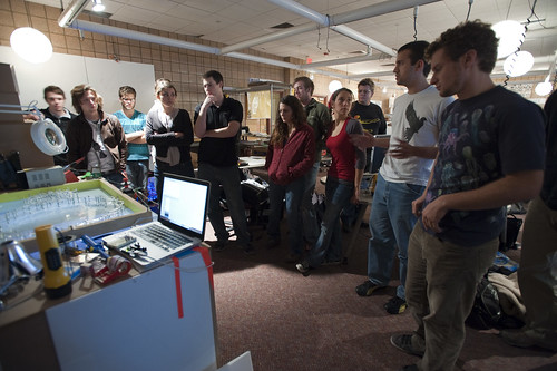
Friday October 16, 12.25.19

The project description.

Let me describe one of the team’s presentations as a way to explicate some of these ideas.

As described in their presentation, Team 3 had started its heliotropic smartsurface project with an offering by one of the team members of a Hoberman Sphere as a prop to accrete ideas and focus the effort. The team created an articulated 2-D sculpture borrowing mechanical idioms from the initial Hoberman Sphere prop. It was a mechanical, moving object consisting of many connected armatures that collectively formed a giant figure-8 lying flat on a smooth surface that was, I would guess, about 1.5 feet x 2.5 feet. The entire assemblage was articulated by a stepper motor with two bobbins that spooled monofilament. The spools turned via the stepper motor. On the spools and running through a simple network of small bobbins, the monofilament line gathered the armatures in such a way that one or the other side of the figure-8 was pinched closed or pulled open. One spool of monofilament ran to around to one side of the It was described that this could lead to a surface that let sunlight in or blocked it off. The control mechanism was a Macbook connected to an Arduino with a light sensor. The Arduino also controlled the stepper motor. An earlier prototype had been constructed using chipboard as the main component of the armatures. This chipboard prototype was not as durable as the demonstrated version which consisted of clear plastic for the armatures. The spooling posed a problem on occasion and had to be tended-to. It was pointed out that this was one of the main problems with the assemblage. The spools were not reliably gathering the monofilament and keeping it neatly coiled on the bobbins that were attached to the stepper motor. The team had ‘burned out’ a couple of Arduinos along the way to this presentation. They had to borrow a larger stepper motor from one of the studio professors a few hours before the project reviews.

Friday October 16, 12.26.22

Demonstration. A flashlight creates the effect of the Sun beams on a sensor connected to an Arduino, connected to a Macbook connected to a stepper motor. Sensor readings are interpreted by firmware in the Arduino’s microcontroller. This then sends control signals to the stepper motor and articulates the armatures via spools attached to the stepper motor which run through bobbins on either side of the box the whole thing sits in.

Team 3’s presentation was a very refined, complete, articulate and functionally robust design. It was seductive to watch the mechanism and listen to the quite articulate description of the process. It was a clear, thoughtful bit of work and the detailed construction was impressive.

My remark — and it was only for the productive discussion, and not a dismissive criticism by any means —  was to focus on this point about the spooling being finicky, requiring tending during the demonstration. In my own interpretation this was the ‘main problem’ the team faced — a remaining point to ‘work through.’ In fact, it was barely seen as a problem in my eyes. It was an excuse for the presentation, or a begging-of-forgiveness for this distraction of a team member stepping to the assemblage and tugging on some monofilament or fussing with the kit.
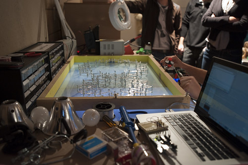
Friday October 16, 12.26.45

The ‘problem’ as an issue to be addressed is that the spools don’t spool the monofilament consistently. Things get a bit tangled up and the issue is handled with a bit of hand-work to get the assemblage back on its feet.

This is a side-issue in a sense. It’s not even really a problem in the sense that it is something that can be easily figured out. After all, spooling monofilament is a black box at this point — an intermediary of sorts. The ‘problem’ no longer exists — this is something that has been solved, closed off, handled already so it’s just a matter of extracting one of those ‘black boxed’ solutions (e.g. by traveling to the world of sewing machine design, fishing rod reels, ships-anchor-mechanisms, &c.)

The use of a stage prop to frame their design/discussion work of what is being done, or what could be done seemed to move this team from a broad range of possible design-expressions of a ‘heliotropic smartsurface’ into a specific thing whose materialization had a form that could be pointed to — the Hoberman Sphere prop. The prop provided a seed that could crystalize a material goal.

Setting a goal in terms that allows iteration and rethinking and, perhaps most importantly — failing — in the design process open up the possibility of unexpected possibilities. Which is to say the possibility of making things different from what might be expected, or pre-supposed. The tactic comes with maturity and the no-fear sense that, no matter what, things will happen and get ‘done.’

What I might say here is that there could have been more intense failure in the midst of all this. Either failure or iteration. The design ended up as a 2D Hoberman Sphere, just as specified from the beginning.

It is a useful design strategy to not expect/specify a particular, instrumentally functioning, pre-specified thing as the ‘final conclusion’ in the process of designing. When introducing the Hoberman Sphere, I believe this very talented group defined their conclusion with the evidence of this presupposed vision of the designed future being, in my Latour-infested mind, this point that the remaining issues are few, or perhaps even just one point of fixing the spooling issue.

As a tactic for designing new things, my own preference is to allow for the possibility that the thing in the end will become something different along the way, so that where you end up may not be where you thought you would conclude. Each moment in the process evolves into its own refresh and re-invigoration of possibilities. The design is never done. There is no hard distinction between ‘research’, ‘exploration’, ‘design’, ‘development’, ‘execution’ — &c. The Gantt Chart attempts to organize and marshall phases that tick into other phases ultimately reaching a conclusion. It won’t help create new things — there are no gaps, no bumps, the future is determined with no opportunities for explicit failure or remaking or starting-over-again.

Why do I blog this? Some notes to reflect on the challenges of design without stepping through a ladder of design-development-execution. Flattening these hierarchies and combining the action of making/destroying/failing/refining as design itself.

[[Thanks to my hosts, John, Cezanne Charles, Karl, Malcolm McCollough, Amy Catania Kulper, &c. and all the wonderful students in Smartsurfaces.]]

Continue reading Props, Prototypes and Design With No Spec: Notes on Heliotropic Smartsurfaces
Nokia N900 Hacks

Nokia is a gigantic battleship, and in some of that ship’s little corners, quite intriguing things happen that are quite consistent with the sensibilities of play, exploration and making new meanings, and especially inverting existing assumptions or retracing histories. I think these sorts of things are some of a small number of ingredients that could make the world a more habitable place.

((And if you are one of the seven people who read this blog, you will recognize a congruency between these playful hacks and our general point-of-view on what is ‘worth-ful’ and what is worthless. Some of you may call these explorations “worthless” because you are tangled up in the constellation of meanings that assume value is only found in something that is so consistent with a “users needs” that they’ll buy it, even if their life is made no better with it than it was without it.))

This video shows some of these ingredients and explorations that activate the imagination and move away from the consistency of mindless incremental change. They are playful, “post-optimal” designs that serve as prompts and reminders and materializations of the experience and interaction metaphors that today we take for granted.

I have my reservations about what the N900 thingie will be or is or how it has come to be (and I’m eager to see it), but this corner of that “program work” gives me more hope for it than I have ever had.

((via Nokia Blog and this PUSH N900 competition.))

Continue reading Nokia N900 Hacks

Design Fiction Chronicles: Urgency and Emergency, Notification and Warning

Saturday January 31 11:07

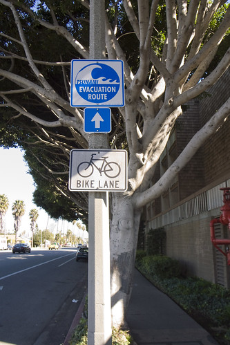
Tsunami Evacuation Route on Washington Boulevard at the border — basically 60 degrees North-North-East, directly opposite the coastline in the other direction, but essentially only a few meters above sea-level for a good couple of miles.

Last week, when there was that earthquake in Samoa, we happened to be talking about Tsunamis in the studio — thinking about the ways that the California coast could be gobbled up in an unfortunate, epic disaster. It’s a distinct possibility, and with the Pacific Ocean popping off earthquakes with increasing frequency (or so it seems..), it makes one think about what sort of early warning system could be put in place — and one that would not rely too much on quite fallible technology-based networks. These are the things that typically fail even without a disaster at hand. (For instance, at the Venice Beach Music Festival a few weeks ago, with a relatively smallish contingent of people occupying Abbot-Kinney Boulevard, me and those I was with were hard-pressed to get a cell signal. If you have all of Venice Beach panicking because of an approaching Tsunami, what are the chances AT&T will be able to handle the load? I’d rather not count on them, to be perfectly honest, to help me communicate with family in a disaster.) Perhaps mesh-y networks that do not rely on too much pre-built systems like cellular base stations.

Or, are there more esoteric warning systems, like these rattling cups? Hairs on the back of your neck? A forest of yammering, naddering wild life suddenly falling dead still and quiet? The color of the sky in the morning? Scattering insects all going in the same direction? A sudden feeling that comes from another array of sensors — ones not invented by scientists or technologists or relying on a functioning grid of power, communication and all that?

What are the other “weak signals” of impending disaster, besides the news?

These fictional moments in movie scenes popped into my head while thinking about early warning of impending disaster.

Why do I blog this? Place marks for ideas related to early warning systems and the stories around them. Signals that are not explicit, but suggestive, providing some clues and cues that force one to be more attentive and resilient and resourceful.
Continue reading Design Fiction Chronicles: Urgency and Emergency, Notification and Warning

Textual Landscapes at Bryce Wolkowitz Gallery

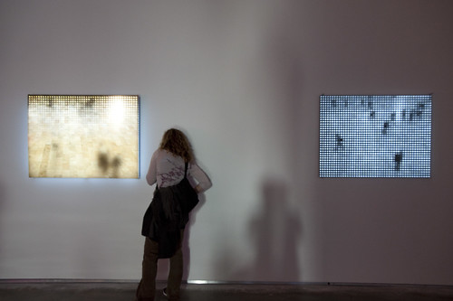
It’s the “how’s it work?” gesture — one of the Top 15 Criteria of Interactive Media Art — so it must be interactive media. Jim Campbell’s work of low-res video illuminations. Again. These are of Grand Central Station looking unusually pacific.

Seen at the Bryce Wolkowitz Gallery in Manhattan on way-west 24th Street, a group show consisting of some favorites — Marina Zurkow especially, with whom I have had the great pleasure of collaborating in the past.

The show was in two rooms separated by this long hallway. In the first entrance room is Alan Rath’s “Flying Eyeballs” IV”. It’s are sort of the canonical retro cathode ray tubes peering at you with blinking eyeballs. The log line: Nam June Paik-envy seasoned with 12 Monkeys production design aesthetic. (I have no photo, but the gallery website will subject you to a medieval-style torture of web navigation if you should like to navigate to the artists’ exhibition photos/videos.)

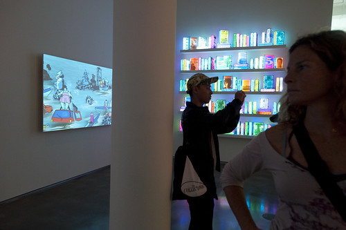
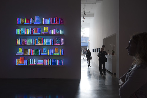
In the main room I enjoyed Marina’s “Slurb”, seen above on the left. On the right is Airan King’s “109 Lighting Books” (indeed..) which is curious sort of literate, didactic sculpture. As a light source in the space, you draw to it like a moth and maybe feel some empathy because of the titles, or maybe some distance because of the titles. I don’t know.


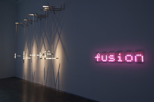
Then there was Ben Rubin’s “Shakespeare Machine Study No 4” (on the left) and “Lolita 6” (on the right), two word-y sculptures from the guy who brought us the crucial internet sculpture “Listening Post” — the thing that collapsed the simultaneity of networks-conversations into physical form.

Why do I blog this? Just a bookmark to myself about an intriguing show using instruments, aesthetics and the setting of an art gallery. I also liked this gesture of someone looking behind a sculpture to see if they can figure out how it works — one of the “Fat 15” criteria that define “interactive media art.”
Continue reading Textual Landscapes at Bryce Wolkowitz Gallery

Upcoming Talks, Crits, Lectures

A quick dispatch to mention a few upcoming events at which I will be sharing thoughts, new materials and so forth.

On October 15th and 16th I’ll be at the University of Michigan’s School of Art & Design, hosted John Marshall who is running an excellent recession-proof studio called Smart Surfaces. (John and I have been nattering like a couple of old hens about interdisciplinary work practices and have a short essay on this topic appearing in a forthcoming book called Digital Blur: Creative Practices at the Boundaries of Architecture, Design and Art which will presumably be available at some point this fall.) I’m just really curious how to teach design that is more congruent with innovation than styling and I think John has that bit all figured out. My cost of entry is a lecture or two and crits, which seems a bargain to me.

On November 6th and 7th and 8th I’ll be at Carnegie Mellon University, hosted by Golan Levin to participate in the Mobile Art & Code Symposium and Workshop that he and his colleagues have organized. I’ll be doing a workshop on concept tactics and technical strategies for designing experiences for mobile contexts.

On November 13th I’ll be moderating a panel for the Mobile Symposium organized by UCLA’s Design Media Arts. This day of presentations and panel discussions will explore how emerging networked devices are changing the ways we communicate, entertain ourselves, and explore the city. They day will feature nine presentations grouped around three themes: new interface concepts, networked games, and geospatial media. (Along with this, on November 12th, Kevin Slavin will be launching the symposium with a lecture at 6pm. On November 14th there will be workshops all day — check it out.)

And then over the United States Thanksgiving weekend — November 26th ’til the 29thish — I’ll be in Paris (along with Adam and Nicolas) at this curious sounding New Industrial World Forum, which sounds like either an overconfident workers’ revolution or the semantically gaffed name of a Hong Kong shoelace manufacturer. In either case, or if it is in fact a forum for the new industrial world, I’ll be describing the 7 corners of an evolved networked episteme. Just to be a bit numerico-biblico and Francomantic about it all.
Continue reading Upcoming Talks, Crits, Lectures