Some Critical Thoughts to Inspire People Active in the Internet of Things

DSC01857

It has never been so easy to build things and throw them into people’s pockets, bags, phones, homes, cars. Almost inevitably — with this abundance of ‘solutions’ — it has never been so easy to get caught in the hyperbolic discourses of perpetual technological disruptions with their visions of flawless connectivity and seamless experiences. When translated literally, theses visions often take the form of a questionable world of Internet of Things (IoT).

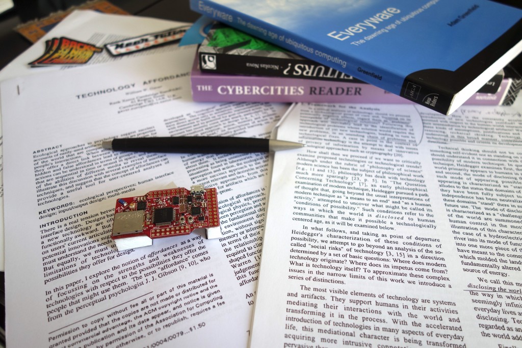
At Near Future Laboratory, we get the chance to meet amazing people active in the IoT who request critique and feedback on their products. We help them abstract from the hype of the dominant vision and gain fringe insights that can refresh their strategies. To do so, I often dig into the rich literature produced in the early days of ubiquitous computing. Some of the texts were published more than 10 years old, but — trust me — they all carry inspiring thoughts to improve the contemporary and near future connected worlds.

I hope this accessible academic literature is useful for people active in IoT curious to enrich their ethical, human, geographic and social perspectives on technologies. En route and beware of shortcuts!

The shift from the showcase of the potential of technologies to the showcase of active engagement of people

Written in 1995, Questioning Ubiquitous Computing critiqued that research in ubiquitous computing is conceived as being primarily as the best possibility for “achieving the real potential of information technology” and had little to do with human needs and much more with the unfolding of technology per se.

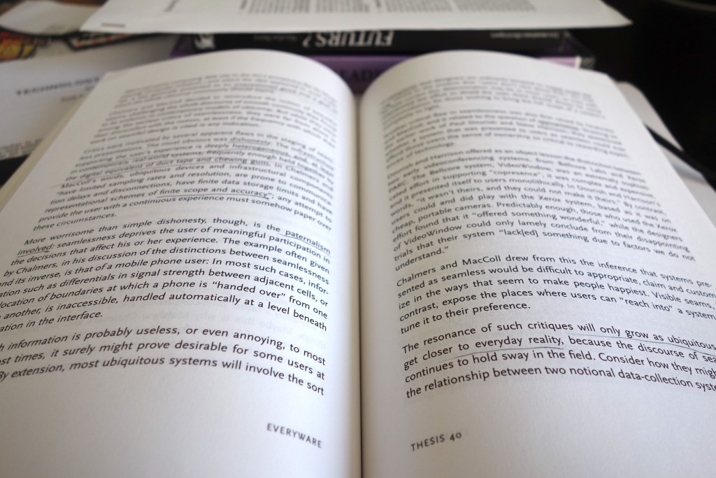
Ten years after, based on similar observations, but with more constructive arguments, Adam Greenfield wrote Everyware to question the implications of the scale up of ubiquitous computing and genuinely how to improve the connected world he coined as “everyware” [my notes].

DSC01861

In the same period voices raised to rephrase the approach of ubiquitous computing. For instance, in Moving on from Weiser’s vision of calm computing: engaging ubicomp experiences Yvonne Rodgers promotes connected technologies designed not to do things for people but to engage them more actively in what they currently do [my notes].

The shift from the design of a perfect future to the design for the messiness of everyday life

Similarly, in Yesterday’s Tomorrows: Notes on Ubiquitous Computing’s Dominant Vision Genevieve Bell and Paul Dourish highlight that the problems of ubiquitous computing are framed as implementation issues that are, essentially, someone else’s problem, to be cleaned up as part of the broad march of technology. In other words, the dominant vision of ubiquitous computing promotes an indefinitely postponed future in which someone else will take care of solving any technological (e.g. interoperability, fluctuant connectivity, or limited battery life) or social issues. Consequently, the text argues for a “ubicomp of the present” which takes the messiness of everyday life as a central theme [my notes].

That notion of messiness of technological settings provoked the interests of researchers to regard technological imperfections as an opportunity for the design of everyday life technologies. William Gaver pioneered work in that domain with his proposals of Ambiguity as a Resource for Design that requires people to participate in making meaning of a system [my notes] and Technology Affordances that promotes interfaces disclosing the direct link between perception and action. Practically, as advocated by Matthew Chalmers in Seamful interweaving: heterogeneity in the theory and design of interactive systems, this means that people accommodate and take advantage of technological imperfections or seams, in and through the process of interaction. In No to NoUI, Timo Arnall gives excellent additional arguments that question the tempting approach of “invisible design”.

Observing the dynamic relationship of technology, space and humans to demystify the perfect technology

In her PhD dissertation A Brief History of the Future of Urban Computing and Locative Media Anne Galloway shows that ubiquitous technologies reshape people experiences of spatiality, temporality and embodiment in the networked city. Her contribution augments an extensive literature that investigates how technologies are not the sole drivers of urban change and how they co-evolve with the urban fabric as they become woven into the social, economic and political life of cities. Code/Space is a seminal book by Rob Kitchin and Martin Dodge that precisely discuss software from a spatial perspective, analyzing the dynamic relationship of software and space. The production of space, they argue, is increasingly dependent on code, and code is written to produce space [my notes]. In that machine readable space bugs, glitches and crashes are widely accepted imperfections as the routine part of the convenience of computers [my notes]. Also, ubiquitous computing helps remake urban spaces through new formed strategies of security. For instance some chapters of the book Cybercities Reader talk about the emerging militarized control society encouraged by the dream of the perfect technology and the myth of the perfect power [my notes].

DSC01862

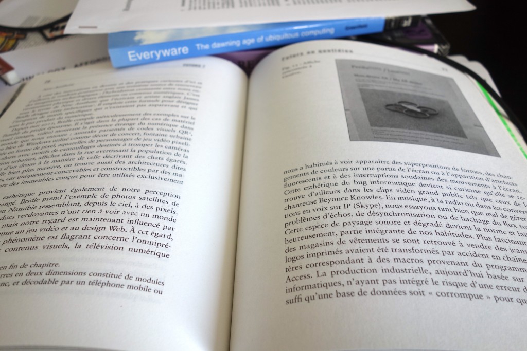
Precisely with the objective of moving beyond these dreams that foster indefinitely postponed futures, Nicolas Nova wrote Futurs? La panne des imaginaires technologiques that explores alternative ways to imagine and design future objects and experiences including Design Fiction.

I took many shortcuts to put together these heterogeneous publications but I hope that some of them can help you better question the dominant visions of the IoT and enrich your approach to improve any of the technologies that are constantly getting closer to people, their homes, streets and clothes (e.g. AI, Big Data, etc).
Curious Rituals

Curious Rituals is a project about gestures, postures and rituals people adopt when using digital technologies. It’s both a book documenting gestures we observed, and a design fiction film that speculates about their evolution

Location: Los Angeles, USA
Years: Summer 2012
Leader: Nicolas Nova
Method: Ethnography and prototyping

Curious Rituals was a research project conducted at Art Center College of Design (Pasadena) in July-August 2012 by Nicolas Nova (The Near Future Laboratory / HEAD-Genève), Katherine Miyake, Nancy Kwon and Walton Chiu from the media design program.

The project was about gestures, postures and digital rituals that typically emerged with the use of digital technologies (computers, mobile phones, sensors, robots, etc.): gestures such as recalibrating your smartphone doing an horizontal 8 sign with your hand, the swiping of wallet with RFID cards in public transports, etc. These practices can be seen as the results of a co-construction between technical/physical constraints, contextual variables, designers intents and people’s understanding. We can see them as an intriguing focus of interest to envision the future of material culture.

The aim of the project was to envision the future of gestures and rituals based on:

  1. A documentation of current digital gestures in a book format
  2. The making of a design fiction film that speculate about their evolution

“Curious Rituals” was produced as part of a research residency in the Media Design Program at Art Center College of Design in Pasadena, California.

One Moment Please

A curious addendum to account for a UI/UX muck up at a nearby gasoline station. These moments reveal these hybrid displays — both purposeful, and one made to accomodate for failures in the machine. And this second one — how peculiar. My new laser printer to replace the 10 year old one what that I printed my dissertation on back in 2004..it’s fine. A bit noisy. And it’s got a whole slew of LEDs to indicate status and all that. The one it replaced? It had a light that was either green (“all good”) or flashed amber (“something’s wrong..paper jam!”) In the last days of the old printer’s life — that light just stayed amber and never went back green. This new one? Well — it’s got lights for days and a sticker it came with so you can figure out what all the flashing codes mean.

Why do I blog this? Just trying to understand the complexities and vagaries of the interfaces to our devices. This complex of things that we need to know about when/where/how to operate them — how long to wait before doing something (slow machines? slow networks?), how to know what’s going on with the machine and the obscure ways they want to talk to us..flashing lights.

Continue reading One Moment Please

Just A Note: Design Fiction Is Not Design You'd Do Anyway + Motion Graphics

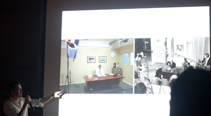
Just a thought and a note which is not an edict — just to say that Design Fiction can work as a way to have a thorough, sensible story that represents what could be. Yes, certainly it can. I’d argue that the work represented above called The Golden Institute and this other work called Super California: Forever Future by Sascha Pohflepp use Design Fiction to play around with what could have been and what could be in lovely, seductive visual narratives. Along with them go some fantastic exemplars and artefacts of those designed fictions. Those things — the artefacts and the films — are the design fiction itself. It’s more than the visual story, but the thoroughness of the stories with the artefacts that make them compelling and engaging. The films alone are great — but the projects come together in the coupling of the material with the visual documents.

There is a fine line between speculation in a way that throws things a bit off their track — gives some new, unexpected, perhaps illogical food for thought on a topic. The Golden Institute assumes that President Jimmy Carter’s ambitions for a comprehensive energy plan for the United States came to fruition. In the visual narrative we are given a documentary style government/corporate video of the plan and its possible outcomes. The objects help tell the story. Forever Future follows a rocket scientist as he explains how the hopes and ambitions for a future were not able to come about. He laments the failed ambitions but tirelessly archives new plans and new ambitions for future space programs — both those that succeed and those that feel.

The future when it arrives is more often than not as annoying, mentally stressful, mundane, boring and *blah as the present is. There’s lots to marvel about the today, about the present. But as much to ruefully shake one’s head about or decide — okay, this isn’t the future the zealous future pundits and moonbase architects said we’d get.

Okay. That may just be *me, but I prefer to think about what I consider truly novel, unexpected things rather than the same thing only done with a different brand on an existing object. That goes for failures as much as things that come to fruition, but often times in a different-than-expected form. Jet Packs exist — they’re just not commonplace or cheap or even safe. Doing Design Fiction is just as much about isolating unexpected outcomes — for example, the inevitable porn that will sustain any augmented reality future..it certainly won’t be mapping applications and city tours as the current augmented reality planners suspect to be that technology future’s economic lifeblood.

Doing Design Fiction as the normal, boring possibilities that are basically just visual narratives about the boring aspects of a new, provocative idea misses the grit and grime and disappointments and banality of most futures. That in my mind is closer to just doing traditional design — same stuff, different client; same stuff, only on the iPad instead of just the Web; same stuff, only with a different UI modality. Etc.

There are good reasons to use little films plus some motion graphics and, like..Mocha or SynthEyes or your favorite prosumer special effects package to make something look like it belongs in the scene and all that. I *get that. But in the case of doing normal design work, those little films are best suited to contributing to the refinement and iteration and exploration of a design project. It’s a perhaps more thorough way of figuring out how a UI should work because you have to go through the trouble of making a more resolved version than you might with static wireframes. That’s all. But, in this case — with due respect to what I am sure are fine, thoughtful, creative folks at Hotstudios — that ain’t Design Fiction in my book. That’s just good Design Prototyping with a little film.

Continue reading Just A Note: Design Fiction Is Not Design You'd Do Anyway + Motion Graphics

The iPod Time Capsule – Notes on Listening + Time + Design of Things That Make Sound

Over the week’s end I was in the back studio tearing down and rebuilding the wall of photos for the Hello, Skater Girl “side” book project. I was tasked with this particular endeavor by the guy I hired to do the book design. I knew I’d have to do it all along which is why I had put up sound board many, many months ago.

It was going to be an all-afternoon-into-the-evening effort, which is fine. Making a book is hard fun work. I needed music but I didn’t want to suffer the tyranny of choosing or even curating a list of things. I just wanted music to come out of the stereo.

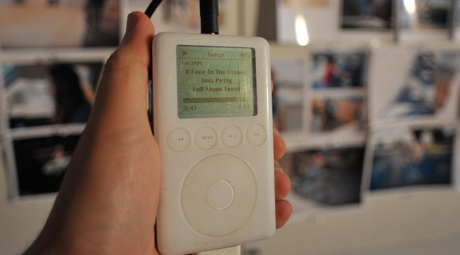
And then I remembered — I have my old dear friend’s ancient 2004 iPod. She gave it to me when she upgraded and I’ve never even looked at it. It’s just followed me around from city to city and house to house. There it was.

I plugged it in and it booted up just fine. And then I just pressed play and got to work.

It was a sea of past era music. Not super past — early 2000s. Perfectly fine. Some songs I may not have chosen. Some songs I didn’t know. Whatever. It was somewhat enthralling to realize I was listening to a frozen epoch of sound, incapsulated in this old touch wheel iPod. I sorta wish I had my original iPod. As it is, I still use my 80gb model, although that’s becoming a bit obsolete as a device in this era of having all-the-music-in-the-world-in-the-palm-of-your-cloud-connected-device.

I find it a bit incredible that this thing still works. I mean, it’s a hard drive with a little insect brain — so there aren’t firmware drivers to suffer incompatibilities with a future it was never destined for. Even though it has become obsolete in the consumer electronics meaning of obsolete — it can still work and sound just comes out of it the way an audio device should function.

That’s significant as a principle of audio and sound things, so I’ll say it again sound just comes out of it — and it does. The old trusty 3.5mm jack delivers amplitude modulated signaling in a way that is as dumb as door knobs — and that is as it should be. Not every signal should or needs to be “smart”..just like every refrigerator need not be smart. It’s back to basics for very good reason, I would say. (Parenthetically, I’ve been assaying a fancy new mixed-signal oscilloscope which can take an optional module to specially handle audio signaling — there are audio processing…)

What’s the future of that for the collective of things? How many things will work beyond their time? What are the things that won’t need an epic support system of interfaces, data, connectivity to *just work* after their time in the light? What of the cloud? When it breaks, grows old, has an epic failure that makes us all wonder what the fuck we were thinking to put everything in there — will my music stop coming out of my little boxes?

As I pinned up lots of little photos and every once and again checked the iPod to see what was playing, I thought about some stuff related to the design of audio and design of things that make sound.


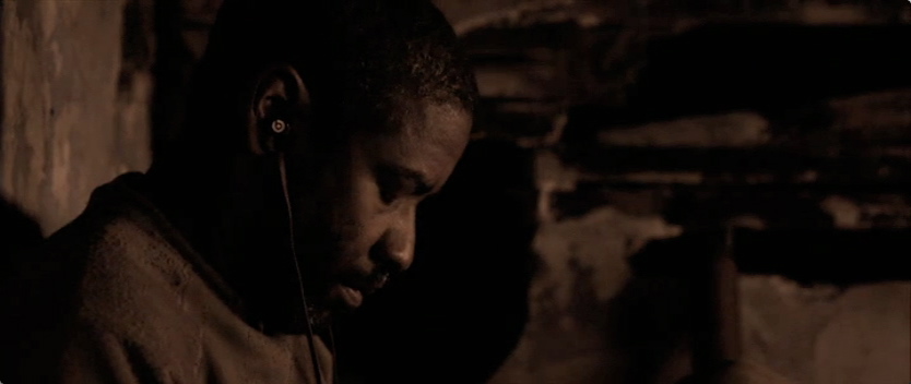
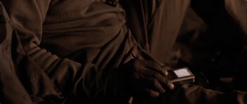
iPods and music players generally are great single-purpose devices from the perspective of their being time capsules of what one once listened to. You’ll recall the role the iPod played in the apocalyptic tale “The Book of Eli” — it becomes a retreat to a past life for the the messianic title character. And despite the end of the world (again) the device will still work with a set of headphones the (potentially unfortunate) propriety dock connection and means to charge it through that dock connection. Quite nice for it to show up as a bit of near future design fiction.

What will happen to the list of music, which already seems to be a bit of a throw-back to hit parades and top 100s sorts of thigns. Those are relics from the creaky, anemic, shivering-with-palsy, octogenarian music industry which gave you one way to listen and one thing to listen to — broadcast from the top down through terrestrial radio stations that you could listen to at the cost of suffering through advertisements.

Now music (in particular, lets just focus ont that) comes from all over the place, which is both enthralling and enervating. Where do you find it? Who gets it to you and how? How do you find what you don’t even know is out there? Are there other discovery mechanisms to be discovered? Is this “Genius” thing an algorithmic means of finding new stuff — and who’s in charge of that algorithm? Some sort of Casey Kasem AI bot? Or the near future version of a record play graft scam? Or do we tune by what we like to listen to?

And despite the prodigious amount of music on this flash-frozen iPod from some years ago — now kids are growing up in a world in which many orders of magnitude *more music is available to them just by thinking about it..almost. It’s all out there. Hype Machine, Spotify, Last.fm, Rdio, Soundcloud..in a way YouTube — new music players and browsers like Tomahawk, Clementine — whatever. These new systems, services, MVC apps or whatever you want to call them — they are working under the assumption that all the music that is out there is available to you, either free if you’re feeling pirate-y or for a 1st world category “small fee” if you want to cover your ass (although probably still mug the musicians.) The licensing guys must be the last one’s over the side on this capsizing industry.

Listening rituals must be evolving as well, I’d guess. Doing a photography book about girl skaterboarders means that you end up hanging out with girl skateboarders and you end up observing what and how they listen to music. What I’ve noticed is that they do lots of flipping-through. They’ll listen to the hook and then maybe back it up and play it again. And then find another song. It’s almost excruciating if it weren’t an observation worth holding onto. I wonder — will a corner of music evolve to nothing but hooks?


Spotify Box project on IxDA awards thing is interesting to consider. I love the way the box becomes the thing that sound just comes out of. And the interaction ritual of having physical playlists in those little discs is cute. The graduate student puppy love affair with Dieter Rams is sweet in an “aaaahhh..I remember when..” sorta way. It’s a fantastic nod to the traditions and principles of music. And the little discs — well, to complete the picture maybe they should be more evocative of those 45 RPM adapters some of you will remember — and certainly plenty of 23 year old boys with tartan lumber jack flannels and full-beards are discovering somewhere in Williamsburg or Shoreditch or Silver Lake. They’ll love the boo-bee-boo sound track that the project video documentation comes with. Great stuff. Lovely appearance model. For interaction design superlativeness — there’s some good work yet to be done.

Okay. So…what?

It is interesting though to think of the evolution of things that make sound. And I suppose there’s no point here other than an observation that lists are dying. I feel a bit of the tyranny of the cloud’s infinity. If I can listen to *anything and after I’ve retreated to my old era favorites — now what? The discovery mechanisms are exciting to consider and there’s quite a bit of work yet to be done to find the ways to find new music. It definitely used to be a less daunting task — you’d basically check out Rolling Stone or listen to the local college radio. Now? *Pfft. If you’re not an over eager audiophile and have lots of other things to do — you can maybe glance around to see what friends are listening to; you could do the “Artist Radio” thing, which is fine; you could listen to “artist that are like” the one you are listening to. Basically — you can click lots of buttons on a screen. To listen to new music, you can click lots of buttons on screen. And occasionally CTRL RIGHT-CLICK.

Fantastic.

In an upcoming post on the design of things that make sound, we’ll have a look at the interaction design languages for things that make sound.

Before so, I’d say that clicking on screens and scrolling through linear lists have become physically and mentally exhausting. Just whipping the lovely-and-disruptive-at-the-time track wheel on an old iPod seems positively archaic as names just scrolled by forever. The track wheel changed everything and made the list reasonable as a queue and selection mechanism.

But, can you imagine scrolling through *everything that you can listen to today? What’s the future of the linear list of music? And how do we pick what we play? What are the parametric and algorithmic interaction idioms besides up and down in an alphabetically sorted list of everything?

Good stuff to chew on.

More later.

Why do I blog this? Considerations to ponder on the near future evolution of things that make sound and play music in an era in which the scale of what is available has reached the asymptotic point of “everything.” What are the implications for interface and interaction design? What is the future of the playlist? And how can sound things keep making sound even after the IEEE-4095a standard has become obsolete. (Short answer — the 3.5mm plug.)

Continue reading The iPod Time Capsule – Notes on Listening + Time + Design of Things That Make Sound