Interaction Awards 2012: Drift Deck for People's Choice

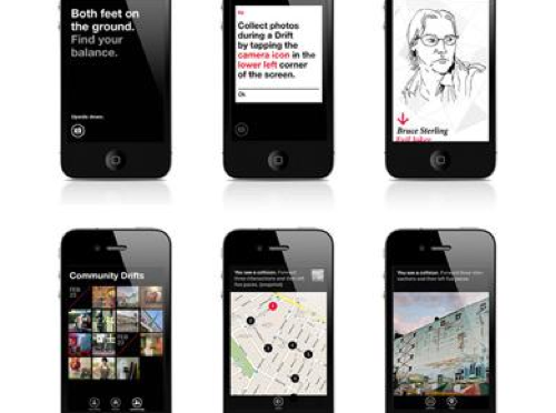
Drift Deck is up for the IxDA Interaction Awards in the “People’s Choice” category. Which isn’t the “Jury’s Choice” but — whatev. It’s the People, so we’re hustling to make you, the People, aware of this chance for you to choose what is the Choice of the People. For Interaction Design Awards.

Please give it a vote.

What makes Drift Deck chooseable? Well — it does something different and provocative in the world of interaction design for the things we do when we’re going/finding. The canon of interaction design for what were once fondly called “maps” is pretty stuck in the mud. Nothing extraordinary going on there that you wouldn’t expect from the next generation of mapping things.

What we did with Drift Deck was look at the world a little sideways and imagine a world in which the map was a bit dynamic and the act of going/finding was a bit less, you know — purposeful in a tedious, dogmatic sort of way.

It’s an otherworldly map app, if you will. Drift Deck is meant partly to be pragmatic for those times I find myself somewhere and have no idea what to do if I have an hour to wander about. (Sometimes we all need a bit of a start, or a script to follow.) And of course, it’s playful in it’s nod to the Situationists and their experiments with re-imagining urban space.

The principles led directly from the Drift Deck: Analog Edition that you can find here and more here.

These are the kinds of projects we do here. They’re not “Conceptual.” That cheapens the hard work that goes into them. We write code. We do illustrations of things that get properly printed on big Heidelberg presses. We put together electrical components and have printed circuit boards made and populated with parts to create new sorts of interaction rituals, new sorts of devices — new things that are different from the old things. These are ways of evolving the ordinary to make possibily otherworldly, extraordinary things. They come from ideas that we then evolve into material form so that the ideas can be held and dropped and switched up, on and off to be understood properly.

So, just to be clear — Drift Deck isn’t a conceptual bit of wankery. It’s a thing that got made. Ideas turned into lines of code turned into compiled bytecode. Oh, look! It’s running on my iPhone! Doesn’t feel very concept-y to me.
Continue reading Interaction Awards 2012: Drift Deck for People's Choice
The Faint Scent of Brimstone with Notes of Sulfur

Note to Self

A hand written note to remind me to stop and make a call at 2p. That’s all. I’ve been thinking about notes and reminders lately.

If I followed this to its logical yet design fiction-y conclusion, I’m sure I’d find the devil himself. <a href="The New York Times does a slightly fluffy anecdotal piece on toddlers strangely addicted to iPhones. If I were in charge I’d consider legislation to slap little warning labels on these damn things. Apple lovers — many of whom have fancy jobs enough to afford a new iPhone to replace the perfectly good one from last year — are probably huffing with hands-on-hips (thumbs forward) dismissing the early warning signs which I am sure are weak signals of a species transformation of the sort that shifts the gray matter around in a horrifyingly Crichton-esque fashion.

Continue reading The Faint Scent of Brimstone with Notes of Sulfur

Interoperability

Sunday September 20, 17.43.18

A curious interoperability protocol, wherein the address for some weird place in Seoul has been found on an iPhone and must now be entered into the GPS of the taxi. A simple affair, with minimal bumps often enough, particularly because the map on the iPhone shows the address and streets in Korean, which is great for the taxi cab driver, but miserable for the the traveler who can only hope that the locale on the map is actually where he would like to be.

Why do I blog this? This are useful moments to capture, where language, culture, objects, data come into conflict and must work their way around one another. I am told the iPhone isn’t available in South Korea at the time of this photo, so you have this foreign object — one that is probably quite legible as the iPod Touch was spotted around the city — and a baroque assemblage of devices, machines, transaction mechanisms, remote controls, identity stickers, car controls, radios, etc. I would have to contrast this with the notion of seamless perfection and interoperability that is often the image of the future transportation dashboard.
Continue reading Interoperability

To The Accessory Crap Heap

Tuesday June 23, 07.53.59

Yes, an old original iPhone car charger and…what’s this? The iPhone 3Gs cannot take the same charging accessories as the iPhone original!? So..basically the introduction of something new forces something old to be tossed out? Maybe there’s something that can be done with the old charger, but, I mean…really? Is this “Good Design” or adhering to those Green sensibilities that Apple is so often associated?

Think not.

Epic Fail. Epic, epic fail. I’m slack jawed. Shocking.

Why do I blog this? Something is always wrong. The whole smash barely works, seriously. It’s not uncommon to get Apple fetishists asking me why Nokia does not do things as cool. There are all kinds of good and bad reasons. But, one of the good ones that makes the most sense to me is that Nokia has to design compatibility (which it does not always do well, to be honest) across hundreds of its factories’ products, and with so much stuff out in the world that, every year if you put them all end-to-end? They’d wrap around the world more than once. But, if you make three or so phones and you can’t get them all to use the same charging specifications? That’s just really bad. Imagine, every upgrade has someone tossing some entirely opaque hunk of plastic and electronics into a bin.

(Oh yeah. Rem Koolhaus’ wonderful Delirious New York: A Retroactive Manifesto for Manhattan is about the only happy thing in this photo.)

Continue reading To The Accessory Crap Heap

Locative Play

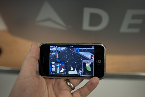
Ian Bogost‘s and his Persuasive Games operation have introduced an iPhone game called JetSet
— a curious little gem that situates specific locations as the enforced zone for game play.

Very interesting play mechanic — a location-based game that you can basically only play when you’re at any one of a huge list of airports in the world. And, your score (if it’s good enough..) goes up on that airport’s leader board. The only way to play, say — Madrid Barajas International Airport is to go to Madrid Barajas International Airport. You have to physically be at the airport to play and get on that airport’s leader board, get that airport’s “souvenirs” (this game’s equivalent of blue gems), and so forth.

Oh, the game — okay, you’re a security screener dude screening passengers, and the "prohibited" list changes so you’re constantly having to figure out what to remove from the traveler, from the mundane — shoes? hat? water bottles? coffee? to the obscure — bacon? rocks? snakes? robots? pudding cups? hummus? There should be a way to put leader boards up along on my Dopplr page and Dopplr personal annual report!

It’s simple and an exciting play mechanic that’s intimates at the near future of all kinds of interactive experiences as the digital continues to leak out into the real world. Nicely done.
Continue reading Locative Play