Critical Engineering


* The Critical Engineer considers Engineering to be the most transformative language of our time, shaping the way we move, communicate and think. It is the work of the Critical Engineer to study and exploit this language, exposing its influence.

* The Critical Engineer considers any technology depended upon to be both a challenge and a threat. The greater the dependence on a technology the greater the need to study and expose its inner workings, regardless of ownership or legal provision.

* The Critical Engineer raises awareness that with each technological advance our techno-political literacy is challenged.

* The Critical Engineer deconstructs and incites suspicion of rich user experiences.

* The Critical Engineer looks beyond the ‘awe of implementation’ to determine methods of influence and their specific effects.

* The Critical Engineer recognises that each work of engineering engineers its user, proportional to that user’s dependency upon it.

* The Critical Engineer expands ‘machine’ to describe interrelationships encompassing devices, bodies, agents, forces and networks.

* The Critical Engineer observes the space between the production and consumption of technology. Acting rapidly to changes in this space, the Critical Engineer serves to expose moments of imbalance and deception.

* The Critical Engineer looks to the history of art, architecture, activism, philosophy and invention and finds exemplary works of Critical Engineering. Strategies, ideas and agendas from these disciplines will be adopted, re-purposed and deployed.

* The Critical Engineer notes that written code expands into social and psychological realms, regulating behaviour between people and the machines they interact with. By understanding this, the Critical Engineer seeks to reconstruct user-constraints and social action through means of digital excavation.

* The Critical Engineer considers the exploit to be the most desirable form of exposure.


Came across this Critical Engineering Manifesto by J. Oliver, G. Savičić, D. Vasiliev and available (as Manifestos seemingly must) in eleven languages, just in case anyone may be left out and not know what to do.

A couple of reads through, I want to endear myself to the sensibilities here. I think I am endeared, and maybe a bit anxious by the vagueness of the Manifesto. Maybe more prose or exemplars in material — made things that represent what is to be engineered or how the engineering practice of the critical engineer proceeds.

But, it *is a Manifesto and so therefor more about the spirit and aspiration of turning the instrumentality of engineering into a critical function that can effect change in a larger systemic way — a way larger than the service of Capital and the mindless making of things for the sake of making more things that can be sold, or making more things (platforms) that can sell more things (content.)

The Critical Engineer Manifesto raised more questions than it intended, I think. It’s not actionable. I’m not sure what to do if I want to be a Critical Engineer. Some of it I get — like, engineering is a form of social work; engineers “engineer”, manipulate, provide frames within which people who use engineered things are able to think/operate/behave. That much is clear — and perhaps that’s the start of it. That engineers have an exceptional power to create frameworks of possibility.

The difficult bit to overcome if there is to be any sort of social-political critical mode to engineering is that the sensibility and spirit of engineering is to serve the technology and the instrument and, more often than not — the engineers own sense of what is good, right, correct, suitable, satisfying, best-for-the-user, best-for-me-the-engineer, wizard-y-hack-that-will-make-other-engineers-stand-up-and-nod-knowingly, etc. That’s ingrained. It’s systemic and a cornerstone of the pedagogy of the engineer.

But..more questions.

* Who *are these Critical Engineers, anyway? Or who are they now that they become Critical Engineers? Are they filling the ranks of Lab126? Hanging out in the world’s Hacker Spaces? Are they black hat and subversive?

* If the Critical Engineer considers the most desirable form of exposure to be the exploit — who/what are they exposing? Why are they exposing it/them?

* Why are rich user experiences (whatever those are — I wonder myself) to be suspected?

* Is the ‘awe of implementation’ the ingenious hack? What are those methods of influence that need to be determined?

* Does a Critical Engineer really believe that there is a thing called the ‘user’?

It’ll require more sub-parts, stories, and prose to make this Manifesto more than a statement that has the potential, as all Manifestos do, to enforce its own tyranny.

Another little alarm bell that goes off in my admittedly hard head — it’s quite Academic. I think if you put this in front of one of those guys who is actually in a position to effect material change at Lab126, for example — they’d shrug and wonder “..the fuck?” If you put this out as a little art pamphlet that a few hundred people see at Transmediale or Ars Electronica — you’ll probably win a prize. No one’s going to make more clever, critically engineered, mass-market e-book readers though.

I understand Manifestos to be about effecting material change. Doing so in a world of Consumer Electronics (to extend the CE imagery here, which I think is on purpose) is millions-of times more difficult than in the really teeny-tiny world of one-off clever academic-art-technology-design thesis/research/festival projects.

((I had a meeting a week ago. We’re design-engineering with a twinge of design-fiction-ing a new lovely Consumer Electronic. The number of people who were candidates for the dealio worldwide? About 7 million. Sounds like a lot, dudn’t it? Well — turns out arguing that that is a market for a clever new thing is challenging in the least.))

Art-design-tech will always be critical and marginal. It’s the legacy of institutions at the margins to be critical and to manifest their critical stance in Manifestos. Those institutions and critics and artists and so forth — they are where new ideas are supposed to come from — where change comes about. Research, thought, theorizing, publishing, being independent and being different and thereby always, perpetually stuck in a position where you have to challenge.

Personally — I decided that academia is not the place to affect material change for all sorts of reasons. It may have been in the romantic old political days. Nowadays? It’s as complicit in creating crappy stuff as “them”. The political, economic, legal, property & ownership motivations are nastier than anything in a “normal” Corporation. ((Don’t forget — University is a Corporation, too.))

Why do I blog this? I like the spirit and aspiration here, even if I don’t know how to turn these statements into something I can do to bring about the sort of change in sensibility that I think is at the heart of this here. There’s a practical side to doing engineering and doing design that brings about change. That’s the heart of the Design Fiction ‘movement’. It’s partly critique, but the shortcoming of critique or critical positions is that they often don’t tell you what to do. Nowadays I’m more intrigued by how you can effect change from inside the industrial machines so you have scale and you have influence. I’m not convinced it’s possible, but if you can whisper the right incantations in the ears of people who can sign-off on good new less crappy stuff, there’s an opportunity. I’ve been told, and once recently accidentally overheard — it’s a long shot, doubt it’ll happen. It’s fun to try anyway, and learn along the way.
Continue reading Critical Engineering

Weekending 10302011

Oh, okay. Last week I was in London.

There was some fun, cool Nokia stuff going on — besides Nokia World, which I didn’t attend only because there were also other things going on, including this event at the Design Museum called People Made in which a well-curated exhibition of Nokia’s contribution to the world of mobile social networked stuff. Despite assy and snarky remarks on the influence Nokia has had on the design of these sorts of things, I thought this was quite good, quite legible and just small enough to be digestible and large enough to note the important bits, like the evolution of mobile picture taking, degrees of portability and things to come in the near future.

There was a swell two day workshop for Project Audio with the fine folks at the Really Interesting Group. That included some days inside at Whitechapel Gallery and a field trip to the Science Museum, which has a great exhibit of audio things from the early 20th century into the networked age. Old radio sets and things with knobs are great for thinking about what the future holds for sound design and audio devices and talking to people. And, it was fun to see Listening Post there — I didn’t know that the science museum had bought one. That’d make the third exhibition space in which I’ve seen it — first at The Whitney when it premiered, I believe way back in the day. Then at the San Jose Museum during ISEA in 2009 I think it was. It holds up remarkably well. It’s quite prescient, too — in particular as regards this idea of “trending topics” in some sense. I’m not sure precisely what algorithm Mark Hansen is using to extract content (obviously chats and discussions in text) — but one gets the sense that the statistics is identifying things of import or interest. Now — it might not be what *most people are talking about, but they seem to become poignant statements indicating states of mind. There is also quite excellent use of silence in such a way that one is not thinking — huh..is this thing broken? Some ambience and machine noises give the device its mechanistic quality that is nice and sculptural and real and that of a thing with momentum. Which is very much unlike most digital/computational devices. I really like the machinic character of this thing, Listening Post.

I had a visit with James Auguer over at Design Interactions at the RCA. Nick Foster was there as well. That was fun. I’d never been. It felt like an art college. I gave a little impromptu talk to a clutch of students. And Noam Toran was there and gave me some lovely documentation of his projects. I especially like the series of objects he made called The Macguffin Library. It beautifully captures the way Hitchckock’s use of these opaque plot devices are objects to move a story — which is a concept that can be directly applied to the Design Fiction notion. These are things that are props that stand in for whatever it is that motivates and moves a story along. They’re nice as a concept because the thing itself matters even less than its functionality — except insofar as its functionality is to motivate a story.

There was a nice afternoon spent with the partner-in-crime Nicolas Nova discussing the future of the Near Future Laboratory and some exciting evolutions of our activities that will happen quite soon. Expect more to be going on here and some new folks coming along to make more things and create more weird implications and provocations. All discussed over toast, beans, sausages and eggs.

I was super excited that Geoff Manaugh rang to see if I’d be around to participate in this event at the Architectural Association called Thrilling Wonder Stories. I don’t know how to describe it except to say it was a full day of a seminar of presentations and discussions on a variety of Thrilling Wonder Story-like topics. I shared some thoughts and perspectives on designing with science fiction at the end, together with Bruce Sterling and Kevin Slavin. That was swell — fun and a great way to end the week in London.

That was pretty much it, except for one little thing that Bruce left me thinking about after that four hour dinner the last night. Venn diagrams. Evidently done by this fellow called Hugh Dubberly and the diagram contains the three circules and one is “DESIRABLE” the other is “BUILDABLE” and the other is “PROFITABLE”. The overlap in the center is what markets and capital understand as “real” stuff. You get these annoying debates within making-industries where that is the “real” deal. It was the introduction to my brief 15 minute talk at Thrilling Wonder Stories — people get shy and apologetic when they discuss things outside of that center “sweet spot” of things that are all-of desirable, buildable and profitable. “Oh, sorry — this is just an idea” or — “Oh, this is only a demo” or — “Oh, this is just a concept/video/bit-of-fiction”

Needless to say — we here in the Shameless Speculation Department of the Near Future Laboratory think that position is rubbish. There should be no apologizing for the imagination. Everything counts. I’d say even that the things outside of the sweet-spot even more than those in it. That sweet-spot is modifiable. Just cause something can be built does not make it “more” than the thing that can be massively manufactured because it fits in someone’s measure of what that sweet-spot consists of — what its parameters of “sweet-spotiness” are. And then this introduces a discussion about those parameters and scale and what profitability consists of.

That’s it.

Continue reading Weekending 10302011

Janet Cardiff Sound Art

JCB_25072011_080845_9970

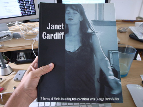
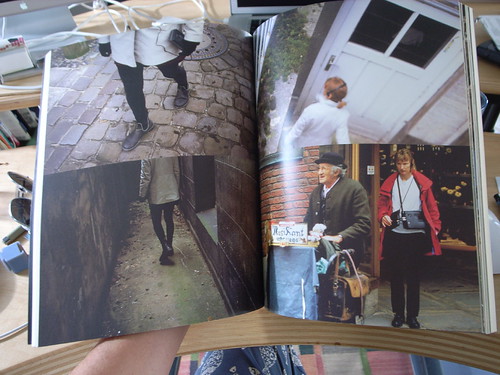
Just a quick note on some material in this hard-to-find catalogue resume of Janet Cardiff‘s work.

It’s called Janet Cardiff: A Survey of Works, with George Bures Miller

Cardiff is well-known for her early-days “sound walks” where participants were given a Walkman or similar device to listen to as they walked about. Stories were told or experiences recounted in the audio track. The idea is simple, but from what I understand (never had the pleasure..) it was the story that made the experience engaging.

I first came across Cardiff’s work while doing sort of informal background research for the PDPal project where we were trying to understand interaction in the wild — away from desks and keyboard and all that.

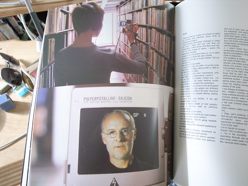
What I find curious about her work is the way it augments reality before people even really thought about all this augmented reality stuff — but, it does not fetishize little tiny screens and orientation sensing and GPS and all that. It uses our earballs rather than our eyeballs — and somehow that makes it all much less fiddly. Although — if you look carefully at the bottom image you’ll see an image from a project in which one does use a screen — from a small DV camera which is playing a movie for you as you go along.

Janet Cardiff

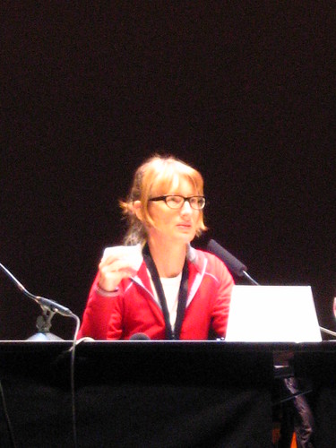
Parenthetically, I think Cardiff had one of the best augmented reality projects with her telescopes. I’ve only seen this as documentation when I saw Cardiff talk in Berlin at Transmediale 08. There should be more documentation of this somewhere, but the effect was to look through the telescope and see a scene in a back alley that was the back alley — only with a suspicious set of activities being committed — perhaps a crime. The illusion was in the registration but the story was in the sequence of events that one saw, effectively the story. So much augmented reality augments nothing except coupons and crap like that. There is no compelling story in much augmented reality, but I don’t follow it closely so maybe things have changed.

JCB_25072011_080858_9971
JCB_25072011_080945_9972

Continue reading Janet Cardiff Sound Art

PDPal in Talk To Me


Well, I have a fondness for this old project — PDPal. PDPal is now enshrined on the Talk To Me exhibit’s little online catalog of thing-ies. Without getting assy about it, I think it deserved to be in the physical exhibit with all the installation mechanics we had built for its display in the real world..we could’ve even bought a bunch of Palm m505’s off of EBay and given them out with PDPal on them, those things are so cheap nowadays.

*shrug.

There’s no figuring the mind of the institutional curator. Plus, they over at MoMA have their perennial favorites that they shove into every show.

It’s on the list of @2011 Goals that I keep here to re-do in something like iOS — anything modern. I remember squirreling away in the depths of Metrowerks Code Warrior writing Palm PDA code to get this thing working. Seeking support from some dodgy Russian software company that made a little library I needed to use. Being up until the crack of dawn in an artist’s panic thinking — “This is it..This’ll be the end of me.”

At the end of it all — it was fine. It’s a lovely little bit of futuristic serendipity-y mobile app-y application. I don’t mean to get all, like..”back in my day”-y on you but, like — all the iPhone app kiddies? You have little idea what it was to program a PDA — that awful industry term that some knot head in the business unit came up with to describe these things. It was ugly. Thoroughly barely fun. There were no APIs for anything. You wrote to the metal and built things up from there. Really nasty. I reckon, even with my squeaky iOS skills that I could have an iOS edition of PDPal written in a week..couple of weeks if I work just at night.

Anyway — enough reminiscing. I’m just glad this one still has a little life left in ‘er.

Check out the main PDPal page here for more data points and to download the emulator, if you want. It’ll be wonderfully baffling.

Continue reading PDPal in Talk To Me

Cory Arcangel Show At The Whitney As Evidence That Retro Is As Dead As Disco

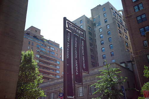
So, I’ve admired Cory Arcangel’s work, more or less. Maybe I just really enjoy the seduction of Super Mario Clouds. I had prints once. And I have the little blue artist’s book somewhere. The one with the embossed blue clouds. I didn’t know about the show at The Whitney Museum until I was back home and happened across mention of it in an issue of New York Magazine laying around the house. I was determined to see it before I left, which would be complicated by obligations and promises to myself and other things. But — I’d do it. That and the ICP’s Elliot Erwitt exhibition.

ICP first, then uptown and over east to The Whitney. $18 USD and I was in. I just went straight to the 4th where Arcangel had the entire floor. They allowed photography by special dispensation, so that’s always exciting. I never really understood — in this day and age — the no-photography thing in museums. I guess it’s so people don’t stand around taking photographs of art instead of just looking at it. In any case, you could take photographs at Arcangel’s exhibition.

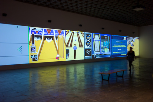
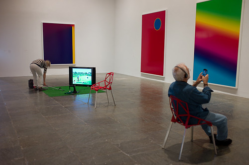
First thing, you’re inundated with the cacocophony of a bunch of retro bowling games projected ginormously against a wall. Okay. Seems Arcangel-y. The 8-bit video game thing. Seen this stuff. I guess most of America has not. I watched and *shrugged and figured I needed to get warmed up. Around the corner so fuck-off big C-Prints of Photoshop gradients and the like. I was told I should appreciate these cause it’s, like..I dunno..something anyone can do? And it’s digital? And now, like..it’s a C-Print that’ll last longer than something-or-another..time? Or, like..who knows? Maybe it’ll be important cause it’s a C-Print of something art-y in an ironic, Williamsburg-y sorta way..like painting a painting on a painting canvas that’s all white? Or maybe black or whatever happened back then.

*Disappointed.

Then there was the pitch of astroturf and a golfing game. And a couple of chairs and a guy listening to something about the show I guess and taking an iPhone photo of one of the C-Prints.

Oh. That’s why they don’t want people taking photos in museums? So, like..you don’t sit there taking photos of things in museums while just sitting there?

*Whatev. Still not feeling it.

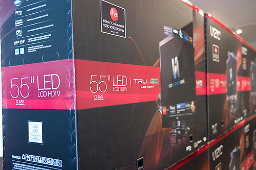
Next room. A bunch of unopened boxes of big commodity flat screens with lots of trandemark technology logos like Bluetooth and crap all over them. This is when I started reading the wall text of the pieces of art. That were, like..the art exhibition wall text equivalent of those business books with the long titles that basically explain what you’re supposed to know about by the time you’ve finished reading the book. In this case, the wall text was so didactic and explanatory — that I got the sinking feeling that, had this been a movie? It would’ve been a movie in which the ushers would be waiting to explain to you what you just saw, with the assumption that you’d have no idea otherwise.

*That’s sad.

There was a tape loop of Seinfeld episodes — the one’s in which Kramer invites the coffee table coffee book. More wall text explaining why the hell this is art (besides the fact that an artist made it). It was sad wall text. Like..wall text for the shake weight that explains why you should be buying it to help you “get fit” in case you thought it was an erotic massage toy. What I saw? What I saw was an assembly of Seinfeld out-takes that I might expect to see when Ken Burns does the epic documentary of late 20th century American comedy television. It’s just outtakes. You laugh only because you remember laughing while you were watching it for real on your own sofa (if you laughed) but you certainly forget you’re standing around in The Whitney.

*Feeling anxious about the $18.

Then there was a screening room with a barely tolerable assemblage of YouTube excerpts of guys rocking the guitar with each clip containing a note or passage from a Paganini riff that metal-y guitarist use to exhibit their prowess on the guitar. I get it. It’s a coherent collage of lots of YouTube videos of lots of YouTubers doing the same thing only they’re all different dudes with different guitars in different bedrooms, with..&c.

*Sigh.

And that’s it. I expected something else. The retro thing feels well played out, I have to say. 8-bit is as exciting as those hipsters shooting with film cameras or using typewriters. Video of 90’s sitcoms is just video of 90’s sitcoms. Like being a dude with no cable at home but now you’re sitting in a Hampton’s Inn with jetlag, flipping the channels and you come across the 90’s channel. That’s not fun. And boxes of commodity television sets? I mean..Not sure what to do with that.

I feel like I lost a twenty dollar bill. I’m glad I didn’t rush the ICP. It was well-worth the time dawdling over the lovely photography, even if I had to rush The Whitney.

Why do I blog this? Cause I went there and it made me think about work that I had a thing for but now it seems that 10 years later it’s not the same thing and it’s more tiresome on my brainball. I like the idea of canning stuff from 10, 15, 20 years ago and then pointing to the can and saying what the contents says about “today” or how it’s a little timecapsule of yesteryear and we have a connection to those moments. But it’s more our connection than an artists/artistic translation of those things. And the other thing is? The other thing is that institutional art struggles and will continue to struggle with giving the network’s toys and the industrialists’ toys a place to live in a white-walled space. Youtube in a museum viewing closet all big like that? It’s something else and it’s not quite what is sold on the wall text, which hyperintellectualizes the medium. Same thing with 8-bit bowling games (and just watching 8-bit bowling games). It’s excruciating in a way to not be able to fiddle with it. And to see them on 16 foot walls.

Continue reading Cory Arcangel Show At The Whitney As Evidence That Retro Is As Dead As Disco

Quiet But Not Quiescent

Judge not the less yammer-y state of the studio blog to indicate that there is nothing worth yammering about. It’s just that the clang of steel caressing code has been going on and that in great measure, too. Some of you may have glimpsed and grinned at the fantastic electronified edition of the paper Drift Deck that we developed a couple of years ago. That’s right. We’ve added *batteries to the Drift Deck and it’s fallen into the *app well..it’s an app which is fantastic because it means the last remaining physical card editions can become properly *artisinal and the electronic battery editions can spread the sensibility of the Drift Deck concept to the rest of the world.

Release is imminent. Prepare ye iPhones. Hop expectantly from foot-to-foot. More news in a short while, including linkages to downloadables. In the meantime, check out the new Drift Deck webified “page” and the fantastic roster of hammererers that batteryified the ‘deck.

..And then — onto the next thing here. It’ll be quiet a little, but good things are baking in the kiln, rest assured.

*Willow next. The superlative friendregator for the discerning social being.
Continue reading Quiet But Not Quiescent

Grafikdemo by Niklas Roy

JCB_29102010_060645_9850

While in Basel a few weeks ago, Nicolas and Cris and I stole off for a few moments to check out this typically expensive art and technology exhibition in the docks region of the city. I forget the name of it, and also did not have any paper money so I didn’t get an exhibition catalog. Nicolas has a more complete description of the project on his recent post about Grafikdemo by Niklas Roy.

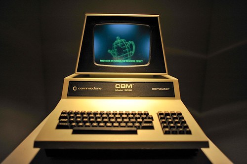
I just wanted to share a thought I had about the project which is the curious way it was manufactured. Interior to the display cabinet of this lovely old Commodore is a physical object — a lattice frame colored in a green florescent paint of some kind that made it look like it was the old fashioned style of CAD rendering where everything was green basically (I think) because people were using green CRTs (for those too young to remember — that’s cathode *ray tube, which now sounds quite archaic). The object can turn and tumble across the x, y and z axis by using the keys on the number pad of the CBM. It’s quite nice. It’s both an homage to an earlier day and a joke, of course, in a way. Nice project.
Continue reading Grafikdemo by Niklas Roy

Weekending 09192010

Friday September 17 18:56

Okay. There was some more fussing about to pull together a reading list / viewing list for a new project I’ve been thinking about that is in and around augmented reality. The viewing list includes the usual suspects — Terminator 2, They Live (which I showed in the studio — and only three or four people showed up to, which is lame), Until the End of the World, Iron Man, and 2081, although that last one may be a stretch. There may also be some of the important “boot-up” moments from RoboCop that are relevant.The point is to look sideways at the topic from the get-go and not assume the outcome before things get started, which can happen very easily when the project is quite specific. ((It’s not broad at all — as a matter of fact, the name basically says what it wants to produce, which is the wrong way to do any project, I think.))

Friday September 17 17:06

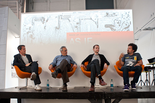
I scrambled over to Art Center College of Design Friday afternoon to participate in their As If.. / Made Up research residency on a panel discussion with Norman Klein and Sascha Pohflepp, which was good fun and engaging and helpful for my own questions. I think I’m now more-or-less set on creating a catalog of genre conventions for design fiction, especially as it happens in film. Getting a copy of that book “Cinematic Storytelling: The 100 Most Powerful Film Conventions Every Filmmaker Must Know” (bleechh..these titles..)) made me think about how I might structure such a catalog and then of course I’m forced to think of why this might be useful. Part of it is just the process of forcing myself to identify what might be curious, useful or intriguing visual patterns and story telling techniques that make it possible to imagine the future, or some aspect of it. I was thinking this could make a curious DVD of some sort.

Get the flash player here: http://www.adobe.com/flashplayer

var so = new SWFObject(“http://www.db798.com/pictobrowser.swf”, “PictoBrowser”, “500”, “500”, “8”, “#EEEEEE”); so.addVariable(“source”, “sets”); so.addVariable(“names”, “2010 01SJ Biennial – Build Your Own World”); so.addVariable(“userName”, “julianbleecker”); so.addVariable(“userId”, “66854529@N00”); so.addVariable(“ids”, “72157625004848614”); so.addVariable(“titles”, “on”); so.addVariable(“displayNotes”, “on”); so.addVariable(“thumbAutoHide”, “off”); so.addVariable(“imageSize”, “medium”); so.addVariable(“vAlign”, “mid”); so.addVariable(“vertOffset”, “0”); so.addVariable(“colorHexVar”, “EEEEEE”); so.addVariable(“initialScale”, “off”); so.addVariable(“bgAlpha”, “90”); so.write(“PictoBrowser100921100902”);

Saturday, went up to 01SJ, ran into everyone and a barricade. It was fun, engaging a little scattered and far-flung and lonely in spots and great to see many friends and their peculiar provocative projects.

Get the flash player here: http://www.adobe.com/flashplayer

var so = new SWFObject(“http://www.db798.com/pictobrowser.swf”, “PictoBrowser”, “500”, “500”, “8”, “#EEEEEE”); so.addVariable(“source”, “sets”); so.addVariable(“names”, “Silly Girl Pirate Bowl”); so.addVariable(“userName”, “julianbleecker”); so.addVariable(“userId”, “66854529@N00”); so.addVariable(“ids”, “72157624994149716”); so.addVariable(“titles”, “on”); so.addVariable(“displayNotes”, “on”); so.addVariable(“thumbAutoHide”, “off”); so.addVariable(“imageSize”, “medium”); so.addVariable(“vAlign”, “mid”); so.addVariable(“vertOffset”, “0”); so.addVariable(“colorHexVar”, “EEEEEE”); so.addVariable(“initialScale”, “off”); so.addVariable(“bgAlpha”, “90”); so.write(“PictoBrowser100921105429”);

Closed the weekend out with a fantastic Silly Girl skate event at the secret Iguana Bowl — Pirate Bowl, for talk like a pirate day!
Continue reading Weekending 09192010

Apparatus at The HABITAR Exhibition

Wednesday June 17, 14.44.17

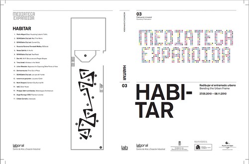
As Fabien has mentioned and due to his participation in curating the event, the laboratory’s Apparatus for Capturing Other Points of View will be exhibited at HABITAR. It’ snice to have this project reconsidered in an art & technology context. The exhibition catalog is available as a PDF here.

Originally this was a thought-collaboration after a Nokia colleague turned me onto this William H. Whyte small book called The Social Life of Small Urban Spaces. Whyte managed to capture the dynamics of urban parks and gathering points with the recording technoogy of the day — eyeballs, notebooks and some 16mm cameras. (You can watch some of it here and other places.)

HABITAR

It was a simple thing to get excited about — how might this sort of observation be redone in the early 21st century and what might be some curious things to look for? My own interest was to build the thing and make it a provocative instrument and then wonder what a video enhancement and post-processing of these images look like? Something algorithmic, I supposed — are there behaviors and movements that can be abstracted from the general hub-bub and rush of urban pedestrians’ lives?

You can find most of the videos here, and there are some new edits at the exhibition should you be in their neighborhood.

Continue reading Apparatus at The HABITAR Exhibition