Weekending 17062012

Here in Los Angeles it’s mostly been programming and book editing and talking to humans. Geoff Manaugh and Nicola Twilley stopped by to do an interview for their curious cross-country mobile blog/interview platform/landscape exploration vehicle called Venue. That was good fun to discuss the various ways landscape, urban space, data-based representations of places, things and flows of humans has informed and influenced the work we do here. Curiously — that seemed to be the topic of the weekend in one way or another. By that I mean that Sunday evening Zoe Ryan and Karen Kice to talk about the same set of topics for a forthcoming exhibition that the Art Institute of Chicago will do. It was a good opportunity for myself — to refresh my memory about a number of projects that sometimes I forget about, like Drift Deck and PDPal. So fun conversation time last week.

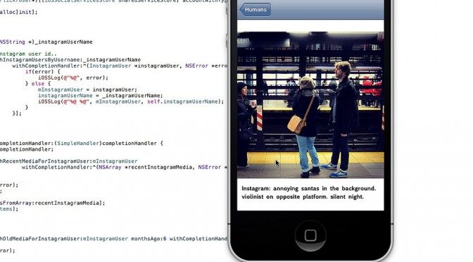
The programming has been good and fun as well. It’s quite nice to get back into that and maintain that skill as well as check off the to-do list a number of ideas and projects that have been lingering. I’m currently working on a little social browser/viewer that inverts the way I “catch-up” with my Friends — other than the “friends” that I find online or who ask me to be their friends but, really? I have little idea as to who they are and often quite a small/nil stake in what they’ve been doing or what they’ve taken a photo of. So, in the app I basically go through the social services for these true-blue Friends and show their latest photos, tweets, etc., so that I don’t have to trawl for them amongst the kruft of illegible feeds and all that crap. I go to people first rather than social services.

And then Rachel Hinman’s new book “Mobile Frontier” showed up with a little interview she did with me. So..that was fun.

Additionally, there’s been more planning and phone calls for this Design Fiction workshop we’ll be doing in Detroit this fall. More about that when I’m not rushing off.

Otherwise..looking forward to the summer with Nicolas here quite nearby in Venice Beach.

Continue reading Weekending 17062012

Pretty Maps – 20×200 Editions

Some of you may have noticed, mostly probably not — but the Laboratory has expanded its ranks. It’s starting to feel like a proper design collective in here. One of the lovely attributes of the people in the Lab are the broad sectors of activity they cover that doesn’t make it seem like they do a zillion different things, but do many things to work though a relatively core set of interests.

Take Aaron Staup Cope. He writes algorithms that tell computers what to do. He makes maps out of paper. He makes maps out of algorithms. He makes you think about the ways that algorithms can do things evocative of map-ness..on paper.

Etc.

What I’ve learned from all of Aaron’s exploits in Dopplr-land, Open Street Maps-land, Walking Maps-land is that maps are dynamic, living things that should never be fixed in their format, style, purpose. They should never be taken for granted — even if the Google Map-ification of the world is doing just this. They should come in a bunch of sizes and shapes and colors and purposes. Etc.

Check out Aaron’s 20×200 Editions of his Pretty Maps. Get yours. I did. LA’ll go on one side of the wall. NYC will go on t’other.

Here’s what they say about Aaron over on 20×200.

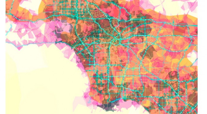
For now, let’s set our eyes West, on L.A. County. Like prettymaps (sfba), prettymaps (la) is derived from all sorts of information, from all over the internet. Its translucent layers illuminate information we’re used to relying on maps for–the green lines are OSM roads and paths, and orange marks urban areas as defined by Natural Earth. They also highlight what’s often not seen–the white areas show where people on Flickr have taken pictures. It’s an inverse of a kind of memory-making–a record of where people were looking from instead of what they were looking at, as they sought to remember a specific place and time.

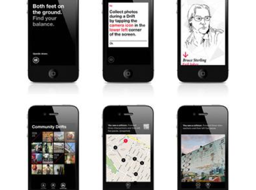
Interaction Awards 2012: Drift Deck for People's Choice

Drift Deck is up for the IxDA Interaction Awards in the “People’s Choice” category. Which isn’t the “Jury’s Choice” but — whatev. It’s the People, so we’re hustling to make you, the People, aware of this chance for you to choose what is the Choice of the People. For Interaction Design Awards.

Please give it a vote.

What makes Drift Deck chooseable? Well — it does something different and provocative in the world of interaction design for the things we do when we’re going/finding. The canon of interaction design for what were once fondly called “maps” is pretty stuck in the mud. Nothing extraordinary going on there that you wouldn’t expect from the next generation of mapping things.

What we did with Drift Deck was look at the world a little sideways and imagine a world in which the map was a bit dynamic and the act of going/finding was a bit less, you know — purposeful in a tedious, dogmatic sort of way.

It’s an otherworldly map app, if you will. Drift Deck is meant partly to be pragmatic for those times I find myself somewhere and have no idea what to do if I have an hour to wander about. (Sometimes we all need a bit of a start, or a script to follow.) And of course, it’s playful in it’s nod to the Situationists and their experiments with re-imagining urban space.

The principles led directly from the Drift Deck: Analog Edition that you can find here and more here.

These are the kinds of projects we do here. They’re not “Conceptual.” That cheapens the hard work that goes into them. We write code. We do illustrations of things that get properly printed on big Heidelberg presses. We put together electrical components and have printed circuit boards made and populated with parts to create new sorts of interaction rituals, new sorts of devices — new things that are different from the old things. These are ways of evolving the ordinary to make possibily otherworldly, extraordinary things. They come from ideas that we then evolve into material form so that the ideas can be held and dropped and switched up, on and off to be understood properly.

So, just to be clear — Drift Deck isn’t a conceptual bit of wankery. It’s a thing that got made. Ideas turned into lines of code turned into compiled bytecode. Oh, look! It’s running on my iPhone! Doesn’t feel very concept-y to me.
Continue reading Interaction Awards 2012: Drift Deck for People's Choice

privatesquare

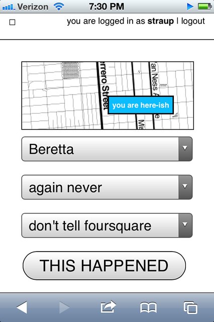
I’ve been working on, and testing out, a new thing for the last couple of weeks. It is called privatesquare. It is a pretty simple web application that manages a private database of foursquare check-ins. It uses foursquare itself as a login service and also queries foursquare for nearby locations. The application uses the built-in geolocation hooks in the web browser to figure out what “nearby” means (which sometimes brings the weird but we’ll get to that later). On some levels it’s nothing more than a glorified check-in application. Except for two things:

First, when you do check in the data is stored in a local database you control. Check-ins can be sent on to foursquare (and again re-broadcast to Twitter, etc. or to your followers or just “off the grid”) but the important part is: They don’t have to be. As much as this screenshot of my activity on foursquare cracks me up it’s not actually representative of my life and suggests a particular kind of self-censorship. I don’t tell foursquare about a lot of stuff simply because I’m not comfortable putting that data in to their sandbox. So as much as anything privatesquare is about making a place to file those things away safely for future consideration. A kind of personal zone of safekeeping.

Second, privatesquare has its own internal taxonomy of event-iness. It is:

  • I am here
  • I was there
  • I want to go there
  • again
  • again again
  • again maybe
  • again never

The first item maps the easiest to foursquare’s model of “checking in”. It is what it says on the tin. The second is the thing that you can’t do on foursquare but everyone does anyway: Checking in after the fact if only to have a personal record of things you’ve done. This just makes the act explicit. The third is not unlike the “lists” feature that was introduced on foursquare, last year. It is also the one flavour of check-in that is not forwarded on foursquare. I suppose I could figure out how to add things to a list, but I haven’t yet.

The last four are a long overdue love song to Chris Heathcote and a plaintive desire for something like the Dopplr Social Atlas (not to mention Dopplr itself) but one that isn’t held hostage to the seeming neglect of its parent company, Nokia. Once upon a time, I went to Helsinki for Important Business Meetings ™ involving Flickr and Nokia while Chris still lived and worked in Finland. I asked him where I should eat during my stay and he sent back a long list of restaurants (all lunch places, I think) each flagged as “again”, “againagain” and so on.

The Social Atlas was a feature added somewhere around year two at Dopplr and is a list of places to eat at, stay in or explore. Places are added by the users and organized by city. It remains a lovely example of how to do this sort of thing though there’s not much going on there these days. You can flag as place as somewhere you’ve been, somewhere you like but not someplace you dislike. Which always seemed like a shame because I would find it helpful to know that someone I know and trust dislikes a restaurant in London as much as I despise Herbivore, in San Francisco.

Chris’ is a genius classification system. It does not get lost in the weeds of weird similes and absurd metaphors (wine tasting, anyone?) and by and large captures the experience of asking someone where you should go to eat in a place you’re not all that familiar with. It is also entirely bound to the relationship of the person telling and the person asking. It is not a recommendation engine.

It assumes that although two people would both do something again, or do it enthusiastically (“againagain”), they are just as likely not to do the same thing. Those details are left out of the equation (read: the computer) because it will never be able to account for the subtlety and history of experience between two people.

The “again” ratings (markings, like on a tree?) are an odd lot in that they don’t go out of there way to distinguish themselves in time. Is it just an indication that you went there some time in the past and want some record of the event? Or does it mean that you wait to check-in until you’ve decided how you feel about it? Or do you check-in and then say whether it was good or not?

I am very consciously punting on these questions for the time being in order to see how the thing actually gets used and what I find myself wishing it did. I suspect that most of the confusion that may be generated by these kinds of blurry and overlapping assignments can be overcome by displaying dates and times clearly.

It is worth nothing that privatesquare does almost nothing that foursquare doesn’t already do, and better. privatesquare is not meant to replace foursquare but is part of an on-going exploration of the hows and whens and whys of backing up centralized services with bespoke shadow, or parallel, implementations of the service itself. It is designed to be built and run by individuals or as a managed service for small groups of people who know and trust one another.

privatesquare remains a work in progress and I am not planning to run it as a public service any time soon but it is available as an open-source project, on Github, that you can run yourself:

http://straup.github.com/privatesquare/

The documentation and installation process still remains out of bounds for most people who don’t self-identify with the nerd squad but that will sort itself out over time. For what it’s worth my copy is running on insert a vanilla shared web-hosting provider that can run WordPress here so that’s a promising start, I think.

The site is built on top of Flamework, which is a whiteroom re-implimentation of the core libraries and tools that a bunch of ex-Flickr engineers used to build Flickr, the same way that parallel-flickr is. Meaning that some part of all these projects is just putting Flamework through its paces to find the stress points and to better understand the hows and whats of the process (installation, documentation, gotchas and so on) should be. And like parallel-flickr “it ain’t pretty or classy (yet) but it does work.”

Here’s an unordered list of the things privatesquare still doesn’t do:

  • Sync with the foursquare API. For a whole bunch of reasons you might find yourself checking in to foursquare using another client application. privatesquare should be able to fetch and merge all those check-ins that it didn’t handle first.

  • The “nearest linear” cell-tower problem. This is one of those problems that gives credence to all the hyperbolic hand-waving done by companies driving around mapping latitude and longitude coordinates for wifi networks. Without this data determining geographic location for a web application running on a phone is often handled by assuming that whatever cell tower your phone is connected to is “good enough”. Sometimes it is but just as often it’s not. You have a line-of-sight, a signal, back to a cell tower that exceeds the maximum radius in which to query for venues. Because your phone thinks you are somewhere else you always end up falling outside the hula-hoop of places that are actually near you.

    The map that’s displayed with venue listings (there’s a screenshot at the bottom of this post) is one possible alternative. As I write this the map isn’t responsive. It’s just there to try and help you understand why a particular list of places was chosen. Eventually you should be able to re-center the map to a given location and use that when looking up nearby venues, for those times when your web browser can’t figure out who is on first by itself.

  • There is no ability to delete (or undo) check-ins.

  • There is no ability to add new venues. Nor is there any way to record events offline or when you don’t have a network connection. I’m not sure whether either of these will ever happen. At the moment there are just too many other things going on. Beyond that I sort of like the fact that privatesquare doesn’t try to do everything.

  • There is no way to distinguish duplicate venues (same name, different ID).

  • Export, which is probably the single most important thing to add in the short-term. This includes a plain old web view of past check-ins.

  • Pages for venues, though I’m really sure what I was thinking when I was blocking out this blog post and wrote that. It’s probably related to what I wrote about cities (below) and the idea that the really interesting aspect of a venue page is seeing a user’s arc of again-iness for that spot over time.

  • Pages for cities. The other nice thing that privatesquare does when you check-in is “reverse geocode” the location of the venue and store the Where On Earth (WOE) ID of the city the venue is in. Which will make it possible to build something that looks like the Social Atlas. For example, if you were going to Montréal I might send you a link to all my check-ins in that city (WOE ID 3534) tagged “again”, “againagain” and “I want to go there”.

In a way privatesquare is just the foursquare version of parallel-flickr: a tool to backup your check-ins, albeit pre-emptively. Which is sort of an interesting idea all on its own. The differences between the two applications are that parallel-flickr doesn’t let you upload photos (yet) and privatesquare doesn’t really provide any mechanism for sharing your check-ins with a restricted set of users. Currently, it’s all or nothing (read: “nothing” because the code forces you to be logged in before you can see anything).

I am also thinking about forking; piggybacking; hijacking (piggyjacking?) some or all of the work that Stamen has done with the Dotspotting project. For two reasons: First they are both built on Flamework so it ought to be possible to make them hold hands without too much fuss. Second, there’s a nice un-intended feature in the way the code for browser things and the code for database things handle the data that people upload to the site: HTML tables.

In theory (and I haven’t tested this out yet) anything that can generate an HTML table, with the relevant semantic attributes, and send it to the browser along with the relevant JavaScript code will be able to take advantage of all the lovely display and interaction work that Sean Connelley and Shawn Allen did for Dotspotting. Just like that!

The reason this all works is that when we started writing Dotspotting it was during a time when Flamework was still pretty green and lacking any code for doing API delegation or authentication. Rather than trying to shave that particular yak we simply opted to use the HTML sent to the browser and jQuery as a kind of internal good-enough-for-now API.

Once it’s sorted for privatesquare it should be easy enough to swap out the table parsing code with proper API calls, now that Flamework has its own API delegation code, and then it could be dropped in to parallel-flickr as an alternative view of your geotagged photos.

It’s all still magic-pony talk and none of it addresses mobile (tiny) web browsers or anything but a pretty conventional linear paginated view of the data (no clustering or other fancy stuff) but, still: This pleases me.

In the short-term I’m going to continue to focus primarily on the data input side of things trying to make it as easy and fast as possible to record the data along with the simplest of CSV or GeoJSON exports, so that you could at least look at your data in tools like Dotspotting or Show Me the GeoJSON respectively.

And if I can get that part squared then it also might be possible to re-use some of the same work to make things like Airport Timer easier since the two projects are each a kind of side-car to the other, when you stop and think about it.

A Few Things The Laboratory Did In 2011

LOS ANGELES

Projects
* It was a year of mostly audio creations ahead and around of Project Audio for Nokia. Some very exciting little bits of design, fiction and design, fact. These will continue into 2012 with some more public than others, necessarily. The over-arching theme of creating a renaissance of Audio UX across the board and to say — listen, we’ve been very screen-y over the last, what? 50 years. Our screens a nagging jealous things. What about our ears? Has design fallen short in this regard and actually is design incomplete insofar as it relies so heavily on what we see and what we touch, sit in and so forth without regard to the studied appreciation and elevation of what and how we hear? Effectively, sound is an under-appreciated and, from within the canon of even just UX and Interaction Design — basically ignominiously ignored.
* Made a couple of little electronic hardware things, but not as much as I would’ve liked. An incomplete portable audio mixer; an incomplete portable Ear Freshener. Those’ll go into the 2012 pile.
* We worked on a bit of Radio Design Fiction for Project Audio at Nokia. The conceit was to work with and understand radio as something that possibly everyone did and had — rather than centralized broadcasting, such as big commercial radio stations — everyone had a radio and possibly radio was a viable and successful alternative to personal communication such that point-to-point communication (e.g. cell phones) never took off because a bunch of powerful men met in a high-desert compound in New Mexico and conspired to make Zenith and RCA the largest corporations in the world. Cellular never takes off and AT&T becomes a little lump of spent coal in the global economic smelter.

Presentations & Workshops
* At the beginning of the year was the Microsoft Social Computing Symposium. I went, and mostly listened. I think I got happily wrangled into facilitating something.
* There was the 4S conference where I presented on a panel to discuss the relationship between science, fact and fiction. David Kirby was on the panel, so that was tons of fun. Discovered this book: Science Fiction and Computing: Essays on Interlinked Domains, but then realized I had it already.
* I participated in a fun panel discussion for the V2__ Design Fiction Workshop in Rotterdam
* I went to The Overlap un-conference outside of Santa Cruz
* I went to Interaction 11 to see about the world of interaction design.
* Australian Broadcast Corporation interview on Design Fiction — Transcript and here’s the actual audio and stuff.
* Interview on Vice – Talking to the future humans with Kevin Holmes.
* Interview on Steve Portigal’s The Omni Project
* UX Week 2011 Design Fiction Workshop
* Fabulous Project Audio workshop in London with the fine folks at Really Interesting Group.
* And there was Thrilling Wonder Stories event at the Architectural Association in London in October.

That’s all the stuff that I can remember right now. I’ll add to it for the Laboratory log as things return to my memory.

BARCELONA

Projects
Our main investigation line on network data (byproducts of digital activity) brought us in direct contact with the different actors of the urban environment (e.g. city authorities, service providers, space managers, citizens) jointly exploring the opportunities in exploiting this new type of living material. Our projects strategically split into self-supported initiatives initiatives and client works with a common objective to provide new tools to qualify the built environment and produce new insights for its actors. We experimented complementary approaches with observations and prototyping mutually informing our practice. For instance, along our investigations we like to employ fast-prototyped solutions (see Sketching with Data) to provoke and uncover unexpected trails and share insights with tangible elements such as interactive visualizations and animation. We found it to be an essential mean to engage the often heterogeneous teams that deal with network data around a shared language. Practically, we teamed up with:

* A real-time traffic information provider to produce innovative indicators and interactive visualizations that profile the traffic on key road segments.

* A multinational retail bank to co-create its role in the networked city of the near future with a mix of workshops and tangible results on how bank data are sources of novel services

* A large exhibition and convention center to perform audits based on sensor data to rethink the way they manage and sells their spaces.

* A mobile phone operator and a city council to measure the pulse at different parts of the city from its cellphone network activity and extract value for both city governance and new services for citizens and mobile customers.

* elephant path is a pet project to explore the actual implementation of a social navigation service based on social network data. Would love to develop it more, automate it and port it to mobile. It won the 2nd price at the MiniMax Mapping contest.

Product
The second part of the year was also dedicated to collaborating with our friends at Bestiario to land a product that provides tools for individuals and organizations to explore and communicated with (big) data. Our role consists in supporting Bestiario in matching market demand with product specifications, orchestrating the design of the user experience and steering the technical developments. Quadrigram has integrated now our data science toolbox.

Presentations
* After staying out of the stage for most of the year (expect a lecture at ENSCI in Paris), I entered the polishing phase on the work with data with a talk at the Smart City World Congress.

Publications
* Our friends at Groupe Chronos kindly invited us to participate to an issue of the Revue Urbanism. We contributed with a piece on the ‘domestication’ of the digital city. I also wrote a text for Manual Lima’s recent book Visual Complexity. The text was not published eventually, but I appreciated the opportunity to write about my domain for a new audience.

We have been actively collaborating with academic entities such as:

* Yuji Yoshimura at UPF on a follow-up investigation of our study of hyper-congestion at the Louvre. The first fruit of this collaboration that also involved Carlo Ratti at MIT has been published in the ENTER2012 conference proceedings: New tools for studying visitor behaviours in museums: a case study at the Louvre
* Jennifer Dunnam at MIT for which we collected Flick data used in her Matching Markets project.
* Francisco Pereira at MIT for the article Crowdsensing in the web: analyzing the citizen experience in the urban space published in the book From Social Butterfly to Engaged Citizen.
* Boris Beaude at EPFL who helped us run a the co-creation workshop on open municipal data at Lift11
* Bernd Resch at University of Osnabrueck who spent endless hours developing and run models for our specific needs for spatial data analysis

and studios and individuals:
* Urbanscale for their effective and beautifully crafted maps
* Olivier Plante who designed Elephant Path
* Bestiario, the team behind Quadrigram
* Brava, our german graphic designers

GENEVA

Projects
* Three field studies about the appropriation of various digital technologies: Shadow Cities (a location-based game), 3D interfaces on mobile displays, the use of head-mounted displays in public settings. While the first one has been conducted internally (and will result in a presentation at the pre-ICA conference), the two others have been conducted for a French laboratory in Grenoble. Although field research about this has been conducted in 2011, it’s quite sure that the insights we collected in these 3 projects will be turned into various deliverables (speech, articles, report…).
* Interestingly, the Geneva bureau has more and more request for projects out of the digital sphere. This year we worked with a cooking appliance manufacturer, a coffee machine company and a electricity utility on various things ranging from new product development (the near future of …) to co-creation workshops or training the R&D team to deploy design research approaches (based on ethnography).
* I also took part to the “Streets of BBVA” project with Fabien, contribution to the workshop series about the use of networked data for a spanish bank.
* My second book, about the recurring failure of digital products, has been released in French. It eventually leads to various interviews and speeches (See below).
* For Imaginove, a cluster of new media companies in France, I organized a series of lectures and workshops about digital technologies.
* The game controller project is slowly moving forward (discussion with editors, writing, drawings…). Laurent Bolli and myself not only work on the book but there will be also an exhibit at the Swiss Museum of Science Fiction (planned for March 2012).
* I wrote a research grant with Boris Beaude (Choros, EPFL) about the role of networked data in social sciences. It’s a quite big project (3 years long!) and we’ll have the answer by April 2011.

Various speeches and workshops
* Des usages au design: comprendre les utilisateurs pour améliorer les produits, Talent Days, December 1, Lyon, France.
* Panelist at Swiss Design Network Symposium 2011, November 25, Geneva.
* Mobile and location-based serious games? At Serious Game Expo, November 22, Lyon, France.
* Les flops technologiques, ENSCI, PAris, November 17.
* My interaction with “interactions” in interaction design, ixda Paris, November 16.
* User-Centered Design in Video Games: Investigating Gestural Interfaces Appropriation, World Usability Day, Geneva, November 10, 2011.
* Fail fast. Learn. Move on, Netzzunft, Zürich, October 27.
* Wrong is the new right, NEXT 2011, Aarhus, Denmark, August 31.
* Robot fictions: entertainment cultures and engineering research entanglements, Secret Robot House event, Hatfield,, UK June 16.
* Tracing the past of interfaces to envision their future, Yverdon, June 9.
* Traces and hybridization University of the Arts, London, June 19.
* PostGUI: upcoming territories for interaction design, Festival Siana, Evry, May 12.
* The evolution of social software, April 7, Lyon, France.
* De l’ethnographie au game design, Brownbag Tecfa, April 15, Geneva
* interfaces & interactions for the future” Creative Center, April 8, Montreux.
“The evolution of social software”, April 7, Lyon, France. Gamification Lift@home, March 3, Lyon.
* Smart Cities workshop with Vlad Trifa and Fabien Girardin, Lift11, Geneva, Switzerland
* Culture et numérique : la nécessité du design, L’Atelier Français, January 27, Paris, France.

Teaching
* At HEAD-Geneva, at masters level, I taught a semester-long class about user-centered design (how to apply field research in a design project) for two semesters. This fall, I also taught interaction design and acted as tutor for 9 masters students (which is obviously time-consuming!).
* At ENSCI, I conducted two week-long workshops/courses: one about reading in public places, one about the use of rental bikes with Raphael Grignani (from Method).
* At Zurich school of design, I gave a day-long course and workshop about locative media last June.
* At Gobelins Annecy, I gave a three day course about innovation and foresight, last June.
* At HEG Geneva, I also gave 3 lectures about innovation and foresight last fall.
Airport Timer


There’s a passage in David Pascoe’s book Aircraft where he talks about how none of the airports of the time were prepared for the introduction of the 747. Specifically there was no part of the physical infrastructure of an airport that wasn’t overwhelmed by the size of and volume of the “jumbo” jet.

None of the waiting areas were large enough to accommodate the number of passengers getting on or off the planes. Often the planes themselves were too big to fit in the loading bays outside the terminals and the few enclosed jetways that had been in use up to that point were too small to even reach the doors on the planes.

Later in the book he goes on to describe a similar clusterfuck ushered in by the hostage taking during the 1972 Munich Olympics and the decision to install security checkpoints and passenger screening areas in airports. The just opened Dallas/Fort Worth airport was particularly hard hit. Although its design was modular and extensible from the outset (with all the terminals as simple semi-circles that could be snapped together like Lego up to the 10 miles in length) the buildings themselves were too narrow to retain any design or aesthetic after they been cut in two by x-ray machines and the lint trap of people waiting to go through them.

I was thinking about this last month when I had the misfortune of flying out of Terminal 7 at New York’s JFK airport. Architecturally, Terminal 7 resembles two staggered butter sticks. The first butter stick is where you check in and is connected to the second “stick” which houses the departure gates by a short flight of stairs. In between the two, just in front of the stairs, is where you go through airport security.

United Airlines flies out of Terminal 7 so at least some of the misery of the security process can be blamed on United poisoning any and everything it comes in to contact with. The rest, though, is a combination of the need for the Transport and Security Administration (and their international counterparts) to indulge itself in ever greater security theater of Broadway musical proportions; the inability of people to imagine any kind of personal efficiency or shared responsibility getting through the line; and a New York City scale “Fuck you, never again” attitude to the process born out of the reality of the 9/11 attacks. All multiplied by the ever increasing numbers of people flying to and from, and especially to and from New York City.

There isn’t much to say about the other terminals at JFK. Both Terminal 4 and the newer addition to Terminal 5 are little more than oversized cargo ship containers with drywall and designer handbag shops but at least they are big enough to dampen the indignity of the fear and paranoia that define contemporary air travel. Put another way: Terminal 7 is just too small and the security line is where everything grinds to a simultaneously depressing and rage-inducing halt and forces everyone to in to a shared despairing for all humanity, all the while with too little space to comfortably take off your shoes.

Untitled Intimacy #1076031825

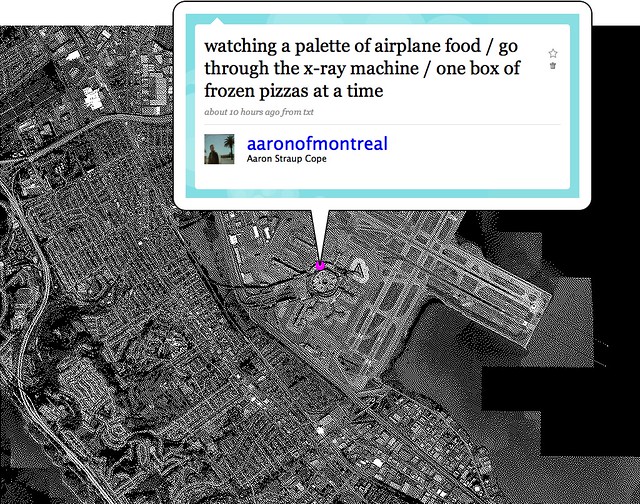
So I made a website: http://airport-timer.spum.org

Airport Timer is a simple web-based stopwatch application to record how long it takes to get through security at the airport.

Before you get in the screening line you enter, by hand, the three-letter airport code and the name of the terminal you’re in and then press the start button which launches a timer in the background. Then you put your phone (presumably) back in your pocket before you are disappeared for spooking the security agents. When you make it through to the other side you press the stop button which stops the timer and, after a confirmation screen, uploads the airport code, the terminal and the time you spent (measured in seconds) going through security to Pachube. There’s also an option to send a pithy message to Twitter.

That’s it.

The site uses the Twitter API as a single-sign-on provider but that’s mostly as a kind of half-assed throttle on the API that proxies and sends the timing data up to Pachube. Because of the way that the Twitter kids have built their Javascript widgets and because there’s currently no place to store the Twitter user associated with a given report in Pachube there’s a reasonable argument that you shouldn’t need to log in at all. Modulo the part where even Instapaper gave in and forced people to create user accounts on the site. Anyway, you need to log in with your Twitter account.

The sites also uses Pachube as a datastore because it seemed like an obvious place to test the claim, in a networked world, that “every human is a sensor”. Pachube’s data model consists of three nested pieces: Environments (airports), Data Streams (terminals) and Data Points (individual time through security reports). The first two can be assigned additional metadata (tags, location, etc.) but the data points can only contain a timestamp and a value.

Which makes sense but right away the inability to add metadata to individual data points means that I can’t record who just went through security or generate, easily, the “your stuff” style personal reports that people expect from social websites. Arguably Pachube is not a social site except for the part where, in a world where we are all sensors, any centralized time-series service that has humans as inputs will be measured on its ability to abstract the data. Robots may not care (or need) to see all that information bucketed by airport or by Wednesday versus Tuesday but we do.

You could just as easily write a backend for this kind of site using MySQL or Solr. Solr’s ability to facet by date and eventually to do nested faceting (for example, to facet by airport and then for each airport by week or to facet by user and then by airport) makes it an attractive possibility but I’m choosing to use Pachube because it is a logical meeting of minds.

There are no “report” style pages for individuals or airports yet. There’s actually a lot of stuff the site doesn’t do yet. It does not try to retrieve your GPS coordinates automatically or use them to auto-detect your airport or validate that you’re really at Charles de Gaulle aiport and not sitting at a coffee shop in Winnipeg. It does not have a magic auto-completing list of terminals for each airport. It does not (and will never) have heat maps.

Some of these things will come with time. I have already imported all of the whereonearth-airport data in to a Solr instance so auto-detection and validation are both more than theoretically possible. Auto-complete for terminals is little more wrapper code around the Pachube API to pull out the titles of terminals (datastreams) for a given airport (environment/feed). But for now, it’s just a simple thing to record the data and put it somewhere safe and public.

Upcoming essay on the asynchronous city

Peeker

A high altitude imaging system for providing curious asynchronous perspectives of the world for analysis and synthesis. Artist’s interpretation, by Rhys Newman.

Via Nicolas — Upcoming piece about the asynchronous city:

Just for the sake of bringing things to the table before they do: Nicolas Nova and myself are putting a final touch to a pamphlet entitled “A synchronicity: design fictions for asynchronous urban computing” in the Situated Technologies series. Here’s the blurb:

Over the last five years the urban computing field has increasingly emphasized a so-called “real-time, database-enabled city.” Geospatial tracking, location-based services, and visualizations of urban activity tend to focus on the present and the ephemeral. There seems to be a conspicuous “arms” race towards more instantaneity and more temporal proximity between events, people, and places. In Situated Technologies Pamphlets 5, Julian Bleecker and Nicolas Nova invert this common perspective on data-enabled experiences and speculate on the existence of an “asynchronous” city, a place where the database, the wireless signal, the rfid tag, and the geospatial datum are not necessarily the guiding principles of the urban computing dream.

Due for September 2009. A sort of updated version of near future laboratory thinking that builds upon various projects, discussions (and partly going beyond material from my french book). Stay tuned.

Continue reading Upcoming essay on the asynchronous city

Companion Species Training Game

Wednesday July 15, 14.35.42

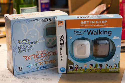
The new-to-me Nintendo DS “Personal Trainer Walking” (heck of a name..) alongside of the Japanese language game whose name I forget and cannot read.

I found out about this Nintendo DS game from Kevin who found out about it from Russell. I literally just got it yesterday, but it’s pretty exciting to see. I can only imagine in my head out the play dynamics unfold, but I’ll be playing with it and have some more thoughts before long.

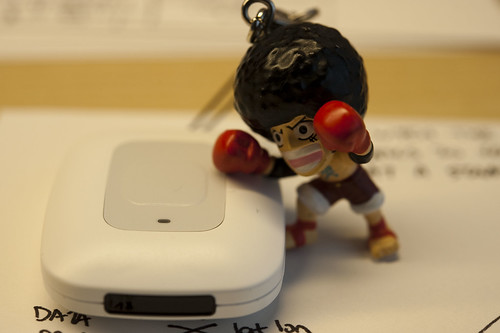
So far I enjoy the “blind” design of the pedometer part of the concept — not too much display other than this blinking light which changes color when you’ve reached your goal. Simple, direct and not a nagging taunt from a fancy LCD that shows more than you need. You focus on your activities or just being a normal human being without poking and prodding at the device all the time, checking your status in detail, etc. When you’re in the world, be in the world, I say.

Wednesday July 15, 15.47.20

Wednesday July 15, 15.14.44

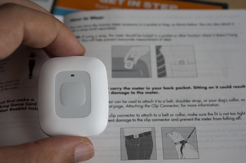
This one aspect of the design is quite curious — there is an extra pedometer device for your dog! I mean, I get the idea — people walk their dogs and so this is perfect for you and your dog to get some training together. The language in the users manual / guidebook is very funny, and I’m not sure if this is deliberate or perhaps the sensibilities of a Japanese game design company? I know none of the facts and that does not matter so much to me, but maybe it’s my sensitivities to things that fold together different species into what my advisor calls “transpecies” or “companion species” — species that need each other, or play and interact together in curious ways. (cf The Companion Species Manifesto) Thus, I cracked up when I read these items in the guide:

Wednesday July 15, 15.12.07

The meter should only be used by a person or dog. It will not work properly with any other type of animal.

The meter should only be used on a dog when supervised by a person. It should be attached in a location where it is not at risk of being chewed or swallowed.

Great stuff. I’m looking forward to seeing how the DS experience works.

Downside: I’m pre-disappointed that walking is the only physical activity it seems to work with. I ride a bike and want this to count. And there are so many other sorts of physical things that won’t count, I assume.

*shrug*

Russell points out the simplicity of the synchronization ritual, which is fantastic. Point. Press. Watch your pedometer pebble appear from a pipe on the screen and become “alive” on your screen. If you’ve ever tried to synchronize ANYTHING you’ll laugh out loud, as I did. If you’ve ever designed ANYTHING that requires synchronization, take close note of the interaction ritual here. It’s fantastically playful and simple and sensical.

Some related topics: this perpetual Laboratory project, Flavonoid.