Data science and “methodolatry”, the aestheticization and idolization of method.

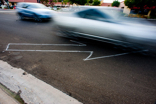
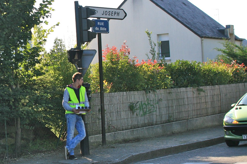
(Someone counting the number of car near a roundabout in Nantes, France)

"Methodolatry and the Art of Measure by Shannon Mattern is an interesting piece that Jan sent me this morning. It addresses the implications of "urban data science", i.e. citizen scientists, public labs, urban explorers, infrastructural tourists generating and collecting their own data on one end of the spectrum, civic hackers on the other.

Both share the same "way of conceptualizing and operationalizing the city" and an "instrumental rationality/solutionism”... what the author calls “methodolatry,” the aestheticization and idolization of method. The author describes how the relationships between the urban environment and data with different historical pointers showing how cities are "'machine' for efficient circulation". She also refers to different claims by Lewis Munford, Friedrick Kittler and Ola Söderström which are quite relevant.

Some excerpts I found interesting:

"Is there an ethos, a value system, driving these data-generated processes, or is it all just algorithms? Of course, we wouldn’t say that there’s no ideology inherent in the algorithms themselves, but the computers powering these Big Data projects run billions of operations that cumulatively produce substantive transformations in the urban landscape, with little regard for underlying values (...) sometimes the most readily apparent or accessible way — for students in particular — to gain entry to those complex practices is to take on the aesthetics of measurement: to devise a clever data collection system, to accumulate a reassuringly big pile of data, and to massage that data into a persuasive visualization. That’s a worrisome trend. This isn’t to say that engagement with the affective or stylistic dimensions of measurement precludes engagement with its larger methodological functions; Feyerabend has shown us otherwise. Rather, I hope these concerns are brought into alignment: that the methodological packaging suits the purpose, the form serves the function, the knolling serves the knowledge. (...) perhaps these methodolatrous projects, in their aestheticization of measurement, are calling our attention to presumptions about scientific rigor, parodying our algorithmic impulses, tacitly asking questions about the ideology of a pervasive culture of measurement and assessment. Perhaps, despite their implicit alliance with CUSP and Cisco and the like, our citizen data gatherers want to highlight the “givenness,” the rhetorical nature of that data, to show its inherent irrationality, to demonstrate that the “science of cities” is also, necessarily, an art."

Why do I blog this? An interesting addition to the debates about data science and smart cities. Certainly a good complement to Adam Greenfield's "Against the Smart City".

Pretty Maps – 20×200 Editions

Some of you may have noticed, mostly probably not — but the Laboratory has expanded its ranks. It’s starting to feel like a proper design collective in here. One of the lovely attributes of the people in the Lab are the broad sectors of activity they cover that doesn’t make it seem like they do a zillion different things, but do many things to work though a relatively core set of interests.

Take Aaron Staup Cope. He writes algorithms that tell computers what to do. He makes maps out of paper. He makes maps out of algorithms. He makes you think about the ways that algorithms can do things evocative of map-ness..on paper.

Etc.

What I’ve learned from all of Aaron’s exploits in Dopplr-land, Open Street Maps-land, Walking Maps-land is that maps are dynamic, living things that should never be fixed in their format, style, purpose. They should never be taken for granted — even if the Google Map-ification of the world is doing just this. They should come in a bunch of sizes and shapes and colors and purposes. Etc.

Check out Aaron’s 20×200 Editions of his Pretty Maps. Get yours. I did. LA’ll go on one side of the wall. NYC will go on t’other.

Here’s what they say about Aaron over on 20×200.

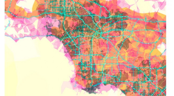
For now, let’s set our eyes West, on L.A. County. Like prettymaps (sfba), prettymaps (la) is derived from all sorts of information, from all over the internet. Its translucent layers illuminate information we’re used to relying on maps for–the green lines are OSM roads and paths, and orange marks urban areas as defined by Natural Earth. They also highlight what’s often not seen–the white areas show where people on Flickr have taken pictures. It’s an inverse of a kind of memory-making–a record of where people were looking from instead of what they were looking at, as they sought to remember a specific place and time.

Quiet But Not Quiescent

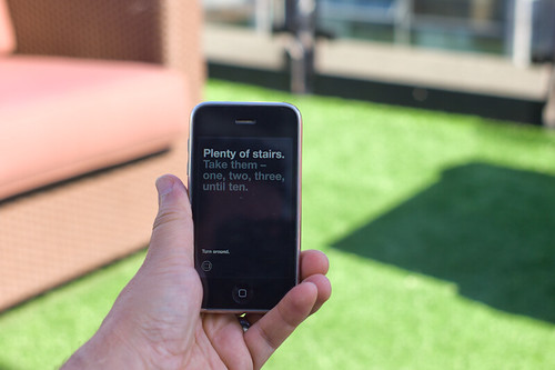
Judge not the less yammer-y state of the studio blog to indicate that there is nothing worth yammering about. It’s just that the clang of steel caressing code has been going on and that in great measure, too. Some of you may have glimpsed and grinned at the fantastic electronified edition of the paper Drift Deck that we developed a couple of years ago. That’s right. We’ve added *batteries to the Drift Deck and it’s fallen into the *app well..it’s an app which is fantastic because it means the last remaining physical card editions can become properly *artisinal and the electronic battery editions can spread the sensibility of the Drift Deck concept to the rest of the world.

Release is imminent. Prepare ye iPhones. Hop expectantly from foot-to-foot. More news in a short while, including linkages to downloadables. In the meantime, check out the new Drift Deck webified “page” and the fantastic roster of hammererers that batteryified the ‘deck.

..And then — onto the next thing here. It’ll be quiet a little, but good things are baking in the kiln, rest assured.

*Willow next. The superlative friendregator for the discerning social being.
Continue reading Quiet But Not Quiescent

Cinema City

Or…in this case, cinematic architecture. Jonathan Rennie presented a project yesterday that I found most fitting in the vein of design fiction / architecture fiction. For the studio class run by Geoff Manaugh (@bldgblog) called Cinema City, a graduate studio that starts with this brief and asks the students to consider what they may. There were some interesting projects. This one in particular stood out for me. It was an unconventional approach in an architecture class to present a series of fictions about the future of cinema.

Monday December 13 14:06

Continuous Machinic Cinema

This project explores a particular narrative for the future of cinema and, in turn, it proposes new possibilities for the moving image and its place, content, viewers & screen.

The project proposes a scenario of technological discovery and development where:

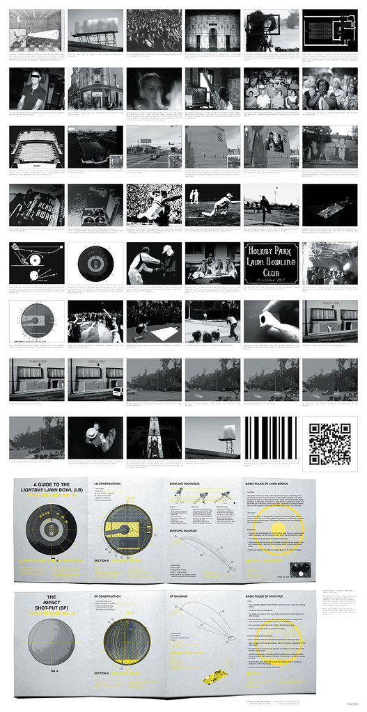
** Guerilla film distribution occurs in new places via Lawn Bowl and Shot-put film grenades;

** With anamorphic lenses the perpendicular hegemony of conventional cinema watching is broken;

A shift in content to QR coded cinema is predicted and, in turn..

** A future point where non-narrative images are viewed by post-human machine optics is proposed, with screens affecting the fabric of the city.

The project is a sneak preview for a future of cinema, proposing a continuous cinema that is freed from both the spatial confines of the movie house and the literary expectations of narrative — told by and to non-human machines.

FInal Panels_Further Revised.indd

In the first proposal, guerilla film distribution is done by throwing film grenades, a “weapon” first proposed by the Soviets and designed to be surreptitiously deployed during the Olympics. The weapons are found again by Jonathan during his project research, including documentation and some diagrams describing the clandestine Soviet project.

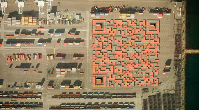
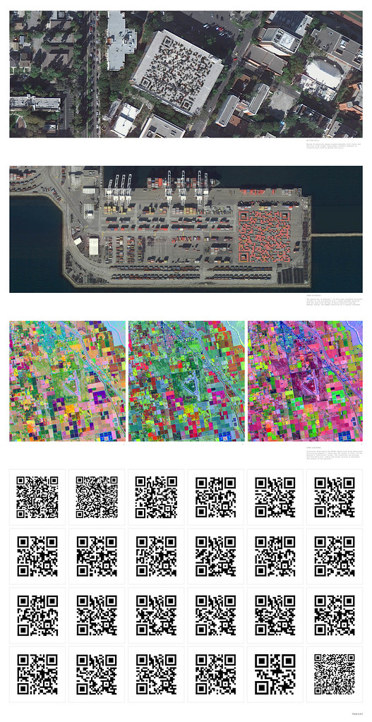
In the second proposal, Skynet — an extraterrestrial orbital satellite platform — finds QR codes in the landscape of earth. The QR codes embed stories and films that the satellites share with one another. Over time, as they see the same films over and over again and become bored — they begin to look for QR codes elsewhere, perhaps interpreting barcode-like structures in the landscape at different wavelengths — for instance an infrared folliage rendering may appear to contain QR codes. They seek out new films in this way, perhaps even instructing terrestrial machines, such as the cranes at loading docks or tractors in large farm fields, to construct new QR codes containing new cinema and stories.

Still 1

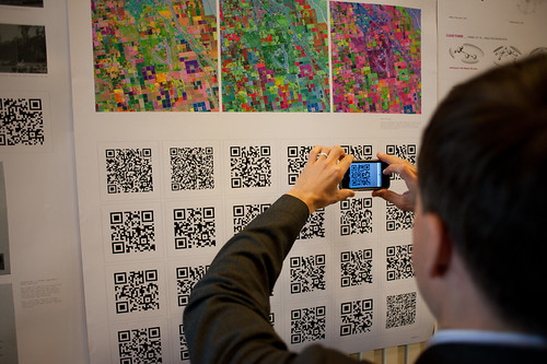
Jonathan also ginned up a sort of graphic novella/short story to go along with the proposal so that each QR code that you see in his poster documentation points to a page in the comic. You can see the full graphic novella here: QR Cinema

Why do I blog this? This is one of those architecture projects that plays at the far end of the spectrum of architecture’s inherent speculative nature. The spectrum runs from the pragmatic *planning what will be* (traditional floor-plan stuff) all the way across to *speculating to help think* (architecture fiction), with *proposing (cardboard models, photoshop site renderings, camera-tracked little films showing the space as it would be) somewhere in the middle.

I enjoy considering the spectrum of realizations as things move from idea to their material form. In this case, Jonathan has used the architectural brief to propose a speculation about machines reading the landscape to interpret meaning, or to watch movies that are referred to by the QR codes they (think?) they see. This is using the landscape as an interface, which I find super intriguing.

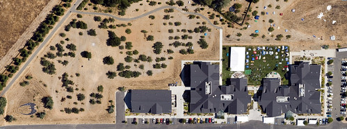
What does this help us think about? Well — it’s a fun Sci-Fi comic he’s done here, so there’s that on its own. Aside from this, we can start to think about Cyphertecture — embedding machine-readable (or maybe only-for-machine) texts in physical structures. Like, for example, this bit of landscape cyphertecture from several years ago

Space Invaders: Google Earth Edition

DIY Media? Fan Art in Google Earth

Space Invaders upper right..Cylon Raider bottom left.

Geoff has the more lucid discussion of this point, but suppose cornice details became machine readable physical cuts and bumps that would represent some meaning for, say…Google Street View cars? I’m not saying this is entirely practical, but I could see a day when bold marks like this that are required to exist (for any number of reasons — local services to identify what building they are at definitively, etc.) on new structures. This then becomes turned into an aesthetic to make it more pleasing as a facade, and so on. In any case — Jonathan’s work certainly gives me things to think about in an entirely fun, imaginative way.
Continue reading Cinema City

The Urban Internet of Things 2010. An International Workshop

JCB_03082009_175602_2534

Coming up is an exciting sounding workshop on the “urban internet of things — programming the real-time city.” Some more opportunities to get this one right..or at least human.

** As more people move to cities, it becomes increasingly challenging )) the necessarily understated preamble (( to build efficient )) maybe we shouldn’t even hope for efficiency (( infrastructures that support the needs of inhabitants without sacrificing the quality of life. The increasing digital instrumentation of urban areas through various networked sensors provides many opportunities to design smarter cities )) smart? i’d settle for clever and wily (( through a meaningful interpretation and usage of all this real-time data. In today’s world, there are strong incentives to leverage the most recent technologies to create digital infrastructures that foster collaboration between the different disciplines involved in urban design. By considering the IoT as a platform for engaging citizen’s action, a new design space is created where citizens are at the center of its urban environment and empowered to actively shape the city they live in.

The goal of this workshop is to gather original and inspiring contributions from technology experts, researchers in academia and industry, designers, urban planners, and architects that are willing to share their knowledge, experiences, and best practices for building smarter cities. We will explore the design of open and efficient platforms and tools to collect, analyze, store, and share the enormous amount of real-time data digital cities generate through a mix of papers, demos, invited presentations and open discussions for collectively create the city of the future. **

http://www.webofthings.com/urban-iot/2010/
Continue reading The Urban Internet of Things 2010. An International Workshop

Apparatus at The HABITAR Exhibition

Wednesday June 17, 14.44.17

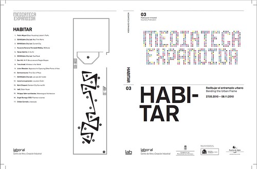
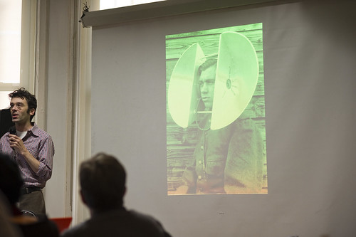
As Fabien has mentioned and due to his participation in curating the event, the laboratory’s Apparatus for Capturing Other Points of View will be exhibited at HABITAR. It’ snice to have this project reconsidered in an art & technology context. The exhibition catalog is available as a PDF here.

Originally this was a thought-collaboration after a Nokia colleague turned me onto this William H. Whyte small book called The Social Life of Small Urban Spaces. Whyte managed to capture the dynamics of urban parks and gathering points with the recording technoogy of the day — eyeballs, notebooks and some 16mm cameras. (You can watch some of it here and other places.)

HABITAR

It was a simple thing to get excited about — how might this sort of observation be redone in the early 21st century and what might be some curious things to look for? My own interest was to build the thing and make it a provocative instrument and then wonder what a video enhancement and post-processing of these images look like? Something algorithmic, I supposed — are there behaviors and movements that can be abstracted from the general hub-bub and rush of urban pedestrians’ lives?

You can find most of the videos here, and there are some new edits at the exhibition should you be in their neighborhood.

Continue reading Apparatus at The HABITAR Exhibition

iotaSalon: The City @ UCLA

Sunday March 29, 13.18.40

This sounds like fun.


May 6, 2010, 7pm
Experimental Digital Arts at UCLA.

iotaCenter’s mission is to inspire both new and existing artists in a historically dispersed and constantly changing technological environment.

The theme for our next iotaSalon is THE CITY. We will be investigating the way urban environments are depicted in abstract and experimental works. How does construction influence image creation? How does the urban environment surrounding an artist inform or invade their work? How does the process of abstraction change our view of the city? How have architectural tools and thinking affected abstract and experimental moving images?

Screening on 16mm ((16mm FTW!!)) as part of the historic film segment:
Sausage City (1974) – Adam Beckett
Diagram Film (1978) – Paul Glabicki
Commuter (1981) – Mike Patterson

Screening on video for the contemporary segment:
Giant Steps (2001) – Michal Levy
Communicate (2009) – Erick Oh
Berlin Skin (2007) – Kim Collmer
Continue reading iotaSalon: The City @ UCLA

Microsoft Social Computing Symposium 2010 – Notes

Get the flash player here: http://www.adobe.com/flashplayer

var so = new SWFObject(“http://www.db798.com/pictobrowser.swf”, “PictoBrowser”, “500”, “500”, “8”, “#EEEEEE”); so.addVariable(“source”, “sets”); so.addVariable(“names”, “SCS2010”); so.addVariable(“userName”, “julianbleecker”); so.addVariable(“userId”, “66854529@N00”); so.addVariable(“ids”, “72157623066738659”); so.addVariable(“titles”, “on”); so.addVariable(“displayNotes”, “on”); so.addVariable(“thumbAutoHide”, “off”); so.addVariable(“imageSize”, “medium”); so.addVariable(“vAlign”, “mid”); so.addVariable(“vertOffset”, “0”); so.addVariable(“colorHexVar”, “EEEEEE”); so.addVariable(“initialScale”, “off”); so.addVariable(“bgAlpha”, “90”); so.write(“PictoBrowser100117084809”);

I attended the Microsoft Social Computing Symposium, 2010 edition, held at New York University’s ITP, and sponsored Microsoft Research’s Creative Systems Group. The theme of the event was on the theme of “city as platform”, a very intriguing and curious topic for the Laboratory, especially in light of the recently published A Synchronicity book with Nicolas Nova (who also attended), which explores the theme of ubiquitious computing in urban contexts, and does so without the assumptions of efficiency, seamless connectivity and interaction perfection.

There were a number of highlights, which will likely appear in the videos that were captured by the capable A/V Club at ITP.

Monday January 11 11:30

I’ll give some notes from the notebook.

Kevin Slavin’s talk that related high-frequency trading in financial markets to the location of high-cost network data center carrier hotels 10ths of milliseconds closer to where trade’s were happening, to the Rothschild’s carrier pigeon fleet that put them 10s of days closer to Waterloo where Napolean’s war was happening, to the stealth bomber algorithms of hiding big things by scattering them all over the place..that are suspiciously similar to the ways the high-frequency traders hide their massive, bulky transactions as they attempt to make their financial-bomb runs through unsuspecting public markets. I don’t think that adequately summarizes it as it was a far-ranging, epic talk with many linkages to very intriguing things, and made great use of imagery and archival videos that correlated the absence of the brush and push and crazy gesturing of market trading in by-gone eras to the more ephemeral actions of today’s push-button trading. Yet..there is still the physicality and materiality of this, as with most things social — only this time it is the locations and the physical infrastructures that have become significant. It turns out, as we know — the network happens in specific places. The hubs and nodes are physical structures — data centers, carrier hotels, terminal entryways for submarine cables connecting continents, etc. Now it is 80 Hudson for Wall Street — an enormous infrastructure building, formerly owned by Western Union which is where the internet happens for New York City and Wall Street. The real estate within and surrounding it is expensive out of all conventional proportion — because it is *closer by milliseconds* to where the network transactions happen. The physicality of moving bits of data around that must push their way through routers, hopscotch through switches, pass their baton of information over hubs, slip and fall on microsecond-long packet blockages — all this means that the closer you can get in time to *where the internet is* — the less likely your transaction event will be spotted by the next guy in time for them to piggyback like a pilot fish on your enormous, sharkish money-making gobble.

I’m sure I’ve mangled the substance of his talk, and this is just my recollection a week-on. Hopefully, we’ll have the video soon. ((You might also do a hashtag search on Twitter for condensed, real-time notes from the event…just start at the beginning and work toward the present to get the right flow. The stuff at the end is mostly people saying how much fun they had.))
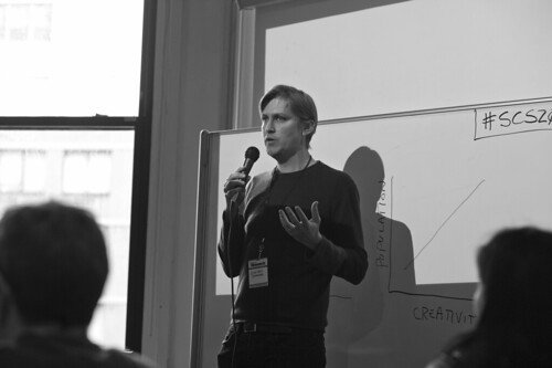
Monday January 11 09:50

Steven Johnson

There were several other very good, thought-provoking talks: Steven Johnson‘s talk that introduced to me exaptation…..

[[Exaptation, cooption, and preadaptation are related terms referring to shifts in the function of a trait during evolution. For example, a trait can evolve because it served one particular function, but subsequently it may come to serve another. Exaptations are common in both anatomy and behavior. Bird feathers are a classic example: initially these evolved for temperature regulation, but later were adapted for flight. Interest in exaptation relates to both the process and product of evolution: the process that creates complex traits and the product that may be imperfectly designed.]]

….in the context of cities and creativity, a rethink for a moment on *new ideas need old buildings* alongside of that, and a curious applique of Kleiber’s Law….

[[Kleiber’s Law is the observation that, for the vast majority of animals, an animal’s metabolic rate scales to the ¾ power of the animal’s mass. Symbolically: if q0 is the animal’s metabolic rate, and M the animal’s mass, then Kleiber’s law states that q0 ~ M¾. Thus a cat, having a mass 100 times that of a mouse, will have a metabolism roughly 31 times greater than that of a mouse. In plants, the exponent is found to be close to 1.]]

…..as a metaphor for understanding urban mass/density and its relationship to the metabolic/creative/energy production in cities. Or something along these lines. ((despite my mucking it up, there’s something curious here that Steven implied was a topic in the book he is presently working on — also, some ties into Hunch and DIYcity, the endeavor he is working on in collaboration with John Gerachi.

Molly Steenson gave a fascinating swirl around the topic of a history of the city and computer, with lots of curious imagery of things like Western Union people rollerskating around to deliver messages and pointing out this relationship between AI and architecture, including a book by Nicolas Negroponte that should probably be reprinted called The Architecture Machine: Toward a More Human Environment which is just too curiously designed and too provocative a title by an author whose contemporary work gives me an annoying rash and makes me sigh — this one looks intriguing. Unfortunately, only available used, but I’m a book whore. Add-to-cart.

Dan Hill and Duncan Wilson gave a good talk overview of various very curious projects at Arup with the emphasis on projects that are about “Making the Invisible, Visible”, using real-time data to expose neighborhood activity. My favorite point here was the use of neighborhood “smart towers” — like a church tower or water tower or something that can be seen from the *neighborhood* versus the more individual/home-based “smart meters.”

That’s it. Great event with smart, interesting talks and workshops and all that. Thanks for the invitation. Oh, wait — one additional thing: it was quite interesting to see the communication of ideas using more video/time-based motion in *slides*, moving clearly away from static slides. Nothing wrong with that — it was just curious to see much of it happening rather than just static images.
Continue reading Microsoft Social Computing Symposium 2010 – Notes
A Curious Crosswalk Clarification

Friday January 08, 14.46.08

Friday January 08, 14.46.21

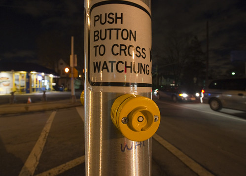
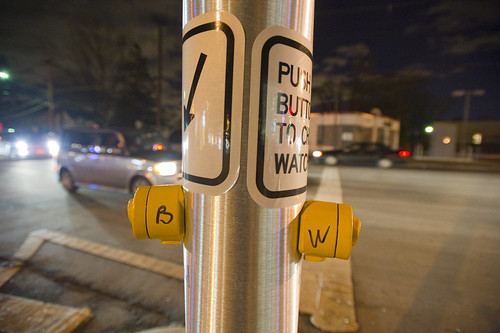
A curious inscription left by someone to clarify which button expedites which crosswalk signal. Someone has written with an indelible marker “B” and “W” on each button (for Broad Street and Watchung Avenue respectively), as well as writing an abbreviation on the pole (“WAT”, for example.) What is interesting here is that an official sign also indicates which direction is controlled by the button (“Push button to cross *arrow* Watchung”) making me wonder if this was an addition made after some complaints about the confusing buttons. What made this confusing initially was probably the fact that there are two crossings in roughly a straight line. You cross a small bit of one-lane street that subsequently does an easy turn onto Broad Street from Watchung, and then stand on this island with the buttons. Then you cross a larger street — Watchung Avenue proper — with several lanes. Approaching the island after a nervous crossing and then looking out into a daunting sea of fast-moving traffic on your way to a quick sugar fix at Holsten’s, you might think the first button you see is the one to hit, which would be wrong.

Why do I blog this? I find these sorts of thoughtful, improvised inscriptions fascinating. A different kind of “read-write” city or read-write urbanism, where people in their everyday moments take it upon themselves to make additions, hacks, DIY improvements and adjustments to make the city more livable and agreeable to their sensibilities. The points where urban design from the top-down meets urban living from the bottom-up.
Continue reading A Curious Crosswalk Clarification

Minor Urban Disaster

Montreal, Canada.

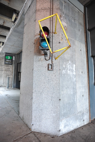
Curious minor urban disaster. The brace meant to prevent the signal light from being struck by a large truck or something was struck by a large truck or something and, thence, struck the object it was meant to protect.

Why do I blog this? I enjoy finding these disturbances in perfection and cleanliness. Typical, everyday moments in which a bit of history — however minor — is etched into solid metal and concrete to remind us of the below-the-radar bits of function of the city. We might call this a minor chink in the city’s urban armor battle suit thing.

Continue reading Minor Urban Disaster