When Automation Bites Back

The business of dishonest automation and how the engineers, data scientists and designers behind it can fix it

The pilots fought continuously until the end of the flight“, said Capt. Nurcahyo Utomo, the head of the investigation of Lion Air Flight 610 that crashed on October 29, 2018, killing the 189 people aboard. The analysis of the black boxes had revealed that the Boeing 737’s nose was repeatedly forced down, apparently by an automatic system receiving incorrect sensor readings. During 10 minutes preceding the tragedy, the pilots tried 24 times to manually pull up the nose of the plane. They struggled against a malfunctioning anti-stall system that they did not know how to disengage for that specific version of the plane.

That type of dramatic scene of humans struggling with a stubborn automated system belongs to pop culture. In the famous scene of the 1968 science-fiction film “2001: A Space Odyssey”, the astronaut Dave asks HAL (Heuristically programmed ALgorithmic computer) to open a pod bay door on the spacecraft, to which HAL responds repeatedly, “I’m sorry, Dave, I’m afraid I can’t do that“.

1. The commodification of automation

Thankfully, the contemporary applications of digital automation are partial and do not take the shape of an “artificial general intelligence” like HAL. However, the computational tasks that once were exclusively applied to automate human jobs in critical environments like a cockpit have reached people’s everyday lives (e.g. automated way-finding, smart thermostat) and the techniques often deployed for more frivolous but yet very lucrative objectives (e.g. targeted advertisements, prioritizing the next video to watch on YouTube).

“What concerns me is that many engineers, data scientists, designers and decision-makers bring digital frictions into people’s everyday life because they do not employ approaches to foresee the limits and implications of their work”

The automated systems that once relied on programmed instructions based on their author’s understanding of the world now also model their behavior from the patterns found in datasets of sensors and human activities. As the application of these Machine Learning techniques becomes widespread, digital automation is becoming a commodity with systems that perform at Internet scale one task with no deep understanding of human context. These systems are trained to complete that “one” job, but there are evidences that their behavior, like HAL or a Boeing 737 anti-stall system, can turn against their user’s intentions when things do not go as expected.

2. The clumsy edges

Recent visual ethnographies at Near Future Laboratory like  #TUXSAX and Curious Rituals uncovered some implications of that commodification of automation. In a completely different scale of dramatic consequences that brought down Lion Air Flight 610, these observations highlight how some digital solutions leave people with a feeling of being “locked in” with no “escape” key to disengage from a stubborn behavior. A wide majority of these digital frictions provoke harmless micro-frustrations in people’s everyday lives. They manifest themselves through poorly calibrated systems and a design that disregards edge cases. For instance, it is common to experience a voice assistant unable to understand a certain accent or pronunciation or a navigation system that misleads a driver due to location inaccuracies, obsolete road data or incorrect traffic information.

Curious rituals is a fiction that showcases the gaps and junctures that glossy corporate videos on the “future of technology” do not reveal. Source: Curious Rituals.

These clumsy automations can be mitigated but will not disappear because it became impossible to design contingency plans for all unexpected limitations or consequences. However, other types of stubborn autonomous behaviours are intentionally designed as the core of business models that trades human control for convenience.

3. The business of dishonest automation

Many techniques to automate everyday tasks allow organizations to reduce costs and increase revenues. Some members of the tech industry employ these new technological capabilities to lock customers or workers into behaviors for which they have no legitimate need or desire. Those systems are typically designed to resist from their user’s demands AND are hard to disengage. Let me give you a couple of examples of what I call “dishonest automations”:

3.1. Data obesity

Automatic cloud backup systems have become a default feature of operating systems. They externalize the storage of personal photos, emails, contacts and other bits of digital life. Their business model encourages customers to endlessly accumulate more content without a clear alternative that promotes a proper hygiene with their data (i.e. nobody has yet come up with “Marie Kondo for Dropbox ™”). Regardless of the promises of the providers, it becomes harder for people to declutter their digital lives from a cloud storage service.

Upgrade your storage to continue backing up: an automatic cloud backup system that locks in its user, leaving no alternative to the accumulation of content.

3.2. Systemic obsolescence

Today’s apps automatic updates often increase the demand of resources and processing power for cosmetic improvements almost in a deliberate attempt to make a hardware obsolete and the software harder to operate. After years of impunity, there is now a bigger conscience against systemic obsolescence because it is wasteful and exploits customers.

3.3. Digital attention

As content grows exponentially on the Internet, (social) media companies rely increasingly on automation to filter and direct information to each one of their users. For instance, YouTube automates billions of videos to play next for 1.5 billion users. These algorithms aim at promoting content for higher engagement and tend to guide people against their interest.


In the light of these examples of clumsy and dishonest automation, what concerns me is that many engineers, data scientists, designers and decision-makers bring these frictions into people’s everyday life because they do not employ approaches to foresee the limits and implications of their work. Apart from the engineering of efficient solutions, automation requires professionals to think about the foundations and consequences of their practice that transcend any Key Performance Indicator of their organization.

4. The design for humane automation

The design of automation is not about removing the presence of humans. It is about the design of humane, respectful and trustful systems that automate some aspects of human activities. When working with data scientists, designers and engineers in that domain, we envision systems beyond the scope of the “user” and the “task” to automate. I encourage teams to a) learn from the past b) critique the present and c) debate the future. Let me explain:

4.1. Learn from the past

When it comes to automation, the acquisition of knowledge in academia and in the industry are not separate pursuits. Over the last 50 years, there has been an extensive body of work produced in research institutions on the implications of automating manual tasks and decision-making. The key findings have helped save money in critical environments and prevent numerous deadly errors (e.g. in cockpits).

Today, that knowledge is not translated into everyday tasks. For instance, many engineers or data scientists do not master concepts like automation bias (i.e. the propensity for humans to favor suggestions from automated decision-making systems) or automation complacency (i.e. decreased human attention to monitor automated results) theorized by research communities in Science and Technology Studies or Human-Computer Interaction. Sadly, only a few organizations promote platforms that gather academics, artists, engineers, data scientists and designers. Industries in the process of digitization would greatly profit from this type cross-pollination of professionals who learn from considerations that already emerged outside of their discipline.

4.2. Critique the present

I believe that the professionals involved in the business of automating human activities should be persistent critical reviewers of the solutions deployed by their peers. They should become stalkers of how people deal today with the clumsy, the dishonest, the annoying, the absurd and any other awkward emerges of digital technologies in their modern lives.

#TUXSAX is an invitation to engage with these knotty, gnarled edges of technology. It provides some raw food for thoughts to consider the mundane frictions between people and technologies. Do we want to mitigate, or even eliminate these frictions? Source: Documenting the State of Contemporary Technology.

When properly documented, these observations offer a complementary form of inspiration to the multitude of “naive optimism” and glamorous utopian visions of the tech industry. They provide material for professionals to question arguably biased goals of automation. Moreover, they set the stage to define attainable objectives in their organization (e.g. what does smart/intelligent mean?, how to measure efficiency?, what must become legible?).

4.3. Debate the future

In today’s Internet, the design of even the most simple application or connected object has become a complex endeavour. They are built on balkanized Operating Systems, stacks of numerous protocols, versions, frameworks, and other packages of reusable code. The mitigation of digital frictions goes beyond the scope of a “Quality Assurance” team that guarantees the sanity of an application. They are also about documenting implications on the context the technologies live, unintended consequences and ‘what if’ scenarios.
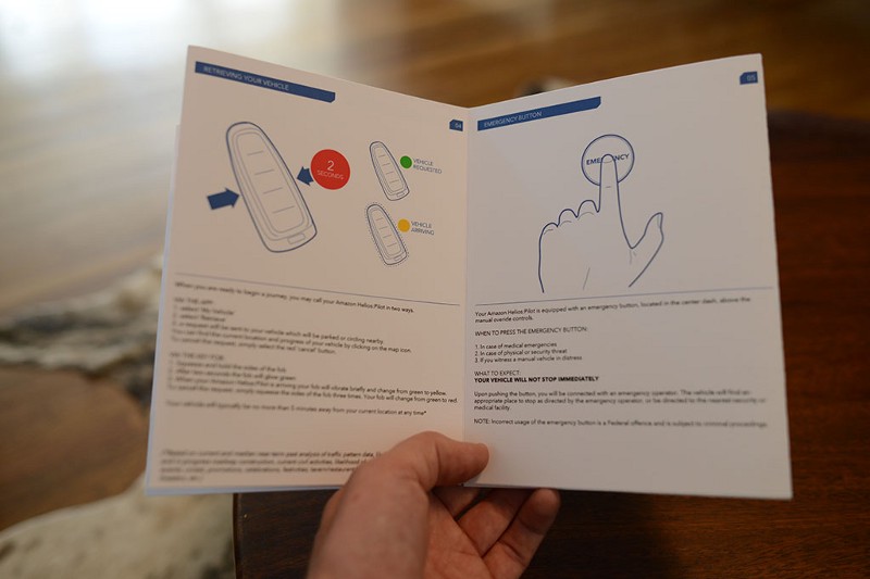
It’s easy to get all Silicon Valley when drooling over the possibility of a world chock-full of self-driving cars. However, when an idea moves from speculation to designed product it is necessary to consider the many facets of its existence - the who, what, how, when, why of the self-driving car. To address these questions, we took a sideways glance at it by forcing ourselves to write the quick-start guide for a typical self-driving car. Source: The World of Self-Driving Cars.

Typically, Design Fiction is an approach to spark a conversation and anticipate the larger questions regarding the automation of human activities. For instance, we produced Quick Start Guide of Amazon Helios: Pilot, a fictional autonomous vehicle. In that project, we identified the key systems that implicate the human aspects of a self-driving car and we brought to life such experiences in a very tangible, compelling fashion for designers, engineers, and anyone else involved in the development of automated systems. Through its collective production, the Quick Start Guide became a totem through which anybody could discuss the consequences, raise design considerations and shape decision-making.

5. The business of trust

Like many technological evolution, the automation of everyday life does not come without the frictions of trading control for convenience. However, the consequences are bigger than mitigating edge cases. They reflect human, organization or society choices. The choice of deploying systems that mislead about their intentions in conflict with people and society’s interests.

In his seminal work on Ubiquitous Computing in the 90s, Mark Weiser strongly influenced the current “third wave” in computing, when technology recedes into the background of people’s lives. Many professionals in the tech industry (including me) embraced his description of Calm technology that “informs but doesn’t demand our focus or attention.” However, what Weiser and many others (including me) did not anticipate is an industry of dishonest automation or solutions that turn against their user’s intentions when things do not go as planned. Nor did we truly anticipate the scale in which automation can bite back the organizations that deploy them with backslashes from their customers, society as well as policymakers.

View this post on Instagram

#curiousrituals #classic #vendingmachine

A post shared by nicolas nova (@nicolasnova) on

These implications suggest an alternative paradigm that transcend the purely technological and commercial for any organization involved in the business of digital automation. For instance, a paradigm that promotes respectful (over efficient), legible (over calm) and honest (over smart) technologies. Those are the types of values that emerge when professionals (e.g. engineers, data scientists, designers, decision-makers, executives) wander outside their practice, apply critical thinking to uncover dishonest behaviors, and use fictions to take decisions that consider implications beyond the scope of the “user” and the “task” to automate.

I believe that the organizations in the business of automation that maintain the status-quo and do not evolve into a business of trust might eventually need to deal with a corroded reputation and its effects on their internal values, the moral of employees, the revenues and ultimately the stakeholders trust.
Social Media at Human Pace

Most connected humans suffer from poor ‘data hygiene’. For instance, we are plainly grotesquely overfed on social media with its ‘anytime’ ‘anywhere’ experience and there is no rational end in sight. In this article, I introduce the reasons why I developed Humans, an app that offers a way to rationally manage too many social media contacts and slows down the consumption of status updates, tweets, selfies, and photos of all kinds.

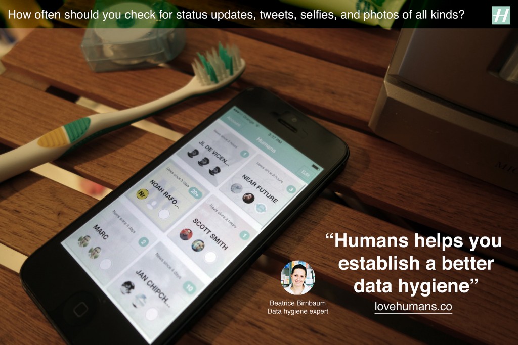
A fictional Humans ad suggesting a better practice of ‘data hygiene’

We live in a society that captures the moment, refashions it to ‘share’ across a network of social media endpoints containing algorithms and human, perpetually. Social media, its algorithms and its humans are highly optimized to never stop the cycle. Consequently, we experiencing an unprecedented increase in the rate of this ‘anytime’ ‘anywhere’ consumption cycle. As of 2014, according to the Nielsen US Digital Consumer Report almost half (47%) of smartphone owners visited social networks every day. On top of that, it is not uncommon for a Facebook user to have 1,500 posts waiting in the queue when logging in. Yet, the perpetual consumption yields to very little and there is no rational end in sight. We are quite plainly grotesquely overfed on social media.

Social media needs its consumption cycle. It depends on ‘views’, ‘eyeballs’, ‘reshares’, ‘likes’, ‘comments’ — the euphemism used by the media mavens is the optimistic word ‘engagement’. We are bloated on ‘engagement’ to the point where we sleep with our nodes, wear them on our wrists, clip them to our dashboards, autistically shove them in pockets only to immediately remove them only to shove them back in our pockets only to immediately remove them in order to slake our thirst for more content. This ‘too much, too fast’ consumption cycles has reduced an ability to pay sustained attention, have a meaningful conversation, reflect deeply — even be without our connected devices.

Humans create technologies, adapt their behaviors to them and vice-versa

The fact is that each major revolution in information technology produced descriptions of humans drowning in information unable to face tsunamis of texts, sounds, images or videos. For instance, in the 15th century Gutenberg’s printing press generated millions of copies of books. Suddenly, there were far more books than any single person could master, and no end in sight or as Barnaby Rich wrote in 1613:

“One of the diseases of this age is the multiplicity of books; they doth so overcharge the world that it is not able to digest the abundance of idle matter that is every day hatched and brought forth into the world”

Besides a Luddite position of some that rejected technological change, the invention of printing began to generate innovative new practices and methods for dealing with the accumulation of information. These included early plans for public libraries, the first universal bibliographies that tried to list all books ever written, the first advice books on how to take notes, and encyclopedic compilations larger and more broadly diffused than ever before. Detailed outlines and alphabetical indexes let readers consult books without reading them through, and the makers of large books experimented with slips of paper for cutting and pasting information from manuscripts and printed matter — a technique that, centuries later, would become essential to modern word processing.

Historically, humans have adapted to the increasing pace of information exchange with the appropriation of new practices and means to filter, categorize and prioritize information feeds.

Similarly, a couple of centuries later, the increasing presence of the telegraph multiplied the levels of stress among merchants used to more local, slower and less competitive transactions. They eventually adapted to the new pace of information exchange with new practices and means to filter, categorize and prioritize information feeds.

From social media ‘diets’ to ‘data hygiene’

What today’s most connected people share with their ancestors is the sense of excess and related discomfort, and stress linked to information load. In many ways, our behaviors for coping with overload have not changed. Besides the promises of AI and machine learning that trade control for convenience, we still need to filter, categorize and prioritize, and ultimately need human judgment and attention to guide the process.

These behaviors perspires in popular media and the many articles that share tips to follow successful social media diets, detox, or cleansing programs. The authors typically advise their readers to move away from being constantly ‘on top of things’ and to give up on concerns of missing out or being out of the loop. The diets are about replacing one behavior with another more frugal by pruning the many social networks (‘quit’, ‘uninstall’, ‘unplug’, ‘remove profile’) and contacts (‘mute’, ‘unfollow’). Yet they target a temporal improvement and fail to promote a more profound sustainable behavior with positive reinforcement.

Besides the promises of AI and machine learning that trade control for convenience, we still need to filter, categorize and prioritize, and ultimately need human judgment and attention to guide the process.

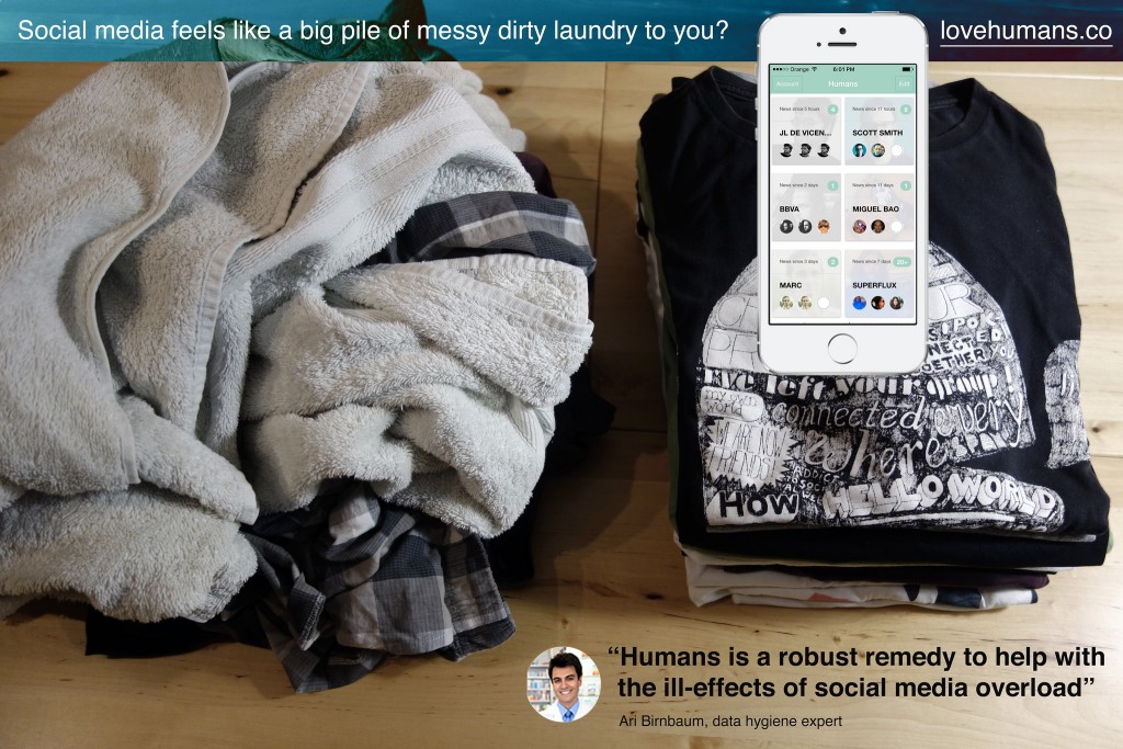
Social media platforms have also slightly updated the interfaces to support these behaviors. For instance Facebook recently started to allow users to specify the certain friends and pages that should appear at the top of the feed and Twitter introduced a ‘while you were away’ feature to its home timeline. Yet, social media feeds still feel like an endlessly accumulating pile of messy dirty laundry.

There is an opportunity to reconsider how we use social media and how we build it. Social media that gives human control to prioritize certain feeds over others, but without normalizing content into something less messy, and less complicated than a human. In fact, adapting to social media overload is not about being ‘on a diet’ than having a good ‘data hygiene’ with a set of rituals and tools. This is what I explored along with my colleagues at Near Future Laboratory with the design and development of Humans.

A fictional Humans ad suggesting a proper ‘data hygiene’.

Introducing Humans

Humans is an app that offers a way to rationally manage too many contacts and slows down the consumption of status updates, tweets, selfies, photos of all kinds. Its design inspires from observations on how humans adapt to the feelings of information overload with its related anxieties, obsessions, stress and other mental burdens. Humans is the toothbrush for social media you pick up twice a day to help prevent these discomforts. It promotes ‘data hygiene’ that helps adjust to current pace of social exchanges.

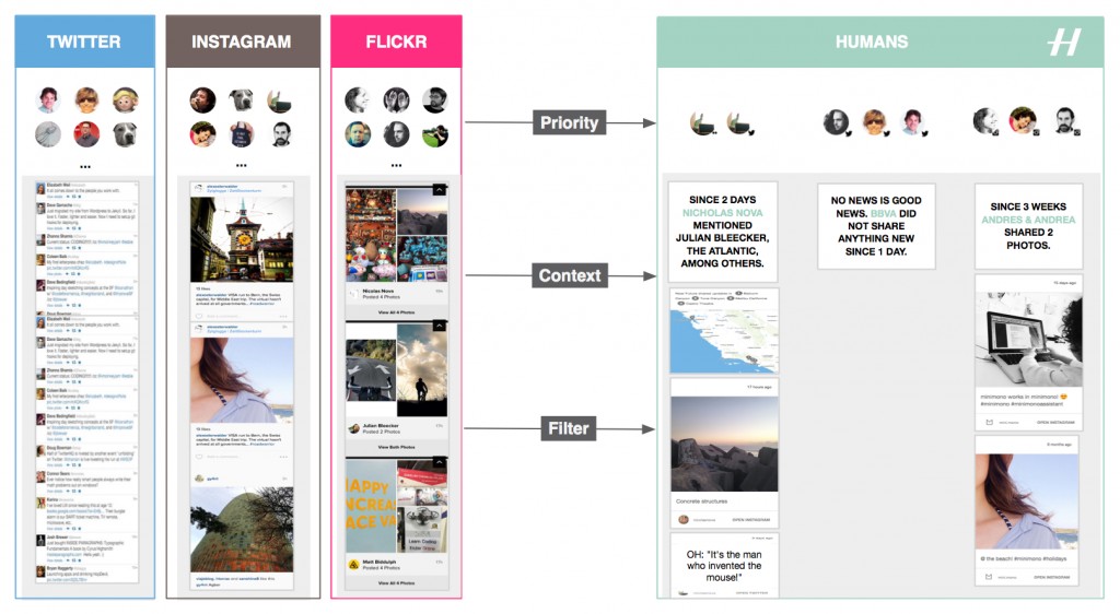
First, Humans gives means to filter, categorize and prioritize feeds spread across multiple services, like Twitter, Instagram, and Flickr. The result forms a curated mosaic of a few contacts, friends, or connections arranged in their context.

Humans gives means to filter, categorize and prioritize feeds spread across multiple services, like Twitter, Instagram, and Flickr.

Additionally Humans strips social network interfaces and algorithms from their ‘toxic’ elements that foment addictions and arouse our desire to accumulate rather than abstract. And that without altering the fascinating dynamics of social networks. One inspiration this ‘data hygiene’ design pattern is the Facebook Demetricator provocative project that removes any number present in the Facebook interface. Its developer Benjamin Grosser advocates for the reduction of our collective obsession with metrics that plays out as an insatiable desire to make every number go higher. Another inspiration is the Little Voices app that removes the ‘noise’ from Twitter feeds and that is ‘ideal for those who like their feeds slightly quieter’.

Taken together, the benefits of using Humans are:

Reduce the compulsion to perpetually check Instagram, Twitter and Flickr

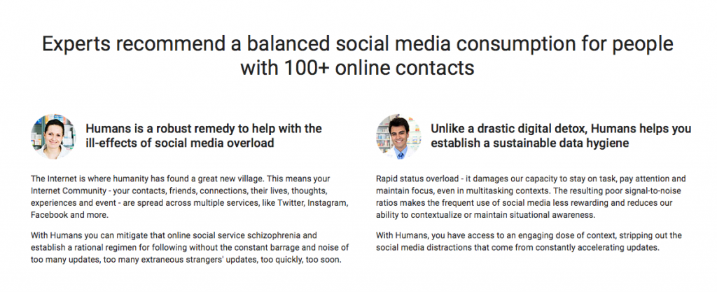
A frequent use of multiple social media services reduces our ability to contextualize and focus. With Humans, you can mitigate that online social service schizophrenia and establish a rational regimen for following without the constant barrage and noise of too many extraneous strangers’ updates. It works with the main social media platforms.

Keep away from the distractions in social media feeds

Get access to content stripped out of the social media distractions. Humans removes visual noise and arrange in their context the many status updates, links, selfies, photos of all kinds.

Mitigate feelings and symptoms of remorse whilst taking short or long offline breaks

If you have been away from your screens or too busy, Humans creates digestible doses of context that will get you up to date.

I designed and developed Humans to exemplify a new mean for ‘data hygiene’ with an interface and algorithms that adapt to human pace and do not uniquely focus on the real-time, the ‘now’, and the accumulation of ‘likes’ and ‘contacts’. Or as our fictional experts in ‘data hygiene’ would suggest:

Humans data hygiene experts

Check lovehumans.co for more information and request the app.

The near future of data hygiene

At Near Future Laboratory, we like to investigate alternative paths for technology. As data and connectivity augment our lives, hygiene might no longer only relate to maintaining a healthy body. Connected humans produce ‘data doppelgängers’ and consume data ‘anywhere’ and ‘anytime’ at an unprecedented rate. Consequently, they start to experience discomforts such as social media overload that Humans helps mitigate.

Like other information technology revolutions, there is a necessity for people to adopt new rituals and tools. In the near future we might see emerge interfaces, experiences, algorithms, design patters that reshape our social practices and for instance:

  • moderate our collective obsession with metrics and the pervasive evaluation and comparison of one self.
  • reclaim space for conversation over the illusion of the connection, its ‘retweets’ and ‘likes’.
  • reduce the social cost to ‘unfollow’.
  • promote solitude as a good thing.
  • regulate our insatiable desire to capture ‘moments’ and accumulate ‘contacts’.
  • help us overcome the ineluctable situations of digital amnesia.
  • empower our skills for abstraction and generalization from the ‘moments’ we capture.
  • help us forget to better remember.
  • invite us to expect less from technology, and more from ourselves and each other.

More on these topics in upcoming projects.

Some Critical Thoughts to Inspire People Active in the Internet of Things

DSC01857

It has never been so easy to build things and throw them into people’s pockets, bags, phones, homes, cars. Almost inevitably — with this abundance of ‘solutions’ — it has never been so easy to get caught in the hyperbolic discourses of perpetual technological disruptions with their visions of flawless connectivity and seamless experiences. When translated literally, theses visions often take the form of a questionable world of Internet of Things (IoT).

At Near Future Laboratory, we get the chance to meet amazing people active in the IoT who request critique and feedback on their products. We help them abstract from the hype of the dominant vision and gain fringe insights that can refresh their strategies. To do so, I often dig into the rich literature produced in the early days of ubiquitous computing. Some of the texts were published more than 10 years old, but — trust me — they all carry inspiring thoughts to improve the contemporary and near future connected worlds.

I hope this accessible academic literature is useful for people active in IoT curious to enrich their ethical, human, geographic and social perspectives on technologies. En route and beware of shortcuts!

The shift from the showcase of the potential of technologies to the showcase of active engagement of people

Written in 1995, Questioning Ubiquitous Computing critiqued that research in ubiquitous computing is conceived as being primarily as the best possibility for “achieving the real potential of information technology” and had little to do with human needs and much more with the unfolding of technology per se.

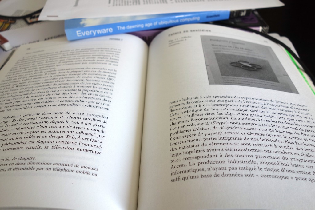
Ten years after, based on similar observations, but with more constructive arguments, Adam Greenfield wrote Everyware to question the implications of the scale up of ubiquitous computing and genuinely how to improve the connected world he coined as “everyware” [my notes].

DSC01861

In the same period voices raised to rephrase the approach of ubiquitous computing. For instance, in Moving on from Weiser’s vision of calm computing: engaging ubicomp experiences Yvonne Rodgers promotes connected technologies designed not to do things for people but to engage them more actively in what they currently do [my notes].

The shift from the design of a perfect future to the design for the messiness of everyday life

Similarly, in Yesterday’s Tomorrows: Notes on Ubiquitous Computing’s Dominant Vision Genevieve Bell and Paul Dourish highlight that the problems of ubiquitous computing are framed as implementation issues that are, essentially, someone else’s problem, to be cleaned up as part of the broad march of technology. In other words, the dominant vision of ubiquitous computing promotes an indefinitely postponed future in which someone else will take care of solving any technological (e.g. interoperability, fluctuant connectivity, or limited battery life) or social issues. Consequently, the text argues for a “ubicomp of the present” which takes the messiness of everyday life as a central theme [my notes].

That notion of messiness of technological settings provoked the interests of researchers to regard technological imperfections as an opportunity for the design of everyday life technologies. William Gaver pioneered work in that domain with his proposals of Ambiguity as a Resource for Design that requires people to participate in making meaning of a system [my notes] and Technology Affordances that promotes interfaces disclosing the direct link between perception and action. Practically, as advocated by Matthew Chalmers in Seamful interweaving: heterogeneity in the theory and design of interactive systems, this means that people accommodate and take advantage of technological imperfections or seams, in and through the process of interaction. In No to NoUI, Timo Arnall gives excellent additional arguments that question the tempting approach of “invisible design”.

Observing the dynamic relationship of technology, space and humans to demystify the perfect technology

In her PhD dissertation A Brief History of the Future of Urban Computing and Locative Media Anne Galloway shows that ubiquitous technologies reshape people experiences of spatiality, temporality and embodiment in the networked city. Her contribution augments an extensive literature that investigates how technologies are not the sole drivers of urban change and how they co-evolve with the urban fabric as they become woven into the social, economic and political life of cities. Code/Space is a seminal book by Rob Kitchin and Martin Dodge that precisely discuss software from a spatial perspective, analyzing the dynamic relationship of software and space. The production of space, they argue, is increasingly dependent on code, and code is written to produce space [my notes]. In that machine readable space bugs, glitches and crashes are widely accepted imperfections as the routine part of the convenience of computers [my notes]. Also, ubiquitous computing helps remake urban spaces through new formed strategies of security. For instance some chapters of the book Cybercities Reader talk about the emerging militarized control society encouraged by the dream of the perfect technology and the myth of the perfect power [my notes].

DSC01862

Precisely with the objective of moving beyond these dreams that foster indefinitely postponed futures, Nicolas Nova wrote Futurs? La panne des imaginaires technologiques that explores alternative ways to imagine and design future objects and experiences including Design Fiction.

I took many shortcuts to put together these heterogeneous publications but I hope that some of them can help you better question the dominant visions of the IoT and enrich your approach to improve any of the technologies that are constantly getting closer to people, their homes, streets and clothes (e.g. AI, Big Data, etc).

Weekending 03062012

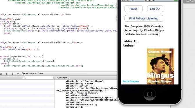
Um. Well, here in Los Angeles it’s been lots of fun/frustrating days getting back into programming the computer. I’ve been getting a bit overwhelmed by the growing list of “ideas” that I thought would be good ways to get back into it. They’re mostly exercises that I thought would be better than following on in the usual lot of slightly mundane book exercises. The one I’m most curious about is a sort of social browser that, like Windows Phone 7’s live tiles, lets me flip through my friends social service “updates” and the like — but do so without having to go to the services, search for my friend, and then see what they’ve done. So — people first, rather than service first. Nothing brilliant there in that, but more a personal preference. Plus, also being able to see stuff from ancient history (many months or even a year ago) along with the latest stuff.

Some folks have mentioned that Path does this in some fashion. I’m still trying to see how. Right now? Path seems as noisy as Twitter. I’m looking for something a bit more — calmer. And the fact that Path is a kind of mobile Facebook status update yammery thing makes me want to enforce a simple rule that limits the number of slots for people. Or puts individuals in a special “Joker’s” slot based on which of your chums are being more yammer-y. Something like this. But, a couple week’s usage of Path leaves me thinking that there’s something that I want that is missing yet still. It’s still everyone. And sometimes you don’t want to share with or hear from everyone.

I also spent a bit of time preparing for a workshop at the Walker Art Center, where the staff is doing some work on the possibilities of speculation and interdisciplinarity for their own internal work. Looking forward to that a bit — especially to try some of the techniques we use in the studio on a group of people who I basically know nothing about.

Oh, that photo? That’s me programming a networking app while flying in an aeroplane. I know it’s not a big deal, but it sorta is for me in a nostalgic sorta way. I think the last time I did that I was heading to the Walker Art Center in, like..2003. Programming in an airplane, that is. Certainly there was no networking going on at the time — but still. It’s sorta nostalgic and fun to get back to that sort of work.

On my side (Nicolas), the beginning of june is packed with different talks in Europe, the organization of a 3-days conference about video-games, preparing the Summer in Los Angeles and the writing of the game controller book… hence the quiet participation to the weeknotes here.

New Aesthetic // OOO // Future of Things

It’s very gratifying to see how the #newaesthetic discussions are popping and percolating across the networks. There’s something to it, I think. Specifically the observations that something here under the New Aesthetic rubric is worth considering, thinking-through, working-towards.

What is that *something? It is perhaps an aesthetic thing. Perhaps it is symptomatic of the whole algorithmic life thing. Perhaps quite a good bit of articulate insights and cleverly stated things by some smart fellas. Also, perhaps those fellas having the *gumption to get up and say some things in a highly entertaining way. Perhaps it’s the thing of a bit of well-deserved very vocal network meme pot-stirring. Certainly some combination of all of these and likely more, you know..things.

Giving a name to an observed phenomena to muster hunches and instincts and observations and focus the meaning-making of things helps to organize thinking around it. That’s the upside.

The downside is that the thing sort of reifies in a way that isn’t always helpful. Or, you know — when things get a bit too academic. Too yammery..less hammery.

Another downside? The art-tech wonks claiming they’ve been doing it all along — of course they have..of course they have..It’ll get worse when it gets theorized as an aesthetic. Then it’ll get all ruined. An aesthetic about the cultures we live in? How do you get to such a thing? Do you use a really tall ladder?

And there’s some linkage to the #OOO // Object-Oriented Ontology world. Ian’s book Alien Phenomenology, or What It’s Like to Be a Thing points towards the inexplicable (as of yet) dark matter // God Particle // elusive ionized Bogoston particle behind it all, I suspect.

The questions that loosely link #OOO // New Aesthetic // Future of Things in my mind are still quite loose and inarticulate. THere’s something amongst them if only because they each point to “things” as having a sort of uncanny role in our networked world. They’re idiotic things, like Siri and algorithmic Cows. They’re the Long Follow Droid. They’re P.K. Dick style Dazzle Camouflage .

I’m trying to nail down the un-nail-downable. Clarity comes whilst in the middle of a night cycle when I’m utterly convinced of my lucid train of thought, which inevitably disappears into a “what? that makes *no sense” recollection after putting the bike away. But here goes..Questions that somehow wrangle these things:

* What are the ways our things of (presumably) our creation begin to express/articulate themselves in unexpected and weird ways? What is the catalyst for these differently animated, chatty things? Sensors? Networks? It’s been done before — talismans, tea leaves, idols, urns. We talk to thing and let them talk back to us, guide us from beyond. What different now? A bathroom scale that tweets your weight. Plants that yammer for water. I tried to figure this out a fistful of years ago when I wrote a short essay called Why Things Matter (The blog post was called A Manifesto for Networked Objects.) I’m not much further along in understanding why, but I think Alien Phenomenology is helping.

* What are these new things? They seem to be articulate enough to express themselves across the digital-physical barrier, in whatever way, with whatever assumptions one might make about the capabilities of the network+algorithms+human+imagination to produce collectively. When architecture expresses digital sensitivities in a physical way, should we be rolling our collective eyeballs at the irony? Or take it as a weak signal of systemic brake pads weeeing and screeching?

* Something is going on in the world of bespoke things, I think. Things made that capture sensibilities that are far away from what can be made en masse. What is that something-going-on? Is it an aesthetic? Is it new again? Is Kickstarter (uh..) equally #newaesthetic and #thefutureofthings an indicator that massively made is old fashioned and highly particular // nearly custom // curated is fun again?

* Things that live in the networked age and with the sensibilities and expectations we have now for what things are capable of, suggest something new is going on. Drones, wondering, autonomous, robotic vision (absent HAL-like autonomous / artificial intelligence), bots, droids, listening things. That’s weird. It’s uncanny. Unsettling and seductive all at once. Look at that droid following that dude. He can’t get away. I mean — if it’s lugging crap for me, cool, I guess. If it’s following me like a hungry, zealous, huge, disgustingly fast man-eating Possum..not so cool..

I think the #newaesthetic is best left as it is for the time being. A simmering stew of lightly curated matter scrolling by with a giant *shrug across James’ New Aesthetic Tumblr. Inexplicable, by definition. Lightly joked about. Sought out, hunted for, skinned and stuffed and mounted on the Tumblr by the rogue curious.

Please, don’t make me throw wet cabbage at you. It’s the symptom of the algorithm. It’s what comes out of the digital-political-economy of cultures that live by networks and the machinary (soft/hard/hashtag-y) that underpin it all. All this #newaesthtic #ooo #futureofproduction stuff is the excess. The unexpected, unplanned for result. It’s the things that happen without one self-consciously *going after* #newaesthetic / object-oriented ontological / future of network connected things sensibilities.


You can’t force this one. You can’t “do” New Aesthetic. It’s a Zizekian-Lacanian symptom of the networked world smushed up with overzealous design-technology and real aspirations to get things done. It’s horrifyingly beautifully unappeallingly seductive. It’s the nostril that must be picked. It’s the *shrug of bafflement upon seeing connected porn vending machines on a Lisbon Alto Barrio street corner with a screen built-in for watching right there. It’s what results from kooky, well-meaning stuff that gets connected, gets digital and gets inexplicable and comes out weird.

Weekending 26022012

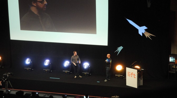
Over here in Geneva, the Laboratory was involved in the Lift 12 conference with various activities. Fabien attended the event and Nicolas is part of the editorial team and, as such, he took care of one third of the keynotes presentations with sessions about games, stories, mobile and near futures. He also organized three workshops, one about networked data (with Interactive Things), one about location-based games (with Mathieu Castelli) and another one about foresight methodologies (with Justin Pickard and Anab Jain from Superflux). The week was therefore very active and it was a great event overall. Lots of encounters with good people, new ideas and existing memes (it’s now time to digest all of those).

Saturday was then devoted to a sort of pilgrimage at CERN with Lift12 speakers.


Well, here in Los Angeles we mostly were working on, oh — let’s call it Marshall Stack. It’s a Project. It’s another project along with Ear Freshener that belongs to the Project Audio Suite. It was some very pragmatic, tactical bits of work that we were doing which meant corralling the team, especially the instrumental implementors — the engineers. It also meant writing up a UX specification but doing it in a non-tedious but very clear way. No boxes and arrows. It’s narrative. It’s more a story than flow chart, which I like. My hope is that it engages people in a way that a story does, rather than making people’s eyeballs glaze over and close as a flow chart or wireframe potentially can do. There was some good, very promising engagement with the technology team who come across as confident and certainly capable. But there’s always that nagging concern that comes from a twinge of engineers’ over-confidence. When idioms like “we can just smash this”, “correct me if i’m wrong — but this smells like just a weekend project” — a little bell goes off in my head that is a mix of “great! this’ll go smooth” and “hold on..but *how and which weekend are we going to smash it?”

Part of the job of creative lead in this case is, I think, to run ahead of that end of things as, at this point — it’s the known unknown. Meaning — there isn’t certainty as to how to implement this although it is definitely possible — we’re not trying to get to Mars or make a cold fusion reactor in a mayonnaise jar. This is entirely doable. It’s now time (4 weeks), enthusiasm and motivation and quite a bit of good, engaging story telling that will put a lovely frame around the experience.

I’m doing some detailed logging of the evolution of Marshall Stack because I think there are some good procedural lessons in the project. The bump and shove of a project and where things get lost and where new things get found. The evolution of things from initial aspiration to a sudden simplification; how different aspects of a project get culled in the interests of expediency. Ways of communicating and sharing and discovering new facets of a concept. Etc. We’ll see. It’ll make for a good postmortem narrative, or whatever you’d call it.
Continue reading Weekending 26022012

The iPod Time Capsule – Notes on Listening + Time + Design of Things That Make Sound

Over the week’s end I was in the back studio tearing down and rebuilding the wall of photos for the Hello, Skater Girl “side” book project. I was tasked with this particular endeavor by the guy I hired to do the book design. I knew I’d have to do it all along which is why I had put up sound board many, many months ago.

It was going to be an all-afternoon-into-the-evening effort, which is fine. Making a book is hard fun work. I needed music but I didn’t want to suffer the tyranny of choosing or even curating a list of things. I just wanted music to come out of the stereo.

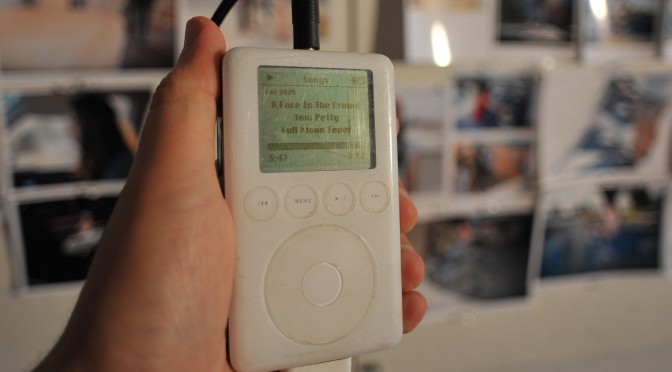
And then I remembered — I have my old dear friend’s ancient 2004 iPod. She gave it to me when she upgraded and I’ve never even looked at it. It’s just followed me around from city to city and house to house. There it was.

I plugged it in and it booted up just fine. And then I just pressed play and got to work.

It was a sea of past era music. Not super past — early 2000s. Perfectly fine. Some songs I may not have chosen. Some songs I didn’t know. Whatever. It was somewhat enthralling to realize I was listening to a frozen epoch of sound, incapsulated in this old touch wheel iPod. I sorta wish I had my original iPod. As it is, I still use my 80gb model, although that’s becoming a bit obsolete as a device in this era of having all-the-music-in-the-world-in-the-palm-of-your-cloud-connected-device.

I find it a bit incredible that this thing still works. I mean, it’s a hard drive with a little insect brain — so there aren’t firmware drivers to suffer incompatibilities with a future it was never destined for. Even though it has become obsolete in the consumer electronics meaning of obsolete — it can still work and sound just comes out of it the way an audio device should function.

That’s significant as a principle of audio and sound things, so I’ll say it again sound just comes out of it — and it does. The old trusty 3.5mm jack delivers amplitude modulated signaling in a way that is as dumb as door knobs — and that is as it should be. Not every signal should or needs to be “smart”..just like every refrigerator need not be smart. It’s back to basics for very good reason, I would say. (Parenthetically, I’ve been assaying a fancy new mixed-signal oscilloscope which can take an optional module to specially handle audio signaling — there are audio processing…)

What’s the future of that for the collective of things? How many things will work beyond their time? What are the things that won’t need an epic support system of interfaces, data, connectivity to *just work* after their time in the light? What of the cloud? When it breaks, grows old, has an epic failure that makes us all wonder what the fuck we were thinking to put everything in there — will my music stop coming out of my little boxes?

As I pinned up lots of little photos and every once and again checked the iPod to see what was playing, I thought about some stuff related to the design of audio and design of things that make sound.


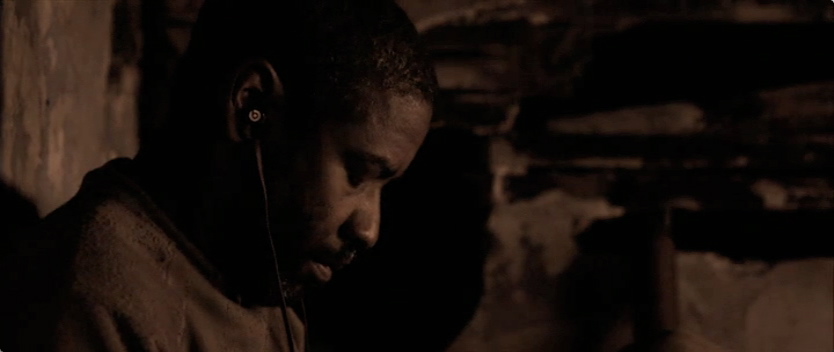
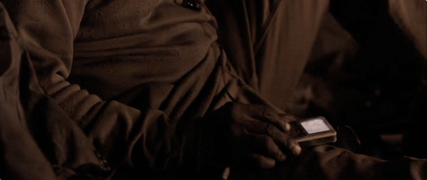
iPods and music players generally are great single-purpose devices from the perspective of their being time capsules of what one once listened to. You’ll recall the role the iPod played in the apocalyptic tale “The Book of Eli” — it becomes a retreat to a past life for the the messianic title character. And despite the end of the world (again) the device will still work with a set of headphones the (potentially unfortunate) propriety dock connection and means to charge it through that dock connection. Quite nice for it to show up as a bit of near future design fiction.

What will happen to the list of music, which already seems to be a bit of a throw-back to hit parades and top 100s sorts of thigns. Those are relics from the creaky, anemic, shivering-with-palsy, octogenarian music industry which gave you one way to listen and one thing to listen to — broadcast from the top down through terrestrial radio stations that you could listen to at the cost of suffering through advertisements.

Now music (in particular, lets just focus ont that) comes from all over the place, which is both enthralling and enervating. Where do you find it? Who gets it to you and how? How do you find what you don’t even know is out there? Are there other discovery mechanisms to be discovered? Is this “Genius” thing an algorithmic means of finding new stuff — and who’s in charge of that algorithm? Some sort of Casey Kasem AI bot? Or the near future version of a record play graft scam? Or do we tune by what we like to listen to?

And despite the prodigious amount of music on this flash-frozen iPod from some years ago — now kids are growing up in a world in which many orders of magnitude *more music is available to them just by thinking about it..almost. It’s all out there. Hype Machine, Spotify, Last.fm, Rdio, Soundcloud..in a way YouTube — new music players and browsers like Tomahawk, Clementine — whatever. These new systems, services, MVC apps or whatever you want to call them — they are working under the assumption that all the music that is out there is available to you, either free if you’re feeling pirate-y or for a 1st world category “small fee” if you want to cover your ass (although probably still mug the musicians.) The licensing guys must be the last one’s over the side on this capsizing industry.

Listening rituals must be evolving as well, I’d guess. Doing a photography book about girl skaterboarders means that you end up hanging out with girl skateboarders and you end up observing what and how they listen to music. What I’ve noticed is that they do lots of flipping-through. They’ll listen to the hook and then maybe back it up and play it again. And then find another song. It’s almost excruciating if it weren’t an observation worth holding onto. I wonder — will a corner of music evolve to nothing but hooks?


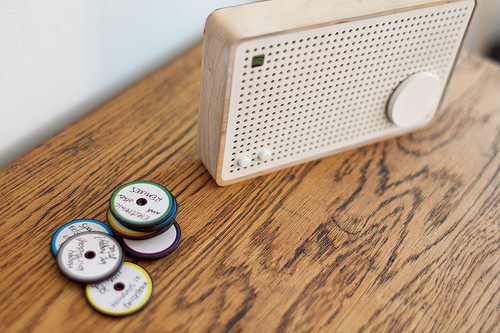
Spotify Box project on IxDA awards thing is interesting to consider. I love the way the box becomes the thing that sound just comes out of. And the interaction ritual of having physical playlists in those little discs is cute. The graduate student puppy love affair with Dieter Rams is sweet in an “aaaahhh..I remember when..” sorta way. It’s a fantastic nod to the traditions and principles of music. And the little discs — well, to complete the picture maybe they should be more evocative of those 45 RPM adapters some of you will remember — and certainly plenty of 23 year old boys with tartan lumber jack flannels and full-beards are discovering somewhere in Williamsburg or Shoreditch or Silver Lake. They’ll love the boo-bee-boo sound track that the project video documentation comes with. Great stuff. Lovely appearance model. For interaction design superlativeness — there’s some good work yet to be done.

Okay. So…what?

It is interesting though to think of the evolution of things that make sound. And I suppose there’s no point here other than an observation that lists are dying. I feel a bit of the tyranny of the cloud’s infinity. If I can listen to *anything and after I’ve retreated to my old era favorites — now what? The discovery mechanisms are exciting to consider and there’s quite a bit of work yet to be done to find the ways to find new music. It definitely used to be a less daunting task — you’d basically check out Rolling Stone or listen to the local college radio. Now? *Pfft. If you’re not an over eager audiophile and have lots of other things to do — you can maybe glance around to see what friends are listening to; you could do the “Artist Radio” thing, which is fine; you could listen to “artist that are like” the one you are listening to. Basically — you can click lots of buttons on a screen. To listen to new music, you can click lots of buttons on screen. And occasionally CTRL RIGHT-CLICK.

Fantastic.

In an upcoming post on the design of things that make sound, we’ll have a look at the interaction design languages for things that make sound.

Before so, I’d say that clicking on screens and scrolling through linear lists have become physically and mentally exhausting. Just whipping the lovely-and-disruptive-at-the-time track wheel on an old iPod seems positively archaic as names just scrolled by forever. The track wheel changed everything and made the list reasonable as a queue and selection mechanism.

But, can you imagine scrolling through *everything that you can listen to today? What’s the future of the linear list of music? And how do we pick what we play? What are the parametric and algorithmic interaction idioms besides up and down in an alphabetically sorted list of everything?

Good stuff to chew on.

More later.

Why do I blog this? Considerations to ponder on the near future evolution of things that make sound and play music in an era in which the scale of what is available has reached the asymptotic point of “everything.” What are the implications for interface and interaction design? What is the future of the playlist? And how can sound things keep making sound even after the IEEE-4095a standard has become obsolete. (Short answer — the 3.5mm plug.)

Continue reading The iPod Time Capsule – Notes on Listening + Time + Design of Things That Make Sound

This Is What I Sent — The Ear Freshener PCB Design

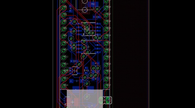
Here’s the current PCB CAD for the Ear Freshener. It’s sorta got two sides, but on the top I basically have a carrier for another board that contains the audio codec device. The components around it are all the brains that control track selection from the potentiometer/knob — that people will think, hopefully, is the volume knob, but actually it isn’t.

The gag/provocation is that knob. It’s an audio thing with a knob..but the knob isn’t an on-off thing. Rather, it’s some kind of semantic intensity knob. You turn it “up” and you get more-of. You turn it “down” and you get less-of.

There’s also a spot to hook up a little button. The button switches the Ear Freshener sound idiom. So you can go through the seasons; or cities; or airports.

((We should figure out a good name for the gag/provocations that we always build into our little devices.))

To do this, I’m probably a little over-engineered, maybe. Maybe not. I use two Atmel Attiny25‘s that basically do the track selection through a data port control on the audio codec. Basically counting in binary, with the track selection one doing the low-order bits and the high-order bits selecting the sound idiom you’ll be freshening your earballs to.

There’s also a bit of circuitry for a step-up regulator. I want to run this off of a single, readily available battery cell — AAA or AA. I’m over USB charging for the time being. At least now. The extra crap you need is a headache. Sorta. I guess I just wanted to get back to that thing where your audio devices take a battery. Not that I want more batteries in the world, but the rechargeable ones? They’re fantastic nowadays. Lots of capacity.

You’ll notice there’s a bunch of nothing on the right. I put that there for mechanical mounting of a battery holder for now. I just didn’t want the battery dangling off in nowheresville. This way I can double-sided sticky tape it to for testing and carrying around.

That’s the deal. I sent off the data to AP Circuits for the first time. It was about $40 with shipping for two boards. The boards are about 2.1in by 2.3in, so sorta small. There was a bit of back and forth to get the data they needed, especially for the board outline. This always ends up being something I leave out — my CAM Processor script doesn’t have that layer built in as output. Need to look into that.

Why do I blog this? I need to keep going on making logs of activity for the various projects that go on here, even if it’s a quick note.

Sound Should Just Come Out Of It

I think going forward I should do a better job of talking around what we’re working on from a technical point of view, until such time as it’s okay to talk about what we’re doing from a principles, rituals and practices point of view. And, also — sometimes in the thick of a design-making-schematic-and-hot-air-baking fire-fight, I do something that I”ll likely have to do again, but without a good, thorough practice of writing things down to remember I, like..forget.

Here’s the thing. I’m making a little tiny audio device. It’s tiny and meant to be simple to use. Like Russell taught me — the thing about audio? You should be able to just turn it on and sound comes out.

I like that rule. That’s what radios used to do before all the knobs, settings, configuration preferences, long vertical scrollable lists and Internet connections fucked things up. You turn the little serrated rotary dial and *click* — radio sound. At worse? Static. But sound started. No swipes. No multi-finger gestures. No tyranny of the 10,000 hours of music & sound in the palm of your hand..and no idea what you want to hear.

There’s something lovely about that that is just pragmatic from an IxD and UX design point of view. I’m not being nostalgic.

So — translating this principle and making it active and not just a sweet, essentialist sounding statement into the guts of the things we’re making, I spent most of yesterday pondering how to make Ear Freshener exhibit and embody and be an exemplar of this design rule. Even to the point of saying, okay..no on-off switch.

Huh?

Yeah, well — the Ear Freshener has the advantage of being a plug-y thing. No speaker. It’s an intimate audio headphone thing. You’d only expect sound out of it when you plug in your headphones. Otherwise — it’s just a little thing that’s quite opaque. There’s only the tell-tale 3.5mm hole that indicates — audio/sound/plug-in-y-ness.

So — simple enough. I decided that plugging-in should equal sound-coming-out. That means that the plug action should turn the actual electronics on. In the world of audio connectors, CUI, Inc. is the go-to operation — along with what I’m sure is a thriving, teeming “ecosystem” of knock-off competitors who may even produce a superior product. They make all sorts of audio connectors for the world of audio devices. There’s a collection of them that have more than the three connectors that are necessary for a Tip Ring Sleeve style stereo audio signal, including the SJ-43614 which is a 3.5mm plug with four signals. The extra one switches from floating (not connected to anything) to ground (or the “sleeve” of the connector, which is normally connected to ground) when you plug a plug into it.

Brilliant. Something changes when you plug the plug into the SJ-43614. One of those signals on that connector gets shorted to the GND rail of the circuit.

Now..what to do with that state change in order to turn the whole circuit on and make sound come out of it with no fuss, no muss.

I pondered and scritched and screwed my face and looked for the answer somewhere on the ceiling over there. I thought of lots of overly-complicated things (as it turns out..in hindsight..) like using a low-power comparator to activate the chip-enable pin of the little 200mA step-up switching regulator I’m using so I can run the circuit off a single 1.5V battery cell.

In that over-designed scenario the NCP1402 step-up regulator is effectively the power supply for the circuit, which wants at least 3.0 volts to operate properly (and draws about 40mA). I can get an NCP1402 hard-wired to output 3.3v, although I may get the 5v version to have a bit more headroom with volume. In any case, this chip is fab cause you can take a little 1.5v cell and it’ll tune up the voltage. Of course, it’s not 100% efficient. Nominally, it’s about 80-ish% efficient at 40mA. So..you lose a little, but you can’t get something (5v) for nothing (1.5v) without giving up something in the trade.

NCP1402SN50T1 efficiency versus output current


So, I have a 1.5v battery of some sort which sits behind the NCP1402. The NCP1402 has an active high chip-enable (CE) pin that turns the chip on — effectively powering the rest of the Ear Freshener circuit. In my overly-complicated scenario, I figured I could use a comparator to sense when the 3.5mm plug had been plugged-into because that one switched pin would go from floating to ground. If I had a simple little 10k resistor between the positive 1.5v side of the battery, the comparator inputs could go on either side of that resistor, with the IN- of the comparator on the side of the resistor that would get shorted to ground when the plug is plugged in. And then the IN+ of the comparator would go on the side of the resistor that is connected directly to the positive side of the 1.5v battery. When the plug goes in, the IN- of the comparator goes to GND, the 10k resistor has a little, negligible-y minuscule current draw and the voltage difference between IN- and IN+ causes the output of the comparator to saturate to pretty close to IN+, or +1.5v. The NCP1402 chip enable would trigger (specs say anthing about 0.8v means “enable” and anything below 0.3v means “disable”) and the whole thing would turn on.

Click the image to expand it and make it easier to read. This is the lousy, over-designed circuit.


How convolutedly and moronically clever is that, especially when you stop to think (as I did, after proudly building the schematic) that you could just use that pin from the plug shorting to ground as a way to close the GND rail of the whole circuit. I mean..if you disconnect the NCP1402 from GND, it should turn off. Basically, it’d have no complete, closed, power supply circuit. It’s as if you pulled the battery out — or half of the battery out. Or ripped out the ground wire.

Anyway. It was clever to get all busy with a comparator and stuff. Simple’s better, though.

This is the simple, no-brainer one that eliminates the need for several additional components.


That’s it. I like the principle and I like even better the fact that I can translate a lovely little design principle into action — materialize it in a circuit that exhibits a fun little unassuming behavior. I can imagine this’d be a bit like wondering if the light stays on in the fridge after closing the door, you know?

So sound stops coming out, the circuit powers down and you no longer need an on-off switch. Stop listening? Turn off. So much nicer than long-press, id’nt it?

Why do I blog this? Cause I need to capture a bit more about the production of this little Ear Freshener-y gem.

Update


Here’s my update on the power circuit. I hope it works. I added two transistors in place of the comparator. The idea here is that the transistor on the right would switch the CE of the step-up switching regulator. When the base goes low — i.e. when the 3.5mm plug is plugged in — the switch opens and CE gets switched to roughly VBATT and enables the step-up regulator. For the transistor on the left, plugging in opens the transistor and VBATT gets connected to the step-up regulator and it, like..steps-up VBATT to VCC. When the plug gets pulled out and floats at VBATT, the two transistors saturate and are on. So on the right, CE is at Vce or effectively ground and shuts the step-up regulator off. The transistor on the left does similar and VBATT drops over R6 and VBATT_SWITCHED is at GND and there’s no longer any supply to step-up, even if the step-up regulator were enabled.

That’s the idea.

We’ll see. I haven’t computed the values for the discretes around the transistors as of yet.

Related — I’ve just sent off the PCB to get fabricated. It’ll be a 2-off prototype. I’m using AP Circuits for the first time because my usual go-to guys Gold Phoenix are off for the Chinese New Year and I need to get this done for some building & testing next week.


But I think I mucked up the CAM data files I sent them, which appear to be slightly different from Gold Phoenix. They want other stuff, like the NC Tool list which I’ve never sent to Gold Phoenix. I guess we’ll see what they say.
Continue reading Sound Should Just Come Out Of It

Ceci n'est pas une caméra

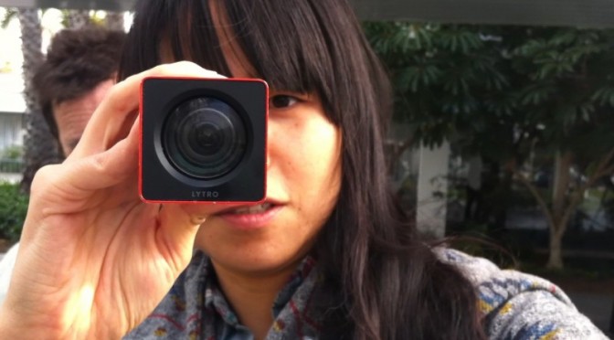
Yesterday while leaving the LA Photo exhibition in Santa Monica — a kind of catch-all retail event of photography through the commercial curatorial world of private galleries — I happened across a small scrum of people with anodized extruded rectangles holding them close to bush leaves, flowers and tiny bits of dirt on the ground. Lytro was in town somehow — or stalking about doing a bit of half-assed DIY guerrilla marketing.

There. I’m a Lytro hater. And maybe I’m getting old and cranky and beginning to catch myself thinkign — “I just don’t understand what kids are up to these days..” That’s a sign of something, I suppose. Oftentimes I can riddle it through and understand, even if I wouldn’t do the “whatever it is” myself.

Nevertheless, I don’t understand what Lytro‘s doing. Let me try and riddle it through.

For those of you, unlike me, who don’t scour the networks for any sign or hint of an evolution in photography and image making generally, you may not know about Lytro’s weirdly optimistic talk about “light field imaging” techniques that is meant to revolutionize photography.

Well, this is it. Effectively, a proper bit of patent gold that allows one to capture a light field (their stoopid way of basically saying “image” or “photograph”) and derive the path of every light ray in such a way that you can focus *after you’ve captured your light field. What that means practically is that you never have to worry about focus ever again, and you can recompose the focus point forever afterwards. So — all that lovely, soft, bokeh (nez depth of field) that has come to mean “professional” photography because you previously could only get nice, lovely, soft depth of field with an expensive, “fast” lens and a big sensor? Well — now you can walk around with an anodized extruded rectangular tube and get it as well. It’ll cost you a bit less than that fast lens would’ve, and you get all the advantages of touching a little postage stamp sized screen to control the camera, and you can run your finger along a side of the rectangle to access zoom controls, and — best of all — you can shove the extruded rectangle at your friends and capture *their light field.


Seriously though — if I were to do a less snarky critique, I’d say that they a few things all turned around here.

First, they missed a serious opportunity to play up on the apparent fascination with analog, or retro-analog, or analog-done-digital. People seem to be in love with cameras that are digital, but harken back clearly to pre-digital photography. I’m talking about the industrial design mostly — but cameras like the Fuji X100 are beautiful, digital and, in their form, signal image-making/image-taking. Things like Instagram filters — whatever you may think about them — signal back to the vagaries and delights of analog film chemistry and the fun of processing in the dark room to achieve specific tonal and visual styles. There’s something about the analog that’s come back. That’s a thing. Perhaps its digital getting more thoughtful or poetic or nostalgic and then we’ll move onto a new, new comfort zone with our gizmos and gadgets and they’ll become less fetish things than lovely little ways to capture and share our lives with pleasing accents and visual stylings. Pixel-perfect will mean something else. Roughness and grit will be an aesthetic.


The extruded rounded rectangle isn’t bad, but it’s not so much camera as it is telescope. And if it’s signaling telescope, I’ll want to hold the thing up flush to my eyebeall, like a pirate or sea captain. And that’s fun as well. More fun, I’d suggest, than holding it out like I was getting ready to chuck a spear at someone.

The fact that I have to hold it several inches so I can pull focus on the display? Well, that’s several inches away from my subject and that little physical alignment schema of photographer —> intrusive-object —> subject is a bad set up. It ruins the intimacy of imaging making. I think that’s well-appreciated if thoroughly ignored aspect of the history of the camera design that the viewfinder makes a difference in the aesthetic and compositional outcome of picture taking. That’s a little bit of lovely, low-hanging fruit in the IxD possibilities for the future of image-making. It’s less a technology-feature, than a behavior feature that can be enabled by some thoughtful collaboration amongst design+technology.

The posture some folks take now of holding their camera out at nearly arms length to compose using the LCD screen on the back of many cameras? That’s bad photography form. You’re taking an image of what your eye sees, not what your camera sees. The intrusion of the visual surround that your peripheral vision naturally takes in when you don’t compose with your eye up to the viewfinder changes the way you compose and how you compose. I’m not saying there are rules, but there are better practices for the rituals of photography that lead to better photography and better photographers. Leastways — that’s what I think. It’s why I prefer an SLR or a rangefinder over a little consumer camera with no viewfinder, or a gesture to the viewfinder that’s barely usable.

You should try taking an image using the viewfinder if your camera has one and then never turn back to the LCD. Use the LCD for image sharing — that’s fine. Or for checking your exposure — that’s awesome and maybe one of the best advantages of the LCD. But to compose using the LCD, you’ve effectively lost the advance that the viewfinder brought to photography, which is to compose the view and do so in a way that makes that composition intimate to the photographers eye. Everything around is removed and blocked out. There are no visual distractions. What you see is basically what you get. (Some viewfinders don’t have 100% coverage, but they are typically quite close.) When the consumer camera manufacturers introduced thin cameras they had to do away with all the optics that allowed the image coming through the lens to do a couple of bends and then go to the photographers eye. And, anyway — all that is extra material, weight, glass, etc. So people started taking photographs by, ironically, moving the camera further away from themselves forever changing photography.

Well, that’s okay. Things change. I like looking through a viewfinder and grouse whenever I see people not using their viewfinder. And, I suppose I don’t use one many times when taking snaps with the happy-snappy or the camera on my phone. Whatever.

The point is that Lytro missed a fab opportunity to redo that compositional gaff that a dozen years of consumer electronics innovation dismissed out of hand.

That’s the Industrial Design gaff. There’s more.

Then there’s the interface. To *zoom you slide your finger left-and-right along an invisible bit of touch-sensitive zone on the gray plastic-rubber-y bit on the near end of the extruded tubular rectangle. Like..what? Okay — I know we’re all into touch, so Lytro can be forgiven for that. But — hold on? Isn’t zoom like..bring it closer; move it further away? Shouldn’t that be sliding towards me or away from me? Or, wait — I get it. The zoom gesture people may be used to is the circular turning of a traditional glass lens. Zoom out by turning clockwise. Zoom in by turning counter-clockwise. Well here I guess you’re sort of turning from the top of the barrel/rectangle — only you’re not turning, you’re finger-sliding left and right. So, I have no idea how this one came about. While a mechanical interface of some sort was probably not considered practical given the production requirements, tooling, integration and all that — I think this begs for either a telescoping zoom feature, or a mechanical rotating zoom feature. At a minimum, a rotating gesture or a pull-in/pull-out gesture if they’re all hopped up on virtual interfaces mimicking their precedents using things like capacitive touch.

Me? I’ve been into manual focus lately. It’s a good, fun, creative challenge. And even manual exposure control. Not to be nostalgic and old-school-y — it’s just fun, especially when you get it right. (Have I game-ified photography? N’ach.) Now with Lytro, the fact that I can focus forever after I’ve taken the image means I’ve now introduced a shit-ton of extra stuff I’ll end up doing after I taken the image, as if I don’t already have a shit-ton of extra stuff I end up doing because the “tools” that were supposed to make things easier (they do, sorta) allow me to do a shit-ton of extra stuff that I inevitably end up doing just cause the tools say I can. And now there’ll be more? Fab.

And further related to the interface is the fact that they introduced a new dilemma — how to view the image. Just as we got quite comfortable with our browsers being able to see images and videos without having to download and install whacky plug-ins, Lytro reverses all that. Because the Lytro light field image is weird, it’s not a JPEG or something so browsers and image viewers have no idea how to show the data unless you tell them how — by installing something/installing/maintaining else, which isn’t cool.

And now I suspect we’ll see a world of images where people are trying to do Lytro-y things like stand in close to squirrels so you can fuck around with the focus and be, like..oooOOooh..cool.

I don’t want to be cranky and crotchity about it, but I take a bit of pride in composing and developing the technical-creative skills to have a good idea as to what my image is going to look like based on aperture and shutter speed and all that. I know Lytro is coming from a good place. They have some cool technology and, like..what do you do if you developed cool technology at Stanford? You spin it off and assume the rest of the world *has to want it, even if it is just a gimmick disguised as a whole camera. Really, this should just be a little twiddle feature of a proper camera, at best — not a camera itself. It’s the classic technologist-engineer-inventor-genius knee-jerk reaction to come up with a fancy new gizmo-y gimmick that looks a bit like a door knob and then put a whole house around it and then say — “hey, check it out! i’ve reinvented the house!”

*shrug.

Why do I blog this? Cause I get frustrated when engineer-oriented folks try to design things without thinking about the history, legacy, existing interaction rituals, behaviors and relevancy to normal humans and basically make things for themselves, which is fine — but then don’t think for a minute about the world outside of the square mile around Palo Alto. It could be so much better if ideas like this were workshopped, evolved, developed to understand in a more complete way what “light field imaging” could be besides something that claims camera-ness in a shitbox form-factor with an objectionable sharing ritual and (probably — all indications suggest as much) a pathetic resolution/mega-pixel count.