The Interaction & Interface Design Car Wreck

Sunday November 28 10:13

For designers, clearly, surfacing, paint colors, materials and interior fabric choices rule out over interface design, which is just plain forgotten about here . Unless it can be justified as, like…Formula 1 inspired, it just doesn’t seem to get any priority as an area of innovation. Look — hybrids barely get any consideration. Even the American car makers booths were bristling with cleaved “Boss” engines reminiscent of the $0.50 a gallon days.

*Sigh.

Well, there’s work to be done. Even the luxury cars could learn a trick or two from the IxDA world..This was a two hour wonder through the subdued LA Auto Show on Sunday. It’s hard to get excited about cars these days, save for the exuberant electric or hopeful hybrid. I chose to annoy myself by noting the wretched center console designs. Who’s in charge of these things, anyway?

Sunday November 28 09:18

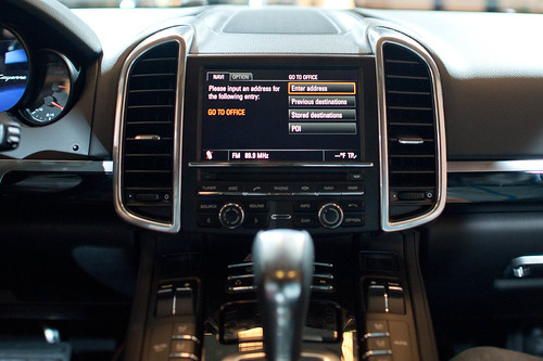
Seriously. I wonder who has to program their office into their car nav. I mean..after the first day, or maybe even the first week of a new job, which you got so you could afford your fuck-off Porsche Cayenne. If you need your nav system to get you to the office everyday..even if you’re coming from the club, or dropping the kids off at school, or whatever..you’re doomed from the get-go.

Sunday November 28 09:34

What can you say? If I had to look at this everyday after spending..whatever. $40,000 on something? I’d cover it with butcher paper and use it as a notepad. Maybe leave a little hole for the austere analog clock there.

Sunday November 28 09:48

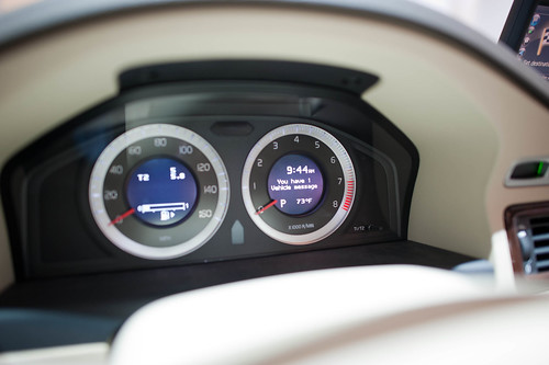
This is a Volvo. This speedo console actually isn’t so bad. It gives you messages close to the idiom of an SMS on your phone. So long as it doesn’t tip into Growl-style pop-ups, I think we’re okay here. It’s actually somewhere between charming and a bit uncanny valley-y..like..has my car turned into a message receiver? Why is my car discussing things with me? On the ride home, my friend Scott, who has an edition of this Volvo, noted that his car was reminding him to take it in for service in a similarly polite way — rather than “Service Engine” which is a deceptively calm way of telling you that there’s no more oil in the crankcase and your engine is pretty much a solid block of molten metal.

Sunday November 28 10:06

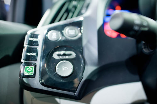
God, I’d ball-hammer whoever decided that the “Eco” mode of the car — presumably an energy-sensitive mode — should get this Evergreen tree icon and then sport and normal are left to this horrid sans serif with no iconographic or color or nuthin’. Why even bother? Like..*g’aahhh..Ball-hammer!

Sunday November 28 10:07

Sunday November 28 10:13

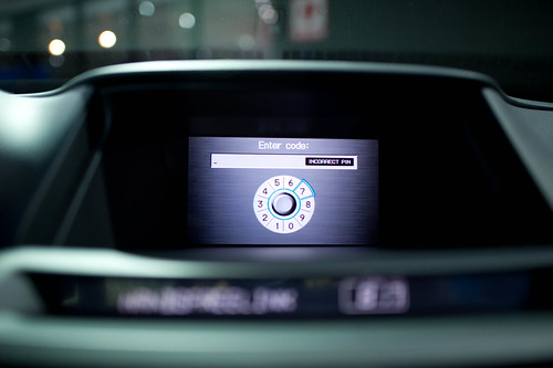
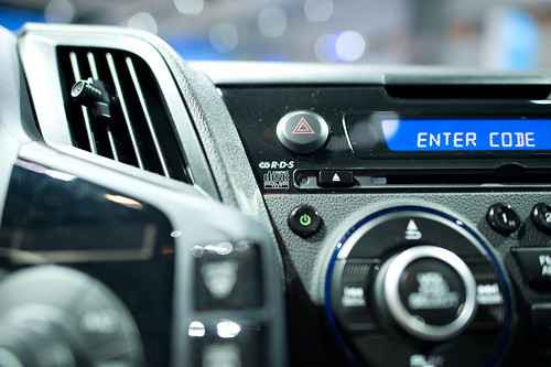
Now our cars require codes, PINs, and passwords — the wretched baggage of cold war security protocols which barely work for humans. Who wants to guess how many 1234’s and 0000’s will start a car? What’s the future of PINS and passwords and why is it not in my fancy, from the future car? I’m not talking about retinal scanners and biometrics here. Just simple, modest, low-level security like..pick a secret picture, your daughter’s favorite animal, &c. PIN? Really?

Sunday November 28 11:22

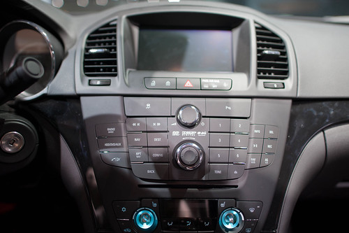
Jeeze. I’d almost prefer the old fashioned mechanical AM/FM radio than this Kafka-esque nightmare. Two knobs. Big old preset number keys from 1-6. A “Back” button the size of two keys. A four way that’s probably got a center-select. It’s just nuts.

Sunday November 28 10:11

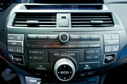
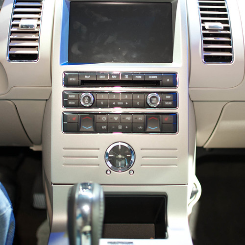
Holy cripes. I mean..this is like 14 different things designed by 73 committees or something. It’s got Menus, Maps, Guides. Titles, XM, “Sound” (what??), CD (really. compact “disc” technology?). Category, Tune, Sync. And that’s an EIGHT way with a center select. EIGHT! It’s just a baroque meshuggener mess trying to look cool and failing miserably. MISERABLY. And on top of all that? The build quality would make me slap my forehead in regret every time I try to adjust the climate control knobs.

Sunday November 28 10:13

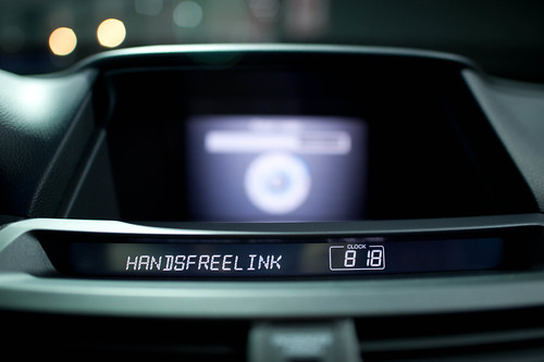
Okay. Someone should probably teach the designer of this display either about Camel Case or remind them that segmented LEDs can sometimes be retro, but only for hipster clocks and calculators.

Continue reading The Interaction & Interface Design Car Wreck

Grafikdemo by Niklas Roy

JCB_29102010_060645_9850

While in Basel a few weeks ago, Nicolas and Cris and I stole off for a few moments to check out this typically expensive art and technology exhibition in the docks region of the city. I forget the name of it, and also did not have any paper money so I didn’t get an exhibition catalog. Nicolas has a more complete description of the project on his recent post about Grafikdemo by Niklas Roy.

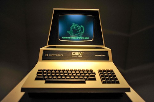
I just wanted to share a thought I had about the project which is the curious way it was manufactured. Interior to the display cabinet of this lovely old Commodore is a physical object — a lattice frame colored in a green florescent paint of some kind that made it look like it was the old fashioned style of CAD rendering where everything was green basically (I think) because people were using green CRTs (for those too young to remember — that’s cathode *ray tube, which now sounds quite archaic). The object can turn and tumble across the x, y and z axis by using the keys on the number pad of the CBM. It’s quite nice. It’s both an homage to an earlier day and a joke, of course, in a way. Nice project.
Continue reading Grafikdemo by Niklas Roy

Design Fiction Chronicles: Before the iPad There Was the PADD

Saturday October 24, 19.35.51

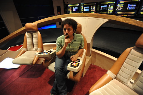
Your author, considering his solution to the Kobayashi Maru during a shake-out run on a Class D starship.

There was recently a wonderful article on Ars Technica interviewing the production and prop designers for Star Trek. I highly recommend giving it a read, even if you’re not a Trekkie. What I find most curious is the creative constraints that the production design was under and their solution. With a limited budget for doing lots of physical design, they decided to draw the user interfaces, rather than assemble them from hardware like knobs and buttons and so on. The idea of a screen-based display that would change based on what it needed to do — a “soft” interface — arose.

“The initial motivation for that was in fact cost,” Okuda explained. “Doing it purely as a graphic was considerably less expensive than buying electronic components. But very quickly we began to realize—as we figured out how these things would work and how someone would operate them, people would come to me and say, ‘What happens if I need to do this?’ Perhaps it was some action I hadn’t thought of, and we didn’t have a specific control for that. And I realized the proper answer to that was, ‘It’s in the software.’ All the things we needed could be software-definable.”

(via http://arstechnica.com/apple/news/2010/08/how-star-trek-artists-imagined-the-ipad-23-years-ago.ars)
Continue reading Design Fiction Chronicles: Before the iPad There Was the PADD

Design Fiction Chronicles: The Dark Knight's Ubicomp Mobile Phone Sonar

Here’s that scene from The Dark Knight where Batman has secretly installed a surveillance system that traces the legal, moral and ethical contours iconic to ubiquitous computing networked devices of this sort. What’s going on — as explained in the short bit of dialog — is that all of the mobile phones used by all of Gotham’s citizens have been secretly connected to this rig that is able to produce sonar-like visualizations of their surroundings to such a level of resolution that one can *see and *hear everything. Batman is asking Lucius Fox / Morgan Freeman to man the rig and listen out for The Joker and direct Batman so he can capture him and end his felonious shenanigans. Lucius plays the moralist here, drawing issue to the fact that Batman would be invading people’s privacy and, moreover, misusing the system that Lucius constructed.

As pertains the Design Fiction motif, what I enjoy about this scene is how quickly it is able to center the pertinent extradiegetic debate on surveillance technologies. Whatever one feels about ubiquitously networked devices and their implications for issues such as the possibilities for over-arching surveillance, state control, and so on — this one scene and its spit of dialogue, together with a suggestive and fairly easily explained and dramatic apparatus — together all of this is able to summon forth the debate, frame its rough contours and open up a conversation. Nice stuff.
Listening Post

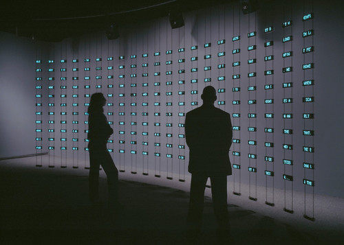
Parenthetically is this device shown above. Called, suggestively, Listening Post, one might be forgiven for mistaking it for a prototype of the surveillance device in The Dark Knight which it may be, or not, or may be both a *real prototype and a probe or a propmaster’s prototype for the film. Or something. In any case, it is a sculpture done by Mark Hansen and Ben Rubin. Listening Post “is an art installation that culls text fragments in real time from thousands of unrestricted Internet chat rooms, bulletin boards and other public forums. The texts are read (or sung) by a voice synthesizer, and simultaneously displayed across a suspended grid of more than two hundred small electronic screens.”

It’s quite curious and depending on what is going on in the world — lovely to listen to. When I first saw it at The Whitney in New York City it was in February of 2003 very shortly after the Columbia Space Shuttle disaster — and the tone of the snippets of chat room conversations were echoing the sentiments of that event. In a sense the device anticipates the aggregation of *chatter that comprises or can be cohered into *trends or *trending topics as the year of Twitter has made increasingly legible.

In any case, the similarity of these two devices — The Dark Knight apparatus and Hansen and Rubin’s “Listening Post” are clearly in some sort of conversation with one another, both provoking similar discussions and considerations, whether or not anyone except me is raising these points.

Why do I blog this? This is a useful example of the way a small, short scene — barely even a story — can help raise an issue to a more tangible and more legible level, making it perhaps more intriguing to grapple with abstractions like the ethics of surveillance. It provides a hook for these conversations in material form.
The Week Ending 220110

Sunday January 24 14:01

What one finds house hunting in Los Angeles and coming across one owned by a Hollywood set designer. Also looking at the same moment, a demure, polite and inquisitive actress vaguely recognized and thence confirmed to be the nitty Shannon from season one of Lost.

Diligent weeknotes are already eluding me. Perhaps because it was a short week last week and I wasn’t in the studio until Thursday. Nevertheless — mostly a couple of days of dusting off the desk and considering what remained to finish from the previous year and continue on into the new one.

Project Trust achieved its milestone late last year and the last couple of days last week were spent assessing it’s 2010 tributaries — where and to who does it get shared? How to distil what has been learned both in practical terms as well as in the very intriguing, curious *meta* terms such as — what did we learn about how to design in such a way as to achieve unexpected, new, perhaps innovative things? What about the friction of design that hones and reshapes and burnishes a nascent idea into a new, curious, future form that moves away from the hum-drum expected outcomes? What about the style of communication, which has moved away from PowerPoint / Keynote into visual stories? What is that and how can it be informally formalized as a new way of sharing ideas that, for the time being, while this style is still new — shock, excite and awe people into becoming fervent allies and help turn that idea into its deserved material form.
So. Decisions made, for the most part, about what prototypes find their way downstream, or up-the-ladder, or to new lands. Movies blocked and storyboarded, or at least decided upon. That was those two days last week.
Continue reading The Week Ending 220110

Interoperability

Sunday September 20, 17.43.18

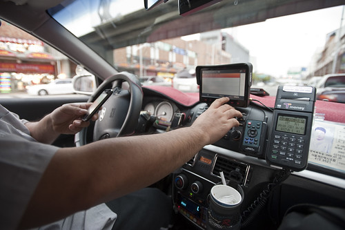
A curious interoperability protocol, wherein the address for some weird place in Seoul has been found on an iPhone and must now be entered into the GPS of the taxi. A simple affair, with minimal bumps often enough, particularly because the map on the iPhone shows the address and streets in Korean, which is great for the taxi cab driver, but miserable for the the traveler who can only hope that the locale on the map is actually where he would like to be.

Why do I blog this? This are useful moments to capture, where language, culture, objects, data come into conflict and must work their way around one another. I am told the iPhone isn’t available in South Korea at the time of this photo, so you have this foreign object — one that is probably quite legible as the iPod Touch was spotted around the city — and a baroque assemblage of devices, machines, transaction mechanisms, remote controls, identity stickers, car controls, radios, etc. I would have to contrast this with the notion of seamless perfection and interoperability that is often the image of the future transportation dashboard.
Continue reading Interoperability

Zip In, Reach Over, Zip Out

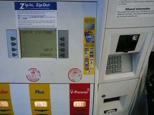
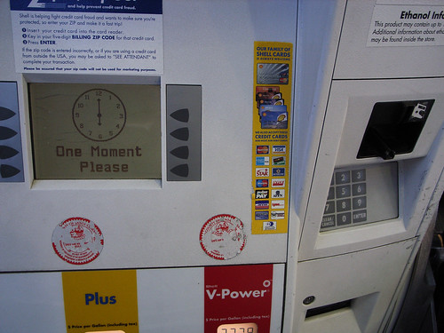
Seen just south of San Jose, California, another curious pragmatic interface that allows me to use my speedy, trusty debit card to complete a transaction without cash, but with a little dose of poor interaction design. After swiping my card, for security purposes (presumably) I must enter my postal zip code. So I can “Zip In, Zip Out.” This is all good stuff. If I were a thief who was a bit of a bungler, I might have swiped someone’s card and attempt to use it, but be stymied if I didn’t have the foresight to get their zip code, such as would likely be found on their drivers license, which is probably also in the wallet I just stole, or found, or whatever. So, I may have a consequential hurdle to charging up a $50 or $60 tank of gas. But the bigger hurdle might be searching for the obvious place to enter the zip code which is, of course, on the panel over around the little articulation in the otherwise flat-front of the pump. Now, this is nit-picky. Anyone would figure this out, that the entry point for numbers and such all is over on the number pad. But, I mean..why is it there and not as any considered design would place it — below or at least beside the display? And why, in a “Zip In, Zip Out” interaction should a “wait just a moment..” wait..wait..wait..clock appear at all? Even if it does take time to transact and validate, some other sort of graphic idiom that suggests zippiness seems like it would be more in keeping with the principle of fast service here.

Sigh.

Why do I blog this? Another in the continuing stream of design observations of failures, successes and imperfections to be considered.
Continue reading Zip In, Reach Over, Zip Out

Ambient Power Consumption Monitoring

20080528_12-15-34

20080528_12-15-38

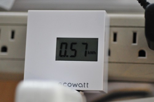
Picked a couple of these “Ecowatt” devices up while in Tokyo, from Bic Camera. They monitor power consumption of whatever you’ve plugged into it. Here I had my MacBook Pro plugged in and running (no sleep) for about 24 hours. The device simply runs through four measurements — two I have no idea about because the symbols are in Kanji, and then two more that are kilowatt hours of consumption and estimated CO2 that would be exhausted from, presumably, a power plant that produced CO2 gas.

There’s lots of work to be done around this sort of idea, first of all a more compelling UI. Maybe even the draconian edition that starts to dim your display or attenuate your Internet as you run past your daily quota of energy.
Continue reading Ambient Power Consumption Monitoring

Display Driver

20080526_18-52-40

20080526_18-31-04

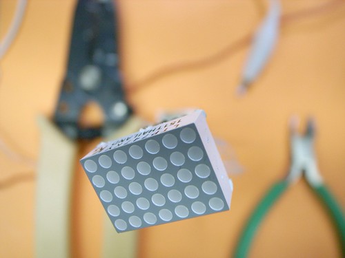
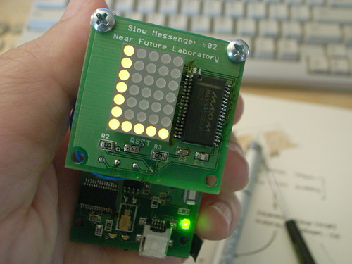
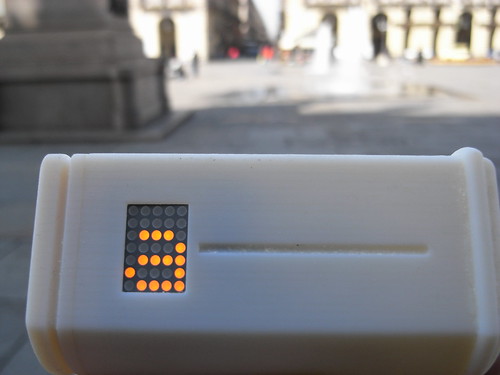
The project here is to find ways to create a simple interface display element, as an experiment in subtractive features — removing things to create less bloat, less confusion. A return to fundamentals rather than feature creep. Not that a 4×5 matrix LED display would necessarily be an end-goal. Rather, what are the limit cases for subtractive design of interface displays? What are the benefits in terms of usability and simplicity and power consumption?

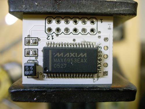
I made another version of the 4×5 matrix display driver using the MAX6953, ostensibly for Slow Messenger, but also possibly for other curious things in the “post-gui” category of explorations. It’s smaller and designed to hold the LED module off of the board so that it’d be possible to have a small setting for the messenger device. I like the idea of a device that’s stalk-like, sort of like these Copic markers I’ve been fond of as of late.

The previous version was like this image, below. You can see that the LED module fits on the board itself, so that mounting the module to fit through some kind of housing would have to take into account the footprint of the entire PCB. That became a bit tricky. I would’ve rather have the LED module at the top of a form like below, but perhaps quite a bit smaller in diameter.

R0013308

20080313_054916

20080526_19-03-20

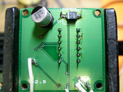
That larger board also had this unfortunate layout issue — entirely my doing. The fatty 47uF capacitor was on the bottom, and the part I used is this ginormous tin can that quite often would get knocked off, or partially knocked off. In the new instance, I managed to find a EIA 3528-21 sized capacitor that’s got a low rectangular profile and put it on top, with most of the other components. I replaced the big thing for the smaller one on this board, above.

Mixing Realities

20080106_Sun_160125

Human Frogger

Can I imagine an interface consisting of computational elements, digital semantics, networks that bridge and connect social elements that do not consist of screens and keys? Can the imagination of digital kids imagine a different set of interaction rituals that are not just about touching little plastic squares and staring at glowing, power-hungry screens? Or is it just inconceivable that digital kids could know anything else — the ones who have only ever known millions of colors and 1280×800 and learned to touch-type when they were 4. Can human-scale time, physical movement through urban paths, suburban cul-de-sacs or backcountry trails contain elements of possibility for digital experiences that are not just the hackneyed PDA/GPS/GSM tour guide blindly explicating the relevance of this or that locale? What do you even call that, when all the possibility for anything new has been bled out from all the idioms surrounding computation? Does anyone else think it’s positively moronic and fully lacking in any foresight that “mobile computers” are just little, battery draining desktop computers?? I heard of a project meant to research mobile computing that was precisely a mindless projects to get mobile phones handle advertising presentation technologies. I mean..