The Urban Internet of Things 2010. An International Workshop

JCB_03082009_175602_2534

Coming up is an exciting sounding workshop on the “urban internet of things — programming the real-time city.” Some more opportunities to get this one right..or at least human.

** As more people move to cities, it becomes increasingly challenging )) the necessarily understated preamble (( to build efficient )) maybe we shouldn’t even hope for efficiency (( infrastructures that support the needs of inhabitants without sacrificing the quality of life. The increasing digital instrumentation of urban areas through various networked sensors provides many opportunities to design smarter cities )) smart? i’d settle for clever and wily (( through a meaningful interpretation and usage of all this real-time data. In today’s world, there are strong incentives to leverage the most recent technologies to create digital infrastructures that foster collaboration between the different disciplines involved in urban design. By considering the IoT as a platform for engaging citizen’s action, a new design space is created where citizens are at the center of its urban environment and empowered to actively shape the city they live in.

The goal of this workshop is to gather original and inspiring contributions from technology experts, researchers in academia and industry, designers, urban planners, and architects that are willing to share their knowledge, experiences, and best practices for building smarter cities. We will explore the design of open and efficient platforms and tools to collect, analyze, store, and share the enormous amount of real-time data digital cities generate through a mix of papers, demos, invited presentations and open discussions for collectively create the city of the future. **

http://www.webofthings.com/urban-iot/2010/
Continue reading The Urban Internet of Things 2010. An International Workshop

Weekending 08222010

photo.JPG

The disadvantage of having so much fun taking photos of skateboarders is that I have less “design research-y” photos to go along with the dispatches here from the Laboratory. So..I’m reusing some and digging deep into the archives.

Anyway. I’ve missed a week in here somewhere. I can say that the last two weeks have been weeks of wrangling thoughts into diagrams..wrangling and rustling and cow-branding and then, in the evening, playing lonely harmonica melodies and sipping coffee ’round the campfire. And early rising to count the herd, chase back the strays and move them along a little further to the, well..taking the allegory to its logical conclusion would ruin everything so, no good ideas really go to the slaughterhouse, they just get assessed and assayed for bits and pieces.

One continuing realization has been that these are definitely times where doing good projects is enough — and if they do good then that’s enough, too.

There was the usual cross-continental calls to update and share and exchange ideas. Some reviews and research proposals. Very exciting cross-silo puddle jumping going on. I’ve long been intrigued by the possibility that engineering and design cross-pollinate in some fashion and there may be a chance to try in the coming months.

Went to a concert at the Greek — Rodrigo y Gabriela — and normally this wouldn’t make it into a weekending post, except that it formalized the scourge of personal portable video recording devices, mostly the iPhone as there are the inevitable block-heads who just hold the thing up video recording entire songs so that you “enjoy” your time at The Greek — the canonical intimate medium-sized venue — with some jackhole holding a little video screen up in front of your view of what you should just be watching just right over there.

So — in the context of the material of this blog, I wonder how these little mobile devices that allow us to do these fascinating things like record experiences for later playback are changing behaviors. Clearly there is some kind of time shifting and hoarding and collecting and sharing rituals are in play here. Also something is going on with our ability to pay attention and maybe level-up our ability to recollect experiences without these devices — just as moments or translated perhaps into a diary or as a memory. And finally — the selfishness of that guy holding up his iPhone and blocking and impeding the view of the rows of people behind him? What’s up with that sort of willful disregard for fellow tribesman? Or whatever?

Anyway — onward. I think I am going to try to read “The Mirror, the Window, and the Telescope: How Renaissance Linear Perspective Changed Our Vision of the Universe“, the more legible follow-on to Samuel Y. Edgerton’s much more academic “The Renaissance Rediscovery of Linear Perspective“. I guess it’s weird putting a “to-do” in a “weekending”, but I started reading it, so I guess this is a marker in time-space so I can go back and note when I started sometime in the future when I realize I didn’t finish it..again. But, I’m curious for more useful stories in the catalog of useful stories about “how things were different” in the past — sort of a high road around the “wheels on luggage” conversation. I was encouraged to collect more “wheels-on-luggage” stories — moments where you realize that something happened to bring us to where we are today and things have not always been as they are, even if it seems incredibly obvious that anything other than what we have today seems silly — like not having wheels on luggage. In the case of the Edgerton books, he’s looking at how Renaissance linear perspective changed how we see and even understand the world around us, and it’s impossible in a sense to imagine that we could have seen the world differently. That may not be the best “wheels on luggage” example because it’s quite a big thing, different from small bits of design work that just make things a little better and do so in a subtle, understated way, but it’s one other story amongst hopefully many other useful examples. (I’m also curious if something like AR will do what the mirror and the window and the telescope have done to the way we see, understand, describe, discuss the world — will AR have its Brunelleschi moment where all of a sudden our “view” of the world, the way we see, changes?)

And finally — there was the Device Design Day talks brought to the world by Kicker Studio. I gave a presentation — some updates and re-workings of the Design Fiction material based on an essay that is quite well over due for the Swiss Design Network conference in late October. And a renewed committment to myself to do this remake of Kubrick’s 2001, as well as some small threads of the underpinnings of this based on some of the notes on HAL and “strong AI” found in the AIAA’s Special 2001 issue from April 2008, Volume 33 Issue 2. A note to self — I realized I wasn’t able to give any prescriptive thoughts as in — here are the three steps toward better device design. And that was okay — this need not be medicine, although people want a cure. It may be enough to think of Design Thinking as an approach rather than a process. Anyway — Bob Ryskamp has some brief notes on the entire Device Design Day, um..day..

Continue reading Weekending 08222010

Design Fiction Chronicles: Before the iPad There Was the PADD

Saturday October 24, 19.35.51

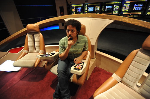
Your author, considering his solution to the Kobayashi Maru during a shake-out run on a Class D starship.

There was recently a wonderful article on Ars Technica interviewing the production and prop designers for Star Trek. I highly recommend giving it a read, even if you’re not a Trekkie. What I find most curious is the creative constraints that the production design was under and their solution. With a limited budget for doing lots of physical design, they decided to draw the user interfaces, rather than assemble them from hardware like knobs and buttons and so on. The idea of a screen-based display that would change based on what it needed to do — a “soft” interface — arose.

“The initial motivation for that was in fact cost,” Okuda explained. “Doing it purely as a graphic was considerably less expensive than buying electronic components. But very quickly we began to realize—as we figured out how these things would work and how someone would operate them, people would come to me and say, ‘What happens if I need to do this?’ Perhaps it was some action I hadn’t thought of, and we didn’t have a specific control for that. And I realized the proper answer to that was, ‘It’s in the software.’ All the things we needed could be software-definable.”

(via http://arstechnica.com/apple/news/2010/08/how-star-trek-artists-imagined-the-ipad-23-years-ago.ars)
Continue reading Design Fiction Chronicles: Before the iPad There Was the PADD

Hand Drawn Maps..Drawn By Computer

ours

One of a sample of “Destination Maps” presented at SIGGRAPH Asia 2010 by a team of researchers. It shows a computer-generated emulation of the canonical napkin-style hand-drawn map. The described advantages are that it highlights relevant “neighborhood” streets and diminishes the arterials and highways that are not necessary and perhaps confusing for reaching the destination. It closes in on that typical style of map that was perhaps described best in Denis Wood’s “The Power of Maps” — the rough, perhaps off-scale map that gives the contours of a place and only what is roughly right and nearly necessary to navigate a place.

Some questions around this sort of map making:

* Why the use of kitsch-y napkin texture and the recognizable human-hand-hunting for lines with pencil? This idea of having the computer draw like a human seems a little dishonest, which puts me off. But, I suppose at the same time its recognizable and legible to people, which may make it more palatable and familiar, which I guess is something kitch is good at.

* I’m sure this is in the category of “it’s a prototype, relax” sort of thing, but shouldn’t the interstate highway signs be roughly-right, too?

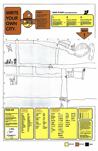
Related, just to keep the project in-mind, to the PDPal efforts to make roughly-right emotionally evocative personal maps — here’s one that was just the other day done by a friend’s young’n, by happy coincidence. I often think about this project and its relevance to what I still think is curious, intriguing and worth pondering over. Fascination with maps and cartography — mostly off-kilter, peculiar, provocative ways of making maps and exploring is super interesting to us here, especially the fellas smoothing parchment in the clean room on the 3rd floor.

JonseyPDPalMap-08102010

cf. Mark Shepherd’s Serendipitor — an iPhone app to help you explore by creating unexpected routes from point A to point B. I’ve been mucking with this for a few weeks — very cool and fun. Not for anyone trying to just get from A to B, which isn’t always the most exciting way to explore.

cf. Designing for iPad, which has some nice remarks on the use of kitsch in interface design.

via http://johanneskopf.de/publications/destination_maps/index.html
Continue reading Hand Drawn Maps..Drawn By Computer

Weeksendings 07302010 and 08062010

Friday July 23 12:01

Sketching in Hardware 2010

I can sum the last two weeks up briefly and, again — for my own record keeping. Nothing useful here, likely at all.

The week that ended on 08062010 had a couple of days off during which time I stayed here in LA and the super fun opportunity to photograph the X Games, ESPN’s blitz of extremely nutso sports.

The weekend before was the ThingM produced “Sketching in Hardware” event for 2010. It was held appropriately at the retro-future “Encounter” restaurant smack-dab in the middle of LAX. I presented a brief and generalized thoughts on the Design Fiction business. In the midst of it, I realized that this was an appropriate continuation of the previous three presentations at Sketching I had done. There was this theme of how making things is a way of answering questions, but pushing those questions beyond the pragmatic sort of prototyping — asking “wouldn’t it be cool if..?” and then answering that question by making something. I think this is a different approach from the more engineering-style prototyping which asks “I wonder if this put together with these other things will work?” The difference I was thinking about is that the former is closer to story, whereas the latter is more instrumental and less speculative. Or something.

I spent the weekend *trying to finish the 5000 words I was asked to put together for a keynote at this Swiss Design Network conference this fall. I think it sounds repetitive. I’m trying to find a way to write about design fiction genre conventions or, as Tim Dufree put it during the opening ceremonies for the Art Center’s “Made Up” summer studios “the lanugage of design fiction.”

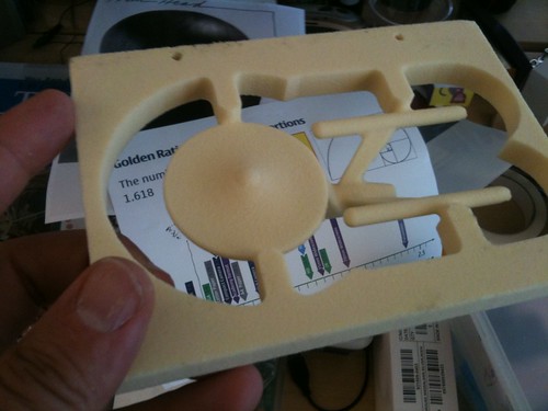
Enterprise from Foam

Found during the studio pack-up! I think Andrew made this to test the new CNC tool-pathing procedures that were made infinitely easier with the Nikolaj’s hard work.

We packed up the studio so all our *stuff that had been hiding and unnecessarily accumulating so it could be moved aside for new furniture which was generally grumbled about before it even was installed for a variety of reasons, mostly having to do with the inertia that settles around what you think is best for you because it’s already there and works fine. I straddled the line and, if I’m honest with myself, used the opportunity to grumble only because I felt grumbly. Now that the new stuff has been in for a week, it’s an awesomely refreshing change. No over head storage (grumble..sour looks..) means more light (aaaaAAAAH..unicorn-y twinkle noises..) and I can actually see across the entire studio (hip-hip-hooray! my other studio mates!).

Last week was mostly a week of trying to design UIs back and forth from UI principles. It’s hard work, as in bailing hay hard work and by that I mean I feel this delicate balance between knowing what’s right and hearing in my head the voices of people who might be, like..that? It’s all wrong. Where’s the Augmented Reality Door Knob we’re meant to have attached to the side?

*shrug*

I looked over the original Drift Deck notes and spreadsheets — I need, need, need to write up another 20 or so cards to bring the deck for the digital edition up to 52. No big deal — it just needs to get done.

I got some new Laboratory work gear to make for some of our associates for putting in work on the Laboratory’s projects.

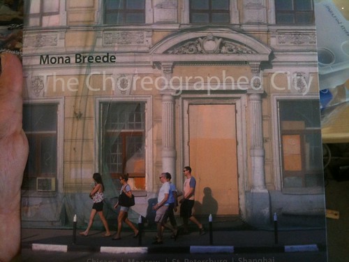
The Choreographed City - Mona Breede

Wonderful book of photography by Mona Breede, also found (never lost, just made apparent from beneath the overwhelming piles of stuff and shelves of books.)

Why do I blog this? I missed the week before, so I’m catching up. And I find it extraordinarily useful to have this running log of what I’ve been doing, when and with whom.
Continue reading Weeksendings 07302010 and 08062010

Features Aren't A Measure Of Innovation

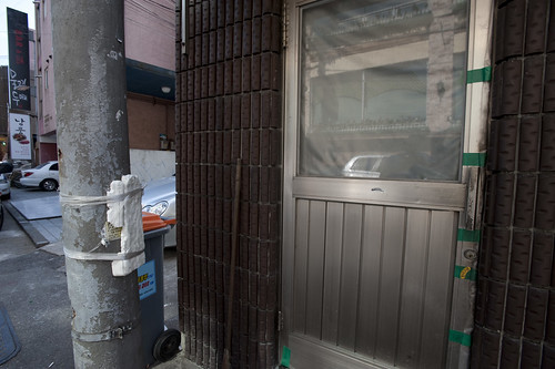
A fix to keep a door from clanging against an adjacent utility pole. Observed in Seoul, South Korea.

It’s too bad that the measure of results often must translate to quantities or business-y things, like numbers of meetings obtained or pages of PowerPoint presentations. Decanting often rich, qualitatively substantial ideas into boxes and “slides” and “decks” sloughs off so much richness that all that was learned often evaporates. The miscommunication is tragic in such instances. When asked for “the presentation”, I’ve taken to doing the electronic email version of a *shrug* — sorry, no “deck”. We can chat. I can send you some object-thing-embodiments-of-principles..if you like. If you want to stare at words, well..

The culture of PowerPoint is best described as a social disease. I don’t mean to gripe too much — it’s not a new thing, and it isn’t only a reaction to conditions as they exist for the Laboratory right now. The culture of the deck has been around us since the days at the advertising agencies and brand marketing agencies during the last cycle — where there were entire departments who did nothing but make presentation decks. Ugh. Can you imagine?

The Measure of Reality has been an obsession since I fully comprehended the made-up nature of reality, I suppose while thinking about the social and cultural parameters of science while over-educating myself. It’s good stuff — I’m not complaining — and it makes it positively frustrating at times to communicate something where you know that everything depends on how you communicate and not only the idea living in your head. No matter how much you believe in it, you have to materialize it in such a way that other people believe in it, too. You need to enroll people in your vision to the degree that they suit up and follow.

In the world of things the Laboratory works on — weird gizmos, gadgets and devices — this becomes particularly difficult when the basis for describing a design-led vision avoids touching on technology-specific features. For some reason lists of features are legible to accountants and engineers who often have the keys to the car and decide what gets done. Here, we wouldn’t offer something up that starts with a bit of technical kit — an augmented reality sensor array or whatever — and then build around that. We would start with a peculiar people-centric platform of experience — say, an otherworldly city guide as we did for the first analog edition of the Drift Deck and as Laboratory Associate Platinum Class Jon Bell is doing for the second digital edition of the Drift Deck. Our conceit has been that experiences for people offer a richer, more meaningful and legible way of creating new stuff. Innovating, only not by stacking lists of features and parts and stuff — but at least by starting with ways of creating opportunities and experiences that lead people in new, unexpected directions. That make space for experiences that go beyond expectation. Basically creating new user experiences. I don’t think you do that just by creating new features and bolting on new technologies.

When I first wrote the draft of this post, it came to mind when the folks at Tenyagroup asked permission to use a photo (that wasn’t even mine, but whatever..) I looked at their short article and found it intriguing. At one point they say:

..great brands change the game by changing the customer, not by changing the product. They become new platforms of opportunity for a new kind of customer, freshly empowered.

Those are weird words not really in the Laboratory lexicon, but somehow it makes sense. The “changing the customer” part might be stated plainly as: offering new sorts of interaction rituals and behaviors. Merely adding a bit of technology does not translate that technology into a necessarily compelling experience. It’s back to the doorknobs joke — if you can’t translate the technology into terms and experiences legible to a normal human, you’ve just stacked yet another unnecessary ornamentation on top of everything else.

This is all swirling around an argument not to design for features lists.


For brand builders, the following definitions of “features” might be useful:

Feature – Evidence of unfinished design.
Feature – The absence of brand vision.
Feature – Fear of freeing the customer–and raising him/her to the next level.
Feature – Footprint of the committee: more is less. As a rule, good design minimizes features and maximizes customers.

(inspiration via http://tenayagroup.com/blog/2009/02/21/customers-drive-brand-growth-not-features/)

Why do I blog this? This has been sitting in the Drafts pile for 18 months and I felt it was time to just post it before it got lost to some kind of data backup failure. But, I am continuing to hunt down ways of putting design-for-people as a guiding principle ahead of just adding meaningless features. Sometimes I see ideas from powerful decision-making people that basically lists the technologies du jour as specifications for what should be made. It’s infuriating — which is entirely my fault. I wish I had the techkwondo to flip that for real, and do so in an elegant way that helps people see the trouble of trying to stick doorknobs on everything they see. Also — trying to cohere some thoughts and scraps for the upcoming Device Design Day later this month.
Continue reading Features Aren't A Measure Of Innovation

When Not To Use Doorknobs

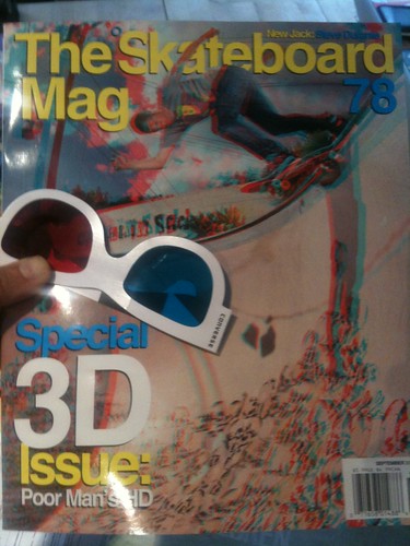
3D Magazines

A familiar challenge is to translate the seemingly unyielding demand to put a specific technology into something because it is expected, or because the name of the technology is the new great thing. It doesn’t matter what it is in particular — I use “doorknob” as a stand-in for whatever the latest “doorknob” of the day might be.

For example — we’re going through an Augmented Reality “doorknob” phase presently, as most of you know. As evidenced by the recent issue of “The Skateboard Mag (78)”, we’re also continuing to go through another, another 3D “doorknob” phase. Which is fine, I guess. 3D is fun when the impact is light, like a magazine.

What do I mean by doorknob? Doorknobs are things that rarely mean anything at all to normal human beings but they mean everything in the world to doorknob enthusiasts who spend most of their time trying to put doorknobs onto everything they possibly can — coffee tables, lampposts, patio chaises, kid’s t-shirts, wrist watches, fancy cameras, car dashboards, toasters, clock radios, keychains, tea kettles, baseball hats.. I could go on, but I’ll let the “doorknob” enthusiasts go crazy themselves.

Rarely, on occasion — someone puts a doorknob on a door because, perhaps, they lead their thinking and ideas and making with principles that focus on people and their practices before they just think of shoving doorknobs on kitten collars or broom handles.

Rather than specifying design first based on technology and engineering-based *parts, fashion small, short stories around the people-based principles that might, in the end, specify that a doorknob be used. But, only at the tail end of things. If you start to feel like you’re bolting doorknobs onto stuff cause some guy in a yellow tie and blue shirt had a graph that suggests that competition is going to start using Baroque, mother-of-pearl encrusted doorknobs on their 2013 saw horses — then obviously something is backwards with the design process. Increasingly — or maybe at this point completely — my own opinion is that, for the near future at least, design can play a much larger role in fashioning and specifying and coordinating the activities between all the other participants in the making of things. Amongst engineering, marketing, operations, production, sourcing and so on. Not that all that is fun at all — but it may be crucial and necessary for creating a legible, sensible “output” at the end of a lot of hard work. Something that communicates and represents value in a people-centered way. It’s incredible how much kruft comes out at the end of markets-led decisions — it’s simply unsustainable, and often done just to keep a foot in the door and so that conversations (good or bad) continue to float around.

Alternatively is the translation of the *doorknob into something else. Doorknobs can be props that stand in for something else that is more people and experience-centric — say, access. A way in. Even an ornamental way in that suggests something wonderful lies beyond. Translating that experience could make a doorknob more than an inappropriate proboscis on something it has no business being part of, I suppose. That feels like a middle ground compromise, as opposed to starting with experiences that are legible to whomever you are hoping to make something for — making those experiences the best they can be (or even just a little better than they already are.)

*shrug*

Okay. Back to it, then.

Why do I blog this? Honestly, don’t read much into this or try to interpret what might *really be going on. I’m just capturing some caffeine-fueled notes on a thorough-going set of questions about how to effectively lead “innovation” or the making of things with design principles and design practices that then themselves specify “the parts.” How can design lead with the respect and authority that engineering and business and marketing-type activities have already? And do so without the hubris of “John H. Doe Design Agency” sort of stuff. If engineering and “research” start with, say — doorknobs that operate without touching them and business and marketing start by assessing what sort of doorknob ornamentation will the market expect down the road what is the way for design to contribute a perspective and translates that language in such a way that, perhaps — doorknobs themselves are questioned and new propositions appear that aren’t specifications based on what is available, but specifications based on what should be, that based on principles more thoroughly considered than “just ’cause.”
Continue reading When Not To Use Doorknobs