The Atlas of Desire

Or: privatesquare, ten months later

It would be generous to say that privatesquare was ever released. Instead, the source code was made public with a long and twisty blog post and a flurry of screenshots. I’ve told a few people about my installation of privatesquare but since I haven’t had the stamina to run a service for strangers (and a free one, at that) it’s remained small and reserved for friends and family. A few people along the way have set up their own instances and that’s been both gratifying and enormously useful in working out some of the kinks.

Maybe there are lots of copies of privatesquare running in the wild. I have no idea and no way of knowing. This is not a bad thing. In the meantime, I’ve continued to chip away at the project adding small features and fixing bugs as they come up.

Recently, we moved from San Francisco to New York City. Maybe foursquare, itself, woulda-coulda-shoulda started in another city but once you start to live the day-to-day ritual in New York it becomes pretty clear why it started here. The Atlas of Desire feature, described below, probably would have languished in a pit of good intentions if we hadn’t moved here but I’ll come back to that in a bit.

When it was first announced, last November, privatesquare came with a long list of tricks it hadn’t learned so it’s probably long overdue for a status update.

New old things

Here’s an unordered list of the things privatesquare said it didn’t do went I pushed it out of the nest:

  • History pages

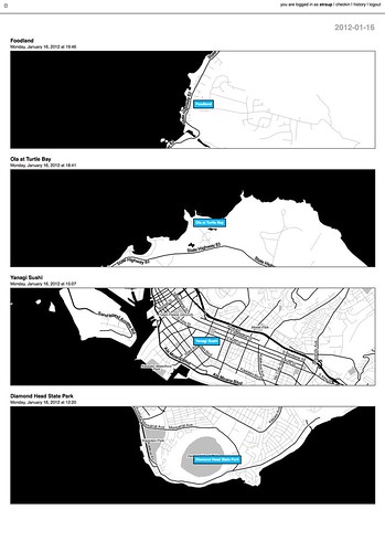
    North shore / South shore (Jan. 16)

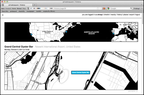
    There are now history pages for venues and dates (and date ranges) as well as for cities. Details on that below.

  • Sync with the foursquare API…

    This is now possible, although it’s not enabled by default.

    Specifically, there is a little script that can be run by hand to import any foursquare check-ins that may have happened outside of privatesquare. This includes the history of check-ins that predate someone starting to use privatesquare. Or not. That’s why the feature needs to be explicitly enabled by each user choosing from one of three options:

    • Do not sync foursquare check-ins – Which is what it says on the tin. What you do elsewhere is entirely your business and privatesquare doesn’t need to know about it.
    • Only sync recent foursquare check-ins – Tell privatesquare to archive missing check-ins but only those that have happened since you signed up (with privatesquare).
    • Sync all foursquare check-ins past and future – This tells privatesquare to archive your entire foursquare history. This is what I’d expect most users to choose but it just always ends better when you let people make that decision for themselves.
  • The nearest linear cell-tower problem…

    Sort of. Not really, though.

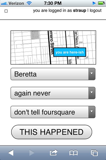
    The nearest linear cell-tower problem is caused by the fact that when a person is using privatesquare from their phone they are connected to the Internet through a cellular rather than a wireless network. Since the nearest cell-tower is used as a proxy for your location and since cell-towers have a range that is sometimes greater than the radius used to query nearby venues the list of places that gets returned is sometimes weird and full of bunk.

    One issue is that the W3C geolocation API, used by web browsers to determine your location, doesn’t tell you how your location was acquired. Was it from a wireless network? A cell-tower? A passing drone, overhead? There’s no way to know and by extension no way to adjust expectations.

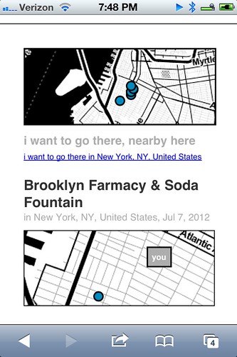
    The nearest linear cell-tower problem is ultimately a user-interface problem and not one that’s ever been tackled particularly well. In more recent versions of privatesquare there is sometimes a little grey dot (rather than blue) that’s meant to indicate where the code thinks you are and help provide some context for the other dots.

    Another option is to allow you to grow the search radius for each query but I haven’t done that yet. File under: Something, however inadequate, instead of nothing.

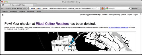
  • There is no ability to delete (or undo) check-ins…

    Done.

    deleted checkins

    Except for the part where there’s no way to delete check-ins using foursquare API which is … puzzling, to say the least. So in those instances where you’ve checked in to both privatesquare and foursquare and then delete check-in using privatesquare you’ll be presented with a short (exasperated) note explaining the situation and a link to the foursquare site where you can finish things up.

    I know, right?

  • There is no ability to add new venues….

    Nope. Still not possible. Chances of it happening remain close to zero.

  • Nor is there any way to record events offline…

    Sort of. Kind of. But only one particular facet of the problem is handled well.

    I first started thinking about this at SXSW this year because the combination of both the cellular network and foursquare being simultaneously overloaded with eager users meant that privatesquare was often unusable in downtown Austin.

    deferred checkins / work in progress

    There are two problems that need to be sorted here:

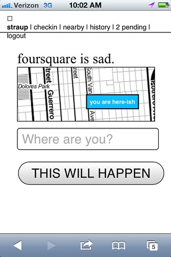
    • The first is some way to store a check-in for future use when foursquare API is sad.
    • The second is some way to store a check-in for future use when the network itself is sad.

    The first problem is now accounted for with pending check-ins, something I’ll discuss more in a bit. The second problem isn’t really accounted for at all and at some point I just need to sit down and look carefully at what the Lanyrd kids did for their mobile site and probably just copy that.

  • There is no way to distinguish duplicate venues (same name, different ID)…

    Nope. Still punting on that.

  • Pages for venues…

    Totally!

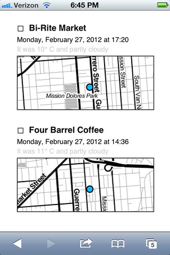
    Every venue you’ve checked in to now has its own page on privatesquare. Each venue page has a list of the dates you’ve checked in there (including links to the actual check-in page), a link to other places you’ve checked in to nearby and a handy I am here now button for … well, check-ing in again.

    (art is your friend)

    Designing for thumbs, and all that.

  • Pages for cities…

    Yes!

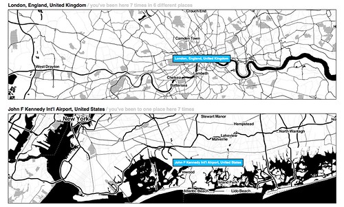
    All check-ins in privatesquare are reverse-geocoded using the Flickr API which returns a list of Where on Earth (WOE) ID associated with a venue. At the moment only cities are recorded so you can’t filter check-ins by neighbourhood or country. Technically, there’s nothing to prevent it from being possible but cities seemed like a good and easy place to start.

    The places pages are kind of great and they are especially striking when you see them on a screen that is bigger than your phone. And because it uses the Flickr API it means that airports are bucketed as cities which makes even more sense in a foursquare context.

    privatesquare starts to get places pages / airport city

    Neighbourhoods are also a near-certainty given that no one’s geo infrastructure can figure out how to make peace with the meta-neighbourcities, called boroughs, that form the NYC metropolitan area and I actually have to suffer the consequences now that I live here. See also: the Atlas of Desire, below.

  • Export…

    Yes!

    There are handy links at the bottom of most pages to export your check-ins as either a CSV or a GeoJSON file.

    Exports are available for the following buckets: check-ins by date or date range; check-ins for a venue; check-ins for a place. Exports should be available but aren’t yet for for: check-ins by nearby-iness; check-ins by desire (more below).

    It has also been the case that if you’re running privatesquare in a controlled environment (like a shared web-hosting service) that enforces its own usage limits exporting check-ins for a user with billions und billions und billions of check-ins can be problematic. I don’t have a ready-made solution for this problem, yet.

New new things

At the same time all of that was being done, there were a bunch of smaller things happening. In no particular order they are:

  • Documentation!

    Gary Gale has done an amazing job of peeling away, with fresh eyes, the stack behind privatesquare and Flamework and keeping detailed notes about what everything means and how to get privatesquare up and running with a minimum of fuss in a variety of environments.

    Gary is also one of those people who checks in every time he exhales so he’s been excellent at finding the crumbly edge of things in privatesquare.

  • Weather tracking

    privatesquare records the weather!

    privatesquare tries to record the weather (based a venue’s latitude and longitude) whenever you check in. Not much is done with that data except to show in the list of check-ins for a venue. The data is stored alongside the check-in so there’s always to opportunity to do something clever and interesting with in the future and in the meantime it makes for a nice soundtrack when scrolling backwards through the history of a place.

  • Time of day tracking

    Sort of.

    Vladimir Agafonkin wrote a lovely little Javascript library to calculate the time pie for a given timestamp and Tom Carden was good enough to create a handy HTTP pony wrapper for it on Heroku that can be poked when a user checks in.

    All your check-ins that happened during the golden hour and that sort of thing.

    Unfortunately, with all the other network requests going out to third parties (foursquare, weather services and so on) the API call to get a time pie is often the one that fails or is killed because it happens so late in the chain of events. For the time being it is not a feature that is enabled by default. There’s a branch of privatesquare with the start of a pure PHP port of the code but it is both incomplete and full of bugs.

    If you’re not familiar with the idea of time pies, you should definitely read this blog post about them from the Stamen kids.

  • Deferred check-ins

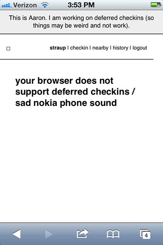
    Occasionally the foursquare API is sad. Sometimes it happens when you’re trying to use privatesquare. In the past you were sorry-out-of-luck but now when that first API call to fetch nearby venues fails privatesquare will give you the option of writing down the name of the venue you were trying to check in to and stick it, along with a timestamp, in your browser’s local (storage) cache.

    Once that happens a link titled pending will magically appears in the navigation menu and from there you can go back in time (sort of) and finish check-ing in.

    Essentially all that’s happening is the usual check-in process being replayed but with a canned search term and a note to privatesquare to use a an equally canned check-in time instead of of right now.

    copy is interface, right?

    For a bunch of perfectly good reasons you can’t do the same in foursquare so any pending, or deferred, check-ins are not forwarded along to the mothership. I may change that in the future and handle the spacetime disconnect by simply adding a note to the foursquare check-in. We’ll see.

    This is basically what should happen when the network itself is down or unavailable. Cities like New York are strange beasts that way. It’s hard to keep the scale of the infrastructure, and the burden of its history, in mind some days. Aside from the fact there are whole pockets of the city with terrible network (read: cellular) connectivity there are others that completely silent, to this day.

    Subways are an obvious place to want to check-in and privatesquare shouldn’t let itself be defeated by the dark spaces underground so teaching the code to play nicely as an offline application is rapidly bubbling up the totem pole.

    I’m told that if you have one of the fancy auto-refilling monthly New York City subway passes it’s possible to retrieve a history of all the stations where it’s been swiped so that bodes well for some sexy Clipper Futures style integration with privatesquare in the not too distant future.

  • The Atlas of Desire

    Untitled

    Let’s be honest. On its current trajectory privatesquare will, sooner or later, become Dopplr. I don’t know what that says about foursquare and since the thing I built is, by design, not social I couldn’t exactly call the Chris Heathcote buckets described in the first blog post a Social Atlas. So, I called it what it is: an Atlas of Desire. Or, in concrete terms:

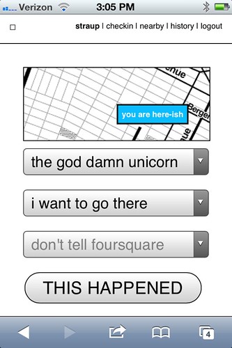
    • Web pages and list view for all the places you’ve checked-in to rolled up by the status you assigned: I am here; I want to go there; again again; and so on.
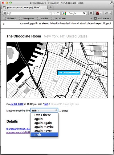
    • The ability to change a status after you’ve checked-in. For example, you could check-in to a restaurant when you sit down to eat and then change to again maybe when you leave.

    I’ve also added a new status simply called meh which, to my mind, is somewhere between again maybe and again never but ultimately the semantics are left up to individual users.

    If you asked me I’d tell you it’s for those places that you would visit for purely mechanical reasons: No matter how lackluster the food is it remains less bad than the bad craziness and temper tantrums caused when you melt down out of hunger.

    privatesquare got a new VERB

    Shelley Bernstein, from the Brooklyn Museum, deserves a proper shout-out for the Idea of Meh which was part of her work making public the museum’s collection metadata.

    In addition to filtering your check-ins by status, you can further prune those places by nearby-iness or by city. It’s become pretty obvious that you should also be able to scope your desire to a neighbourhood. (See above inre: neighbourhoods.) It’s not a hard feature to add but it is a lot of typing so it will happen sometime between this blog post and re-wiring everything to work offline.

Still broken things:

Things that should never have been broken in the first place and that maybe I should fix before I say anything else, but oh well…

  • OMGWTFTZ… timezones

    There are no excuses for this. It’s a thing that conveniently Just Works ® on the West Coast (because that’s the default timezone in the source code) and a thing complicated enough, under the surface, that I’d like to spend a little bit of time thinking about it before I go charging in to fix things.

    Probably the best thing would be to check for the timezone in the foursquare API response when you check-in and store that information locally. Failing timezone information in the API response I might build a simple httpony service on top of the whereonearth-timezeone dataset to do reverse geocoding for timezones.

    Sorry.

Things still TO DO

Untitled

Mike Migurski has requested that privatesquare grow an I’m on my way status flag which is tempting but we’ll have to see about that one. Meanwhile, in no particular order these are some of the outstanding known-knowns:

  • Make the tasteful pale grey permalink button and link for individual check-ins less invisible

    Yes, there are tasteful pale grey permalink buttons and links and for every check-in.

  • Build scripts for “cloud app” hosting

    Gary’s documentation for setting up privatesquare is great and makes the whole process less painful but enough technical hoop-jumping remains to make it all inaccessible to a lot of people. Meanwhile, there are a whole raft of hosted services, like Heroku or PHPFog, that allow you to one-button install web applications which seem like they would be a good fit for things like privatesquare.

    Unfortunately the way the privatesquare is bundled (read: the ways the files and folders are organized) doesn’t lend it to one-button anything with many of these services. privatesquare (and similar tools I’ve been tinkering with at the same time) has never had versioned releases but it might be time be time to start freeze-drying the code at particular moments and creating discrete bundles targeted at specific environments.

    Those releases would always lag a little behind the new and shiny but the up-side is that it would be easier to install, which is probably a trade-off some people would make.

  • Sharing. Maybe? Probably not…

    privatesquare is so-called for a reason. Every now and then I think about changing the default check-in status from don’t tell foursquare to don’t tell anyone which would, once you pulled in a user’s contact list, allow for sharing of things on privatesquare.

    I am still unconvinced about this one as it adds another layer of complexity and it’s not clear why it’s useful (foursquare is pretty good at that side of things) outside of the Atlas of Desire for which plain vanilla exports are probably more important. To whit:

  • Better integration and/or pillaging of the Dotspotting codebase

    A couple months ago I forked the source code for Dotspotting and started to add the ability to edit individual dots. That’s really as far as I got and I’m not entirely sure where it all fits with privatesquare but the shadows of the two projects seem to overlap more often than not.

    Something something something see above something about exports something something something maps something something something.

  • A proper API

    privatesquare already uses its own API but punts entirely on delegated authentication and still uses cookies for authentication and authorization. This is not ideal or, rather, is not a reason to lack an API that third-parties could build on.

    This is just another one of those tasks that requires some time where I sit down and spend the time to finish all the typing necessary to make it happen. Unfortunately, it is a thing made more complicated by the fact that having to read any of the OAuth specs makes me a little crazy in the head. It will happen.

  • Notes

    Maybe. I’m of two minds which is to say I’m not inclined to add notes because I like the simplicity of the site, now, but could be convinced. For a while I had a version of privatesquare that would let you add notes to Findery (née Pinwheel) from venue, or check-in, pages and relied on the magic of machine tags (on their side) to stitch everything back together. I liked that and when there is a public API for the site (in the past I was… well, yeah, anyway…) I will probably slip it back in as an optional feature.

  • Artisanal Integers!

    No, really.

    Privatesquare is at least half the reason that artisanal integers exist at all so it’s only fitting that is should start using them. Dan Catt’s blog post about London Integers is good place to start if you’re sitting there oscillating between confusion and table-pounding muttering the words artisanal… integers…

    Really.

One of the nicest things anyone has said to me about privatesquare since I started building it was: Oh, I’d love to use it but I can’t because I have an Android phone. The nice part is: you can! privatesquare is nothing more than a what-do-you-call-it web application.

The whole native versus web application debate on mobile is interesting, but only insofar as there are still a few tricks that web browsers can’t do or that they are prevented from doing by the operating system itself. Beyond that it all smells too much like the insane and self-serving hair-splitting that people, in the 90s and early 2000s, made about WAP and other uniquely mobile technologies. Read: Small computers, in your pocket.

privatesquare gets a HUD / flying home from Lisbon

privatesquare is meant to play equally well with your desktop as it is your phone. As time permits and I can work through what a print-specific CSS file looks like it should also work on that crazy retrograde technology that refuses to die: paper. The extent to which privatesquare fails, in any of those arenas, is more a reflection of (my) poor design skills than it is proof that somebody’s preferred form factor wins at celebrity death match.

And on and on, it goes!
Pretty Maps – 20×200 Editions

Some of you may have noticed, mostly probably not — but the Laboratory has expanded its ranks. It’s starting to feel like a proper design collective in here. One of the lovely attributes of the people in the Lab are the broad sectors of activity they cover that doesn’t make it seem like they do a zillion different things, but do many things to work though a relatively core set of interests.

Take Aaron Staup Cope. He writes algorithms that tell computers what to do. He makes maps out of paper. He makes maps out of algorithms. He makes you think about the ways that algorithms can do things evocative of map-ness..on paper.

Etc.

What I’ve learned from all of Aaron’s exploits in Dopplr-land, Open Street Maps-land, Walking Maps-land is that maps are dynamic, living things that should never be fixed in their format, style, purpose. They should never be taken for granted — even if the Google Map-ification of the world is doing just this. They should come in a bunch of sizes and shapes and colors and purposes. Etc.

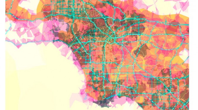
Check out Aaron’s 20×200 Editions of his Pretty Maps. Get yours. I did. LA’ll go on one side of the wall. NYC will go on t’other.

Here’s what they say about Aaron over on 20×200.

For now, let’s set our eyes West, on L.A. County. Like prettymaps (sfba), prettymaps (la) is derived from all sorts of information, from all over the internet. Its translucent layers illuminate information we’re used to relying on maps for–the green lines are OSM roads and paths, and orange marks urban areas as defined by Natural Earth. They also highlight what’s often not seen–the white areas show where people on Flickr have taken pictures. It’s an inverse of a kind of memory-making–a record of where people were looking from instead of what they were looking at, as they sought to remember a specific place and time.

Interaction Awards 2012: Drift Deck for People's Choice

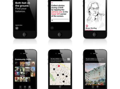
Drift Deck is up for the IxDA Interaction Awards in the “People’s Choice” category. Which isn’t the “Jury’s Choice” but — whatev. It’s the People, so we’re hustling to make you, the People, aware of this chance for you to choose what is the Choice of the People. For Interaction Design Awards.

Please give it a vote.

What makes Drift Deck chooseable? Well — it does something different and provocative in the world of interaction design for the things we do when we’re going/finding. The canon of interaction design for what were once fondly called “maps” is pretty stuck in the mud. Nothing extraordinary going on there that you wouldn’t expect from the next generation of mapping things.

What we did with Drift Deck was look at the world a little sideways and imagine a world in which the map was a bit dynamic and the act of going/finding was a bit less, you know — purposeful in a tedious, dogmatic sort of way.

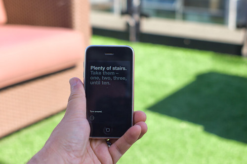
It’s an otherworldly map app, if you will. Drift Deck is meant partly to be pragmatic for those times I find myself somewhere and have no idea what to do if I have an hour to wander about. (Sometimes we all need a bit of a start, or a script to follow.) And of course, it’s playful in it’s nod to the Situationists and their experiments with re-imagining urban space.

The principles led directly from the Drift Deck: Analog Edition that you can find here and more here.

These are the kinds of projects we do here. They’re not “Conceptual.” That cheapens the hard work that goes into them. We write code. We do illustrations of things that get properly printed on big Heidelberg presses. We put together electrical components and have printed circuit boards made and populated with parts to create new sorts of interaction rituals, new sorts of devices — new things that are different from the old things. These are ways of evolving the ordinary to make possibily otherworldly, extraordinary things. They come from ideas that we then evolve into material form so that the ideas can be held and dropped and switched up, on and off to be understood properly.

So, just to be clear — Drift Deck isn’t a conceptual bit of wankery. It’s a thing that got made. Ideas turned into lines of code turned into compiled bytecode. Oh, look! It’s running on my iPhone! Doesn’t feel very concept-y to me.
Continue reading Interaction Awards 2012: Drift Deck for People's Choice

privatesquare

I’ve been working on, and testing out, a new thing for the last couple of weeks. It is called privatesquare. It is a pretty simple web application that manages a private database of foursquare check-ins. It uses foursquare itself as a login service and also queries foursquare for nearby locations. The application uses the built-in geolocation hooks in the web browser to figure out what “nearby” means (which sometimes brings the weird but we’ll get to that later). On some levels it’s nothing more than a glorified check-in application. Except for two things:

First, when you do check in the data is stored in a local database you control. Check-ins can be sent on to foursquare (and again re-broadcast to Twitter, etc. or to your followers or just “off the grid”) but the important part is: They don’t have to be. As much as this screenshot of my activity on foursquare cracks me up it’s not actually representative of my life and suggests a particular kind of self-censorship. I don’t tell foursquare about a lot of stuff simply because I’m not comfortable putting that data in to their sandbox. So as much as anything privatesquare is about making a place to file those things away safely for future consideration. A kind of personal zone of safekeeping.

Second, privatesquare has its own internal taxonomy of event-iness. It is:

  • I am here
  • I was there
  • I want to go there
  • again
  • again again
  • again maybe
  • again never

The first item maps the easiest to foursquare’s model of “checking in”. It is what it says on the tin. The second is the thing that you can’t do on foursquare but everyone does anyway: Checking in after the fact if only to have a personal record of things you’ve done. This just makes the act explicit. The third is not unlike the “lists” feature that was introduced on foursquare, last year. It is also the one flavour of check-in that is not forwarded on foursquare. I suppose I could figure out how to add things to a list, but I haven’t yet.

The last four are a long overdue love song to Chris Heathcote and a plaintive desire for something like the Dopplr Social Atlas (not to mention Dopplr itself) but one that isn’t held hostage to the seeming neglect of its parent company, Nokia. Once upon a time, I went to Helsinki for Important Business Meetings ™ involving Flickr and Nokia while Chris still lived and worked in Finland. I asked him where I should eat during my stay and he sent back a long list of restaurants (all lunch places, I think) each flagged as “again”, “againagain” and so on.

The Social Atlas was a feature added somewhere around year two at Dopplr and is a list of places to eat at, stay in or explore. Places are added by the users and organized by city. It remains a lovely example of how to do this sort of thing though there’s not much going on there these days. You can flag as place as somewhere you’ve been, somewhere you like but not someplace you dislike. Which always seemed like a shame because I would find it helpful to know that someone I know and trust dislikes a restaurant in London as much as I despise Herbivore, in San Francisco.

Chris’ is a genius classification system. It does not get lost in the weeds of weird similes and absurd metaphors (wine tasting, anyone?) and by and large captures the experience of asking someone where you should go to eat in a place you’re not all that familiar with. It is also entirely bound to the relationship of the person telling and the person asking. It is not a recommendation engine.

It assumes that although two people would both do something again, or do it enthusiastically (“againagain”), they are just as likely not to do the same thing. Those details are left out of the equation (read: the computer) because it will never be able to account for the subtlety and history of experience between two people.

The “again” ratings (markings, like on a tree?) are an odd lot in that they don’t go out of there way to distinguish themselves in time. Is it just an indication that you went there some time in the past and want some record of the event? Or does it mean that you wait to check-in until you’ve decided how you feel about it? Or do you check-in and then say whether it was good or not?

I am very consciously punting on these questions for the time being in order to see how the thing actually gets used and what I find myself wishing it did. I suspect that most of the confusion that may be generated by these kinds of blurry and overlapping assignments can be overcome by displaying dates and times clearly.

It is worth nothing that privatesquare does almost nothing that foursquare doesn’t already do, and better. privatesquare is not meant to replace foursquare but is part of an on-going exploration of the hows and whens and whys of backing up centralized services with bespoke shadow, or parallel, implementations of the service itself. It is designed to be built and run by individuals or as a managed service for small groups of people who know and trust one another.

privatesquare remains a work in progress and I am not planning to run it as a public service any time soon but it is available as an open-source project, on Github, that you can run yourself:

http://straup.github.com/privatesquare/

The documentation and installation process still remains out of bounds for most people who don’t self-identify with the nerd squad but that will sort itself out over time. For what it’s worth my copy is running on insert a vanilla shared web-hosting provider that can run WordPress here so that’s a promising start, I think.

The site is built on top of Flamework, which is a whiteroom re-implimentation of the core libraries and tools that a bunch of ex-Flickr engineers used to build Flickr, the same way that parallel-flickr is. Meaning that some part of all these projects is just putting Flamework through its paces to find the stress points and to better understand the hows and whats of the process (installation, documentation, gotchas and so on) should be. And like parallel-flickr “it ain’t pretty or classy (yet) but it does work.”

Here’s an unordered list of the things privatesquare still doesn’t do:

  • Sync with the foursquare API. For a whole bunch of reasons you might find yourself checking in to foursquare using another client application. privatesquare should be able to fetch and merge all those check-ins that it didn’t handle first.

  • The “nearest linear” cell-tower problem. This is one of those problems that gives credence to all the hyperbolic hand-waving done by companies driving around mapping latitude and longitude coordinates for wifi networks. Without this data determining geographic location for a web application running on a phone is often handled by assuming that whatever cell tower your phone is connected to is “good enough”. Sometimes it is but just as often it’s not. You have a line-of-sight, a signal, back to a cell tower that exceeds the maximum radius in which to query for venues. Because your phone thinks you are somewhere else you always end up falling outside the hula-hoop of places that are actually near you.

    The map that’s displayed with venue listings (there’s a screenshot at the bottom of this post) is one possible alternative. As I write this the map isn’t responsive. It’s just there to try and help you understand why a particular list of places was chosen. Eventually you should be able to re-center the map to a given location and use that when looking up nearby venues, for those times when your web browser can’t figure out who is on first by itself.

  • There is no ability to delete (or undo) check-ins.

  • There is no ability to add new venues. Nor is there any way to record events offline or when you don’t have a network connection. I’m not sure whether either of these will ever happen. At the moment there are just too many other things going on. Beyond that I sort of like the fact that privatesquare doesn’t try to do everything.

  • There is no way to distinguish duplicate venues (same name, different ID).

  • Export, which is probably the single most important thing to add in the short-term. This includes a plain old web view of past check-ins.

  • Pages for venues, though I’m really sure what I was thinking when I was blocking out this blog post and wrote that. It’s probably related to what I wrote about cities (below) and the idea that the really interesting aspect of a venue page is seeing a user’s arc of again-iness for that spot over time.

  • Pages for cities. The other nice thing that privatesquare does when you check-in is “reverse geocode” the location of the venue and store the Where On Earth (WOE) ID of the city the venue is in. Which will make it possible to build something that looks like the Social Atlas. For example, if you were going to Montréal I might send you a link to all my check-ins in that city (WOE ID 3534) tagged “again”, “againagain” and “I want to go there”.

In a way privatesquare is just the foursquare version of parallel-flickr: a tool to backup your check-ins, albeit pre-emptively. Which is sort of an interesting idea all on its own. The differences between the two applications are that parallel-flickr doesn’t let you upload photos (yet) and privatesquare doesn’t really provide any mechanism for sharing your check-ins with a restricted set of users. Currently, it’s all or nothing (read: “nothing” because the code forces you to be logged in before you can see anything).

I am also thinking about forking; piggybacking; hijacking (piggyjacking?) some or all of the work that Stamen has done with the Dotspotting project. For two reasons: First they are both built on Flamework so it ought to be possible to make them hold hands without too much fuss. Second, there’s a nice un-intended feature in the way the code for browser things and the code for database things handle the data that people upload to the site: HTML tables.

In theory (and I haven’t tested this out yet) anything that can generate an HTML table, with the relevant semantic attributes, and send it to the browser along with the relevant JavaScript code will be able to take advantage of all the lovely display and interaction work that Sean Connelley and Shawn Allen did for Dotspotting. Just like that!

The reason this all works is that when we started writing Dotspotting it was during a time when Flamework was still pretty green and lacking any code for doing API delegation or authentication. Rather than trying to shave that particular yak we simply opted to use the HTML sent to the browser and jQuery as a kind of internal good-enough-for-now API.

Once it’s sorted for privatesquare it should be easy enough to swap out the table parsing code with proper API calls, now that Flamework has its own API delegation code, and then it could be dropped in to parallel-flickr as an alternative view of your geotagged photos.

It’s all still magic-pony talk and none of it addresses mobile (tiny) web browsers or anything but a pretty conventional linear paginated view of the data (no clustering or other fancy stuff) but, still: This pleases me.

In the short-term I’m going to continue to focus primarily on the data input side of things trying to make it as easy and fast as possible to record the data along with the simplest of CSV or GeoJSON exports, so that you could at least look at your data in tools like Dotspotting or Show Me the GeoJSON respectively.

And if I can get that part squared then it also might be possible to re-use some of the same work to make things like Airport Timer easier since the two projects are each a kind of side-car to the other, when you stop and think about it.

Quiet But Not Quiescent

Judge not the less yammer-y state of the studio blog to indicate that there is nothing worth yammering about. It’s just that the clang of steel caressing code has been going on and that in great measure, too. Some of you may have glimpsed and grinned at the fantastic electronified edition of the paper Drift Deck that we developed a couple of years ago. That’s right. We’ve added *batteries to the Drift Deck and it’s fallen into the *app well..it’s an app which is fantastic because it means the last remaining physical card editions can become properly *artisinal and the electronic battery editions can spread the sensibility of the Drift Deck concept to the rest of the world.

Release is imminent. Prepare ye iPhones. Hop expectantly from foot-to-foot. More news in a short while, including linkages to downloadables. In the meantime, check out the new Drift Deck webified “page” and the fantastic roster of hammererers that batteryified the ‘deck.

..And then — onto the next thing here. It’ll be quiet a little, but good things are baking in the kiln, rest assured.

*Willow next. The superlative friendregator for the discerning social being.
Continue reading Quiet But Not Quiescent

Cinema City

Or…in this case, cinematic architecture. Jonathan Rennie presented a project yesterday that I found most fitting in the vein of design fiction / architecture fiction. For the studio class run by Geoff Manaugh (@bldgblog) called Cinema City, a graduate studio that starts with this brief and asks the students to consider what they may. There were some interesting projects. This one in particular stood out for me. It was an unconventional approach in an architecture class to present a series of fictions about the future of cinema.

Monday December 13 14:06

Continuous Machinic Cinema

This project explores a particular narrative for the future of cinema and, in turn, it proposes new possibilities for the moving image and its place, content, viewers & screen.

The project proposes a scenario of technological discovery and development where:

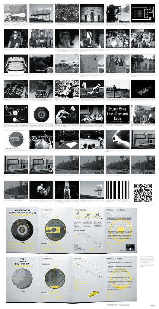
** Guerilla film distribution occurs in new places via Lawn Bowl and Shot-put film grenades;

** With anamorphic lenses the perpendicular hegemony of conventional cinema watching is broken;

A shift in content to QR coded cinema is predicted and, in turn..

** A future point where non-narrative images are viewed by post-human machine optics is proposed, with screens affecting the fabric of the city.

The project is a sneak preview for a future of cinema, proposing a continuous cinema that is freed from both the spatial confines of the movie house and the literary expectations of narrative — told by and to non-human machines.

FInal Panels_Further Revised.indd

In the first proposal, guerilla film distribution is done by throwing film grenades, a “weapon” first proposed by the Soviets and designed to be surreptitiously deployed during the Olympics. The weapons are found again by Jonathan during his project research, including documentation and some diagrams describing the clandestine Soviet project.

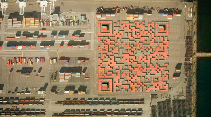
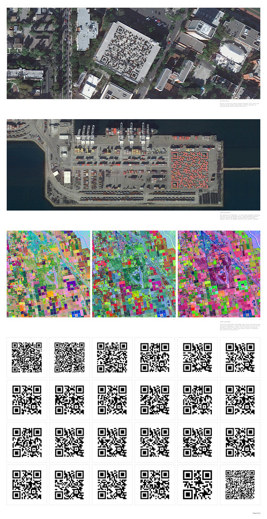
In the second proposal, Skynet — an extraterrestrial orbital satellite platform — finds QR codes in the landscape of earth. The QR codes embed stories and films that the satellites share with one another. Over time, as they see the same films over and over again and become bored — they begin to look for QR codes elsewhere, perhaps interpreting barcode-like structures in the landscape at different wavelengths — for instance an infrared folliage rendering may appear to contain QR codes. They seek out new films in this way, perhaps even instructing terrestrial machines, such as the cranes at loading docks or tractors in large farm fields, to construct new QR codes containing new cinema and stories.

Still 1

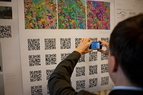
Jonathan also ginned up a sort of graphic novella/short story to go along with the proposal so that each QR code that you see in his poster documentation points to a page in the comic. You can see the full graphic novella here: QR Cinema

Why do I blog this? This is one of those architecture projects that plays at the far end of the spectrum of architecture’s inherent speculative nature. The spectrum runs from the pragmatic *planning what will be* (traditional floor-plan stuff) all the way across to *speculating to help think* (architecture fiction), with *proposing (cardboard models, photoshop site renderings, camera-tracked little films showing the space as it would be) somewhere in the middle.

I enjoy considering the spectrum of realizations as things move from idea to their material form. In this case, Jonathan has used the architectural brief to propose a speculation about machines reading the landscape to interpret meaning, or to watch movies that are referred to by the QR codes they (think?) they see. This is using the landscape as an interface, which I find super intriguing.

What does this help us think about? Well — it’s a fun Sci-Fi comic he’s done here, so there’s that on its own. Aside from this, we can start to think about Cyphertecture — embedding machine-readable (or maybe only-for-machine) texts in physical structures. Like, for example, this bit of landscape cyphertecture from several years ago

Space Invaders: Google Earth Edition

DIY Media? Fan Art in Google Earth

Space Invaders upper right..Cylon Raider bottom left.

Geoff has the more lucid discussion of this point, but suppose cornice details became machine readable physical cuts and bumps that would represent some meaning for, say…Google Street View cars? I’m not saying this is entirely practical, but I could see a day when bold marks like this that are required to exist (for any number of reasons — local services to identify what building they are at definitively, etc.) on new structures. This then becomes turned into an aesthetic to make it more pleasing as a facade, and so on. In any case — Jonathan’s work certainly gives me things to think about in an entirely fun, imaginative way.
Continue reading Cinema City

Hand Drawn Maps..Drawn By Computer

ours

One of a sample of “Destination Maps” presented at SIGGRAPH Asia 2010 by a team of researchers. It shows a computer-generated emulation of the canonical napkin-style hand-drawn map. The described advantages are that it highlights relevant “neighborhood” streets and diminishes the arterials and highways that are not necessary and perhaps confusing for reaching the destination. It closes in on that typical style of map that was perhaps described best in Denis Wood’s “The Power of Maps” — the rough, perhaps off-scale map that gives the contours of a place and only what is roughly right and nearly necessary to navigate a place.

Some questions around this sort of map making:

* Why the use of kitsch-y napkin texture and the recognizable human-hand-hunting for lines with pencil? This idea of having the computer draw like a human seems a little dishonest, which puts me off. But, I suppose at the same time its recognizable and legible to people, which may make it more palatable and familiar, which I guess is something kitch is good at.

* I’m sure this is in the category of “it’s a prototype, relax” sort of thing, but shouldn’t the interstate highway signs be roughly-right, too?

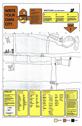
Related, just to keep the project in-mind, to the PDPal efforts to make roughly-right emotionally evocative personal maps — here’s one that was just the other day done by a friend’s young’n, by happy coincidence. I often think about this project and its relevance to what I still think is curious, intriguing and worth pondering over. Fascination with maps and cartography — mostly off-kilter, peculiar, provocative ways of making maps and exploring is super interesting to us here, especially the fellas smoothing parchment in the clean room on the 3rd floor.

JonseyPDPalMap-08102010

cf. Mark Shepherd’s Serendipitor — an iPhone app to help you explore by creating unexpected routes from point A to point B. I’ve been mucking with this for a few weeks — very cool and fun. Not for anyone trying to just get from A to B, which isn’t always the most exciting way to explore.

cf. Designing for iPad, which has some nice remarks on the use of kitsch in interface design.

via http://johanneskopf.de/publications/destination_maps/index.html
Continue reading Hand Drawn Maps..Drawn By Computer

Apparatus at The HABITAR Exhibition

Wednesday June 17, 14.44.17

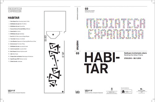
As Fabien has mentioned and due to his participation in curating the event, the laboratory’s Apparatus for Capturing Other Points of View will be exhibited at HABITAR. It’ snice to have this project reconsidered in an art & technology context. The exhibition catalog is available as a PDF here.

Originally this was a thought-collaboration after a Nokia colleague turned me onto this William H. Whyte small book called The Social Life of Small Urban Spaces. Whyte managed to capture the dynamics of urban parks and gathering points with the recording technoogy of the day — eyeballs, notebooks and some 16mm cameras. (You can watch some of it here and other places.)

HABITAR

It was a simple thing to get excited about — how might this sort of observation be redone in the early 21st century and what might be some curious things to look for? My own interest was to build the thing and make it a provocative instrument and then wonder what a video enhancement and post-processing of these images look like? Something algorithmic, I supposed — are there behaviors and movements that can be abstracted from the general hub-bub and rush of urban pedestrians’ lives?

You can find most of the videos here, and there are some new edits at the exhibition should you be in their neighborhood.

Continue reading Apparatus at The HABITAR Exhibition

A Curious Crosswalk Clarification

Friday January 08, 14.46.08

Friday January 08, 14.46.21

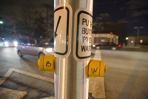
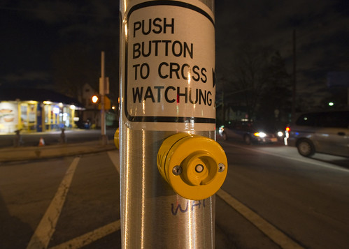
A curious inscription left by someone to clarify which button expedites which crosswalk signal. Someone has written with an indelible marker “B” and “W” on each button (for Broad Street and Watchung Avenue respectively), as well as writing an abbreviation on the pole (“WAT”, for example.) What is interesting here is that an official sign also indicates which direction is controlled by the button (“Push button to cross *arrow* Watchung”) making me wonder if this was an addition made after some complaints about the confusing buttons. What made this confusing initially was probably the fact that there are two crossings in roughly a straight line. You cross a small bit of one-lane street that subsequently does an easy turn onto Broad Street from Watchung, and then stand on this island with the buttons. Then you cross a larger street — Watchung Avenue proper — with several lanes. Approaching the island after a nervous crossing and then looking out into a daunting sea of fast-moving traffic on your way to a quick sugar fix at Holsten’s, you might think the first button you see is the one to hit, which would be wrong.

Why do I blog this? I find these sorts of thoughtful, improvised inscriptions fascinating. A different kind of “read-write” city or read-write urbanism, where people in their everyday moments take it upon themselves to make additions, hacks, DIY improvements and adjustments to make the city more livable and agreeable to their sensibilities. The points where urban design from the top-down meets urban living from the bottom-up.
Continue reading A Curious Crosswalk Clarification